[Preprint]. 2020 May 2:2020.04.28.20083279.
doi: 10.1101/2020.04.28.20083279.

CovidCounties - an interactive, real-time tracker of the COVID-19 pandemic at the level of US counties

Affiliations

CovidCounties - an interactive, real-time tracker of the COVID-19 pandemic at the level of US counties

Douglas Arneson et al. medRxiv. .

Update in

Abstract

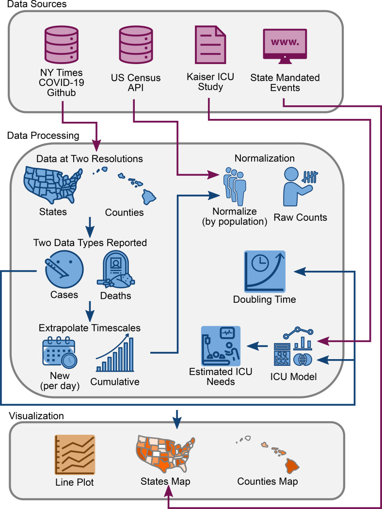
Management of the COVID-19 pandemic has proven to be a significant challenge to policy makers. This is in large part due to uneven reporting and the absence of open-access visualization tools to present local trends and infer healthcare needs. Here we report the development of CovidCounties.org, an interactive web application that depicts daily disease trends at the level of US counties using time series plots and maps. This application is accompanied by a manually curated dataset that catalogs all major public policy actions made at the state-level, as well as technical validation of the primary data. Finally, the underlying code for the site is also provided as open source, enabling others to validate and learn from this work.


Conflict of interest statement

Competing Interests: The authors declare no relevant competing interests

Figures

Figure 1:
Figure 1:. Database schematic.
Source data was obtained from The New York Times, US Census Bureau, Kaiser Health News, and from a manual curation of state governmental websites and news outlets as described in Methods. Data was processed to reflect case and death counts at the level of states and counties. Functions were written to perform x- and y-axis rescaling, normalization by population, doubling time estimation, and ICU bed utilization. Results were depicted using interactive line plots and maps.
Figure 2:
Figure 2:. Technical validation of the datasets.
A. Comparison of estimated ICU bed occupancy, cumulative cases, and cumulative deaths reported by CovidCounties against corresponding data reported by the California Department of Public Health. Each point corresponds to a measurement from a given California county on a particular date where both datasets report counts. Data is from 4/1/2020 – 4/9/2020. B. Comparison of the estimated hospital bed occupancy, cumulative cases, and cumulative deaths reported by CovidCounties against corresponding data reported by the Connecticut Department of Public Health. Each point corresponds to a measurement from a given Connecticut county on a particular date where both datasets report counts. Data is from 3/24/2020 – 4/9/2020. C. Comparison of the estimated hospital bed occupancy, cumulative cases, and cumulative deaths reported by CovidCounties against corresponding data reported by the website Corona Data Scraper as of 4/10/2020 (includes data up to 4/9/2020). Each point corresponds to a measurement from any US county in the dataset at a particular time where both datasets report counts. D. Comparison of the estimated hospital bed occupancy, cumulative cases, and cumulative deaths reported by CovidCounties against corresponding data reported by 8 different state Departments of Public Health. Data ranges vary by state; curated state data is available in the data file accompanying this manuscript.
Figure 3:
Figure 3:. Effect of shelter in place orders on doubling time
A. States within the United States are color-coded by percentile of date to implement state mandated shelter in place. White indicates earlier dates (among states) while dark orange indicates later dates or no state mandate. B. States within the United States are color-coded by percentile of case doubling time on April 15, 2020. Dark orange indicates a fast doubling time (among states), white indicates a slow doubling time.
Figure 4:
Figure 4:. Overview of CovidCounties.org.
A. The primary view of CovidCounties.org is the line plot view, depicting time-series trends by individual county. Depicted counties may be selected by single or double clicking the counties displayed in the legend. They may also be selected by typing in counties (including from outside of a given state) at the bottom. B. User-selected individual states are color coded according to the variable of interest (e.g. cumulative cases). Dark orange corresponds to the highest percentiles within the state, white indicates the lowest percentile. Hovering functionality displays statistics corresponding to a given county. C. Line plot views can be extensively customized, with features to enable axis re-centering/scaling, count normalization, depiction of doubling time, and predicted ICU bed utilization. Individual state and United States plots update to reflect selected parameters where appropriate. D. States within the United States are color-coded by percentile according to the variable of interest (e.g. cumulative cases). Dark orange indicates relatively high percentile (among states), white indicates low percentile. Hovering functionality displays statistics corresponding to a given state. The dropdown menu below allows the user to change the view to depict timing that various social distancing policies were implemented: white indicates relatively early adoption (by percentile), dark orange indicates late or no current adoption.

References

    1. World Health Organization. Novel Coronavirus – China. https://www.who.int/csr/don/12-january-2020-novel-coronavirus-china/en/ (2020).
    1. Center for Systems Engineering and Science at Johns Hopkins. COVID-19 Dashboard. Coronavirus Resource Center; https://coronavirus.jhu.edu/map.html (2020).
    1. The New York Times. Coronavirus (Covid-19) Data in the United States. https://github.com/nytimes/covid-19-data (2020).
    1. The U.S. Census Bureau. U.S. Census Bureau’s 2014–2018 American Community Survey 5-year estimates. https://www.census.gov/data/developers/data-sets/acs-5year.html (2020).
    1. Walker K. tidycensus: Load US Census Boundary and Attribute Data as ‘tidyverse’ and ‘sf’-Ready Data Frames. R package version 0.9.6. https://CRAN.R-project.org/package=tidycensus (2020).

Publication types

LinkOut - more resources