Review
doi: 10.1167/iovs.61.6.25.
Display of Data
Affiliations
- PMID: 32531059
- PMCID: PMC7415299
- DOI: 10.1167/iovs.61.6.25
Item in Clipboard
Review
Display of Data
Invest Ophthalmol Vis Sci.
.
No abstract available
Conflict of interest statement
Disclosure:
Figures
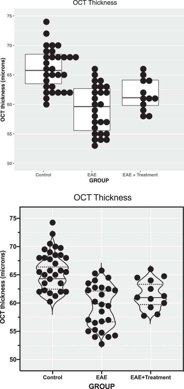
OCT of the inner retinal layer thickness displayed by categorical groups. The raw data for OCT thickness represent the thickness of the RGC complex in microns. (A) Produced with software program R. Individual data points with the same value are stacked laterally to accurately depict a distribution, and a box plot with median and first and third quartiles is superimposed. Note that in the EAE group there are more points at the upper and lower portions of the distribution than expected for a Gaussian distribution (“heavy” tails). (B) Produced with GraphPad Prism software with the same data as in A. Random noise was added to the scatterplot data (“jittering”) to prevent overplotting observations with the same value. In the “standard” scatterplot from Prism, the width of the distribution of points is proportionate to the number of points at that y value. In this example, a violin plot was superimposed, in contrast to the box plot in A. Violin plots are sometimes used to display the smoothed shape of the frequency distribution of the data. Median values and quartiles are indicated with horizontal lines in both plots.
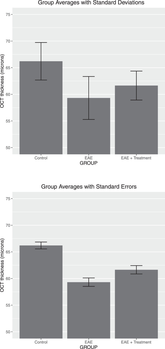
Suboptimal data presentation: bar chart of OCT thickness of the RGC complex group in microns. Averages with ±1 SD added (top plot) and ±1 SE (bottom plot) are shown for the same data as in Figure 1. The distribution and number of data points are not shown.
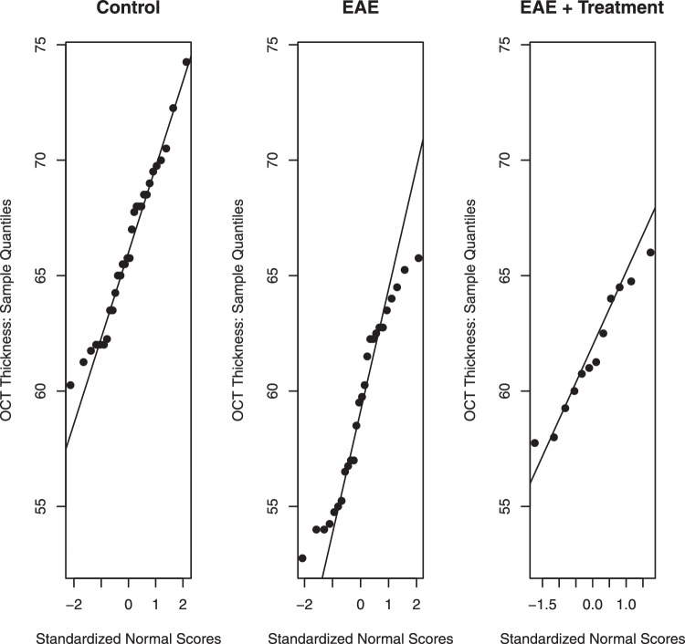
Normality assessed by q–q plots. Observations on the y-axis are plotted against their standardized normal scores. For normally distributed data, the points should scatter around the reference line. Deviations from linearity are a sign of non-normality.
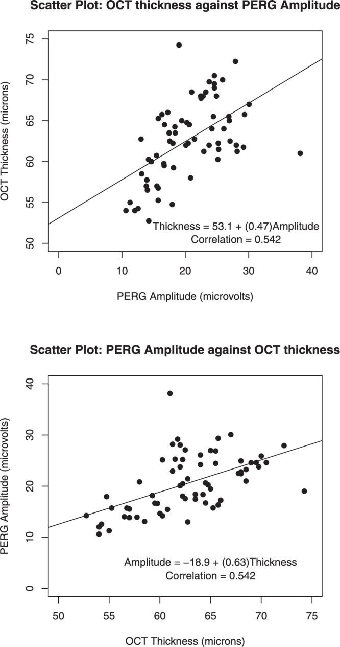
Scatterplots of OCT thickness and PERG amplitude, with fitted least-squares lines added. Axes are reversed in the second plot. PERG amplitudes are given in microvolts and were calculated from the P1 peak to the N2 trough from the evoked potentials. The OCT thickness of the inner retinal layer is given in microns.
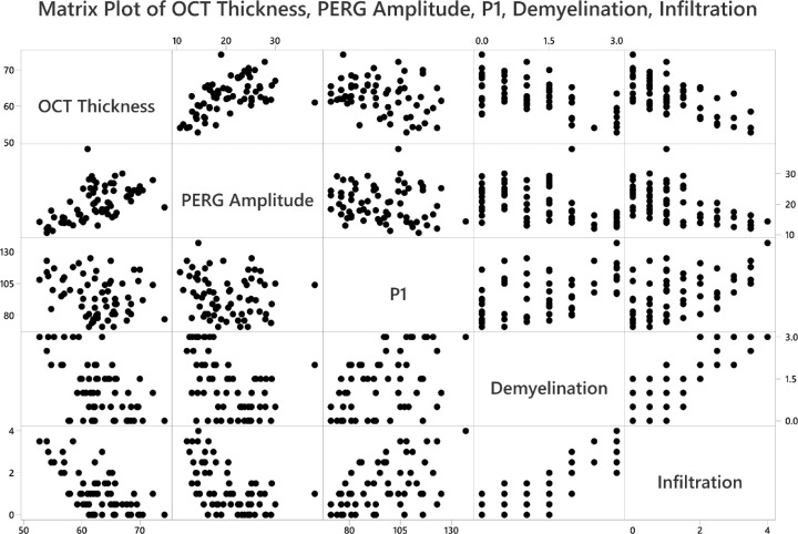
Pairwise scatterplots to display the relationships among different measurements, such as thickness of the RGC complex (OCT thickness), PERG amplitude, implicit time of the P1 peak, and grade of demyelination and magnitude of cell infiltration in optic nerves. Each row of figures has the labeled box as the y-axis (e.g., first row y-axis is OCT thickness; second row y-axis is PERG amplitude).
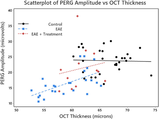
Scatterplots of OCT thickness against PERG amplitude for each eye, stratified for the three treatment groups. A linear regression was performed for each of the three groups. PERG amplitudes are given in microvolts and were calculated from the P1 peak to the N2 trough from the evoked potentials. The OCT thickness of the inner retinal layer is given in microns. Note that we used a color scheme that would accommodate a reader with red–green color blindness.
Similar articles
-
Assessing Intereye Symmetry and Its Implications for Study Design.Invest Ophthalmol Vis Sci. 2020 Jun 3;61(6):27. doi: 10.1167/iovs.61.6.27. Invest Ophthalmol Vis Sci. 2020. PMID: 32531057 Free PMC article. Review. No abstract available.
-
A Mini Review of Clinical and Research Applications of the Retinal Function Imager.Curr Eye Res. 2018 Mar;43(3):273-288. doi: 10.1080/02713683.2017.1414853. Epub 2018 Jan 8. Curr Eye Res. 2018. PMID: 29308926 Review.
-
[Top ten research advances of ophthalmology in China (2009-2013)].Zhonghua Yan Ke Za Zhi. 2014 Aug;50(8):606-9. Zhonghua Yan Ke Za Zhi. 2014. PMID: 25385381 Chinese.
-
Gender differences in retinal diseases: A review.Clin Exp Ophthalmol. 2024 Apr;52(3):317-333. doi: 10.1111/ceo.14364. Epub 2024 Feb 13. Clin Exp Ophthalmol. 2024. PMID: 38348562 Review.
-
Imperceptible watermarking for security of fundus images in tele-ophthalmology applications and computer-aided diagnosis of retina diseases.Int J Med Inform. 2017 Dec;108:110-124. doi: 10.1016/j.ijmedinf.2017.10.010. Epub 2017 Oct 16. Int J Med Inform. 2017. PMID: 29132616
Cited by
-
Focus on Data: Statistical Design of Experiments and Sample Size Selection Using Power Analysis.Invest Ophthalmol Vis Sci. 2020 Jul 1;61(8):11. doi: 10.1167/iovs.61.8.11. Invest Ophthalmol Vis Sci. 2020. PMID: 32645134 Free PMC article. Review.
-
Parametric Statistical Inference for Comparing Means and Variances.Invest Ophthalmol Vis Sci. 2020 Jul 1;61(8):25. doi: 10.1167/iovs.61.8.25. Invest Ophthalmol Vis Sci. 2020. PMID: 32692838 Free PMC article.
-
Correlation and causation for cardiothoracic surgeons: part 4-distinguishing relationships in data.Indian J Thorac Cardiovasc Surg. 2025 Mar;41(3):371-380. doi: 10.1007/s12055-024-01889-1. Epub 2025 Feb 8. Indian J Thorac Cardiovasc Surg. 2025. PMID: 39975868
References
-
- Cleveland WS. Visualizing Data. Summit, NJ: Hobart Press; 1993.
Publication types
MeSH terms
Grants and funding
LinkOut - more resources
Full Text Sources
Medical