. 2020 Sep 20;39(21):2714-2742.
doi: 10.1002/sim.8570. Epub 2020 Jun 16.

Graphical calibration curves and the integrated calibration index (ICI) for survival models

Affiliations

Graphical calibration curves and the integrated calibration index (ICI) for survival models

Peter C Austin et al. Stat Med. .

Abstract

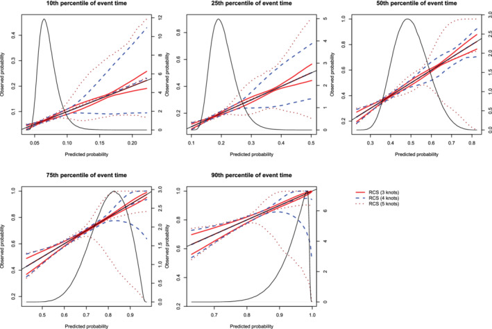
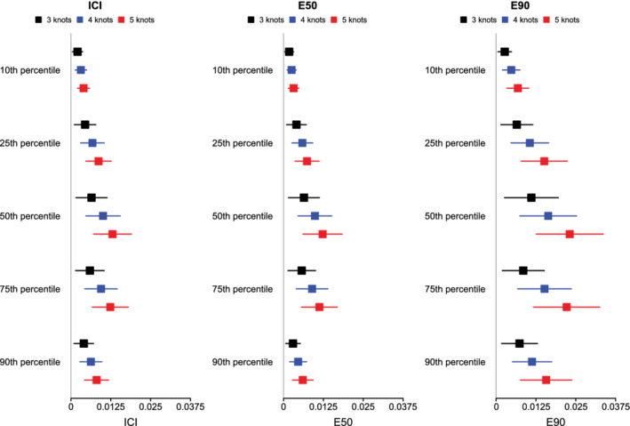
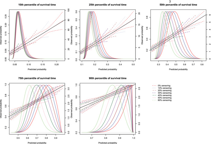
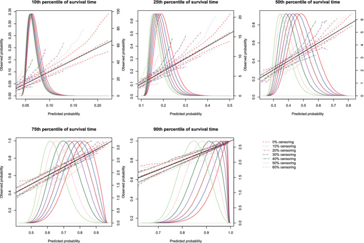
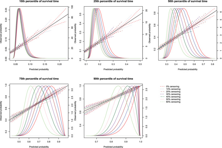
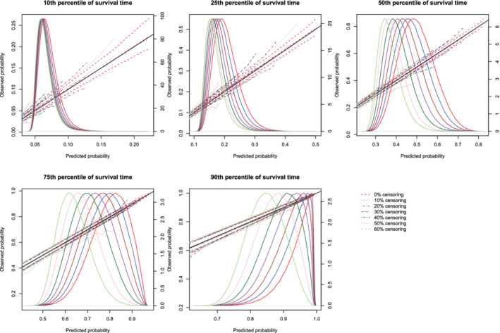
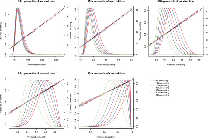
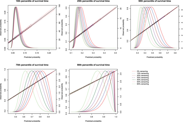
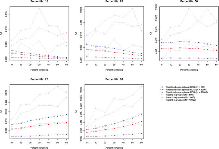
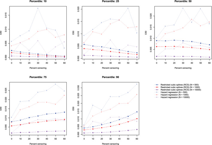
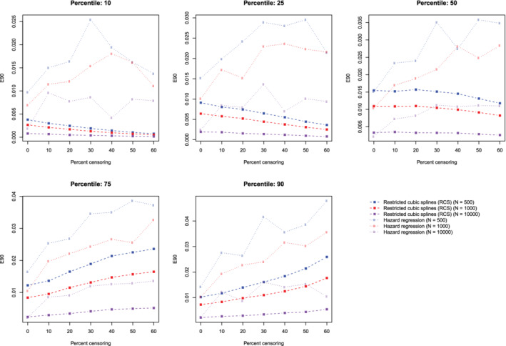
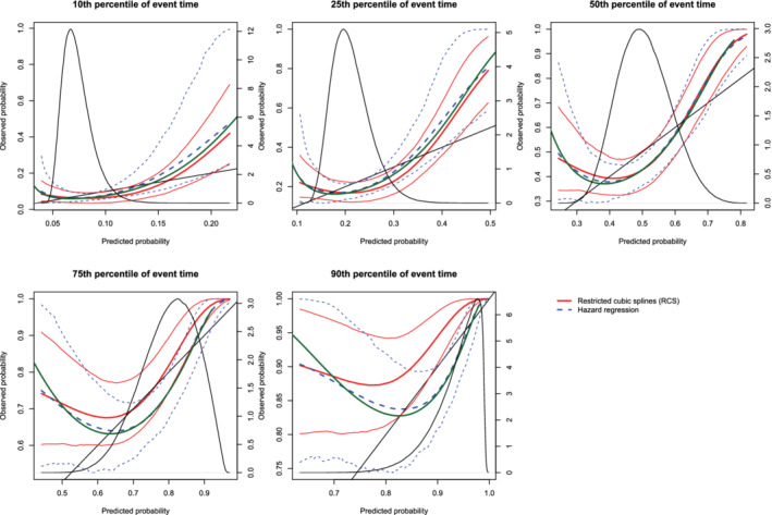
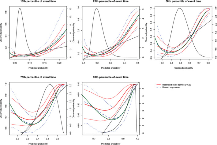
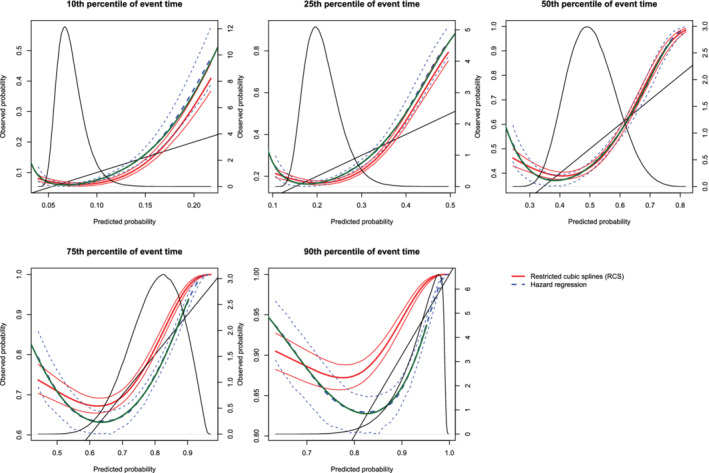
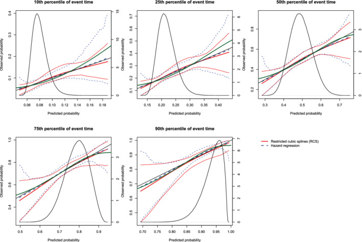
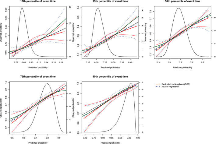
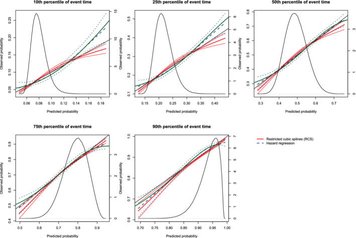
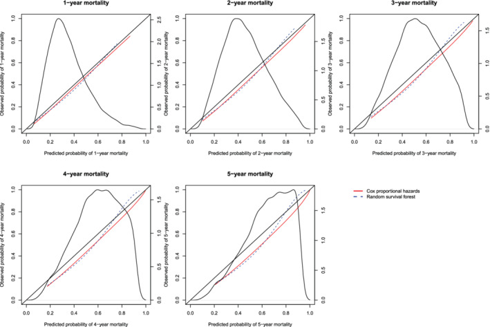
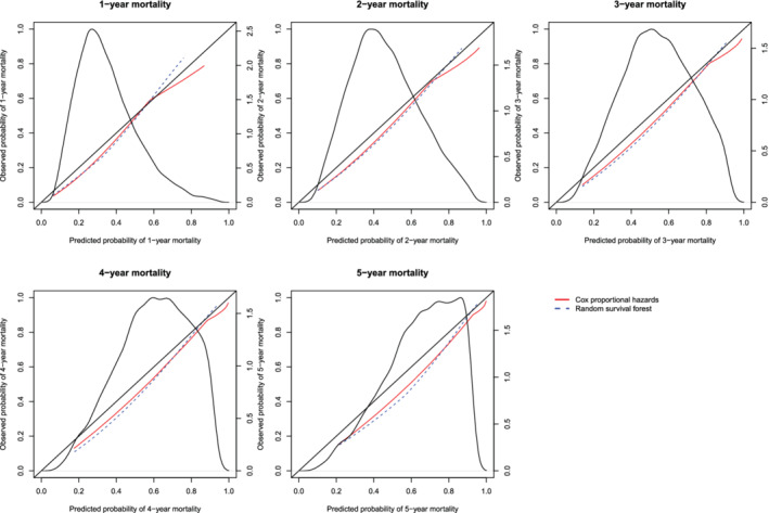
In the context of survival analysis, calibration refers to the agreement between predicted probabilities and observed event rates or frequencies of the outcome within a given duration of time. We aimed to describe and evaluate methods for graphically assessing the calibration of survival models. We focus on hazard regression models and restricted cubic splines in conjunction with a Cox proportional hazards model. We also describe modifications of the Integrated Calibration Index, of E50 and of E90. In this context, this is the average (respectively, median or 90th percentile) absolute difference between predicted survival probabilities and smoothed survival frequencies. We conducted a series of Monte Carlo simulations to evaluate the performance of these calibration measures when the underlying model has been correctly specified and under different types of model mis-specification. We illustrate the utility of calibration curves and the three calibration metrics by using them to compare the calibration of a Cox proportional hazards regression model with that of a random survival forest for predicting mortality in patients hospitalized with heart failure. Under a correctly specified regression model, differences between the two methods for constructing calibration curves were minimal, although the performance of the method based on restricted cubic splines tended to be slightly better. In contrast, under a mis-specified model, the smoothed calibration curved constructed using hazard regression tended to be closer to the true calibration curve. The use of calibration curves and of these numeric calibration metrics permits for a comprehensive comparison of the calibration of competing survival models.

Keywords: calibration; model validation; random forests; survival analysis; time-to-event model.


Figures

Figure 1
Figure 1
Calibration plots when using restricted cubic splines (RCS) and different number of knots. For each of the three different values of number of knots (3, 4, or 5), or there are three curves. The inner curve represents the mean calibration curve across the 1000 simulation replicates. The outer two curves represent the 2.5th and 97.5th percentiles of the calibration curves across the simulation replicates. The density function denotes a non‐parametric estimate of the distribution of predicted risk across the large super‐population (right axis) [Colour figure can be viewed at wileyonlinelibrary.com]
Figure 2
Figure 2
ICI/E50/E90 when using RCS and different number of knots. The squares represent the mean value of ICI/E50/E90 across the 1000 simulation replicates. The error bars represent the SD of ICI/E50/E90 across the 1000 simulation replicates [Colour figure can be viewed at wileyonlinelibrary.com]
Figure 3
Figure 3
Effect of degree of censoring on estimated calibration curves for different sample sizes and estimation methods. There are three curves for each of the seven degrees of censoring. The inner curve represents the mean calibration curve across the 1000 simulation replicates. The outer two curves represent the 2.5th and 97.5th percentiles of the calibration curves across the simulation replicates. The density function denotes a non‐parametric estimate of the distribution of predicted risk across the large super‐population (right axis) [Colour figure can be viewed at wileyonlinelibrary.com]
Figure 4
Figure 4
Effect of degree of censoring on estimated calibration curves for different sample sizes and estimation methods. There are three curves for each of the seven degrees of censoring. The inner curve represents the mean calibration curve across the 1000 simulation replicates. The outer two curves represent the 2.5th and 97.5th percentiles of the calibration curves across the simulation replicates. The density function denotes a non‐parametric estimate of the distribution of predicted risk across the large super‐population (right axis) [Colour figure can be viewed at wileyonlinelibrary.com]
Figure 5
Figure 5
Effect of degree of censoring on estimated calibration curves for different sample sizes and estimation methods. There are three curves for each of the seven degrees of censoring. The inner curve represents the mean calibration curve across the 1000 simulation replicates. The outer two curves represent the 2.5th and 97.5th percentiles of the calibration curves across the simulation replicates. The density function denotes a non‐parametric estimate of the distribution of predicted risk across the large super‐population (right axis) [Colour figure can be viewed at wileyonlinelibrary.com]
Figure 6
Figure 6
Effect of degree of censoring on estimated calibration curves for different sample sizes and estimation methods. There are three curves for each of the seven degrees of censoring. The inner curve represents the mean calibration curve across the 1000 simulation replicates. The outer two curves represent the 2.5th and 97.5th percentiles of the calibration curves across the simulation replicates. The density function denotes a non‐parametric estimate of the distribution of predicted risk across the large super‐population (right axis) [Colour figure can be viewed at wileyonlinelibrary.com]
Figure 7
Figure 7
Effect of degree of censoring on estimated calibration curves for different sample sizes and estimation methods. There are three curves for each of the seven degrees of censoring. The inner curve represents the mean calibration curve across the 1000 simulation replicates. The outer two curves represent the 2.5th and 97.5th percentiles of the calibration curves across the simulation replicates. The density function denotes a non‐parametric estimate of the distribution of predicted risk across the large super‐population (right axis) [Colour figure can be viewed at wileyonlinelibrary.com]
Figure 8
Figure 8
Effect of degree of censoring on estimated calibration curves for different sample sizes and estimation methods. There are three curves for each of the seven degrees of censoring. The inner curve represents the mean calibration curve across the 1000 simulation replicates. The outer two curves represent the 2.5th and 97.5th percentiles of the calibration curves across the simulation replicates. The density function denotes a non‐parametric estimate of the distribution of predicted risk across the large super‐population (right axis) [Colour figure can be viewed at wileyonlinelibrary.com]
Figure 9
Figure 9
Relationship between degree of censoring and estimation of ICI. There is one line for each combination of sample size and estimation method. The points represent the mean ICI across the 1000 simulation replicates [Colour figure can be viewed at wileyonlinelibrary.com]
Figure 10
Figure 10
Relationship between degree of censoring and estimation of E50. There is one line for each combination of sample size and estimation method. The points represent the mean E50 across the 1000 simulation replicates [Colour figure can be viewed at wileyonlinelibrary.com]
Figure 11
Figure 11
Relationship between degree of censoring and estimation of E90. There is one line for each combination of sample size and estimation method. The points represent the mean E90 across the 1000 simulation replicates [Colour figure can be viewed at wileyonlinelibrary.com]
Figure 12
Figure 12
Calibration plots when the true model included a quadratic term (N = 500). There are three curves for each of the two estimation methods (RCS and hazard regression). The inner curve represents the mean calibration curve across the 1000 simulation replicates. The outer two curves represent the 2.5th and 97.5th percentiles of the calibration curves across the simulation replicates. The green curve denotes the true calibration curve derived from the large super‐population. The density function denotes a non‐parametric estimate of the distribution of predicted risk across the large super‐population (right axis) [Colour figure can be viewed at wileyonlinelibrary.com]
Figure 13
Figure 13
Calibration plots when the true model included a quadratic term (N = 1000). There are three curves for each of the two estimation methods (RCS and hazard regression). The inner curve represents the mean calibration curve across the 1000 simulation replicates. The outer two curves represent the 2.5th and 97.5th percentiles of the calibration curves across the simulation replicates. The green curve denotes the true calibration curve derived from the large super‐population. The density function denotes a non‐parametric estimate of the distribution of predicted risk across the large super‐population (right axis) [Colour figure can be viewed at wileyonlinelibrary.com]
Figure 14
Figure 14
Calibration plots when the true model included a quadratic term(N = 10,000). There are three curves for each of the two estimation methods (RCS and hazard regression). The inner curve represents the mean calibration curve across the 1000 simulation replicates. The outer two curves represent the 2.5th and 97.5th percentiles of the calibration curves across the simulation replicates. The green curve denotes the true calibration curve derived from the large super‐population. The density function denotes a non‐parametric estimate of the distribution of predicted risk across the large super‐population (right axis) [Colour figure can be viewed at wileyonlinelibrary.com]
Figure 15
Figure 15
Calibration plots when the true model included an interaction term (N = 500). There are three curves for each of the two estimation methods (RCS and hazard regression). The inner curve represents the mean calibration curve across the 1000 simulation replicates. The outer two curves represent the 2.5th and 97.5th percentiles of the calibration curves across the simulation replicates. The green curve denotes the true calibration curve derived from the large super‐population. The density function denotes a non‐parametric estimate of the distribution of predicted risk across the large super‐population (right axis) [Colour figure can be viewed at wileyonlinelibrary.com]
Figure 16
Figure 16
Calibration plots when the true model included an interaction term (N = 1000). There are three curves for each of the two estimation methods (RCS and hazard regression). The inner curve represents the mean calibration curve across the 1000 simulation replicates. The outer two curves represent the 2.5th and 97.5th percentiles of the calibration curves across the simulation replicates. The green curve denotes the true calibration curve derived from the large super‐population. The density function denotes a non‐parametric estimate of the distribution of predicted risk across the large super‐population (right axis) [Colour figure can be viewed at wileyonlinelibrary.com]
Figure 17
Figure 17
Calibration plots when the true model included an interaction term (N = 10,000). There are three curves for each of the two estimation methods (RCS and hazard regression). The inner curve represents the mean calibration curve across the 1000 simulation replicates. The outer two curves represent the 2.5th and 97.5th percentiles of the calibration curves across the simulation replicates. The green curve denotes the true calibration curve derived from the large super‐population. The density function denotes a non‐parametric estimate of the distribution of predicted risk across the large super‐population (right axis) [Colour figure can be viewed at wileyonlinelibrary.com]
Figure 18
Figure 18
Calibration curves for the Cox proportional hazard model and the random survival forest when RCS was used to construct the calibration curves. There is one curve for each of the two models. The diagonal line denotes the line of perfect calibration. The density function denotes a non‐parametric estimate of the distribution of predicted risk across the sample (right axis) [Colour figure can be viewed at wileyonlinelibrary.com]
Figure 19
Figure 19
Calibration curves for the Cox proportional hazard model and the random survival forest when hazard regression was used to construct the calibration curves. There is one curve for each of the two models. The diagonal line denotes the line of perfect calibration. The density function denotes a non‐parametric estimate of the distribution of predicted risk across the sample (right axis) [Colour figure can be viewed at wileyonlinelibrary.com]

Similar articles

Cited by

References

    1. Harrell FE Jr. Regression Modeling Strategies. 2nd ed. New York, NY: Springer‐Verlag; 2015.
    1. Steyerberg EW. Clinical Prediction Models. 2nd ed. New York, NY: Springer‐Verlag; 2019.
    1. Austin PC, Steyerberg EW. Graphical assessment of internal and external calibration of logistic regression models by using loess smoothers. Stat Med. 2014;33(3):517‐535. - PMC - PubMed
    1. Cox DR. Two further applications of a model for binary regression. Biometrika. 1958;45(3–4):592‐565.
    1. Wilson PW, D'Agostino RB, Levy D, Belanger AM, Silbershatz H, Kannel WB. Prediction of coronary heart disease using risk factor categories. Circulation. 1998;97(18):1837‐1847. - PubMed

Publication types

LinkOut - more resources