scClassify: sample size estimation and multiscale classification of cells using single and multiple reference
- PMID: 32567229
- PMCID: PMC7306901
- DOI: 10.15252/msb.20199389
scClassify: sample size estimation and multiscale classification of cells using single and multiple reference
Abstract
Automated cell type identification is a key computational challenge in single-cell RNA-sequencing (scRNA-seq) data. To capitalise on the large collection of well-annotated scRNA-seq datasets, we developed scClassify, a multiscale classification framework based on ensemble learning and cell type hierarchies constructed from single or multiple annotated datasets as references. scClassify enables the estimation of sample size required for accurate classification of cell types in a cell type hierarchy and allows joint classification of cells when multiple references are available. We show that scClassify consistently performs better than other supervised cell type classification methods across 114 pairs of reference and testing data, representing a diverse combination of sizes, technologies and levels of complexity, and further demonstrate the unique components of scClassify through simulations and compendia of experimental datasets. Finally, we demonstrate the scalability of scClassify on large single-cell atlases and highlight a novel application of identifying subpopulations of cells from the Tabula Muris data that were unidentified in the original publication. Together, scClassify represents state-of-the-art methodology in automated cell type identification from scRNA-seq data.
Keywords: cell type hierarchy; cell type identification; multiscale classification; sample size estimation; single-cell.
© 2020 The Authors. Published under the terms of the CC BY 4.0 license.
Conflict of interest statement
The authors declare that they have no conflict of interest.
Figures
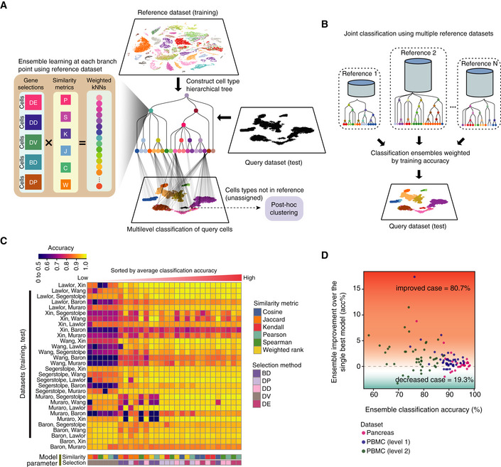
Schematic illustration of the scClassify framework. Gene selections: DE, differentially expressed; DD, differentially distributed; DV, differentially variable; BD, bimodally distributed; DP, differentially expressed proportions. Similarity metrics: P, Pearson's correlation; S, Spearman's correlation; K, Kendall's correlation; J, Jaccard distance; C, cosine distance; W, weighted rank correlation.
Schematic illustration of the joint classification using multiple reference datasets.
Classification accuracy of all pairs of reference and test datasets was calculated using all combinations of six similarity metrics and five gene selection methods.
Improvement in classification accuracy after applying an ensemble learning model over the best single model (i.e. weighted kNN + Pearson + DE).
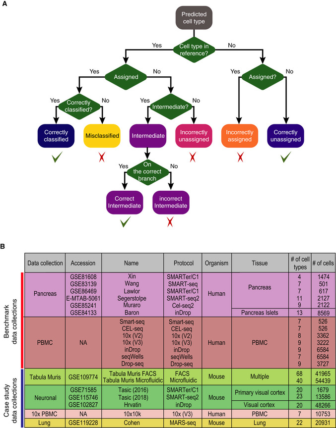
Evaluation framework used in this study. Predictions are classified into “correctly classified”, “misclassified”, “intermediate” (either correct or incorrect), “incorrectly unassigned”, “incorrectly assigned” or “correctly unassigned”.
All datasets used in this study, including two collections for benchmarking and five collections for case study in sample size learning and rare cell type identification.
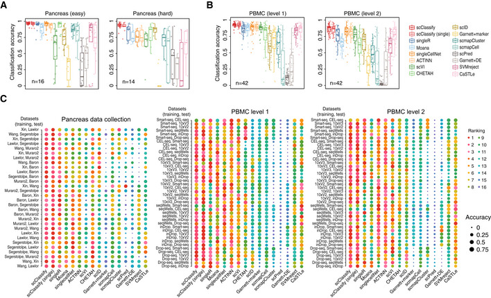
Performance evaluation for 16 methods on 30 training and test data pairs from the pancreas data collection. Each boxplot ranges from the first to third quartile of classification accuracy for each method with the median of classification accuracy as the horizontal line. The lower and higher whiskers of boxplot are extended to the first quartile minus 1.5 interquartile range and the third quartile plus 1.5 interquartile, respectively.
Performance evaluation for 16 methods on 84 training and test data pairs from the PBMC data collection. Each boxplot ranges from the first to third quartile of classification accuracy for each method with the median of classification accuracy as the horizontal line. The lower and higher whiskers of boxplot are extended to the first quartile minus 1.5 interquartile range and the third quartile plus 1.5 interquartile, respectively.
A 1‐by‐3 panel of dot plots indicating the rankings of each method in 114 pairs of reference and testing data pairs. The x‐axis refers to the different methods, and the y‐axis refers to the reference and testing data pairs. The dots are coloured by rank, and the size of the dots indicates the degree of accuracy.
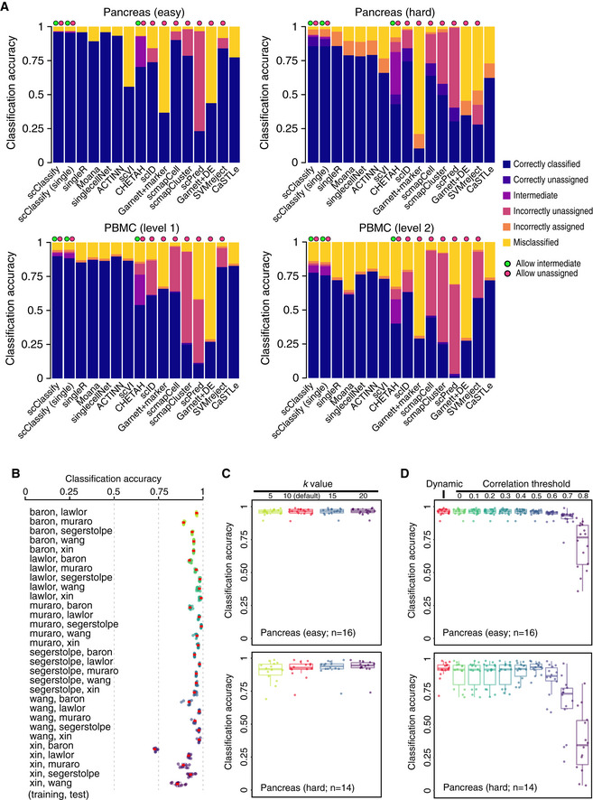
Benchmarking results for 16 different methods. Each bar indicates the composition of predicted categories of the average performance in a collection of reference–testing pairs. We divided reference–test pairs into four groups: pancreas (easy), pancreas (hard), PBMC (level 1) and PBMC (level 2).
Each box indicates the classification accuracy by subsampling 80% of training data, repeated 10 times, using 30 training and test data pairs from the pancreas data collection. The red dots indicate the classification accuracy of using the full training data. Each boxplot ranges from the first to third quartile of classification accuracy with the median as the horizontal line. The lower and higher whiskers of boxplot are extended to the first quartile minus 1.5 interquartile range and the third quartile plus 1.5 interquartile, respectively.
Each box indicates the classification accuracy with different number of nearest neighbours (k = 5, 10, 15 and 20) to be considered in the weighted kNN, using 30 training and test data pairs from the pancreas data collection, with 16 easy cases (top panel) and 14 hard cases (bottom panel). Each boxplot ranges from the first to third quartile of classification accuracy with the median as the horizontal line. The lower and higher whiskers of boxplot are extended to the first quartile minus 1.5 interquartile range and the third quartile plus 1.5 interquartile, respectively.
Each box indicates the classification accuracy with different correlation thresholds determined, either dynamic or pre‐defined (ranging from 0 to 0.8), using 30 training and test data pairs from the pancreas data collection, with 16 easy cases (top panel) and 14 hard cases (bottom panel). Each boxplot ranges from the first to third quartile of classification accuracy with the median as the horizontal line. The lower and higher whiskers of boxplot are extended to the first quartile minus 1.5 interquartile range and the third quartile plus 1.5 interquartile, respectively.
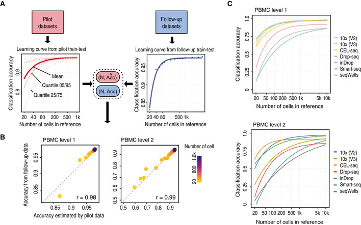
Schematic illustration of the scClassify sample size learning framework.
Scatter plot of sample size estimation based on the pilot data (horizontal axis) compared with accuracy results from the in silico experiments (vertical axis).
Sample size estimation from the PBMC data collection. Sample size learning curve with the horizontal axis representing sample size (N) and the vertical axis representing classification accuracy. The learning curves for the different datasets provide estimates of the sample size required to identify cell types at the top (top panel) and second (bottom panel) levels of the cell type hierarchical tree.
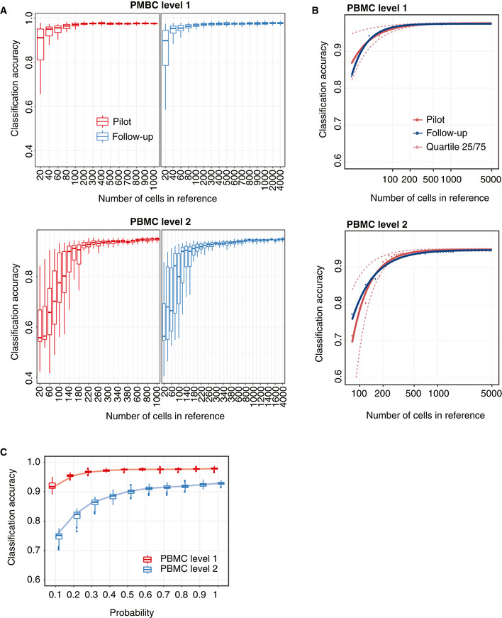
A 2‐by‐2 panel of collections of boxplots demonstrating the validation of the sample size calculation using the PBMC10k dataset. The x‐axis indicates the sample size (N), and the y‐axis indicates the accuracy rate. The left panel indicates the results for the pilot data (20% of the full dataset), and the right panel indicates the results for the reference–test data (the remaining 80% data), representing the data that would be obtained in a follow‐up experiment. The top panel indicates the results of predicting PBMC at the top level of the cell type tree, while the bottom panel indicates the results of cell type prediction at the second level of the cell type tree. Each boxplot ranges from the first to third quartile of classification accuracy with the median as the horizontal line. The lower and higher whiskers of boxplot are extended to the first quartile minus 1.5 interquartile range and the third quartile plus 1.5 interquartile, respectively.
The fitted learning curves on the same data where red solid lines indicate the learning curves by fitting mean accuracy rate of pilot data; red dashed lines are the learning curves obtained by fitting the learning curves to the upper (75%) and lower (25%) quartile of accuracy rate of pilot data. The blue lines indicate the learning curves by fitting the mean of the accuracy rate for the follow‐up reference and test dataset.
Down‐sampling of the PBMC10k data using DECENT's beta‐binomial capture model (Ye et al, 2019). Boxplots indicate the accuracy rates of the cell predictions from down‐sampled data for the top (red) and second level (blue) of the cell type tree. Each boxplot ranges from the first to third quartile of classification accuracy with the median as the horizontal line. The lower and higher whiskers of boxplot are extended to the first quartile minus 1.5 interquartile range and the third quartile plus 1.5 interquartile, respectively. The x‐axis indicates the down‐sampling parameter of the beta‐binomial distribution (that is, the ratio of capture efficiency in the down‐sampled dataset relative to the original dataset), and the y‐axis denotes the accuracy rate.
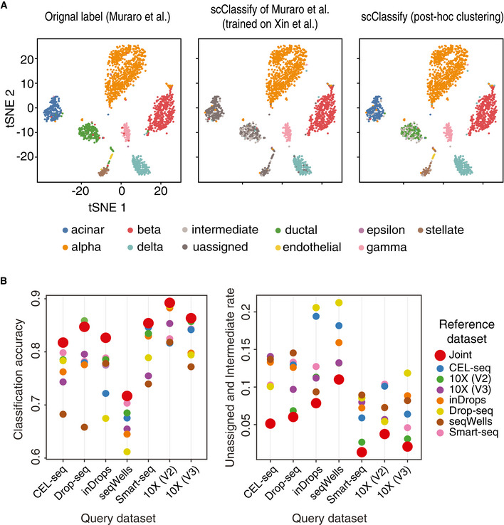
Left panel shows cell types based on the original publication by Muraro et al (2016), Data ref: Muraro et al (2016). Middle panel shows the predicted cell types from scClassify trained on the reference dataset by Xin et al (2016), Data ref: Xin et al (2016). Note that the reference dataset does not contain the cell types acinar, ductal and stellate cells. Right panel shows post hoc clustering and cell typing results for cells that remained unassigned in the scClassify prediction.
Joint classification on the PBMC data collection. Classifying query datasets using the joint prediction from multiple reference datasets (red circle). Classification accuracy as well as unassigned and intermediate rate of the joint prediction is compared to that obtained from using single reference datasets (other colours).
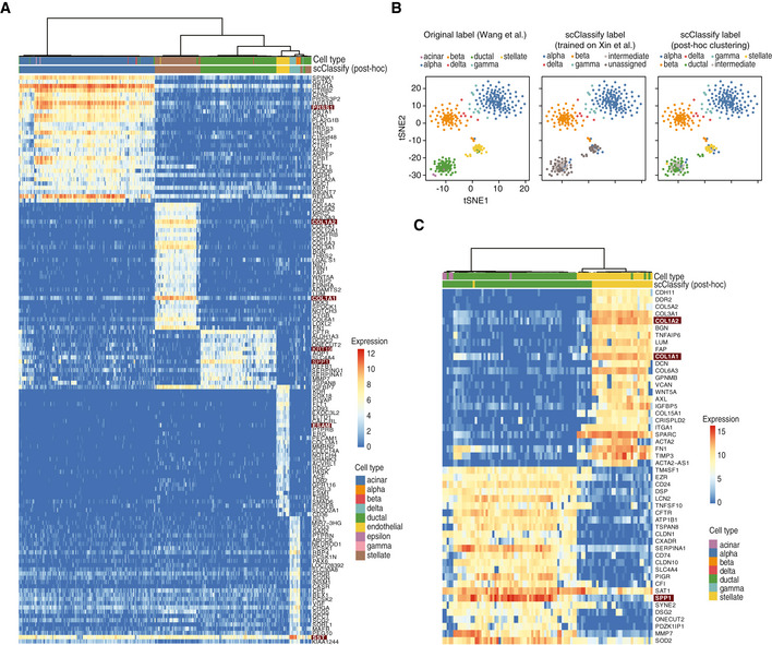
Heatmap of the top 20 differentially expressed genes from each of the five cell type clusters generated through post hoc clustering of the Xin‐Muraro data pair. Here, Xin et al data are used as the reference dataset and Muraro et al data as the query dataset. The heatmap is coloured by the log‐transformed expression values. The red rectangles indicate markers that are consistent with those found in the original study.
A 1‐by‐3 panel of tSNE plots of Wang et al from the human pancreas data collection colour‐coded by original cell types given in Wang et al (2016) (left panel), the scClassify label generated using Xin et al as the reference dataset (middle panel) and the scClassify predicted cell types after performing post hoc clustering (right panel).
Heatmap of the top 20 differentially expressed genes from each of the two cell type clusters generated from post hoc clustering of the Xin‐Wang data pair. The heatmap is colour‐coded by the log‐transformed expression level. The red rectangles indicate markers that are consistent with those found in the original study.
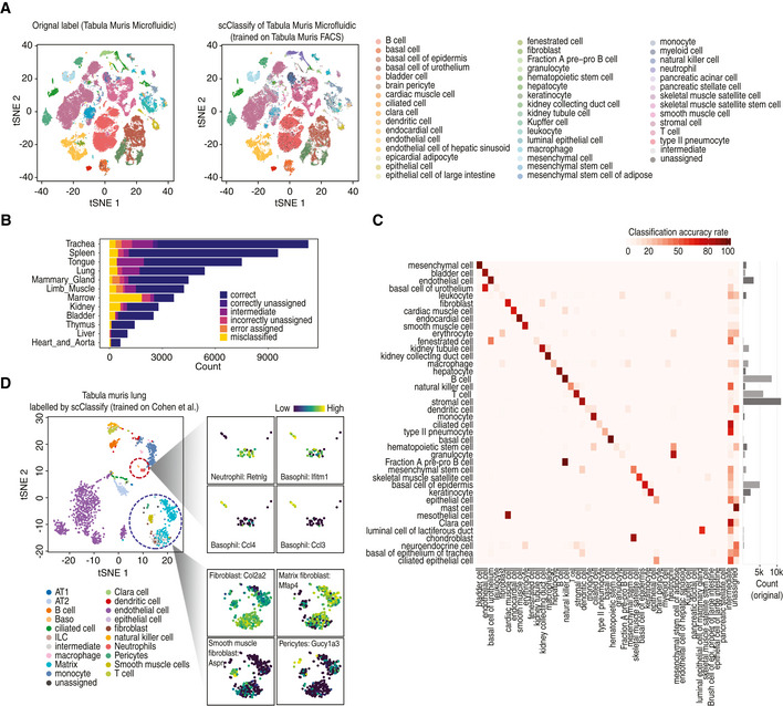
tSNE visualisation of the Tabula Muris Microfluidic dataset (The Tabula Muris Consortium, 2018; Data ref: The Tabula Muris Consortium 2018). Cell typing is based on either the original publication (left panel) or scClassify prediction (right panel). scClassify was applied to the Tabula Muris Microfluidic data collection with the Tabula Muris FACS dataset as reference data for model training.
Bar plot indicating the predicted cell types organised by tissue types when the Tabula Muris Microfluidic dataset was used as query and the Tabula Muris FACS dataset was used as reference.
Heatmap of data in (A) comparing the original cell types given in the Tabula Muris Microfluidic data (rows) against the scClassify predicted cell types (columns) generated using the Tabula Muris FACS data as the reference dataset.
scClassify prediction results of cells in lung tissue type in the Tabula Muris FACS data by using Cohen et al dataset as reference (Cohen et al, 2018; Data ref: Cohen et al, 2018). The large tSNE plot is the full data coloured by scClassify predicted cell types, while the smaller tSNE panels show two subsets of cells from the large plot, each coloured to highlight four marker genes, where the lighter yellow colour represents higher gene expression.
References
Publication types
MeSH terms
Associated data
- Actions
- Actions
- Actions
- Actions
- Actions
- Actions
Grants and funding
LinkOut - more resources
Full Text Sources