. 2020 Jul 28;17(7):e1003220.
doi: 10.1371/journal.pmed.1003220. eCollection 2020 Jul.

Changes in the amount of nutrient of packaged foods and beverages after the initial implementation of the Chilean Law of Food Labelling and Advertising: A nonexperimental prospective study

Affiliations

Changes in the amount of nutrient of packaged foods and beverages after the initial implementation of the Chilean Law of Food Labelling and Advertising: A nonexperimental prospective study

Marcela Reyes et al. PLoS Med. .

Abstract

Background: In June 2016, the first phase of the Chilean Food Labelling and Advertising Law that mandated front-of-package warning labels and marketing restrictions for unhealthy foods and beverages was implemented. We assess foods and beverages reformulation after this initial implementation.

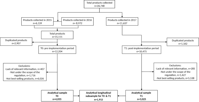
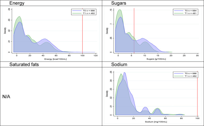
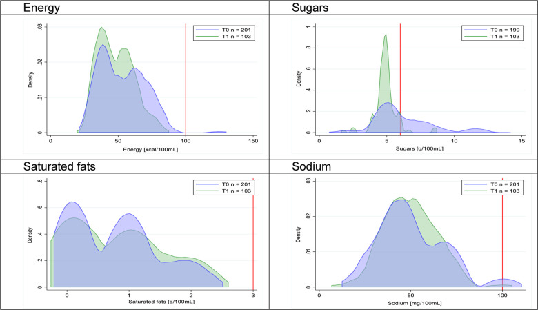
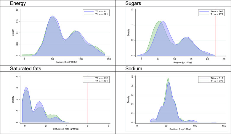
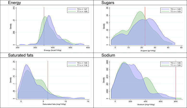
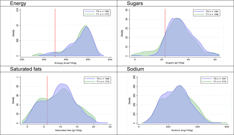
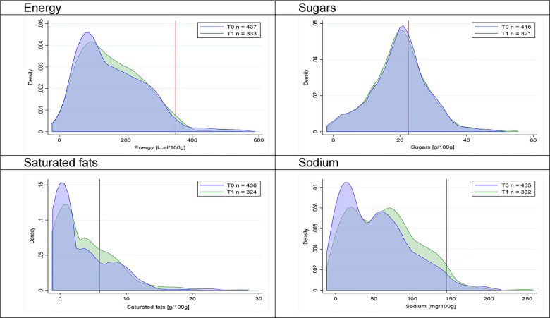
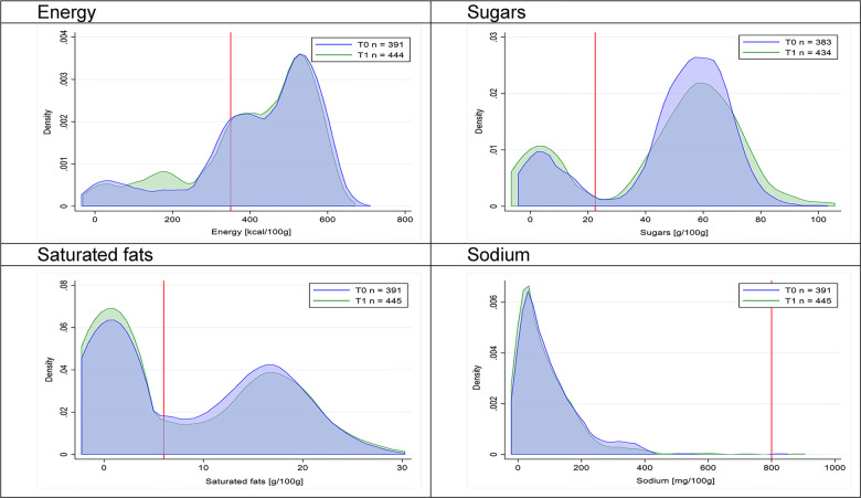
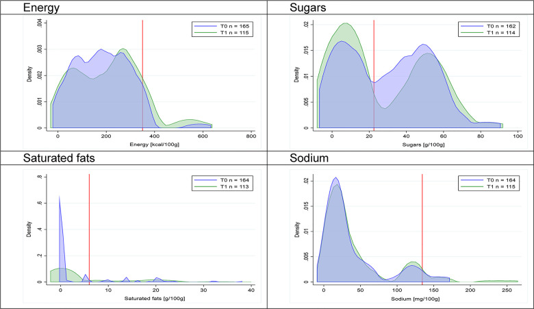
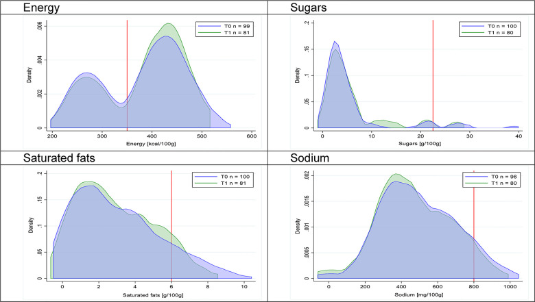
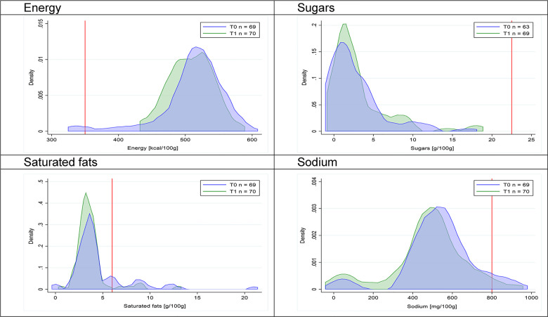
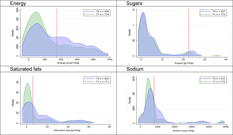
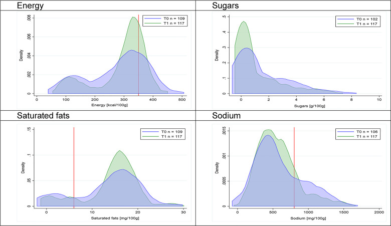
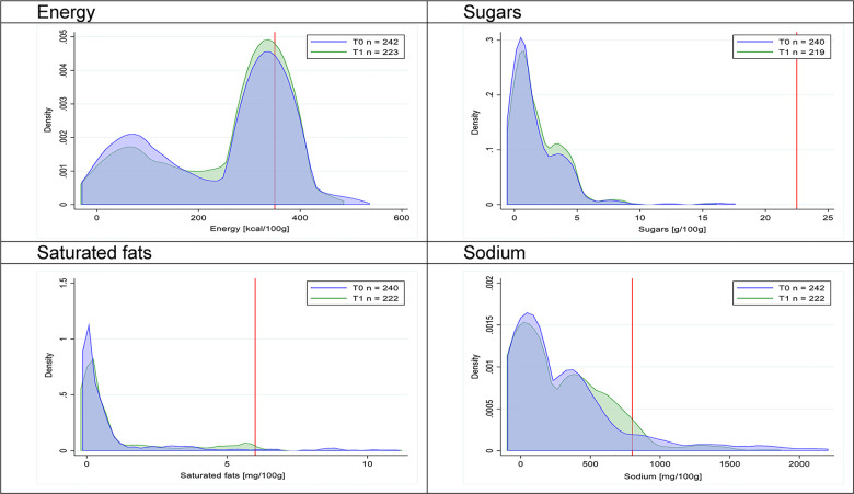
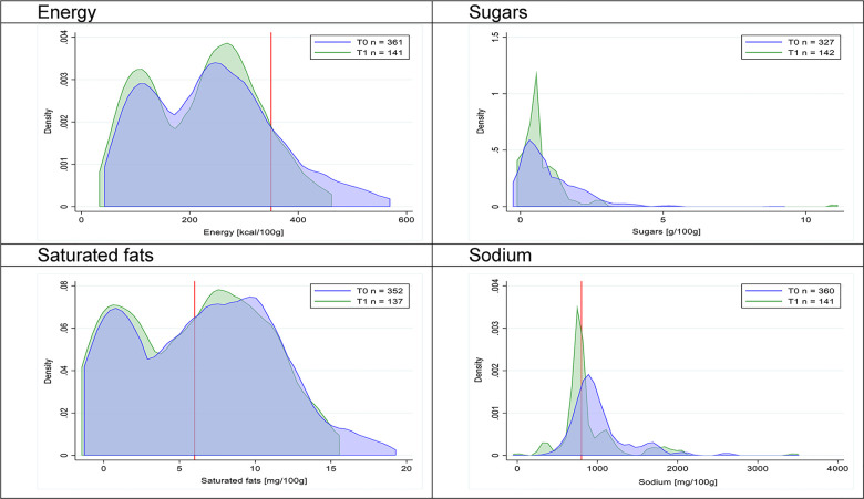
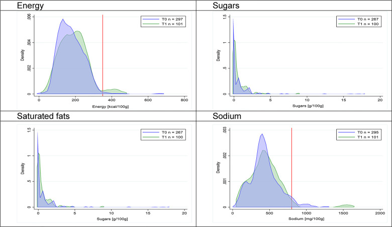
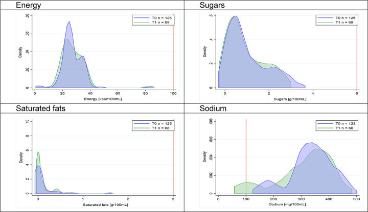
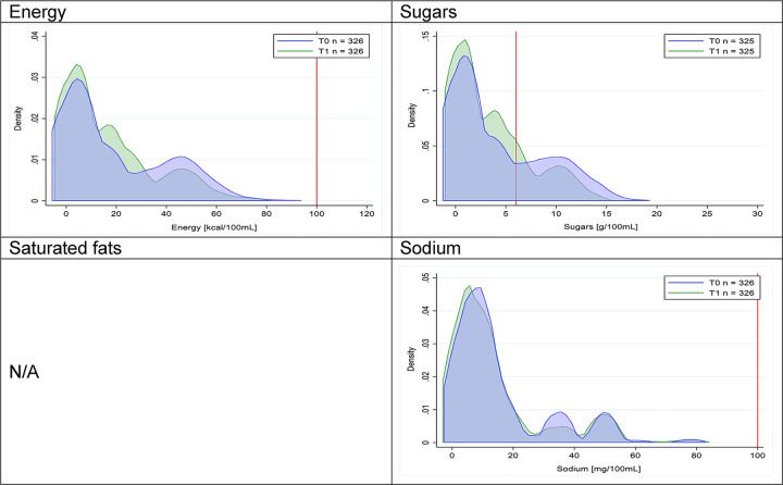
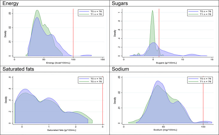
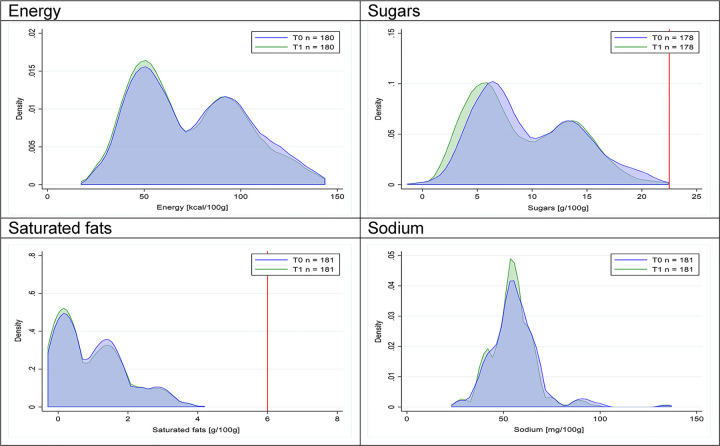
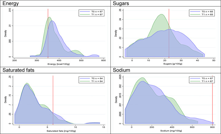
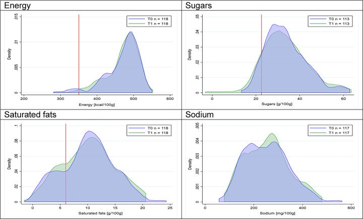
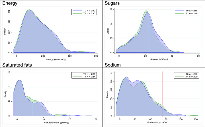
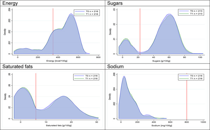
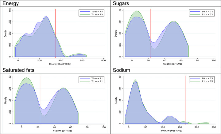
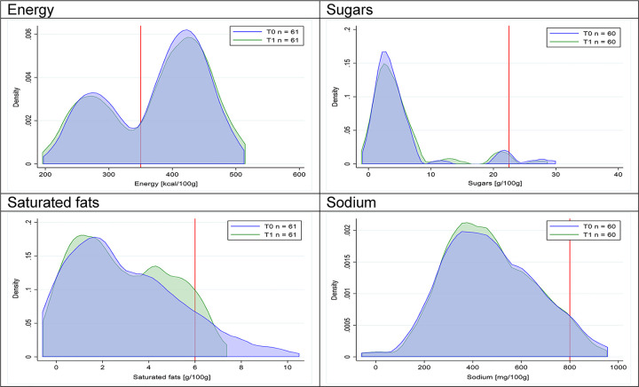
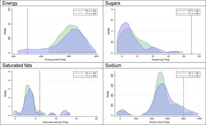
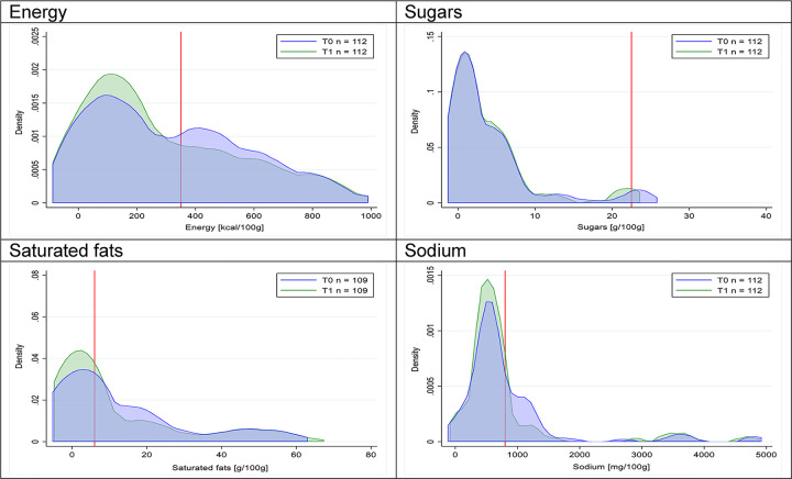
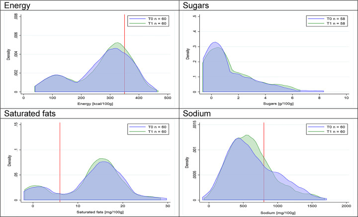
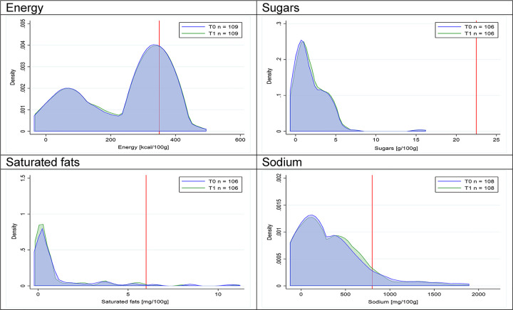
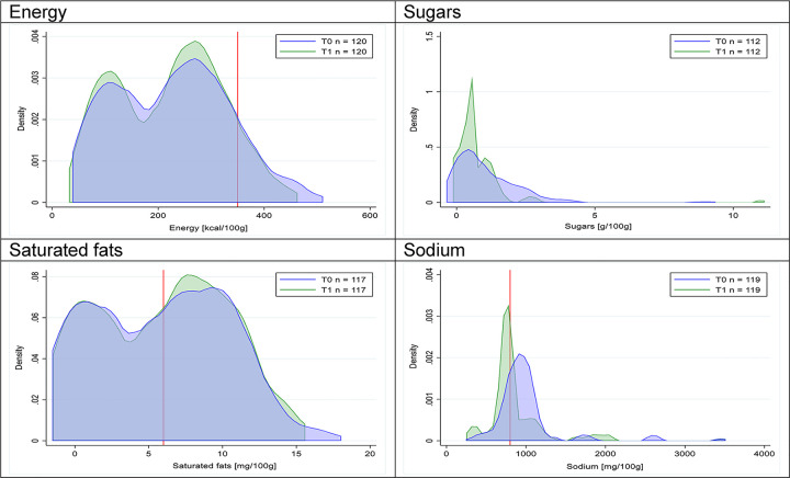
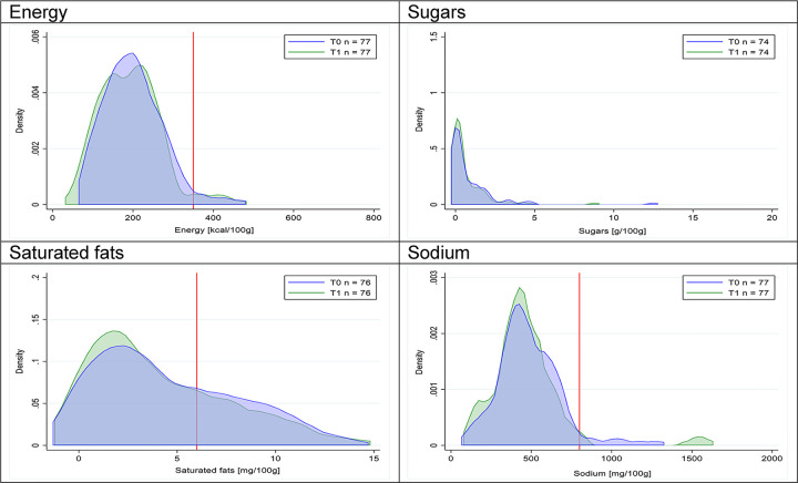
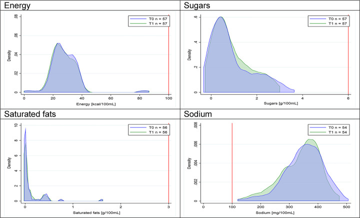
Methods and findings: A data set with the 2015 to 2017 nutritional information was developed collecting the information at 2 time periods: preimplementation (T0: January-February 2015 or 2016; n = 4,055) and postimplementation (T1: January-February 2017; n = 3,025). Quartiles of energy and nutrients of concern (total sugars, saturated fats, and sodium, per 100 g/100 mL) and the proportion of products with energy and nutrients exceeding the cutoffs of the law (i.e., products "high in") were compared pre- and postimplementation of the law in cross-sectional samples of products with sales >1% of their specific food or beverage groups, according to the Euromonitor International Database; a longitudinal subsample (i.e., products collected in both the pre- and postimplementation periods, n = 1,915) was also analyzed. Chi-squared, McNemar tests, and quantile regressions (simple and multilevel) were used for comparing T0 and T1. Cross-sectional analysis showed a significant decrease (T0 versus T1) in the proportion of product with any "high in" (from 51% [95% confidence interval (CI) 49-52] to 44% [95% CI 42-45]), mostly in food and beverage groups in which regulatory cutoffs were below the 75th percentile of the nutrient or energy distribution. Most frequent reductions were in the proportion of "high in" sugars products (in beverages, milks and milk-based drinks, breakfast cereals, sweet baked products, and sweet and savory spreads; from 80% [95% CI 73-86] to 60% [95% CI 51-69]) and in "high in sodium" products (in savory spreads, cheeses, ready-to-eat meals, soups, and sausages; from 74% [95% CI 69-78] to 27% [95% CI 20-35]). Conversely, the proportion of products "high in" saturated fats only decreased in savory spreads (p < 0.01), and the proportion of "high in" energy products significantly decreased among breakfast cereals and savory spreads (both p < 0.01). Quantile analyses showed that most of the changes took place close to the cutoff values, with only few exceptions of overall left shifts in distribution. Longitudinal analyses showed similar results. However, it is important to note that the nonexperimental nature of this study does not allow to imply causality of these findings.

Conclusions: Our results show that, after initial implementation of the Chilean Law of Food Labelling and Advertising, there was a significant decrease in the amount of sugars and sodium in several groups of packaged foods and beverages. Further studies should clarify how food reformulation will impact dietary quality of the population.


Conflict of interest statement

I have read the journal's policy and the authors of this manuscript have the following competing interests: BP is an Academic Editor for PLOS Medicine. We have no other competing interest to disclose.

Figures

Fig 1
Fig 1. Flow chart describing products excluded from the analytical sample.
T0, preimplementation period; T1, postimplementation period.
Fig 2
Fig 2. Density curves for the amount of energy and nutrients of concern in beverages, cross-sectional samples.
The blue line represents the distribution in T0 (preimplementation), the green line represents the distribution in T1 (postimplementation), and the red line represents the cutoff for the amount of energy or nutrients of concern.
Fig 3
Fig 3. Density curves for the amount of energy and nutrients of concern in milk and milk-based drinks, cross-sectional samples.
The blue line represents the distribution in T0 (preimplementation), the green line represents the distribution in T1 (postimplementation), and the red line represents the cutoff for the amount of energy or nutrients of concern.
Fig 4
Fig 4. Density curves for the amount of energy and nutrients of concern in yogurts, cross-sectional samples.
The blue line represents the distribution in T0 (preimplementation), the green line represents the distribution in T1 (postimplementation), and the red line represents the cutoff for the amount of energy or nutrients of concern.
Fig 5
Fig 5. Density curves for the amount of energy and nutrients of concern in breakfast cereals, cross-sectional samples.
The blue line represents the distribution in T0 (preimplementation), the green line represents the distribution in T1 (postimplementation), and the red line represents the cutoff for the amount of energy or nutrients of concern.
Fig 6
Fig 6. Density curves for the amount of energy and nutrients of concern in sweet baked products, cross-sectional samples.
The blue line represents the distribution in T0 (preimplementation), the green line represents the distribution in T1 (postimplementation), and the red line represents the cutoff for the amount of energy or nutrients of concern.
Fig 7
Fig 7. Density curves for the amount of energy and nutrients of concern in desserts and ice creams, cross-sectional samples.
The blue line represents the distribution in T0 (preimplementation), the green line represents the distribution in T1 (postimplementation), and the red line represents the cutoff for the amount of energy or nutrients of concern.
Fig 8
Fig 8. Density curves for the amount of energy and nutrients of concern in candies and sweet confectioneries, cross-sectional samples.
The blue line represents the distribution in T0 (preimplementation), the green line represents the distribution in T1 (postimplementation), and the red line represents the cutoff for the amount of energy or nutrients of concern.
Fig 9
Fig 9. Density curves for the amount of energy and nutrients of concern in sweet spreads, cross-sectional samples.
The blue line represents the distribution in T0 (preimplementation), the green line represents the distribution in T1 (postimplementation), and the red line represents the cutoff for the amount of energy or nutrients of concern.
Fig 10
Fig 10. Density curves for the amount of energy and nutrients of concern in savory baked products, cross-sectional samples.
The blue line represents the distribution in T0 (preimplementation), the green line represents the distribution in T1 (postimplementation), and the red line represents the cutoff for the amount of energy or nutrients of concern.
Fig 11
Fig 11. Density curves for the amount of energy and nutrients of concern in savory snacks, cross-sectional samples.
The blue line represents the distribution in T0 (preimplementation), the green line represents the distribution in T1 (postimplementation), and the red line represents the cutoff for the amount of energy or nutrients of concern.
Fig 12
Fig 12. Density curves for the amount of energy and nutrients of concern in savory spreads, cross-sectional samples.
The blue line represents the distribution in T0 (preimplementation), the green line represents the distribution in T1 (postimplementation), and the red line represents the cutoff for the amount of energy or nutrients of concern.
Fig 13
Fig 13. Density curves for the amount of energy and nutrients of concern in cheeses, cross-sectional samples.
The blue line represents the distribution in T0 (preimplementation), the green line represents the distribution in T1 (postimplementation), and the red line represents the cutoff for the amount of energy or nutrients of concern.
Fig 14
Fig 14. Density curves for the amount of energy and nutrients of concern in ready-to-eat meals, cross-sectional samples.
The blue line represents the distribution in T0 (preimplementation), the green line represents the distribution in T1 (postimplementation), and the red line represents the cutoff for the amount of energy or nutrients of concern.
Fig 15
Fig 15. Density curves for the amount of energy and nutrients of concern in sausages, cross-sectional samples.
The blue line represents the distribution in T0 (preimplementation), the green line represents the distribution in T1 (postimplementation), and the red line represents the cutoff for the amount of energy or nutrients of concern.
Fig 16
Fig 16. Density curves for the amount of energy and nutrients of concern in nonsausage meat products, cross-sectional samples.
The blue line represents the distribution in T0 (preimplementation), the green line represents the distribution in T1 (postimplementation), and the red line represents the cutoff for the amount of energy or nutrients of concern.
Fig 17
Fig 17. Density curves for the amount of energy and nutrients of concern in soups, cross-sectional samples.
The blue line represents the distribution in T0 (preimplementation), the green line represents the distribution in T1 (postimplementation), and the red line represents the cutoff for the amount of energy or nutrients of concern.
Fig 18
Fig 18. Density curves for the amount of energy and nutrients of concern in beverages, longitudinal subsample.
The blue line represents the distribution in T0 (preimplementation), the green line represents the distribution in T1 (postimplementation), and the red line represents the cutoff for the amount of energy or nutrients of concern.
Fig 19
Fig 19. . Density curves for the amount of energy and nutrients of concern in milk and milk-based drinks, longitudinal subsample.
The blue line represents the distribution in T0 (preimplementation), the green line represents the distribution in T1 (postimplementation), and the red line represents the cutoff for the amount of energy or nutrients of concern.
Fig 20
Fig 20. Density curves for the amount of energy and nutrients of concern in yogurts, longitudinal subsample.
The blue line represents the distribution in T0 (preimplementation), the green line represents the distribution in T1 (postimplementation), and the red line represents the cutoff for the amount of energy or nutrients of concern.
Fig 21
Fig 21. Density curves for the amount of energy and nutrients of concern in breakfast cereals, longitudinal subsample.
The blue line represents the distribution in T0 (preimplementation), the green line represents the distribution in T1 (postimplementation), and the red line represents the cutoff for the amount of energy or nutrients of concern.
Fig 22
Fig 22
Density curves for the amount of energy and nutrients of concern in sweet baked products, longitudinal subsample. The blue line represents the distribution in T0 (preimplementation), the green line represents the distribution in T1 (postimplementation), and the red line represents the cutoff for the amount of energy or nutrients of concern.
Fig 23
Fig 23. Density curves for the amount of energy and nutrients of concern in desserts and ice creams, longitudinal subsample.
The blue line represents the distribution in T0 (preimplementation), the green line represents the distribution in T1 (postimplementation), and the red line represents the cutoff for the amount of energy or nutrients of concern.
Fig 24
Fig 24. Density curves for the amount of energy and nutrients of concern in candies and sweet confectioneries, longitudinal subsample.
The blue line represents the distribution in T0 (preimplementation), the green line represents the distribution in T1 (postimplementation), and the red line represents the cutoff for the amount of energy or nutrients of concern.
Fig 25
Fig 25. Density curves for the amount of energy and nutrients of concern in sweet spreads, longitudinal subsample.
The blue line represents the distribution in T0 (preimplementation), the green line represents the distribution in T1 (postimplementation), and the red line represents the cutoff for the amount of energy or nutrients of concern.
Fig 26
Fig 26. Density curves for the amount of energy and nutrients of concern in savory baked products, longitudinal subsample.
The blue line represents the distribution in T0 (preimplementation), the green line represents the distribution in T1 (postimplementation), and the red line represents the cutoff for the amount of energy or nutrients of concern.
Fig 27
Fig 27. Density curves for the amount of energy and nutrients of concern in savory snacks, longitudinal subsample.
The blue line represents the distribution in T0 (preimplementation), the green line represents the distribution in T1 (postimplementation), and the red line represents the cutoff for the amount of energy or nutrients of concern.
Fig 28
Fig 28. Density curves for the amount of energy and nutrients of concern in savory spreads, longitudinal subsample.
The blue line represents the distribution in T0 (preimplementation), the green line represents the distribution in T1 (postimplementation), and the red line represents the cutoff for the amount of energy or nutrients of concern.
Fig 29
Fig 29. Density curves for the amount of energy and nutrients of concern in cheeses, longitudinal subsample.
The blue line represents the distribution in T0 (preimplementation), the green line represents the distribution in T1 (postimplementation), and the red line represents the cutoff for the amount of energy or nutrients of concern.
Fig 30
Fig 30. Density curves for the amount of energy and nutrients of concern in ready-to-eat meals, longitudinal subsample.
The blue line represents the distribution in T0 (preimplementation), the green line represents the distribution in T1 (postimplementation), and the red line represents the cutoff for the amount of energy or nutrients of concern.
Fig 31
Fig 31. Density curves for the amount of energy and nutrients of concern in sausages, longitudinal subsample.
The blue line represents the distribution in T0 (preimplementation), the green line represents the distribution in T1 (postimplementation), and the red line represents the cutoff for the amount of energy or nutrients of concern.
Fig 32
Fig 32. Density curves for the amount of energy and nutrients of concern in nonsausage meat products, longitudinal subsample.
The blue line represents the distribution in T0 (preimplementation), the green line represents the distribution in T1 (postimplementation), and the red line represents the cutoff for the amount of energy or nutrients of concern.
Fig 33
Fig 33. Density curves for the amount of energy and nutrients of concern in soups, longitudinal subsample.
The blue line represents the distribution in T0 (preimplementation), the green line represents the distribution in T1 (postimplementation), and the red line represents the cutoff for the amount of energy or nutrients of concern.

References

    1. Vandevijvere S, Jaacks LM, Monteiro CA, Moubarac JC, Girling-Butcher M, Lee AC, et al. Global trends in ultraprocessed food and drink product sales and their association with adult body mass index trajectories. Obes Rev. 2019: 10–9. 10.1111/obr.12860 . - DOI - PubMed
    1. Popkin B, Reardon T. Obesity and the food system transformation in Latin America. Obes Rev. 2018;19(8):1028–64. 10.1111/obr.12694 - DOI - PMC - PubMed
    1. GBD 2017 Diet Collaborators. Health effects of dietary risks in 195 countries, 1990–2017: a systematic analysis for the Global Burden of Disease Study 2017. Lancet. 2019;393(10184):1958–72. 10.1016/S0140-6736(19)30041-8 . - DOI - PMC - PubMed
    1. OECD. The heavy burden of obesity: the economics of prevention. Paris, France: OECD Health Policy Studies, 2019.
    1. World Cancer Research Fund International. Improve nutritional quality of the whole food supply: World Cancer Research Fund International; 2018. Available from: https://www.wcrf.org/sites/default/files/Improve-food-supply.pdf. [cited 2019 October 1].

Publication types