. 2020 Jul;583(7818):744-751.
doi: 10.1038/s41586-020-2093-3. Epub 2020 Jul 29.

An atlas of dynamic chromatin landscapes in mouse fetal development

Affiliations

An atlas of dynamic chromatin landscapes in mouse fetal development

David U Gorkin et al. Nature. 2020 Jul.

Erratum in

  • Author Correction: An atlas of dynamic chromatin landscapes in mouse fetal development.
    Gorkin DU, Barozzi I, Zhao Y, Zhang Y, Huang H, Lee AY, Li B, Chiou J, Wildberg A, Ding B, Zhang B, Wang M, Strattan JS, Davidson JM, Qiu Y, Afzal V, Akiyama JA, Plajzer-Frick I, Novak CS, Kato M, Garvin TH, Pham QT, Harrington AN, Mannion BJ, Lee EA, Fukuda-Yuzawa Y, He Y, Preissl S, Chee S, Han JY, Williams BA, Trout D, Amrhein H, Yang H, Cherry JM, Wang W, Gaulton K, Ecker JR, Shen Y, Dickel DE, Visel A, Pennacchio LA, Ren B. Gorkin DU, et al. Nature. 2020 Oct;586(7831):E31. doi: 10.1038/s41586-020-2841-4. Nature. 2020. PMID: 33037424 Free PMC article.
  • Author Correction: An atlas of dynamic chromatin landscapes in mouse fetal development.
    Gorkin DU, Barozzi I, Zhao Y, Zhang Y, Huang H, Lee AY, Li B, Chiou J, Wildberg A, Ding B, Zhang B, Wang M, Strattan JS, Davidson JM, Qiu Y, Afzal V, Akiyama JA, Plajzer-Frick I, Novak CS, Kato M, Garvin TH, Pham QT, Harrington AN, Mannion BJ, Lee EA, Fukuda-Yuzawa Y, He Y, Preissl S, Chee S, Han JY, Williams BA, Trout D, Amrhein H, Yang H, Cherry JM, Wang W, Gaulton K, Ecker JR, Shen Y, Dickel DE, Visel A, Pennacchio LA, Ren B. Gorkin DU, et al. Nature. 2021 Jan;589(7842):E4. doi: 10.1038/s41586-020-03089-4. Nature. 2021. PMID: 33398137 Free PMC article. No abstract available.

Abstract

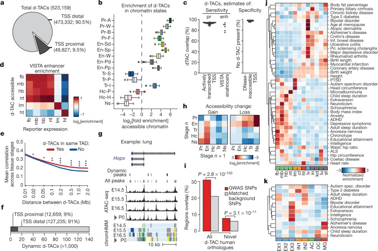
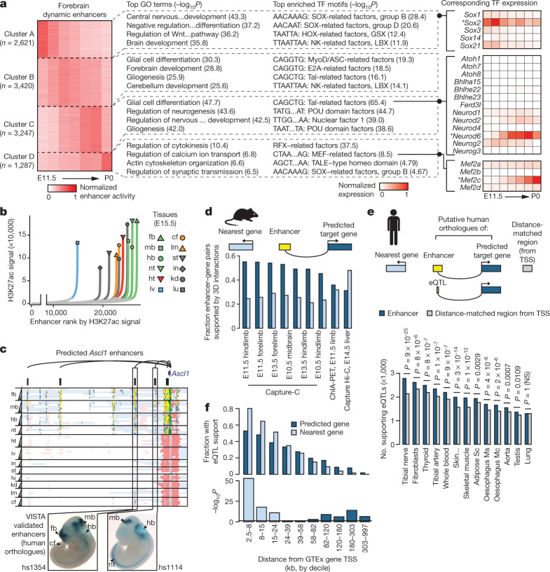
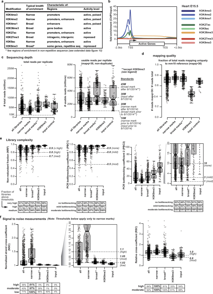
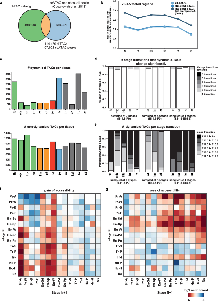
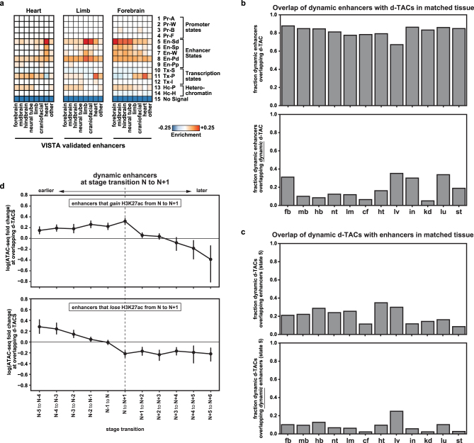
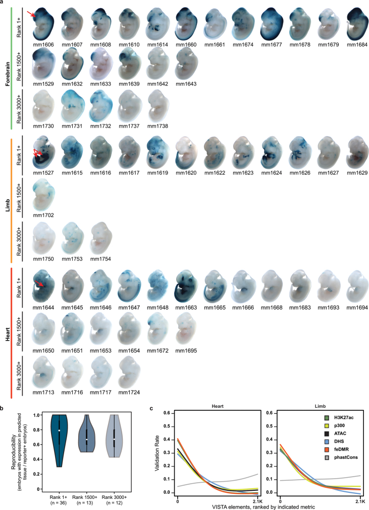
The Encyclopedia of DNA Elements (ENCODE) project has established a genomic resource for mammalian development, profiling a diverse panel of mouse tissues at 8 developmental stages from 10.5 days after conception until birth, including transcriptomes, methylomes and chromatin states. Here we systematically examined the state and accessibility of chromatin in the developing mouse fetus. In total we performed 1,128 chromatin immunoprecipitation with sequencing (ChIP-seq) assays for histone modifications and 132 assay for transposase-accessible chromatin using sequencing (ATAC-seq) assays for chromatin accessibility across 72 distinct tissue-stages. We used integrative analysis to develop a unified set of chromatin state annotations, infer the identities of dynamic enhancers and key transcriptional regulators, and characterize the relationship between chromatin state and accessibility during developmental gene regulation. We also leveraged these data to link enhancers to putative target genes and demonstrate tissue-specific enrichments of sequence variants associated with disease in humans. The mouse ENCODE data sets provide a compendium of resources for biomedical researchers and achieve, to our knowledge, the most comprehensive view of chromatin dynamics during mammalian fetal development to date.


Conflict of interest statement

B.R. is co-founder and share holder of Arima Genomics. The other authors declare no competing interests.

Figures

Fig. 1
Fig. 1. Profiling histone modifications during mouse fetal development.
a, Experimental design. b, Three major axes of the data series: data types, tissues, and developmental stages (chr11: 98,318,134–98,336,928; mm10). Horizontal scale 0–30 for narrow marks (H3K4me3, H3K4me2, H3K27ac, H3K9ac), 0–10 for broad marks (H3K27me3, H3K4me1, H3K9me3, H3K36me3) and ATAC–seq. c, Number of TSS-distal (top, >1 kb) and TSS-proximal (bottom) ATAC–seq peaks for each tissue. d, k-means clustering of H3K27ac peaks (n = 333,097) across tissue-stages (k = 8). Cluster sizes, top to bottom: 20,497, 50,790, 31,043, 36,849, 38,670, 31,168, 36,822 and 87,258. e, Spearman’s correlations of peak strength between replicates from the same stage (that is, developmental stages separating data sets is 0), or from different stages separated by one to six intervening stages, as indicated. Number of points per comparison: 0 stages, 66; 1 stage, 108; 2 stages, 84; 3 stages, 60; 4 stages, 36; 5 stages, 20; 6 stages, 10. For all boxplots in this paper: horizontal line, median; box, interquartile range (IQR); whiskers, most extreme value within ±1.5 × IQR.
Fig. 2
Fig. 2. A 15-state model characterizes the mouse developmental chromatin landscape.
a, Emission probabilities for histone modifications in 15 ChromHMM states, with descriptive title of each state. b, Chromatin state landscapes at Gad1 (chr2: 70,541,017–70,641,016; mm10) and Gata4 (chr14: 63,181,234–63,288,624; mm10). Pr, promoter; En, enhancer; Tr, transcription; Hc, heterochromatin. c, Average chromatin accessibility at different chromatin states in E15.5 forebrain. d, Genome coverage of chromatin states in each tissue-stage (n = 66). e, Fraction of bases for each state that vary in forebrain between E11.5 and other stages (top), or between E15.5 forebrain and other tissues at E15.5 (bottom). f, Fraction of indicated gene sets that show evidence of PcG repression: for all protein-coding genes (0.313, black line); TF protein-coding genes (0.515, light blue line); and MDG TF protein-coding genes (0.667, dark blue line). Cumulative fractions plotted by the number of tissue-stages at which a gene shows PcG repression (from one to 66, x-axis). g, MDG TFs are more likely to show evidence of PcG repression (MDG+, 150/225; MDG−, 349/744). χ2 test of independence between PcG repression and MDG involvement.
Fig. 3
Fig. 3. An expansive catalogue of regulatory sequences in mouse fetal development.
a, Number of TSS-proximal and TSS-distal d-TACs. b, Enrichment of accessible chromatin within different chromatin states (n = 66 tissue-stages). c, Estimates of d-TAC catalogue sensitivity (left) and specificity (right). Six tissue-stages plotted for enhancers based on VISTA data availability (E11.5 forebrain, midbrain, hindbrain, limb, heart and neural tube). Eighteen tissue-stages plotted for DNase-inaccessible TSS based on matched DNase data available through the ENCODE portal. pr, promoter; enh, enhancer. d, Enrichment for elements that direct tissue-restricted reporter expression within d-TACs accessible in the corresponding tissue. e, Correlation of ATAC–seq signal across tissue-stages plotted as a function of genomic distance between d-TACs (n = 523,159). d-TACs are divided according to whether they are the same TAD (red line) or not (blue line). Two-sided Wilcoxon signed rank test, left to right: P = 0.04, 0.02, 2 × 10−3, 2 × 10−4, 1 × 10−4, 1 × 10−4, 1 × 10−4, 1 × 10−4. f, Number of dynamic TSS-proximal and TSS-distal d-TACs. g, Dynamic d-TACs in lung at Hopx (chr5: 77,084,370–77,116,768; mm10), a marker of mature alveolar type I cells. h, Chromatin state changes at dynamic d-TACs that gain (left) or lose (right) accessibility. Enrichment relative to coverage of each state in total d-TAC catalogue. i, Enrichment of genome-wide association study (GWAS) single nucleotide polymorphisms (SNPs) in d-TAC human orthologues compared to background set generated with SNPsnap. Hypergeometric test (all n = 190,462; novel n = 20,891, not described in catalogues of accessible chromatin regions in human). j, Enrichment of GWAS signal for complex traits and diseases (y-axis) within human orthologues of TSS-distal d-TACs from specific tissues (x-axis) with polyTest. For GWAS sample sizes, see Supplementary Table 11. Enrichment values plotted are −log10[polyTest P values] z-score normalized within studies. k, As in j, but with TSS-distal accessible chromatin regions from published forebrain single-nucleus ATAC–seq. EX, excitatory neurons (sub-clusters 1, 2, 3); IN, inhibitory neurons (sub-clusters 1, 2); AC, astrocytes; OC, oligodendrocytes; MG, microglia.
Fig. 4
Fig. 4. Developmental enhancer dynamics reveal key regulators and link enhancers to target genes.
a, k-means clustering (k = 4) of dynamic forebrain enhancers based on H3K27ac signal. The top enriched biological process GO terms by GREAT are plotted next to each cluster, and the top sequence motifs enriched in each cluster are plotted next to the GO terms. Some motifs and GO terms are abbreviated to fit. Heatmap to the right shows normalized gene expression for related TFs that potentially correspond to the motifs indicated by black circles. *TFs mentioned in text. b, The distribution of H3K27ac signal (read counts) across all enhancers identified in each tissue at E15.5. Super-enhancers show exceptionally high signal (coloured lines). c, Predicted enhancers of Ascl1 (chr10: 87,301,848–87,515,210; mm10). Enhancers with human orthologues validated by in vivo reporter assays are shown below main panel. Arrowheads, tissues with reproducible staining. d, Enhancer target genes supported by published chromatin interaction data obtained using Capture-C, ChIA–PET and Capture Hi-C. The liver Capture Hi-C data set contains by far the most interactions (about 600,000), which may explain why the nearest gene assumption works in this data set only. e, Number of eQTLs (y-axis) supporting human orthologues of enhancer target gene predictions relative to TSS distance matched regions. Two-sided Fisher’s exact test. f, Genes binned into deciles by distance between enhancer and putative target gene (n = 13,873 pairs). Lower plot shows −log10(P) by two-sided Fisher’s exact test. Horizontal line indicates P = 0.05. NS, not significant.
Fig. 5
Fig. 5. Systematic analysis of enhancer validation rate in vivo.
a, Proportion of enhancers in each rank tier with reproducible staining in the expected tissue (blue) or any tissue (white). One-tailed Fisher’s exact test. b, Number of tissues with reproducible reporter expression, for all enhancers that validated in the expected tissue. One-tailed Mann–Whitney U test. White circles, median; black rectangles, IQR; whiskers, most extreme value within ±1.5 × IQR. c, Example enhancers from each tissue type and rank category that validated in the expected tissue. Representative transgenic E12.5 embryos show reporter expression (blue staining), along with the unique VISTA identifier and reproducibility (fraction of embryos with consistent staining). Far right, magnified images of heart (RA, right atrium; LA, left atrium; RV, right ventricle; LV, left ventricle). Red arrowheads, enhancer activity pattern. d, Retrospective analysis of 422, 299, and 414 elements in VISTA showing E11.5 activity in forebrain, limb or heart, respectively. Top, validation rate as a function of E11.5 H3K27ac rank. Horizontal dashed lines indicate estimated background validation rate for each tissue. Thin vertical lines mark the 1st, 1,500th, and 3,000th ranks. Bottom, cumulative number of positive enhancers as a function of H3K27ac rank. e, Enhancer validation rate across forebrain VISTA elements ranked with different genomic data sets (colours).
Extended Data Fig. 1
Extended Data Fig. 1. ChIP–seq data summary.
a, Summary of characteristic enrichment patterns for histone modifications surveyed here. Modifications are generally categorized as narrow or broad depending on the typical breadth of enrichment. H3K9me3 is further distinguished from other broad marks because it shows very few regions of enrichment in non-repetitive sequence in primary tissues and cells. b, Metagene plot illustrating the typical patterns of histone modification enrichment at active genes (here defined as RPKM >10 in all tissue-stages surveyed). ChIP–seq data plotted are from embryonic heart at E15.5. c, Sequencing depth plotted for every library reported (n = 1,272 total, 552 narrow, 432 broad, 144 H3K9me3, 144 input). ENCODE ‘usable’ read depth standards (mapping quality scores (mapq) >30, and after PCR duplicate removal) are indicated to the right. Read depth standards changed part way through our study (increasing from 10M to 20M for narrow marks, 20M to 45M for broad marks, and 10M to 30M for input). All narrow mark libraries exceed the 10M minimal depth. Broad mark libraries exceed the 20M minimal depth with only four exceptions, all of which exceed 19M. Input libraries exceed the 10M minimal depth with only one exception, which exceeds 9.7M. The read depth standard for H3K9me3 is >45M mapped reads of any mapq (because H3k9me3 is enriched in repetitive sequence, Extended Data Fig. 10); all H3K9me3 libraries exceed this threshold. Box plots: horizontal line, median; box, IQR; whiskers, most extreme value within ±1.5 × IQR. d, Mapping quality plotted for every library, measured as the fraction of reads with mapq >30. Reads with lower mapq scores (that is, non-uniquely mapping reads) were eliminated from downstream analysis. e, Three metrics of library complexity are plotted (NRF, PBC1, PBC2). See ENCODE data standards for detailed descriptions and formulas. Tables below each plot show the percentage of libraries that exceed the thresholds indicated. f, Two measures of signal-to-noise ratio are plotted (NSC, RSC). Again, detailed descriptions are available in the ENCODE data standards descriptions. These metrics are not well calibrated for broad marks or input and thresholds apply only to narrow marks.
Extended Data Fig. 2
Extended Data Fig. 2. ChIP–seq peak calling.
a, Schematic of ChIP–seq peak calling pipeline. More information can be found here: https://www.encodeproject.org/pipelines/. b, Four peak summary statistics plotted for every tissue-stage. From top to bottom: 1) number of peaks called (passing IDR threshold); 2) total coverage of those peaks; 3) peak coverage as in (2), but separated according to tissue; 4) peak coverage as in (2), but separated by stage. E10.5 ChIP–seq experiments were performed with a modified protocol, and in some cases a different, more sensitive antibody was used (H3K27ac, H3K4me1). We suspect that is why E10.5 sometimes appears as an outlier in terms of coverage. n = 72 for all marks, expect for H3K4me2 and H3K9ac where n = 66. c, Peak reproducibility as measured by the percentage of peaks called from the pooled data that were called independently in both individual replicates. d, Peak reproducibility as measured by correlation of peak strengths (average fold enrichment over input) between biological replicates.
Extended Data Fig. 3
Extended Data Fig. 3. ATAC–seq data summary.
a, The number of usable read pairs per tissue-stage, after filtering for mapping quality and PCR duplicates. b, The number of replicated ATAC–seq peaks called per tissue-stage. c, Genome coverage of replicated ATAC–seq peaks at each tissue-stage. d, Correlation of ATAC–seq signal at replicated peaks between biological replicates (n = 66 tissue-stages), as measured by Pearson’s correlation coefficient (left) or Spearman’s correlation coefficient (right). e, Multidimensional scaling (MDS) plot showing that the ATAC–seq signals at d-TACs tend to separate the samples first by tissue (indicated by coloured shapes) and then by stage (shade of colour within shapes). f, Fraction of usable reads overlapping TSS (measure of signal-to-noise ratio) for the ATAC–seq data and other reference data. H3K27ac ChIP–seq data and input from our ENCODE3 mouse tissues are shown to provide additional context for interpreting these numbers.
Extended Data Fig. 4
Extended Data Fig. 4. Chromatin landscapes across tissues.
a, Dendrograms from hierarchical clustering based on signal for each histone modification and ATAC–seq, as indicated. Note the consistent relationships between tissues of similar developmental origin. b, Genome browser view of NeuroD6 (chr6: 55,637,617–55,708,251; mm10) and Nkx2–5 (chr17: 26,818,483–26,870,007; mm10), markers of neuronal and cardiomyocyte differentiation, respectively. c, Principal component analysis of all tissue-stages based on ChIP–seq data for individual histone modifications, as indicated.
Extended Data Fig. 5
Extended Data Fig. 5. Chromatin landscapes across stages.
a, Heatmap showing the H3K27ac ChIP–seq signal at H3K27ac ChIP–seq peaks in forebrain. Peaks are clustered according to how many stages within forebrain they were present at (y-axis, left). The number of peaks in each cluster is indicated to the right. b, Pearson’s correlation coefficients between H3K27ac signal in peaks at stages E11.5–P0 in forebrain (top) or heart (bottom). c, The x-axis at the top indicates the number of tissues in which a given peak is present (1–12). The top line plot shows tissue specificity as the percentage of total peaks for a given mark that were called in a given number of tissues. The middle heatmap shows stage specificity as the average fraction of stages within a tissue at which a peak is present. Peaks that are more restricted to specific tissues are also more restricted to specific stages within those tissues. The bottom heatmap shows the locations of peaks relative to TSSs by plotting the fraction of peaks that overlap an annotated GENCODE TSS. Peaks that are more consistent across tissues and across stages also tend to overlap a TSS. d, Genome browser view of Gad1 (chr2: 70,547,104–70,615,401; mm10) and NeuroD6 (chr6: 55,637,617–55,708,251; mm10), neuronal markers, showing the gain of active chromatin signatures during forebrain development. e, Genome browser views of Ccnb1 (chr13: 100,776,802–100,788,423; mm10) and Cdk2 (chr10: 128,693,493–128,709,497; mm10), key cell cycle regulators, showing the loss of active chromatin signatures during forebrain development. f, Genome browser view of the Myh6/Myh7 locus (chr14: 54,927,121–55,010,762; mm10), showing a shift in activity from Myh7 to Myh6 that is known to occur in cardiomyocytes just before birth.
Extended Data Fig. 6
Extended Data Fig. 6. Fifteen-state ChromHMM model.
a, Schematic of the ChromHMM strategy applied in this study. b, Heatmaps showing the maximum Pearson’s correlation of each state in the full model (y-axis) with its best matching state in each simpler model (x-axis). The median correlation of all 24 states is shown in the plots on top of the heatmaps. c, Classification of the k-means clustering of the emission probabilities from all the models. The optimal number of states was defined by the smallest value of k that showed a ratio equal to or higher than 95% (orange line) of the maximum clusters’ separation (red line). SS, sum of squares. d, The emission probabilities for each chromatin mark in each state, as defined by ChromHMM, for both replicates. e, Spearman’s correlation of emission probabilities from ChromHMM models derived from two biological replicates, colour-coded by state (left) or by modification (right). f, Comparison of the ChromHMM model reported here with previously published ChromHMM models. Horizontal white bars indicate chromatin states identified in our study that did not have a clear counterpart in those studies. g, Similarity between replicates from the same tissue-stage (n = 66), from the same tissue any stage (n = 702), or from any tissue any stage (n = 8,646). Similarity measured as pairwise binary distance. Two-sided Mann–Whitney test. h, Enrichment of each mark in state 11 (permissive) relative to state 15 (no signal, genomic background). The ChromHMM emission probability for H3K36me3 in state 11 is >30-fold higher than genomic background. i, Enrichment of chromatin states relative to annotated genes. Gene annotations were not considered during model training or genome segmentation.
Extended Data Fig. 7
Extended Data Fig. 7. Comparing eight-mark ChromHMM model with six-mark models.
a, Median correlations of the 24 states in the full model (y-axis) with its best matching state in each simpler model (x-axis). The box indicates that a value close to the maximum is already reached with an 11-state model, and a value virtually equal to the maximum is obtained with a 16-state model. Shaded area represents confidence intervals of the smoothing line obtained using stat_smooth() of ggplot2 (using default parameters, default method is LOESS). b, Emission probabilities for each histone modification in each state, as defined by ChromHMM, for both replicates (11-state model on top, and 16-state model at the bottom). c, Overlap of regions in each of the eight-mark 15-state models with the regions classified by the 11- and 16-state models using only 6 marks. Major differences are indicated by asterisks and explained below.
Extended Data Fig. 8
Extended Data Fig. 8. Chromatin state developmental dynamics.
a, Enrichment of accessible chromatin within regions segmented into different chromatin states. Left, values for a set of ChromHMM annotations made using ChIP–seq data pooled from both biological replicates. Right, values for a more conservative set of ChromHMM annotations including only those regions annotated in the same state independently in both biological replicates. n = 66 tissue-stages per box. b, Hierarchical relationships among strong enhancers (state no. 5) in different tissues during development (clustering according to binary distance, Ward’s method). This analysis revealed a strong relationship between limb and facial tissue, also observed in clustering of specific histone modifications (Extended Data Fig. 4a), and further supporting the hypothesis of that facial structures and limbs have a common developmental origin,. c, Enrichment of functional terms (x-axis, GO biological processes, P values from GREAT binomial test; FDR is Benjamini–Hochberg corrected q value) for the sets of strong enhancers (state no. 5) across each tissue-stage (y-axis). Sample sizes provided in Supplementary Table 5. The terms were hierarchically clustered (average linkage) according to Pearson’s correlation. A subset of the terms highly enriched in both limb and face is listed below the main heatmap. d, Fraction of bases (x-axis) annotated in the indicated state consistently in up to seven stages sampled (y-axis). Only tissues sampled at seven stages are shown here (n = 5). e, Sankey diagram showing the origin and fate of all genomic intervals classified as TSS-distal strong enhancers (state no. 5) in E14.5 forebrain. The chromatin state classification of these regions was tracked across the available developmental stages, and the relative genomic coverage of each chromatin state at each transition is plotted. The thickness of each colour (y-axis) indicates the coverage of each state.
Extended Data Fig. 9
Extended Data Fig. 9. Chromatin state dynamics and signature of PcG repression at key regulators.
a, The most enriched biological processes (GO terms) for genes near putative liver enhancers (n = 4,595). The significantly enriched terms for each stage were identified and divided into deciles (based on statistical significance). The ten most enriched terms for each stage were then grouped together and hierarchically clustered. Genes involved in either haematopoiesis or metabolic processes are colour-coded, as indicated. P values from binomial test (GREAT); FDR is Benjamini–Hochberg corrected q value. b, Genome browser views showing tissue-restricted activity patterns at Cdx2 (chr5: 147,294,550–147,313,599; mm10), Barx1 (chr13: 48,649,148–48,680,395; mm10), Nkx2-1 (chr12: 56,507,647–56,560,509; mm10), and Wt1 (chr2: 105,097,427–105,200,306). c, Left, the number of TSSs marked by Hc-P in each tissue-stage. Right, the number of genes with at least one annotated TSS marked by Hc-P in each tissue-stage.
Extended Data Fig. 10
Extended Data Fig. 10. H3K9me3 heterochromatin.
a, Genome browser view showing a large region of chromosome 15 (chr15: 87,165,311–104,043,685; mm10). Signal tracks (fold enrichment over input) are shown for all marks. H3K9me3 looks relatively flat, unlike the other marks. We find very few regions of strong H3K9me3 enrichment outside repetitive elements, consistent with previous reports of H3K9me3 distribution in primary tissues. Data shown here and in d are from E15.5. b, The fraction of total sequencing reads that map to the reference genome (light green), and that map uniquely to the reference genome (mapq ≥30; dark green). y-axis is the mean for all ChIP libraries reported here separated by mark (n = 72 for all marks except for H3K4me2 and H3K9ac where n = 66), and error bars represent s.d. Control bars represent ChIP input libraries (no IP step). All marks and input have a high mapping rate (mean >90%), but H3K9me3 has a markedly low rate of unique mapping, suggesting that this modification is specifically enriched in non-unique (that is, repetitive) genomic regions. c, Stacked bar plots show the type of repetitive elements from which the non-uniquely mapping reads from b are likely to originate. H3K9me3 reads are highly enriched in satellite repeats relative to the input controls. d, Genome browser view of ChIP–seq fold enrichment tracks at Pchd (chr18: 36,720,767–38,058,585; mm10) and Zfp454 (chr11: 50,774,724–50,939,391; mm10) shows significant H3K9me3 enrichment (state 14) during development. The 3′ UTRs of Zfp genes marked by H3K9me3 (reported previously) are indicated by pink arrowheads. e, As in d, but showing chromatin states across these regions.
Extended Data Fig. 11
Extended Data Fig. 11. Properties of putative PcG target genes.
a, TSSs are binned together according to the number of tissue-stages in which they are marked by Hc-P (0–66, x-axis). For each bin, the fraction of TSSs that are K4 + K27 (bivalent), K27 (repressed), K4 (active), or has no K4 or K27 in mouse ES cells is plotted, as reported previously. bd, Similar schema to a, but plotting the fraction of TSSs bound by RING1B (PRC1 component), EZH2 (PRC2 component), or SUZ12 (PRC2 component) in mouse ES cells, as previously reported. e, Comparison of Hc-P regions as reported here and DMVs from ref. . Left, metrics related to regions annotated as Hc-P in each tissue-stage (x-axis). From top to bottom: number of Hc-P regions in each tissue-stage; coverage of Hc-P in each tissue-stage; fraction of Hc-P regions that overlap a TSS; fraction of Hc-P regions that overlap a DMV. Right, metrics related to regions annotated as DMVs in each tissue-stage (x-axis). From top to bottom: number of DMVs in each tissue-stage; coverage of DMVs in each tissue-stage; fraction of DMV regions that overlap a TSS; fraction of DMV regions that overlap a Hc-P region. f, Schema as in ad, but with axes switched. For each bin, the fraction of TSSs that overlap a CGI is plotted on the x-axis. gj, The following properties of CGIs that overlapped Hc-P TSSs are plotted (left to right): CGI length; CpG number; CPG percentage; GC percentage. None of these properties is strongly correlated with the number of tissue-stages in which a given TSS is marked by Hc-P (x-axis), supporting the role of factors other than CGIs in recruiting or excluding PcG at target promoters in a tissue- and/or stage-restricted fashion,. Green line shows LOESS smooth curve, span 0.25 and degree 1.
Extended Data Fig. 12
Extended Data Fig. 12. Hc-P enrichment at disease-relevant TF genes.
a, Enrichment of ‘molecular function’ GO terms in genes near repressed regions (state 13, Hc-P) as measured by GREAT binomial test with Benjamini–Hochberg correction. GO terms on the y-axis are ordered by average enrichment P value across all tissue-stages. The top 20 GO terms are listed below, and are all related to TF function. Number of regions for each tissue-stage shown in Extended Data Fig. 11e. b, Similar layout to Fig. 2f. The fractions of six gene sets that show evidence of PcG repression are plotted: 1) all protein-coding genes (black line); 2) the subset of protein-coding genes that code for TFs (green line); 3) the subset of protein-coding genes that code for TFs and underlie human Mendelian diseases (dark blue line); 4) the subset of protein-coding genes that code for TFs but do not underlie human Mendelian diseases (light blue line); 5) the subset of protein-coding genes that underlie human Mendelian diseases; 6) the subset of protein-coding genes that underlie human Mendelian diseases but are not TFs. The origin of the TF super-sets is indicated on top of each sub-panel, from left to right: the TFClass database, the DBD database, and genes associated with a GO term containing the phrase ‘TF’. c, P values from χ2 test of independence between PcG repression and Mendelian phenotype involvement. Different subsets of TF genes were used for this analysis, clockwise from top to bottom: All, all genes annotated as TF in the indicated database (TFClass or DBD); non-Zf, genes annotated as TF but not as zinc finger, to ensure that the enrichment for disease genes is not coming only from this large family of TFs; GO term development, genes with a GO term containing ‘development’, to show that the enrichment for disease genes exists even amongst TFs that are all likely to have a role in development; CCDS, genes with transcripts annotated by the consensus coding sequence (CCDS) project, representing high-confidence gene annotations in both the mouse and human genomes. Sample sizes shown over each bar. d, Patterns of PcG repression at Sox9 (chr11: 112,766,260–112,803,708; mm10), Shh (chr5: 28,392,703–28,531,239; mm10), Pax3 (chr1: 78,027,730–78,280,060; mm10), and Wnt6/Ihh (chr1: 74,643,751–74,987,517; mm10). This small but well-characterized set of genes is known to cause human congenital phenotypes when expressed ectopically during development,.
Extended Data Fig. 13
Extended Data Fig. 13. Dynamic d-TACs.
a, Overlapping regions between our d-TAC catalogue and the adult single-cell ATAC–seq atlas from ref. . b, Fraction of tested d-TACs active in each tissue that exhibit positive reporter activity in the same tissue. This analysis was performed for three different sets of tissue-accessible d-TACs: all d-TACs, TSS-distal d-TACs, and TSS-distal d-TACs that overlap state 5 (strong TSS-distal enhancers). c, Top, number of dynamic d-TACs per tissue. Bottom, number of non-dynamic d-TACs per tissue. If a d-TAC was called as significantly dynamic at any stage transition within it a tissue it was labelled as dynamic; otherwise it was labelled as non-dynamic. d, Stacked bar plot shows the fraction of dynamic d-TACs in each tissue that are dynamic at one, two, three, four, five, or six stage transitions. e, The fraction of dynamic d-TACs within a tissue that undergo significant changes in accessibility at each stage transition. f, Similar schema to Fig. 3h but showing each chromatin state separately instead of as supersets. The heatmap shows the chromatin state changes that occur at dynamic d-TACs that gain accessibility at a given stage transition. Enrichment is relative to the coverage of each state in total d-TAC catalogue. g, As in f, but for d-TACs that lose accessibility at a given stage transition.
Extended Data Fig. 14
Extended Data Fig. 14. Chromatin state-based enhancers.
a, Tissue-specific enrichments of VISTA enhancers for different chromatin states in E11.5 heart, limb and forebrain. b, Top, fraction of dynamic enhancers in each tissue (based on H3K27ac) that overlap d-TACs accessible in the matching tissue. Bottom, fraction of dynamic enhancers in each tissue that overlap d-TACs that were also called as dynamic by ATAC–seq in the matching tissue. c, Top, fraction of dynamic d-TACs in each tissue that overlap enhancers called by ChromHMM (state 5) in the matching tissue. Bottom, fraction of dynamic d-TACs in each tissue that overlap dynamic enhancers called with H3K27ac in the matching tissue. Each point represents one tissue-stage (n = 66). d, Top, dynamic enhancers that gain H3K27ac at a given stage transition n to n + 1. Lines show the log2 fold change in ATAC–seq signal within d-TACs that overlap those dynamic enhancers at various stage transitions. Dynamic enhancers that gain H3K27ac at a given stage transition tend to gain accessibility as measured by ATAC–seq either at or before the stage transition in question (sometimes preceding H3K27ac gain by as much as five stage transitions). Mean and s.d., filled circles and vertical lines, respectively. Bottom, dynamic enhancers that lose H3K27ac at a given stage transition n to n + 1. Dynamic enhancers that lose H3K27ac at a given stage transition tend to lose accessibility as measured by ATAC–seq either at or after the stage transition in question (sometimes proceeding H3K27ac loss by as much as five stage transitions). The number of stage comparisons for each offset is: ±0 n = 54, ±1 n = 42, ±2 n = 30, ±3 n = 18, ±4 n = 10, ±5 n = 5.
Extended Data Fig. 15
Extended Data Fig. 15. Super-enhancers.
a, Distribution of the H3K27ac signal (read counts) across all enhancers identified in each tissue. Within each tissue, different stages are plotted as separate lines. A subset of the enhancers (super-enhancers) show exceptionally high levels of signal, as represented by coloured lines. b, Heatmap shows the normalized H3K27ac signal for all super-enhancers merged across tissues and stages (n = 4,833). The rows are hierarchically clustered according to Pearson’s correlation distance.
Extended Data Fig. 16
Extended Data Fig. 16. Dynamic chromatin state-based enhancers.
a, Same layout as Fig. 4a, but for dynamic enhancers in heart. b, As in a, but for liver. GO biological process enrichment determined by GREAT. Motif enrichment P values calculated by two-sided Fisher’s exact test. c, k-means clustering of dynamic enhancers for all other tissues based on H3K27ac signal at available stages from E11.5 to P0. The number of clusters within each tissue, and the number of dynamic enhancers within each cluster, are indicated to the left of each heatmap. Corresponding GO enrichment and motifs are provided in Supplementary Table 7. Sample sizes are indicated the left of each heatmap.
Extended Data Fig. 17
Extended Data Fig. 17. Enhancer target gene predictions.
a, Schematic of the approach to assign enhancers to target genes. b, Genome browser view showing the Ascl1 locus, as in Fig. 4c, but showing ChIP–seq fold enrichment tracks instead of chromatin states. c, Histogram of the number of enhancers per gene. d, For each replicate, the fraction of putative enhancers assigned to the same gene using data from the other available replicate. e, Scatter plots showing reproducibility of enhancer–gene maps as measured by correlation between enhancer–gene pairs (left; n = 21,141 pairs), and the number of enhancers per gene (right; n = 5,611 genes). f, Left, fraction of enhancer–gene associations that overlap interactions previously reported in ref. (n = 907/12,655), GeneHancer (n = 2,067/12,546), JEME (662/36,007), and RIPPLE (31/37,541). The global level of overlap is low, perhaps in part owing to the different sample types used to predict these interactions. Right, distribution of scores for the unique and overlapping pairs in GeneHancer, JEME and RIPPLE, respectively. Where predictions from those reports overlap with ours, their scores are significantly higher. P values calculated using two-sided Mann–Whitney U test. g, As in Fig. 4d, this plot shows that enhancer–gene interactions identified by this correlative approach are generally more likely to be supported by chromatin interaction data than associations derived by a nearest gene approach. To ensure that this was not due to an artefact of the chromatin capture technologies being unable to detect short-range interactions, we used different distance cutoffs (10 kb, 100 kb) to define the ‘nearest’ non-target gene. h, The Bcl11a locus (chr11: 24,044,043–24,197,927; mm10) provides an interesting case in which genetic variation in enhancers regulating a pleiotropic Mendelian disease gene may contribute to tissue-restricted phenotypes with lower penetrance. Boxes outline enhancer clusters with active chromatin signatures in the CNS (left) and liver (right), and which have validated activity in the CNS and erythroid lineage, respectively,, (mouse embryonic liver is a site of erythropoiesis). The subpanels on either side of the main browser view show regions of the human genome that correspond to either the CNS enhancer cluster (left, chr2: 60,752,530–60,767,198; hg19) or liver enhancer cluster (right, chr2: 60,711,940–60,741,118; hg19). Thick black bars on top represent orthologues of the predicted Bcl11a enhancers, and thin green bars below represent GWAS SNPs for the EMBL-EBI GWAS catalogue.
Extended Data Fig. 18
Extended Data Fig. 18. Transgenic validation results for predicted enhancers.
a, Representative E12.5 transgenic embryos for each of the 61 enhancers that validated in the expected tissue (forebrain, limb, or heart). Reporter gene expression is indicated by blue staining, and enhancer names (mm numbers) are the unique identifiers from the VISTA Enhancer Browser. Reproducibility for each enhancer is available in Supplementary Table 10 and through VISTA. Red arrows indicate forebrain, limbs, or heart. See also Supplementary Table 10 for results. b, Violin plots show transgenic enhancer assay reproducibility (that is, the percentage of embryos with reproducible activity) for different rank classes of tested elements. Only those enhancers that validated in the correct expected tissue are shown. Reproducibility differences between rank classes were not statistically significant (Mann–Whitney U test). Violin plots as in Fig. 5b, sample sizes shown below each violin. c, Same schema as in Fig. 5e, but for heart (left) and limb (right).

References

    1. Allis, C. D. & Jenuwein, T. The molecular hallmarks of epigenetic control. Nat. Rev. Genet. 17, 487–500 (2016). - PubMed
    1. Tessarz, P. & Kouzarides, T. Histone core modifications regulating nucleosome structure and dynamics. Nat. Rev. Mol. Cell Biol. 15, 703–708 (2014). - PubMed
    1. Shlyueva, D., Stampfel, G. & Stark, A. Transcriptional enhancers: from properties to genome-wide predictions. Nat. Rev. Genet. 15, 272–286 (2014). - PubMed
    1. Visel, A., Rubin, E. M. & Pennacchio, L. A. Genomic views of distant-acting enhancers. Nature461, 199–205 (2009). - PMC - PubMed
    1. Shen, Y. et al. A map of the cis-regulatory sequences in the mouse genome. Nature488, 116–120 (2012). - PMC - PubMed

Publication types

MeSH terms