. 2020 Sep 17;182(6):1419-1440.e23.
doi: 10.1016/j.cell.2020.08.001. Epub 2020 Aug 5.

Severe COVID-19 Is Marked by a Dysregulated Myeloid Cell Compartment

Jonas Schulte-Schrepping  1 Nico Reusch  1 Daniela Paclik  2 Kevin Baßler  1 Stephan Schlickeiser  3 Bowen Zhang  4 Benjamin Krämer  5 Tobias Krammer  6 Sophia Brumhard  7 Lorenzo Bonaguro  1 Elena De Domenico  8 Daniel Wendisch  7 Martin Grasshoff  4 Theodore S Kapellos  1 Michael Beckstette  4 Tal Pecht  1 Adem Saglam  8 Oliver Dietrich  6 Henrik E Mei  9 Axel R Schulz  9 Claudia Conrad  7 Désirée Kunkel  10 Ehsan Vafadarnejad  6 Cheng-Jian Xu  11 Arik Horne  1 Miriam Herbert  1 Anna Drews  8 Charlotte Thibeault  7 Moritz Pfeiffer  7 Stefan Hippenstiel  12 Andreas Hocke  12 Holger Müller-Redetzky  7 Katrin-Moira Heim  7 Felix Machleidt  7 Alexander Uhrig  7 Laure Bosquillon de Jarcy  7 Linda Jürgens  7 Miriam Stegemann  7 Christoph R Glösenkamp  7 Hans-Dieter Volk  13 Christine Goffinet  14 Markus Landthaler  15 Emanuel Wyler  15 Philipp Georg  7 Maria Schneider  2 Chantip Dang-Heine  16 Nick Neuwinger  17 Kai Kappert  17 Rudolf Tauber  17 Victor Corman  18 Jan Raabe  5 Kim Melanie Kaiser  5 Michael To Vinh  5 Gereon Rieke  5 Christian Meisel  19 Thomas Ulas  8 Matthias Becker  8 Robert Geffers  20 Martin Witzenrath  12 Christian Drosten  21 Norbert Suttorp  12 Christof von Kalle  16 Florian Kurth  22 Kristian Händler  8 Joachim L Schultze  23 Anna C Aschenbrenner  24 Yang Li  11 Jacob Nattermann  25 Birgit Sawitzki  2 Antoine-Emmanuel Saliba  6 Leif Erik Sander  12 Deutsche COVID-19 OMICS Initiative (DeCOI)
Collaborators, Affiliations

Severe COVID-19 Is Marked by a Dysregulated Myeloid Cell Compartment

Jonas Schulte-Schrepping et al. Cell. .

Abstract

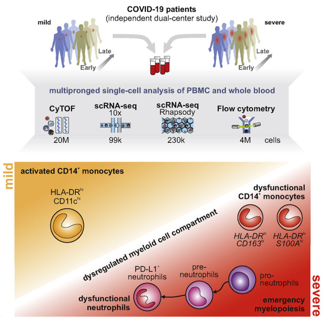
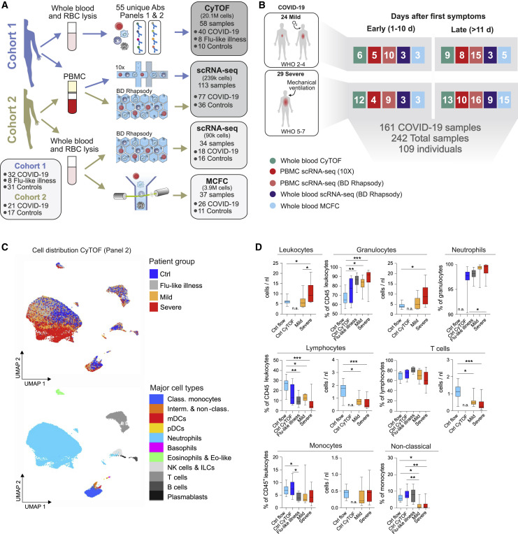
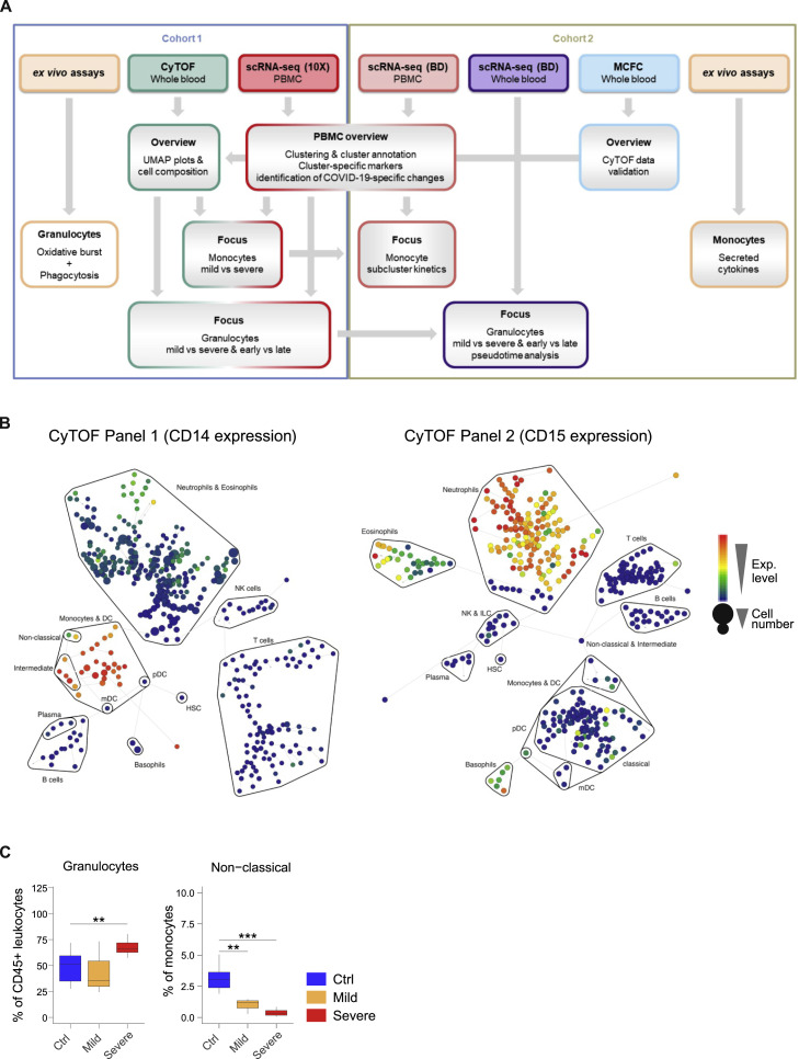
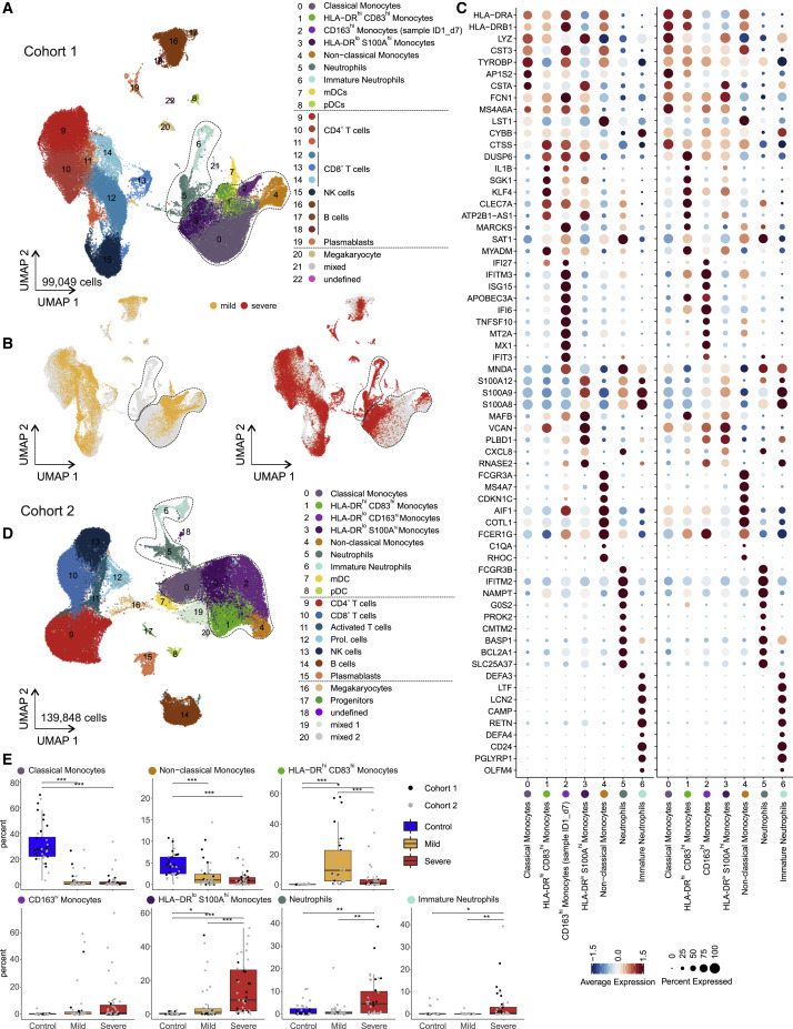
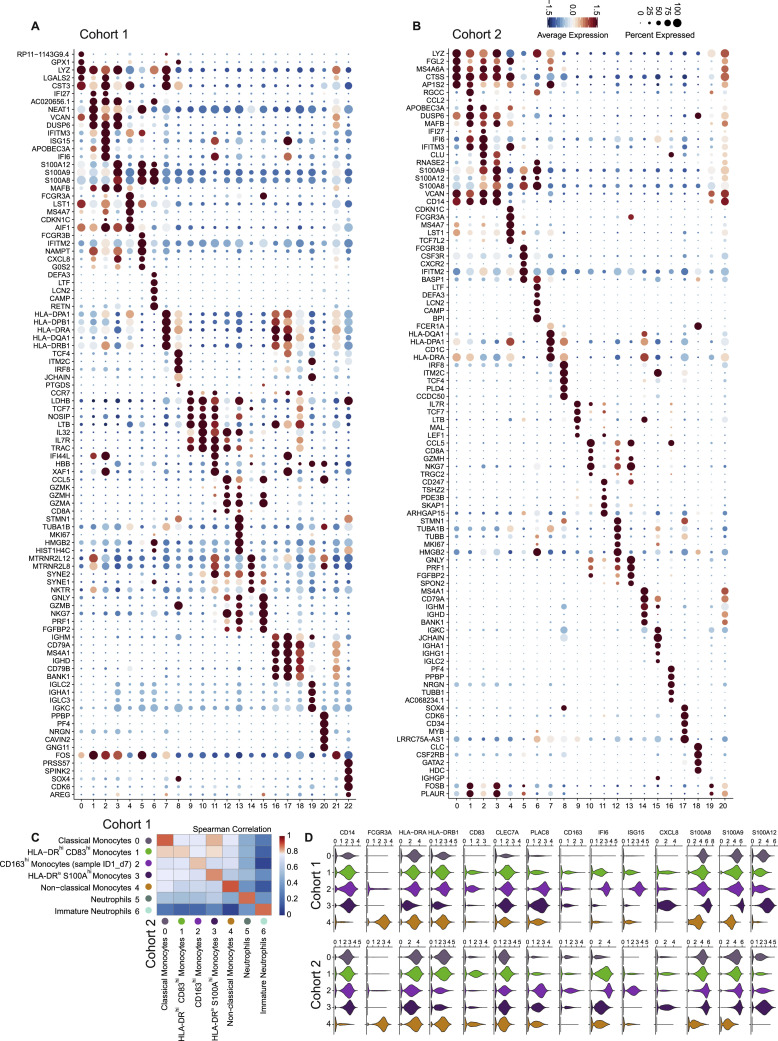
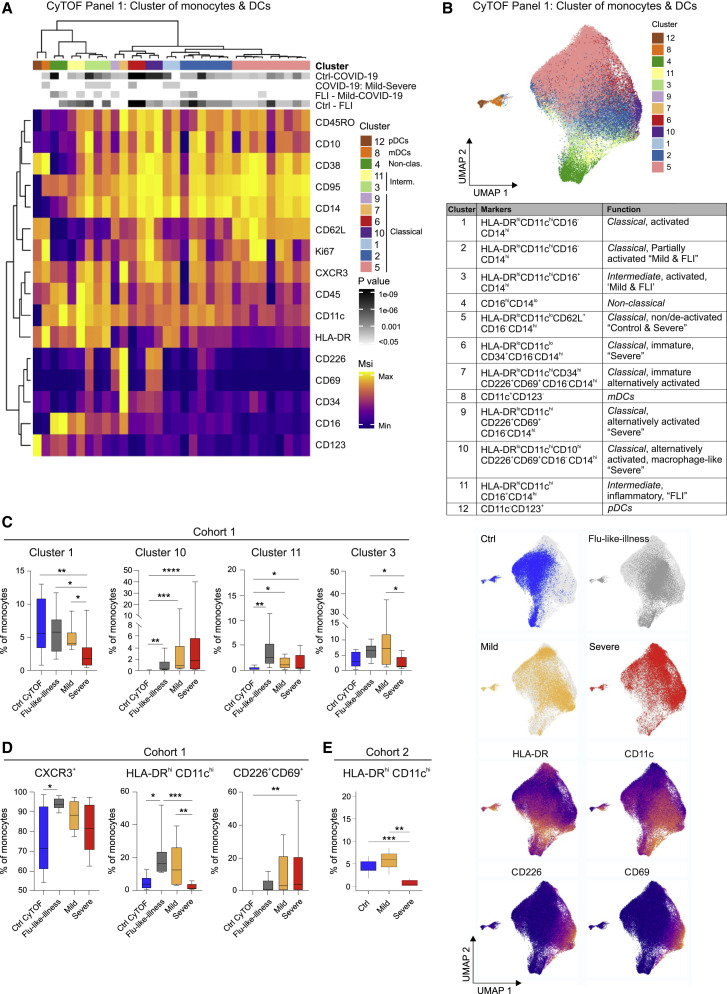
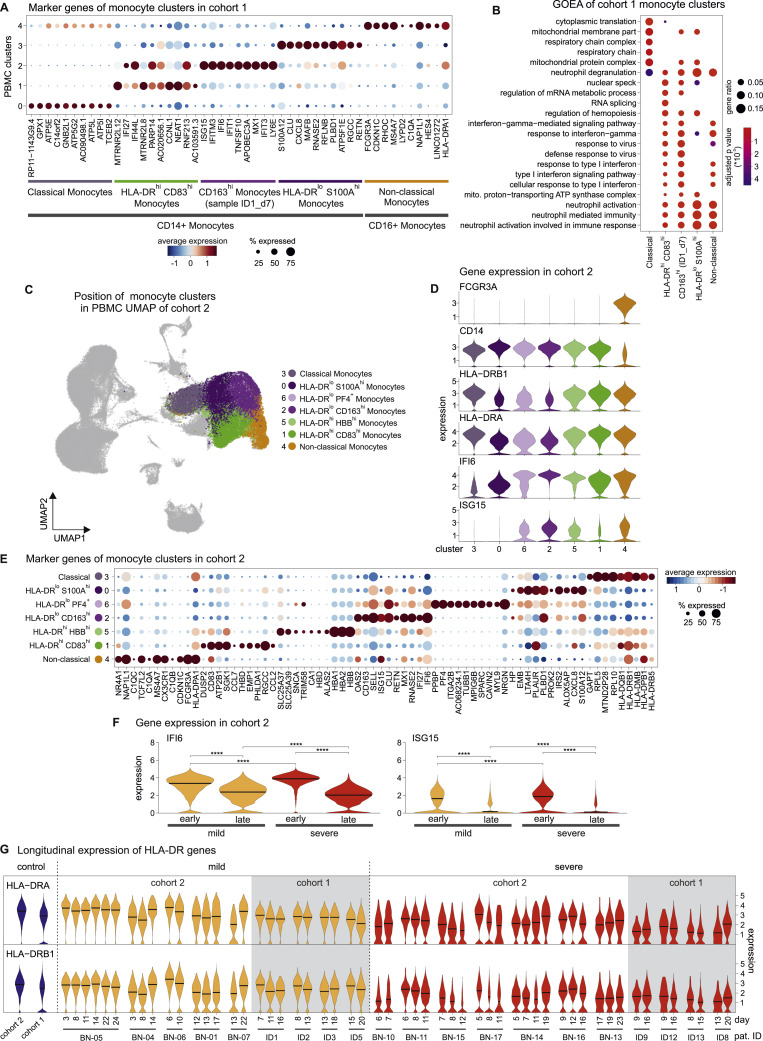
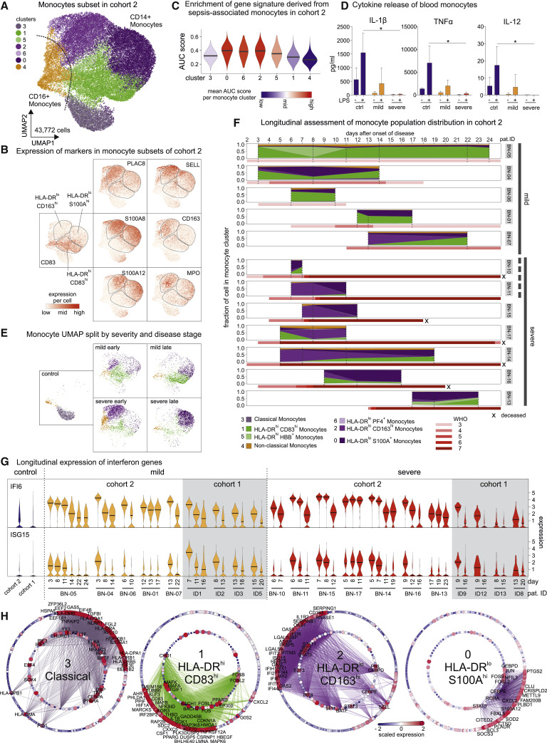
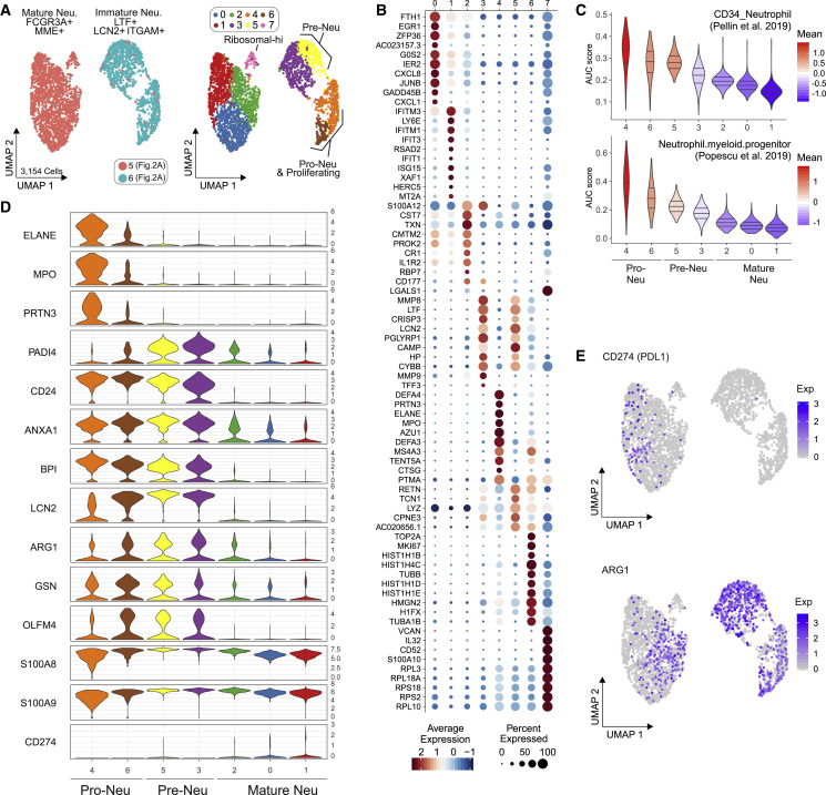
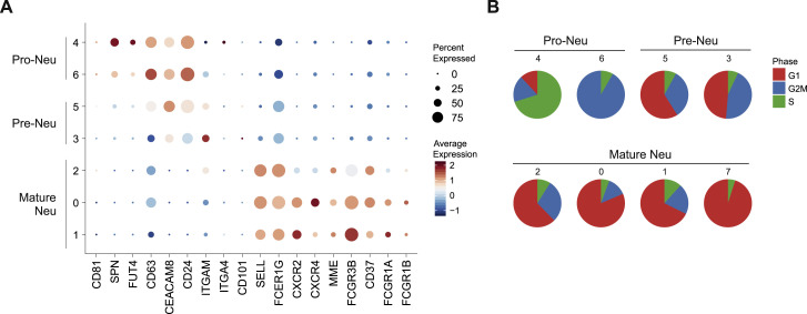
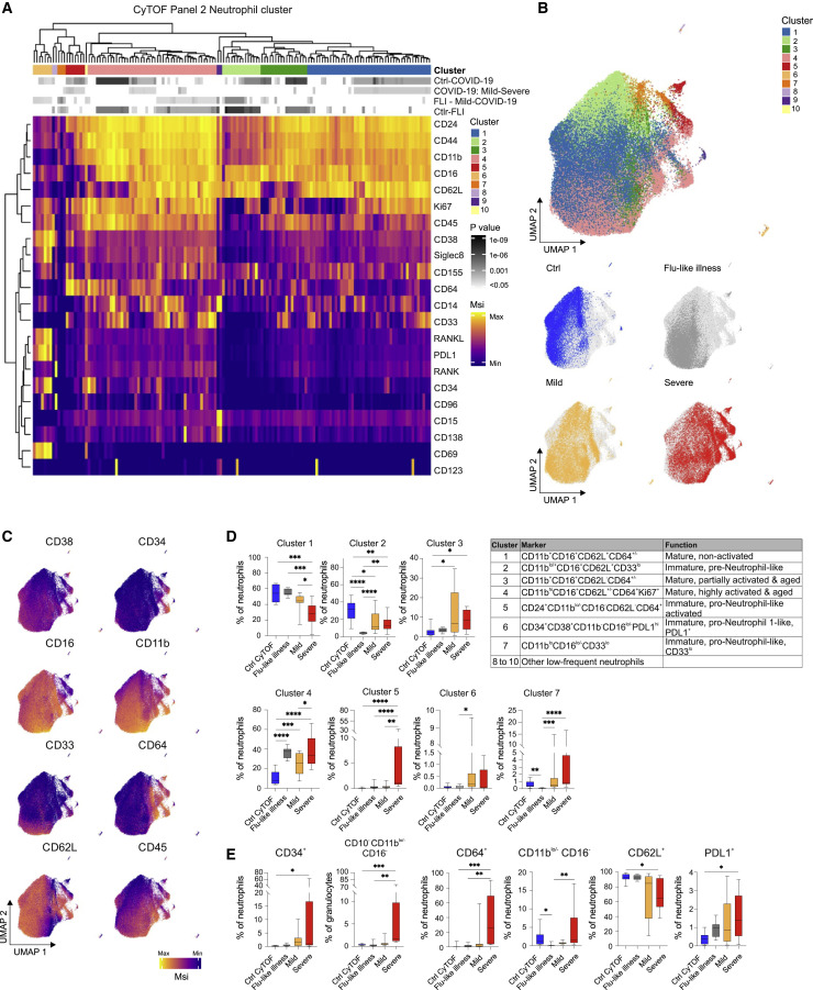
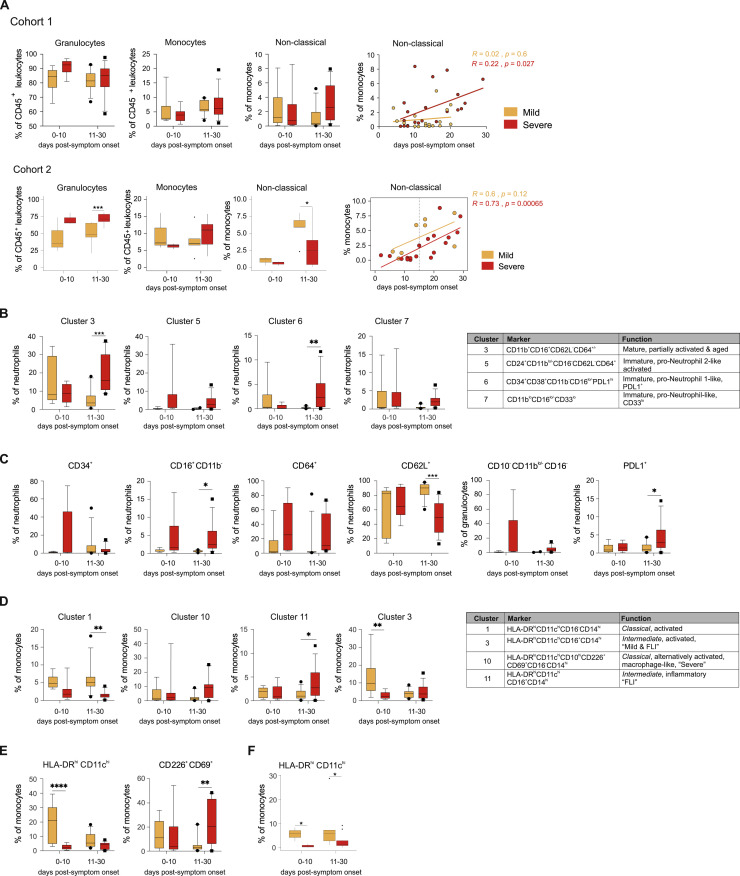
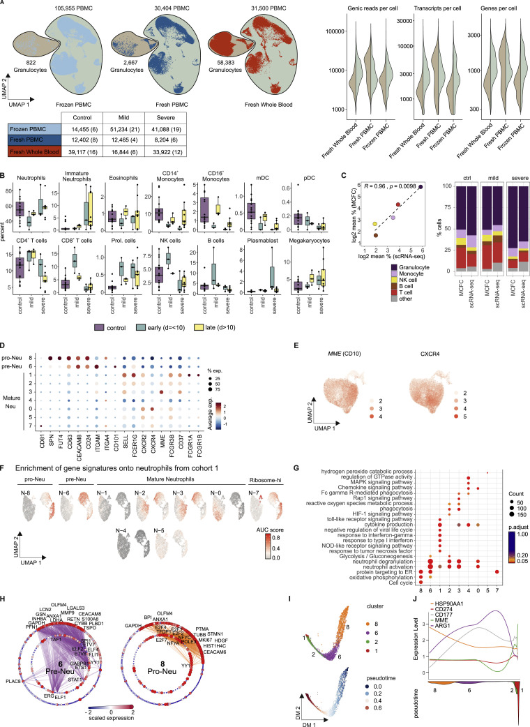
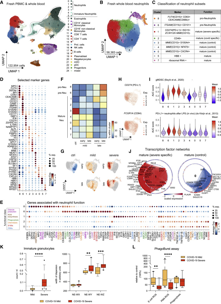
Coronavirus disease 2019 (COVID-19) is a mild to moderate respiratory tract infection, however, a subset of patients progress to severe disease and respiratory failure. The mechanism of protective immunity in mild forms and the pathogenesis of severe COVID-19 associated with increased neutrophil counts and dysregulated immune responses remain unclear. In a dual-center, two-cohort study, we combined single-cell RNA-sequencing and single-cell proteomics of whole-blood and peripheral-blood mononuclear cells to determine changes in immune cell composition and activation in mild versus severe COVID-19 (242 samples from 109 individuals) over time. HLA-DRhiCD11chi inflammatory monocytes with an interferon-stimulated gene signature were elevated in mild COVID-19. Severe COVID-19 was marked by occurrence of neutrophil precursors, as evidence of emergency myelopoiesis, dysfunctional mature neutrophils, and HLA-DRlo monocytes. Our study provides detailed insights into the systemic immune response to SARS-CoV-2 infection and reveals profound alterations in the myeloid cell compartment associated with severe COVID-19.

Keywords: COVID-19; SARS-CoV-2; dysfunctional neutrophils; emergency myelopoiesis; immune profiling; mass cytometry; monocytes; neutrophils; scRNA-seq.


Conflict of interest statement

Declaration of Interests The authors declare no competing interests.

Figures

None
Graphical abstract
Figure 1
Figure 1
Cohort Definition and Single-Cell Multi-omics Analysis Strategy (A) Pipeline for control and COVID-19 blood samples of the two cohorts (see also Table S1). Whole blood samples were subjected to red blood cell (RBC) lysis and processed for CyTOF mass cytometry (two antibody panels), multi-color flow cytometry (MCFC), or scRNA-seq (BD Rhapsody). PBMCs were isolated by density centrifugation and processed directly or after frozen storage, labeled with cell hashing antibodies and loaded on droplet-based (10x) or microwell-based (BD Rhapsody) scRNA-seq platforms. Box (bottom left): number of subjects in each cohort. Boxes (on the right): number of samples analyzed with each technique. (B) Number of samples per technique summarized across cohorts, divided by disease severity according to WHO ordinal scale and by the time after onset of first symptoms (early: days 0–10, late: >day 11). (C) UMAP of CD45+ leukocytes, down-sampled to 70,000 cells, from mass cytometry using antibody panel 2 (30 markers, Table S2). Cells are colored according to donor origin (blue, age-matched controls; gray, FLI; yellow, mild COVID-19; red, severe COVID-19) and major lineage subtypes. (D) Box and whisker (10–90 percentile) plots of major cell lineage composition in whole blood from FLI (n = 8), COVID-19 patients with mild (n = 8) or severe disease (n = 9), age-matched controls measured by mass cytometry (ctrl CyTOF, n = 9) or by flow cytometry (ctrl flow, n = 19) (Kverneland et al., 2016). Kruskal-Wallis and Dunn’s multiple comparison test p < 0.05, ∗∗p < 0.01, ∗∗∗p < 0.001, ∗∗∗∗p < 0.0001. n.a., not available. See also Figure S1 and Table S3.
Figure S1
Figure S1
Overview of Sample Analysis Pipeline, Major Leukocyte Lineages Definition, and Quantification by CyTOF and MCFC, Related to Figure 1 A, Overview of the analysis pipeline for scRNA-seq and proteomics of COVID-19 samples. B, High resolution SPADE analysis with 400 target nodes and individual nodes aggregated to the indicated major immune cell lineages according to the expression of lineage specific cell marker such as CD14 for monocytes and CD15 for neutrophils of whole blood samples collected from FLI patients, COVID-19 patients and controls and stained with CyTOF panel 1 and 2, respectively. C, Boxplots of the composition of total granulocytes and non-classical monocytes within whole blood samples from the second cohort of COVID-19 patients showing either mild (n = 3) or severe disease (n = 7) as well as controls (n = 11) measured by flow cytometry. Statistical analysis was performed using unpaired t test. ∗∗p < 0.01, ∗∗∗p < 0.001.
Figure 2
Figure 2
scRNA-Seq of PBMC from Patients of the Two Independent Cohorts (A) UMAP visualization of scRNA-seq profiles (10x, cohort 1) of 99,049 PBMC from 49 samples (8 mild, 10 severe patients, different time points) and 22 control samples colored according to cell type classification (Louvain clustering), reference-based cell-type annotation, and marker gene expression (Table S4). (B) UMAP shown in (A) colored according to disease severity (yellow, mild COVID-19; red, severe COVID-19). (C) Dot plots of the intersection of the top 20 marker genes sorted by average log fold change determined for the indicated myeloid cell subsets in the PBMC datasets of both cohorts. (D) UMAP visualization of scRNA-seq profiles (BD Rhapsody, cohort 2) of 139,848 PBMCs (50 samples of 8 mild, 9 severe COVID-19; 14 samples of 13 controls; different time points), coloring as in (A) (see also Figure S2A and Table S4). (E) Box and whisker plots (25–75 percentile) of percentages of cell subsets of total PBMC (per patient). Boxes are colored according to disease group and dots according to the respective cohort of the sample. Dirichlet-multinomial regression adjusted with the Benjamini-Hochberg method, p < 0.05, ∗∗p < 0.01, ∗∗∗p < 0.001. See also Table S1.
Figure S2
Figure S2
Cluster-Specific Marker Gene Expression Shows Inflammatory Activation Signatures of Monocyte Subsets and the Appearance of Neutrophil Subsets in the PBMC Fraction, Related to Figure 2 (A), Dot plots of the top 5 marker genes sorted by average log fold change determined for the clusters depicted in Figure 2A. (B), Dot plot representation of the top 5 marker genes sorted by average log fold change determined for the clusters depicted in Figure 2D. C: Heatmap of the Spearman correlation coefficients between myeloid cell subsets in two cohorts, based on the union of top 50 marker genes per cluster.
Figure 3
Figure 3
CD11clo and HLA-DRlo but CD226+CD69+ Monocytes in Severe COVID-19 (A) Heatmap of CyTOF data (antibody panel 1, cohort 1) covering monocytes and DCs. Main cell, as defined by the numbers 1 to 12, and individual cell clusters are displayed in columns and marker identity is indicated in rows. MSI, marker staining intensity respective expression level, significance level for the following comparisons: (1) controls (ctrl, n = 9) versus COVID-19 (mild and severe, n = 17, first row), (2) mild (n = 8) versus severe (n = 9, second row), (3) FLI (n = 8) versus mild COVID-19 (n = 8, third row), as well as (4) controls (ctrl, n = 9) versus FLI (n = 8) are indicated using a gray scale on top of the heatmap (p value scale next to heatmap). COVID-19 samples collected between days 4 and 13 post-symptom onset ( = first day of sample collection per patient). Abundance testing via generalized mixed effects models and multiple comparison adjustment using the Benjamini-Hochberg procedure and a false discovery rate (FDR) cutoff of 5% across all clusters/subsets and between-group comparisons. (B) UMAP of monocytes and DCs, down-sampled to 70,000 cells, (39 markers, Table S2). Cells are colored according to main cell clusters (1 to 12, colors as in A) as defined in the table, donor origin (blue, controls; gray, FLI; yellow, mild COVID-19; red, severe COVID-19) and expression intensity of HLA-DR, CD11c, CD226, and CD69. (C) Box and whisker (10–90 percentile) plots of main monocyte clusters 1, 10 (CD14hiCD16 classical monocytes), 11, and 3 (CD14hiCD16+ intermediate monocytes) determined by mass cytometry (whole blood, cohort 1): controls (n = 9), FLI patients (n = 8), COVID-19 patients (mild, n = 8; severe, n = 9). Abundance testing via R multcomp and lsmeans packages adjusted using the Benjamini-Hochberg procedure and an FDR-cutoff of 5% across all clusters/subsets and between-group comparisons. (D) Box and whisker (10–90 percentile) plots of CXCR3+, HLA-DRhiCD11chi, and CD226+CD69+ monocytes measured by mass cytometry (whole blood, cohort 1): controls (n = 9), FLI patients (n = 8), and COVID-19 patients (mild, n = 8; severe, n = 9). Kruskal-Wallis and Dunn’s multiple comparison tests. (E) Boxplot of HLA-DRhiCD11chi monocytes (cohort 2) measured by flow cytometry: COVID-19 (mild, n = 3; severe, n = 7) and age-matched controls (n = 11). Unpaired t test. p < 0.05, ∗∗p < 0.01, ∗∗∗p < 0.001, ∗∗∗∗p < 0.0001. See also Tables S1 and S3.
Figure S3
Figure S3
Transcriptional Differences of Monocytes from Mild and Severe COVID-19, Related to Figure 4 A, Dot plot of the top 10 marker genes sorted by average log fold change of the clusters within the monocyte space of cohort 1 (related to Figure 2, Table S4). B, Gene ontology enrichment analysis based on the complete marker genes obtained for each monocyte cluster of cohort 1, showing the top 10 significant terms enriched in each cluster ranked by adjusted p values. C, Back-mapping of monocyte clusters of cohort 2 (Figure 4C) onto the PBMC UMAP of cohort 2 (Figure 2D). The legend shows the association of the colors to the clusters together with the labeling of the clusters based on expressed marker genes (according to Figures 2 and S3D–S3F). D, Violin plots of marker gene expression in the monocyte clusters identified in the complete PBMC space of cohort 2 (Figures 2C and 2D) E, Dot plot of the top 10 marker genes sorted by average log fold change calculated for the monocyte clusters (Figure 4C). F, Violin plots of the IFI6 and ISG15 expression in cells of mild and severe patients, additionally divided into early (1-10 days after disease onset) and late (> 10 days after disease onset). Statistical analysis was performed using Wilcoxon Rank Sum test adjusted with the Bonferroni method, ∗∗∗∗p < 0.0001. G, Violin plots showing the time-dependent change of HLA-DRA and HLA-DRB1 expression in the monocyte population of cohort 1 (mild: n = 4; severe: n = 4) and cohort 2 (mild: n = 5; severe: n = 7). Mild samples are colored in yellow, severe samples in red and controls in blue, with the latter shown as reference violin plots representing the expression of all control monocytes in the respective cohort (cohort 1: n = 22, cohort 2: n = 6).
Figure 4
Figure 4
Disease-Related Longitudinal Changes in Monocyte Transcriptomes (A) UMAP visualization of monocytes (43,772 cells; from Figure 2C, cohort 2); 46 samples from controls (n = 6) and COVID-19 (mild, n = 7; severe, n = 8). Cells are colored according to the identified monocyte clusters (Louvain clustering, Table S4). (B) Visualization of scaled expression of selected genes (monocyte markers, Figures 2 and S3E) using the UMAP defined in (A). Three main clusters defining monocytes in COVID-19 (HLA-DRloCD163hi, HLA-DRloS100Ahi, and HLA-DRhiCD83hi monocytes) indicated by dashed areas. (C) AUCell-based enrichment of a gene signature from sepsis-associated monocytes (MS1 cells) (Reyes et al., 2020), violin plots of the area under the curve (AUC) scores. Horizontal lines: median of the respective AUC scores per cluster. (D) Cytokine detection of IL-1β, tumor necrosis factor alpha (TNF)-α, and IL-12 in supernatants of purified monocytes (controls, ctrl, n = 3; COVID-19, mild, n = 3, and severe, n = 3) after 8 h in vitro incubation with or without 1 ng/mL LPS. Mean ± standard deviation. Kruskal-Wallis test adjusted with Benjamini-Hochberg method, p < 0.05. (E) Mapping of monocytes derived from COVID-19 patients (mild early, mild late, severe early, and severe late) onto UMAP from (A), coloring according to monocyte cluster identity. (F) Cluster occupancy over time for patients with longitudinal scRNA-seq data (mild, n = 5; severe, n = 7), coloring according to (A). Vertical dashed lines: time points of sampling. Red bar, WHO ordinal scale; X, patient deceased. Patient IDs on the right side, grouping according to disease severity. Bold dotted line (right): patients classified as mild at initial sampling developing severe disease over time. (G) Time-dependent change of IFI6 and ISG15 expression (violin-plots) in monocytes of cohort 1 (mild [yellow], n = 4; severe [red], n = 4), cohort 2 (mild [yellow], n = 5; severe [red], n = 7), and controls (cohort 1, n = 22, cohort 2, n = 6). (H) Network representation of marker genes and their predicted upstream transcriptional regulators for monocyte clusters 0, 1, 2, and 3. Edges: predicted transcriptional regulation. Transcription factors (TFs, inner circle) and predicted target genes (outer circle) represented as nodes sized and colored according to the scaled expression level across all clusters. Selected TFs and genes labeled based on connectivity and literature mining. Numbers in the center refer to clusters defined in (A). See also Figure S1 and Tables S1 and S4.
Figure 5
Figure 5
Immature and Dysfunctional Low-Density Neutrophils Emerge in PBMC (A) UMAP representation and clustering of low-density neutrophils (LDNs, 3,154 cells) in PBMCs (cohort 1, clusters 5/6, Figure 2A) from 21 samples (6 mild, 10 severe COVID-19). Left panel: cluster affiliation in Figure 2A. Right panel: data-driven clustering and cell type nomenclature based on marker genes (Table S4). (B) Dot plot of the top 10 marker genes sorted by average log fold change associated with the neutrophil clusters identified in (A). (C) Signature enrichment scores of single-cell data from neutrophil progenitors (Pellin et al., 2019; Popescu et al., 2019) in LDN clusters, plotted as violin plots. The lines in the violin plots represent the median of the respective AUC scores per cluster and the 0.25 and 0.75 quantiles. The ribosomalhi-specific cluster 7 was excluded from this analysis. (D) Violin plots of expression of selected activation genes across the neutrophil clusters identified in (A). The panel of genes was chosen based on their described role in neutrophil extracellular trap formation (PRTN3, ELANE, MPO, and PADI4) and neutrophil activation and dysregulation (CD24, OLFM4, LCN2, BPI, CD274 [PD-L1], Arginase 1 [ARG1], and ANXA1). (E) Expression of ARG1 and CD274(PD-L1) projected on the UMAP from (A). See also Figure S4 and Table S1.
Figure S4
Figure S4
Additional Analysis of Dysfunctional Neutrophils in PBMC Fraction, Related to Figure 5 A, Dot plot of marker genes associated with immature neutrophils (pro- and pre-neutrophils), and mature neutrophils. B, Pie charts showing the proportion of cells predicted to be in a given cell cycle stage. The numbers refer to the cell clusters presented in panel A.
Figure 6
Figure 6
Appearance of Immature and PD-L1+ Neutrophils in Severe COVID-19 (A) Heatmap revealing differences in marker expression determined by mass cytometry (antibody panel 2, cohort 1) of main neutrophil cell cluster (1 to 10). Main individual neutrophil cell clusters are displayed in columns and marker identity is indicated in rows. MSI, marker staining intensity respective expression level. Significance level for the following comparisons: (1) controls (ctrl, n = 9) versus COVID-19 (mild and severe, n = 17, first row), (2) mild (n = 8) versus severe (n = 9, second row), (3) FLI (n = 8) versus mild COVID-19 (n = 8, third row), as well as (4) controls (ctrl, n = 9) versus FLI (n = 8) are indicated using a gray scale on top of the heatmap (see also p value scale next to the heatmap). Samples of COVID-19 patients collected between day 4 and 13 post-symptom onset (= first day of sample collection per patient). Abundance testing via generalized mixed effects models and multiple comparison adjustment using the Benjamini-Hochberg procedure and an FDR-cutoff of 5% across all clusters/subsets and between-group comparisons (B) UMAP of neutrophils, down-sampled to 70,000 cells (30 markers, Table S2). Cells are colored according to main cell clusters (1 to 10, see table). Donor origin (blue, controls; gray, FLI; yellow, mild COVID-19; red, severe COVID-19). (C) UMAP (from (B) with cells colored according to expression intensity of CD38, CD34, CD16, CD11b, CD33, CD64, CD62L, and CD45. (D) Box and whisker (10–90 percentile) plots of main neutrophil cell clusters 1 to 7, reaching proportions of over 1%, measured by mass cytometry (whole blood, cohort 1): controls (n = 9), FLI (n = 8), and COVID-19 (mild, n = 8; severe, n = 9). Abundance testing via generalized mixed effects models and multiple comparison adjustment using the Benjamini-Hochberg procedure and an FDR-cutoff of 5% across all clusters/subsets and between-group comparisons. (E) Box and whisker (10–90 percentile) plots of proportions of CD34+, CD11blo/−CD16, CD64+, CD62L+, CD10CD11blo/−CD16 (reported from panel 1) and PD-L1+ neutrophils (whole blood, cohort 1): controls (n = 9), FLI (n = 8), and COVID-19 (mild, n = 8; severe, n = 9). Kruskal-Wallis and Dunn’s multiple comparison tests. p < 0.05, ∗∗p < 0.01, ∗∗∗p < 0.001, ∗∗∗∗p < 0.0001. See also Figure S5 and Tables S1 and S3.
Figure S5
Figure S5
Longitudinal Analysis of Neutrophil and Monocyte Cell Populations, Related to Figure 6 A, Box and whisker (10-90 percentile) plots of time-dependent differences in total granulocytes and monocytes, non-classical monocytes and correlation analysis between days post-symptom onset and proportion of non-classical monocytes. B, Box and whisker (10-90 percentile) plots of time-dependent differences in main neutrophil cell cluster 3, 5, 6 and 7 in cohort 1. C, Box and whisker (10-90 percentile) plots of time-dependent differences in proportions of CD34+, CD11blo/-CD16-, CD64+, CD62L+, CD10-CD11blo/-CD16- (reported from panel 1) and PD-L1+ neutrophils in cohort 1. D, Box and whisker (10-90 percentile) plots of time-dependent differences in main monocyte cluster 1, 10 (belonging to CD14hiCD16- classical monocytes), cluster 11 and 3 (belonging to CD14hiCD16+ intermediate monocytes) in cohort 1. E, Box and whisker (10-90 percentile) plots of time-dependent differences in CXCR3+, HLA-DRhiCD11chi and CD226+CD69+ monocytes. (F), Box and whisker (10-90 percentile) plot showing time-dependent differences in HLA-DRhiCD11chi monocytes in cohort 2. Measurements in cohort 1 were done applying mass cytometry on whole blood samples distinguishing between COVID-19 patients with mild (days 0-10: n = 6, days 11-30: n = 12) or severe disease (days 0-10: n = 9, days 11-30: n = 13) course. Mixed-effect-analysis and Sidak’s multiple comparison test was used to calculate significant differences Measurements in cohort 2 were done with flow cytometry on 26 whole blood samples from COVID-19 patients showing either mild (n = 8) or severe disease (n = 18) course as well as 11 samples from age-matched controls (n = 10). p < 0.05, ∗∗p < 0.01, ∗∗∗p < 0.001, ∗∗∗∗p < 0.0001
Figure S6
Figure S6
Overview of scRNA-Seq Dataset from Cohort 2 and Additional Characterization of Neutrophils, Related to Figure 7 (A), UMAP (on the left) of the complete scRNA-seq dataset from cohort 2 (frozen PBMC, fresh PBMC, fresh whole blood), encompassing 98 samples from 16 controls, 8 mild, and 10 severe COVID-19 patients. Right panel: violin plots of the number of genic reads, transcripts and genes expressed in the PBMC (right) versus the granulocyte fraction (left) across the different datasets of cohort 2. The UMAP is split by experimental condition and the classified granulocyte and PBMC fractions are marked separately. The table below indicates the number of cells per experimental condition separated by control, COVID-19 mild and COVID-19 severe. The numbers of samples are indicated in brackets. (B), Box and whisker plots (25–75 percentile) of cell type frequencies identified by scRNA-seq in fresh whole blood samples after erythrocyte lysis comparing 16 samples from 15 controls, 6 from 5 mild COVID-19 and 12 from 4 severe COVID-19 patients. (C), Comparison between cell frequencies identified by scRNA-seq and MCFC. Pearson’s correlation between the mean of each cell population measured in MCFC (y axis) and by scRNA-seq of R2 = 0.96 with p = 0.0098 (left). The stacked bar chart sorted by disease severity shows the cell type frequency for controls (n = 16), mild (n = 5) and severe COVID-19 samples (n = 18) split by scRNA-seq and MCFC. (D), Dot plot of literature-based marker genes classifying different neutrophil subsets. (E), UMAP of neutrophils showing the scaled expression of MME(CD10) and CXCR4 with enrichment in the control-specific clusters 0. (F), UMAP of AUCell-based enrichment of gene signatures derived from the neutrophil clusters from cohort 2 on the UMAP visualization of cohort 1. The UMAP is colored by the ‘Area Under the Curve’ (AUC) scores of each cell. (G), Dot plot visualization of selected significantly enriched Gene Ontology terms and KEGG pathways for each cluster from the neutrophil space. The dots are colored by their adjusted p value and the size of the dots is defined by the number of genes found in the Gene Ontology term. (H), Network representation of marker genes and their predicted upstream transcriptional regulators for neutrophil clusters 6 (pre-Neutrophils) and 8 (pro-Neutrophils). Edges represent predicted transcriptional regulation. Transcription factors in the inner circle and their predicted target genes in the outer circle are represented as nodes sized and colored according to the scaled expression level across all clusters. Selected genes and transcription factors were labeled based on connectivity and literature mining. (I), Diffusion map dimensionality reduction of the main neutrophil clusters 8, 6, 2, and 1 from the severe COVID-19 patients (top) and diffusion pseudotime visualized on the diffusion map indicating the transition probability of the different clusters in the following order: 8 - 6 - 2 - 1 (bottom). (J), Genes specific for each cluster (HSP90AA1, CD274(PD-L1), CD177, MME(CD10), ARG1) visualized along the diffusion pseudotime (top) with the density of each cluster along the pseudotime (bottom) highlighting the proposed order of differentiation of the different neutrophil subsets.
Figure 7
Figure 7
Immature and Dysfunctional Whole-Blood Neutrophils in Severe COVID-19 (A) UMAP of 35 fresh blood samples from cohort 2 (122,954 cells, PBMCs, and whole blood): controls (n = 17), mild COVID-19 (early, n = 3; late, n = 3) and severe COVID-19 (early, n = 3, late = 9). Clusters defined by Louvain clustering. Cell types assigned based on reference-based cell type classification (Aran et al., 2019) and marker gene expression (Table S4). (B) UMAP visualization of neutrophils (58,383 cells; 34 whole blood samples, cohort 2): controls (n = 16), mild COVID-19 (early, n = 3; late, n = 3), and severe COVID-19 (early, n = 3; late, n = 9). Clusters defined by Louvain clustering (Table S4). (C) Nomenclature and marker genes for each neutrophil cluster from (B). (D) Dot plot of selected marker genes for each neutrophil cluster from (B). (E) Dot plot of genes from different functional classes (based on literature research). Clusters 8, 6, 1, and 2 are specific for severe COVID-19, cluster 0 represents homeostatic mature neutrophils from controls. (F) Heatmap divided by disease severity and stage (early versus late) showing the proportion of each patient group for each cluster. (G) Density plot of cell frequency by disease severity and stage (early versus late) overlaid on the UMAP of the neutrophil space. (H) UMAP visualization showing scaled expression of CD274 (PD-L1) and FCGR1A (CD64). (I) Violin plots showing AUCell-based enrichment as AUC scores of gene signature from granulocytic myeloid-derived suppressor cells (Bayik et al., 2020) and PD-L1hi neutrophils after LPS exposure (de Kleijn et al., 2013) in neutrophil clusters from (B). Horizontal lines: median of the respective AUC scores per cluster and 0.25 and 0.75 quantiles. (J) Network representation of marker genes and their predicted upstream transcriptional regulators for neutrophil clusters 1 (mature/COVID-19 severe-specific) and 0 (mature/control-specific). Edges in cluster color: predicted transcriptional regulation. TFs (inner circle) and their predicted target genes (outer circle): nodes, sized, and colored according to scaled expression level across all clusters. Selected genes and TFs labeled based on connectivity and literature mining. (K) Box and whisker (10-90 percentile) plots representing the hematological analyses (whole blood, cohort 1): mild (n = 11), severe (n = 21) COVID-19. Analytes, measured by flow cytometry in white blood cell differential channel, included absolute counts of immature granulocytes (IG, dotted line: upper limit of reference range) and width of neutrophil cytometric dispersions (NE-WX, dispersion of side scatter; NE-WY, dispersion of side fluorescence light; NE-WZ, dispersion of forward scatter). Mann Whitney test applied to IG count analysis and mixed-effect-analysis and Sidak’s multiple comparison test to NE-WX, NE-WY, and NE-WZ analyses. (L) Box and whisker (10–90 percentile) plots of E. coli- and PMA-induced neutrophil oxidative burst (reactive oxygen species [ROS] production) and phagocytosis of whole blood samples (cohort 1; mild, n = 10; severe [n = 8] COVID-19) in comparison to controls measured by flow cytometry. Dotted line: relative level of controls run in the assay. Mixed-effect-analysis and Sidak’s multiple comparison test. ∗∗p < 0.01, ∗∗∗p < 0.001, ∗∗∗∗p < 0.0001. See also Figure S6 and Table S1.

References

    1. Ahmad S., Singh P., Sharma A., Arora S., Shriwash N., Rahmani A.H., Almatroodi S.A., Manda K., Dohare R., Syed M.A. Transcriptome meta-analysis deciphers a dysregulation in immune response-associated gene signatures during sepsis. Genes (Basel) 2019;10:1005. - PMC - PubMed
    1. Aibar S., González-Blas C.B., Moerman T., Huynh-Thu V.A., Imrichova H., Hulselmans G., Rambow F., Marine J.C., Geurts P., Aerts J. SCENIC: single-cell regulatory network inference and clustering. Nat. Methods. 2017;14:1083–1086. - PMC - PubMed
    1. Alder M.N., Opoka A.M., Lahni P., Hildeman D.A., Wong H.R. Olfactomedin-4 Is a Candidate Marker for a Pathogenic Neutrophil Subset in Septic Shock. Crit. Care Med. 2017;45:e426–e432. - PMC - PubMed
    1. Angerer P., Haghverdi L., Büttner M., Theis F.J., Marr C., Buettner F. destiny: diffusion maps for large-scale single-cell data in R. Bioinformatics. 2016;32:1241–1243. - PubMed
    1. Aran D., Looney A.P., Liu L., Wu E., Fong V., Hsu A., Chak S., Naikawadi R.P., Wolters P.J., Abate A.R. Reference-based analysis of lung single-cell sequencing reveals a transitional profibrotic macrophage. Nat. Immunol. 2019;20:163–172. - PMC - PubMed

Publication types

MeSH terms