. 2020 Aug 7:5:89.
doi: 10.12688/wellcomeopenres.15881.2. eCollection 2020.

Dynamic causal modelling of COVID-19

Affiliations

Dynamic causal modelling of COVID-19

Karl J Friston et al. Wellcome Open Res. .

Abstract

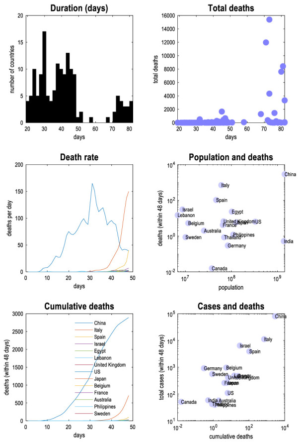
This technical report describes a dynamic causal model of the spread of coronavirus through a population. The model is based upon ensemble or population dynamics that generate outcomes, like new cases and deaths over time. The purpose of this model is to quantify the uncertainty that attends predictions of relevant outcomes. By assuming suitable conditional dependencies, one can model the effects of interventions (e.g., social distancing) and differences among populations (e.g., herd immunity) to predict what might happen in different circumstances. Technically, this model leverages state-of-the-art variational (Bayesian) model inversion and comparison procedures, originally developed to characterise the responses of neuronal ensembles to perturbations. Here, this modelling is applied to epidemiological populations-to illustrate the kind of inferences that are supported and how the model per se can be optimised given timeseries data. Although the purpose of this paper is to describe a modelling protocol, the results illustrate some interesting perspectives on the current pandemic; for example, the nonlinear effects of herd immunity that speak to a self-organised mitigation process.

Keywords: Bayesian; compartmental models; coronavirus; dynamic causal modelling; epidemiology; variational.


Conflict of interest statement

No competing interests were disclosed.

Figures

Figure 1.
Figure 1.. generative model.
This figure is a schematic description of the generative model used in subsequent analyses. In brief, this compartmental model generates timeseries data based on a mean field approximation to ensemble or population dynamics. The implicit probability distributions are over four latent factors, each with four levels or states. These factors are sufficient to generate measurable outcomes; for example, the number of new cases or the proportion of people infected. The first factor is the location of an individual, who can be at home, at work, in a critical care unit ( CCU) or in the morgue. The second factor is infection status; namely, susceptible to infection, infected, infectious or immune. This model assumes that there is a progression from a state of susceptibility to immunity, through a period of (pre-contagious) infection to an infectious (contagious) status. The third factor is clinical status; namely, asymptomatic, symptomatic, acute respiratory distress syndrome (ARDS) or deceased. Again, there is an assumed progression from asymptomatic to ARDS, where people with ARDS can either recover to an asymptomatic state or not. Finally, the fourth factor represents diagnostic or testing status. An individual can be untested or waiting for the results of a test that can either be positive or negative. With this setup, one can be in one of four places, with any infectious status, expressing symptoms or not, and having test results or not. Note that—in this construction—it is possible to be infected and yet be asymptomatic. However, the marginal distributions are not independent, by virtue of the dynamics that describe the transition among states within each factor. Crucially, the transitions within any factor depend upon the marginal distribution of other factors. For example, the probability of becoming infected, given that one is susceptible to infection, depends upon whether one is at home or at work. Similarly, the probability of developing symptoms depends upon whether one is infected or not. The probability of testing negative depends upon whether one is susceptible (or immune) to infection, and so on. Finally, to complete the circular dependency, the probability of leaving home to go to work depends upon the number of infected people in the population, mediated by social distancing. The curvilinear arrows denote a conditioning of transition probabilities on the marginal distributions over other factors. These conditional dependencies constitute the mean field approximation and enable the dynamics to be solved or integrated over time. At any point in time, the probability of being in any combination of the four states determines what would be observed at the population level. For example, the occupancy of the deceased level of the clinical factor determines the current number of people who have recorded deaths. Similarly, the occupancy of the positive level of the testing factor determines the expected number of positive cases reported. From these expectations, the expected number of new cases per day can be generated. A more detailed description of the generative model—in terms of transition probabilities—can be found in in the main text.
Figure 2.
Figure 2.. timeseries data.
This figure provides a brief overview of the timeseries used for subsequent modelling, with a focus on the early trajectories of mortality. The upper left panel shows the distribution, over countries, of the number of days after the onset of an outbreak—defined as 8 days before more than one case was reported. At the time of writing (4 th April 2020), a substantial number of countries witnessed an outbreak lasting for more than 60 days. The upper right panel plots the total number of deaths against the durations in the left panel. Those countries whose outbreak started earlier have greater cumulative deaths. The middle left panel plots the new deaths reported (per day) over a 48-day period following the onset of an outbreak. The colours of the lines denote different countries. These countries are listed in the lower left panel, which plots the cumulative death rate. China is clearly the first country to be severely affected, with remaining countries evincing an accumulation of deaths some 30 days after China. The middle right panel is a logarithmic plot of the total deaths against population size in the initial (48-day) period. Interestingly, there is little correlation between the total number of deaths and population size. However, there is a stronger correlation between the total number of cases reported (within the first 48 days) and the cumulative deaths as shown in lower right panel. In this period, Germany has the greatest ratio of total cases to deaths. Countries were included if their outbreak had lasted for more than 48 days and more than 16 deaths had been reported. The timeseries were smoothed with a Gaussian kernel (full width half maximum of two days) to account for erratic reporting (e.g., recording deaths over the weekend).
Figure 3.
Figure 3.. Bayesian model reduction.
This figure reports the results of Bayesian model reduction. In this instance, the models compared are at the second or between-country level. In other words, the models compared contained all combinations of (second level) parameters (a parameter is removed by setting its prior variance to zero). If the model evidence increases—in virtue of reducing model complexity—then this parameter is redundant. The upper panels show the relative evidence of the most likely 256 models, in terms of log evidence (left panel) and the corresponding posterior probability (right panel). Redundant parameters are illustrated in the lower panels by comparing the posterior expectations before and after the Bayesian model reduction. The blue bars correspond to posterior expectations, while the pink bars denote 90% Bayesian credible intervals. The key thing to take from this analysis is that a large number of second level parameters have been eliminated. These second level parameters encode the effects of population size and geographical location, on each of the parameters of the generative model. The next figure illustrates the nonredundant effects that can be inferred with almost 100% posterior confidence.
Figure 4.
Figure 4.. between country effects.
This figure shows the relationship between parameters of the generative model and the explanatory variables in a general linear model (GLM) of between country effects. The left panel shows a regression of country-specific DCM parameters on the independent variable that had the greatest absolute value; namely, the contribution of an explanatory variable to a model parameter. Here, the effective size of the population appears to depend upon the latitude of a country. The right panel shows the absolute values of the GLM parameters in matrix form, showing that the effective size of the population was most predictable (the largest values are in white), though not necessarily predictable by total population size. The red circle highlights the parameter mediating the relationship illustrated in the left panel.
Figure 5.
Figure 5.. Bayesian parameter averages.
This figure reports the Bayesian parameter averages over countries following a hierarchical or parametric empirical Bayesian analysis that tests for—and applies shrinkage priors to—posterior parameter estimates for each country. The upper panel shows the parameters as estimated in log space, while the lower panel shows the same results for the corresponding scale (nonnegative) parameters. The blue bars report posterior expectations, while the thinner red bars in the upper panel are prior expectations. The pink bars denote 90% Bayesian credible intervals. One can interpret these parameters as the average value for any given parameter of the generative model, to which a random (country-specific) effect is added to generate the ensemble dynamics for each country. In turn, these ensemble distributions determine the likelihood of various outcome measures under large number (i.e., Gaussian) assumptions.
Figure 6.
Figure 6.. differences among countries.
This figure reports the differences among countries in terms of selected parameters of the generative model, ranging from the effective population size, through to the probability of testing its denizens. The blue bars represent the posterior expectations, while the pink bars are 90% Bayesian credible intervals. Notice that these intervals are not symmetrical about the mean because we are reporting scale parameters—as opposed to log parameters. For each parameter, the countries showing the smallest and largest values are labelled. The red asterisk denotes the country considered in the next section (the United Kingdom). The next figure illustrates the projections, in terms of new deaths and cases, based upon these parameter estimates. The order of the countries is listed in Figure 2.
Figure 7.
Figure 7.. projected outcomes.
This figure reports predicted 27 new deaths and cases (and CCU occupancy) for an exemplar country; here, the United Kingdom. The panels on the left show the predicted outcomes as a function of weeks. The blue lines correspond to the expected trajectory, while the shaded areas are 90% Bayesian credible intervals. The black dots represent empirical data, upon which the parameter estimates are based. The lower right panel shows the parameter estimates for the country in question. As in previous figures, the prior expectations are shown as pink bars over the posterior expectations (and credible intervals). The upper right panel illustrates the equivalent expectations in terms of cumulative deaths. The dotted red lines indicate the number of people who died from seasonal influenza in recent years 28. The key point to take from this figure is the quantification of uncertainty inherent in the credible intervals. In other words, uncertainty about the parameters propagates through to uncertainty in predicted outcomes. This uncertainty changes over time because of the nonlinear relationship between model parameters and ensemble dynamics. By model design, one can be certain about the final states; however, uncertainty about cumulative death rates itself accumulates. The mapping from parameters, through ensemble dynamics to outcomes is mediated by latent or hidden states. The trajectory of these states is illustrated in the next figure.
Figure 8.
Figure 8.. latent causes of observed consequences.
The upper panels reproduce the expected trajectories of the previous figure, for an example country (here the United Kingdom). The expected death rate is shown in blue, new cases in red, predicted recovery rate in orange and CCU occupancy in yellow. The black dots correspond to empirical data. The lower four panels show the evolution of latent (ensemble) dynamics, in terms of the expected probability of being in various states. The first (location) panel shows that after about 5 to 6 weeks, there is sufficient evidence for the onset of an episode to induce social distancing, such that the probability of being found at work falls, over a couple of weeks to negligible levels. At this time, the number of infected people increases (to about 32%) with a concomitant probability of being infectious a few days later. During this time, the probability of becoming immune increases monotonically and saturates at about 20 weeks. Clinically, the probability of becoming symptomatic rises to about 30%, with a small probability of developing acute respiratory distress and, possibly death (these probabilities are very small and cannot be seen in this graph). In terms of testing, there is a progressive increase in the number of people tested, with a concomitant decrease in those untested or waiting for their results. Interestingly, initially the number of negative tests increases monotonically, while the proportion of positive tests starts to catch up during the peak of the episode. Under these parameters, the entire episode lasts for about 10 weeks, or less than three months. The broken red line in the upper left panel shows the typical number of CCU beds available to a well-resourced city, prior to the outbreak.
Figure 9.
Figure 9.. sensitivity analysis.
These panels show the change in outcome measures—here cumulative deaths—with respect to model parameters (upper panel: first order derivatives. lower panel: second order derivatives). The bar charts in the upper panel are the derivatives of outcomes with respect to each of the parameters. Positive values (on the right) exacerbate new cases when increased, while negative values (on the left) decrease new cases. As one might expect, increasing social distancing, bed availability and the probability of survival outside critical care, tend to decrease death rate. Interestingly, increasing both the period of symptoms and ARDS decreases overall death rate, because (in this compartmental model) keeping someone alive for longer in a CCU reduces fatality rates (as long as capacity is not exceeded). The lower panel shows the second order derivatives. These reflect the effect of one parameter on the effect of another parameter on total deaths. For example, the effects of bed availability and fatality in CCU are positive, meaning that the beneficial (negative) effects of increasing bed availability—on total deaths—decrease with fatality rates.
Figure 10.
Figure 10.. the effects of social distancing.
This figure uses the same format as Figure 9. However, here trajectories are reproduced under different levels of social distancing; from zero through to four (in 16 steps). This parameter is the exponent applied to the probability of not being infected. In other words, it scores the sensitivity of social distancing to the prevalence of the virus in the population. In this example (based upon posterior expectations for the United Kingdom and Bayesian parameter averages over countries), death rates (per day) decrease progressively with social distancing. The cumulative death rate is shown as a function of social distancing in the upper right panel. The vertical line corresponds to the posterior expectation of the social distancing exponent for this country. These results suggest that social distancing relieves pressure on critical care capacities and ameliorates cumulative deaths by about 3000 people. Note that these projections are based upon an effective social distancing policy at home, with about four contacts. In the next figure, we repeat this analysis but looking at the effect of herd immunity.
Figure 11.
Figure 11.. herd immunity.
This figure reproduces the format of the previous figure. However, here, we increased the initial proportion of the at-risk population who were initially immune. Increasing the initial immunity dramatically decreases death rates with a fall in the cumulative deaths from several thousand to negligible levels with an initial herd immunity of about 70%. The dashed lines in the upper panel shows the equivalent deaths over the same time period due to seasonal flu (based upon 2014/2014 and 2018/2019 figures). The lower deaths due to seasonal flu would require an initial herd immunity of about 60%. Note that predictions—like the percentage of herd immunity—pertain to the effective population. For example, if 80% of the effective (2.5 million) population are seropositive, one would expect 22% of the census (8.9 million) population of London to have seroconverted by early May.
Figure 12.
Figure 12.. effective reproduction ratio.
This figure plots the predicted death rates for the United Kingdom from Figure 6 and the concomitant fluctuations in the effective reproduction rate ( R) and herd immunity. The blue lines represent the posterior expectations while the shaded areas correspond to 90% credible intervals.
Figure 13.
Figure 13.. predictive validity.
This figure uses the same format as Figure 7; however, here, the posterior estimates are based upon partial data, from early in the timeseries for an exemplar country (Italy). These estimates were obtained under (parametric) empirical Bayesian priors. The red dots show outcomes that were not used to estimate the expected trajectories (and credible intervals). This example illustrates the predictive validity of the estimates for a 10-day period following the last datapoint, which capture the rise to the peak of new cases.

References

    1. Berger JO: Statistical decision theory and Bayesian analysis.Springer, New York; London. 2011. 10.1007/978-1-4757-4286-2 - DOI
    1. Birkhoff GD: Proof of the ergodic theorem. Proc Natl Acad Sci U S A. 1931;17(12):656–660. 10.1073/pnas.17.2.656 - DOI - PMC - PubMed
    1. Bressloff PC, Newby JM: Stochastic models of intracellular transport. Rev Mod Phys. 2013;85:135–196. 10.1103/RevModPhys.85.135 - DOI
    1. Davidson L: Uncertainty in Economics. Uncertainty, International Money, Employment and Theory: Volume 3: The Collected Writings of Paul Davidson.Palgrave Macmillan UK London. 1999;30–37. 10.1007/978-1-349-14991-9_2 - DOI
    1. Deco G, Jirsa VK, Robinson PA, et al. : The dynamic brain: from spiking neurons to neural masses and cortical fields. PLoS Comput Biol. 2008;4(8):e1000092. 10.1371/journal.pcbi.1000092 - DOI - PMC - PubMed

LinkOut - more resources