. 2020 Sep;4(9):972-982.
doi: 10.1038/s41562-020-00944-2. Epub 2020 Aug 26.

Population-scale longitudinal mapping of COVID-19 symptoms, behaviour and testing

Affiliations

Population-scale longitudinal mapping of COVID-19 symptoms, behaviour and testing

William E Allen et al. Nat Hum Behav. 2020 Sep.

Abstract

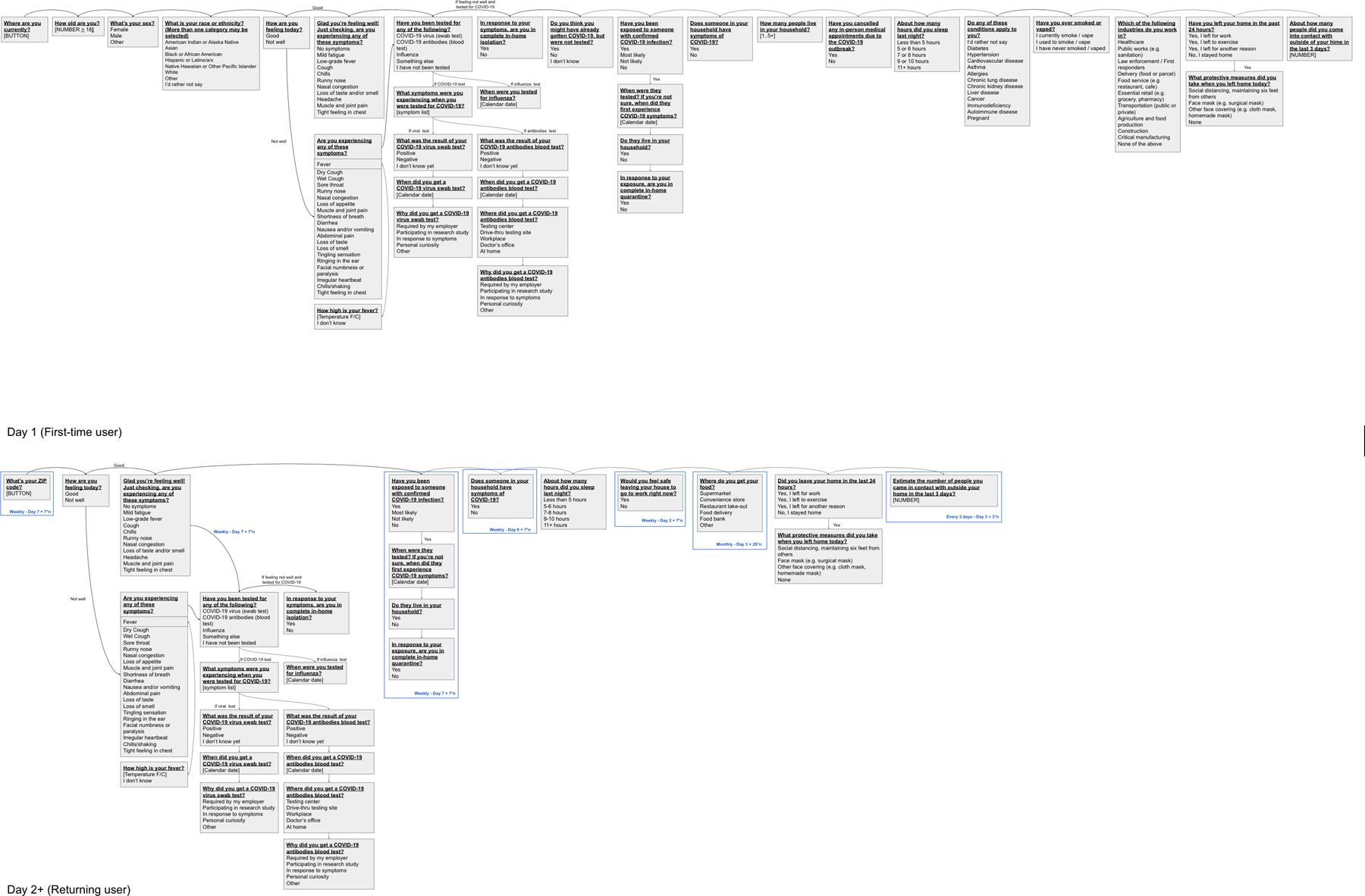
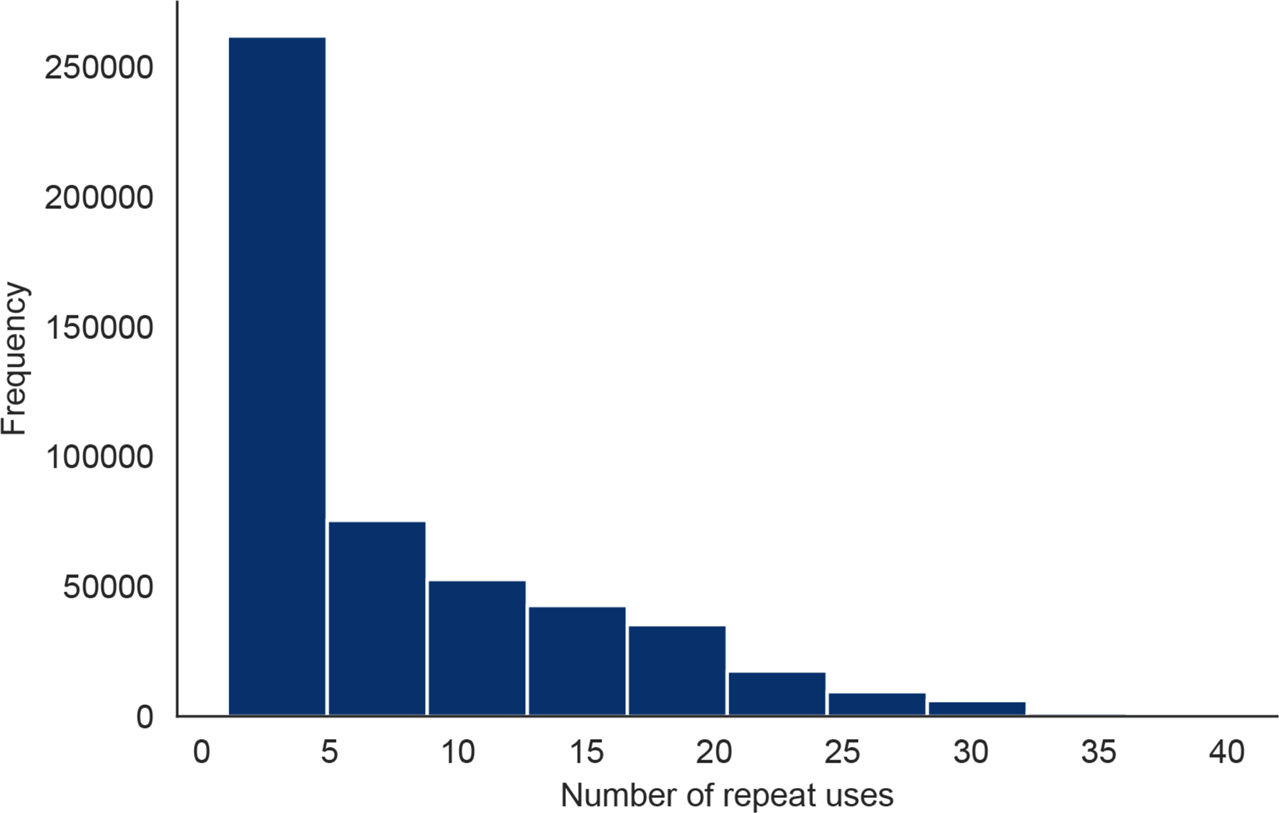
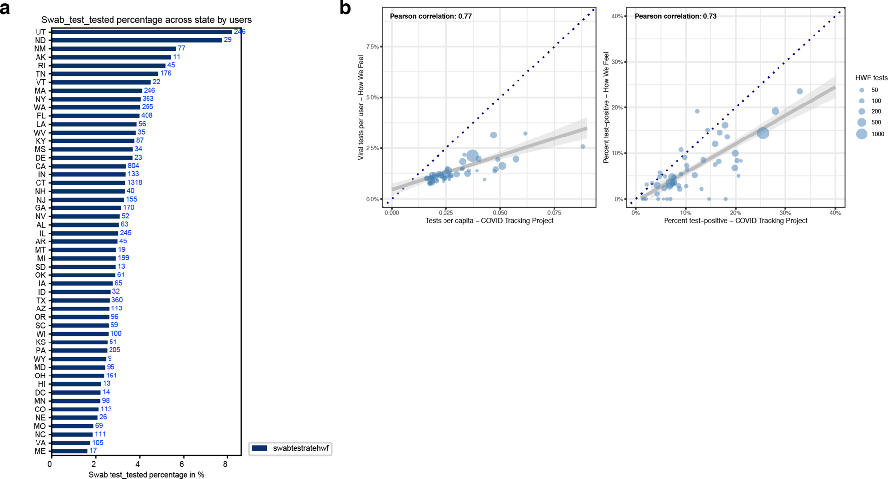
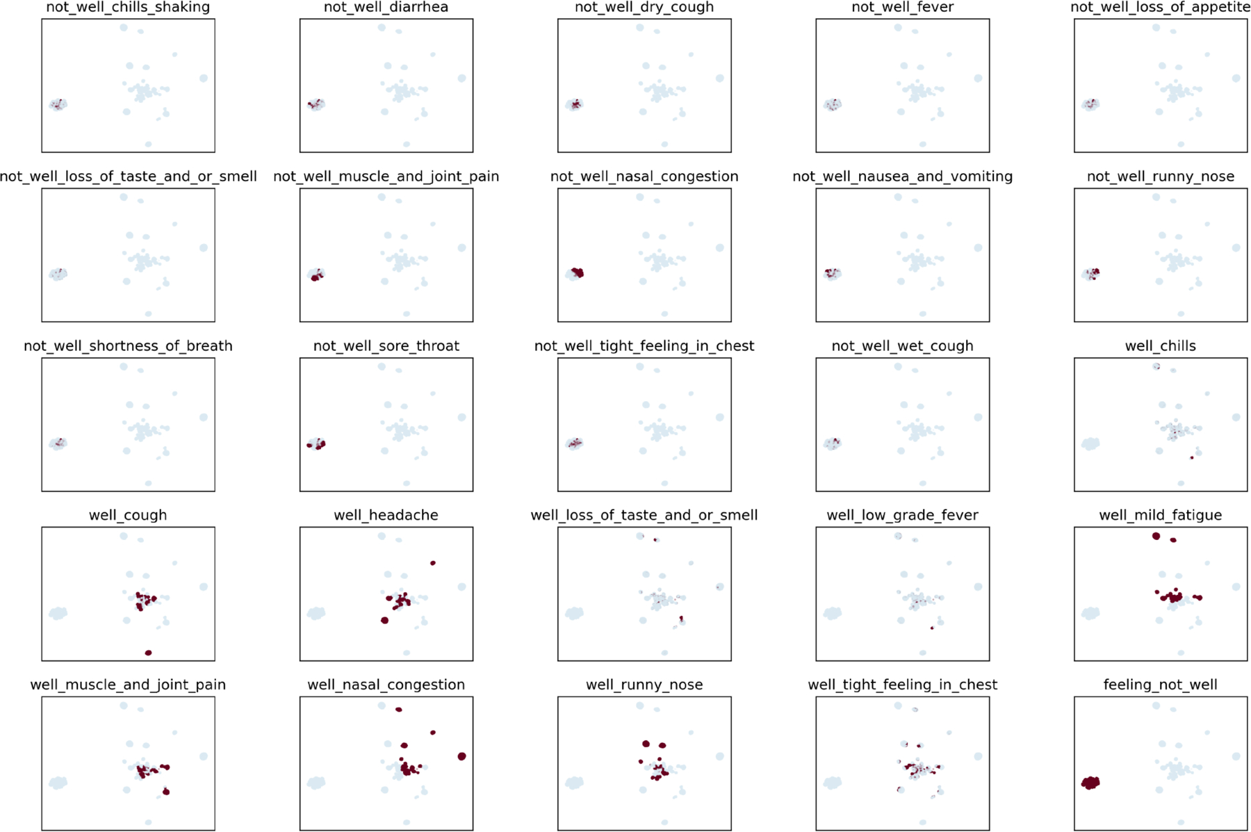
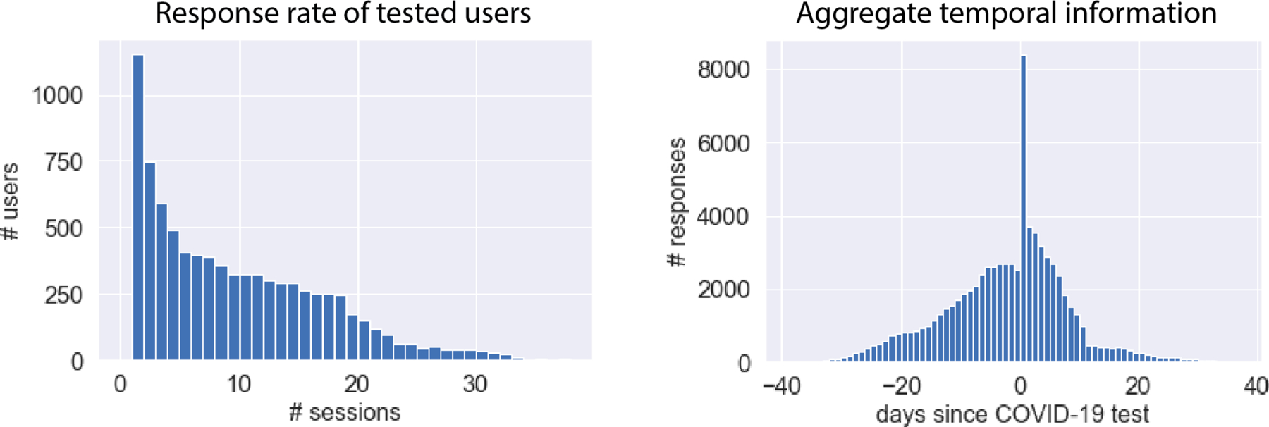
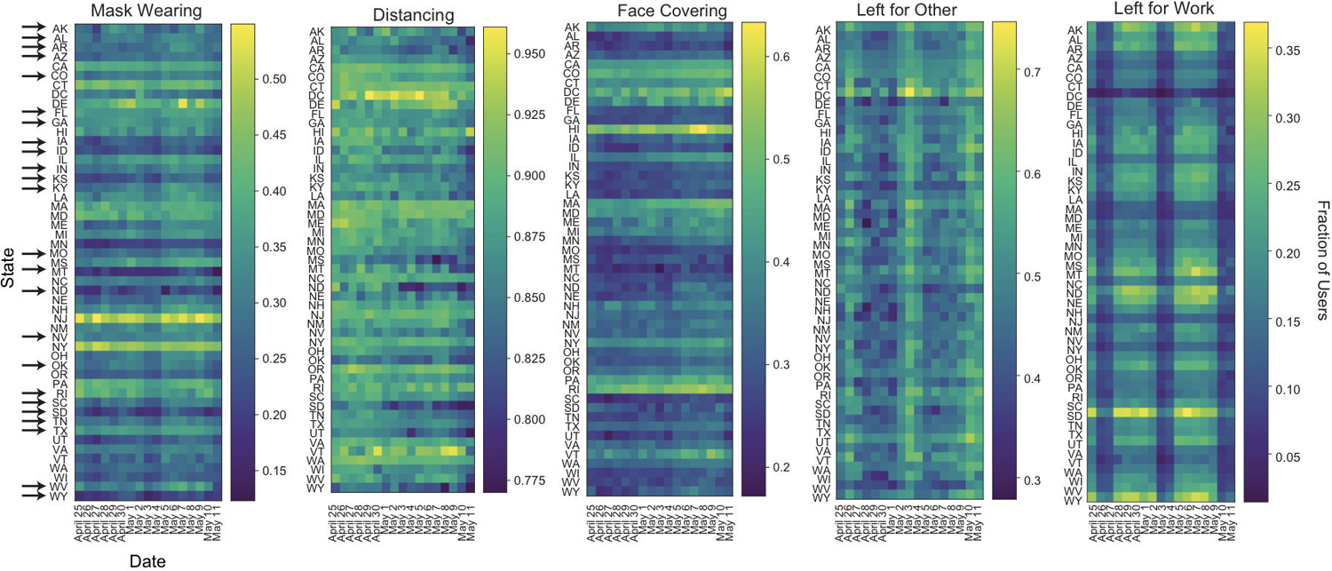
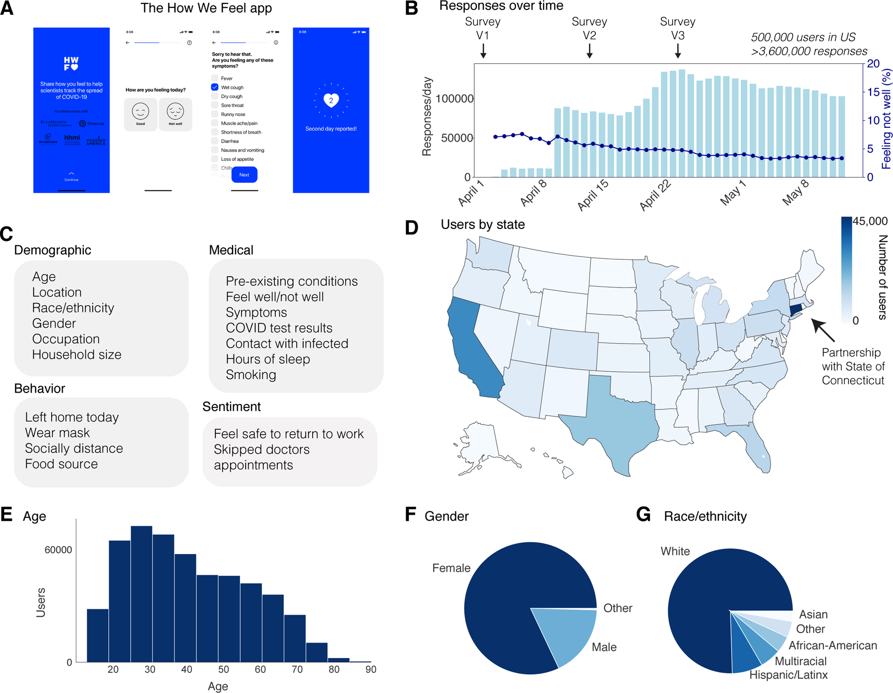
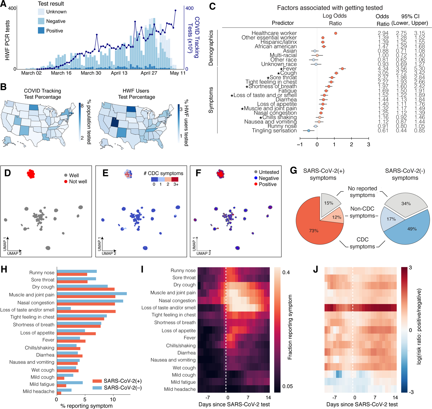
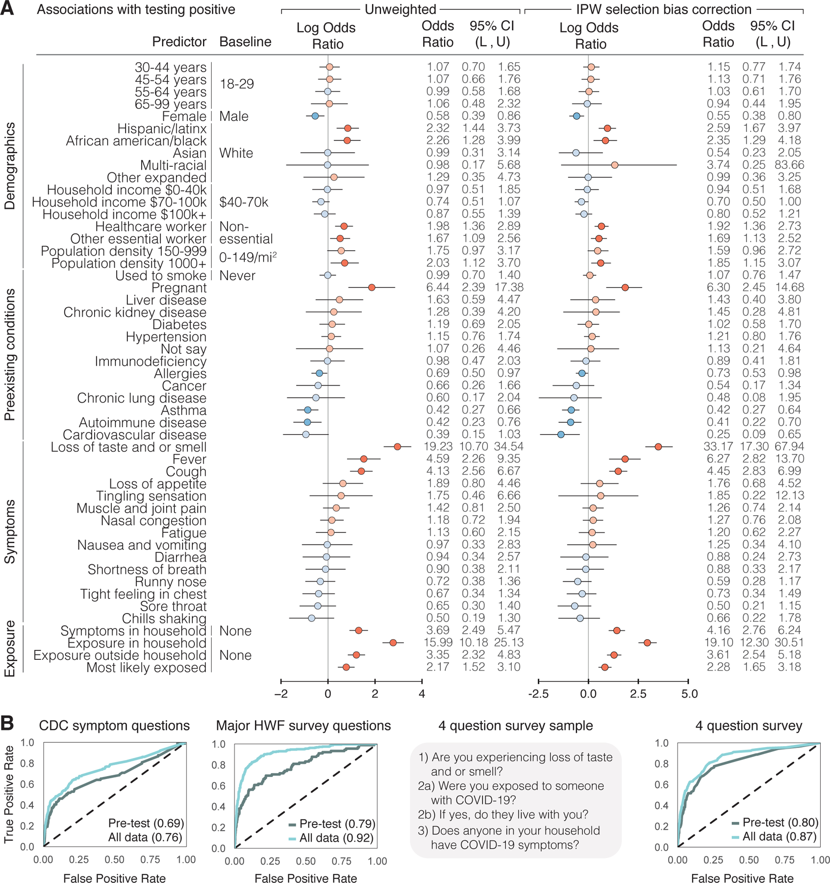
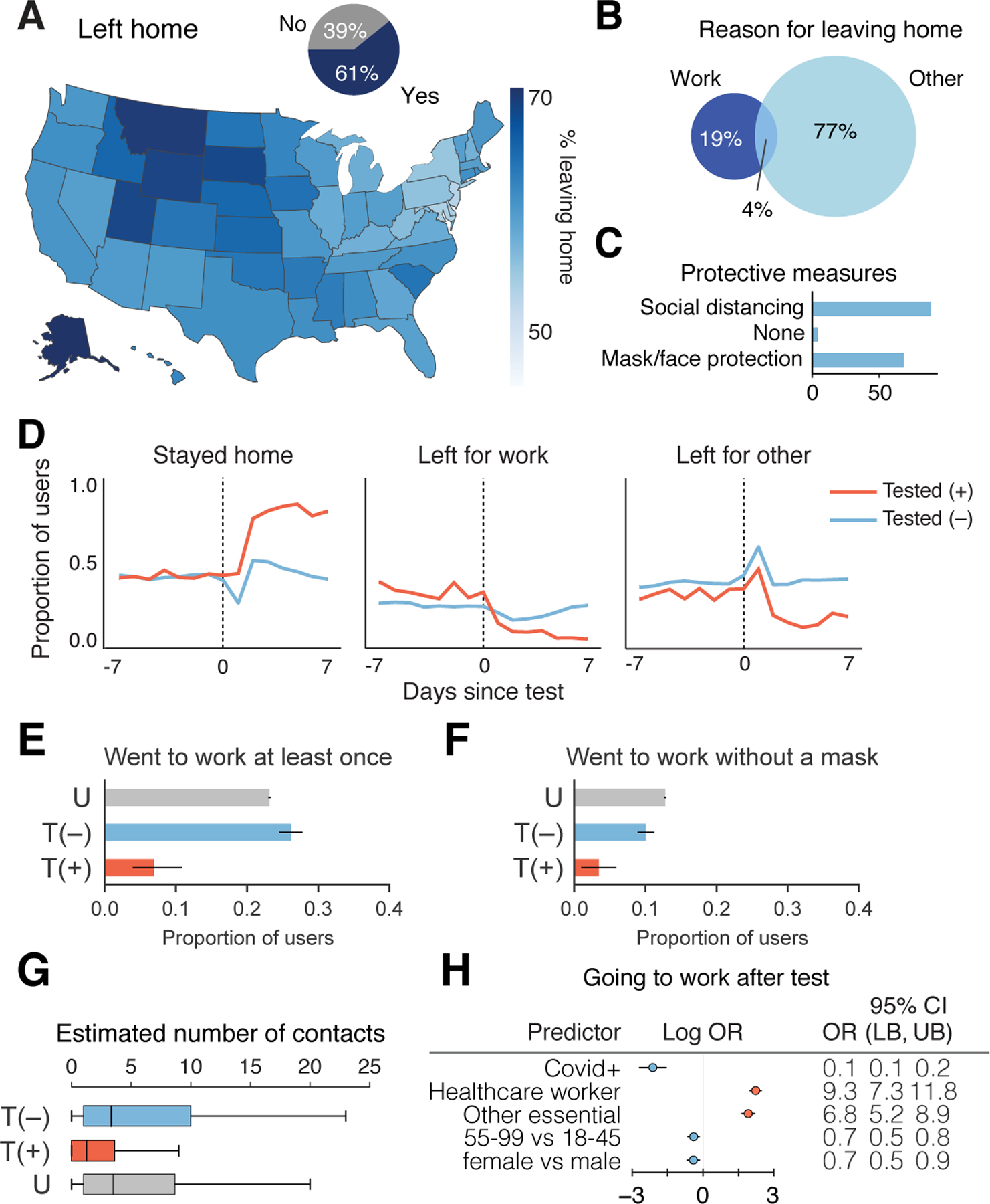
Despite the widespread implementation of public health measures, coronavirus disease 2019 (COVID-19) continues to spread in the United States. To facilitate an agile response to the pandemic, we developed How We Feel, a web and mobile application that collects longitudinal self-reported survey responses on health, behaviour and demographics. Here, we report results from over 500,000 users in the United States from 2 April 2020 to 12 May 2020. We show that self-reported surveys can be used to build predictive models to identify likely COVID-19-positive individuals. We find evidence among our users for asymptomatic or presymptomatic presentation; show a variety of exposure, occupational and demographic risk factors for COVID-19 beyond symptoms; reveal factors for which users have been SARS-CoV-2 PCR tested; and highlight the temporal dynamics of symptoms and self-isolation behaviour. These results highlight the utility of collecting a diverse set of symptomatic, demographic, exposure and behavioural self-reported data to fight the COVID-19 pandemic.


Conflict of interest statement

Competing Interests:

The authors declare no competing interests.

Figures

Extended Data Fig. 1
Extended Data Fig. 1. HWF Survey Structure
Flow of questions through the HWF survey V3 for both first time users and returning users.
Extended Data Fig. 2
Extended Data Fig. 2. Number of Repeat Uses Per HWF User
The number of times each HWF user checked into the app.
Extended Data Fig. 3
Extended Data Fig. 3. Analyses Regarding Receiving PCR-based Viral Tests
a, A univariate plot of the frequency of people receiving a PCR-based viral test in each state. b, Correlations of viral tests per person (left) and percent of tests with positive results (right) comparing state-level data from How We Feel to testing data collected by the COVID Tracking Project. Each point represents a state, and the size of the point scales continuously with the total number of viral tests reported to How We Feel. Tests with an unresolved result at time of analysis were excluded. Several sizes shown in legend for reference. The dark blue dotted line is the x=y line and represents the expectation if sampling was random with respect to testing and test-positive results. The gray line is the best-fit linear regression line (and 95% CI) weighted by the number of viral tests reported to How We Feel.
Extended Data Fig. 4
Extended Data Fig. 4. UMAP Visualization of Multivariate Self-Reported Symptom Structure
Plots show individual distributions for 25 self-reported symptoms on the UMAP embedding shown in main text Fig. 2.
Extended Data Fig. 5
Extended Data Fig. 5. HWF Usage Over Time Per COVID-19 Tested User.
Left: Response rate of tested users. COVID-19 HWF users provided between 1 and 39 responses each, with a mean of 9 responses per user. Right: Aggregate temporal information showing number of responses relative to COVID-19 test date. In aggregate, we obtains > 1,843 survey responses each day within a window of 7 days of the COVID-19 test.
Extended Data Fig. 6
Extended Data Fig. 6. COVID-19 Test-Result Prediction Model Comparisons.
Six classified models (heatmap rows) were trained to predict COVID-19 test results from survey data among users tested within the V3 survey (N=3,829; 315 positive; April 24 - May 12), as assessed by cross-validation AUC measurement. Hyperparameters were optimized by grid search. The input survey data was treated in a variety of ways with models trained on either: the average of responses provided before the test (pre-test), the average of responses provided from 10 days before to 14 days after the test (average), the weekly average in this window (week_bins_avg), or the weekly average after imputing missing responses by back-filling (week_bins_imp). The analysis was performed on three different feature sets: all survey features (N=133), symptoms only (N=56) or non-symptoms only (N=77). The overall most accurate classifier was XGBoost, which was used for the analysis in Fig. 3.
Extended Data Fig. 7
Extended Data Fig. 7. Results of Sensitivity Analyses for Biased Geographic Locations of Users and Demographics.
Comparison of testing outcome regression analysis between IPW corre ction alone and a, census based post-stratification + IPW correction and b, IPW correction on dataset with CT and CA users removed from the analysis. From left to right is 1) the comparison of the testing selection logistic regression model, 2) comparison of the predicted probability of getting tested using the testing selection logistic regression model, 3) comparison of the bootstrapped mean model coefficient from the testing outcome model, 4) comparison of the bootstrapped 95% confidence interval widths from the testing outcome model.
Extended Data Fig. 8
Extended Data Fig. 8. Firth regression sensitivity analysis.
a, Comparison of regression coefficients (left), p-values (center) and standard errors (right) from Firth regression (y-axis) vs. logistic regression from Fig. 2c in the manuscript (x-axis) for the model predicting which users would be tested. The dotted line is the identity (y = x) line. b, Comparison of regression coefficients (left), p-values (center) and standard errors (right) from Firth regression (y-axis) vs. unweighted logistic regression from Fig. 3a in the manuscript (x-axis) for the model predicting which users among the tested users would test positive. The dotted line is the identity (y = x) line.
Extended Data Fig. 9
Extended Data Fig. 9. Timecourse of User Behavior in Different States.
Time course of fraction of users in each state reporting wearing masks, socially distancing, covering their faces when leaving home, as well as leaving home for other reasons or for work from April 25 through May 11. Arrows indicate states that reopened before May 10. The wide dark bands in “Left for Work” and “Left for Other” correspond to weekends. Users per state: AK 487, AL 2590, AR 1858, AZ 5302, CA 28860, CO 6373, CT 45295, DC 749, DE 752, FL 12621, GA 6803, HI 702, IA 2797, ID 1483, IL 9799, IN 4882, KS 2476, KY 2879, LA 1882, MA 7174, MD 4696, ME 1242, MI 8157, MN 5269, MO 4544, MS 1176, MT 784, NC 7314, ND 451, NE 1508, NH 1425, NJ 5758, NM 1667, NV 2057, NY 11072, OH 8244, OK 2608, OR 4371, PA 9804, RI 1051, SC 3298, SD 551, TN 4513, TX 17088, UT 3755, VA 7239, VT 587, WA 7560, WI 4711, WV 1153, WY 440.
Figure 1:
Figure 1:. The How We Feel Application and User Base.
a, The How We Feel (HWF) app: longitudinal tracking of self-reported COVID-19-related data. b, Responses over time, as well as percentage of users reporting feeling unwell, with releases of major updates to survey indicated. c, Information collected by the HWF app. d, Users by state across the United States. e, Age distribution of users. Note: users had to be older than 18 to use the app. f, Distribution of self-reported sex. g, Distribution of self-reported race or ethnicity. Users were allowed to report multiple races. “Multiracial” = the user indicated more than one category. “Other” includes American Indian/Alaskan Native and Hawaiian/Pacific Islander, as well as users who selected “Other”.
Figure 2:
Figure 2:. SARS-CoV-2 PCR Testing and Symptoms.
a, Stacked bar plot of user-reported test results over time, overlaid with official number of tests across US based on COVID Tracking Project data. N = 4,759 users who took the V3 survey and reported a test result, out of 277,151 users. b, Left: Map of per-capita test rates across the United States. Right: Map of COVID-19 tests per number of users by state. c, Associations of professions and symptoms with receiving a SARS-CoV-2 PCR test, adjusted for demographics and other covariates (Methods). Common symptoms listed by the CDC are starred. N = 4,759 users with a reported test within 14 days of a survey response out of 277,151 users. d-f, UMAP visualization of 667,651 multivariate symptom responses among HWF users that reported at least one symptom. Coloring indicates: d, responses according to users feeling well; e, the reported number of COVID-19 symptoms listed by the CDC; and f, the COVID-19 test result among tested users. g, Proportion of positive COVID-19 patients (red) and negative COVID-19 patients (blue) experiencing either CDC-common symptoms (dark), only non-CDC symptoms (light), or no symptoms (grey) on the day of their test. N = 1,170 positive users, 8,892 negative users who reported a test result between April 2 and May 12, 2020. h, Histogram of reported symptoms among COVID-19 tested users. i, Longitudinal self-reported symptoms from users that tested positive for COVID-19. Dates are centered on the self-reported test-date. j, Ratio of symptoms comparing users that test positive versus test negative for COVID-19.
Figure 3:
Figure 3:. SARS-CoV-2 PCR Test Result Associations and Predictions.
a, Factors associated with respondents receiving and reporting a positive test result, as determined through logistic regression. Left: results from unweighted model. Right: results from model incorporating selection probabilities via inverse probability weights (IPW). Reference categories are indicated where relevant, and when not indicated, the reference is not having that specific feature. Log odds ratios and their confidence intervals are plotted, with red indicating positive association and blue indicating negative association. Darker colors indicate confidence intervals that do not cover 0. Population density and neighborhood household income were approximated using the county level data. L = lower bound, U = upper bound of 95% confidence intervals. N = 3,829 users, 315 positive, 3,514 negative who took the V3 survey within ±2 weeks of receiving a test. b, Prediction of positive test results using ±2 weeks of data from test date, using 5-fold cross validation, shown as receiver operating characteristic (ROC) curves. The XGBoost model was trained on different subsets of questions: CDC Symptom Questions = using just the subset of COVID-19 symptoms listed by the CDC. All Survey Questions = using the entire survey. 4 Question survey = using a reduced set of 4 questions that were found to be highly predictive. Numerical values are AUC = area under the ROC curve. N = 3,829 users.
Figure 4:
Figure 4:. Behavioral Factors Potentially Contributing to COVID-19 Spread.
a, Proportion of responses indicated users leaving home across US (map) or overall (inset pie chart). N = 1,934,719 responses from 279,481 users. b, Percentage of responses of users reporting work or other reason for leaving home. N = 1,176,360 responses from 244,175 users. c, Reported protective measures taken per response taken by users upon leaving home. N = 1,176,360 responses from 244,175 users. d, Time course of proportion of SARS-CoV-2 PCR tested positive (+) or negative (−) users staying home, leaving for work, and leaving for other reasons. N=4,396 total users who reported being tested positive or negative in the V3 survey and responded on at least one day within ±1 week of being tested. e–f, Proportion SARS-CoV-2 PCR tested (+) or (−), or untested (U), going to work (e) (N=14 out of 203 positive, 664 out of 2,533 negative, 62,483 out of 269,833 untested), going to work without a mask (f) (N=7 out of 203 positive, 255 out of 2,533 negative, 34,481 out of 269,833 untested) who responded within the 2–7 days post test for T = tested, or 3 weeks since last check in for U = untested. Healthcare workers and other essential workers are compared to non-essential workers as the baseline. g, Average reported number of contacts per 3 days in the 2–7 days after their test date. T(+), N=138 users; T(−), N=2,269 users; U, N=254,751 users. OR = odds ratio, LB = lower bound, UB = upper bound, CI = confidence interval, T = tested, P = positive, U = untested. h, Logistic regression analysis of factors contributing to users going to work in the 2–7 days after their COVID-19 test N=678 users going to work out of 2,736 users with definitive test outcome and survey responses in the 2–7 days after their test date.

Update of

References

    1. Zhou P et al. A pneumonia outbreak associated with a new coronavirus of probable bat origin. Nature 579, 270–273 (2020). - PMC - PubMed
    1. Wölfel R et al. Virological assessment of hospitalized patients with COVID-2019. Nature 1–10 (2020). doi:10.1038/s41586-020-2196-x - DOI - PubMed
    1. Sanche S et al. High Contagiousness and Rapid Spread of Severe Acute Respiratory Syndrome Coronavirus 2. Emerg. Infect. Dis. J 26, (2020). - PMC - PubMed
    1. Schuchat A Public Health Response to the Initiation and Spread of Pandemic COVID-19 in the United States, February 24–April 21, 2020. MMWR. Morb. Mortal. Wkly. Rep 69, 551–556 (2020). - PMC - PubMed
    1. Kraemer MUG et al. The effect of human mobility and control measures on the COVID-19 epidemic in China. Science (80-. ) (2020). doi:10.1126/science.abb4218 - DOI - PMC - PubMed

Publication types

MeSH terms