. 2020 Sep 5;20(1):1362.
doi: 10.1186/s12889-020-09461-3.

Spatial distribution of incomplete immunization among under-five children in Ethiopia: evidence from 2005, 2011, and 2016 Ethiopian Demographic and health survey data

Affiliations

Spatial distribution of incomplete immunization among under-five children in Ethiopia: evidence from 2005, 2011, and 2016 Ethiopian Demographic and health survey data

Mequannent Sharew Melaku et al. BMC Public Health. .

Abstract

Background: An estimate of 2-3 million children under 5 die in the world annually due to vaccine-preventable disease. In Ethiopia, incomplete immunization accounts for nearly 16% of under-five mortality, and there is spatial variation for vaccination of children in Ethiopia. Spatial variation of vaccination can create hotspot of under vaccination and delay control and elimination of vaccine preventable disease. Thus, this study aims to assess the spatial distribution of incomplete immunization among children in Ethiopia from the three consecutive Ethiopia demographic and health survey data.

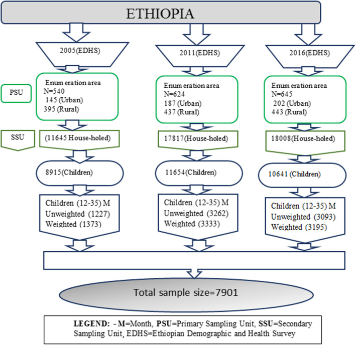
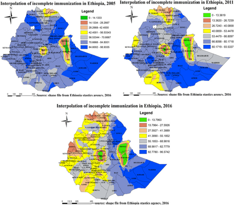
Method: A cross-sectional study was employed from Ethiopia demographic and health survey (2005, 2011and 2016) data. In total, 7901mothers who have children aged (12-35) months were included in this study. ArcGIS 10.5 Software was used for global and local statistics analysis and mapping. In addition, a Bernoulli model was used to analyze the purely spatial cluster detection of incomplete immunization. GWR version 4 Software was used to model spatial relationships.

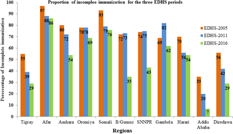
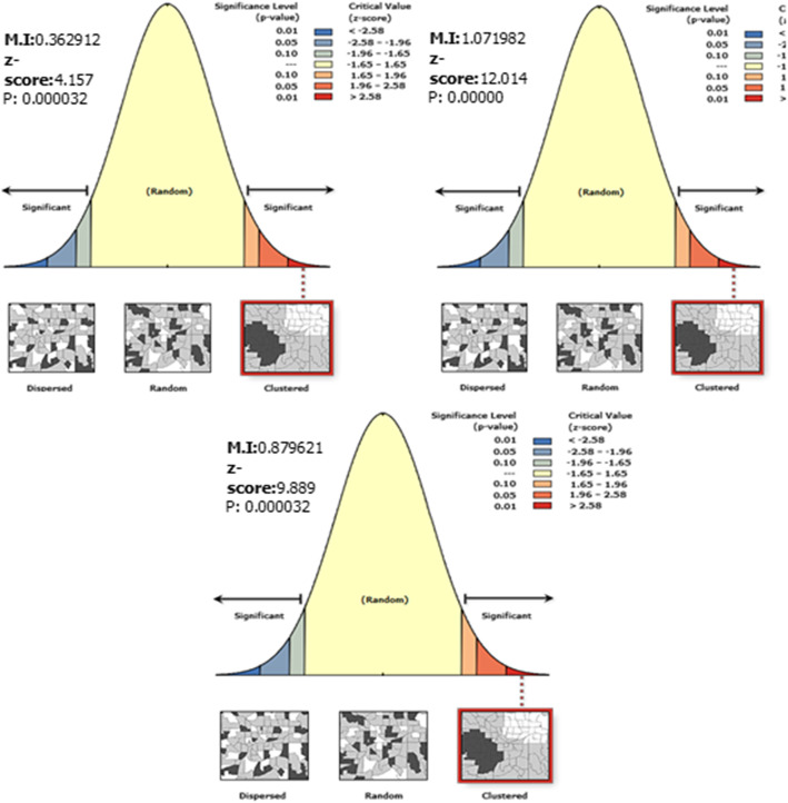
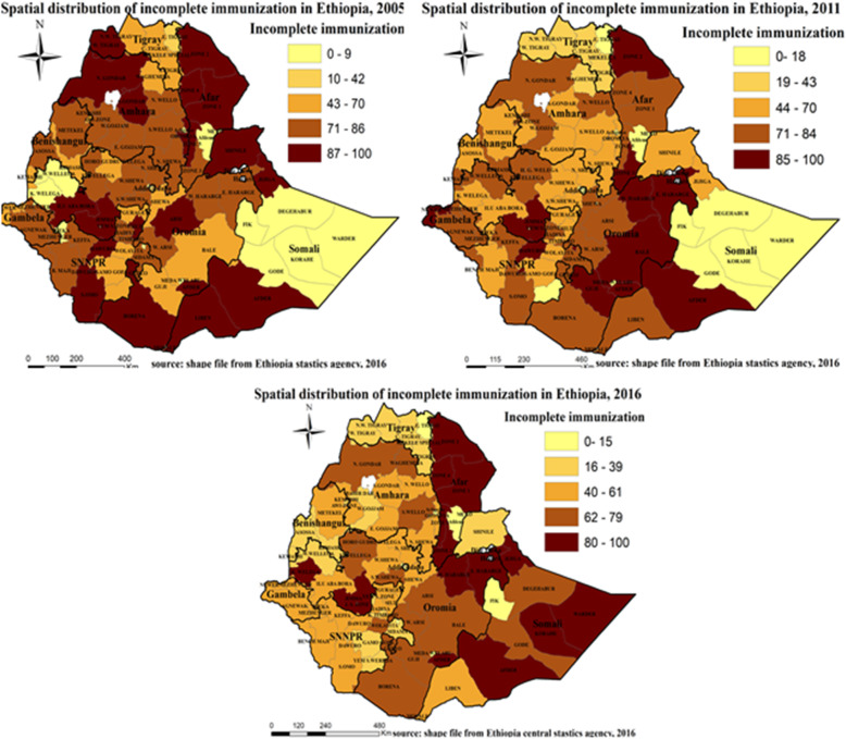
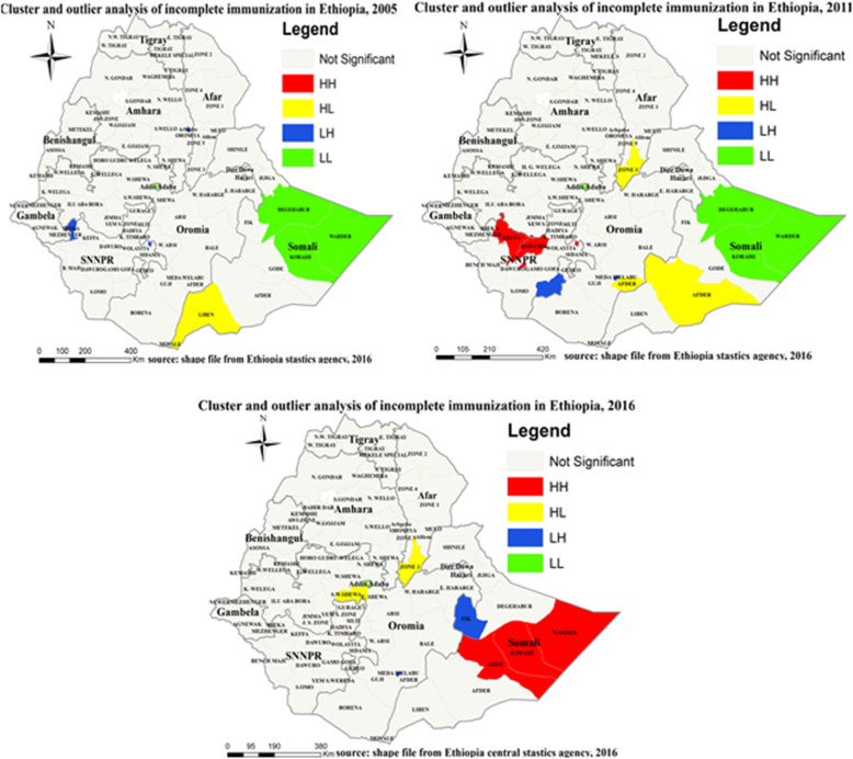
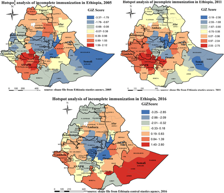
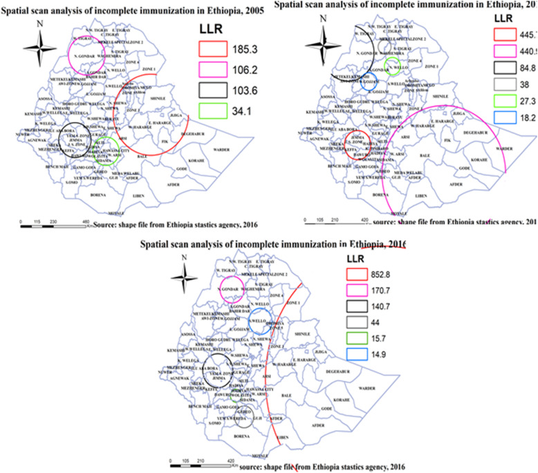
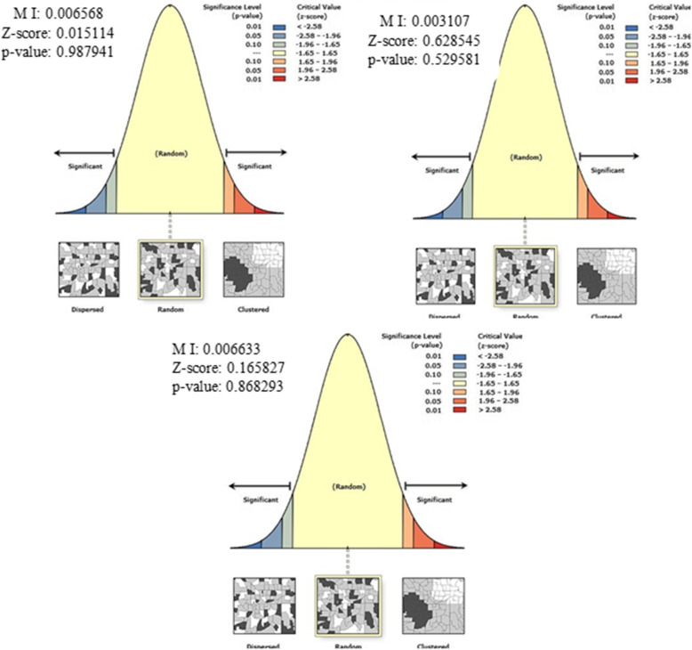
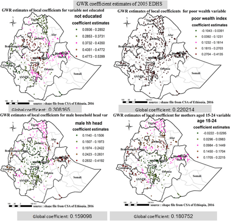
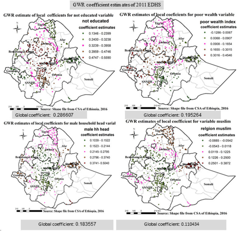
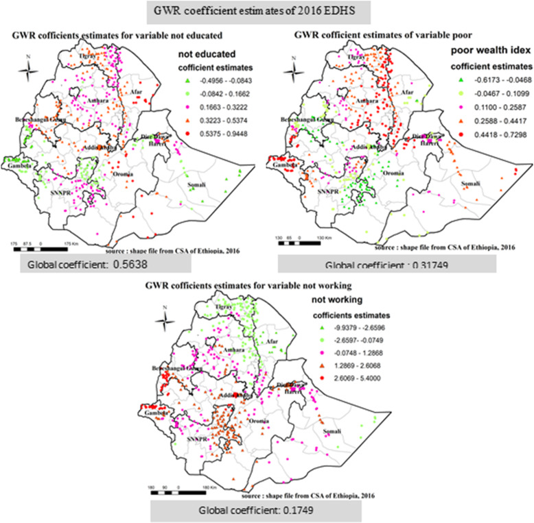
Result: The proportion of incomplete immunization was 74.6% in 2005, 71.4% in 2011, and 55.1% in 2016. The spatial distribution of incomplete immunization was clustered in all the study periods (2005, 2011, and 2016) with global Moran's I of 0.3629, 1.0700, and 0.8796 respectively. Getis-Ord analysis pointed out high-risk regions for incomplete immunization: In 2005, hot spot (high risk) regions were detected in Kefa, Gamogofa, KembataTemibaro, and Hadya zones of SNNPR region, Jimma zone of Oromiya region. Similarly, Kefa, Gamogofa, Kembatatemibaro, Dawuro, and Hadya zones of SNNPR region; Jimma and West Arsi zones of Oromiya region were hot spot regions. In 2016, Afder, Gode, Korahe, Warder Zones of Somali region were hot spot regions. Geographically weighted regression identified different significant variables; being not educated and poor wealth index were the two common for incomplete immunization in different parts of the country in all the three surveys.

Conclusion: Incomplete immunization was reduced overtime across the study periods. The spatial distribution of incomplete immunization was clustered and High-risk areas were identified in all the study periods. Predictors of incomplete immunization were identified in the three consecutive surveys.

Keywords: Associated factors; Ethiopia; Incomplete immunization; Spatial distribution.


Conflict of interest statement

The authors declare that they have no competing interest.

Figures

Fig. 1
Fig. 1
Map of the study area [Shape file source: CSA, 2013; URL: https://africaopendata.org/dataset/ethiopia-shapefiles]
Fig. 2
Fig. 2
Sampling procedure
Fig. 3
Fig. 3
Regional variation of incomplete immunization in Ethiopia
Fig. 4
Fig. 4
Spatial autocorrelation of incomplete immunization in Ethiopia, EDHS 2005, 2011 and 2016. The right panel represents for 2005 EDHS, the middle panel represents for 2011 EDHS, and the left panel represents for 2016 EDHS. The right part of the panel indicates dispersed, the central part of the panel indicates random, and the left part of the panel indicates clustered. In this study incomplete immunization is clustered in all periods. The clustered pattern on the right side of the panels indicates that high rate of incomplete immunization over the study periods the output has automatically generated keys on the upper right side of the panel as well as in the underneath reveals that: there is less than 1% likelihood that this clustered pattern could be the result of random chance. [Shape file source: (CSA, 2013; https://africaopendata.org/dataset/ethiopia-shapefiles); Map output: Own analysis using ArcGIS 10.7 Software]
Fig. 5
Fig. 5
Spatial distribution of incomplete immunization in Ethiopia, EDHS 2005, 2011 and 2016. Spatial distribution of incomplete immunization in Ethiopia from Ethiopian demographic and health survey. The right panel represents for 2005 EDHS, and the left panel represents for 2011 EDHS the right bottom panel represents for 2016 EDHS. In the figure the damp gray color indicates very high clustering, the bright gray color indicates high clustering, the damp yellow color indicates moderate clustering, the bright yellow color indicates low clustering, and the whitish yellow color indicates very low clustering of incomplete immunization cases. The thick white black line indicates regional borders while the thin white black line indicates zonal borders. [Shape file source: (CSA, 2013; URL: https://africaopendata.org/dataset/ethiopia-shapefiles); Map output: Own analysis using ArcGIS 10.7 Software]
Fig. 6
Fig. 6
Cluster and outlier analysis of incomplete immunization in Ethiopia, EDHS 2005, 2011 and 2016. Local Moran’s I analysis result of incomplete immunization in Ethiopia from Ethiopian demographic and health survey. The right panel represents for 2005 EDHS, and the left panel represents for 2011 EDHS the right bottom panel represents for 2016 EDHS. In the figure the red color indicates high clustering, the yellow color indicates high outlier clustering, the blue color indicates low outlier clustering, and the green color indicates low clustering the fogy color indicates insignificant clustering. The thick white black line indicates regional borders while the thin white black line indicates zonal borders. [Shape file source: (CSA, 2013; URL: https://africaopendata.org/dataset/ethiopia-shapefiles); Map output: Own analysis using ArcGIS 10.7 Software]
Fig. 7
Fig. 7
Gettis-Ord analysis of incomplete immunization in Ethiopia, EDHS 2005, 2011 and 2016. Gettis-Ord Gi* local Hotspot analysis result of incomplete immunization in Ethiopia from Ethiopian demographic and health survey. The right panel represents for 2005 EDHS, and the left panel represents for 2011 EDHS the right bottom panel represents for 2016 EDHS. In the figure the red color indicates high hotspot zones, the blue color indicates cold spot zones, the whitish yellow color indicates insignificant clustering of incomplete immunization. The thick black line indicates regional borders, while the thin white black line indicates zonal borders. [Shape file source: (CSA, 2013; URL: https://africaopendata.org/dataset/ethiopia-shapefiles); Map output: Own analysis using ArcGIS 10.7 Software]
Fig. 8
Fig. 8
Spatial interpolation of incomplete immunization in Ethiopia, EDHS 2005, 2011 and 2016. Kriging interpolation analysis result of incomplete immunization in Ethiopia from Ethiopian demographic and health survey. The right panel represents for 2005 EDHS, and the left panel represents for 2011 EDHS the right bottom panel represents for 2016 EDHS. In the figure the blue, bright blue, bright black color indicates high risk zones depending on its intensity, the yellow color indicates moderate risk, and the green, gray, bright color indicates low risk zones of incomplete immunization in Ethiopia. The thin black line indicates zonal borders. [Shape file source: (CSA, 2013; URL: https://africaopendata.org/dataset/ethiopia-shapefiles); Map output: Own analysis using ArcGIS 10.7 Software]
Fig. 9
Fig. 9
Spatial scan statistics analysis of incomplete immunization in Ethiopia, EDHS 2005, 2011 and 2016. Spatial scan statistics analysis result of incomplete immunization in Ethiopia from Ethiopian demographic and health survey. The right panel represents for 2005 EDHS, and the left panel represents for 2011 EDHS the right bottom panel represents for 2016 EDHS. In the figure the red color rings indicates primary spatial window, the rose, black, bright black, green and blue colored ring indicates secondary spatial windows. The blue line indicates zonal borders. [Shape file source: (CSA, 2013; URL: https://africaopendata.org/dataset/ethiopia-shapefiles); Map output: Own analysis using SatScan 9.6 Software]
Fig. 10
Fig. 10
Spatial analysis of Geographic Weighted Regression in Ethiopia, EDHS 2005, 2011 and 2016 EDHS 2005, 2011 and 2016. The right panel represents for 2005 EDHS, the middle panel represents for 2011 EDHS, and the left panel represents for 2016 EDHS. The right part of the panel indicates dispersed, the central part of the panel indicates random, and the left part of the panel indicates clustered. In this study, residuals of GWR are distributed randomly in all periods. The random pattern on the middle side of the panels indicates that spatially uncorrelated residuals in GWR analysis of the study periods. The output has automatically generated keys on the upper right side of the panel as well as in the underneath reveals that; the pattern does not appear to be significantly different than random. [Shape file source: (CSA, 2013; URL: https://africaopendata.org/dataset/ethiopia-shapefiles); Map output: Own analysis using ArcGIS 10.7 Software]
Fig. 11
Fig. 11
Geographic Weighted Regression analysis in Ethiopia, EDHS 2005 EDHS 2005, 2011 and 2016. Geographically weighted regression (GWR) analysis result of explanatory variables (not educated, poor wealth index, mothers aged 15–24, and male household head) with incomplete immunization in Ethiopia from Ethiopian demographic and health survey 2005. Each point in the map represents one enumeration area which has a lots of incomplete immunization cases. The right panel represents for not educated, the left panel represents for poor wealth index, and the right bottom panel represents for male household head and the right bottom panel represents for mothers aged 15–24. In the figure the bright red color indicates high magnitude of coefficient estimates, the green color indicates low magnitude of coefficient estimates, and the rose color indicates medium magnitude of coefficient estimates. The thick black line indicates regional borders while the thin white black line indicates zonal borders. [Shape file source: (CSA, 2013; URL: https://africaopendata.org/dataset/ethiopia-shapefiles); Map output: Own analysis using GWR 4.0 Software]
Fig. 12
Fig. 12
Geographic Weighted Regression analysis in Ethiopia, EDHS 2011 EDHS 2005, 2011 and 2016. Geographically weighted regression (GWR) analysis result of explanatory variables (not educated, poor wealth index, Muslim religion, and male household head) with incomplete immunization in Ethiopia from Ethiopian demographic and health survey 2011. Each point in the map represents one enumeration area which has a lot of incomplete immunization cases. The right panel represents for not educated, the left panel represents for poor wealth index, and the right bottom panel represents for male household head and the right bottom panel represents for Muslim religion. In the figure the bright red color indicates high magnitude of coefficient estimates, the green color indicates low magnitude of coefficient estimates, and the rose color indicates medium magnitude of coefficient estimates. The thick black line indicates regional borders while the thin white black line indicates zonal borders. [Shape file source: (CSA, 2013; URL: https://africaopendata.org/dataset/ethiopia-shapefiles); Map output: Own analysis using GWR 4.0 software]
Fig. 13
Fig. 13
Geographic Weighted Regression analysis in Ethiopia, EDHS 2016 EDHS 2005, 2011 and 2016. Geographically weighted regression (GWR) analysis result of explanatory variables (not educated, poor wealth index, and not working) with incomplete immunization in Ethiopia from Ethiopian demographic and health survey 2016. Each point in the map represents one enumeration area which has a lot of incomplete immunization cases. The right panel represents for not educated, the left panel represents for poor wealth index, and the right bottom panel represents for not working. In the figure the bright red color indicates high magnitude of coefficient estimates, the green color indicates low magnitude of coefficient estimates, the rose color indicates medium magnitude of coefficient estimates, the thick black line indicates regional borders while the thin white black line indicates zonal borders. [Shape file source: (CSA, 2013; URL: https://africaopendata.org/dataset/ethiopia-shapefiles); Map output: Own analysis using GWR 4.0 Software]

Similar articles

Cited by

References

    1. Gentile A, et al. Pediatric disease burden and vaccination recommendations: understanding local differences. Int J Infect Dis. 2010;14(8):e649–e658. - PubMed
    1. Bofarraj, M.A., Knowledge, attitude and practices of mothers regarding immunization of infants and preschool children at Al-Beida City, Libya 2008. Egyptian Journal of Pediatric Allergy and Immunology (The), 2011. 9(1).
    1. Masud T, Navaratne KV. The expanded program on immunization in Pakistan: recommendations for improving performance. 2012.
    1. Burton A, et al. WHO and UNICEF estimates of national infant immunization coverage: methods and processes. Bull World Health Organ. 2009;87:535–541. - PMC - PubMed
    1. Ortiz JR, et al. A global review of national influenza immunization policies: analysis of the 2014 WHO/UNICEF joint reporting form on immunization. Vaccine. 2016;34(45):5400–5405. - PMC - PubMed