. 2020 Sep 7;11(1):4439.
doi: 10.1038/s41467-020-18297-9.

Developing a COVID-19 mortality risk prediction model when individual-level data are not available

Affiliations

Developing a COVID-19 mortality risk prediction model when individual-level data are not available

Noam Barda et al. Nat Commun. .

Abstract

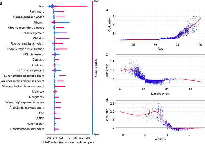
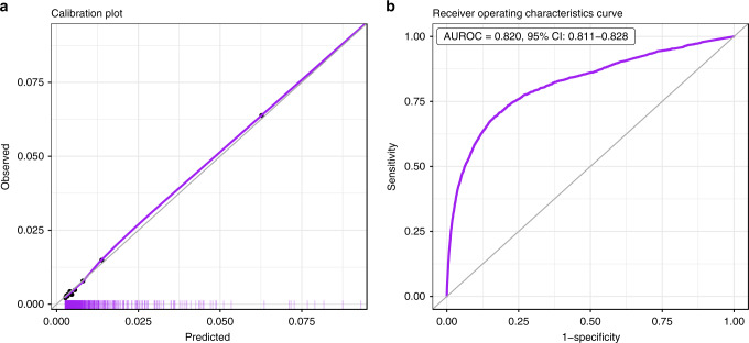
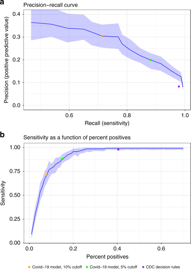
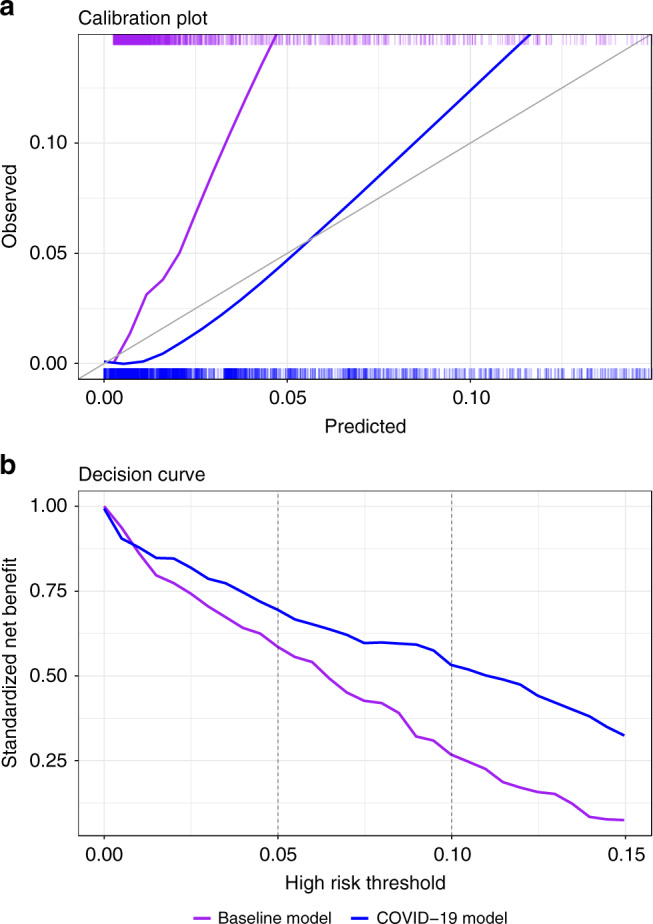
At the COVID-19 pandemic onset, when individual-level data of COVID-19 patients were not yet available, there was already a need for risk predictors to support prevention and treatment decisions. Here, we report a hybrid strategy to create such a predictor, combining the development of a baseline severe respiratory infection risk predictor and a post-processing method to calibrate the predictions to reported COVID-19 case-fatality rates. With the accumulation of a COVID-19 patient cohort, this predictor is validated to have good discrimination (area under the receiver-operating characteristics curve of 0.943) and calibration (markedly improved compared to that of the baseline predictor). At a 5% risk threshold, 15% of patients are marked as high-risk, achieving a sensitivity of 88%. We thus demonstrate that even at the onset of a pandemic, shrouded in epidemiologic fog of war, it is possible to provide a useful risk predictor, now widely used in a large healthcare organization.


Conflict of interest statement

The authors declare no competing interests.

Figures

Fig. 1
Fig. 1. Summary and feature-specific SHAP values for the baseline model.
a A summary plot of the SHAP values for each feature. Going from top to bottom, features are ordered by their overall importance in creating the final prediction (sum of SHAP values). In each feature (line), every point is a specific case (individual), with colors ranging from red (high values of the predictor) to blue (low values of the predictor). Gray points signal missing values. The point’s location on the X-axis represents the SHAP value—the effect the variable had on the prediction in this specific individual, with points further to the right marking that for that individual this covariate contributed to increasing of the risk and points to the left indicate that the covariate contributed to decreasing the risk. The vertical line in the middle represents no change in risk. b A plot of the odds ratio for different values of age. A smoothed red line is fit to the curve and a horizontal gray line is drawn at odds ratio = 1. c A plot of the odds ratio for different values of percent of lymphocytes in the blood. A smoothed red line is fit to the curve and a horizontal gray line is drawn at odds ratio = 1. d A plot of the odds ratio for different values of albumin. A smoothed red line is fit to the curve and a horizontal gray line is drawn at odds ratio = 1. a is based on the training set of the baseline population, n = 625,500 unique patients. bd use a random sample of patients from this same population, n = 10,000 unique patients. SHAP SHapley Additive exPlanations, HDL high-density lipoprotein, COPD chronic obstructive pulmonary disease.
Fig. 2
Fig. 2. Performance charts for the baseline model.
a Calibration plot, plotting the observed outcome against the predicted probabilities. The diagonal gray line represents perfect calibration. A smoothed line is fit to the curve, and points are drawn to represent the averages in ten discretized bins. The rug under the plot illustrates the distribution of predictions. b Receiver-operating characteristics curve, plotting the sensitivity against one minus specificity for different values of the threshold. The diagonal gray line represents a model with no discrimination. The area under the curve, with its 95% confidence interval, is shown on the top-left. Both panels use the test population of the baseline model, n = 315,000 unique patients. AUROC area under the receiver-operating characteristics curve, CI confidence interval.
Fig. 3
Fig. 3. Performance charts for the COVID-19 model.
a A plot of the positive predictive value against the sensitivity of the predictor for different thresholds. The central line represents the point estimates from the full population. The light band around the line represents point-wise 95% confidence intervals derived by bootstrapping. Only thresholds up to 15% absolute risk were plotted because of very low outcome rates in higher thresholds, which resulted in instability. The colored dots show the performance of three binary classifiers. b A plot of the sensitivity against the percent of patients identified as high risk for different thresholds. The central line represents the point estimates from the full population. The light band around the line represents point-wise 95% confidence intervals derived by bootstrapping. The colored dots show the performance of three binary classifiers. Both panels use the COVID-19 patient population, n = 4179 unique patients. CDC Centers for Disease Control and prevention, COVID-19 coronavirus disease 2019.
Fig. 4
Fig. 4. Calibration plot and decision curves comparing the COVID-19 and baseline models.
a Calibration plots plotting the observed outcome against the predicted probabilities of both models. The diagonal gray line represents perfect calibration. A smoothed line is fit to each curve. The rug above and under the plots illustrates the distribution of predictions for each model. The plot covers 95% of COVID-19 predictions. b The decision curve plots the standardized net benefit against different decision thresholds for both models. Net benefit is a measure of utility that calculates a weighted sum of true positives and false positives, weighted according to the threshold. Vertical dashed lines were added at relevant decision thresholds that were used in practice. Both panels use the COVID-19 patient population, n = 4179 unique patients. COVID-19 coronavirus disease 2019.

References

    1. Mahase E. Coronavirus covid-19 has killed more people than SARS and MERS combined, despite lower case fatality rate. BMJ. 2020;368:m641. doi: 10.1136/bmj.m641. - DOI - PubMed
    1. Ranney ML, Griffeth V, Jha AK. Critical supply shortages—the need for ventilators and personal protective equipment during the Covid-19 pandemic. N. Engl. J. Med. 2020;382:e41. doi: 10.1056/NEJMp2006141. - DOI - PubMed
    1. Wu JT, et al. Estimating clinical severity of COVID-19 from the transmission dynamics in Wuhan, China. Nat. Med. 2020;26:506–510. doi: 10.1038/s41591-020-0822-7. - DOI - PMC - PubMed
    1. Centers for Disease Control and Prevention. People Who Are at Higher Risk for Severe Illness, Vol. 2020 (Centers for Disease Control and Prevention, 2020). https://www.cdc.gov/coronavirus/2019-ncov/need-extra-precautions/people-....
    1. Chen JH, Asch SM. Machine learning and prediction in medicine—beyond the peak of inflated expectations. N. Engl. J. Med. 2017;376:2507–2509. doi: 10.1056/NEJMp1702071. - DOI - PMC - PubMed

Publication types

MeSH terms