

This is a preprint.
Semi-parametric modeling of SARS-CoV-2 transmission using tests, cases, deaths, and seroprevalence data
- PMID: 32908946
- PMCID: PMC7480029
Semi-parametric modeling of SARS-CoV-2 transmission using tests, cases, deaths, and seroprevalence data
Abstract
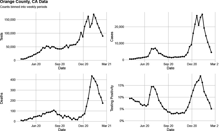
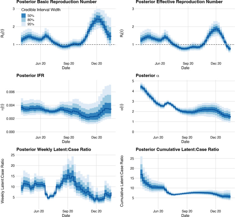
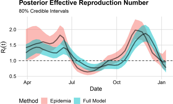
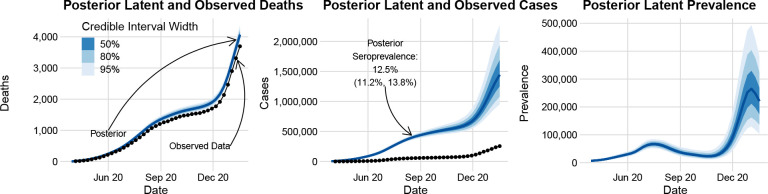
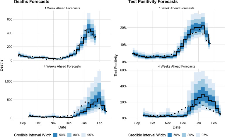
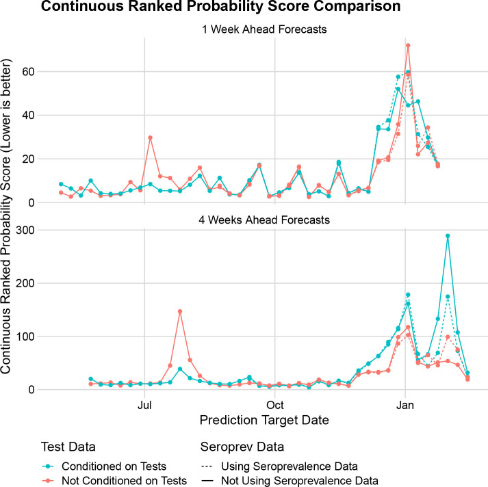
Mechanistic models fit to streaming surveillance data are critical to understanding the transmission dynamics of an outbreak as it unfolds in real-time. However, transmission model parameter estimation can be imprecise, and sometimes even impossible, because surveillance data are noisy and not informative about all aspects of the mechanistic model. To partially overcome this obstacle, Bayesian models have been proposed to integrate multiple surveillance data streams. We devised a modeling framework for integrating SARS-CoV-2 diagnostics test and mortality time series data, as well as seroprevalence data from cross-sectional studies, and tested the importance of individual data streams for both inference and forecasting. Importantly, our model for incidence data accounts for changes in the total number of tests performed. We model the transmission rate, infection-to-fatality ratio, and a parameter controlling a functional relationship between the true case incidence and the fraction of positive tests as time-varying quantities and estimate changes of these parameters nonparametrically. We compare our base model against modified versions which do not use diagnostics test counts or seroprevalence data to demonstrate the utility of including these often unused data streams. We apply our Bayesian data integration method to COVID-19 surveillance data collected in Orange County, California between March 2020 and February 2021 and find that 32-72% of the Orange County residents experienced SARS-CoV-2 infection by mid-January, 2021. Despite this high number of infections, our results suggest that the abrupt end of the winter surge in January 2021 was due to both behavioral changes and a high level of accumulated natural immunity.
Figures

References
-
- Anderson S. C., Edwards A. M., Yerlanov M., Mulberry N., Stockdale J. E., Iyaniwura S. A., Falcao R. C., Otterstatter M. C., Irvine M. A., Janjua N. Z., Coombs D., and Colijn C. (2020), “Quantifying the impact of COVID-19 control measures using a Bayesian model of physical distancing,” PLOS Computational Biology, 16, 1–15. - PMC - PubMed
-
- Andrieu C., Doucet A., and Holenstein R. (2010), “Particle Markov chain Monte Carlo methods,” Journal of the Royal Statistical Society: Series B (Statistical Methodology), 72, 269–342.
-
- Bosse N. I., Gruson H., Cori A., van Leeuwen E., Funk S., and Abbott S. (2022), “Evaluating forecasts with scoringutils in R,” arXiv preprint arXiv:2205.07090.
-
- Bretó C., He D., Ionides E., and King A. (2009), “Time series analysis via mechanistic models,” The Annals of Applied Statistics, 3, 319–348.
Publication types
Grants and funding
LinkOut - more resources
Full Text Sources
Miscellaneous