. 2020 Sep 21;11(1):4826.
doi: 10.1038/s41467-020-18527-0.

A predictable conserved DNA base composition signature defines human core DNA replication origins

Affiliations

A predictable conserved DNA base composition signature defines human core DNA replication origins

Ildem Akerman et al. Nat Commun. .

Abstract

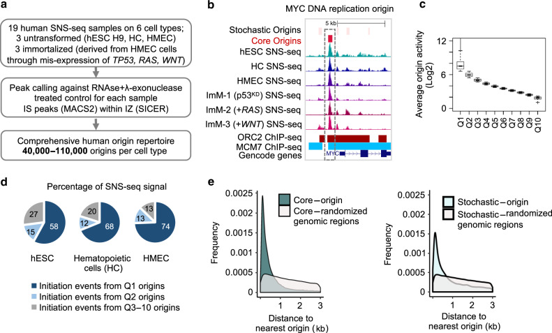
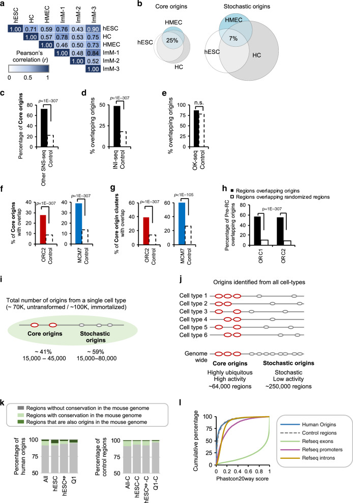
DNA replication initiates from multiple genomic locations called replication origins. In metazoa, DNA sequence elements involved in origin specification remain elusive. Here, we examine pluripotent, primary, differentiating, and immortalized human cells, and demonstrate that a class of origins, termed core origins, is shared by different cell types and host ~80% of all DNA replication initiation events in any cell population. We detect a shared G-rich DNA sequence signature that coincides with most core origins in both human and mouse genomes. Transcription and G-rich elements can independently associate with replication origin activity. Computational algorithms show that core origins can be predicted, based solely on DNA sequence patterns but not on consensus motifs. Our results demonstrate that, despite an attributed stochasticity, core origins are chosen from a limited pool of genomic regions. Immortalization through oncogenic gene expression, but not normal cellular differentiation, results in increased stochastic firing from heterochromatin and decreased origin density at TAD borders.


Conflict of interest statement

The authors declare no competing interests.

Figures

Fig. 1
Fig. 1. Human origin repertoire.
a Experimental workflow. SNS-seq was performed on three untransformed (hESC H9, patient derived hematopoietic cells (HC), and patient derived Human Mammary Epithelial Cells (HMEC), and three immortalised cell types (total n = 19). Immortalised cells were obtained through a reduction of TP53 mRNA levels (ImM-1, p53KD) or further expression of oncogenes RAS (ImM-2, +RAS) or WNT (ImM-3, +WNT) in HMEC cells. b UCSC genome browser snapshot of the human replication origin (MYC origin) captured by SNS-seq. Representative SNS-seq read-profiles, published positions of ORC2- (red) and MCM7-bound (blue) regions and the GENCODE genes (v25) are shown. The positions of origins defined in this study are shown on top; red: high-activity origins (core origins), light pink: low-activity origins (stochastic origins). c Boxplot showing the average origin activity (normalised SNS-seq counts across all samples, in Log2) per each quantile (x-axis represents Q1-Q10 origins). Line within the boxplot represents median, whereas the bounds of the box define the first and third quartiles. Bottom and top of whiskers represent minimum and maximum numbers respectively for each boxplot. d Q1 and Q2 origins host the overwhelming majority of initiation events in untransformed cell types. Pie chart representing the percentage of DNA replication initiation events (normalised SNS-seq counts) that originate from Q1, Q2 or Q3-10 origins in the indicated untransformed cell types. e Density plots showing the distribution of the distances to nearest origin (x-axis, in Kb) for core origins (left panel) and stochastic origins (right panel). In grey are control density plots that show the distribution of the distances between core/stochastic origins to the nearest randomised genomic region of the same size and number as origins. Both frequency plots were significantly different from randomised distributions (p ≤ 2.2E-16, Chi-square Goodness-of-Fit test in R with observed and expected values for frequency).
Fig. 2
Fig. 2. Higher activity origins are ubiquitously present across replicates and cell types.
a Pearson’s correlation coefficient (r) of origin activities between cell types. b Euler diagrams showing the fraction of core and stochastic origins shared by the untransformed cell types. c Bar plots show the percentage of core origins that were identified as origin regions by another SNS-seq study (black), and the expected amount of overlap with control regions (white, dotted line). Control regions in this figure are regions of equal size to core origins that are located in randomised coordinates of the human genome. P-value obtained by Chi-square Goodness-of-Fit test. d Bar plot representing the percentage of regions identified by INI-seq (in black) that overlap origins identified in this study. Dotted bar represents the expected amount of overlap with control regions. P-value obtained by Chi-square Goodness-of-Fit test. e As in d for OK-seq regions. f Percentage of core origins that overlap with pre-RC components ORC2 (within ± 2Kb; in red) and MCM7 (direct overlap, in blue). Dotted bars represent the expected amount of overlap with control regions. P-values obtained by Chi-square Goodness-of-Fit test. g As in f for core origins found in clusters. h Bar plots show the percentage of ORC1- (~13,000) and ORC2-bound (~55,000) sites that host DNA replication initiation within 2 Kb. Dotted bars represent overlap with control regions. P-values obtained by Chi-square Goodness-of-Fit test. i Schematic summary of origin activity in a single cell type. j Schematic summary of origin activity in the different cell types. k Bar plots showing the percentage of all, hESC, hESC-specific, and Q1 human origins with homology to mouse (light green). Also indicated are regions in the human genome with a homologous region in the mouse (light green). Regions that are also origins in mouse are dark green. On the right, are bar plots showing the percentage of the corresponding shuffled genomic regions. l Cumulative Phastcon20way scores plotted for human DNA replication initiation sites (blue), similar-sized control regions (dotted, grey), Refseq exons (green), promoters (defined as 500 bp upstream of TSS regions, in purple) and introns (mustard).
Fig. 3
Fig. 3. The DNA sequence content is a major predictor of DNA replication IS.
a Graph showing the percentage of origins in each quantile that overlap with G4 defined by G4Hunter (in silico) or mismatches (in vitro G4). Dotted lines (CTL) represent overlap with control regions. b Base content of the regions flanking human DNA replication origins and control genomic regions. Frequency plots are centred at the origin summits. The base frequency represents the proportion of each base (0–1). The human genome is composed of 30% A,T and 20% G, C as indicated by genomic average. Origins are oriented with the highest G-content upstream. c Density plot represents the frequency of the distance measured between the initiation site summit (dotted line) and the centre /summit of the nearest ORC1 (red), ORC2 (dark red) and MCM7 (blue) bound regions. Origins are oriented with the highest G-content upstream. d As in c but for stochastic origins. e Schematic representation of a core origin. The vertical line represents the IS summit. The nearest ORC1, ORC2 and MCM7 peak centres are presented, as well as their average distance from the core IS summit. The average size of the ORC1, ORC2 and MCM7 binding sites is indicated on the left. f Bar plot showing the percentage of origins that can be predicted based on the genome-scanning (GS) algorithm. Dotted bars represent the expected amount of overlap with control regions. The pie chart shows the percentage of false-positive results (grey). P-values obtained by Chi-square Goodness-of-Fit test using observed and expected values for overlap. g Percentage of origins in each quantile predictable by the GS algorithm as in f. h Percentage of Mus musculus origins predicted by the GS algorithm as in f. i Bar plots representing the percentage of core origins that can be predicted using a combination of GS algorithm and two different machine-learning algorithms (single vector machine (SVM) and logistic regression (LR) with greedy feature selection). P-values obtained by Chi-square Goodness-of-Fit test using observed and expected values for overlap. j Schematic showing the properties of the regions predicted to be origins. G-richness in the immediate (0.5 Kb) and distal (2 Kb) upstream region to the initiation site are predictive parameters.
Fig. 4
Fig. 4. Impact of transcription on the DNA replication origin landscape.
a Plot representing the percentage of DNA replication origins in each quantile that overlap a promoter region (±2 Kb of TSS) of a GENCODE gene (in red). Overlaps with control regions (paler colour) which are randomly shuffled genomic regions of equal size and number as the origins are also shown. P-values obtained by Chi-square Goodness-of-Fit test using observed and expected values for overlap. b As in a for overlaps with intergenic regions (>2 Kb upstream of a GENCODE gene, TSS are excluded). c As in a for overlaps with gene body (genic region 2 Kb downstream of the TSS excluded). d Bar plot representing percentage of CpG-containing gene promoters that host a DNA replication origin within ±2 Kb of their TSS. Promoters with different transcriptional activity levels in hematopoietic cells are shown (silent = 0, low = 0–15, medium = 15–60, and high = >60 RPKM). In this figure, a promoter is considered CpG-containing (CpG(+)) if a CpG island is present within ±2 Kb of the TSS (Gencode v25). e Bar plot showing the average number of origins localised within 2 Kb of the TSS of genes with different transcriptional output levels (silent = 0, low = 0–15, medium = 15–60, and high = >60 RPKM) in hematopoietic cells. f Boxplots showing the average activity of origins localised within 2 Kb of the TSS of genes with different transcriptional output levels as in d in hematopoietic cells. P-values were obtained using the Wilcoxon test in R. g Dot plot shows the correlation of transcriptional output of CpGi(+) promoters in hematopoietic progenitors (y-axis; RPKMs, Log2) and the activity of core origins located within ±2 Kb of the TSS of these genes in hematopoietic progenitors (x-axis; normalised SNS-seq counts, Log2). Top and bottom 5% outliers were removed. The Pearson’s correlation coefficient (r) and P-value for correlation is indicated on the top, and trendline is shown in blue. h As in d for CpGi(−) promoter regions. i As in e for CpGi(−) promoter regions. j As in f for CpGi(−) promoter regions. k As in g for CpGi(−) promoter regions. l Schematic summary of findings. CpGi(+) promoters (black) tend to host DNA replication origins, irrespectively of their transcriptional status, while CpGi(−) promoters (grey) tend to host origins when they are transcriptionally active.
Fig. 5
Fig. 5. Immortalisation alters the DNA replication origin distribution in heterochromatin and at TAD borders.
a Euler diagrams showing the percentage of shared core and stochastic origins identified in untransformed (white) and immortalised (grey) cell lines. b In immortalised cells stochastic origins are markedly increased. Bar plots showing the percentage of core (red) and stochastic (grey) origins identified in each cell type. c Line plot showing the percentage of origins (Q1 to Q10) identified in immortalised (pink) and untransformed (blue) cells. d Percentage of origins in each quantile (untransformed Q1–10 in blue, immortalised Q1–Q10 in pink) that overlap with promoter regions (within ±2 kb of the TSS). The expected chance overlap is shown with dotted lines (paler colours). P-values obtained by Chi-square Goodness-of-Fit test. P-value indicated in blue represent statistical analysis of overlaps in untransformed cells, while pink indicates immortalised cells. e As in d for overlaps with gene body (excluding the TSS + 2 kb region) of GENCODE (v25) genes. f As in d for overlaps with regions enriched for heterochromatin-associated H3K9me3 histone mark (in hESC, left panel) and with regions defined as heterochromatin by HMM in hESC and K265 cells (right panel). g Plot shows the core origin (red) density across topologically associating domains (TADs). Average origin density per bin (100 bins) across all TADs was plotted (y-axis, in origins/Mb). Core origin density is higher at the TAD borders, creating a “smiley” trend-line. P-values were obtained using the non-parametric Wilcoxon test in R. h Same as in g but for stochastic origins. i Bar plot showing the sum of normalised mean SNS-seq signal (y-axis, total initiation) across 19 samples coming from both core and stochastic origins at TAD borders and TAD centres. The total amount of SNS-seq signal is 1.53-fold higher at TAD borders. j Density of core origins active in HMEC (blue) and ImM-1 cells (orange) across TADs as in g. k Same as in j but for stochastic origins active in HMEC and ImM-1 cells. l As in i for HMEC (parental, in blue) and immortalised ImM-1 (in orange) cell types.

References

    1. Ganier O, Prorok P, Akerman I, Mechali M. Metazoan DNA replication origins. Curr. Opin. Cell Biol. 2019;58:134–141. doi: 10.1016/j.ceb.2019.03.003. - DOI - PubMed
    1. Cayrou C, et al. The chromatin environment shapes DNA replication origin organization and defines origin classes. Genome Res. 2015;25:1873–1885. doi: 10.1101/gr.192799.115. - DOI - PMC - PubMed
    1. Cayrou C, et al. New insights into replication origin characteristics in metazoans. Cell Cycle. 2012;11:658–667. doi: 10.4161/cc.11.4.19097. - DOI - PMC - PubMed
    1. Cayrou C, et al. Genome-scale analysis of metazoan replication origins reveals their organization in specific but flexible sites defined by conserved features. Genome Res. 2011;21:1438–1449. doi: 10.1101/gr.121830.111. - DOI - PMC - PubMed
    1. Comoglio F, et al. High-resolution profiling of Drosophila replication start sites reveals a DNA shape and chromatin signature of metazoan origins. Cell Rep. 2015;11:821–834. doi: 10.1016/j.celrep.2015.03.070. - DOI - PMC - PubMed

Publication types