Integrated regulatory models for inference of subtype-specific susceptibilities in glioblastoma
- PMID: 32974985
- PMCID: PMC7516378
- DOI: 10.15252/msb.20209506
Integrated regulatory models for inference of subtype-specific susceptibilities in glioblastoma
Abstract
Glioblastoma multiforme (GBM) is a highly malignant form of cancer that lacks effective treatment options or well-defined strategies for personalized cancer therapy. The disease has been stratified into distinct molecular subtypes; however, the underlying regulatory circuitry that gives rise to such heterogeneity and its implications for therapy remain unclear. We developed a modular computational pipeline, Integrative Modeling of Transcription Regulatory Interactions for Systematic Inference of Susceptibility in Cancer (inTRINSiC), to dissect subtype-specific regulatory programs and predict genetic dependencies in individual patient tumors. Using a multilayer network consisting of 518 transcription factors (TFs), 10,733 target genes, and a signaling layer of 3,132 proteins, we were able to accurately identify differential regulatory activity of TFs that shape subtype-specific expression landscapes. Our models also allowed inference of mechanisms for altered TF behavior in different GBM subtypes. Most importantly, we were able to use the multilayer models to perform an in silico perturbation analysis to infer differential genetic vulnerabilities across GBM subtypes and pinpoint the MYB family member MYBL2 as a drug target specific for the Proneural subtype.
Keywords: cell state plasticity; gene essentiality inference; glioblastoma multiforme; subtype-specific gene regulation; transcription regulatory networks.
© 2020 The Authors. Published under the terms of the CC BY 4.0 license.
Conflict of interest statement
The authors declare that they have no conflict of interest.
Figures
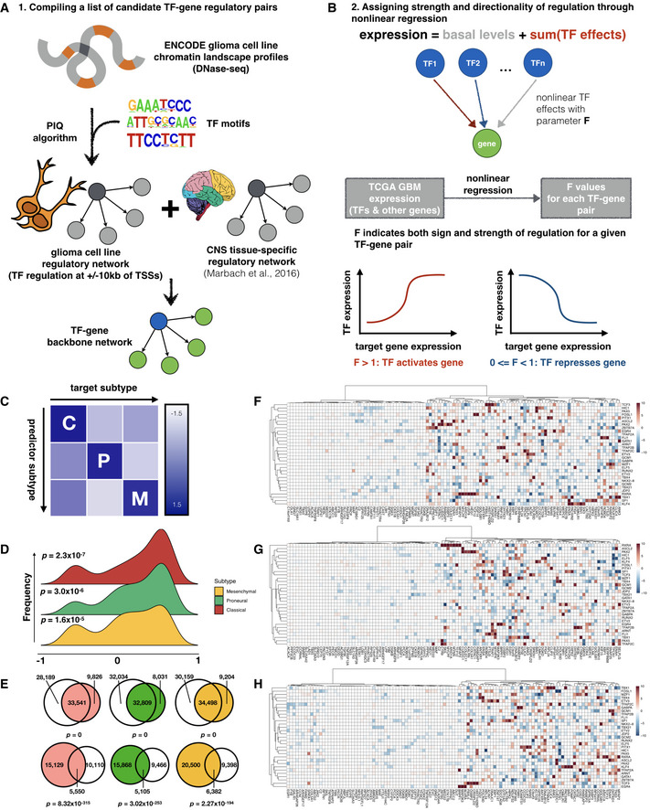
- A
Schematic of workflow for compiling a candidate network for GBM‐specific transcription regulation.
- B
Nonlinear regression assigns magnitude and directionality of transcription regulation for each transcription factor‐target gene pair through a parameter, F value.
- C
Inter‐subtype prediction matrix, where the regression model from each subtype along a column is used to predict gene expression in another subtype along a row, and scaled average of the median symmetric mean absolute percentage error (sMAPE) values across top variable genes is visualized as heatmap colors.
- D
Distribution of correlation coefficients between F value profiles obtained from bulk (TCGA) and single‐cell datasets.
- E
Venn diagrams showing overlap of edges between regression models built from TCGA and CGGA where a transcription factor shows up‐regulation (upper row) or down‐regulation (lower row) of its target genes. Shown from left to right are Classical (red), Proneural (green), and Mesenchymal (orange) subtypes, respectively, and corresponding CGGA subtypes are colored in gray. Fisher's exact test P‐values for Venn diagrams are labeled correspondingly.
- F–H
Heatmaps of representative subsets of F values for the 3 GBM subtypes (Classical, Proneural, and Mesenchymal, respectively). Rows and columns correspond to transcription factors and target genes with top absolute log2 F values, respectively.
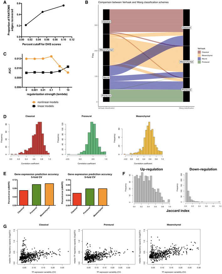
Proportion of edges in FANTOM5 brain‐specific regulatory network covered by the DNaseI hypersensitivity site (DHS) network constructed from ENCODE cell line datasets using different PIQ score cutoffs.
Alluvial diagram collating subtype label assignment of TCGA samples using classification scheme of Verhaak et al (2010) (left column) and that of Wang et al (2017) (right column).
Area under precision‐recall curve for the recovery of known interactions among transcription factors (TFs) by parameterized regulatory networks constructed with varying regularization strengths (connected orange dots). The same metrics were computed for networks built using linear regression for comparison (connected black dots).
Histograms showing distribution of Pearson correlation coefficients between F value vectors obtained using TCGA subtype labels from Verhaak et al (Fig EV1B left column) and those obtained using re‐assigned subtype labels from Wang et al (Fig EV1B right column). Mean of the distribution is significantly larger than 0 with estimated Wilcoxon test P‐values of 2.13 × 10−86, 8.02 × 10−86, and 4.86 × 10−86 for Classical, Proneural, and Mesenchymal subtypes, respectively.
Error rates of gene expression prediction for each glioblastoma multiforme (GBM) subtype using the final parameterized network. Left panel: symmetric mean absolute percentage error (sMAPE) was computed for each gene's expression values across all samples in a given subtype and the average sMAPE across all genes in each subtype is reported. Results did not significantly vary when median instead of mean sMAPE value across all genes were used (right panel). Bar plots show mean error rates in 5‐fold cross‐validation.
Histograms of overlap (as quantified by the Jaccard index) between TF‐target gene pairs inferred using the TCGA and CGGA datasets for up‐regulation (left) and down‐regulation (right) edges. Estimated Wilcoxon test P‐values are 6.00 × 10−76 and 2.42 × 10−47 for the up‐ and down‐regulation distributions, respectively.
Subtype‐specific plots showing a non‐monotonic relationship between median TF regulatory capacity (calculated as median absolute value of log2 F values for each TF in each subtype) and TF expression variability (calculated as coefficient of variation for gene expression).
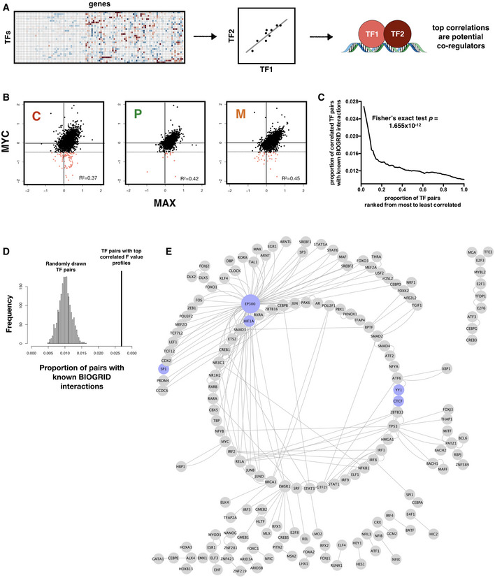
Schematic of workflow for inferring TF‐TF interactions.
Scatter plot showing consistent correlation between the regulatory profiles (F values) of MYC and MAX across all three subtypes. Pearson correlation coefficient (R 2) values are shown. Regions where MYC shows negative regulation of gene expression (hence likely to be interacting with MAD rather than MAX) and MAX shows no significant regulation are shaded pink, with threshold for negative regulation shown as dotted horizontal lines.
TF‐TF pairs with top F value correlations are enriched for known interactions in the BIOGRID database. P‐value for Fisher's exact test of proportion of known interaction pairs among top 1% correlated TFs compared to selecting all possible interaction pairs is shown.
Distribution of prediction precision of known BIOGRID interactions from 2,000 randomly drawn TF pairs (histogram) compared with those predicted from TF pairs with top 1% F value correlation (vertical line). Simulated P‐value is 0.
Network representation of captured known BIOGRID interactions from top 1% F value correlation coefficients. A subset of nodes participating in well‐characterized interactions, including CTCF‐YY1 and dense interaction subnetwork of EP300, is colored in blue.
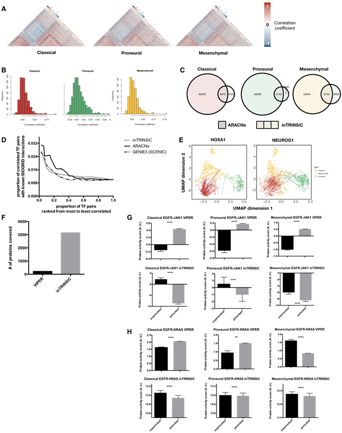
- A
Heatmaps of correlation coefficients among TF regulatory profiles in each GBM subtype. The Classical subtype heatmap was ordered using hierarchical clustering with the average linkage method as the reference and all other heatmaps were ordered in the same way for comparison. Only upper triangular matrices are shown.
- B
Histograms of Pearson correlation coefficients between transcription regulatory parameters inferred by inTRINSiC (F values) and ARACNe (mutual information). The RANSAC method was used to prevent correlation from being heavily skewed by extreme values.
- C
Overlap between TF‐TF interactions inferred by inTRINSiC and ARACNe using correlation among pairs of TF regulatory profiles. Fisher's exact test P‐values are 2.55 × 10−58, 2.31 × 10−131, and 4.63 × 10−95 for overlap between Classical, Proneural, and Mesenchymal datasets, respectively.
- D
Enrichment of known BIOGRID interactions recovered by inTRINSiC (dotted curve), ARACNe (solid curve), and GENIE3 (used in the SCENIC pipeline) plotted against increasingly relaxed threshold on TF‐TF parameter correlation thresholds. P‐value for Fisher's exact test of proportion of known interaction pairs among top 1% correlated TFs compared with selecting all possible interaction pairs: 1.655 × 10⁻¹² for inTRINSiC, 1.19 × 10⁻¹⁷ for ARACNe, and 3.313 × 10⁻¹² for GENIE3.
- E
UMAP projections of TCGA samples upon simulated knockdown of HOXA1 (left panel) and NEUROG1 (right panel). Each arrow points from the TCGA sample before perturbation to the same sample after perturbation in the same UMAP embedding.
- F
Number of proteins covered by VIPER and that covered by the exponential ranking protein activity inference function in inTRINSiC.
- G, H
Inferred response of STAT3 (i) and KRAS (j) protein activity to EGFR inhibition in each of the three subtypes predicted by VIPER (upper panels) or inTRINSiC (lower panels). P‐values are calculated using Wilcoxon matched‐pairs signed rank test. ****P < 0.0001, **P < 0.01. Bars represent mean ± SEM. # of patients in each subtype: Classical—139, Proneural—103, Mesenchymal—165.
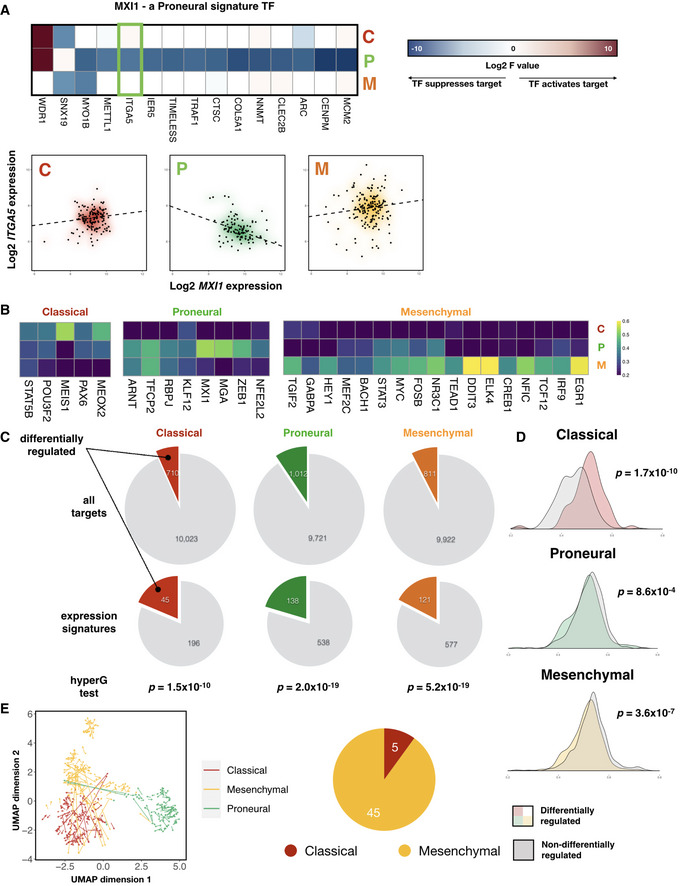
Left panel: heatmap of signature F values on a log2 scale for MXI1, a Proneural subtype signature transcription factor. Right panel: gene expression plots of ITGA5, a signature target gene of MXI1 (highlighted in green box in left panel), against that of MXI1, across the three GBM subtypes. Density clouds are overlaid onto scatter plots, and a dashed linear regression line is shown for each subtype.
Heatmaps showing participation of each subtype's signature TFs in the corresponding subtype signature. Color scale corresponds to the proportion of TF‐target gene pairs that show consistent signature behavior with the corresponding subtype signature among all TF‐target pairs that show any signature behavior.
Pie charts showing proportion of target genes that show differential regulation by TFs, comparing all target genes (upper panel) with those that are differentially expressed among the subtypes (i.e., subtype expression signatures, lower panel). P‐values from hypergeometric tests for enrichment of differentially regulated target genes among expression signatures in each subtype are shown.
Kernel density estimations of average correlation coefficients between target genes and their corresponding transcription factors. P‐values for Mann–Whitney tests comparing each pair of distributions are shown.
Left panel: perturbation of STAT3 induces Mesenchymal samples to shift toward the Classical subtype cluster. Each arrow points from the TCGA sample before perturbation to the same sample after perturbation, projected onto a 2‐dimensional Uniform Manifold Approximation and Projection (UMAP) space. Right panel: pie‐chart showing distribution of the subtype showing the largest overall shift among the 50 TFs that induce the largest subtype‐specific shift.
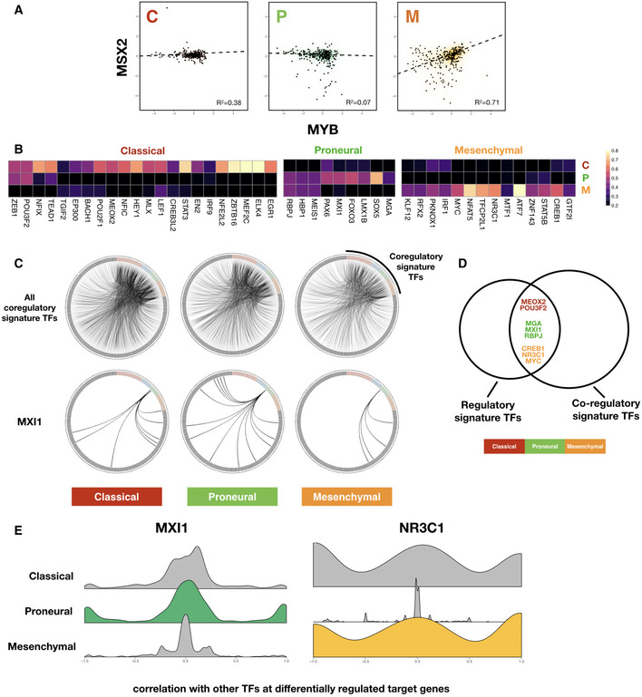
Scatter plot showing consistent correlation between F value profiles of MSX2 and MYB across each subtype. Robust regression lines (dashed lines in each panel) as well as Pearson correlation coefficient (R 2) values are shown. Density clouds are overlaid onto scatter plots to highlight trends.
Heatmaps showing participation of each subtype's signature TFs in the corresponding subtype TF‐TF co‐regulatory signature. Note that here instead of F values of TF‐target regulation, signatures are derived from correlation coefficients of F value profiles between pairs of TFs across subtypes. Color scale corresponds to the proportion of TF‐TF co‐regulatory pairs that show signature behavior consistent with the corresponding subtype signature among all TF‐TF pairs that show any signature co‐regulatory behavior.
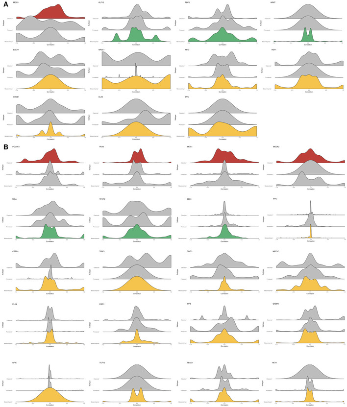
Upper panels: circos diagrams showing all top co‐regulatory partners (gray nodes along the outer circle) inferred for subtype signature TFs (colored nodes along the outer circle). TF pairs with F value correlation coefficients larger than 0.8 are visualized as links. Lower panels: same TFs but only showing links originating from MXI1, a Proneural subtype signature TF.
Venn diagram showing overlap between regulatory and co‐regulatory signature TFs, colored according to GBM subtypes.
Kernel density plots of correlation coefficients of signature TFs MXI1 (Proneural) and NR3C1 (Mesenchymal) with other TFs at differentially regulated target genes.
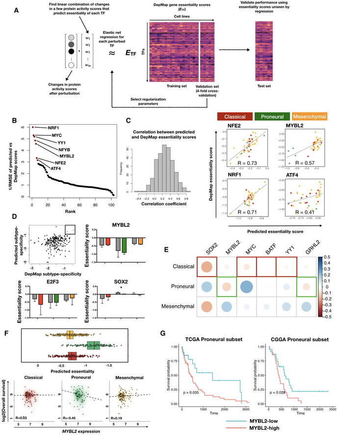
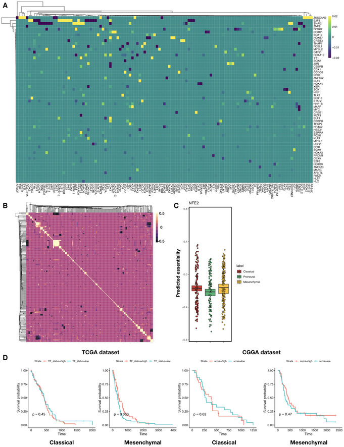
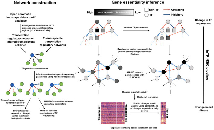
Schematic of in silico perturbation through multilayer network information flow simulation. Left: changes in gene expression induced by perturbation of a TF can be estimated through transcriptional regulatory models, and propagated to the protein signaling network, where a modified random walk algorithm scores signaling activity. Middle: iteratively perturb each TF and generate a matrix of perturbed signaling scores. Right: optimal “readout” of effects of TF perturbation on fitness can be learned through known genetic screening data such as DepMap gene essentiality scores.
Transcription factors ranked by the prediction accuracy in test set cell lines (y axis, plotted are 1 over root mean squared error values) of their essentiality when compared to DepMap scores.
Left panel: histogram of correlation between predicted and DepMap TF essentiality scores. Right panel: experimentally determined (DepMap) versus predicted gene essentiality scores for TFs where a linear combination of protein signaling activity scores could predict TF essentiality with high accuracy. Data points are color‐coded according to subtype labels (red—Classical, green—Proneural and orange—Mesenchymal).
Upper left panel: subtype specificity of predicted versus DepMap essentiality scores. Three TFs with top consistent specificity values are highlighted in a box region. Remaining panels: bar plots showing mean ± standard error of the mean (SEM) of DepMap (gray) and predicted (color‐coded according to subtypes as in (C)) essentiality scores, grouped by subtypes. # of cell lines in each subtype: Classical—11, Proneural—4, Mesenchymal—25. Paired Student's t‐test P‐values for each paired set of DepMap‐predicted results are non‐significant after Bonferroni correction except for the Proneural subtype in SOX2 perturbations (*P = 0.044).
Heatmap of correlations between TF expression and TCGA patient survival in each subtype. Shown are the six TFs that are consistent in terms of the most dependent subtype predicted by inTRINSiC and the subtype showing the most negative correlation between TF expression and patient survival.
Box and jitter plots of predicted essentiality scores of MYBL2 in TCGA tumor samples grouped by subtype. Box plots show 25th, 50th, and 75th percentiles, and whiskers extend up to 90th and down to 10th percentiles. # of samples: Mesenchymal—165, Proneural—103, Classical—139.
Kaplan–Meier survival curves of TCGA and CGGA Proneural GBM samples, grouped by MYBL2 score (high versus low demarcated by median expression). # of patients in TCGA Proneural subset: MYBL2‐high—47, MYBL2‐low—48. # of patients in CGGA Proneural subset: MYBL2‐high—24, MYBL2‐low——25. Log‐rank test P‐values are shown. Survival curves for the remaining subtypes are provided in Fig EV4D.
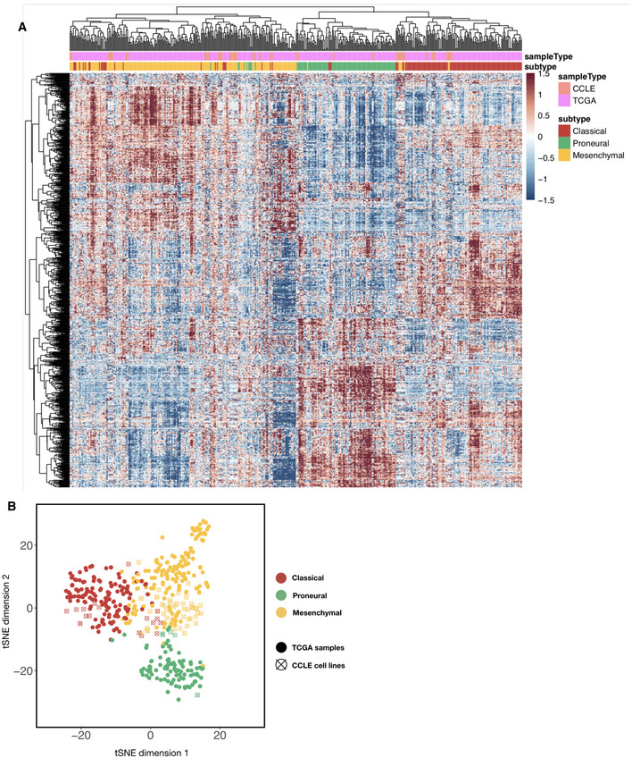
Heatmap of combined TCGA tumor sample and CCLE brain tumor cell line gene expression values (with top 2,000 median absolute deviation across all samples), ordered using hierarchical clustering with the complete linkage method. Top color codes above the first row indicate whether the column is a tumor sample (teal) or a cell line (magenta), and bottom color codes indicate the subtype that the sample is assigned. Prior to clustering, the TCGA and CCLE expression datasets were normalized using the RemoveBatchEffects function in the R limma package.
t‐stochastic neighbor embedding (t‐SNE) plot of TCGA and CCLE brain tumor/cell line samples (color‐coded using subtype labels) with perplexity set to 10. Solid dots are TCGA tumor samples whereas empty circles with a cross are CCLE samples.
Heatmap of elastic net regression coefficients for predicting susceptibility to the perturbation of each TF. Shown are TFs with top absolute regression coefficients (maximum absolute value > 0.01 across all predictors), and rows and columns are both ordered using hierarchical clustering with the Weighted Pair Group Method with Centroid Averaging (WPGMC) method.
WPGMC‐clustered heatmap of correlation coefficients among the regression coefficient vectors of TFs.
In silico knockdown of NFE2 in TCGA GBM samples potentially confers a Proneural‐specific therapeutic advantage. Shown are jitter plots of predicted essentiality scores of NFE2 in tumor samples grouped by subtype. Box plots show 25th, 50th, and 75th percentiles, and whiskers extend up to 90th and down to 10th percentiles. P‐value for one‐way analysis of means among scores across subtypes is 1.16 × 10⁻¹¹ (df1 = 2, df2 = 252.12). # of patients in each subtype: Classical—139, Proneural—103, Mesenchymal—165.
Kaplan–Meier curves for TCGA and CCGA Classical and Mesenchymal tumor patient survival, with patients segregated into MYBL2‐high (salmon curve) and MYBL2‐low (teal curve) groups. Log‐rank test P‐values are shown for each subtype. Number of patients in TCGA Classical subset: MYBL2‐high—62, MYBL2‐low—63, TCGA Mesenchymal subset: MYBL2‐high—79, MYBL2‐low—80. Number of patients in CGGA Classical subset: MYBL2‐high—24, MYBL2‐low—24, CGGA Mesenchymal subset: MYBL2‐high—37, MYBL2‐low—38.
- A, B
Histograms of correlation coefficients of signature TFs with other TFs at differentially regulated target genes where the log2 F values at these target genes in the signature subtype are higher (A) or lower (B) than the average across all subtypes. Plots are grouped according to signature subtype. Histograms in each subplot are arranged in the order of Classical, Proneural, and Mesenchymal subtypes from top to bottom.
Similar articles
-
Identifying Cancer Subtypes from miRNA-TF-mRNA Regulatory Networks and Expression Data.PLoS One. 2016 Apr 1;11(4):e0152792. doi: 10.1371/journal.pone.0152792. eCollection 2016. PLoS One. 2016. PMID: 27035433 Free PMC article.
-
Expression signature of IFN/STAT1 signaling genes predicts poor survival outcome in glioblastoma multiforme in a subtype-specific manner.PLoS One. 2012;7(1):e29653. doi: 10.1371/journal.pone.0029653. Epub 2012 Jan 5. PLoS One. 2012. PMID: 22242177 Free PMC article.
-
Uncovering MicroRNA and Transcription Factor Mediated Regulatory Networks in Glioblastoma.PLoS Comput Biol. 2012;8(7):e1002488. doi: 10.1371/journal.pcbi.1002488. Epub 2012 Jul 19. PLoS Comput Biol. 2012. PMID: 22829753 Free PMC article.
-
Comprehensive understanding of glioblastoma molecular phenotypes: classification, characteristics, and transition.Cancer Biol Med. 2024 May 6;21(5):363-81. doi: 10.20892/j.issn.2095-3941.2023.0510. Cancer Biol Med. 2024. PMID: 38712813 Free PMC article. Review.
-
Comparison of glioblastoma (GBM) molecular classification methods.Semin Cancer Biol. 2018 Dec;53:201-211. doi: 10.1016/j.semcancer.2018.07.006. Epub 2018 Jul 19. Semin Cancer Biol. 2018. PMID: 30031763 Review.
Cited by
-
A single-cell multimodal view on gene regulatory network inference from transcriptomics and chromatin accessibility data.Brief Bioinform. 2024 Jul 25;25(5):bbae382. doi: 10.1093/bib/bbae382. Brief Bioinform. 2024. PMID: 39207727 Free PMC article. Review.
-
Transcriptome analysis and prognostic model construction based on splicing profiling in glioblastoma.Oncol Lett. 2021 Feb;21(2):138. doi: 10.3892/ol.2020.12399. Epub 2020 Dec 20. Oncol Lett. 2021. PMID: 33552257 Free PMC article.
-
The Role of Network Science in Glioblastoma.Cancers (Basel). 2021 Mar 2;13(5):1045. doi: 10.3390/cancers13051045. Cancers (Basel). 2021. PMID: 33801334 Free PMC article. Review.
-
Glioblastoma Molecular Classification Tool Based on mRNA Analysis: From Wet-Lab to Subtype.Int J Mol Sci. 2022 Dec 14;23(24):15875. doi: 10.3390/ijms232415875. Int J Mol Sci. 2022. PMID: 36555518 Free PMC article.
References
-
- Amati B (1994) Myc‐Max‐Mad: a transcription factor network controlling cell cycle progression differentiation and death. Curr Opin Genet Dev 4: 102–108 - PubMed
Publication types
MeSH terms
Substances
Grants and funding
LinkOut - more resources
Full Text Sources
Medical
Miscellaneous