. 2020 Oct 1;183(1):158-168.e14.
doi: 10.1016/j.cell.2020.08.017. Epub 2020 Aug 14.

Robust T Cell Immunity in Convalescent Individuals with Asymptomatic or Mild COVID-19

Collaborators, Affiliations

Robust T Cell Immunity in Convalescent Individuals with Asymptomatic or Mild COVID-19

Takuya Sekine et al. Cell. .

Abstract

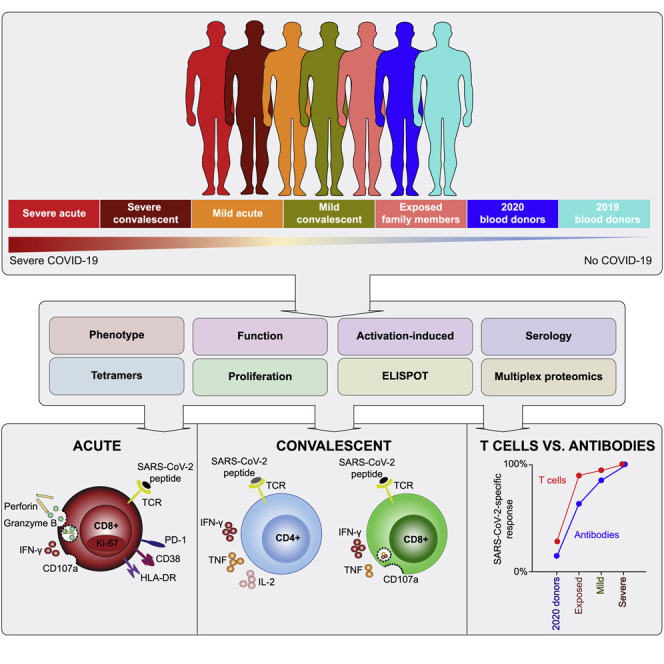
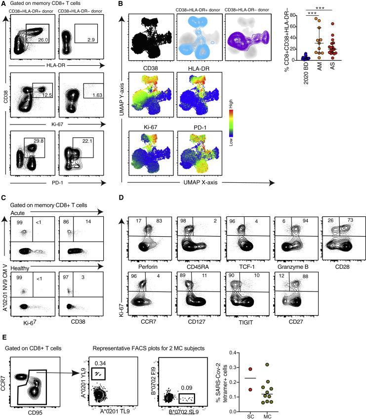
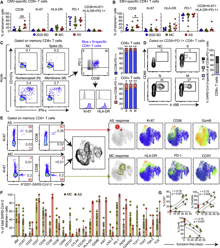
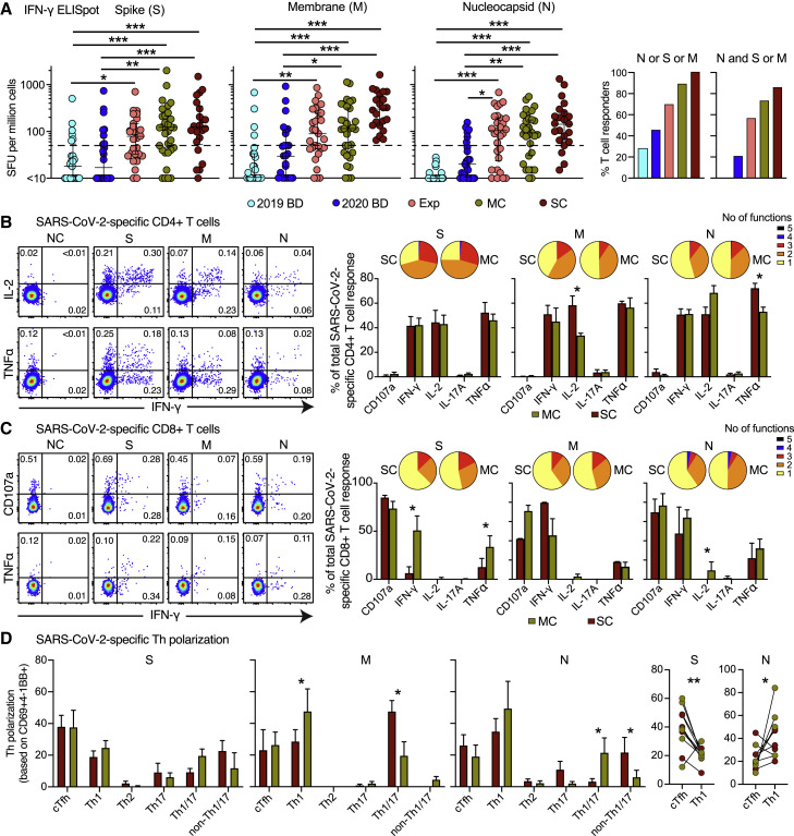
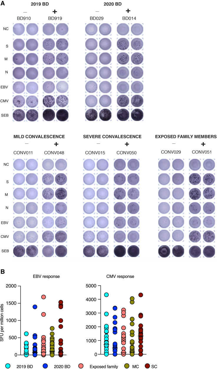
SARS-CoV-2-specific memory T cells will likely prove critical for long-term immune protection against COVID-19. Here, we systematically mapped the functional and phenotypic landscape of SARS-CoV-2-specific T cell responses in unexposed individuals, exposed family members, and individuals with acute or convalescent COVID-19. Acute-phase SARS-CoV-2-specific T cells displayed a highly activated cytotoxic phenotype that correlated with various clinical markers of disease severity, whereas convalescent-phase SARS-CoV-2-specific T cells were polyfunctional and displayed a stem-like memory phenotype. Importantly, SARS-CoV-2-specific T cells were detectable in antibody-seronegative exposed family members and convalescent individuals with a history of asymptomatic and mild COVID-19. Our collective dataset shows that SARS-CoV-2 elicits broadly directed and functionally replete memory T cell responses, suggesting that natural exposure or infection may prevent recurrent episodes of severe COVID-19.


Conflict of interest statement

Declaration of Interests The authors declare no competing interests.

Figures

None
Graphical abstract
Figure 1
Figure 1
T Cell Perturbations in COVID-19 (A) Dot plots summarizing the absolute counts and relative frequencies of CD3+ (left), CD4+ (center), and CD8+ T cells (right) in healthy blood donors from 2020 (2020 BD ) and patients with acute moderate (AM ) or acute severe COVID-19 (AS). Each dot represents one donor. Data are shown as median ± IQR. p < 0.05, ∗∗∗p < 0.001. Kruskal-Wallis rank-sum test with Dunn’s post hoc test for multiple comparisons. (B) Top: PCA plots showing the distribution and segregation of memory CD4+ and CD8+ T cells by group. Each dot represents one donor. Memory cells were defined by exclusion of naive cells (CCR7+ CD45RA+ CD95). Center: PCA plots showing the corresponding trajectories of key markers that influenced the group-defined segregation of memory CD4+ and CD8+ T cells. Bottom: dot plots showing the group-defined distribution of markers in PC2. Each dot represents one donor. MC, individuals in the convalescent phase after mild COVID-19. ∗∗p < 0.01, ∗∗∗p < 0.001. Kruskal-Wallis rank-sum test with Dunn’s post hoc test for multiple comparisons. (C) Dot plots summarizing the expression frequencies of activation/cycling markers among memory CD4+ (top) and CD8+ T cells (bottom) by group. Each dot represents one donor. Data are shown as median ± IQR. p < 0.05, ∗∗p < 0.01, ∗∗∗p < 0.001. Kruskal-Wallis rank-sum test with Dunn’s post hoc test for multiple comparisons. (D) Top: UMAP plots showing the clustering of memory CD8+ T cells by group in relation to all memory CD8+ T cells (left). Bottom: UMAP plots showing the expression of individual markers (n = 3 donors per group). UMAP plots were based on all markers distinguished in the bottom row. (E) Left: representative flow cytometry plots showing the expression of activation/cycling markers among memory CD8+ T cells by group. Numbers indicate percentages in the drawn gates. Right: dot plots showing the expression frequencies of activation/cycling markers among memory CD8+ T cells by group. Each dot represents one donor. Data are shown as median ± IQR. Key as in (B) and (C). ∗∗p < 0.01, ∗∗∗p < 0.001. Kruskal-Wallis rank-sum test with Dunn’s post hoc test for multiple comparisons.
Figure S1
Figure S1
Quantification and Characterization of CD4+ and CD8+ T Cells in COVID-19, Related to Figure 1 (A) Flow cytometric gating strategy for the identification and quantification of CD4+ and CD8+ T cells. (B) Left: flow cytometric gating strategy for the identification and quantification of memory CD4+ and CD8+ T cells. Right: dot plots summarizing the absolute numbers and relative frequencies of memory CD4+ and CD8+ T cells by group. Each dot represents one donor. Data are shown as median ± IQR. 2020 BD: healthy blood donors from 2020 (n = 18). AM: patients with acute moderate COVID-19 (n = 11). AS: patients with acute severe COVID-19 (n = 17). (C) Dot plots summarizing the expression frequencies of phenotypic markers among memory CD4+ and CD8+ T cells by group. Each dot represents one donor. Bars indicate median values. 2020 BD: healthy blood donors from 2020 (n = 18). MC: individuals in the convalescent phase after mild COVID-19 (n = 31). AM: patients with acute moderate COVID-19 (n = 11). AS: patients with acute severe COVID-19 (n = 17).
Figure S2
Figure S2
Phenograph and UMAP Clustering of Memory CD4+ and CD8+ T Cells with Correlative Analyses of Immune Activation Phenotypes versus Clinical Parameters in Acute COVID-19, Related to Figure 1 (A) Phenograph plots showing the clustering of memory CD8+ T cells and heatmap highlighting clusters 20 and 29. (B) Top left: UMAP plots showing the clustering of memory CD4+ T cells by group in relation to all memory CD4+ T cells (left). Bottom left: UMAP plots showing the expression of individual markers (n = 3 donors per group). Right: dot plots summarizing the expression frequencies of activation/cycling markers among memory CD4+ T cells by group. Each dot represents one donor. Data are shown as median ± IQR. 2020 BD: healthy blood donors from 2020 (n = 18). MC: individuals in the convalescent phase after mild COVID-19 (n = 31). AM: patients with acute moderate COVID-19 (n = 11). AS: patients with acute severe COVID-19 (n = 17). p < 0.05, ∗∗p < 0.01, ∗∗∗p < 0.001. Kruskal-Wallis rank-sum test with Dunn’s post hoc test for multiple comparisons. (C) and (D) Heatmaps summarizing the pairwise correlations between phenotypically defined subpopulations of memory CD4+ or CD8+ T cells and various clinical parameters in patients with acute COVID-19. p < 0.05, ∗∗p < 0.01, ∗∗∗p < 0.001. Spearman rank correlation.
Figure S3
Figure S3
Immune Activation Patterns in Acute COVID-19, Related to Figure 2 (A) Representative flow cytometry plots showing the expression of activation/cycling markers among memory CD8+ T cells in patients with acute severe COVID-19. Numbers indicate percentages in the drawn gates. (B) Top left: UMAP plots showing the clustering of memory CD8+ T cells by phenotype in relation to all memory CD8+ T cells (left). Bottom left: UMAP plots showing the expression of individual markers (n = 1 donor per group). Right: dot plot summarizing the frequencies of CD38+ HLA-DR memory CD8+ T cells by group. Each dot represents one donor. Data are shown as median ± IQR. 2020 BD: healthy blood donors from 2020 (n = 18). AM: patients with acute moderate COVID-19 (n = 11). AS: patients with acute severe COVID-19 (n = 17). ∗∗∗p < 0.001. Kruskal-Wallis rank-sum test with Dunn’s post hoc test for multiple comparisons. (C) Representative flow cytometry plots showing the expression of activation/cycling markers among CMV-specific memory CD8+ T cells in a healthy control and a patient with acute severe COVID-19. Numbers indicate percentages in the drawn gates. (D) Representative flow cytometry plots showing the phenotype of Ki-67+ memory CD8+ T cells in a patient with acute severe COVID-19. Numbers indicate percentages in the drawn gates. (E) Left: representative flow cytometry plots showing SARS-CoV-2-specific tetramer+ CD8+ T cells in two donors from group MC. Right: dot plot summarizing the frequencies of SARS-CoV-2-specific tetramer+ CD8+ T cells in donors from groups MC (n = 10) and SC (n = 2).
Figure 2
Figure 2
Phenotypic Characteristics of SARS-CoV-2-Specific T Cells in Acute and Convalescent COVID-19 (A and B) Dot plots summarizing the expression frequencies of activation/cycling markers among tetramer+ CMV-specific (A) or EBV-specific CD8+ T cells (B) by group. Each dot represents one specificity in one donor. Data are shown as median ± IQR. p < 0.05, ∗∗p < 0.01. Kruskal-Wallis rank-sum test with Dunn’s post hoc test for multiple comparisons. (C) Representative flow cytometry plots (left) and bar graphs (right) showing the expression of activation/cycling markers among CD107a+ and/or IFN-γ+ SARS-CoV-2-specific CD4+ and CD8+ T cells (n = 6 donors). Numbers indicate percentages in the drawn gates. Data are shown as median ± IQR. NC, negative control. p < 0.05, ∗∗p < 0.01. Paired t test or Wilcoxon signed-rank test. (D) Representative flow cytometry plots (left) and bar graph (right) showing the upregulation of CD69 and 4-1BB (AIM assay) among CD38+ PD-1+ SARS-CoV-2-specific CD8+ T cells (n = 6 donors). Numbers indicate percentages in the drawn gates. S, spike; M, membrane; N, nucleocapsid. (E) Left: representative flow cytometry plots showing the expression of activation/cycling markers among tetramer+ SARS-CoV-2-specific CD8+ T cells by group (red) and by total frequency (black). Center: UMAP plot showing the clustering of memory CD8+ T cells. Right: UMAP plots showing the clustering of tetramer+ SARS-CoV-2-specific CD8+ T cells by group and the expression of individual markers (n = 2 donors). (F) Dot plots summarizing the expression frequencies of all quantified markers among tetramer+ SARS-CoV-2-specific CD8+ T cells by group. Each dot represents combined specificities in one donor. Data are shown as median ± IQR. (G) Bivariate plots showing the pairwise correlations between symptom-free days and the expression frequencies of CCR7, CD45RA, or granzyme B (GzmB). Each dot represents combined specificities in one donor. Key as in (F). Spearman rank correlation.
Figure 3
Figure 3
Functional Characteristics of SARS-CoV-2-Specific T Cells in Convalescent COVID-19 (A) Left: dot plots summarizing the frequencies of IFN-γ-producing cells responding to overlapping peptides spanning the immunogenic domains of the SARS-CoV-2 S, M, and N proteins by group (ELISpot assays). Each dot represents one donor. The dotted line indicates the cutoff for positive responses. Right: bar graph showing the frequencies of IFN-γ-producing cells responding to the internal (N) and surface antigens (M and/or S) of SARS-CoV-2 by group (ELISpot assays). 2019 BD, healthy blood donors from 2019; Exp, exposed family members; SC, individuals in the convalescent phase after severe COVID-19; SFU, spot-forming unit. p < 0.05, ∗∗p < 0.01, ∗∗∗p < 0.001. Kruskal-Wallis rank-sum test with Dunn’s post hoc test for multiple comparisons. (B) and (C) Left: representative flow cytometry plots showing the functional profiles of SARS-CoV-2-specific CD4+ (B) and CD8+ T cells (C) from a convalescent individual (group MC). Numbers indicate percentages in the drawn gates. Right: bar graphs and pie charts summarizing the distribution of individual functions among SARS-CoV-2-specific CD4+ (B) and CD8+ T cells (C) from convalescent individuals in groups MC (n = 12) or SC (n = 14). Data are shown as median ± IQR. Key as in (A). p < 0.05. Unpaired t test or Mann-Whitney U test. (D) Left: bar graphs summarizing the functional polarization of SARS-CoV-2-specific CD4+ T cells from convalescent individuals in groups MC (n = 5) and SC (n = 6). Subsets were defined as CXCR5+ (cTfh), CCR4 CCR6 CXCR3+ CXCR5 (Th1), CCR4+ CCR6 CXCR3 CXCR5 (Th2), CCR4 CCR6+ CXCR3 CXCR5 (Th17), CCR4 CCR6+ CXCR3+ CXCR5 (Th1/17), and CCR4 CCR6 CXCR3 CXCR5 (non-Th1/2/17). Data are shown as median ± IQR. p < 0.05. Unpaired t test or Mann-Whitney U test. Right: line graph comparing cTfh versus Th1 polarization by specificity in convalescent individuals from groups MC and SC. Each dot represents one donor. Key as in (A). p < 0.05, ∗∗p < 0.01. Paired t test.
Figure S4
Figure S4
Quantification of Functional T Cell Reactivity in COVID-19, Related to Figure 3 (A) Representative images showing the detection of IFN-γ-producing cells responding to overlapping peptides spanning the immunogenic domains of the SARS-CoV-2 spike (S), membrane (M), and nucleocapsid proteins (N) by group (ELISpot assays). NC: negative control. EBV: Epstein-Barr virus. CMV: cytomegalovirus. SEB: staphylococcal enterotoxin B. (B) Dot plots summarizing the frequencies of IFN-γ-producing cells responding to optimal peptide epitopes derived from EBV BZLF1 and EBNA-1 (left) or CMV pp65 (right) by group (ELISpot assays). Each dot represents the mean of combined specificities in one donor. Bars indicate median values. No significant differences were detected among groups for any specificity. 2019 BD: healthy blood donors from 2019 (n = 25). 2020 BD: healthy blood donors from 2020 (n = 24). Exp: exposed family members (n = 30). MC: individuals in the convalescent phase after mild COVID-19 (n = 31). SC: individuals in the convalescent phase after severe COVID-19 (n = 22). SFU: spot-forming unit.
Figure S5
Figure S5
Functional Polarization of SARS-CoV-2-Specific Memory CD4+ T Cells, Antibody Correlations, and Comparative Analyses of SARS-CoV-2-Specific CD4+ and CD8+ T Cell Responses versus Serostatus in COVID-19, Related to Figures 3 and 4 (A) Representative flow cytometry plots showing the identification of memory CD4+ T cells responding to overlapping peptides spanning the immunogenic domains of the SARS-CoV-2 nucleocapsid protein by subset (AIM assay). Subsets were defined as CXCR5+ (cTfh), CCR4 CCR6 CXCR3+ CXCR5 (Th1), CCR4+ CCR6 CXCR3 CXCR5 (Th2), CCR4 CCR6+ CXCR3 CXCR5 (Th17), CCR4 CCR6+ CXCR3+ CXCR5 (Th1/17), and CCR4 CCR6 CXCR3 CXCR5 (non-Th1/2/17). (B) Bar graphs summarizing the functional polarization of memory CXCR5+ (cTfh) CD4+ T cells responding to overlapping peptides spanning the immunogenic domains of the SARS-CoV-2 spike (S), membrane (M), and nucleocapsid proteins (N). Data are shown as median ± IQR. Key as in C. (C) Correlation between anti-spike (S) and anti-nucleocapsid (N) IgG levels. Each dot represents one donor. 2020 BD: healthy blood donors from 2020 (n = 31). Exp: exposed family members (n = 28). MC: individuals in the convalescent phase after mild COVID-19 (n = 31). SC: individuals in the convalescent phase after severe COVID-19 (n = 23). Spearman rank correlation. (D) Representative flow cytometry plots showing functional SARS-CoV-2-specific memory CD4+ T cell responses in a seronegative convalescent donor (group MC). Numbers indicate percentages in the drawn gates. NC: negative control. S: spike. M: membrane. N: nucleocapsid. (E) Dot plots summarizing SARS-CoV-2-specific CD4+ and CD8+ T cell responses versus serostatus in exposed family members (left) and individuals in the convalescent phase after mild COVID-19 (right). Each dot represents one donor. Data are shown as median ± IQR. S: spike. M: membrane. N: nucleocapsid. p < 0.05. Mann-Whitney U test. (F) Dot plots summarizing SARS-CoV-2-specific CD4+ and CD8+ T cell responses in exposed seronegative family members and unexposed healthy blood donors (group 2019 BD). Each dot represents one donor. Data are shown as median ± IQR. p < 0.05. Mann-Whitney U test.
Figure 4
Figure 4
Antibody Responses and Proliferation Capabilities of SARS-CoV-2-Specific T Cells in Convalescent COVID-19 (A) Representative flow cytometry plots showing the proliferation (CTV) and functionality (IFN-γ+) of SARS-CoV-2-specific T cells from a convalescent individual (group MC) after stimulation with overlapping peptides spanning the immunogenic domains of the SARS-CoV-2 S, M, and N proteins. Numbers indicate percentages in the drawn gates. (B) and (C) Dot plots summarizing the frequencies of CTV IFN-γ+ SARS-CoV-2-specific CD4+ (B) and CD8+ T cells (C) by group and specificity. Each dot represents one donor. The dotted line indicates the cutoff for positive responses. p < 0.05, ∗∗p < 0.01, ∗∗∗p < 0.001. Kruskal-Wallis rank-sum test with Dunn’s post hoc test for multiple comparisons. (D) Dot plots comparing the frequencies of CTV IFN-γ+ SARS-CoV-2-specific CD4+ versus CD8+ T cells by group and specificity. Each dot represents one donor. Data are shown as median ± IQR. Key as in (B) and (C). p < 0.05, ∗∗p < 0.01, ∗∗∗p < 0.001. Paired t test or Wilcoxon signed-rank test. (E) Left: representative flow cytometry plots showing the production of IFN-γ and TNF among CTV virus-specific CD4+ (top) and CD8+ T cells (bottom) from a convalescent individual (group MC). Numbers indicate percentages in the drawn gates. Right: heatmaps summarizing the functional profiles of CTV IFN-γ+ virus-specific CD4+ (top) and CD8+ T cells (bottom). Data are shown as mean frequencies (key). (F) Dot plots summarizing the frequencies of CTV IFN-γ+ SARS-CoV-2-specific CD4+ and CD8+ T cells by group, serostatus, and specificity. Each dot represents one donor. The dotted line indicates the cutoff for positive responses. Key as in (B) and (C). ∗∗∗p < 0.001. Mann-Whitney U test. (G) Left: bar graph summarizing percent seropositivity by group. Right: bar graph summarizing the percentage of individuals in each group with detectable T cell responses directed against the internal (N) and surface antigens (M and/or S) of SARS-CoV-2.

References

    1. Alshukairi A.N., Khalid I., Ahmed W.A., Dada A.M., Bayumi D.T., Malic L.S., Althawadi S., Ignacio K., Alsalmi H.S., Al-Abdely H.M. Antibody Response and Disease Severity in Healthcare Worker MERS Survivors. Emerg. Infect. Dis. 2016;22:1113–1115. - PMC - PubMed
    1. Beigel J.H., Tomashek K.M., Dodd L.E., Mehta A.K., Zingman B.S., Kalil A.C., Hohmann E., Chu H.Y., Luetkemeyer A., Kline S. Remdesivir for the Treatment of Covid-19— Preliminary Report. N Engl J Med. 2020 doi: 10.1056/NEJMoa2007764. Published online May 22, 2020. - DOI - PMC - PubMed
    1. Betts M.R., Nason M.C., West S.M., De Rosa S.C., Migueles S.A., Abraham J., Lederman M.M., Benito J.M., Goepfert P.A., Connors M. HIV nonprogressors preferentially maintain highly functional HIV-specific CD8+ T cells. Blood. 2006;107:4781–4789. - PMC - PubMed
    1. Blom K., Braun M., Ivarsson M.A., Gonzalez V.D., Falconer K., Moll M., Ljunggren H.G., Michaëlsson J., Sandberg J.K. Temporal dynamics of the primary human T cell response to yellow fever virus 17D as it matures from an effector- to a memory-type response. J. Immunol. 2013;190:2150–2158. - PubMed
    1. Braun J., Loyal L., Frentsch M., Wendisch D., Georg P., Kurth F., Hippenstiel S., Dingeldey M., Kruse B., Fauchere F. SARS-CoV-2-reactive T cells in healthy donors and patients with COVID-19. Nature. 2020 doi: 10.1038/s41586-020-2598-9. Published online July 29, 2020. - DOI - PubMed

Publication types

Substances