. 2019 Feb;134(1):51-107.
doi: 10.1093/qje/qjy020. Epub 2018 Sep 4.

THE PRICE AIN'T RIGHT? HOSPITAL PRICES AND HEALTH SPENDING ON THE PRIVATELY INSURED

Affiliations

THE PRICE AIN'T RIGHT? HOSPITAL PRICES AND HEALTH SPENDING ON THE PRIVATELY INSURED

Zack Cooper et al. Q J Econ. 2019 Feb.

Abstract

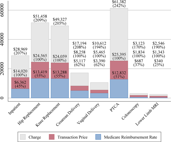
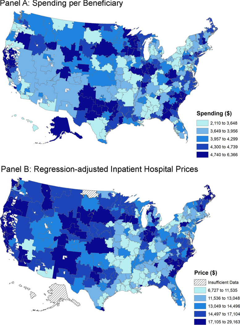
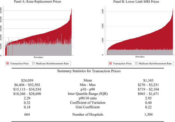
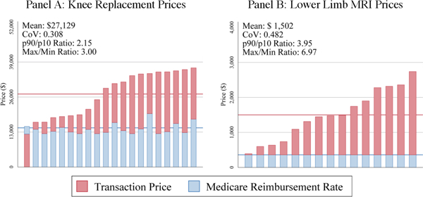
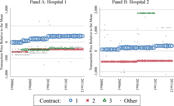
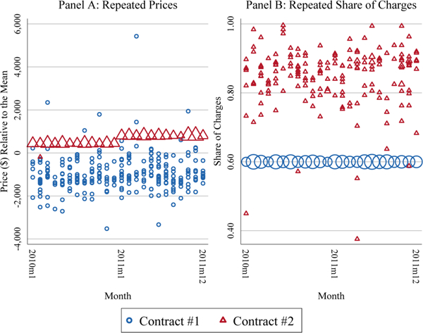
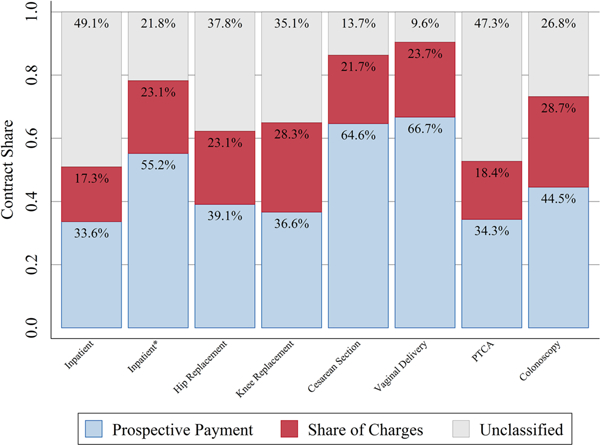
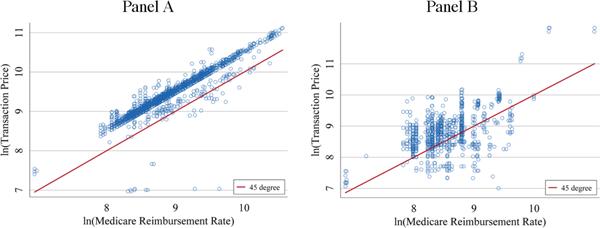
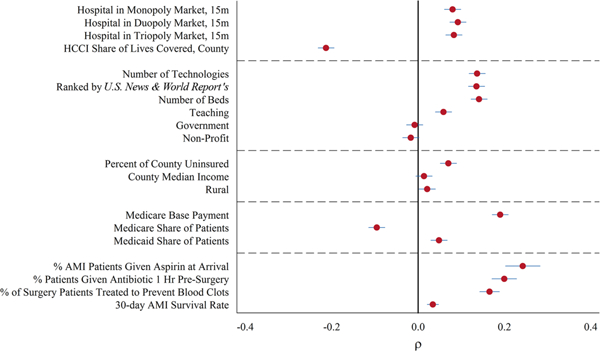
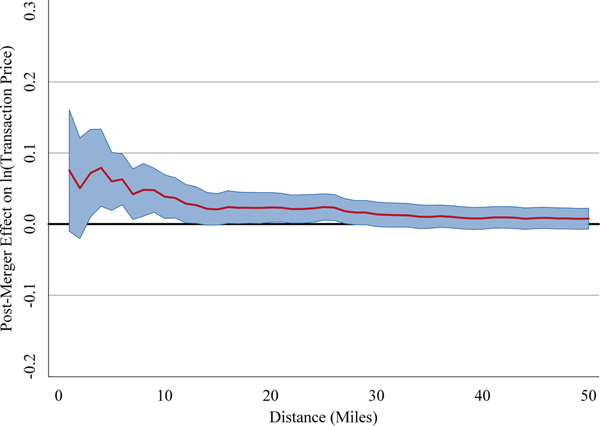
We use insurance claims data covering 28% of individuals with employer-sponsored health insurance in the United States to study the variation in health spending on the privately insured, examine the structure of insurer-hospital contracts, and analyze the variation in hospital prices across the nation. Health spending per privately insured beneficiary differs by a factor of three across geographic areas and has a very low correlation with Medicare spending. For the privately insured, half of the spending variation is driven by price variation across regions, and half is driven by quantity variation. Prices vary substantially across regions, across hospitals within regions, and even within hospitals. For example, even for a nearly homogeneous service such as lower-limb magnetic resonance imaging, about a fifth of the total case-level price variation occurs within a hospital in the cross section. Hospital market structure is strongly associated with price levels and contract structure. Prices at monopoly hospitals are 12% higher than those in markets with four or more rivals. Monopoly hospitals also have contracts that load more risk on insurers (e.g., they have more cases with prices set as a share of their charges). In concentrated insurer markets the opposite occurs-hospitals have lower prices and bear more financial risk. Examining the 366 mergers and acquisitions that occurred between 2007 and 2011, we find that prices increased by over 6% when the merging hospitals were geographically close (e.g., 5 miles or less apart), but not when the hospitals were geographically distant (e.g., over 25 miles apart).


Figures

Figure I
Figure I
Average Hospital Facilities Charges, Transaction Prices, and Medicare Reimbursements, 2011 Data drawn from the inpatient and procedures samples. The height of the light gray bars (top) are the average hospital charges. The height of the darker shaded bars (middle) are the transaction prices. Both are risk-adjusted as described in Online Appendix B.1 and B.2. The intermediate shaded bars (bottom) are the Medicare reimbursements as described in Online Appendix B.4. Prices are given in 2011 dollar amounts and as a percentage of the transaction prices (in parentheses).
Figure II
Figure II
Total Private Spending by HRR, 2011 Panel A captures risk-adjusted spending per beneficiary by HRR using data from 2011. Each bin captures a quintile of spending per beneficiary. The data are drawn from the spending sample. Spending per beneficiary is risk-adjusted for age and sex. Panel B captures HRR-level average hospital regression-adjusted inpatient prices that are risk-adjusted for DRG, age, and sex, and weighted by hospital activity. In Online Appendix Figure VII, we present this map normalized using the Medicare wage-index to control for local wage costs across the United States. Thatched regions are areas where we do not have sufficient data to calculate prices.
Figure III
Figure III
National Variation in Hospital Prices for Knee Replacement and Lower-Limb MRIs, 2011 Each darkly shaded bar represents a single hospital’s regression-adjusted transaction price based on 2011 cases. The Medicare payment (lightly shaded bars) is based on the PPS fee schedule described in Online Appendix B.4. The bars are ordered by private price. The summary statistics in the left column refer to knee replacements and those in the right column refer to MRIs.
Figure IV
Figure IV
Within-Market Hospital Price Variation for Philadelphia, PA, 2011 These panels present average hospital-level regression-adjusted private-payer prices for knee replacements and lower-limb MRIs using data from 2011. Each column captures a hospital in the Philadelphia HRR. We include similar graphs for all procedures and HRRs that include five or more providers at http://www.healthcarepricingproject.org.
Figure V
Figure V
Within-Hospital Prices for Lower Limb-MRIs at Two High-volume Hospitals, 2008–2011 These figures highlight the top three linked contracts (circles, crosses, and triangles) within the two highest-volume hospitals in our data in 2008–2011. Each point represents a unique price paid for a lower-limb MRI in a given hospital-month, where the size of the point corresponds to the volume of MRIs paid at that price. Repeated prices are linked across renegotiation events using information on the plan characteristics of the patients whose episodes were paid at that price. For more information on the methods used to link contracted prices see Online Appendix B.3.
Figure VI
Figure VI
Repeated Price and Share of Charge Agreements at a Hospital for Vaginal Delivery,2010–2011 These figures highlight the top two linked contracts within a high volume hospital for 2010–2011. Circles represent contract 1; triangles represent contract 2. The size of the point corresponds to the volume of cases at that price. Repeated prices and price-to-charge ratios are linked across renegotiation events using information on the plan characteristics of the patients whose episodes were paid at that price or rate. For more information on the methods used to link contracted prices see Online Appendix B.3. In Panel A the prices on the y-axis are relative to the average hospital price over the entire period which is constant across all observations (in order to avoid revealing a particular price).
Figure VII
Figure VII
Contract Classifications Overall and by Procedure, 2010–2011 The bars present the share of the claims by procedure (or inpatient sample) classified into each type of contract using case-level data from 2010 to 2011. The bottom bars display the percent of cases classified as prospective payments. The middle bars display the percent of cases paid as a share of charges. The top bars display the percent of cases not classified. The numbers of hospitals (cases) underlying each bar are 2,253 (2,288,907) for the inpatient sample, 404 (15,122) for hip replacement, 809 (37,157) for knee replacement, 1,041 (81,482) for cesarean section, 1,136 (108,794) for vaginal delivery, 501 (16,636) for PTCA, and 1,008 (66,018) for colonoscopy. Inpatient* presents a restricted subsample of the inpatient cases for hospital-DRG pairs that represent at least 20 admissions from 2010 to 2011. This sample represents 1,841 hospitals and 1,078,697 admissions.
Figure VIII
Figure VIII
Medicare Reimbursements and Transaction Prices at Two High-Volume Hospitals, 2011 The panels represent two large hospitals in the data. Each circle is a unique, privately paid prospective-payment amount for a DRG (y-axis). The x-axis is the corresponding logged Medicare reimbursement rates based on 2011 data. The diagonal line is the 45° line.
Figure IX
Figure IX
Bivariate Correlations of Hospital Price with Observable Factors, 2008–2011 The x-axis reflects the level of the bivariate correlations between key variables featured in our regressions and hospitals’ regression-adjusted inpatient prices that are risk-adjusted for DRG, age, and sex. The bars show the 95% confidence intervals surrounding the correlations. Because these are bivariate correlations, “duopoly” is duopoly or monopoly and the implicit omitted category is triopoly or greater. “Triopoly” is triopoly, duopoly, or monopoly. For government and nonprofit, the omitted category is private for-profit hospital.
Figure X
Figure X
How Merger Coefficient Changes for Mergers Between Hospitals of Different Geographical Proximity These are the regression coefficients from equation (3) of postmerger effects on the log of regression-adjusted price for the sample of inpatient admission. These prices are risk-adjusted for DRG, age, and sex. We estimate the model separately for 50 specifications identical to that of Panel A in Table V. We allow the merger definition to vary in including merging hospitals within the distances shown on the x-axis. So a value of 10 corresponds to a merger of hospitals within 10 miles of each other. The shaded area presents the 90 percent confidence interval for each estimate.

References

    1. Ashenfelter Orley, Hosken Daniel, and Weinberg Matthew, “Did Robert Bork Understate the Competitive Impact of Mergers? Evidence from Consummated Mergers,” Journal of Law and Economics, 57 (2014), S67–S100.
    1. Bai Ge, and Anderson Gerard F., “Extreme Markup: The Fifty US Hospitals with the Highest Charge-To-Cost Ratios,” Health Affairs, 34 (2015), 922–928. - PubMed
    1. j/>Baker Laurence, M. Kate Bundorf, Aileen Devlin, and Daniel P. Kessler, “Why Don’t Commercial Health Plans Use Prospective Payment?,” NBER Working Paperseries No. 22709, 2016.
    1. Bloom Nick, Propper Carol, Seiler Stephan, and John Van Reenen, “The Impact of Competition on Management Quality: Evidence from Public Hospitals,” Review of Economic Studies, 82 (2015), 457–489.
    1. Bloom Nick, Lemos Renata, Raffaella sadun, and John Van Reenen, “Healthy Business? Managerial Education and Management in Healthcare,” Centre for Economic Performance Discussion Paper 1500, 2017.