. 2020 Dec;26(12):1919-1928.
doi: 10.1038/s41591-020-1112-0. Epub 2020 Oct 14.

Magnitude, demographics and dynamics of the effect of the first wave of the COVID-19 pandemic on all-cause mortality in 21 industrialized countries

Affiliations

Magnitude, demographics and dynamics of the effect of the first wave of the COVID-19 pandemic on all-cause mortality in 21 industrialized countries

Vasilis Kontis et al. Nat Med. 2020 Dec.

Erratum in

Abstract

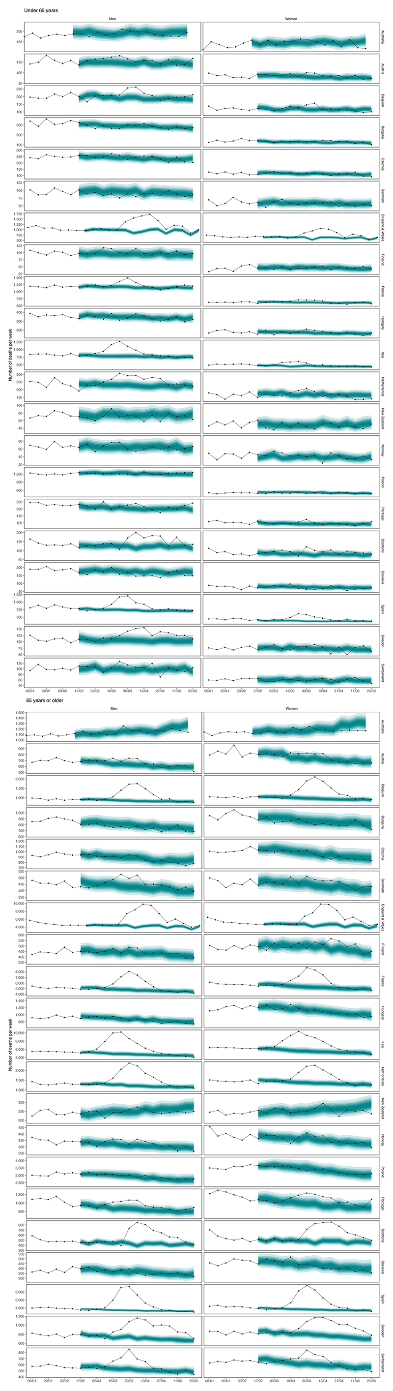
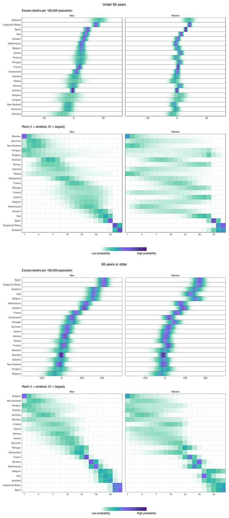
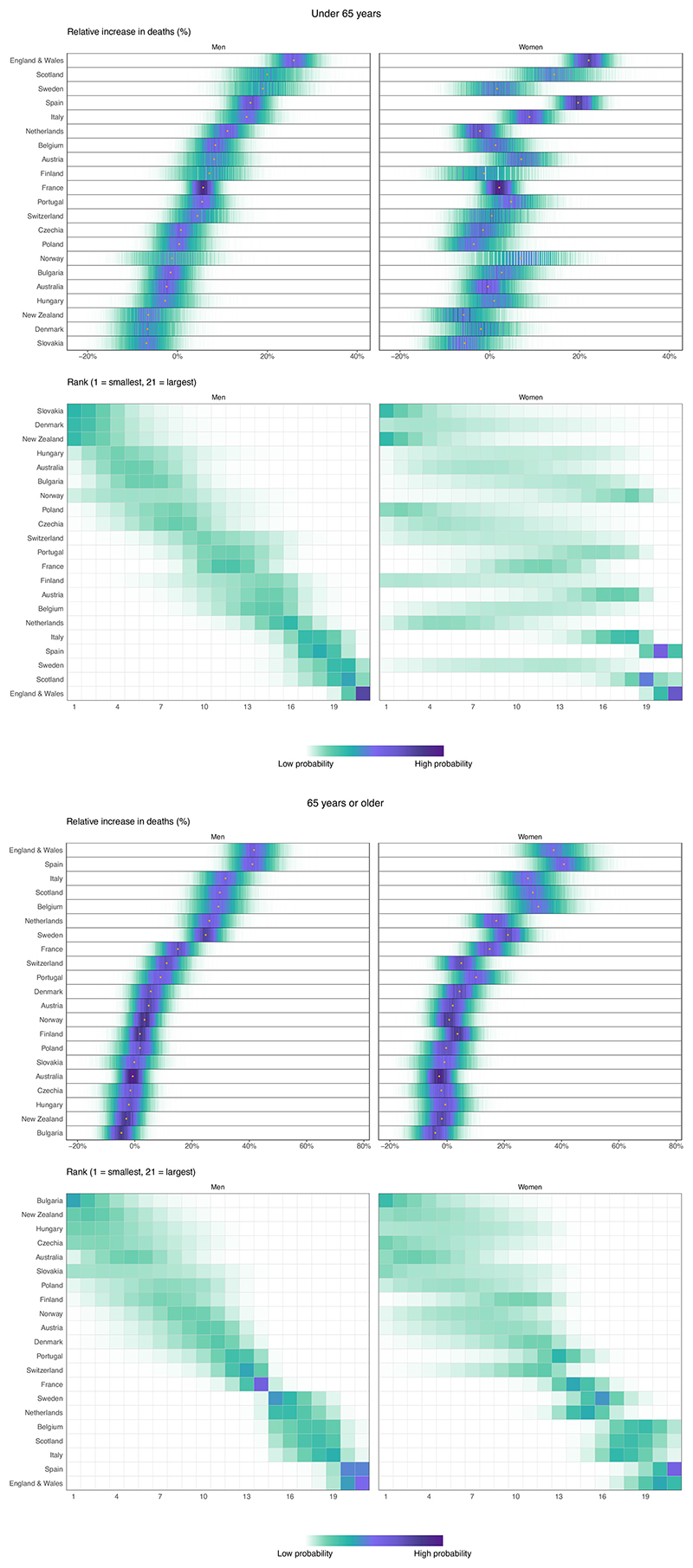
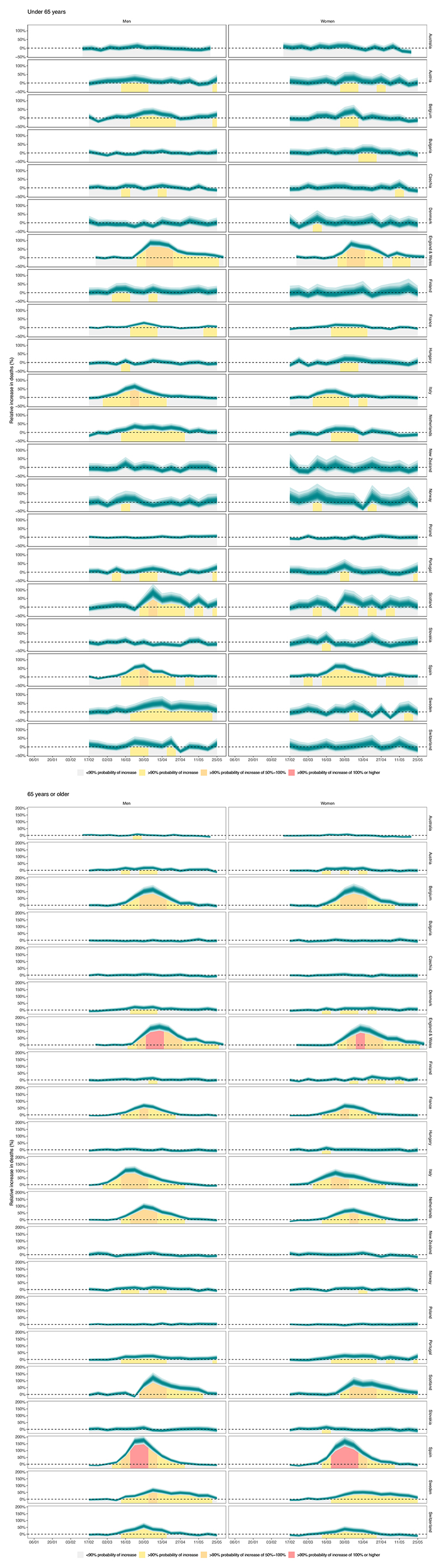
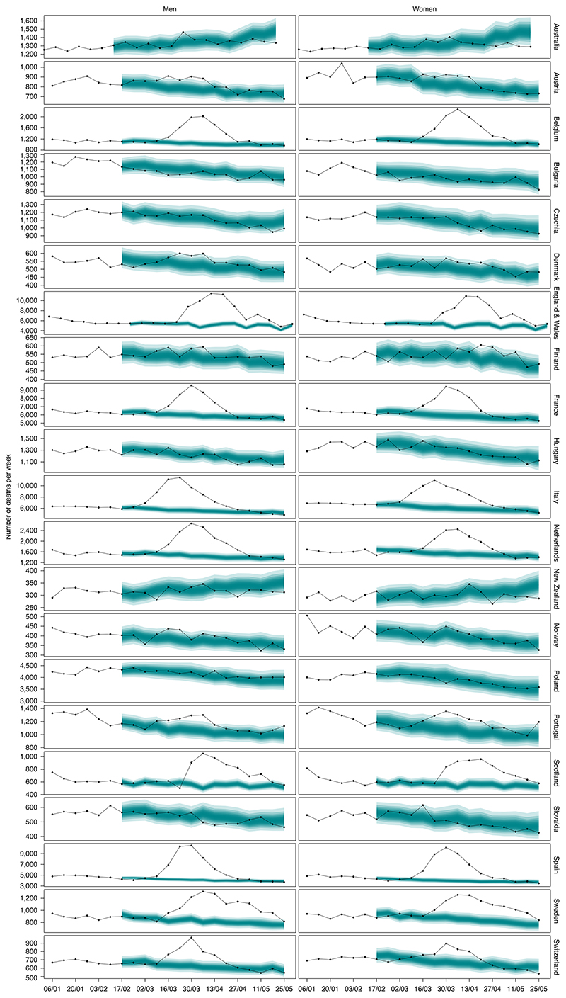
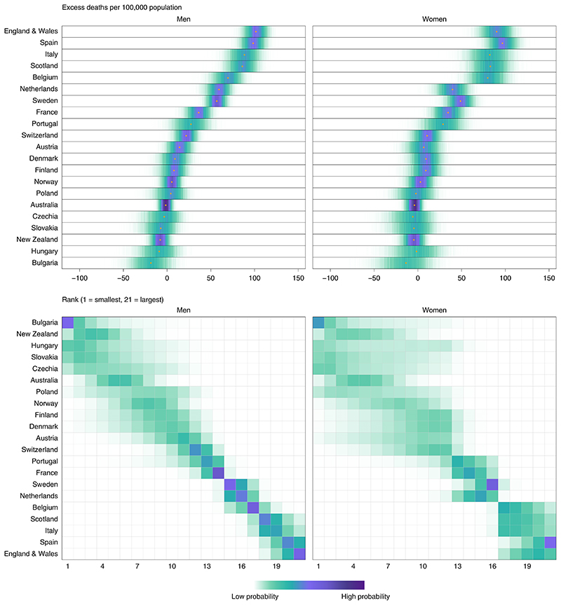
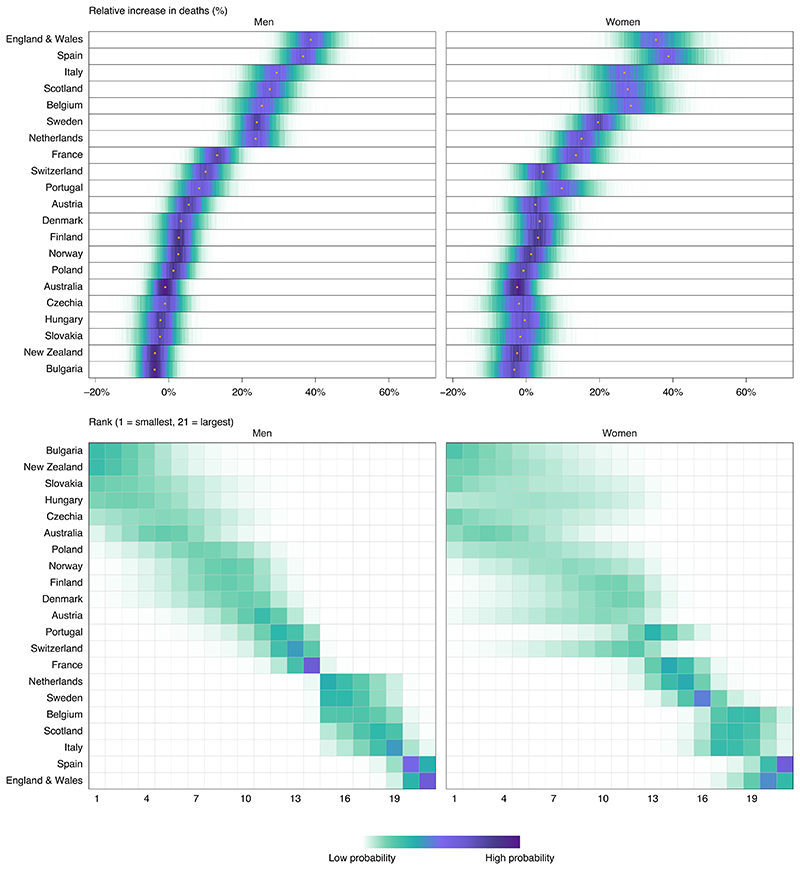
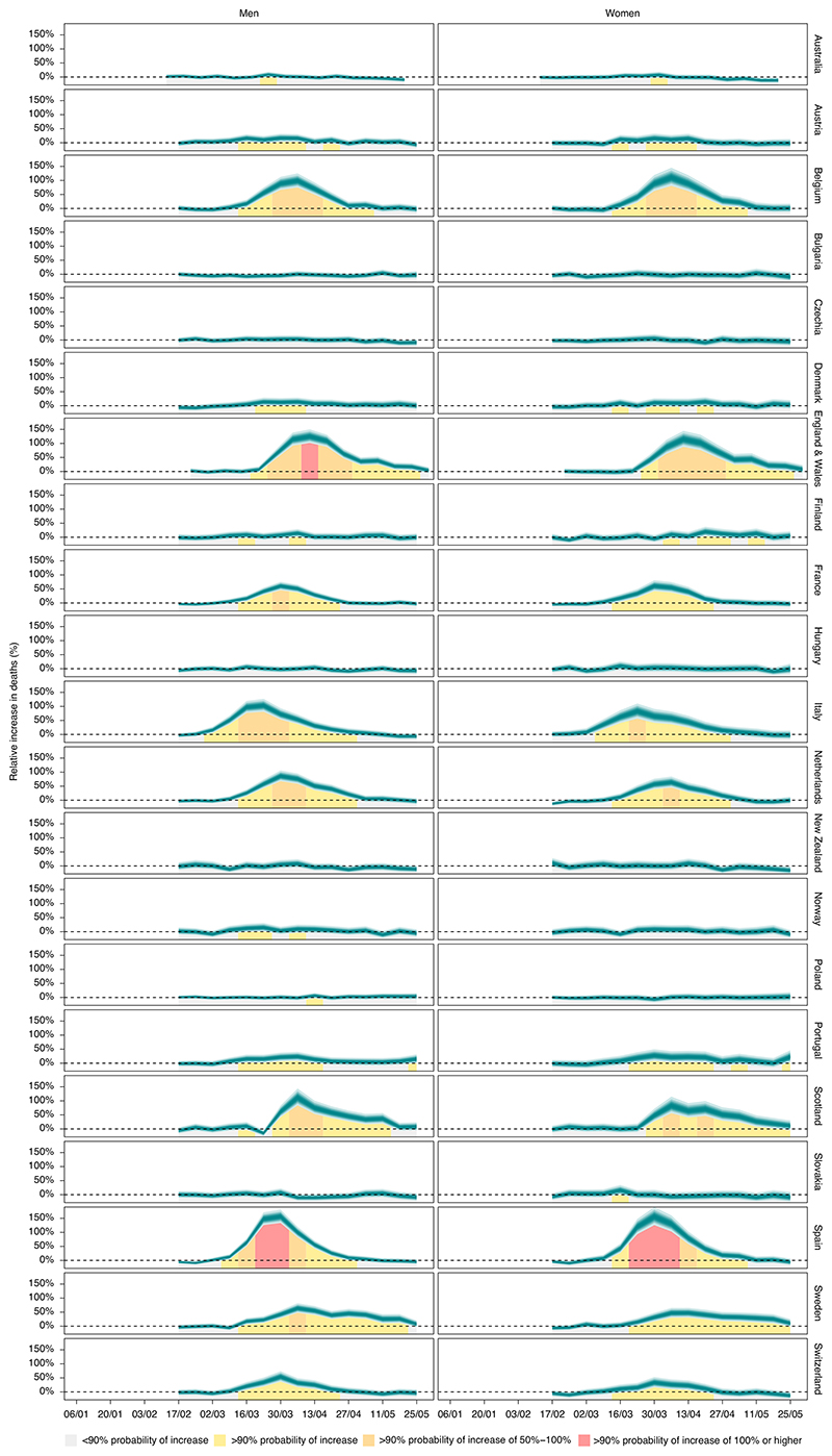
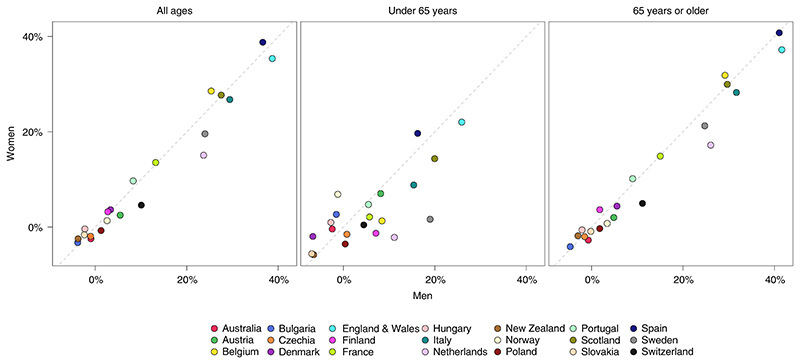
The Coronavirus Disease 2019 (COVID-19) pandemic has changed many social, economic, environmental and healthcare determinants of health. We applied an ensemble of 16 Bayesian models to vital statistics data to estimate the all-cause mortality effect of the pandemic for 21 industrialized countries. From mid-February through May 2020, 206,000 (95% credible interval, 178,100-231,000) more people died in these countries than would have had the pandemic not occurred. The number of excess deaths, excess deaths per 100,000 people and relative increase in deaths were similar between men and women in most countries. England and Wales and Spain experienced the largest effect: ~100 excess deaths per 100,000 people, equivalent to a 37% (30-44%) relative increase in England and Wales and 38% (31-45%) in Spain. Bulgaria, New Zealand, Slovakia, Australia, Czechia, Hungary, Poland, Norway, Denmark and Finland experienced mortality changes that ranged from possible small declines to increases of 5% or less in either sex. The heterogeneous mortality effects of the COVID-19 pandemic reflect differences in how well countries have managed the pandemic and the resilience and preparedness of the health and social care system.


Conflict of interest statement

Competing interests

M.E. reports a charitable grant from the AstraZeneca Young Health Programme and personal fees from Prudential, outside the submitted work. J.P.-S. is vice-chair of the Royal Society for Public Health and reports personal fees from Novo Nordisk A/S and Lane, Clark & Peacock, outside of the submitted work.

Figures

Extended Data Fig. 1
Extended Data Fig. 1. Weekly number of deaths from January 2020 through May 2020, by age group.
The points show reported deaths. The grey-shaded areas show the predictions of how many deaths would have been expected from mid-February had Covid-19 pandemic not taken place. The turquoise shading shows the credible intervals around the median prediction, from 5% (dark) to 95% (light) in 10% increments, obtained from 16,000 posterior draws as described in Methods.
Extended Data Fig. 2
Extended Data Fig. 2. Posterior distribution of excess deaths from any cause per 100,000 people from mid-February to end of May 2020 and posterior distribution of each country’s rank, by age group.
Gold dots in the top panels show the posterior medians. Countries are ordered vertically by median excess (top panels) and mean rank (bottom panels) in men.
Extended Data Fig. 3
Extended Data Fig. 3. Posterior distribution of percent increase in deaths from any cause from mid-February to end of May 2020 and posterior distribution of each country’s rank, by age group.
Gold dots in the top panels show the posterior medians. Countries are ordered vertically by median increase (top panels) and mean rank (bottom panels) in men.
Extended Data Fig. 4
Extended Data Fig. 4. Weekly percent increase in mortality as a result of the Covid-19 pandemic by country, by age group.
The turquoise shading shows the credible intervals around the median prediction, from 5% (dark) to 95% (light) in 10% increments, obtained from 16,000 posterior draws as described in Methods. The background shading indicates the magnitude of the weekly increase that was detectable with a posterior probability of at least 90%.
Fig. 1
Fig. 1. Weekly number of deaths from any cause from January 2020 through May 2020.
The points show reported deaths (placed at the start of each week in this graph). The turquoise-shaded areas show the predictions of how many deaths would have been expected from mid-February had the COVID-19 pandemic not ocurred. The shading shows the credible intervals around the median prediction, from 5% (dark) to 95% (light) in 10% increments, obtained from 16,000 posterior draws as described in the Methods. Extended Data Fig. 1 shows results by age group.
Fig. 2
Fig. 2. Posterior distribution of excess deaths from any cause per 100,000 people from mid-February to the end of May 2020 and posterior distribution of each country’s rank.
Gold dots in the top panels show the posterior medians. Countries are ordered vertically by median excess (top panels) and mean rank (bottom panels) in men. Extended Data Fig. 2 shows results by age group. In the top panels, there is a relatively high posterior probability that excess deaths per 100,000 people in each country are in the ranges shaded in dark purple and a low posterior probability that they are in the ranges shaded in light green. In the bottom panels, there is a relatively high posterior probability that each country ranks in the positions shaded in dark purple and a low posterior probability that it ranks in the positions shaded in light green.
Fig. 3
Fig. 3. Posterior distribution of percent increase in deaths from any cause from mid-February to the end of May 2020 and posterior distribution of each country’s rank.
Gold dots in the top panels show the posterior medians. Countries are ordered vertically by median increase (top panels) and mean rank (bottom panels) in men. Extended Data Fig. 3 shows results by age group. The Fig. 2 caption explains how the shadings in the two panels should be interpreted.
Fig. 4
Fig. 4. Weekly percent increase in mortality from any cause as a result of the COVID-19 pandemic by country.
The turquoise shading (placed at the start of each week) shows the credible intervals around the median prediction, from 5% (dark) to 95% (light) in 10% increments, obtained from 16,000 posterior draws as described in the Methods. The background shading indicates the magnitude of the weekly increase that was detectable with a posterior probability of at least 90%. Extended Data Fig. 4 shows results by age group.
Fig. 5
Fig. 5. Comparison of percent increase in deaths from any cause as a result of the COVID-19 pandemic between men and women, for all ages and by age group.

Similar articles

Cited by

References

    1. Douglas M, Katikireddi SV, Taulbut M, McKee M, McCartney G. Mitigating the wider health effects of COVID-19 pandemic response. BMJ. 2020;369:m1557. - PMC - PubMed
    1. Pearce N, Lawlor DA, Brickley EB. Comparisons between countries are essential for the control of COVID-19. Int J Epidemiol. 2020 doi: 10.1093/ije/20.4.1093. - DOI - PMC - PubMed
    1. Merrick R. Coronavirus: Boris Johnson’s claim it is ‘too early’ to draw global death toll comparisons mocked by Keir Starmer. The Independent. 2020. https://www.independent.co.uk/news/uk/politics/coronavirus-daily-briefin... .
    1. World Health Organization. Global Health Estimates: Deaths by Cause, Age, Sex and Country, 2000-2016. World Health Organization; 2018.
    1. Fuller T, Baker M. Coronavirus death in California came weeks before first known U.S. death. The New York Times. 2020 https://www.nytimes.com/2020/04/22/us/coronavirus-first-united-states-de... .

Publication types