. 2021 Jan;27(1):94-105.
doi: 10.1038/s41591-020-1132-9. Epub 2020 Oct 23.

Modeling COVID-19 scenarios for the United States

Collaborators

Modeling COVID-19 scenarios for the United States

IHME COVID-19 Forecasting Team. Nat Med. 2021 Jan.

Erratum in

Abstract

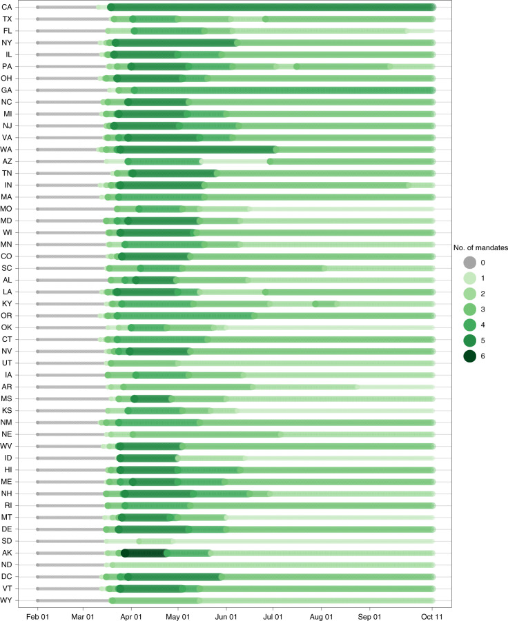
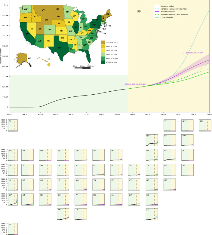
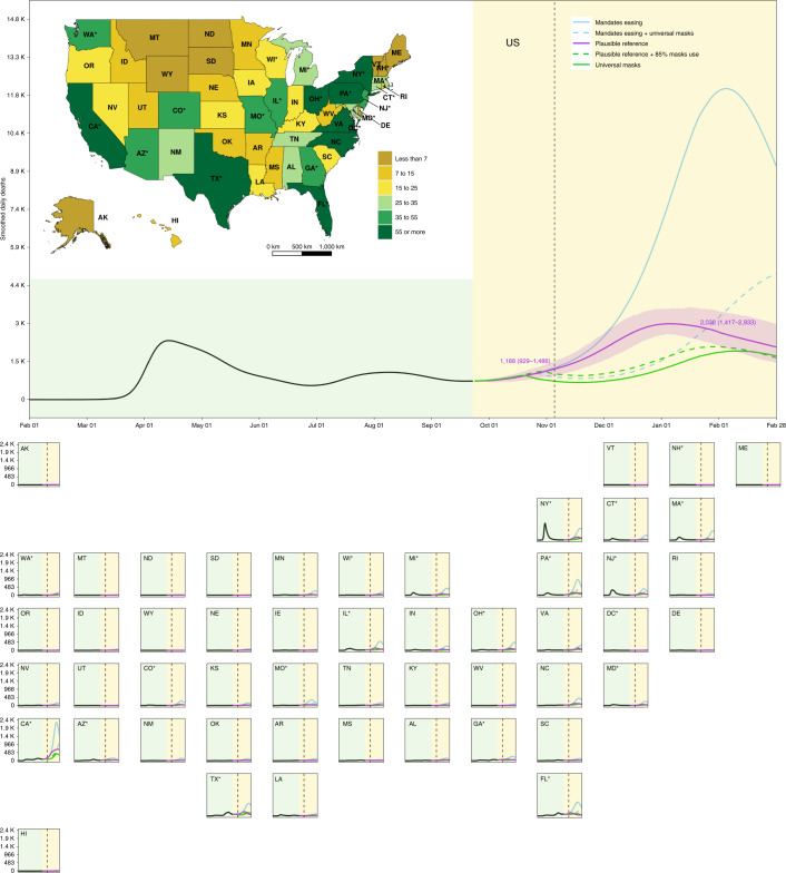
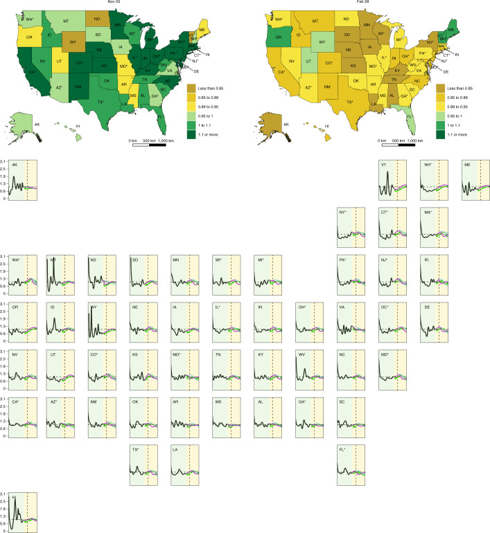
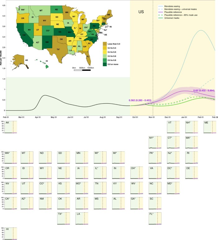
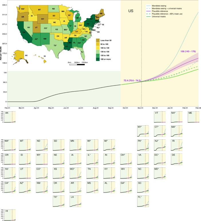
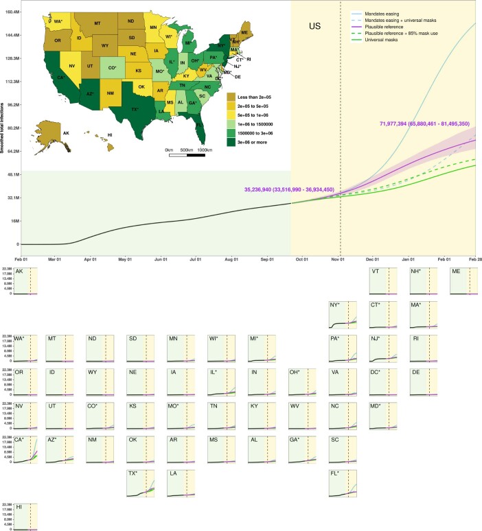
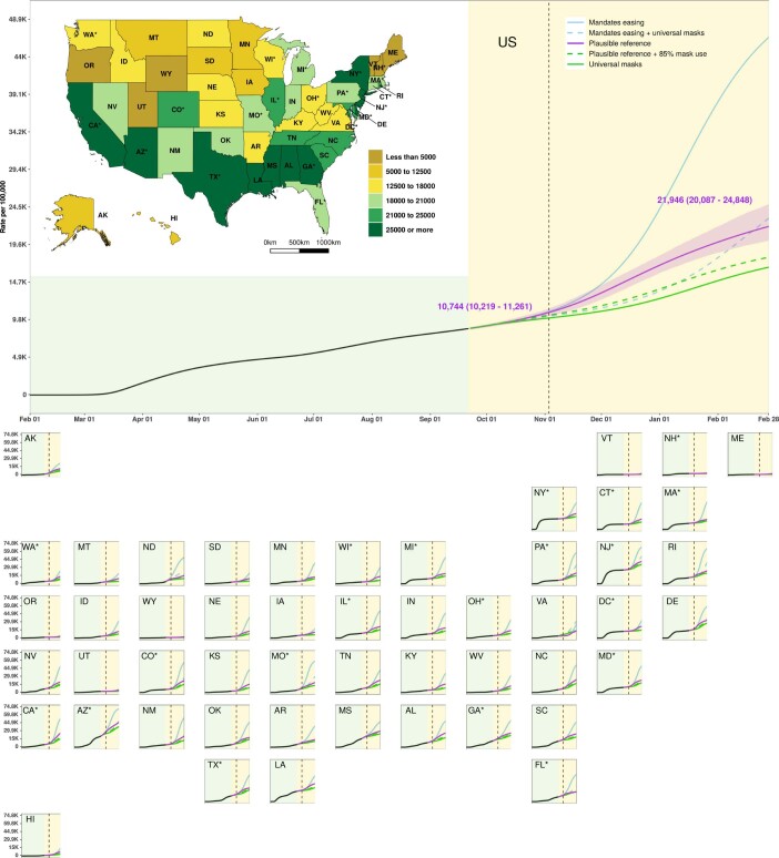
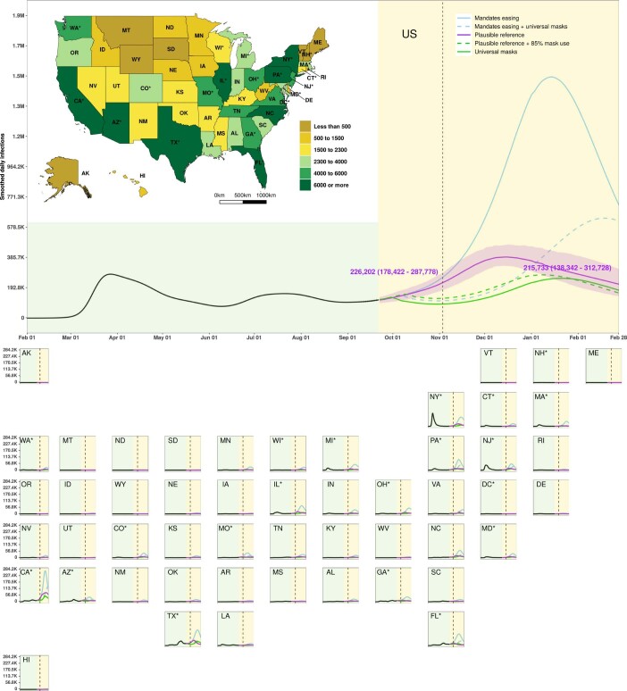
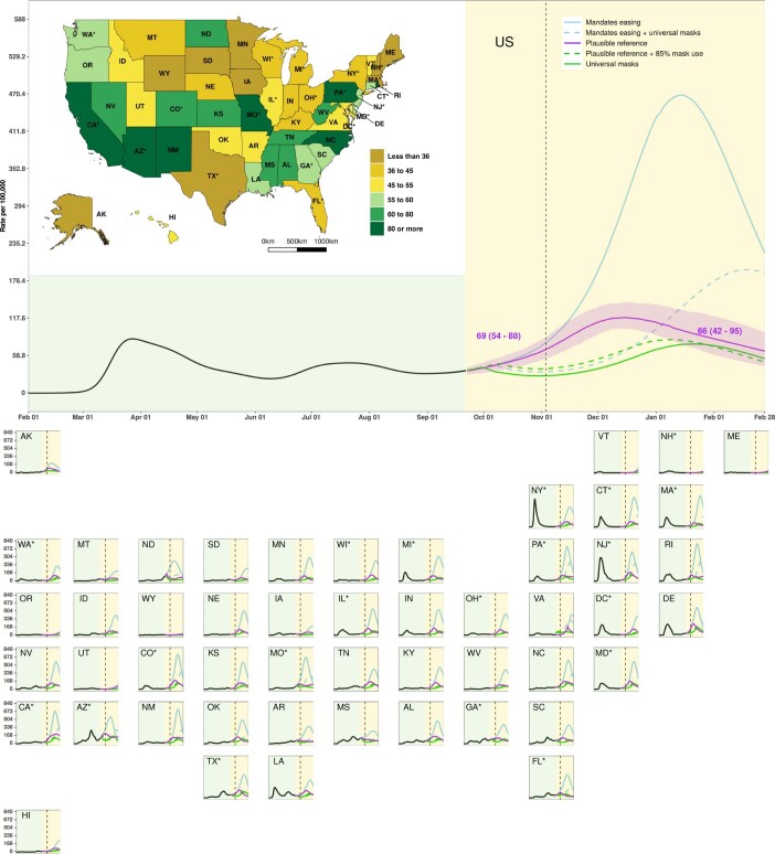
We use COVID-19 case and mortality data from 1 February 2020 to 21 September 2020 and a deterministic SEIR (susceptible, exposed, infectious and recovered) compartmental framework to model possible trajectories of severe acute respiratory syndrome coronavirus 2 (SARS-CoV-2) infections and the effects of non-pharmaceutical interventions in the United States at the state level from 22 September 2020 through 28 February 2021. Using this SEIR model, and projections of critical driving covariates (pneumonia seasonality, mobility, testing rates and mask use per capita), we assessed scenarios of social distancing mandates and levels of mask use. Projections of current non-pharmaceutical intervention strategies by state-with social distancing mandates reinstated when a threshold of 8 deaths per million population is exceeded (reference scenario)-suggest that, cumulatively, 511,373 (469,578-578,347) lives could be lost to COVID-19 across the United States by 28 February 2021. We find that achieving universal mask use (95% mask use in public) could be sufficient to ameliorate the worst effects of epidemic resurgences in many states. Universal mask use could save an additional 129,574 (85,284-170,867) lives from September 22, 2020 through the end of February 2021, or an additional 95,814 (60,731-133,077) lives assuming a lesser adoption of mask wearing (85%), when compared to the reference scenario.


Conflict of interest statement

This study was funded by the Bill & Melinda Gates Foundation. The funders of the study had no role in study design, data collection, data analysis, data interpretation, writing of the final report or the decision to publish. A.F. reports personal fees from Kaiser Permanente and NORC and other support from Agathos, all outside the submitted work. The spouse of J.R.S. is employed by The Bill & Melinda Gates Foundation and had no role in study design, data collection, data analysis, data interpretation, writing of the manuscript or the decision to submit the manuscript for publication. The corresponding author had full access to all the data in the study and had final responsibility for the decision to submit for publication.

Figures

Fig. 1
Fig. 1. Number of social distancing mandates by US state from 1 February 2020 to 22 September 2020.
States are ordered by decreasing population size on the y axis. Source data
Fig. 2
Fig. 2. Cumulative deaths from 1 February 2020 to 28 February 2021.
The inset map displays the cumulative deaths under the plausible reference scenario on 28 February 2021. A light-yellow background separates the observed and predicted part of the time series, before and after 22 September 2020. The dashed vertical line identifies 3 November 2020. Solid lines represent boundary scenarios and dashed lines represent derivative scenarios. Numbers are the means and UIs for the plausible reference scenario on the highlighted dates. An asterisk indicates states with population centers exceeding 2 million persons. UIs are shown for only the plausible reference scenario. Source data
Fig. 3
Fig. 3. Daily deaths from 1 February 2020 to 28 February 2021.
The inset map displays the daily deaths under the plausible reference scenario on 28 February 2021. A light-yellow background separates the observed and predicted part of the time series, before and after 22 September 2020. The dashed vertical line identifies 3 November 2020. Solid lines represent boundary scenarios and dashed lines represent derivative scenarios. Numbers are the means and UIs for the plausible reference scenario on the highlighted dates. An asterisk indicates states with population centers exceeding 2 million persons. UIs are shown for only the plausible reference scenario. Source data
Fig. 4
Fig. 4. Time series for values of Reffective by US state.
Inset maps display the value of Reffective on 3 November 2020 and 28 February 2021; time series of Reffective are presented for each state as separate panels. A light-yellow background separates the observed and predicted part of the time series, before and after 22 September 2020. The dashed vertical line identifies 3 November 2020. An asterisk indicates states with population centers exceeding 2 million persons. Source data
Extended Data Fig. 1
Extended Data Fig. 1. Estimated daily COVID-19 death rate (per 100,000 population) by state for all five scenarios.
The inset map displays the estimated daily deaths from COVID-19 death per 100,000 population by state on 28 February 2021. The light yellow background separates the observed and predicted part of the time series, before and after 21 September 2020. The dashed vertical line identifies 03 November 2020. Numbers are the means and uncertainty interval (UI) for the plausible reference scenario on dates highlighted. Source data
Extended Data Fig. 2
Extended Data Fig. 2. Estimated total hospital beds needed for COVID-19 patients by state from 01 February 2020 to 28 February, 2021, under the plausible reference scenario.
The inset map displays the estimated peak number of all COVID-19 beds above capacity by state between 22 September 2020 and 28 February 2021. The light yellow background separates the observed and predicted part of the time series, before and after 21 September 2020. The dashed vertical line identifies 03 November 2020. Numbers are the means and uncertainty interval (UI) for the plausible reference scenario on dates highlighted. Source data
Extended Data Fig. 3
Extended Data Fig. 3. Estimated total ICU beds needed for COVID-19 patients by state from 01 February 2020 to 28 February 2021, under the plausible reference scenario.
The inset map displays the estimated peak number of all ICU COVID-19 beds above capacity by state between 22 September 2020 and 28 February 2021. The light yellow background separates the observed and predicted part of the time series, before and after 21 September 2020. The dashed vertical line identifies 03 November 2020. Numbers are the means and uncertainty interval (UI) for the plausible reference scenario on dates highlighted. Source data
Extended Data Fig. 4
Extended Data Fig. 4. Estimated cumulative deaths from COVID-19 per 100,000 population from 01 February 2020 to 28 February 2021, by state, for all five scenarios.
The inset map displays the estimated cumulative deaths per 100,000 population under the plausible reference scenario on 28 February 2021. The light yellow background separates the observed and predicted part of the time series, before and after 21 September 2020. The dashed vertical line identifies 03 November 2020. Numbers are the means and uncertainty interval (UI) for the plausible reference scenario on dates highlighted. The UIs are shown only for the plausible reference scenario. Source data
Extended Data Fig. 5
Extended Data Fig. 5. Estimated cumulative infections from SARS-CoV-2 from 01 February 2020 to 28 February 2021, by state, for all five scenarios.
The inset map displays the estimated cumulative infections under the plausible reference scenario on 28 February 2021. The light yellow background separates the observed and predicted part of the time series, before and after 21 September 2020. The dashed vertical line identifies 03 November 2020. Numbers are the means and uncertainty interval (UI) for the plausible reference scenario on dates highlighted. The UIs are shown only for the plausible reference scenario. Source data
Extended Data Fig. 6
Extended Data Fig. 6. Estimated cumulative SARS-CoV-2 infection rate (per 100,000 population) by state, for all five scenarios.
The inset map displays the estimated cumulative infections from COVID-19 per 100,000 population by state on 28 February 2021. The light yellow background separates the observed and predicted part of the time series, before and after 21 September 2020. The dashed vertical line identifies 03 November 2020. Numbers are the means and uncertainty interval (UI) for the plausible reference scenario on dates highlighted. The UIs are shown only for the plausible reference scenario. Source data
Extended Data Fig. 7
Extended Data Fig. 7. Estimated daily infections from SARS-CoV-2 from 01 February 2020 to 28 February 2021 by state, for all five scenarios.
The inset map displays the estimated daily infections under the plausible reference scenario on 28 February 2021. The light yellow background separates the observed and predicted part of the time series, before and after 21 September 2020. The dashed vertical line identifies 03 November 2020. Numbers are the means and uncertainty interval (UI) for the plausible reference scenario on dates highlighted. The UIs are shown only for the plausible reference scenario. Source data
Extended Data Fig. 8
Extended Data Fig. 8. Estimated daily SARS-CoV-2 infection rate (per 100,000 population) by state, for all five scenarios.
The inset map displays the estimated daily infections from COVID-19 per 100,000 population by state on 28 February 2021. The light yellow background separates the observed and predicted part of the time series, before and after 21 September 2020. The dashed vertical line identifies 03 November 2020. Numbers are the means and uncertainty interval (UI) for the plausible reference scenario on dates highlighted. The UIs are shown only for the plausible reference scenario. Source data
Extended Data Fig. 9
Extended Data Fig. 9. Modeled SARS-CoV-2 infection prediction totals compared with survey-derived seroprevalence rates in select locations.
Modeled SARS-CoV-2 infection prediction totals compared with survey-derived seroprevalence rates in select locations globally. The scatter plots show locations colour coded by country; horizontal bars are the 95% confidence interval in the modeled estimates. The inset violin plot of the measured seropositivity data show the predominantly low values seropositivity estimates (below 5%) recorded in this global sample. Source data

References

    1. Andersen KG, Rambaut A, Lipkin WI, Holmes EC, Garry RF. The proximal origin of SARS-CoV-2. Nat. Med. 2020;26:450–452. doi: 10.1038/s41591-020-0820-9. - DOI - PMC - PubMed
    1. World Health Organization. Novel coronavirus disease (2019-nCoV) Situation Report—1 (2020).
    1. World Health Organization. Coronavirus disease 2019 (COVID-19) Situation Report—163 (2020).
    1. Horton, R. The COVID-19 Catastrophe: What’s Gone Wrong and How to Stop it Happening Again. (John Wiley & Sons, 2020).
    1. Miller, I. F., Becker, A. D., Grenfell, B. T. & Metcalf, C. J. E. Disease and healthcare burden of COVID-19 in the United States. Nat. Med.26, 1212–1217 (2020). - PubMed

Publication types