. 2020 Nov;52(11):1158-1168.
doi: 10.1038/s41588-020-00721-x. Epub 2020 Oct 26.

Single-cell epigenomic analyses implicate candidate causal variants at inherited risk loci for Alzheimer's and Parkinson's diseases

Affiliations

Single-cell epigenomic analyses implicate candidate causal variants at inherited risk loci for Alzheimer's and Parkinson's diseases

M Ryan Corces et al. Nat Genet. 2020 Nov.

Abstract

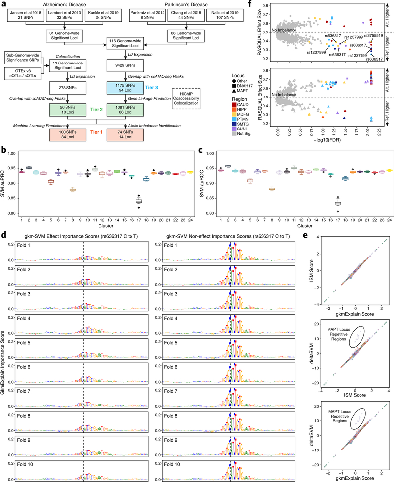
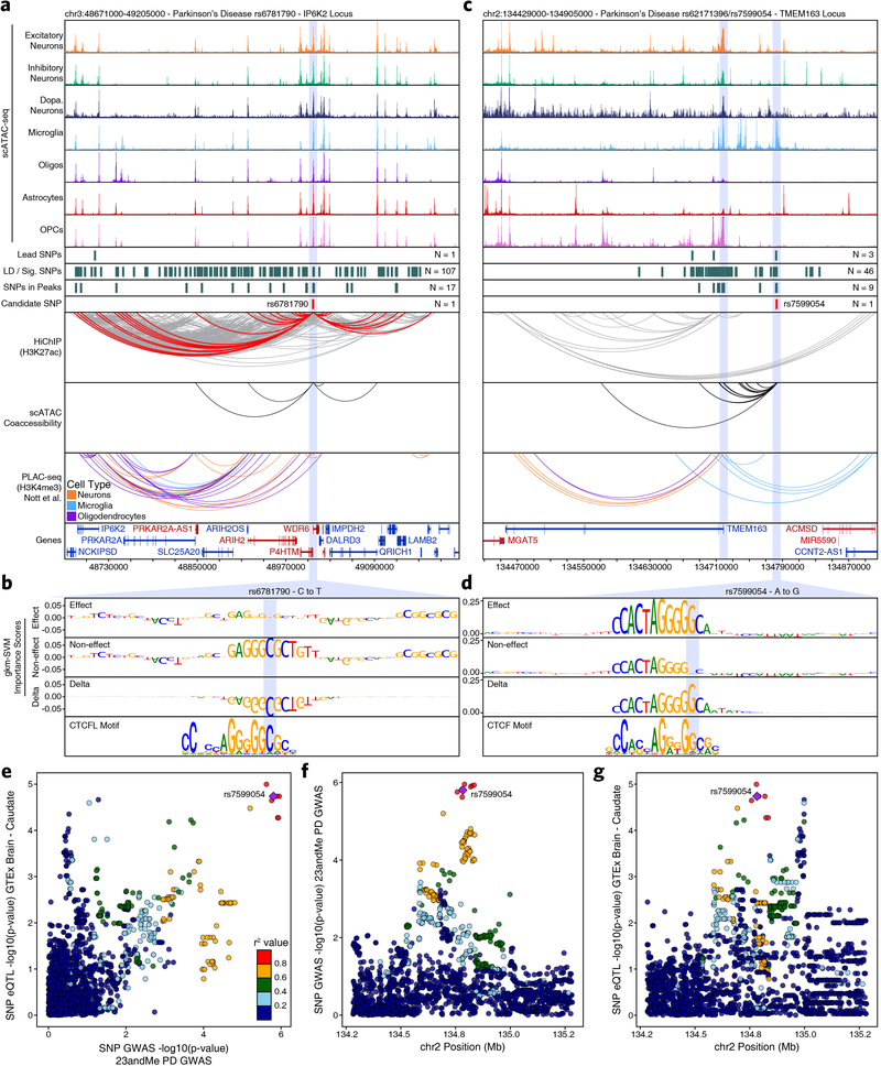
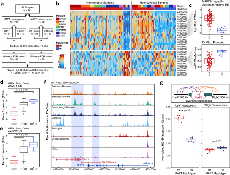
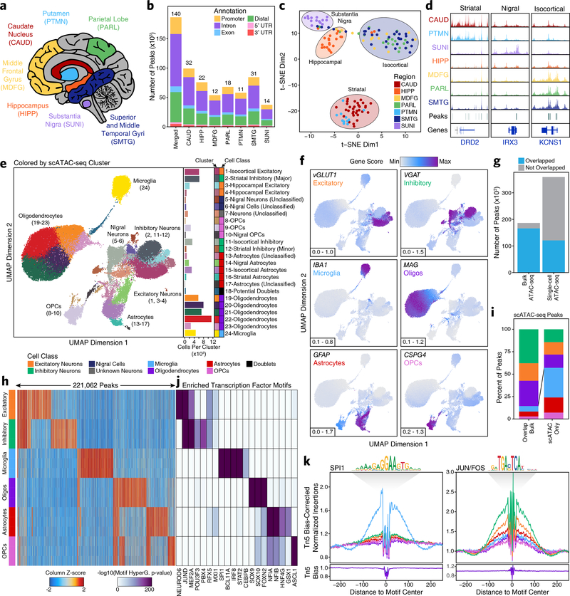
Genome-wide association studies of neurological diseases have identified thousands of variants associated with disease phenotypes. However, most of these variants do not alter coding sequences, making it difficult to assign their function. Here, we present a multi-omic epigenetic atlas of the adult human brain through profiling of single-cell chromatin accessibility landscapes and three-dimensional chromatin interactions of diverse adult brain regions across a cohort of cognitively healthy individuals. We developed a machine-learning classifier to integrate this multi-omic framework and predict dozens of functional SNPs for Alzheimer's and Parkinson's diseases, nominating target genes and cell types for previously orphaned loci from genome-wide association studies. Moreover, we dissected the complex inverted haplotype of the MAPT (encoding tau) Parkinson's disease risk locus, identifying putative ectopic regulatory interactions in neurons that may mediate this disease association. This work expands understanding of inherited variation and provides a roadmap for the epigenomic dissection of causal regulatory variation in disease.


Conflict of interest statement

COMPETING INTERESTS STATEMENT

H.Y.C. is a co-founder of Accent Therapeutics, Boundless Bio, and an advisor to 10x Genomics, Arsenal Biosciences, Spring Discovery. S.B.M. is on the scientific advisory board of MyOme. A.K. is a consultant for Biogen Inc. A.S. is a consultant for MyoKardia. W.J.G. is a consultant for Guardant Health, 10x Genomics, and Protillion Biosciences.

Figures

Extended Data Fig. 1
Extended Data Fig. 1. Region-centric scATAC-seq identifies cellular and regional heterogeneity in chromatin accessibility in adult brain
a-b, UMAP dimensionality reduction (a) prior to and (b) after batch correction with Harmony of scATAC-seq data from 10 different samples. Each dot represents a single cell (N = 70,631). Dots are colored by the sample of origin. Color labels are shown in Extended Data Figure 1b. c, The same UMAP dimensionality reduction shown in Extended Data Figure 1b but each cell is colored by its gene activity score for the annotated lineage-defining gene. Gene activity scores were imputed using MAGIC. Grey represents the minimum gene activity score while purple represents the maximum gene activity score for the given gene. The minimum and maximum scores are shown in the bottom left of each panel. The gene of interest and the cell type that it identified are shown in the upper left of each panel. MSNs – medium spiny neurons. d, Heatmap of cell type-specific markers used to define the cell type corresponding to each cluster. Color represents the row-wise Z-score of chromatin accessibility in the vicinity of each gene for each cluster. e, Cluster residence heatmap showing the percent of each cluster that is composed of cells from each sample. Cell numbers were normalized across samples prior to calculating cluster residence percentages to account for differences in total pass filter cells per sample. f-h, UMAP dimensionality reduction as shown in Extended Data Figure 1b but colored by (f) the gross brain region from which each cell was obtained, (g) the biological sex of the donor for each cell, or (h) the predicted cell class for each cell. i-k, Bar plot showing the number of cells identified in our scATAC-seq data from (i) each of the annotated cell classes, (j) each of the annotated donors/samples, or (k) each of the gross brain regions subdivided based on cell class. Color represents the predicted cell class as shown in the legend of Extended Data Figure 1h. l-m, Bar plot showing the percentage of cells in our scATAC-seq data from (l) each of the gross brain regions subdivided based cell class or (m) each of the annotated cell classes subdivided based on donor/sample of origin. Color represents (l) the predicted cell class as shown in the Extended Data Figure 1h or (m) the biological sample from which the cells were obtained.
Extended Data Fig. 2
Extended Data Fig. 2. Cellular heterogeneity in brain tissue necessitates single-cell approaches to capture biological complexity
a-b, Bar plot of the log2(Fold Change) in the percent of peaks mapping to various genomic annotations comparing peaks from (a) the scATAC-seq peak set that are not overlapped by a peak from the bulk ATAC-seq peak set to peaks that are overlapped by a peak from the bulk ATAC-seq peak set or (b) the scATAC-seq peak set that are were identified as cell type-unique through feature binarization to all peaks from the scATAC-seq peak set. c, Sequencing tracks of lineage-defining factors shown across all 24 scATAC-seq clusters (except Cluster 18 – putative doublets). From left to right, NEFL (neurons; chr8:24933431–24966791), AIF1 (aka IBA1, microglia; chr6:31607841–31617906), MOG (oligodendrocytes; chr6:29652183–29699713), GJB6 (astrocytes; chr13:20200243–20239571), and PDGFRA (OPCs; chr4:54209541–54303643). d, Box and whiskers plots showing the distribution of the number of single cells from our scATAC-seq data showing accessibility within (left) each peak from the set of peaks from the scATAC-seq peak set that overlap a peak from the bulk ATAC-seq peak set (N = 120,941 peaks) and (right) each peak from the set of peaks from the scATAC-seq peak set that do not overlap a peak from the bulk ATAC-seq peak set (N = 238,081 peaks). The lower and upper ends of the box represent the 25th and 75th percentiles and the internal line represents the median. The whiskers represent 1.5 multiplied by the inter-quartile range. P-value determined by Kolmogorov–Smirnov test. e, Dot plot showing the inter-region Pearson correlation of pseudo-bulk replicates comprised of all cells from either SMTG, PARL, or MDFG within each of the clusters shown. The clusters shown were selected based on biological relevance (i.e. clusters annotated as “substantia nigra astrocytes” should not be compared across isocortical regions) and on cluster size (i.e. clusters with small numbers of isocortical cells would not provide robust comparisons).
Extended Data Fig. 3
Extended Data Fig. 3. Neuronal sub-clustering identifies diverse biologically relevant populations of neurons
a-d, UMAP dimensionality reduction of neuronal cells (identified as Clusters 1, 2, 3, 4, 5, 6, 7, 11, and 12 from Figure 1e) (a) prior to or (b-d) after batch correction with Harmony of scATAC-seq data from 10 different samples. Each dot represents a single cell (N = 21,116). Dots are colored by (a-b) the sample of origin, (c) the neuronal sub-cluster (repeated from Figure 2a), or (d) its gene activity score for the annotated lineage-defining gene. In (d), gene activity scores were imputed using MAGIC. Grey represents the minimum gene activity score while purple represents the maximum gene activity score for the given gene. The minimum and maximum scores are shown in the bottom left of each panel. The gene of interest is shown in the upper right of each panel. e, Heatmap of gene activity scores for all neuronal markers used in identifying relevant cell types for neuronal sub-clusters. Color represents the column-wise z-scores for each gene across all neuronal sub-clusters with values thresholded at −2 and +2. Neuronal cluster “major annotation” is shown by color along with a cluster description to the right of the plot. f-h, The same UMAP dimensionality reduction shown in Extended Data Figure 3c but cells are colored by (f) the major cell class annotation, (g) a more granular neuronal sub-annotation, or (h) the neuronal cell class annotation. Assignment was made based on gene activity scores of lineage-defining genes. The cell class annotation shown in (h) was used to perform LD score regression analysis.
Extended Data Fig. 4
Extended Data Fig. 4. Sub-clustering of cells from the substantia nigra identifies TH-positive dopaminergic neurons
a-d, UMAP dimensionality reduction after iterative LSI of scATAC-seq data from substantia nigra cells from 2 different samples. Each dot represents a single cell (N = 11,199). Dots are colored by (a) their corresponding substantia nigra sub-cluster, (b) the sample of origin, or (c-d) its gene activity score for (c) the tyrosine hydoxylase (TH) gene, a specific marker of dopaminergic neurons or (d) other lineage-defining genes. In (c-d), gene activity scores were imputed using MAGIC. Grey represents the minimum gene activity score while purple represents the maximum gene activity score for the TH gene. In (a-c), the minimum and maximum scores are shown in the bottom left of the figure. Predicted cluster cell type identities are overlaid on the UMAPs.
Extended Data Fig. 5
Extended Data Fig. 5. HiChIP and co-accessibilty predict enhancer-promoter interactions in primary adult human brain
a, Heatmap representation of HiChIP interaction signal at 100-kb, 25-kb, and 5-kb resolution at the OLIG2 locus. Sample shown represents the substantia nigra from donor 03–41. Signal is normalized to the square root of the coverage. The maximum value of the color range and the coordinates along chromosome 21 are shown below each panel. b, Bar plots showing the total number of paired-end reads sequenced for each HiChIP library generated in this study. Color represents the brain region from which the data was generated. c, Bar plots showing the number of valid interaction pairs identified in HiChIP data from all samples profiled in this study. Color represents the type of interaction identified. d, Bar plot showing the overlap of FitHiChIP loop calls from the 4 gross brain regions profiled. Color indicates whether the loop was identified in a single region (unique) or more than one region (shared). e, Bar plot showing the classification of FitHiChIP loop calls based on whether the loop call contained an ATAC-seq peak (from either the bulk ATAC-seq peak set or the scATAC-seq peak set) or TSS in one, both, or no anchor. f, Bar plots showing the number of Cicero-predicted co-accessibility-based peak links that are observed in HiChIP (left) or the number of HiChIP-based FitHiChIP loop calls that are predicted as peak links by Cicero. g, Bar plot showing the number of cell type-specific peaks (defined as peaks identified through feature binarization; N = 221,062) or non-cell type-specific peaks (defined as scATAC-seq peaks that were not identified through feature binarization; N = 137,960) that overlap or do not overlap a Cicero-predicated co-accessibility linkage. Significance determined by Kolmogorov-Smirnov test.
Extended Data Fig. 6
Extended Data Fig. 6. A multi-omic tiered approach leverages machine learning to predict functional noncoding SNPs in AD and PD
a, Flow chart of the analytical framework used to prioritize noncoding SNPs and predict functionality. The highest confidence SNPs (Tier 1) are supported by either machine learning predictions, allelic imbalance, or both. Moderate confidence SNPs (Tier 2) are supported by the presence of the SNP within a peak and a HiChIP loop or co-accessibility peak link that connects the SNP to a gene. Lower confidence SNPs (Tier 3) are only supported by the presence of the SNP in a peak. b-c, Box plot showing the area under (b) the precision-recall curve or (c) the receiver-operating characteristics curve for the gkm-SVM machine learning classifier. Performance for each of the 24 broad clusters is shown with dots representing outliers. The lower and upper ends of the box represent the 25th and 75th percentiles. The whiskers represent 1.5 multiplied by the inter-quartile range. The center line represents the median. d, GkmExplain importance scores shown across all 10 folds for each base across a 100-bp window surrounding rs636317 for the effect (left) and noneffect (right) bases. e, Dot plots showing comparison of the GkmExplain score, ISM score, and deltaSVM score. Each dot represents an individual SNP test in a given fold. Dot color represents the GWAS locus number. The only off-diagonal dots (circled) correspond to repetitive regions within the MAPT locus where the deltaSVM score appears to be particularly sensitive. f, Dot plot showing allelic imbalance assessed by RASQUAL across all bulk ATAC-seq data used in this study from a region-specific analysis. Significance is assessed by RASQUAL (see Methods). Dot color indicates the brain region found to have significant allelic imbalance. Grey dots do not pass significance testing based on an empircal distribution of permuted null q-values and a 10% false discovery rate. A RASQUAL effect size greater than 0.5 indicates that the alternate allele is enriched while less than 0.5 indicates that the reference allele is enriched. The plot is divided to show SNPs within the MAPT and DNAH17 loci (bottom) and SNPs in all other loci (top). SNPs mentioned in downstream analyses are highlighted by red text.
Extended Data Fig. 7
Extended Data Fig. 7. Multi-omic characterization of well-studied AD-related GWAS loci pinpoints putative functional noncoding SNPs
a,c, Normalized scATAC-seq-derived pseudo-bulk tracks, H3K27ac HiChIP loop calls, co-accessibility correlations, and publically available H3K4me3 PLAC-seq loop calls (Nott. et al. 2019) in (a) the BIN1 gene locus (chr2:127045000–127182000) and (c) the MS4A gene locus (chr11:60023000–60554000). scATAC-seq tracks represent the aggregate signal of all cells from the given cell type and have been normalized to the total number of reads in TSS regions, enabling direct comparison of tracks across cell types. For HiChIP, each line represents a FitHiChIP loop call connecting the points on each end. Red lines contain one anchor overlapping the SNP of interest while grey lines do not. For co-accessibility, only interactions involving the accessible chromatin region of interest are shown. For PLAC-seq, MAPS loop calls from microglia (blue), neurons (orange), and oligodendrocytes (purple) are shown. b,d, GkmExplain importance scores for each base in the 50-bp region surrounding (b) rs13025717 or (d) rs636317 for the effect and non-effect alleles from the gkm-SVM model for microglia (Cluster 24). The predicted motif affected by the SNP is shown at the bottom and the SNP of interest is highlighted in blue. e, Dot plot showing allelic imbalance at rs636317. Significance of allelic imbalance was determined by RASQUAL. The bulk ATAC-seq counts determined by WASP and ASEReadCounter for the reference/non-effect (A) allele and variant/effect (T) allele are plotted. Each dot represents an individual bulk ATAC-seq sample (N = 140) colored by the brain region from which the sample was collected. Samples where fewer than 3 reads were present to support both the reference and variant allele (i.e. presumed homozygotes or samples with insufficient sequencing depth) are shown in grey. The blue line represents a linear regression of the non-grey points and the grey box represents the 95% confidence interval of that regression.
Extended Data Fig. 8
Extended Data Fig. 8. Multi-omic characterization of noncoding SNPs identifies novel genes implicated in PD
a,c, Normalized scATAC-seq-derived pseudo-bulk tracks, H3K27ac HiChIP loop calls, co-accessibility correlations, and publically available H3K4me3 PLAC-seq loop calls (Nott. et al. 2019) in (a) the IP6K2 gene locus (chr3:48671000–49205000) or (c) the TMEM163 gene locus (chr2:134429000–134905000). scATAC-seq tracks represent the aggregate signal of all cells from the given cell type and have been normalized to the total number of reads in TSS regions, enabling direct comparison of tracks across cell types. For HiChIP, each line represents a FitHiChIP loop call connecting the points on each end. Red lines contain one anchor overlapping the SNP of interest while grey lines do not. For co-accessibility, only interactions involving the accessible chromatin region of interest are shown. For PLAC-seq, MAPS loop calls from microglia (blue), neurons (orange), and oligodendrocytes (purple) are shown. b,d, GkmExplain importance scores for each base in the 50-bp region surrounding (b) rs6781790 or (d) rs7599054 for the effect and non-effect alleles from the gkm-SVM model for (b) astrocytes (Cluster 15) or (d) microglia (Cluster 24). The predicted motif affected by the SNP is shown at the bottom and the SNP of interest is highlighted in blue. e, Dot plot comparing the –log10(p-value) from 23andMe PD GWAS data with the –log10(p-value) from GTEx Caudate eQTL data of SNPs in the TMEM163 locus. Each dot represents an individual SNP. Dot color represents the r2 value of LD with the lead SNP (rs7599054 – purple diamond) within a European reference population. f-g, Dot plots showing the genomic coordinates of each SNP and the –log10(p-value) from (f) 23andMe PD GWAS data or (g) GTEx Caudate eQTL data. Dots are colored as in Extended Data Figure 8e. In (e-g), p-values are based on genome-wide chi-squared statistics from the relevant GWAS and eQTL studies.
Extended Data Fig. 9
Extended Data Fig. 9. Epigenomic dissection of the MAPT locus
a, Flowchart illustrating the analytical scheme used to identify bins with significant allelic imbalance across the H1 and H2 MAPT haplotypes. b, Heatmaps showing chromatin accessibility in 500-bp bins identified as having significantly different accessibility across MAPT haplotypes. Regions are shown for homozygous samples without allelic read splitting (left) and for heterozygous samples after allelic read splitting (right). Bin start coordinates are shown to the right. c, Box and whiskers plots for multiple regions which show differential chromatin accessibility across the H1 and H2 MAPT haplotypes. Each dot represents a single homozygous H1 (N = 91) or homozygous H2 (N = 12) sample. Heterozygotes are not shown. The lower and upper ends of the box represent the 25th and 75th percentiles. The whiskers represent 1.5 multiplied by the inter-quartile range. The center line represents the median. d-e, Gene expression of (d) the KANSL1-AS1 gene or (e) the MAPK8IP1P2 gene shown as a box plot from GTEx cortex brain samples subdivided based on MAPT haplotype. The lower and upper ends of the box represent the 25th and 75th percentiles. The whiskers represent 1.5 multiplied by the inter-quartile range. The center line represents the median. ***p < 10−5 based on Wilcoxon rank sum test. N = 117 H1/H1, 78 H1/H2, and 10 H2/H2. f, Sequencing tracks from pseudo-bulk data derived from predicted cell types in scATAC-seq data. This region represents a zoomed in view of the predicted distal regulatory region (chr17:45216500–45324000) that interacts with the MAPT promoter in the H1 haplotype. Putative neuron-specific regulatory elements are highlighted in blue. g, Box plots showing differential HiChIP interaction signal occurring between regions within the MAPT inversion and regions outside the inversion (“left” or “right”). The schematic at the top explains the analysis performed. The box plots show normalized HiChIP interaction counts for the H1 (N = 6) and H2 (N = 6) haplotypes for upstream/“left” interactions and downstream/“right” interactions. P-value determined by paired two-sided t-test.
Fig. 1 –
Fig. 1 –. Single-cell ATAC-seq identifies cell type-specific chromatin accessibility in the adult brain
a, Brain regions profiled in this study. b, Bar plot showing the number of reproducible peaks identified from samples in each brain region. The “Merged” bar represents the final merged peak set. The numbers above each bar represent the total number of biological samples profiled for each brain region. c, t-SNE dimensionality reduction of bulk ATAC-seq data. Each dot represents a single piece of tissue with technical replicates merged where applicable. d, Sequencing tracks of region-specific ATAC-seq peaks. From left to right, DRD2 (striatum-specific; chr11:113367951–113538919), IRX3 (substantia nigra-specific; chr16:54276577–54291319), and KCNS1 (isocortex-specific; chr20:45086706–45107665). Tracks have been normalized to the total number of reads in TSS regions. e, Left; UMAP dimensionality reduction after iterative LSI of scATAC-seq data from 10 different samples. Each dot represents a single cell (N = 70,631), colored by its corresponding cluster. Right; Bar plot showing the number of cells per cluster. f, Same as Figure 1e but each cell is colored by its gene activity score for the annotated lineage-defining gene. The minimum and maximum gene activity scores are shown in the bottom left of each panel. g, Bar plot showing the overlap of bulk ATAC-seq and scATAC-seq peak calls. “Bulk ATAC-seq” represents the number of peaks from the bulk ATAC-seq merged peak set that are overlapped by a peak called in our scATAC-seq merged peak set. “Single-cell ATAC-seq” represents the number of peaks from our scATAC-seq merged peak set that are overlapped by a peak called in our bulk ATAC-seq merged peak set. Overlap is considered as any overlapping bases. h, Heatmap representation of chromatin accessibility in binarized peaks (N = 221,062) from the scATAC-seq peak set. Each row represents an individual pseudo-bulk replicate (3 per cell type) and each column represents a peak. i, Bar plot of the percent of peaks from the scATAC-seq binarized peak set that overlap peaks identified by bulk ATAC-seq (“Overlap Bulk”) or are uniquely identified by scATAC-seq (“scATAC Only”). Only peaks found to be unique to a single cell type (N = 172,111) were used in this analysis. Bars are colored according to the legend above Fig. 1h. j, Motif enrichments of binarized peaks identified in Figure 1h. Due to redundancy in motifs, TF drivers were predicted using the average gene expression in GTEx brain samples and accessibility at TF promoters in cell class-grouped scATAC-seq profiles. k, Footprinting analysis of the SPI1 (left; CIS-BP M6484_1.02) and JUN/FOS (right; CIS-BP M4625_1.02) TFs across the 6 major cell classes.
Fig. 2 –
Fig. 2 –. Sub-clustering identifies diverse biologically relevant neuronal cell types in the adult brain
a, Left; UMAP dimensionality reduction after iterative LSI of scATAC-seq data from neuronal cells from 10 different samples. Each dot represents a single cell (N = 21,116). Dots are colored by their corresponding neuronal sub-cluster. Neuronal cluster numbers are overlaid on the UMAP above each neuronal cluster centroid. Right; Bar plot showing the number of cells per cluster. Each neuronal cluster sub-annotation is labeled to the right of the bar plot and indicated by color. b, The same UMAP dimensionality reduction shown in Figure 2a but each cell is colored by its gene activity score for the annotated lineage-defining gene. The minimum and maximum gene activity scores are shown in the bottom left of each panel. c-d, LD score regression identifying the enrichment of GWAS SNPs from various brain-related and non-brain-related conditions in the peak regions of various (c) cell classes from the broad scATAC-seq clustering or (d) neuronal cell classes identified from the neuronal sub-clustering analysis. The dotted line represents the Bonferroni-corrected significance threshold for the LDSC coefficient P value (see Methods), adjusted for the number of cell classes tested. The size of the point for each cell class indicates whether this cell class passes the Bonferroni-corrected significance threshold (larger) or not (smaller).
Fig. 3 –
Fig. 3 –. Machine learning predicts functional polymorphisms in AD and PD
a, Schematic of the overall strategy for tiered identification of putative functional SNPs and their corresponding gene targets. b, Schematic of the gkm-SVM machine learning approach used to predict which noncoding SNPs alter TF binding and chromatin accessibility. c,f, Normalized scATAC-seq-derived pseudo-bulk tracks, H3K27ac HiChIP loop calls, co-accessibility correlations, and publicly available H3K4me3 PLAC-seq loop calls (Nott et al. 2019) in the (c) PICALM gene locus (chr11:85599000–86331000) and (f) SLC24A4 locus (chr14:91998000–92729000). scATAC-seq tracks represent the aggregate signal of all cells from the given cell type and have been normalized to the total number of reads in TSS regions. For HiChIP, each line represents a FitHiChIP loop call connecting the points on each end. Red lines contain one anchor overlapping the SNP of interest. For co-accessibility, only interactions involving the accessible chromatin region of interest are shown. For PLAC-seq, MAPS loop calls from microglia (blue), neurons (orange), and oligodendrocytes (purple) are shown. d,g, GkmExplain importance scores for each base in the 50-bp region surrounding (d) rs1237999 and (g) rs10130373 for the effect and non-effect alleles from the gkm-SVM model corresponding to (d) oligodendrocytes (Cluster 21) and (g) microglia (Cluster 24). The predicted motif affected by the SNP is shown at the bottom and the SNP of interest is highlighted in blue. e, Dot plot showing allelic imbalance at rs1237999. The bulk ATAC-seq counts for the reference/non-effect (G) allele and variant/effect (A) allele are plotted. Each dot represents an individual bulk ATAC-seq sample (N = 140) colored by brain region. Samples where fewer than 3 reads were present to support both the reference and variant allele (i.e. presumed homozygotes or samples with insufficient sequencing depth) are shown in grey. The blue line represents a linear regression of the non-grey points and the grey box represents the 95% confidence interval of that regression.
Fig. 4 –
Fig. 4 –. Vertical integration of multi-omic data and machine learning nominates gene targets in AD and PD
a,c, Normalized scATAC-seq-derived pseudo-bulk tracks, H3K27ac HiChIP loop calls, co-accessibility correlations, and publically available H3K4me3 PLAC-seq loop calls (Nott et al. 2019) in (a) the ITIH1 gene locus (chr3:52168000–52890000) or (c) the KCNIP3 locus (chr2:94994000–95394000). scATAC-seq tracks represent the aggregate signal of all cells from the given cell type and have been normalized to the total number of reads in TSS regions. For HiChIP, each line represents a FitHiChIP loop call connecting the points on each end. Red lines contain one anchor overlapping the SNP of interest. For co-accessibility, only interactions involving the accessible chromatin region of interest are shown. For PLAC-seq, MAPS loop calls from microglia (blue), neurons (orange), and oligodendrocytes (purple) are shown. b,d, GkmExplain importance scores for each base in the 50-bp region surrounding (b) rs181391313 or (d) rs7585473 for the effect and non-effect alleles from the gkm-SVM model corresponding to (b) microglia (Cluster 24) or (d) oligodendrocytes (Cluster 21). The predicted motif affected by the SNP is shown at the bottom and the SNP of interest is highlighted in blue. e, Dot plot showing allelic imbalance at rs3755519. The bulk ATAC-seq counts for the reference/non-effect (A) allele and variant/effect (T) allele are plotted. Each dot represents an individual bulk ATAC-seq sample (N = 140) colored by brain region. Samples where fewer than 3 reads were present to support both the reference and variant allele (i.e. presumed homozygotes or samples with insufficient sequencing depth) are shown in grey. The blue line represents a linear regression of the non-grey points and the grey box represents the 95% confidence interval of that regression.
Fig. 5 –
Fig. 5 –. Epigenetic deconvolution of the MAPT locus explains haplotype-associated transcriptional changes
a, The MAPT locus (chr17:44905000–46895000) showing all genes, the predicted locations of the inversion breakpoints, and the 2,366 haplotype-divergent SNPs used for haplotype-specific analyses. b, Gene expression of the MAPT gene from GTEx cortex brain samples subdivided based on MAPT haplotype (N = 117 H1/H1, 78 H1/H2, 10 H2/H2). The lower and upper ends of the box represent the 25th and 75th percentiles and the internal line represents the median. The whiskers represent 1.5 multiplied by the inter-quartile range. Outliers are shown as individual dots. Significance determined by Wilcoxon rank sum test. c, Schematic for the allelic analysis of the MAPT region. d, HiChIP (top) and bulk ATAC-seq (middle) sequencing tracks of the region representing the MAPT locus inside of the predicted inversion breakpoints (chr17:45510000–46580000; bottom). Each track represents the merge of all available H1 or H2 reads from all heterozygotes. HiChIP and ATAC-seq tracks represent unnormalized data from heterozygotes where reads were split based on haplotype. HiChIP is shown as a virtual 4C plot where the anchor is indicated by a dotted line and the signal represents paired-end tag counts overlapping a 10-kb bin. Regions showing significant haplotype bias in ATAC-seq are marked by an asterisk (Wilcoxon rank sum test). e, GTEx cortex gene expression of genes in the MAPT locus comparing H1 homozygotes (N = 117) to H1/H2 (N = 78). Regions A and B are shown as in Figure 5d. * P < 0.05 by Wilcoxon rank sum test after multiple hypothesis correction. f, HiChIP (top) and cell type-specific scATAC-seq (middle) sequencing tracks of the region representing the MAPT locus outside of the predicted inversion breakpoints (bottom). HiChIP tracks for bulk homozygote H1 or H2 samples (normalized based on reads-in-loops) are shown at the top while haplotype-specific tracks from heterozygotes (unnormalized) are shown below. In each HiChIP plot, the anchor represents the MAPT promoter. scATAC-seq tracks represent the aggregate signal of all cells from the given cell type and have been normalized to the total number of reads in TSS regions. g, Schematic illustrating the predicted haplotype-specific change in long-distance interaction between the MAPT promoter and the predicted distal regulatory element identified in Figure 5d. Regions marked A and B represent the same regions marked in Figure 5d-e.

Comment in

References

REFERENCES (MAIN TEXT)

    1. Kunkle BW et al. Genetic meta-analysis of diagnosed Alzheimer’s disease identifies new risk loci and implicates Aβ, tau, immunity and lipid processing. Nat. Genet. 2019 513 51, 414 (2019). - PMC - PubMed
    1. Jansen I et al. Genetic meta-analysis identifies 10 novel loci and functional pathways for Alzheimer’s disease risk. Nat. Genet. 51, 404–413 (2018). - PMC - PubMed
    1. Lambert J-C et al. Meta-analysis of 74,046 individuals identifies 11 new susceptibility loci for Alzheimer’s disease. Nat. Genet. 45, 1452–1458 (2013). - PMC - PubMed
    1. Beecham GW et al. Genome-Wide Association Meta-analysis of Neuropathologic Features of Alzheimer’s Disease and Related Dementias. PLoS Genet 10, (2014). - PMC - PubMed
    1. Pankratz N et al. Meta-analysis of Parkinson’s Disease: Identification of a novel locus, RIT2. Ann. Neurol. 71, 370–384 (2012). - PMC - PubMed

METHODS-ONLY REFERENCES

    1. Pankratz N et al. Genomewide association study for susceptibility genes contributing to familial Parkinson disease. Hum. Genet. 124, 593–605 (2009). - PMC - PubMed
    1. Quinlan AR & Hall IM BEDTools: A flexible suite of utilities for comparing genomic features. Bioinformatics 26, 841–842 (2010). - PMC - PubMed
    1. Heinz S et al. Simple Combinations of Lineage-Determining Transcription Factors Prime cis-Regulatory Elements Required for Macrophage and B Cell Identities. Mol. Cell 38, 576–589 (2010). - PMC - PubMed
    1. Finucane HK et al. Heritability enrichment of specifically expressed genes identifies disease-relevant tissues and cell types. Nat. Genet. 50, 621–629 (2018). - PMC - PubMed
    1. Li Z et al. Genome-wide association analysis identifies 30 new susceptibility loci for schizophrenia. Nat. Genet. 49, 1576–1583 (2017). - PubMed

Publication types

MeSH terms