. 2020 Dec;103(6):2198-2207.
doi: 10.4269/ajtmh.19-0821. Epub 2020 Oct 27.

Lack of Consistent Malaria Incidence Hotspots in a Highland Kenyan Area During a 10-Year Period of Very Low and Unstable Transmission

Affiliations

Lack of Consistent Malaria Incidence Hotspots in a Highland Kenyan Area During a 10-Year Period of Very Low and Unstable Transmission

Karen E S Hamre et al. Am J Trop Med Hyg. 2020 Dec.

Abstract

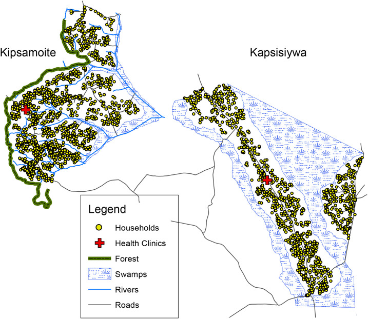
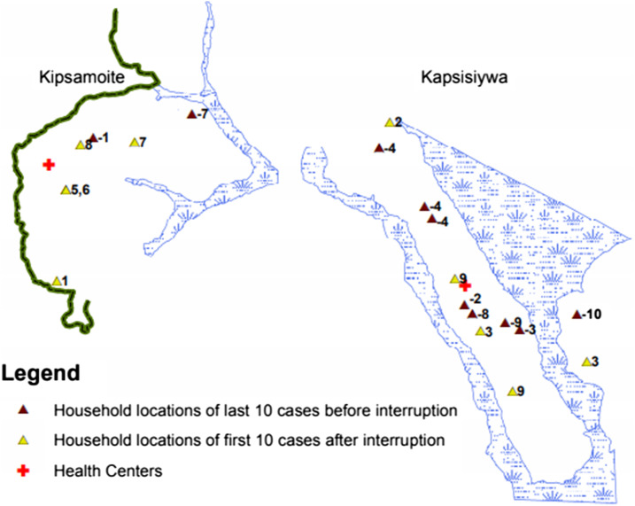
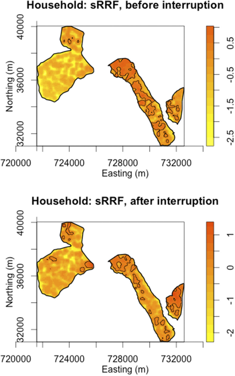
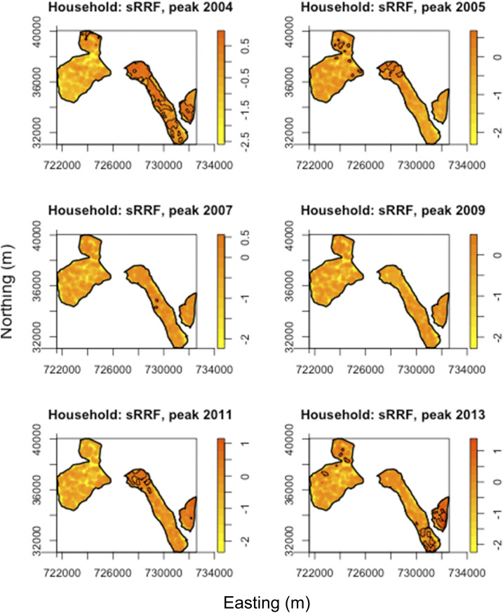
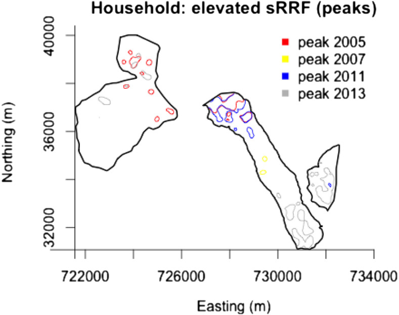
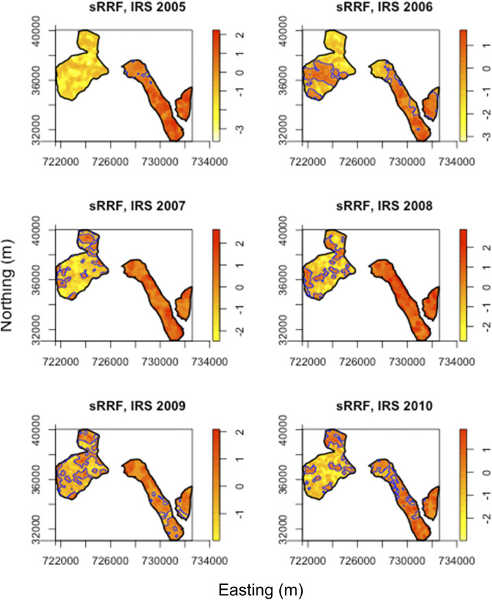
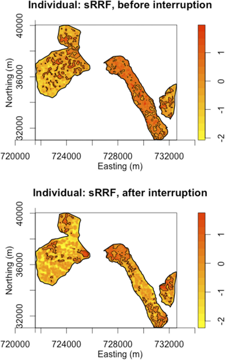
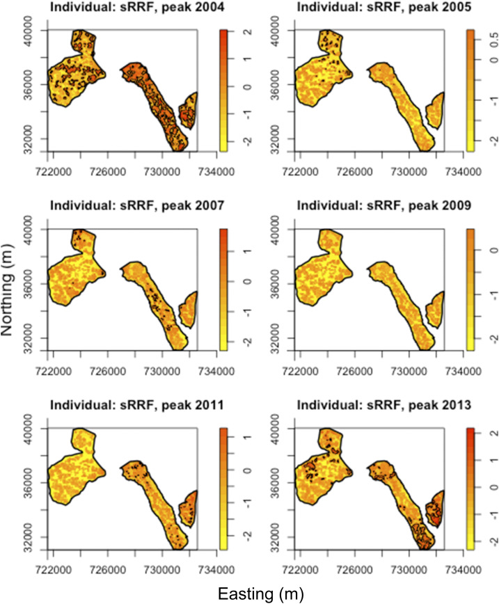
The use of spatial data in malaria elimination strategies is important to understand whether targeted interventions against malaria can be used, particularly in areas with limited resources. We previously documented consistent areas of increased malaria incidence in the epidemic-prone area of Kipsamoite in highland Kenya from 2001 to 2004. In this area and a neighboring subcounty (Kapsisiywa), malaria incidence decreased substantially in 2005, going from peak incidence of 31.7 per 1,000 persons in June 2004 to peak incidence of 7.4 per 1,000 persons in May 2005. Subsequently, the use of indoor residual spraying and artemisinin combination therapy malaria treatment led to a possible interruption of malaria transmission for a 13-month period from 2007 to 2008, after which the incidence returned to very low levels until an epidemic in April-July 2013. In the present study, we used novel kernel density estimation methods to determine whether areas of increased malaria incidence were consistent in six periods of peak incidence from 2003 to 2013, and to assess patterns of incidence in the period before versus. after the period of possible interruption. Areas of highest incidence differed during peak malaria transmission periods over the years 2003-2013, and differed before and after the potential malaria interruption. In this epidemic-prone region with very low malaria transmission, consistent malaria "hotspots" identified in a time of higher transmission are no longer present. Ongoing assessment of spatial malaria epidemiology to identify and target current areas of elevated malaria risk may be important in campaigns to control or eliminate malaria in epidemic-prone areas.


Conflict of interest statement

Financial support: This project was supported by grants from NIH-NIAID (NCT00393757), NIH Fogarty International Center (D43 TW0080085), the University of Minnesota Amplatz Children’s Hospital, and an NIH research training grant (R25 TW009345) awarded to the Northern Pacific Global Health Fellows Program by Fogarty International Center in partnership with several NIH Institutes (NIMH, NIGMS, NHLBI, OAR, and OWH).

Disclosure: This study was published with the permission of the director of the Kenya Medical Research Institute.

Disclaimer: The funding agencies were not involved in any aspect of the study including design, analysis, or interpretation of results.

Figures

Figure 1.
Figure 1.
Detailed map of the study area, Kipsamoite and Kapsisiywa, Nandi County, Kenya. This figure appears in color at www.ajtmh.org.
Figure 2.
Figure 2.
Household locations of the last 10 cases before and first 10 cases after a period of possible interruption of malaria transmission in the Kipsamoite and Kapsisiywa study area. Negative values indicate the order the cases were reported for the last cases before interruption, with increasing values nearer to this period. Positive values indicate the order the cases were reported after the period of interruption, with increasing values further from this period. Cases reported on the same day share values. This figure appears in color at www.ajtmh.org.
Figure 3.
Figure 3.
Estimated natural log of the spatial relative risk functions (sRRFs) of clinical malaria among households before and after a period of possible interruption of clinical malaria. Areas with a significantly elevated risk as compared with other areas during the same time period are indicated by overlaid black tolerance contours (P < 0.05). This figure appears in color at www.ajtmh.org.
Figure 4.
Figure 4.
Estimated natural log of the spatial relative risk functions (sRRFs) of clinical malaria among households during peak periods of malaria transmission in 2004, 2005, 2007, 2009, 2011, and 2013. Areas with significantly elevated risk as compared with other areas during the same time period are indicated by overlaid black tolerance contours (P < 0.05). This figure appears in color at www.ajtmh.org.
Figure 5.
Figure 5.
Overlaid areas of elevated spatial relative risk functions (sRRFs) of clinical malaria (P < 0.05) during peak periods of transmission. (Peak 2005 in red, peak 2007 in yellow, peak 2009 had no areas of elevated risk, peak 2011 in blue, and peak 2013 in gray. Peak 2004 is not shown for comparison because of it being a period of higher transmission with many more areas of elevated risk.) This figure appears in color at www.ajtmh.org.
Figure 6.
Figure 6.
Estimated natural log of the spatial relative risk functions (sRRFs) of indoor residual spraying among households during the annual Ministry of Health indoor residual spraying (IRS) campaigns during 2005–2010. Areas with significantly lower coverage as compared with other areas during the same time period are indicated in overlaid blue tolerance contours (P < 0.05). This figure appears in color at www.ajtmh.org.
Figure 7.
Figure 7.
Estimated natural log of the spatial relative risk functions (sRRFs) of clinical malaria among individuals before and after a period of interruption of clinical malaria. Areas with significantly elevated risk as compared with other areas during the same time period are indicated by overlaid black tolerance contours (P < 0.05). This figure appears in color at www.ajtmh.org.
Figure 8.
Figure 8.
Estimated natural log of the spatial relative risk functions (sRRFs) of clinical malaria among individuals during peak periods of malaria transmission in 2004, 2005, 2007, 2009, 2011, and 2013. Areas of significantly elevated risk as compared with other areas during the same time period are indicated by overlaid black tolerance contours (P < 0.05). This figure appears in color at www.ajtmh.org.

Similar articles

Cited by

References

    1. Summers J, 1989. Soho – A History of London’s Most Colourful Neighborhood. London: Bloomsbury.
    1. Carter R, Mendis KN, Roberts D, 2000. Spatial targeting of interventions against malaria. Bull World Health Organ 78: 1401–1411. - PMC - PubMed
    1. Roll Back Malaria Partnership , 2008. The Global Malaria Action Plan. Technical Report. Geneva, Switzerland: World Health Organization.
    1. Feachem RGA, Phillips AA, Targett GA, editors, 2009. Shrinking the Malaria Map: A Prospectus on Malaria Elimination. San Francisco, CA: The Global Health Group, Global Health Sciences, University of California, San Francisco.
    1. Hay SI, Guerra CA, Tatem AJ, Noor AM, Snow RW, 2004. The global distribution and population at risk of malaria: past, present, and future. Lancet Infect Dis 4: 327–336. - PMC - PubMed

Publication types