Blood molecular markers associated with COVID-19 immunopathology and multi-organ damage
- PMID: 33140861
- PMCID: PMC7737620
- DOI: 10.15252/embj.2020105896
Blood molecular markers associated with COVID-19 immunopathology and multi-organ damage
Abstract
COVID-19 is characterized by dysregulated immune responses, metabolic dysfunction and adverse effects on the function of multiple organs. To understand host responses to COVID-19 pathophysiology, we combined transcriptomics, proteomics, and metabolomics to identify molecular markers in peripheral blood and plasma samples of 66 COVID-19-infected patients experiencing a range of disease severities and 17 healthy controls. A large number of expressed genes, proteins, metabolites, and extracellular RNAs (exRNAs) exhibit strong associations with various clinical parameters. Multiple sets of tissue-specific proteins and exRNAs varied significantly in both mild and severe patients suggesting a potential impact on tissue function. Chronic activation of neutrophils, IFN-I signaling, and a high level of inflammatory cytokines were observed in patients with severe disease progression. In contrast, COVID-19-infected patients experiencing milder disease symptoms showed robust T-cell responses. Finally, we identified genes, proteins, and exRNAs as potential biomarkers that might assist in predicting the prognosis of SARS-CoV-2 infection. These data refine our understanding of the pathophysiology and clinical progress of COVID-19.
Keywords: COVID-19 pathophysiology; SARS-CoV-2; immunopathogenesis; multi-omics; multiple organ damage.
© 2020 The Authors.
Conflict of interest statement
The authors declare that they have no conflict of interest.
Figures
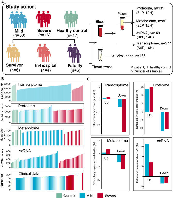
Schematic summary of the study design and patient cohort. Both blood and throat swabs were collected in different timepoint (1 to 5). Not all samples were analyzed in all omics approach due to different requirements of sample quality and amounts for different approach. The sample numbers for each omics data set were shown, and specific sampling time for each sample in each data set was listed in Dataset EV1.
The number of expressed genes and detected proteins, metabolites, exRNAs, and clinical parameters in high‐quality patient samples.
Summary of differentially expressed genes, proteins, metabolites, and exRNAs between uninfected controls and COVID‐19‐infected patients (mild and severe) in the multi‐omics data. Y‐axis showed the proportion of upregulated/downregulated genes, proteins, metabolites, and exRNAs in those that were detected in total.
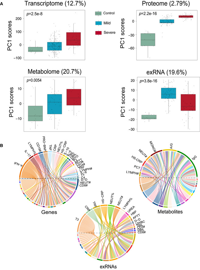
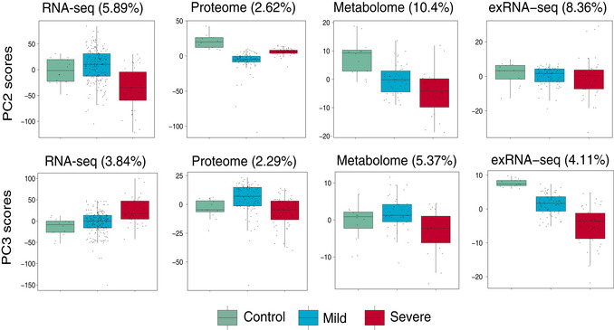
Scores of principal components 1 (PC1) of each sample from the transcriptome (control, n = 14; mild, n = 179; severe, n = 37), proteome (control, n = 12; mild, n = 80; severe, n = 57), metabolome (control, n = 12; mild, n = 42; severe, n = 20), and exRNA‐seq (control, n = 14; mild, n = 179; severe, n = 37) principal component analyses. Differences between groups were estimated using Kruskal–Wallis test. The horizontal box lines in the boxplots represent the first quartile, the median, and the third quartile. Whiskers denote the range of points within the first quartile − 1.5 × the interquartile range and the third quartile + 1.5 × the interquartile range.
Circos plots showing the significant correlations between clinical parameters and the multi‐omics data.
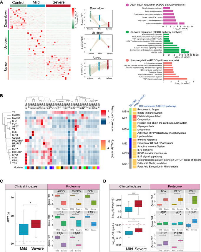
Different expression of proteins in samples collected at the first timepoint. The heatmap (left panel) indicated expression patterns of proteins overrepresented (fold change > 2) in healthy control (1,656 proteins), mild (1,547 proteins), and severe (2,362 proteins) patient groups. The top categories enriched for clusters are shown. Values for each protein in each sample (columns) are color‐coded based on expression levels: low (blue) and high (red) z‐scored FOT. The line plots (middle panel) indicated selected gene sets with up‐up (upregulation in both mild and severe patients compared with healthy controls) or up‐down or down‐down regulation trend during disease progression. The bar plot (right panel) indicated Gene Ontology annotations with up‐up or up‐down or down‐downregulation trend during disease progression (Fisher’s exact test, P < 0.05).
The Weighted Gene Co‐Expression Network Analysis (WGCNA) of 31 COVID‐19 samples shows modules that are highly correlated with clinical features (left heatmap). Among the 33 modules (ME0‐ME32), six of them showed significant correlation with clinical parameters (asterisk in the heatmap). Gene Ontology (GO) enrichment analysis were performed on these six modules, and the enriched pathways were presented on the right panel (Fisher’s exact test, P < 0.05).
Boxplots showing differences of the APTT time (left) and ME1‐enriched protein expressions (right) between mild (n = 13) and severe (n = 18) COVID‐19‐infected patients. Differences between groups were estimated using Mann–Whitney–Wilcoxon test. *P < 0.05, **P < 0.01, ***P < 0.001. The horizontal box lines in the boxplots represent the first quartile, the median, and the third quartile. Whiskers denote the range of points within the first quartile − 1.5 × the interquartile range and the third quartile + 1.5 × the interquartile range.
Boxplots showing differences of IL‐6 level, IL‐10 level (left), and ME15‐enriched protein expressions (right) between mild (n = 13) and severe (n = 18) COVID‐19‐infected patients. Differences between groups were estimated using Mann–Whitney–Wilcoxon test. *P < 0.05, **P < 0.01, ***P < 0.001. The horizontal box lines in the boxplots represent the first quartile, the median, and the third quartile. Whiskers denote the range of points within the first quartile − 1.5 × the interquartile range and the third quartile + 1.5 × the interquartile range.
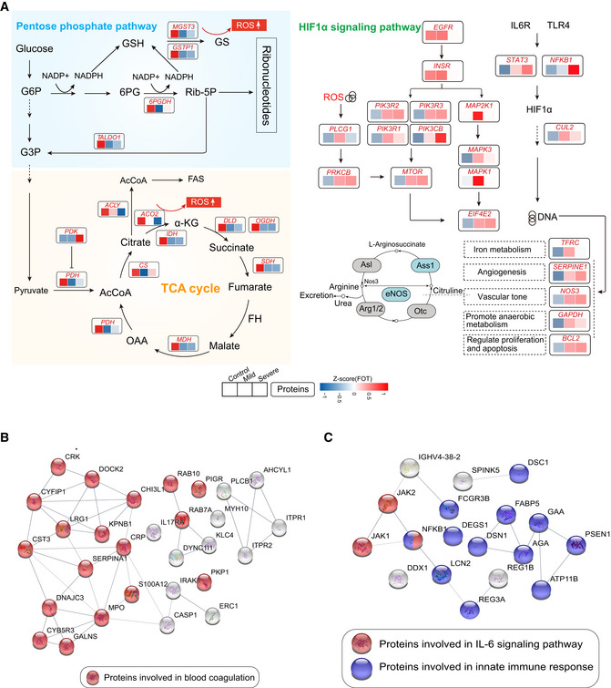
Systematic summary of the proteins and signaling cascades significantly altered in healthy control patients (TCA, PEP) and in mild or severe patients (HIF‐1α). Values for each protein in all samples analyzed (columns) are color‐coded based on expression levels: low (blue) and high (red) z‐scored FOT. Blue and gray circles present proteins that could and could not be detected in this study, respectively; eNOS, endothelial nitric oxide synthase; OTC, Ornithine carbamoyltransferase, mitochondrial; Asl, argininosuccinate lyase; Ass1, argininosuccinate synthase; Arg1/2, arginase‐1/‐2.
Network indicating protein–protein interactions among module 1 enriched proteins.
Network indicating protein–protein interactions among module 2 enriched proteins.
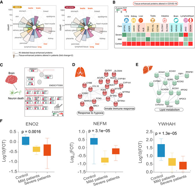
Rose plots indicating the number of all detected and differently expressed tissues‐enhanced proteins in mild (left) and severe patients (right) compared with healthy controls. Tissues labeled in orange represented tissues with the largest proportions (100% of all detected tissue‐enhanced proteins) of altered tissues‐enhanced proteins.
Heatmap indicating expression patterns of proteins related to organ function among control, mild, and severe patient groups. Values for each protein in three groups (rows) are color‐coded based on expression levels: low (green) and high (red) z‐scored FOT.
Systematic summary of brain‐enhanced expressed proteins and signaling cascades significantly altered in COVID‐19‐infected patients (neurotransmitters transport, synthesis). Values for each protein at all analyzed samples (columns) are color‐coded based on the expression levels: low (green) and high (red) z‐scored FOT.
Network summarizing lung‐enhanced expressed proteins and signaling cascades significantly altered in COVID‐19‐infected patients (HIF‐1α signaling pathway).
Network summarizing liver‐enhanced expressed proteins and signaling cascades significantly altered in COVID‐19‐infected patients (Lipid metabolism).
Boxplots indicating the expression level of known brain dysfunctional biomarkers in control (n = 12), mild (n = 13), and severe (n = 18) patients. Differences between groups were estimated using Kruskal–Wallis test. The horizontal box lines in the boxplots represent the first quartile, the median, and the third quartile. Whiskers denote the range of points within the first quartile − 1.5 × the interquartile range and the third quartile + 1.5 × the interquartile range.
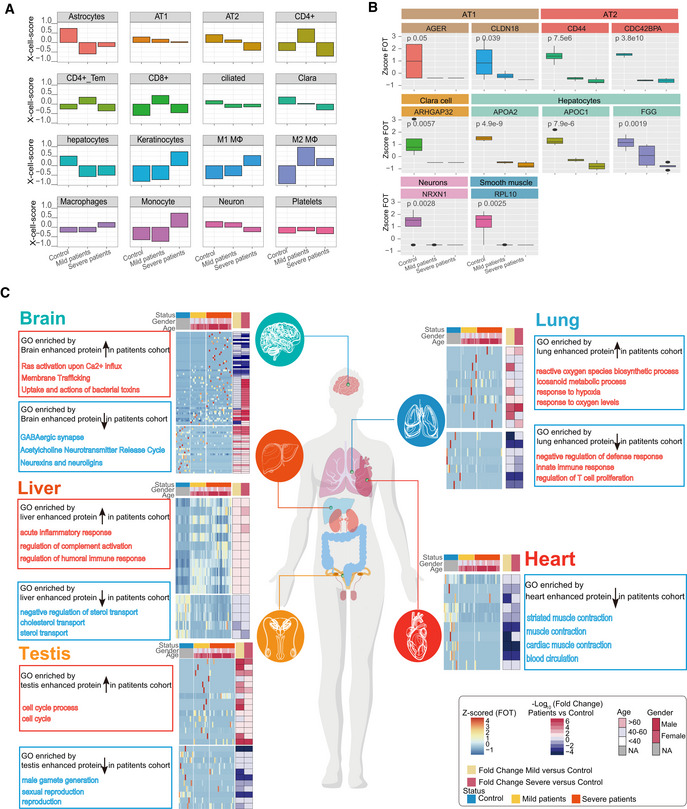
Bar plots showing the X‐Cell scores of specific cell types across control, mild, and severe COVID‐19‐infected patients.
Boxplot showing the selected cell type specific proteins among control (n = 12), mild (n = 13), and severe (n = 18) COVID‐19‐infected patients. Differences between groups were estimated using Kruskal–Wallis test. The horizontal box lines in the boxplots represent the first quartile, the median, and the third quartile. Whiskers denote the range of points within the first quartile − 1.5 × the interquartile range and the third quartile + 1.5 × the interquartile range.
Systematic summary of the GO pathways enriched by tissue‐enhanced proteins that exhibited altered expression among control, mild, and severe patient groups. The heatmap of each panel indicates expression patterns of tissues‐enhanced proteins among control, mild, and severe patient groups. The top panel on the heatmap indicated the age and gender information of patients. The fold changes of tissue‐enhanced proteins between mild/severe patient samples and control samples are shown on the right panel of heatmap.
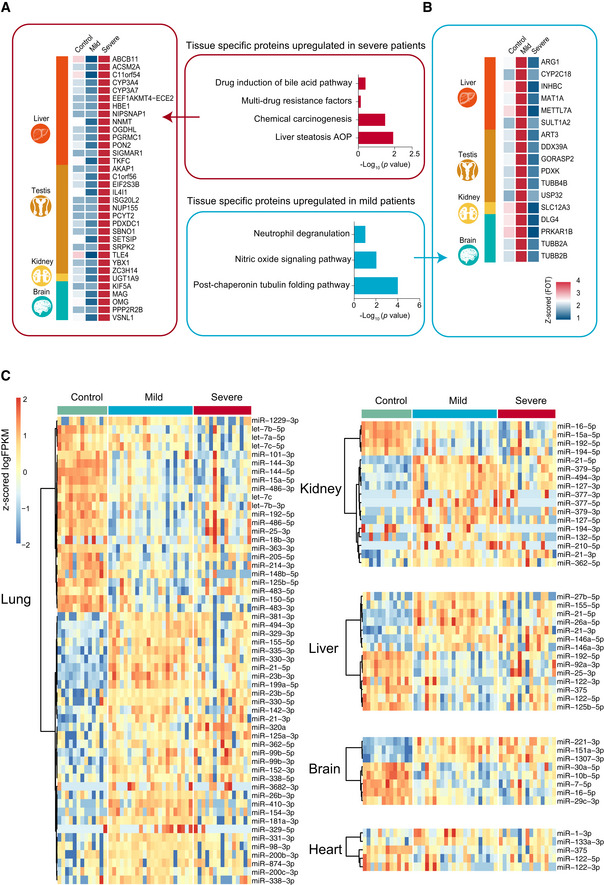
- A, B
The heatmap indicates expression patterns of tissue‐enhanced biomarkers among the healthy control, mild, and severe patient groups. (A), tissue‐enhanced proteins upregulated in severe patients; (B), tissue‐enhanced proteins upregulated in mild patients. Values for each protein in all samples analyzed (columns) are color‐coded based on expression levels: low (blue) and high (red) z‐scored FOT. The bar plots indicate GO processes and pathways enriched by tissue‐specific proteins upregulated in mild patients (A) and severe patients (B) (Fisher’s exact test, P < 0.05).
- C
exRNA data related to tissue injury were collected from publications. The majority of tissue injury‐related exRNAs across all tissues analyzed showed differential expression. Differentially expressed exRNAs were identified using a t‐test < 0.05 and fold change> 2 or < 0.5.
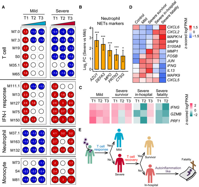
Transcriptional profiles reflect the dynamic immune response in COVID‐19. GSEA (FDR < 0.25; 1,000 permutations) was used to identify positive (red), negative (blue), or no (white) enrichment of BTMs (gene sets). The graph shows the normalized enrichment score (NES) of each selected BTM in the different timepoints (T1, T2, and T3) for patients with mild or severe COVID‐19 illness, in comparison with healthy controls. The timepoints 1, 2, 4 or 1, 3, 5 were used as T1, T2, and T3 for patients with four or five sampling timepoints, respectively.
Expression levels of NETs’ markers for individual transcripts in severe (n = 37) versus mild (n = 179) comparisons. Data were represented as means ± SEM, and differences between groups were estimated using Student’s t‐test. *P < 0.05; **P < 0.01; ***P < 0.001.
Heatmap of IFNG, GZMB, and PRF1 gene expression in COVID‐19‐infected patients. Average expression values were centered and scaled. Red indicates a higher expression, and blue indicates a lower expression.
Heatmap of the expression of genes enriched in IL‐17 signaling pathway between healthy control and COVID‐19‐infected patients. Average expression values were centered and scaled. Red indicates a higher expression and blue indicates a lower expression.
T‐cell and innate immune response elucidate immunopathology of COVID‐19.
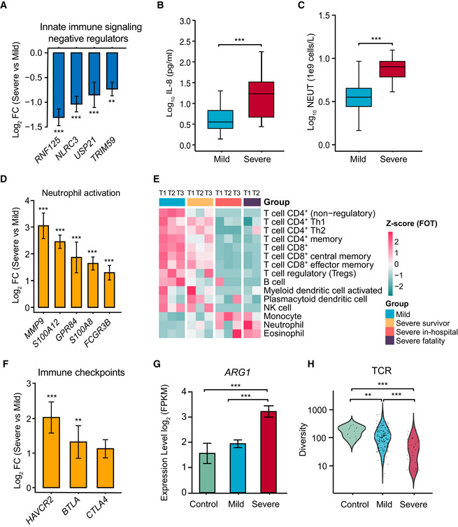
Normalized gene expression of innate immune signaling negative regulators in mild versus severe COVID‐19‐infected patient comparisons. Mild, n = 179; severe, n = 37. Differences between groups were estimated using Student’s t‐test. **P < 0.01; ***P < 0.001.
Level of plasma cytokines IL‐8 between mild and severe patient groups. Mild, n = 35; severe, n = 16. Differences between groups were estimated using Student’s t‐test. ***P < 0.001. The horizontal box lines in the boxplots represent the first quartile, the median, and the third quartile. Whiskers denote the range of points within the first quartile − 1.5 × the interquartile range and the third quartile + 1.5 × the interquartile range.
Absolute neutrophil count (NEUT) between mild and severe patient groups. Mild, n = 50; severe, n = 16. Differences between groups were estimated using Student’s t‐test. ***P < 0.001. The horizontal box lines in the boxplots represent the first quartile, the median, and the third quartile. Whiskers denote the range of points within the first quartile − 1.5 × the interquartile range and the third quartile + 1.5 × the interquartile range.
Normalized expression of neutrophil activation genes in mild versus severe COVID‐19‐infected patient comparisons. Mild, n = 179; severe, n = 37. Data were represented as means ± SEM. Differences between groups were estimated using Student’s t‐test. ***P < 0.001.
Cell type enrichment analysis of the RNA sequencing data using the X‐Cell tool among COVID‐19‐infected patient subgroups from longitudinal samples. The colors of the heatmap represent the Z‐scaled values of fractions of each cell type from different stages and subgroups. The red color stands for a higher proportion whereas the blue color denotes a lower cell population.
Expression levels of immune checkpoints, normalized to CD3G mild versus severe patient comparisons. Mild, n = 179; severe, n = 37. Data were represented as means ± SEM. Differences between groups were estimated using Student’s t‐test. **P < 0.01; ***P < 0.001.
Expression levels of ARG1 between control and COVID‐19‐infected patient subgroups. Control, n = 14; mild, n = 179; severe, n = 37. Data were represented as means ± SEM. Differences between groups were estimated using Student’s t‐test. ***P < 0.001.
Comparison of TCR diversity between healthy controls and COVID‐19‐infected patient subgroups. Control, n = 14; mild, n = 179; severe, n = 37. Differences between groups were estimated using Student’s t‐test. **P < 0.01; ***P < 0.001.
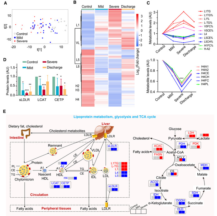
Plasma metabolomic changes revealed a trajectory in COVID‐19 severity, from healthy control (n = 12), mild (n = 29), to severe (n = 17).
Changes in the concentration of plasma metabolites are associated with COVID‐19 severity. The discharge group consist of all patients (mild and severe) that were recovered and discharged. L1, low‐density lipoprotein subclass‐1 (LDL1); VL, very low‐ density lipoprotein (VLDL); L5, LDL5; L6, LDL6; H2: high‐density lipoprotein subclass‐2 (HDL2); H3: HDL3; H4: HDL4.
COVID‐19 severity is associated with significant changes in lipoprotein subclasses including high‐density lipoprotein subclass‐1 (HDL1), HDL4, low‐density lipoprotein subclasses (LDL1, LDL4, LDL5), very low‐density lipoprotein subclass‐5 (VLDL5), and their compositional components (ApoA1, triglycerides, cholesterol). TG: triglycerides; FC: free cholesterol; CE: cholesteryl esters; CH: total cholesterol (i.e., FC + CE); PL: total phospholipids; A1: ApoA1; A2: ApoA2; L1TG: TG in LDL1; L1TG%: percentages of L1TG in total lipids of LDL1; L1%: percentage of LDL1 in all LDL; L‐TG%: percentages of L‐TG(TG in LDL) in total lipids of LDL; V5FC%, V5CE%: percentages of V5FC(FC in VLDL5) and V5CE(CE in VLDL5) in total lipids of VLDL5; L5CE%, L5CH%: percentages of L5CE(CE in LDL5) and L5CH(CH in LDL5) in total lipids of LDL5; H1FC%: percentages of H1FC (FC in HDL1) in total lipids of HDL1; H‐A2: ApoA2 in both HDL and nascent HDL; H4A1, H4A2, H4CE, H4CH, H4FC, H4PL: ApoA1, ApoA2, CE, CH, FC, and PL in HDL4.
Plasma levels of key enzymes and proteins directly involving lipoprotein metabolism are indicators for COVID‐19 severity. Data were represented as means ± SD and differences between groups were estimated using Student’s t‐test. *P < 0.05; **P < 0.01; ***P < 0.001. Control, n = 12; mild, n = 29; severe, n = 17; discharge, n = 16; sLDLR: soluble low‐density lipoprotein receptor; LCAT: lecithin‐cholesterol acyltransferase; CEPT: cholesteryl‐ester transfer protein.
COVID‐19 caused dysregulation in lipoprotein metabolism, glycolysis, and TCA cycle. The three boxes from left to right are control, mild, and severe, in which gray means normal, blue means decrease, red means increase. CS: Citrate synthase; IDH: Isocitrate dehydrogenase; ACO2: Aconitase; OGDH: α‐ketoglutarate dehydrogenase; DLD: Dihydrolipoyl dehydrogenase; SDH: Succinic dehydrogenase; MDH: Malate dehydrogenase; PDH: Pyruvate dehydrogenase; PDK: Pyruvate dehydrogenase kinase; ACLY: ATP citrate lyase; ACAC: Acetyl coenzyme A carboxylase; FASN: Fatty acid synthetase; LDH: Lactate dehydrogenase.
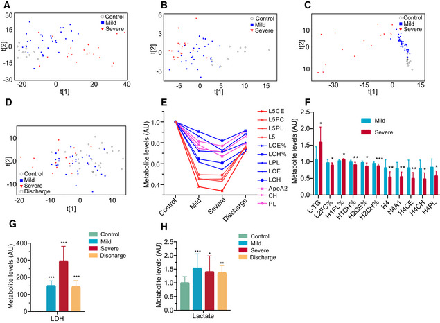
- A–C
COVID‐19 severity was associated with plasma metabolomic phenotypes defined by all MS‐detectable lipidomic compounds (A), hydrophilic metabolites (B), and all NMR‐detectable metabolite signals (C).
- D
PCA scores revealed a variation in plasma metabolomic trajectory among healthy controls, patients with mild and severe COVID‐19, and upon discharge. The discharge group comprised all patients (mild and severe) that were recovered and discharged.
- E–H
COVID‐19 severities are associated with changes in levels of the compositional components of lipoprotein subclasses (E and F), lactate (H), lactate dehydrogenase (G) in blood plasma. Data in bar plots are represented as means ± SD. Control, n = 12; mild, n = 29; severe, n = 17; discharge, n = 16; Differences between groups were estimated using Student’s t‐test. *P < 0.05; **P < 0.01; ***P < 0.001. HDL: high‐density lipoprotein; IDL: intermediate‐density lipoprotein; LDL: low‐density lipoprotein; VLDL: very low‐density lipoprotein; TG: triglycerides; FC: free cholesterol; CE: cholesteryl esters; CH: total cholesterol (i.e., FC + CE); PL: total phospholipids; L5CE, L5FC, L5PL:CE, FC and PL in LDL5; L5:LDL5; LCE, LCH: CE and CH in LDL; LCE%, LCH%: percentages of LCE and LCH in total lipids of LDL; LPL: PL in LDL; L‐TG: TG in LDL; L2FC%: percentages of L2FC (FC in LDL2) in total lipids of LDL2; H1PL%: percentages of H1PL (PL in HDL1) in total lipids of HDL1; H1CH%: percentages of H1CH (CH in HDL1) in total lipids of HDL1; H2CE%: percentages of H2CE (CE in HDL2) in total lipids of HDL2; H2CH%: percentages of H2CH (CH in HDL2) in total lipids of HDL2; H4A1, H4CE, H4CH, H4PL: ApoA1, CE, CH and PL in HDL4; AU: The metabolite concentration of each sample was normalized using the average of the control group; LDH: lactate dehydrogenase.
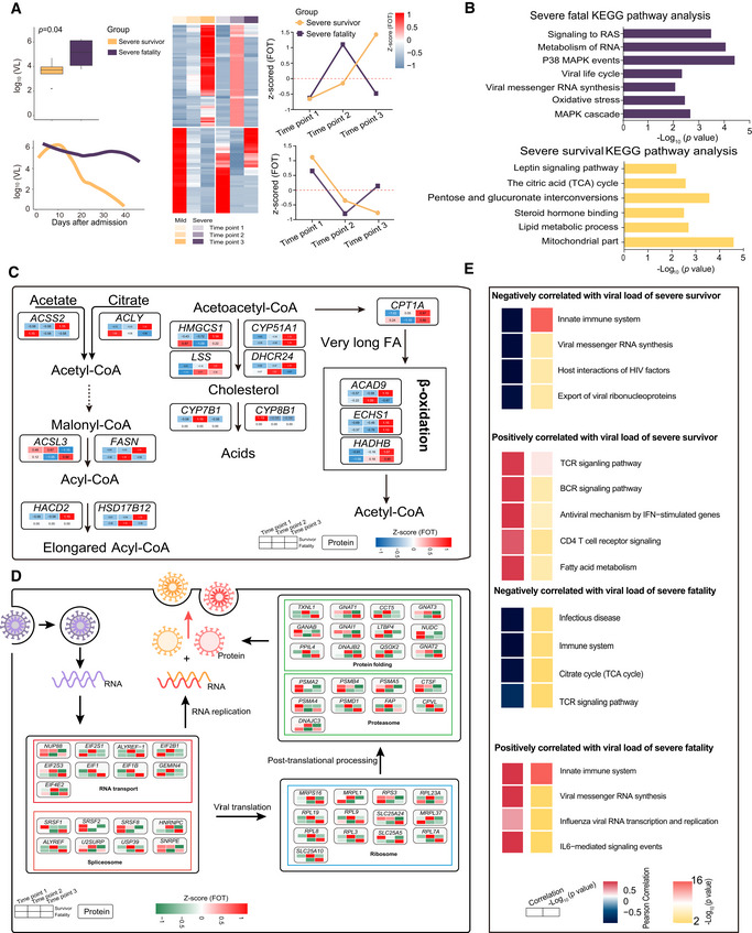
- A
Boxplot comparison of viral loads between severe‐survival patients (yellow, n = 8) and severe‐fatal patients (purple, n = 5). Line graph represents the temporal changes in viral load in time (days) after hospital admission of the patients. The cluster heatmap represents expression patterns of 1,541 proteins that exhibited temporal changes across timepoints in severe‐survival (left) and severe‐fatal (right) patients. The line plots indicate the expression trends of 1,541 selected proteins. VL, viral loads; FOT, the fraction of total. Differences between groups were estimated using Mann–Whitney–Wilcoxon test. The horizontal box lines in the boxplots represent the first quartile, the median, and the third quartile. Whiskers denote the range of points within the first quartile − 1.5 × the interquartile range and the third quartile + 1.5 × the interquartile range.
- B
Enriched annotations for corresponding clusters showed in Fig 6A (Fisher’s exact test, P < 0.05).
- C, D
Systematic summary of proteins and signaling cascades significantly altered in severe‐survival patients (lipid metabolism; (C)) and severe‐fatal (viral life cycle; (D)). Values for each protein in all samples analyzed (columns) are color‐coded based on the expression levels: low (blue) and high (red) z‐scored FOT.
- E
For each of the four panels, the heatmaps on the left indicate the Pearson correlation of proteins with viral load in severe survivors and severe fatalities, the heatmap on the right indicate the significant pathways enriched by proteins positively or negatively correlated with viral load in severe survivors and severe fatalities (Fisher’s exact test, P < 0.05).
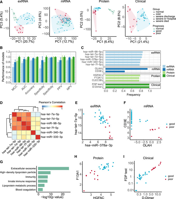
- A
Principal component analysis of exRNA, transcriptome, proteome, and clinical covariate data from samples collected at the first timepoint. The first two components were used to describe the distribution of samples based on expressed genes, proteins, and clinical data, respectively, whereas the first and third components were used for samples based on the exRNA data.
- B
Performance of prognostic models based on exRNA, transcriptome, proteome, and the corresponding clinical covariate data sets. Model performance of the fivefold cross‐validation was assessed using the Matthews correlation coefficient (MCC), AUC, accuracy, sensitivity, specificity, positive predictive value (PPV), and negative predictive value (NPV). Data were represented as means ± SD.
- C
The most frequently selected features of exRNA‐, transcriptome‐, proteome‐, and clinical‐based models. Features were simultaneously identified from each of the four data sets and for each of the four machine learning algorithms based on the frequency of variables used by AI models during 50 runs of the fivefold cross‐validation.
- D
Correlation heatmap among the most frequently selected features (frequency> 0.78) used in the exRNA‐based model. Members in the let‐7 family selected for the exRNA‐based predictors (hsa‐miR‐98‐5p, hsa‐let‐7a‐5p, hsa‐let‐7d‐5p, hsa‐let‐7f‐5p) were highly correlated with each other.
- E–I
Biomarkers identified from exRNA (E), transcriptome (F), proteome (H), and clinical data (I)‐based models exhibited a clear separation between those patients with either good or poor prognosis. (G) Functional enrichment of 110 protein features selected from random forest modeling (Fisher’s extract test, P < 0.05).
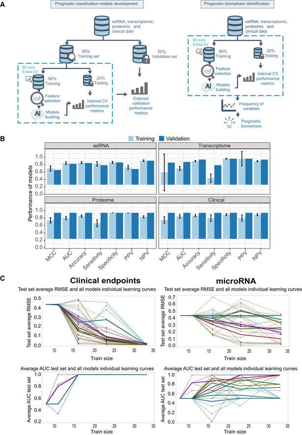
Workflow of prediction model construction.
Performance of AI models in the training and validation set based on exRNA (n = 37), transcriptome (n = 63), proteome (n = 31), and the corresponding clinical covariate data sets (n = 37). Data are represented as means ± SD.
Learning curve model comparison (LCMC) revealing sample size effects on the accuracy and variability of the predictive models using cross‐validation. Each individual root means square error (RMSE) learning curve and the average for each of 8 models is shown. Each color represents a model. A solid line represents the average for each model, whereas a dashed line represents one random iteration for each model.
References
-
- Alonso DO, Iglesias A, Coelho R, Periolo N, Bruno A, Córdoba MT, Filomarino N, Quipildor M, Biondo E, Fortunato E (2019) Epidemiological description, case‐fatality rate, and trends of Hantavirus Pulmonary Syndrome: 9 years of surveillance in Argentina. J Med Virol 91: 1173–1181 - PubMed
Publication types
MeSH terms
Substances
Grants and funding
LinkOut - more resources
Full Text Sources
Medical
Miscellaneous