Clinical Trial
. 2020 Dec 10;183(6):1479-1495.e20.
doi: 10.1016/j.cell.2020.10.037. Epub 2020 Oct 28.

Multi-Omics Resolves a Sharp Disease-State Shift between Mild and Moderate COVID-19

Affiliations
Clinical Trial

Multi-Omics Resolves a Sharp Disease-State Shift between Mild and Moderate COVID-19

Yapeng Su et al. Cell. .

Abstract

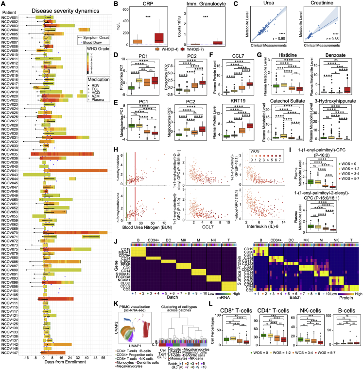
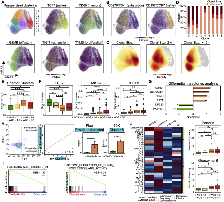
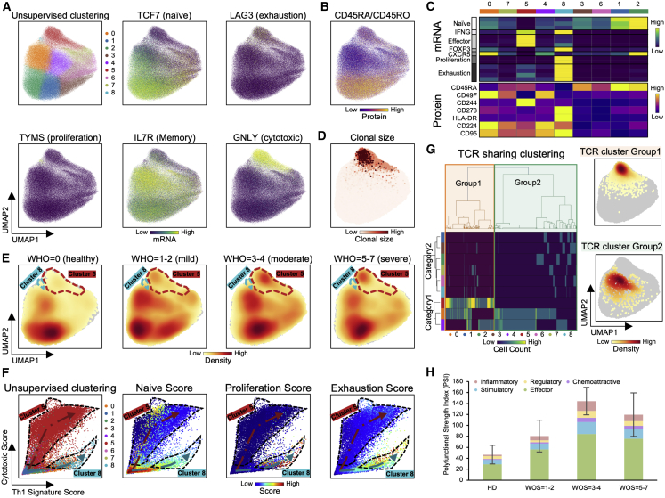
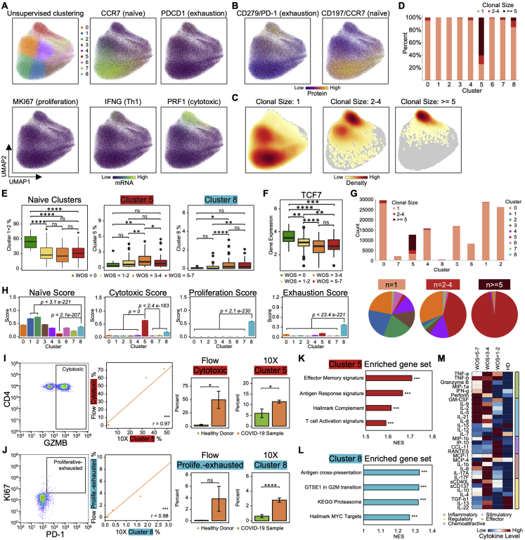
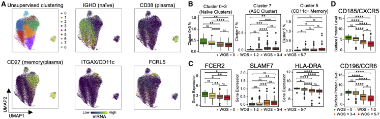
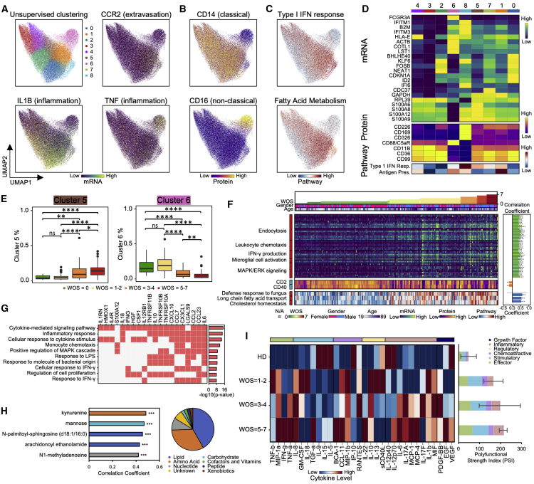
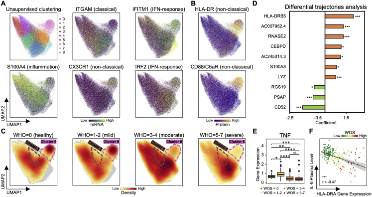
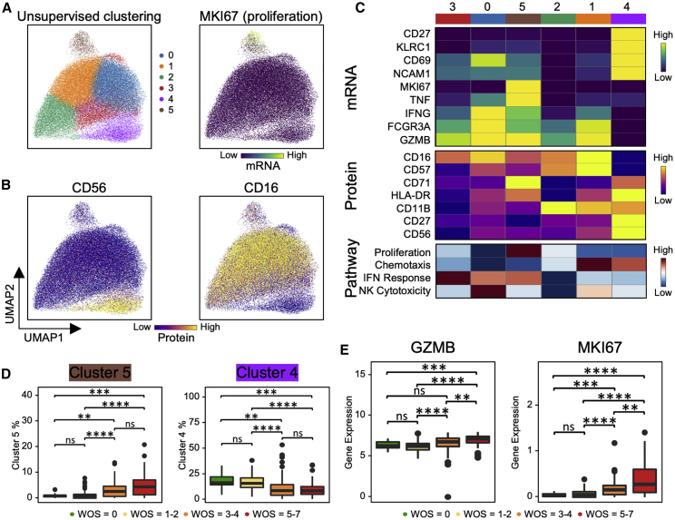
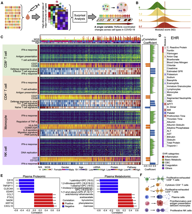
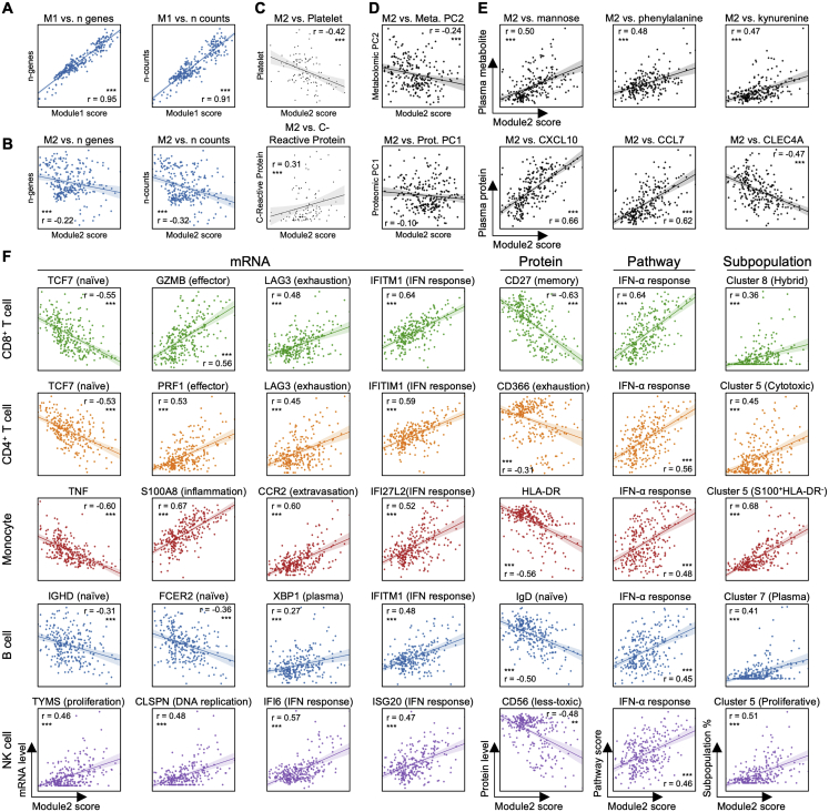
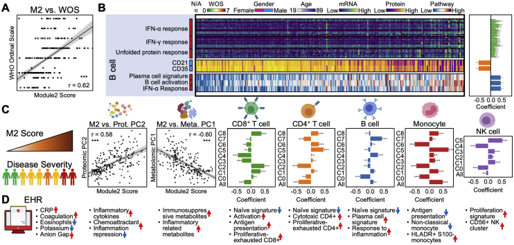
We present an integrated analysis of the clinical measurements, immune cells, and plasma multi-omics of 139 COVID-19 patients representing all levels of disease severity, from serial blood draws collected during the first week of infection following diagnosis. We identify a major shift between mild and moderate disease, at which point elevated inflammatory signaling is accompanied by the loss of specific classes of metabolites and metabolic processes. Within this stressed plasma environment at moderate disease, multiple unusual immune cell phenotypes emerge and amplify with increasing disease severity. We condensed over 120,000 immune features into a single axis to capture how different immune cell classes coordinate in response to SARS-CoV-2. This immune-response axis independently aligns with the major plasma composition changes, with clinical metrics of blood clotting, and with the sharp transition between mild and moderate disease. This study suggests that moderate disease may provide the most effective setting for therapeutic intervention.

Keywords: CITE-seq; COVID-19; immune response; infection; metabolomics; multi-omics; proteomics; single-cell RNA-seq; single-cell TCR-seq; single-cell secretome.


Conflict of interest statement

Declaration of Interests J.R.H. is founder and board member of Isoplexis and PACT Pharma. M.M.D. is a member of the Scientific Advisory Board of PACT Pharma. J.A.B. is a member of the Scientific Advisory Boards of Arcus, Celsius, and VIR. J.A.B. is a member of the Board of Directors of Rheos and Provention. J.A.B. has recently joined Sonoma Biotherapeutics as President and CEO. Sonoma Biotherapeutics is involved in developing novel Treg-based cell therapies for the treatment of autoimmune diseases. R.G. has received consulting income from Juno Therapeutics, Takeda, Infotech Soft, Celgene, Merck and has received research support from Janssen Pharmaceuticals and Juno Therapeutics, and declares ownership in CellSpace Biosciences. P.D.G is on the Scientific Advisory Board of Celsius, Earli, Elpiscience, Immunoscape, Rapt, and Nextech, was a scientific founder of Juno Therapeutics, and receives research support from Lonza. J.D.G. declared contracted research with Gilead, Lilly, and Regeneron. The remaining authors declare no competing interests.

Figures

None
Graphical abstract
Figure 1
Figure 1
Overview of the Multi-Omic Characterization of Immune Responses in COVID-19 Patients (A) Overview of the ISB/Swedish INCOV study of COVID-19 patients. The bar graph represents the counts of patient samples across WHO ordinal score (WOS) of disease severity. The various analytic assays run on the plasma and isolated PBMCs are indicated. (B) EHR clinical measurements for the COVID-19 patients. Correlation matrix of 34 clinical features from hospitalized patients. The square size corresponds to the absolute value of the Spearman rank correlation coefficient, with red (blue) color indicating a positive (negative) correlation. FDR <0.05, ∗∗FDR <0.01, ∗∗∗FDR <0.001. (C and D) Plasma protein (C) and metabolite (D) analysis. Left panel: PCA analysis of plasma proteins (metabolites). Each dot represents 1 plasma sample, color-coded for disease severity (see key). Right panel of (C): statistically significant (FDR <0.05) changed plasma protein from stepwise comparisons of disease severity from T1. The x axis indicates the numbers of significant protein changes, and the y axis indicates the magnitude of those changes (units = age, sex, BMI, and race/ethnicity adjusted NPX protein levels). The changes of four specific proteins are indicated by colored circles. Right panel of (D): statistically significant (FDR <0.05) changed plasma metabolites from stepwise comparisons of disease severity from T1. Changes are shown as upregulated and downregulated bar plot pairs, and each segment within a bar represents a superpathway (for color-code, see key) and is sized by the sum of the fold changes of the superpathway’s significantly changed metabolites. (E) Circos plot visualizing WOS-dependent cross-omic interaction network. Proteins and clinical measures are only shown if they have degree ≥5. Complete results are provided in the Table S1.7. Positive main effects are represented as solid lines and negative as dashed lines. Significant associations with IL6, CCL7, and blood urea nitrogen are highlighted in black, green, and purple lines, respectively. (F) Scatterplot depicting a specific connection from the circos plot. Each dot represents a patient sample color-coded for disease severity. (G) Boxplot depicting percentages, from single cell transcriptome data, of major immune cell types among PBMCs from patients, grouped by WOS. p < 0.05, ∗∗p < 0.01, ∗∗∗p < 0.001, ∗∗∗∗p < 0.0001. See also Figure S1 and Table S1.
Figure S1
Figure S1
Overview of the Multi-Omic Characterization of Immune Responses in COVID-19 Patients, Related to Figure 1 A. The swimmer plot depicting EHR-extracted WOS severity score dynamics for studied patients who were admitted to hospital. Symptom onset and pre-hospitalization (if available) are indicated by black rectangles and lines. WOS is calculated at 6-hour intervals during hospitalization. Blood draws are indicated by upside-down blue triangles and administered medications by symbols overlaid on the colored bands. B. Boxplots of clinical data comparing moderate (orange) and severe (red) patient sample values. Ranges that specify normal limits are indicated by the dashed lines. Significance is indicated by: (p < 0.05, ∗∗p < 0.01, ∗∗∗p < 0.001, ∗∗∗∗p < 0.0001). C. Spearman Rank correlations between the measurement of the same analytes from EHR clinical labs and from metabolon metabolites. The regression line is shown in blue with 95% confidence area in shaded blue. Spearman Rank correlation coefficient and associated P value shown. Significance is indicated by: (p < 0.05, ∗∗p < 0.01, ∗∗∗p < 0.001, ****p < 0.0001). D,E. Boxplot of principal component (PC) 1 and 2 from plasma proteomics data (D) or metabolomics data for donors, grouped by WOS (E). Significance is indicated by: (p < 0.05, ∗∗p < 0.01, ∗∗∗p < 0.001, ∗∗∗∗p < 0.0001) F,G. Boxplots of select plasma protein (F) and metabolite(G) levels for donors, grouped by WOS. Significance is indicated by: (p < 0.05, ∗∗p < 0.01, ∗∗∗p < 0.001, ∗∗∗∗p < 0.0001). H. Scatterplots representing interactions drawn on the circos plot shown in Figure 1E. Each dot represents a patient sample with a color that corresponds to disease severity (see key). I. Boxplots of select plasma lipid-related metabolites levels in donors grouped by different WOS. Metabolites were selected to illustrate (H) middle panel. Significance is indicated by: (p < 0.05, ∗∗p < 0.01, ∗∗∗p < 0.001, ∗∗∗∗p < 0.0001). J. Heatmap showing levels of well-known transcripts (left panel) and surface proteins (right panel) specific for each cell type and across different sequencing batches (see color-code). Cell types indicated by B: B cells, CD34+: CD34+ Progenitor cells, DC: Dendritic cells, MK: Megakaryocytes, M: Monocytes, NK: Natural killer cells, T: T cells. K. UMAP visualization of single-cell RNA-seq data cell type annotation and analysis of batch effect. Left: 2D projection of single-cell RNA-seq data of all PBMCs from all samples using UMAP. Single cells are shown as dots, colored by their assigned cell type. Right: Hierarchical clustering of cell types across sequencing batches. Each column represents the expression profile of a cell type from a sequencing batch. Clustering was performed based on the expression of top 2000 most variable genes. Same cell types were clustered within the same hierarchical groups regardless of sequencing batch. L. Boxplots depicting the percentages of major immune cell types within PBMCs for donors, grouped by WOS. Significance is indicated by: (p < 0.05, ∗∗p < 0.01, ∗∗∗p < 0.001, ∗∗∗∗p < 0.0001).
Figure 2
Figure 2
CD8+ T Cell Heterogeneity in COVID-19 Patients and Its Association with Disease Severity (A and B) UMAP embedding of all CD8+ T cells colored by unsupervised clustering (top left) and by selected mRNA transcript levels (other panels in A) or (B) the CD45RA/CD45RO surface protein ratio. (C) Heatmaps showing the normalized levels of selected mRNA (top panel) and proteins (bottom panel) across each cell cluster. (D) UMAP embedding of CD8+ T cells shaded by clonal expansion level. (E) Boxplots showing the WOS-dependence of percentages of CD8+ T cell clusters. p < 0.05, ∗∗p < 0.01, ∗∗∗p < 0.001, ∗∗∗∗p < 0.0001. (F) UMAP embedding density of CD8+ T cells for different blood draw samples, grouped by WOS. Selected clusters are encircled in the colors of the (A) clusters. (G) Scatterplots showing the naive (x axis) and cytotoxic (y axis) signature scores of individual CD8+ T cells from all PBMC samples. Cluster 8 is encircled. Each point represents one cell. Cells are color coded with cluster-specific colors (left) or signature scores (middle and right). (H) Pearson correlation between MKI67 and PDCD1 gene expression for cluster 8 cells. Correlation coefficient and p value shown. p < 0.05, ∗∗p < 0.01, ∗∗∗p < 0.001. (I) Clonal expansion score for CD8+ T cells from patients with different WOS. p < 0.05, ∗∗p < 0.01, ∗∗∗p < 0.001, ∗∗∗∗p < 0.0001. (J) TCR clustering analysis. Left panel: hierarchical clustering of TCRs (columns) based on TCR sharing patterns across clusters (rows). The two distinct groups of TCRs identified are shaded with orange (group1) and green (group2). Middle panel: UMAP visualization of the embedding density of cells containing TCRs from group1 and group2 from the left panel. Right panel: boxplots represent ratio of cells containing TCRs from group1 over cells containing TCRs from group2 for samples of different WOS. p < 0.05, ∗∗p < 0.01, ∗∗∗p < 0.001, ∗∗∗∗p < 0.0001. (K) Single cell polyfunctional strength index (PSI) of CD8+ T cells according to sample WOS. Data are represented as mean ± SEM. Pairwise statistical comparisons are shown in Table S2.3. See also Figure S2 and Table S2.
Figure S2
Figure S2
CD8+ T Cell Heterogeneity in COVID-19 Patients and Its Association with Severity, Related to Figure 2 A,B. UMAP embedding of all CD8+ T cells colored by unsupervised clustering (top left of A) and by selected mRNA transcript levels (other panels in A) or (B) two selected surface proteins. C. UMAP embedding of all CD8+ T cells colored by the density of cells characterized by different clonal expansion sizes (n = 1, n = 2-4, and n > = 5). D. Clonal expansion sizes of each CD8+ T cell subset from unsupervised clustering. Bar plot shows the normalized clonal composition. E. Boxplots represent percentages of effector CD8+ T cells (cluster 0, 1 and 2) over all CD8+ T cells for PBMCs in donors for different WOS. F. Boxplots showing the mRNA expression levels of 3 transcripts in healthy donors (green), mild (yellow), moderate (orange) and severe (red) blood draws of COVID-19 patients. G. Differential expression analysis of genes that uniquely change in patients who improve (T2 versus T1, WOS decreased) in comparison with patients who did not. Each row represents a gene. The x axis differential expression score with positive being upregulated and negative being downregulated. FDR-corrected P values was shown. H. Flow cytometry validation of the proliferative-exhausted cluster 8 CD8+ T cell. First panel (starting from the left): Representative flow cytometry plots of the gating strategy for proliferative-exhausted CD8+ T cells (top box) and non-proliferative exhausted CD8+ T cells (bottom box). Gating was performed on all CD8+ T cells. Second panel: quantitative comparison of the % of gated proliferative-exhausted CD8+ T cells from flow cytometry (y axis) and % of cluster 8 CD8+ T cells quantified by 10X (x axis) of the same sample. Each dot represents a PBMC sample. The regression line is drawn in green. Pearson correlation coefficient and associated P value shown. Right two panels: Bar plots represent % of proliferative-exhausted CD8+ T cells quantified by flow and cluster 8 cells quantified by sc-RNA-seq, comparing samples from healthy donors and COVID-19 patients. Data are represented as mean ± SEM. I. GSEA of top pathways enriched for cluster 8 cells. Normalized enrichment score (NES) and P values are shown. Full results provided in Table S2.2. J. Functional characterization of CD8+ T cells using single-cell secretome analysis. Left panel: heatmap visualization of average cytokine secretion frequency for cells from healthy donors (HD), mild (WOS = 1-2), moderate (WOS = 3-4) and severe (WOS = 5-7) patients. Right panel: Boxplots indicate the percentage of CD8+ T cells secreting granzyme B, and perforin from samples grouped by different WOS. P values are shown. Significance is indicated by: (p < 0.05, ∗∗p < 0.01, ∗∗∗p < 0.001, ∗∗∗∗p < 0.0001).
Figure 3
Figure 3
Two Distinct CD4+ T Cell Subpopulations Are Associated with COVID-19 Severity (A and B) UMAP embedding of all CD4+ T cells colored by unsupervised clustering (top left of A) and by selected mRNA transcript levels (other panels in A) or (B) the CD45RA/CD45RO surface protein ratio. (C) Heatmap showing the normalized expression of selected transcripts (top panel) and proteins (bottom panel) across each cell cluster. (D) UMAP embedding of CD4+ T cells shaded by clonal expansion level. (E) UMAP embedding density of CD4+ T cells for different samples, grouped by WOS. Selected clusters are encircled in the colors of the (A) clusters. (F) Scatterplots showing the Th1 (x axis) and cytotoxic (y axis) gene signature scores of individual CD4+ T cells from all PBMC samples. Clusters 5 and 8 are encircled. Each point represents one cell. Plots are color coded for their cluster and functional signature as specified on top of each plot. (G) TCR clustering analysis. Hierarchical clustering of TCRs (columns) based on TCR sharing patterns across clusters (rows). Left: the two distinct groups of TCRs identified are shaded with orange (group1) and green (group2). Right: UMAP visualization of the embedding density of cells containing TCRs from group1 and group2 defined by left panel. (H) Single-cell polyfunctional strength grouped according to patient WOS. Data are represented as mean ± SEM. Pairwise statistical comparison are shown in Table S3.3. See also Figure S3 and Table S3.
Figure S3
Figure S3
Two Distinct CD4+ T Cell Subpopulations Are Associated with COVID-19 Severity, Related to Figure 3 A,B. UMAP embedding of all CD4+ T cells colored by unsupervised clustering (top left of A) and by selected mRNA transcript levels (other panels in A) or two selected surface proteins (B). C. UMAP embedding of all CD4+ T cells colored by the density of cells characterized by different clonal expansion sizes (n = 1, n = 2-4, and n > = 5). D. Clonal expansion sizes of each CD4+ T cell subset from unsupervised clustering. Bar plot shows the normalized clonal composition. E. Boxplots showing percentages of naive CD4+ T cells (cluster 1 and 2), cluser5 and 8 over all CD4+ T cells in samples grouped by WOS. F. Boxplots showing the mRNA expression levels in samples grouped by WOS. G. Clonal expansion status, presented as bar plots, for each CD4+ T cell cluster, color-coded by clonal expansion sizes (n = 1, n = 2-4, n > = 5). The pie charts show the CD4+ T cell cluster composition for each clonal expansion sizes present in the bar plots H. Bar plots representing four functional signature scores across different subclusters of CD4+ T cells. P values are shown. I,J. Flow cytometry validation of cytotoxic CD4+ T cells (I) and proliferative-exhausted cluster 8 CD4+ T cells (J). Left panel: Representative flow cytometry plots of the gating strategy for cytotoxic CD4+ T cells (I), and proliferative-exhausted CD4+ T cells (J). Gating was performed on all CD4+ T cells. Middle panel: quantitative comparison of the % of gated cytotoxic (proliferative-exhausted) CD4+ T cells (y axis) and cluster 5 (cluster 8) CD4+ T cell % (x axis); each dot represents a PBMC sample. The regression line is drawn in orange. Pearson correlation coefficient and associated P value shown. Right panels: Boxplots represent % of cytotoxic (proliferative-exhausted) CD4+ T cells quantified by flow cytometry and % of cluster 5 (cluster 8) cells quantified by 10X single cell RNA-seq. Comparison was between samples from healthy donor and COVID-19 patients. Data are represented as mean ± SEM. K, L. Bar plots represent GSEA of top pathways enriched for cluster 5 (K) and cluster 8 (L) cells. Normalized enrichment score (NES) and P values are shown. Full results provided in Tables S3.1 and S3.2. M. Heatmap visualization of average cytokine secretion frequencies for cells from healthy donor (HD), mild (WOS = 1-2), moderate (WOS = 3-4) and severe (WOS = 5-7) patient samples. Significance is indicated by: (p < 0.05, ∗∗p < 0.01, ∗∗∗p < 0.001, ∗∗∗∗p < 0.0001).
Figure 4
Figure 4
B Cell Heterogeneity in COVID-19 Patients and Its Association with Severity (A) UMAP embedding of all B cells colored by unsupervised clustering (top left panel of A) and by selected mRNA transcript levels (other panels in A). (B–D) Boxplots showing the WOS-dependence of specific B cell clusters (B), normalized levels of transcript (C), and proteins (D). p < 0.05, ∗∗p < 0.01, ∗∗∗p < 0.001, ∗∗∗∗p < 0.0001.
Figure 5
Figure 5
S100highHLA-DRlow Dysfunctional Monocyte Subpopulation Reflects Coordinated Changes with Both Plasma Multi-Omics Signals and COVID-19 Severity (A–C) UMAP embedding of all monocytes colored by unsupervised clustering (top left panel of A) and by selected mRNA transcript levels (other panels in A) or (B) surface proteins or (C) pathway enrichment scores. (D) Heatmap displaying normalized expression of differentially expressed genes in each cluster (top), select proteins (middle) and pathway-enrichment scores (bottom) across each cell cluster. Full gene list of differential analysis is provided in Table S4.12. (E) Boxplots showing the WOS-dependence of relative abundance of specific monocyte clusters from (A). p < 0.05, ∗∗p < 0.01, ∗∗∗p < 0.001, ∗∗∗∗p < 0.0001. (F) Heatmap visualization of top genes, surface proteins, and pathways in monocytes that significantly correlated with disease severity (WOS). Each column represents a sample and each row corresponds to levels of mRNA, surface protein, or pathway enrichment score for the monocytes from that sample. Columns are ordered based on WOS in ascending order. The top three rows indicate the WOS, gender, and age. The heatmap keys are provided at the bottom. Sidebar on the left of each row represent correlation of that value with WOS, with red (blue) indicating positive (negative) correlations. Full list of the top genes, proteins, and pathways is provided in Tables S4.5–S4.11. Detailed correlation coefficient and FDR-corrected p values are indicated at the right panel bar plots. FDR <0.05, ∗∗FDR <0.01, ∗∗∗FDR <0.001. (G) GO enrichment analysis of the top50 plasma proteins that positively correlated with cluster 5 monocyte percentages. Each row represents one of the top10 enriched pathways, each column represents each plasma protein. The top10 most over-represented proteins are shown. Bar plot shows the -log10(p value) of the enriched pathways. Full enrichment results are provided Table S4.4. (H) Analysis of the top50 plasma metabolites that positively correlated with cluster 5 monocyte percentage. Pie chart represents the super-pathway composition of the top50 positively correlated metabolites. Bar plot shows Pearson correlation coefficient of the top5 most significantly (p < 0.05) correlated metabolites (Table S4.3). p < 0.05, ∗∗p < 0.01, ∗∗∗p < 0.001. (I) Functional characterization of monocytes. Left panel: heatmap visualization of average cytokine secretion frequencies for cells from samples grouped by WOS. Right panel: polyfunctional characterization of monocytes. Single cell polyfunctional strength is grouped according to sample WOS. Data are represented as mean ± SEM. Pairwise statistical comparison are shown in Table S4.13. See also Figure S4 and Table S4.
Figure S4
Figure S4
S100highHLA-DRlow Dysfunctional Monocyte Subpopulation Reflects Coordinated Changes with Both Plasma Multi-Omics Signals and COVID-19 Severity, Related to Figure 5 A,B. UMAP embedding of all monocytes colored by unsupervised clustering (top left panel of A) and by selected mRNA transcript levels (other panels in A) or (B) surface proteins for non-classical (CD16) monocytes. C. UMAP embedding density of monocytes for different blood draw samples, grouped by WOS. Selected clusters that display significant changes from WOS group to WOS group are encircled in the colors of the (A) clusters. D. Differential expression analysis of monocyte genes that uniquely change in patients who improve (T2 versus T1, WOS decreased) in comparison with patients who did not. Each row represents a gene. The x axis represents differential expression score with positive being upregulated and negative being downregulated. FDR-corrected P values was shown. Significance is indicated by: ( FDR < 0.05, ∗∗ FDR < 0.01, ∗∗∗ FDR < 0.001). E. Boxplots showing the mRNA expression levels of TNF transcripts from monocytes in samples grouped by WOS. Significance is indicated by: (p < 0.05, ∗∗p < 0.01, ∗∗∗p < 0.001, ∗∗∗∗p < 0.0001). F. Pearson correlation of HLA-DRA gene expression in monocytes with plasma IL-6 levels. Each dot represents a blood draw sample and is colored by disease severity (WOS, see key). Regression line indicated in black, with a 95% confidence interval shown in shaded gray. Pearson correlation coefficient and associated P value are shown. Significance is indicated by: (p < 0.05, ∗∗p < 0.01, ∗∗∗p < 0.001).
Figure 6
Figure 6
Proliferative NK Cell Subpopulation Is Associated with Increased COVID-19 Severity (A and B) UMAP embedding of all NK cells colored by unsupervised clustering (top left panel of A) and by selected mRNA transcript levels (top right panel of A) or (B) selected surface proteins. (C) Heatmap displaying normalized level of select mRNA (top), proteins (middle), and pathway-enrichment scores (bottom panel) in each cell cluster. (D and E) Boxplots showing the WOS-dependence of relative abundance of (D) specific NK cell clusters from (A) and (E) normalized transcript levels. p < 0.05, ∗∗p < 0.01, ∗∗∗p < 0.001, ∗∗∗∗p < 0.0001. See also Figure S5 and Table S5.
Figure S5
Figure S5
Proliferative NK Cell Subpopulation Is Associated with Increased COVID-19 Severity, Related to Figure 6 A,B. UMAP embedding of all NK cells colored by unsupervised clustering (top left of A) and by selected mRNA transcript levels (other panels in A) or (B) two selected surface proteins. C. UMAP embedding density of NK cells for different blood draw samples, grouped by WOS. Selected clusters that display significant changes from WOS group to WOS group are encircled in the colors of the (A) clusters. D. Differential expression analysis of NK cell genes that uniquely decrease in patients who improve (T2 versus T1, WOS decreased) in comparison with patients who did not. Each row represents a gene. The x axis represents differential expression score with positive being upregulated and negative being downregulated. FDR-corrected P values was shown. Significance is indicated by: ( FDR < 0.05, ∗∗ FDR < 0.01, ∗∗∗ FDR < 0.001). Full list provided in Table S5.2. E. Boxplot showing the mRNA expression and protein levels of a few markers associated with NK cell functions in samples grouped by WOS. Significance is indicated by: (p < 0.05, ∗∗p < 0.01, ∗∗∗p < 0.001, ∗∗∗∗p < 0.0001). F. Scatterplots showing the Exhaustion gene signature score (x axis) and Undifferentiated gene signature score (y axis) of individual NK cells from all PBMC samples. Plots colored according to unsupervised clustering (from A), proliferation gene signature score, cytotoxic gene signature score, and KIR gene signature score are color-coded in each panel. G. GSEA of top pathway enriched for cluster 5 cells. Normalized enrichment score (NES) and p values are shown. Significance is indicated by: (p < 0.05, ∗∗p < 0.01, ∗∗∗p < 0.001). Full enrichment results are provided in Table S5.1.
Figure 7
Figure 7
Integrating Multi-Omic Profiles across Immune Cell Types Resolves a Coordinate Immune Response to SARS-CoV-2 (A) Cartoon illustration of the process of integrating data from different immune cell types from all samples, followed by reduction in single a dimensional representation (gene module). This characterizes the coordinated changes of cell types across COVID-19 patients. (B) Distribution of individual PBMC datasets along gene module (M) 2 for healthy donors (WOS = 0, green), mild (WOS = 1–2, yellow), moderate (WOS = 3–4, orange), and severe (WOS = 5–7, red) patients. (C) Heatmap visualization of selected top genes, surface proteins, and pathways for each cell type that significantly correlated with M2. Each column represents a sample and each row corresponds to levels of mRNA, surface protein, or pathway-enrichment score for the certain cell type of that sample. Columns are ordered based on M2 score in ascending order. The top three rows indicate the gender, age, and WOS. The heatmap keys are provided at the bottom. Sidebar on the left of each row represents the marker’s correlation with the M2 score, with red (blue) indicating positive (negative) correlation. Full list of the top genes, proteins, and pathways is provided in Table S6. Pearson correlation coefficients and FDR-corrected p values are indicated in the right panel bar plots. FDR <0.05, ∗∗FDR <0.01, ∗∗∗FDR <0.001. (D) Spearman rank correlations between M2 with clinical data. The square size corresponds to absolute value of the Spearman rank correlation coefficient. Blue indicates negative correlation and red indicates positive correlation. FDR <0.05, ∗∗FDR <0.01, ∗∗∗FDR <0.001. (E) Bar plot depicting Pearson correlation coefficient of the top 5 most significantly (p < 0.01) positively (red) and negatively (blue) correlated plasma proteins (left) or metabolites (right) with M2. Full list of correlated proteins (metabolites) is provided in Tables S6.36 and S6.37. p < 0.05, ∗∗p < 0.01, ∗∗∗p < 0.001. (F) Summary for coordinated immune response changes along M2 axis. See also Figures S6 and S7 and Table S6.
Figure S6
Figure S6
Integrating Multi-Omic Profiles across Immune Cell Types Resolves Coordinate Immune Response to SARS-CoV2 Infection, Related to Figure 7 A. Pearson correlations of gene module (M) 1 score with two technical parameters: number of genes detected (left panel) and number of counts (right panel). The regression line is indicated in blue, with the 95% confidence area shown in shaded blue. Pearson correlation coefficient and associated P value are shown. Significance is indicated by: (p < 0.05, ∗∗p < 0.01, ∗∗∗p < 0.001). B. Pearson correlations of gene module (M) 2 score with two technical parameters: number of genes detected (left panel) and number of counts (right panel). The regression line is indicated in blue, with the 95% confidence area shown in shaded blue. Pearson correlation coefficient and associated P value are shown. Significance is indicated by: (p < 0.05, ∗∗p < 0.01, ∗∗∗p < 0.001). C. Spearman Rank correlations of gene module (M) 2 score with two clinical labs from EHR: Platelets (top panel) and CRP (bottom panel). The regression line is indicated in black, with the 95% confidence area shown in shaded gray. Spearman Rank correlation coefficient and associated P value shown. Significance is indicated by: (p < 0.05, ∗∗p < 0.01, ∗∗∗p < 0.001). D. Pearson correlations of gene module (M) 2 score with principal component (PC) 1 values of plasma proteomic (bottom panel) and PC2 values of plasma metabolomic data (top panel). The regression line is indicated in black, with the 95% confidence area shown in shaded gray. Pearson correlation coefficient and associated p value shown. Significance is indicated by: (p < 0.05, ∗∗p < 0.01, ∗∗∗p < 0.001). E. Pearson correlations of gene module (M) 2 score with top correlated plasma metabolites (top panel) and proteins (bottom panel). The regression line is indicated in black, with the 95% confidence area shown in shaded gray. Full list is provided in Tables S6.36 and S6.37. Pearson correlation coefficient and associated p value shown. Significance is indicated by: (p < 0.05, ∗∗p < 0.01, ∗∗∗p < 0.001). F. Pearson correlations of the gene module (M) 2 score with levels of select top correlated mRNA, surface proteins, pathway enrichment scores, and subpopulation percentages from different immune cell types. Full list is provided in Table S6. The regression line is indicated in a cell-type specific color, with the 95% confidence area shown in shaded cell-type specific color. Pearson correlation coefficient and associated p value shown. Significance is indicated by: (p < 0.05, ∗∗p < 0.01, ∗∗∗p < 0.001).
Figure S7
Figure S7
Integrating Multi-Omic Profiles across Immune Cell Types Resolves Coordinate Immune Response to SARS-CoV2 Infection, Related to Figure 7 A. Spearman Rank correlation of M2 with disease severity (WOS). Regression line is indicated in black, with the 95% confidence area in shaded gray. Spearman Rank correlation coefficient and associated P value shown. (p < 0.05, ∗∗p < 0.01, ∗∗∗p < 0.001). B. Heatmap visualization of selected top genes, surface proteins and pathways for B cell that significantly correlated with M2. Each column represents a sample and each row corresponds to levels of mRNA, surface protein, or pathway enrichment score for B cells of that sample. Columns are ordered based on M2 score in ascending order. The heatmap keys are provided at the top. Sidebar on the left of each row represents the marker’s correlation with the M2 score, with red (blue) indicating positive (negative) correlation. Full list of the top genes, proteins and pathways is provided in Table S6. Pearson correlation coefficients and FDR-corrected P values are indicated in the right panel bar plots. ( FDR < 0.05, ∗∗ FDR < 0.01, ∗∗∗ FDR < 0.001). C. Summary of the plasma proteomic, metabolomics and major immune subtypes correlation with M2. 1st panel: cartoon illustration of increase of severity along the M2 axis. 2nd −3rd panels, Pearson correlations of M2 with principal component (PC) 2 of the plasma proteomics data and PC1 of the plasma metabolomics data (PCA shown in Figures 1C and 1D). Regression lines are indicated in black, with 95% confidence area in shaded gray. Spearman Rank correlation coefficient and associated P value shown (p < 0.05, ∗∗p < 0.01, ∗∗∗p < 0.001). Remaining panels: Bar plot depicting Pearson correlation coefficient of immune cell type percentages and subtype percentages with M2. (p < 0.05, ∗∗p < 0.01, ∗∗∗p < 0.001). D. Summary for coordinated immune response changes along M2 axis.

References

    1. Abel B., Tameris M., Mansoor N., Gelderbloem S., Hughes J., Abrahams D., Makhethe L., Erasmus M., de Kock M., van der Merwe L. The novel tuberculosis vaccine, AERAS-402, induces robust and polyfunctional CD4+ and CD8+ T cells in adults. Am. J. Respir. Crit. Care Med. 2010;181:1407–1417. - PMC - PubMed
    1. Abitorabi M.A., Mackay C.R., Jerome E.H., Osorio O., Butcher E.C., Erle D.J. Differential expression of homing molecules on recirculating lymphocytes from sheep gut, peripheral, and lung lymph. J. Immunol. 1996;156:3111–3117. - PubMed
    1. Adler L.N., Jiang W., Bhamidipati K., Millican M., Macaubas C., Hung S.C., Mellins E.D. The Other Function: Class II-Restricted Antigen Presentation by B Cells. Front. Immunol. 2017;8:319. - PMC - PubMed
    1. Agmon N., Alhassid Y., Levine R.D. An algorithm for finding the distribution of maximal entropy. J. Comp. Physiol. 1979;30:250–258.
    1. Agresta L., Hoebe K.H.N., Janssen E.M. The Emerging Role of CD244 Signaling in Immune Cells of the Tumor Microenvironment. Front. Immunol. 2018;9:2809. - PMC - PubMed

Publication types