. 2021 Mar;253(3):268-278.
doi: 10.1002/path.5590. Epub 2021 Jan 5.

Assessment of a computerized quantitative quality control tool for whole slide images of kidney biopsies

Affiliations

Assessment of a computerized quantitative quality control tool for whole slide images of kidney biopsies

Yijiang Chen et al. J Pathol. 2021 Mar.

Abstract

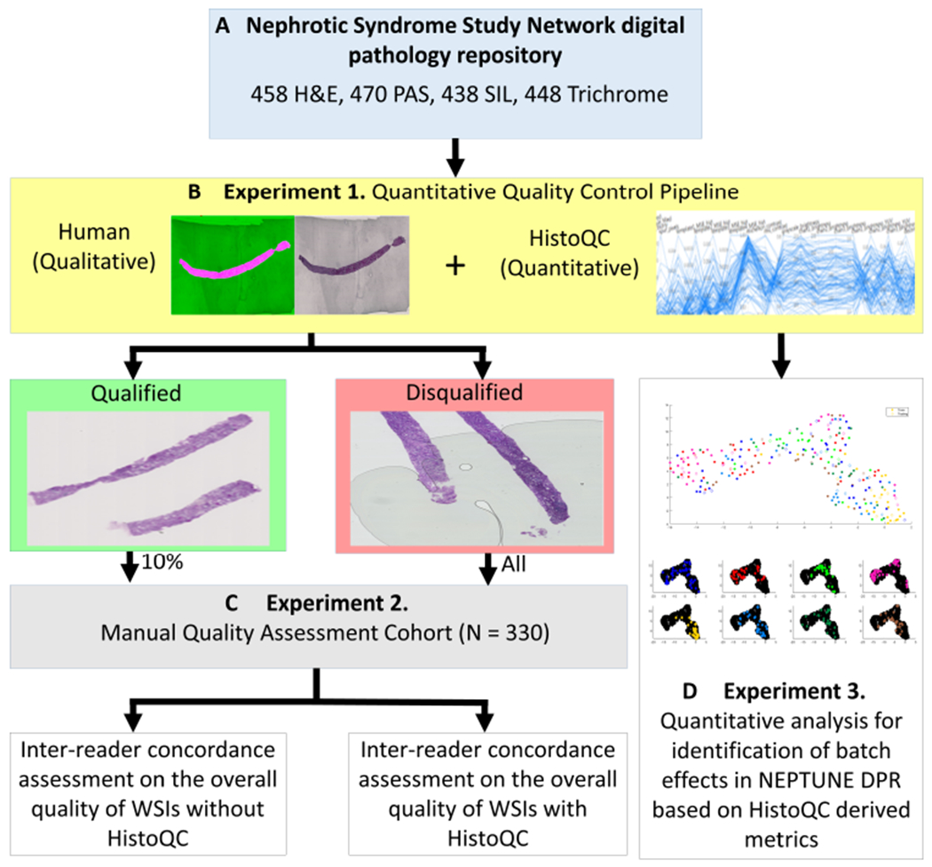
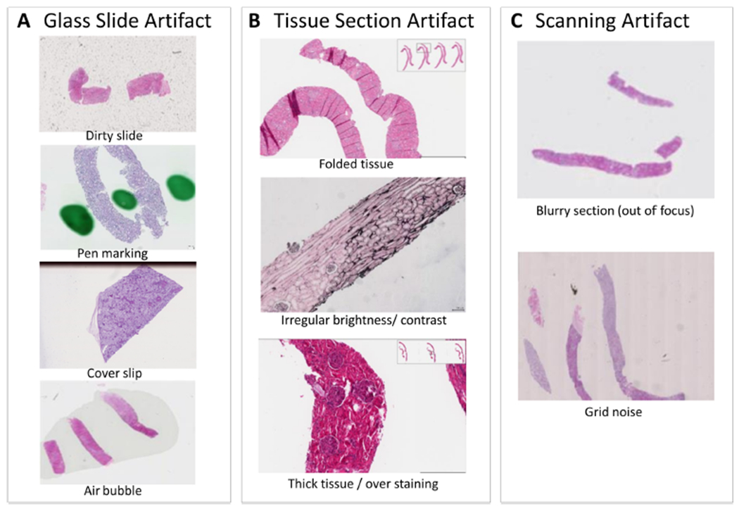
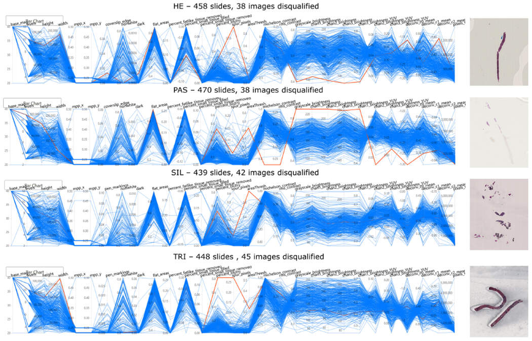
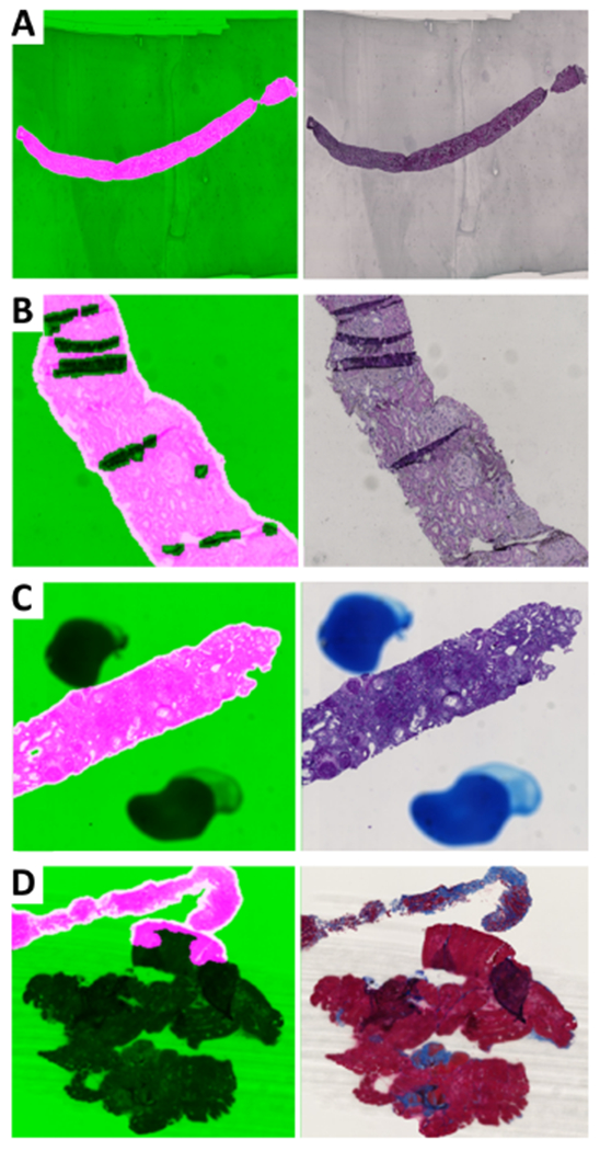
Inconsistencies in the preparation of histology slides and whole-slide images (WSIs) may lead to challenges with subsequent image analysis and machine learning approaches for interrogating the WSI. These variabilities are especially pronounced in multicenter cohorts, where batch effects (i.e. systematic technical artifacts unrelated to biological variability) may introduce biases to machine learning algorithms. To date, manual quality control (QC) has been the de facto standard for dataset curation, but remains highly subjective and is too laborious in light of the increasing scale of tissue slide digitization efforts. This study aimed to evaluate a computer-aided QC pipeline for facilitating a reproducible QC process of WSI datasets. An open source tool, HistoQC, was employed to identify image artifacts and compute quantitative metrics describing visual attributes of WSIs to the Nephrotic Syndrome Study Network (NEPTUNE) digital pathology repository. A comparison in inter-reader concordance between HistoQC aided and unaided curation was performed to quantify improvements in curation reproducibility. HistoQC metrics were additionally employed to quantify the presence of batch effects within NEPTUNE WSIs. Of the 1814 WSIs (458 H&E, 470 PAS, 438 silver, 448 trichrome) from n = 512 cases considered in this study, approximately 9% (163) were identified as unsuitable for subsequent computational analysis. The concordance in the identification of these WSIs among computational pathologists rose from moderate (Gwet's AC1 range 0.43 to 0.59 across stains) to excellent (Gwet's AC1 range 0.79 to 0.93 across stains) agreement when aided by HistoQC. Furthermore, statistically significant batch effects (p < 0.001) in the NEPTUNE WSI dataset were discovered. Taken together, our findings strongly suggest that quantitative QC is a necessary step in the curation of digital pathology cohorts. © 2020 The Pathological Society of Great Britain and Ireland. Published by John Wiley & Sons, Ltd.

Keywords: NEPTUNE; batch effects; computational pathology; computer vision; digital pathology; inter-reader variability; kidney biopsies; machine learning; quality control; whole-slide image.


Figures

Figure 1.
Figure 1.
Experimental pipeline. Using over 1800 WSIs stained with H&E, PAS, SIL and TRI, from the NEPTUNE DPR, a HistoQC-aided QC pipeline was applied to each stain independently. WSIs were assessed for qualification of computational analysis as determined by the presence of artifacts and whether the WSI was an outlier within the stain population. Ten percent of the qualified WSIs and all of the disqualified WSIs were reviewed and scored by three reviewers R1, R2 and R3, for evaluation of inter-reader concordance with and without using HistoQC. HistoQC quantitative quality metrics were later used to assess the presence of batch effects in the NEPTUNE data.
Figure 2.
Figure 2.
Example artifacts that frequently present on digital renal pathology images. In general, common artifacts found in digital renal pathology images can be divided into: (A) glass slide artifacts, (B) tissue section artifacts and (C) scanning artifacts.
Figure 3.
Figure 3.
HistoQC user interface demonstrating selected metrics across four stain types. The PCPs provide an overview of the distribution of WSIs, with each blue line representing a single WSI and each y-axis representing the metric plotted on a normalized axis. Each vertical axis corresponds to a distinct image metric computed by HistoQC. Each horizontally orientated line represents a WSI analyzed by HistoQC. Examples of disqualified WSIs are shown and are highlighted in red in the plot. Disqualified images (red lines) are examples of outliers in certain metrics, indicating potential preparation artifacts. For example, in the first outlier in the H&E-stained image cohort, the WSI highlighted in red deviates from the majority of WSIs (blue lines) in metrics such as ‘Spur_pixels’, and the brightness of all color channels. This indicates that this WSI has many more spur pixels compared with the rest of the H&E-stained WSI, and the tissue itself is probably too dark compared with other H&E WSIs, as the brightness is low. These outlying metrics indicate that a more thorough manual quality assessment is warranted for this particular WSI: it was discovered that the image was dark because of thick cutting, over-staining and a large air bubble covering the entire core. The collection of these artifacts resulted in the disqualification for computational analysis of this WSI.
Figure 4.
Figure 4.
Examples of artifacts identified and associated HistoQC overlay image. For each example, the mask of computationally acceptable tissue overlaid on the WSI is presented on the left, where acceptable tissue areas are highlighted in pink, whereas background and noisy tissue areas are shown in green. The raw thumbnail for each WSI is presented on the right. For each panel, different artifact detection results are shown: (A) glass artifact: stain residue on a glass slide of a SIL WSI; (B) glass artifact: pen marking outside the core of a PAS WSI; (C) tissue artifact: tissue folding on a PAS WSI; (D) tissue and scanning artifact: thick tissue, tissue folding and blurriness on a TRI WSI.
Figure 5.
Figure 5.
Statistical analysis of batch effect presence. (A) Histogram showing accuracy distribution of RF classifiers trained with randomized site labels (blue bins) from a permutation test. The accuracy of a RF classifier trained with correct labels is highlighted on the figure in red. (B) Confusion matrix illustrating RF predicted sites of the n = 50 testing cohort; rows correspond to the predicted class (output class) and columns to true class (target class). Diagonal cells correspond to observations that are correctly classified. Both the number of observations and the percentage of the total number of observations are shown in each cell. The last column shows the precision, or positive predictive value, in green. The bottom row shows the recall, or true positive rate, in green. The bottom right cell shows the overall accuracy. Sites S2 (recall = 66.7%), S3 (recall = 100%), S4 (recall = 80%), S5 (recall = 75%), S6 (recall = 75%) can be seen to have high recall values, driving the overall accuracy of the classifier, and demonstrating the presence of detectable batch effects.
Figure 6.
Figure 6.
UMAP embedded plot for assessment of batch effects in NEPTUNE DPR. (A) Samples from eight sites plotted in the 2D embedded space produced by UMAP, where examples from left (red arrow, site S2) and right (yellow arrow, site S5) are shown, where circles represent cases from the training set and diamonds represent cases from the test set for all color pairs, with (B) the same sites shown in individual plots (with other laboratories in black) to highlight their distributions. The UMAP embedding was generated in an unsupervised manner, with the training and testing cases used in the RF experiment shown as circles and diamonds, respectively. These labels appear to cluster by originating WSI site well, indicating that training and testing samples are near each other in the high dimensional color space features computed by HistoQC. As can be observed, sites S2, S3, S4, S5 are demonstrating concise clusters, indicating the potential presence of batch effects. These findings are in line with observations from the confusion matrix in Figure 5B. Panel (A) further demonstrates that notable presentation differences are driving divergent locations on the plot, with the left WSI showing a higher red and lower blue channel intensity versus the WSI on the right having heavy contrast and a high intensity blue channel.

References

    1. Barisoni L, Gimpel C, Kain R, et al.Digital pathology imaging as a novel platform for standardization and globalization of quantitative nephropathology. Clin Kidney J 2017; 10: 176–187. - PMC - PubMed
    1. Kiser PK, Löhr CV, Meritet D, et al.Histologic processing artifacts and inter-pathologist variation in measurement of inked margins of canine mast cell tumors. J Vet Diagn Invest 2018; 30: 377–385. - PMC - PubMed
    1. Bhargava R, Madabhushi A. Emerging themes in image informatics and molecular analysis for digital pathology. Annu Rev Biomed Eng 2016; 18: 387–412. - PMC - PubMed
    1. Madabhushi A, Lee G. Image analysis and machine learning in digital pathology: challenges and opportunities. Med Image Anal 2016; 33: 170–175. - PMC - PubMed
    1. Sharma V, Sreedhar CM, Debnath J. Combat radiology: challenges and opportunities. Med J Armed Forces India 2017; 73: 410–413. - PMC - PubMed

Publication types

MeSH terms