The relation between color and spatial structure for interpreting colormap data visualizations
- PMID: 33201220
- PMCID: PMC7683863
- DOI: 10.1167/jov.20.12.7
The relation between color and spatial structure for interpreting colormap data visualizations
Abstract
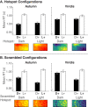
Interpreting colormap visualizations requires determining how dimensions of color in visualizations map onto quantities in data. People have color-based biases that influence their interpretations of colormaps, such as a dark-is-more bias-darker colors map to larger quantities. Previous studies of color-based biases focused on colormaps with weak data spatial structure, but color-based biases may not generalize to colormaps with strong data spatial structure, like "hotspots" typically found in weather maps and neuroimaging brain maps. There may be a hotspot-is-more bias to infer that colors within hotspots represent larger quantities, which may override the dark-is-more bias. We tested this possibility in four experiments. Participants saw colormaps with hotspots and a legend that specified the color-quantity mapping. Their task was to indicate which side of the colormap depicted larger quantities (left/right). We varied whether the legend specified dark-more mapping or light-more mapping across trials and operationalized a dark-is-more bias as faster response time (RT) when the legend specified dark-more mapping. Experiment 1 demonstrated robust evidence for the dark-is-more bias, without evidence for a hotspot-is-more bias. Experiments 2 to 4 suggest that a hotspot-is-more bias becomes relevant when hotspots are a statistically reliable cue to "more" (i.e., the locus of larger quantities) and when hotspots are more perceptually pronounced. Yet, comparing conditions in which the hotspots were "more," RTs were always faster for dark hotspots than light hotspots. Thus, in the presence of strong spatial cues to the locus of larger quantities, color-based biases still influenced interpretations of colormap data visualizations.
Figures


Similar articles
-
More of what? Dissociating effects of conceptual and numeric mappings on interpreting colormap data visualizations.Cogn Res Princ Implic. 2023 Jun 19;8(1):38. doi: 10.1186/s41235-023-00482-1. Cogn Res Princ Implic. 2023. PMID: 37337019 Free PMC article.
-
Mapping Color to Meaning in Colormap Data Visualizations.IEEE Trans Vis Comput Graph. 2019 Jan;25(1):810-819. doi: 10.1109/TVCG.2018.2865147. Epub 2018 Sep 3. IEEE Trans Vis Comput Graph. 2019. PMID: 30188827
-
A Heuristic Approach to Value-Driven Evaluation of Visualizations.IEEE Trans Vis Comput Graph. 2018 Sep 3. doi: 10.1109/TVCG.2018.2865146. Online ahead of print. IEEE Trans Vis Comput Graph. 2018. PMID: 30188826
-
Deep Colormap Extraction From Visualizations.IEEE Trans Vis Comput Graph. 2022 Dec;28(12):4048-4060. doi: 10.1109/TVCG.2021.3070876. Epub 2022 Oct 26. IEEE Trans Vis Comput Graph. 2022. PMID: 33819157
-
Synergy between research on ensemble perception, data visualization, and statistics education: A tutorial review.Atten Percept Psychophys. 2021 Apr;83(3):1290-1311. doi: 10.3758/s13414-020-02212-x. Epub 2021 Jan 3. Atten Percept Psychophys. 2021. PMID: 33389673 Review.
Cited by
-
True colours or red herrings?: colour maps for finite-element analysis in palaeontological studies to enhance interpretation and accessibility.R Soc Open Sci. 2021 Nov 17;8(11):211357. doi: 10.1098/rsos.211357. eCollection 2021 Nov. R Soc Open Sci. 2021. PMID: 34804580 Free PMC article.
-
Concealed Weapon Detection Using Thermal Cameras.J Imaging. 2025 Feb 26;11(3):72. doi: 10.3390/jimaging11030072. J Imaging. 2025. PMID: 40137184 Free PMC article.
-
More of what? Dissociating effects of conceptual and numeric mappings on interpreting colormap data visualizations.Cogn Res Princ Implic. 2023 Jun 19;8(1):38. doi: 10.1186/s41235-023-00482-1. Cogn Res Princ Implic. 2023. PMID: 37337019 Free PMC article.
-
Communicating health information with visual displays.Nat Med. 2023 May;29(5):1085-1091. doi: 10.1038/s41591-023-02328-1. Epub 2023 May 8. Nat Med. 2023. PMID: 37156935 Review.
-
Using Geovisualizations to Educate the Public About Environmental Health Hazards: What Works and Why.Curr Environ Health Rep. 2024 Dec;11(4):453-467. doi: 10.1007/s40572-024-00461-8. Epub 2024 Sep 25. Curr Environ Health Rep. 2024. PMID: 39320394 Review.
References
-
- Albers D., Correll M., & Gleicher M. (2014). Task-driven evaluation of aggregation in time series visualization. Proceedings of the SIGCHI Conference on Human Factors in Computing Systems (pp. 551–560). New York, NY, USA: Association for Computing Machinery, https://dl.acm.org/doi/proceedings/10.1145/2556288. - DOI - PMC - PubMed
-
- Bertin J. (1983). Semiology of graphics: Diagrams, networks, maps. Berlin, Germany: de Gruyter Press.
-
- Borland D., & Taylor R. M. T. II (2007). Rainbow color map (still) considered harmful. IEEE Computer Graphics and Applications , 27(2), 14–17. - PubMed
-
- Brewer C. A. (1994). Color use guidelines for mapping and visualization. In MacEachren A. M. & Taylor D. R. F. (Eds.), Visualization in modern cartography (Vol. 2, pp. 123–148). Tarrytown, NY: Elsevier Science.
-
- Brewer C. A. (1997). Spectral schemes: Controversial color use on maps. Cartography and Geographic Information Systems , 24(4), 203–220.
Publication types
MeSH terms
LinkOut - more resources
Full Text Sources

