. 2021:6:36-45.
doi: 10.1016/j.idm.2020.10.013. Epub 2020 Nov 16.

"Stay nearby or get checked": A Covid-19 control strategy

Affiliations

"Stay nearby or get checked": A Covid-19 control strategy

Jan-Tino Brethouwer et al. Infect Dis Model. 2021.

Abstract

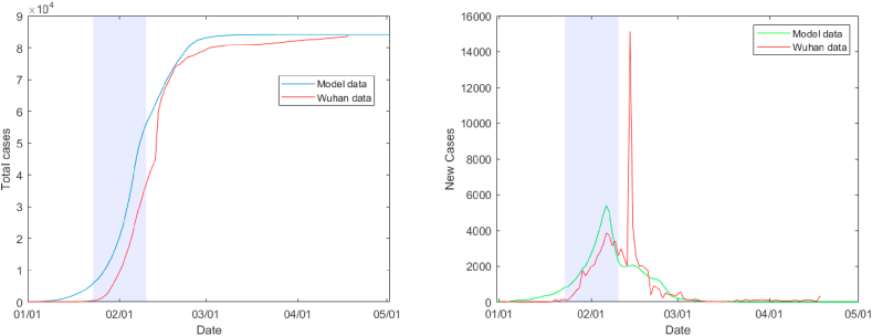
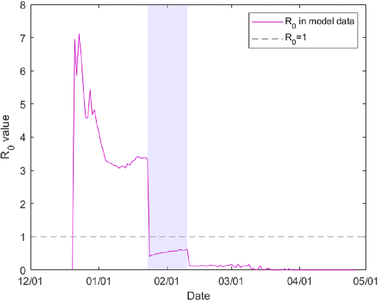
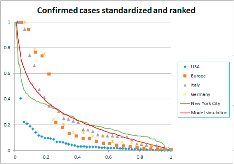
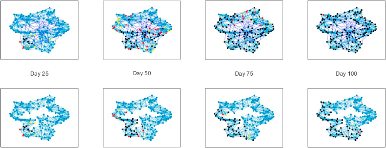
This paper repurposes the classic insight from network theory that long-distance connections drive disease propagation into a strategy for controlling a second wave of Covid-19. We simulate a scenario in which a lockdown is first imposed on a population and then partly lifted while long-range transmission is kept at a minimum. Simulated spreading patterns resemble contemporary distributions of Covid- 19 across EU member states, German and Italian regions, and through New York City, providing some model validation. Results suggest that our proposed strategy may significantly reduce peak infection. We also find that post-lockdown flare-ups remain local longer, aiding geographical containment. These results suggest a tailored policy in which individuals who frequently travel to places where they interact with many people are offered greater protection, tracked more closely, and are regularly tested. This policy can be communicated to the general public as a simple and reasonable principle: Stay nearby or get checked.

Keywords: COVID-19; Epidemiology; Interventions; Lockdown exit; SEIR; Small-world network.


Figures

Fig. 1
Fig. 1
An example of a Watts-Strogatz small-world graph with N = 100, k = 20 and p = 0.05.
Fig. 2
Fig. 2
Total number of officially confirmed cases (left) and daily number of new cases in the Hubei area. The shaded part represents the initial lockdown, between Jan 23 and Feb 10. The spike in new cases on Feb 12 was due to an inclusion of previously uncounted clinically diagnosed patients. The model data are an average of 200 Monte Carlo simulations.
Fig. 3
Fig. 3
The computed reproduction number R0 during the simulation reduces from an initial 7.15 (from r = 0.055, k = 20, t = 6.5) but drops even before the lockdown of January 23. Its average is 0.54 during the initial lockdown (shaded area) and reduces even further during the severe lockdown.
Fig. 4
Fig. 4
Daily number of officially confirmed new cases in Italy (left) with r = 0.01 after lockdown. Our simulation starts with a single infected node on January 31 and we set the initial date of the lockdown at March 9, when the government announced nationwide regulations. We plotted one standard deviation difference in dark green, and a 98 percent confidence interval in light green around the model data to illustrate the accuracy of our model. We find an average reproduction number R0 = 4.0 (right) before lockdown and R0 = 0.84 after lockdown.
Fig. 5
Fig. 5
Daily number of officially confirmed new cases in Austria (left) with r = 0.0055 after lockdown. Our simulation starts with a single infected node on February 22 and a lockdown at March 15. We find an average reproduction number R0 = 4.2 (right) before lockdown and R0 = 0.55 after lockdown. Austria implemented a relatively severe lockdown. We found that a parameter value of r = 0.0055 post-lockdown reproduces the number of confirmed cases.
Fig. 6
Fig. 6
A comparison of the daily number of officially confirmed new cases in ten EU countries during March and April 2020. The numbers are averaged over six days. In the right hand figure, this data is adjusted so that the peak of the number of cases occur after 50 days. This is compared to the 99% confidence band of a model computation with r = 0.055 pre-lockdown and r = 0.0075 during lockdown. Not all countries fit in the confidence band because their waves plateaued, while our model shows a sharp peak. The increase and decrease of the wave in our model does match the data.
Fig. 7
Fig. 7
Number of confirmed cases on three different scales: USA and Europe – Regione and Bundeslander – NYC zip codes. The data is ranked from largest to smallest and normalized. On each scale, the spread of the disease displays a similar exponential decay. The figure also shows the spatial distribution of Covid-19 spread in our model after 60 days, 25 days into lockdown. To this end we arbitrarily divided the ring lattice of N = 10,000 nodes into 100 regions of 100 nodes each. The spatial distribution in our network is comparable to the data of Europe, Germany, Italy, and New York City. The spread of the disease in the USA is more concentrated, with an exceptional number of cases in New York and New Jersey.
Fig. 8
Fig. 8
Number of infections per 1 million of the population (source:Johns Hopkins). Europe versus USA. Our model parameters were r = 0.01 during a lockdown of hundred days in the EU and sixty days in the USA. For the post-lockdown period we used r = 0.015 for the EU and r = 0.02 for 85 percent of the USA and r = 0.015 for the remaining 15 percent. The post-lockdown in the USA lasted for fifty days in our model computations, after which we reduced the parameter to r = 0.01 for the entire network. To match the number of infections in our model with the real world data, we assumed that currently only 5 percent of positive cases is detected.
Fig. 9
Fig. 9
Peak reduction with baseline r = 0.02 and some edges checked.
Fig. 10
Fig. 10
Three policy approaches to opening up a lockdown of 75 days, with varying post-lockdown levels of r: (a) policy does not differentiate long and short ties, (b) policy targets long ties while all other restrictions are lifted, and (c) policy targets long ties while social distancing is encouraged.
Fig. 11
Fig. 11
Effect of shutting down long-range transmission. From left to right graphs show disease propagation at 25 day intervals in a small-world network with N = 150, k = 10 and p = 0.1. All graphs have rshort = 0.055. The top graphs have rlong = 0.055, while the bottom graphs have rlong = 0. Node color indicates SEIR states, blue = susceptible, yellow = exposed, red = infectious, black = resistant.

References

    1. Butts C.T., Carley K. Doctoral Disser; 2002. Spatial models of large-scale interpersonal networks.
    1. Colizza V., Barrat A., Barthelemy M., Vespignani A. The role of the airline transporation network in the prediction and predicitability of global epidemics. Proceedings of the National Academy of Sciences. 2007;103(7) - PMC - PubMed
    1. Ferguson N.M., Derek A.T.C., Fraser C., James C.C., Cooley P.C., Burke D.S. Strategies for mitigating an influenza pandemic. Nature. 2006;442(7101):448–452. - PMC - PubMed
    1. Halloran E.M., Ferguson N.M., Stephen E. Modeling targeted layered containment of an influenza pandemic in the United States. Proceedings of the National Academy of Sciences. 2008;105(12) - PMC - PubMed
    1. Ferguson N.M., Laydon D., Nedjati-Gilani G. Imperial College Covid-19 Response Team; 2020. Impact of non- pharmaceutical interventions (npis) to reduce covid-19 mortality and healthcare demand. - PMC - PubMed

LinkOut - more resources