. 2020 Nov 30;11(1):6129.
doi: 10.1038/s41467-020-19737-2.

Single cell RNA sequencing of human microglia uncovers a subset associated with Alzheimer's disease

Affiliations

Single cell RNA sequencing of human microglia uncovers a subset associated with Alzheimer's disease

Marta Olah et al. Nat Commun. .

Abstract

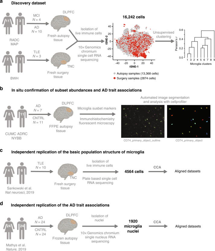
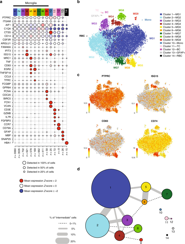
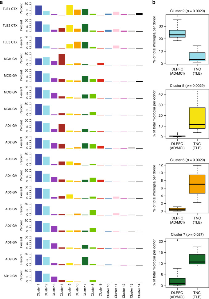
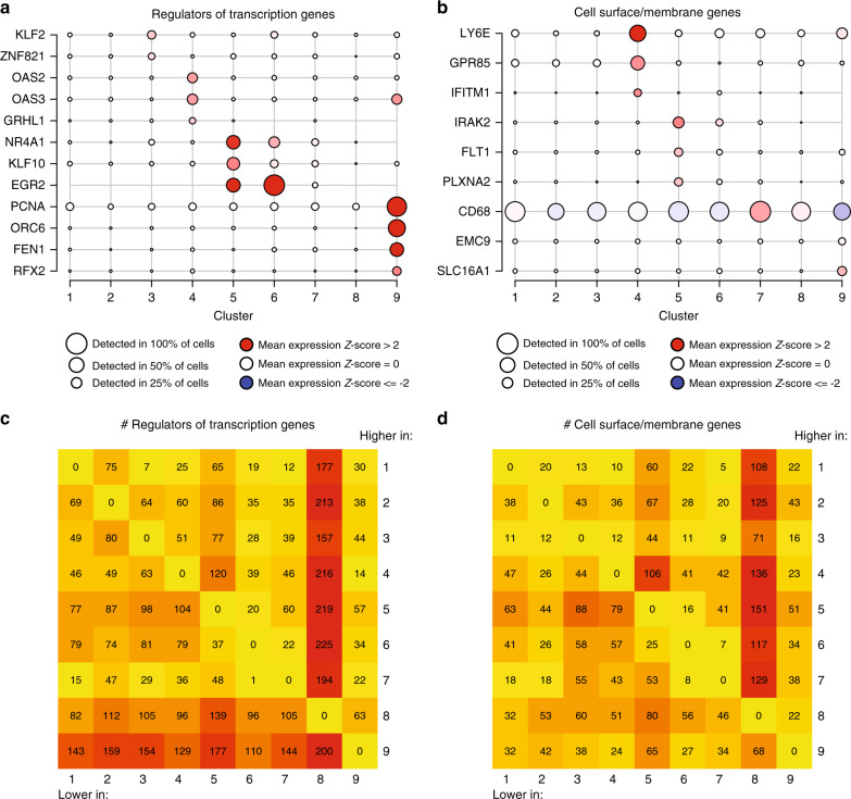
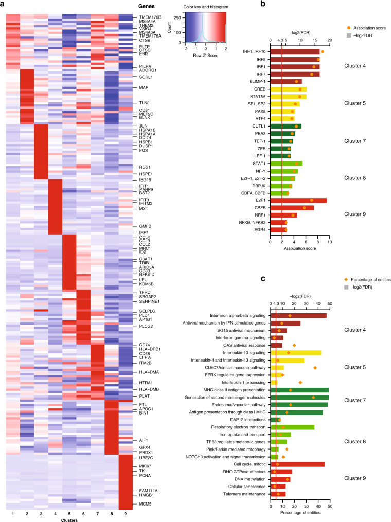
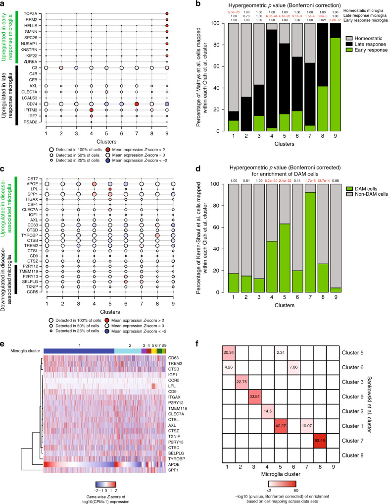
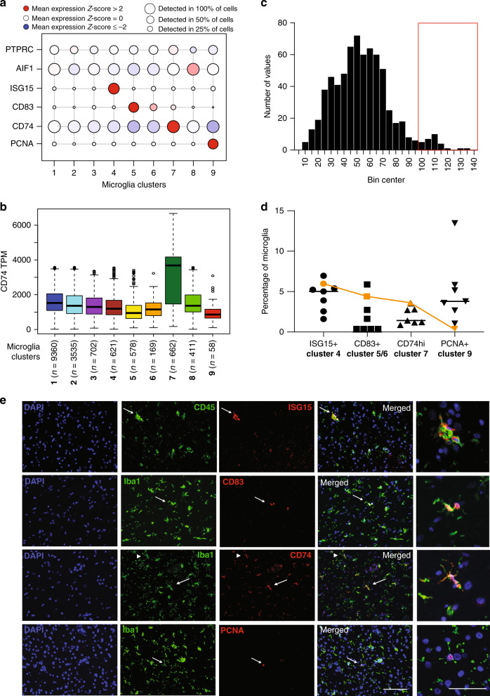
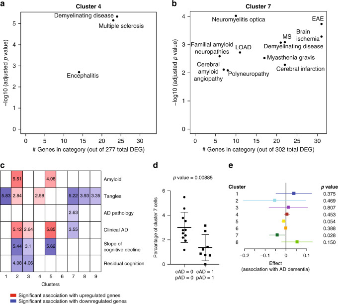
The extent of microglial heterogeneity in humans remains a central yet poorly explored question in light of the development of therapies targeting this cell type. Here, we investigate the population structure of live microglia purified from human cerebral cortex samples obtained at autopsy and during neurosurgical procedures. Using single cell RNA sequencing, we find that some subsets are enriched for disease-related genes and RNA signatures. We confirm the presence of four of these microglial subpopulations histologically and illustrate the utility of our data by characterizing further microglial cluster 7, enriched for genes depleted in the cortex of individuals with Alzheimer's disease (AD). Histologically, these cluster 7 microglia are reduced in frequency in AD tissue, and we validate this observation in an independent set of single nucleus data. Thus, our live human microglia identify a range of subtypes, and we prioritize one of these as being altered in AD.


Conflict of interest statement

A.R. is a co-founder and equity holder of Celsius Therapeutics, an equity holder in Immunitas, and was an SAB member of ThermoFisher Scientific, Syros Pharmaceuticals, Neogene Therapeutics and Asimov. From August 1, 2020, A.R. is now an employee of Genentech. All other authors declare no competing interests.

Figures

Fig. 1
Fig. 1. Experimental setup and overview of human samples and datasets used.
a Workflow for the generation of the discovery dataset. Brain myeloid cells were isolated from 17 donors of both sexes (for a detailed isolation protocol see Methods section, for details on the donors see Supplementary Data 1). Autopsy samples originated from deceased aged individuals with various pathologies, while surgical biopsy samples were from young and middle-aged individuals undergoing surgery for intractable epilepsy. The single-cell suspension preparation of sorted cells was loaded onto one lane of the Chromium system (10x Genomics) and the resulting library was sequenced on the HiSeq4000 platform (Illumina). After quality control, the dataset consisted of 16,242 cells which were then subjected to unsupervised hierarchical clustering. b In situ confirmation of subset abundance and AD trait associations. We performed immunohistochemistry using markers enriched in microglial subsets in order to investigate the abundance of the specific clusters in situ and their associations to clinical and pathological traits of AD. Following image acquisition with a fluorescence microscope, automated image analysis was done using CellProfiler. c Independent replication of the basic population structure of microglia. We used a recently published human microglia single-cell RNA sequencing dataset to confirm the basic population structure of aged human microglia. The two datasets were aligned using CCA. d Independent replication of the AD trait associations. A recently published single nucleus RNA sequencing dataset was used to confirm the AD trait associations found in our dataset. The two datasets were aligned using CCA. DLPFC dorsolateral prefrontal cortex, TNC temporal neocortex, MCI mild cognitive impairment, AD Alzheimer’s disease, TLE temporal lobe epilepsy, CNTRL non-neurological control, tSNE t-distributed stochastic neighbor embedding, RADC Rush Alzheimer’s Disease Center, MAP Rush Memory and Aging Project, BWH Brigham and Women’s Hospital, CUMC ADRC Columbia University Medical Center Alzheimer’s Disease Research Center, FFPE formalin fixed paraffin embedded, CCA canonical correlation analysis.
Fig. 2
Fig. 2. scRNA-seq identifies subsets of human brain myeloid cells.
a Unsupervised iterative PCA-Louvain clustering with stepwise cluster robustness assessment identified 14 different clusters of cells in our dataset. Each column represents a cell cluster. The number of cells assigned to each cluster is noted at the bottom of each column. Each row represents the level of expression of a selected key gene. The size of the dot represents the fraction of cells in a given cluster in which the gene was detected (>0 transcripts per million). The color of the dot represents the average expression z-score (calculated over all 16,242 cells) of the cells within a given cluster. The bulk of the cells belong to 10 clusters (clusters 1–10) identifiable as myeloid based on their marker gene expression (AIF1 and CD14). Of these, cluster 10 has low expression of C1QA, a microglia marker, and thus probably represents monocytes. A small proportion (<1%) of the cells are non-myeloid and belong to clusters that could be characterized by high expression of genes such as GFAP (cluster 13), CD3E (cluster 11), CD79A (cluster 12), and HBA1 (cluster 14), likely representing astrocytes, T cells, B cells, and erythrocytes, respectively. The z-score matrix is available in Supplementary Data 16. b t-SNE plot depicting the different microglial and non-microglial cell subsets. Each dot represents a cell. The cells are color coded based on their cluster affiliation. t-SNE was run using all of the cells in the dataset. c t-SNE plots showing the expression of some of selected genes that are enriched in certain clusters. Each dot represents a cell. The normalized gene expression levels of the selected genes for each cell is projected onto the t-SNE plots. Color gradient bar represents log2(TPM + 1) which has been normalized, so that gray equals to 10th percentile expression value and red equals to maximum expressed value. d Constellation diagram showing the relatedness among clusters based on post-hoc classification of cells. For every pair of clusters, a bootstrapped random forest approach was run to classify each cell 100 times, using 75% of the cells as training data for each run. In the diagram, each node represents a cluster, scaled by the number of cells that belong to it, and each edge represents the fraction of cells that were ambiguously assigned i.e. assigned to the same cluster in fewer than 75 runs, for a given pair of clusters. The largest cluster (cluster 1) shares substantial ambiguously assigned cells with clusters 2 and 3, which may suggest a continuum of states among these three clusters. The other microglial clusters share fewer ambiguously assigned cells with cluster 1, while the monocyte and non-myeloid clusters all share no ambiguously assigned cells with any the microglial clusters. t-SNE t-distributed stochastic neighbor embedding, MG1-9 the nine microglial cell clusters, TC T cells, BC B cells, Mono monocytes, GFAP+a GFAP-positive ambiguous cluster; RBCs red blood cells.
Fig. 3
Fig. 3. Cluster distribution within donors and provenance of clusters.
a Distribution of cells among the different cell clusters for each donor. Each column represents a cluster, and each row represents a subject. The data are presented as the percentage of the cells in a given cluster within a given donor. Cluster 1 is the most abundant cluster in all subjects. Each cluster is color coded according to Fig. 2. b Clusters with differential proportions in the DLPFC (AD & MCI) autopsy samples versus the TNC (TLE) surgical tissue samples. Boxplots of the distribution of proportions of the 4 clusters with statistically significant differences between the two sample groups. The DLPFC (AD & MCI) group contains 14,142 cells from 14 donors (MCI1 GM - MCI4 GM, AD1 GM- AD10 GM), while the TNC (TLE) group contains 2103 cells from 3 donors (TLE1 CTX – TLE3 CTX). Significance was assessed using the (non-parametric) Mann–Whitney test, resulting in the p-values shown for each cluster. All tests were two-sided. The boxes represent the 25th percentile, median, and 75th percentile. The whiskers extend to the furthest value that is no more than 1.5 times the inter-quartile range (default parameter for R’s boxplot function). Source data for this figure are provided in the Source Data file. DLPFC dorsolateral prefrontal cortex, TNC temporal neocortex, MCI mild cognitive impairment, AD Alzheimer’s disease, TLE temporal lobe epilepsy, GM gray matter, CTX cortex.
Fig. 4
Fig. 4. Identifying potential functional marker genes for the microglial clusters.
a Microglial clusters are visualized in columns, and rows represent selected regulators of transcription that are differentially expressed in certain clusters (using the edgeR software package, adjusted p-value < 0.05, with Benjamini–Hochberg FDR correction). As shown in the key code at the bottom of the panel, the size of each dot represents the fraction of cells in a given cluster in which the gene was detected (>0 transcripts per million), and the color of the dot represents the mean of the expression z-score (calculated over all 16,242 cells) for the cells belonging to that cluster, as in Fig. 2a. b Using the same outline as in a, a subset of genes encoding membrane associated proteins that are differentially expressed across clusters are presented as these proteins are good candidates for cell-surface markers. The z-score matrix for a and b is available in Supplementary Data 16. c, d Heatmaps representing the number of differentially expressed genes in each pairwise comparison between the microglial clusters. In c, we limit the analysis to genes that encode transcription factors and transcriptional regulators. In d, we present the results of an analysis limited to genes encoding membrane associated proteins. Color scale for the heatmaps is yellow equals the minimum observed value (0), deep red equals the maximum observed value (225).
Fig. 5
Fig. 5. Functional annotation of the microglial clusters.
a Heatmap depicting the z-scores of the top differentially expressed signature genes (using the edgeR software package, adjusted p-value < 0.05, with Benjamini–Hochberg FDR correction, ordered by adjusted p-value) of each microglial cluster, with representative genes highlighted on the right side of the figure. Rows represent genes, and each cluster is presented in a column. The color coding represents the mean expression (transcripts per million) in the cluster, Z-scored over all the clusters, as shown in the color key with histogram. The z-score matrix is available in Supplementary Data 16. b Predicted transcription factors whose binding sites are enriched among the differentially expressed genes of each microglial cluster. In rows, the names of the transcription factors are shown. Enrichment p values were calculated with PASTAA. The columns are colored according to the cluster identity introduced in Fig. 2. c Functional annotation of certain microglia clusters using REACTOME pathways significantly enriched for their signature genes (top 50 differentially expressed genes). The bar graphs are color coded according to cluster identity as introduced in Fig. 2. FDR false discovery rate.
Fig. 6
Fig. 6. Annotation of the microglial clusters using published datasets.
a Plot depicting the expression levels of representative genes upregulated in either the early (green) or late (black) response of microglia in the CKp25 mouse model. Each cluster described in the current human study is presented in one column. The size of the dots is proportional to the number of cells expressing the given gene in the corresponding cluster. The color of the circle is proportional to the level of differential expression of the selected gene in a given microglial subset, with increased expression denoted in red while decreased expression is shown in blue. b We used Canonical Correlation Analysis (CCA) to map the mouse microglia to our single-cell microglia clusters using a Naïve Bayes classifier. The mouse microglia in the original paper were annotated as being either homeostatic (gray), or part of the late response (black) or part of the early response (green) based on their transcriptomic signature. Next, we assessed relative enrichment of each mouse microglial type in each of the human clusters using a hypergeometric test with Bonferroni correction, with significant results highlighted in red. The results are reported at the top of each column; for example, we see a significant (p = 5.3 × 10−70) excess of mouse homeostatic cells in human microglial cluster 1. c Plot depicting the expression levels of representative genes related to the murine DAM phenotype in each microglial cluster. Each cluster is presented in one column. Genes are either upregulated (green) or downregulated (black) in murine DAM cells. The size of the circles is proportional to the number of cells expressing the given gene in the corresponding cluster. The color of the dots represents the mean Z score of expression. The z-score matrix for a and c is available in Supplementary Data 16. d Results of dataset integration (using CCA) between the Keren-Shaul data and the current dataset: the percentage of DAM (green) or non-DAM (gray) cells assigned to each human cluster is shown. The results of the enrichment analysis (hypergegeometric test) are shown at the top. Significant results are highlighted in red. The human microglia clusters 4, 5, and 7 showed the strongest enrichment for the signature associated with the murine DAM phenotype. e Heatmap depicting the expression levels of the genes in the murine Disease Associated Microglia (DAM) gene set. Each column represents a cell. Cells are ordered first based on cluster and then APOE expression within each cluster. The clusters are labeled at the top of the panel. Genes (rows) are ordered based on unsupervised hierarchical clustering (dendrogram on the left side of the graph). The color code represents Z-score of expression for each gene (i.e. normalized by row). While some of the DAM genes show some correlation in expression levels across cells, the gene set does not appear to be as coherent as it is in mice. The z-score matrix is available in Supplementary Data 16. f We compare our clustering results with those of an independent human microglia single-cell RNA-seq dataset. CCA was used for this comparison, and each cell reports the results of an enrichment analysis for each human microglia clusters reported by Sankowski and colleagues in the microglial clusters that we have defined. The significant correlations are color coded based on the corresponding –log10 transformed p-value (hypergeometric test) of the overlap between the upregulated gene sets in each cluster. Overall, the independent dataset returned clusters, which are similar to the ones that we have defined. CPM counts per million.
Fig. 7
Fig. 7. In situ confirmation of the abundance of major microglial subsets.
a RNA expression levels of markers enriched in different subsets of microglia in the scRNA-seq dataset: ISG15 for interferon cluster 4, CD83 for the cytokine signaling enriched clusters 5 and 6, CD74 for antigen presentation related cluster 7 and PCNA for the proliferative cluster 9. The size of the circles represent the percentage of cells per cluster in which the given gene was detected, while the color coding represent the normalized z-scores. The z-score matrix is available in Supplementary Data 16. b Box-and-whisker plot representing the normalized gene expression of CD74 (in TPMs) among the different microglia clusters. Note that CD74 gene expression is ~2-fold higher in cluster 7 when compared to the expression in other clusters (see Source Data file). The boxes represent the 25th percentile, median, and 75th percentile. The whiskers extend to the furthest value that is no more than 1.5 times the inter-quartile range (default parameter for R’s boxplot function). The number of cells in each microglial cluster is also shown. c Distribution of the expression levels of CD74 on microglia in situ as measured by immunofluorescence and CellProfiler analysis. Note the second small peak at high expression values that we highlight with a red box. Source data are provided in the Source Data file. d Black symbols represent the quantification of the ISG15+, CD83+, and PCNA+ and CD74high microglia in the dorsolateral prefrontal cortex of seven individuals of mixed neuropathology (see Supplementary Data 9). The orange symbols represent the proportions for each subset observed in the single-cell RNA sequencing data. Center line represents the mean. Source data are available in the Source Data file. e Photomicrographs showing representative cells expressing the markers of the different microglia subsets. The arrows point to representative cells for each marker that are shown in the higher magnification photomicrographs in the far right column. In the micrographs showing CD74 staining, arrowhead points to a CD74 dim cell, while the arrow points to a CD74 bright (or high) cell. The bar in the lower right corner micrograph represents 100 μm for the overview images. The bar in the lower right corner of the higher magnification images (right most column) represents 50 μm. These experiments were performed in seven individual donors. In each donor 15–20 images were captured in the gray matter of the DLPFC and analyzed using IHC and automated image analysis. TPM transcripts per million.
Fig. 8
Fig. 8. Disease association in human microglia clusters.
a, b Scatter plots depicting brain related diseases – using gene sets from the disease ontology database (http://disease-ontology.org/) – that are significantly enriched (adjusted p-value < 0.01, hypergeometric test with Benjamini–Hochberg correction) in a given microglial cluster, using the cluster-defining signature gene sets of each microglia subset. Results for two different clusters are shown (cluster 4 and cluster 7); results for the other microglial clusters are included in Supplementary Fig. 10. In each plot, the y-axis reports the p-value of the enrichment analysis while the x-axis reports the number of genes that overlap between the cluster and disease gene sets, an indication of the robustness of the enrichment. c Panel reporting the result of enrichment analyses between the genes defining the microglial clusters and those genes that are associated with certain pathological or clinical traits found in the aging human brain (bulk DLPFC RNA sequencing data) in the ROS and MAP cohorts. Log10 adjusted p-values (using the hypergeometric test with Benjamini–Hochberg correction) are shown for those cluster/trait combinations where they are significant, and the saturation of each box is related to the strength of the association; red shades indicate overlap between cluster-defining genes and genes upregulated with the trait, whereas blue shades indicate overlap between cluster-defining genes and genes downregulated with the trait. d Dot plot comparing the frequency of IBA1+CD74high cells within the IBA1+cells in DLPFC tissue sections from New York Brain Bank subjects with both AD dementia and a pathological diagnosis of AD (cAD = 1, pAD = 1; n = 8) to that found in subjects who fulfill neither of these diagnostic criteria (cAD = 0, pAD = 0; n = 11). Every dot is an individual donor (see Supplementary Data 9). Overlaid on the dot plot, data are also presented as mean values ± SD. The statistical test used was an unpaired t test with a two tailed p value. There is no difference in the frequency of IBA1+ cells (Supplementary Fig. 14a). See Supplementary Data 9 for demographics of the donors and Source Data file for raw data. e Forest plot presenting the effect size of the association statistic from an analysis comparing the frequency of a given microglial cluster in subjects with a diagnosis of AD dementia and a pathologic diagnosis of AD (cAD = 1, pAD = 1; n = 18) versus subjects that do not meet these diagnostic criteria (cAD = 0, pAD = 0; n = 20). The primary analysis involves cluster 7 to replicate results shown in panel d, and we also present results for the eight other microglial clusters that we have defined in this manuscript. The per individual proportions of each cluster is shown in Supplementary Fig. 14b. The mean of the coefficient (effect size) presented here is derived from a standard linear regression model (dependent variable = proportion of each microglial type over the total microglial nuclei for a donor, independent variable = AD pathology/dementia diagnosis, either 0 or 1, as in Fig. 8d). Bars in the forest plot represent the 95% confidence interval for the coefficient, and the p-value represents a two-sided t-test on whether the coefficient is significantly different from 0. P-values were Bonferroni corrected for multiple comparisons. Source data are provided as a Source Data file. DEG differentially expressed genes, AD Alzheimer’s disease, LOAD late onset Alzheimer’s disease, MS multiple sclerosis, EAE experimental autoimmune encephalomyelitis, cAD clinical diagnosis of AD dementia, pAD pathological diagnosis of AD.

References

    1. Stevens B., & Schafer D. P. Roles of microglia in nervous system development, plasticity, and disease. Dev. Neurobiol. 78, 559–560 (2018). - PubMed
    1. Kierdorf K, Prinz M. Microglia in steady state. J. Clin. Invest. 2017;127:3201–3209. doi: 10.1172/JCI90602. - DOI - PMC - PubMed
    1. Galatro TF, et al. Transcriptomic analysis of purified human cortical microglia reveals age-associated changes. Nat. Neurosci. 2017;20:1162–1171. doi: 10.1038/nn.4597. - DOI - PubMed
    1. Gosselin, D. et al. An environment-dependent transcriptional network specifies human microglia identity. Science356, eaal3222 (2017). - PMC - PubMed
    1. Olah M, et al. A transcriptomic atlas of aged human microglia. Nat. Commun. 2018;9:539. doi: 10.1038/s41467-018-02926-5. - DOI - PMC - PubMed

Publication types

LinkOut - more resources