. 2020 Dec 4;11(1):6208.
doi: 10.1038/s41467-020-20053-y.

Longitudinal symptom dynamics of COVID-19 infection

Affiliations

Longitudinal symptom dynamics of COVID-19 infection

Barak Mizrahi et al. Nat Commun. .

Abstract

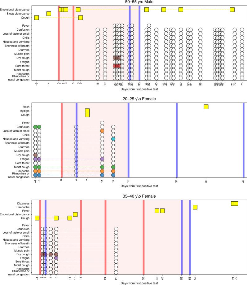
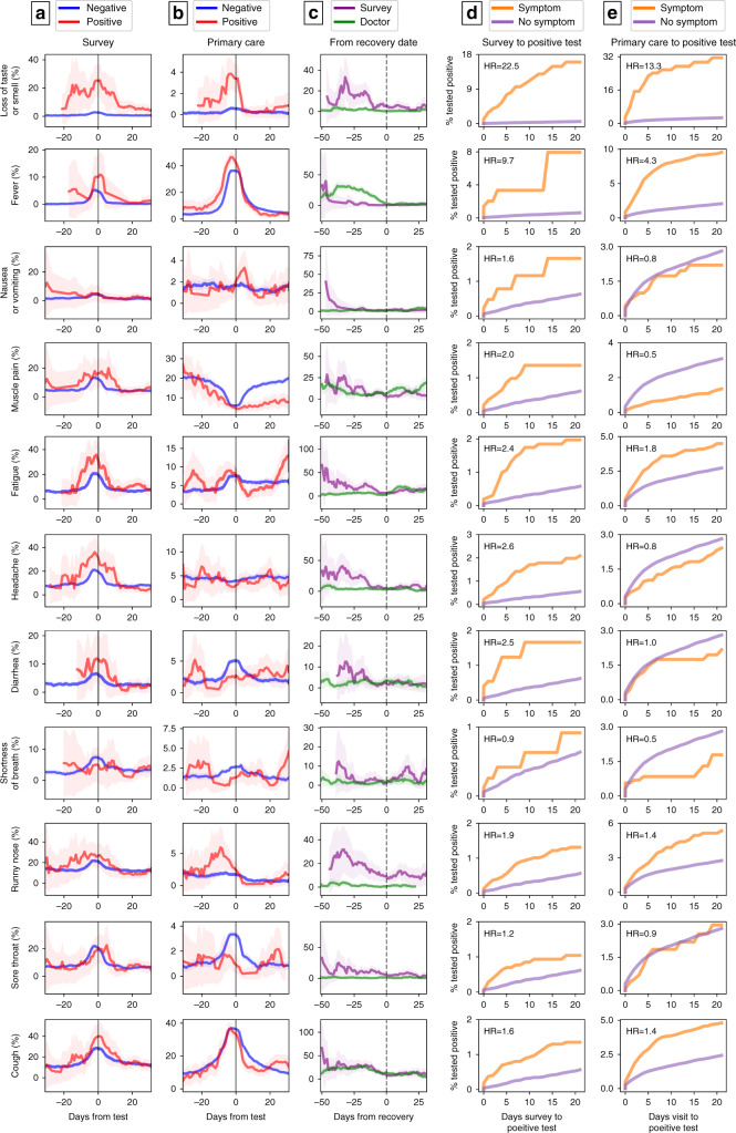
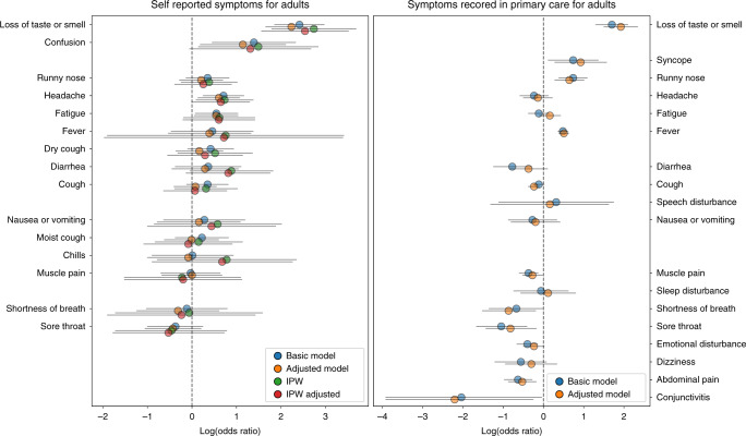
As the COVID-19 pandemic progresses, obtaining information on symptoms dynamics is of essence. Here, we extracted data from primary-care electronic health records and nationwide distributed surveys to assess the longitudinal dynamics of symptoms prior to and throughout SARS-CoV-2 infection. Information was available for 206,377 individuals, including 2471 positive cases. The two datasources were discordant, with survey data capturing most of the symptoms more sensitively. The most prevalent symptoms included fever, cough and fatigue. Loss of taste and smell 3 weeks prior to testing, either self-reported or recorded by physicians, were the most discriminative symptoms for COVID-19. Additional discriminative symptoms included self-reported headache and fatigue and a documentation of syncope, rhinorrhea and fever. Children had a significantly shorter disease duration. Several symptoms were reported weeks after recovery. By a unique integration of two datasources, our study shed light on the longitudinal course of symptoms experienced by cases in primary care.


Conflict of interest statement

The authors declare no competing interests.

Figures

Fig. 1
Fig. 1. Longitudinal dynamics of symptoms in infected individuals.
Three examples are given. Yellow rectangles represent symptoms recorded by a physician at a primary care visit. Colored circles represent symptoms self-reported by the individual throughout the survey. White circles represent self-report of not experiencing a symptom through the survey. Red and blue vertical lines indicate a positive or negative PCR test for SARS-CoV-2, respectively. The area marked in light red indicates the period of time an individual was considered as infected with COVID-19.
Fig. 2
Fig. 2. Dynamics of symptoms in COVID-19 patients.
Columns (a–c): each row represents the prevalence of a symptom in our cohort analyzed by time relative to diagnosis day from (a): Survey of self-reported symptoms and (b): Primary care visits in positive COVID19 cases (red) versus negative (blue) (c): Prevalence of symptoms in our cohort relative to time of recovery by surveys of self-reported symptoms (purple) and primary care visits (green). Each time point is calculated by taking a 1 week window (±3 days from day). Error bands represent 95% binomial proportion confidence intervals. Columns d, e: Kaplan–Meier curves from the time in which a symptom is self-reported (d) or recorded in the EHR (e) to a positive PCR result. The curves present the cumulative incidence of individuals who tested positive for COVID-19 and have a specific symptom (orange) versus those who did not report this symptom (purple) in time. Hazard ratios (HR) adjusted for gender, age, prior conditions and time (number of days since study initiation) are indicated. Note the y-axis scale is different for each panel.
Fig. 3
Fig. 3. Odds ratio analysis of symptoms prior to COVID-19 test.
Log odds ratio (OR) calculated by the prevalence of symptoms 21 days prior to COVID-19 test for adults in self recorded symptoms (n = 4843) versus EHR-captured symptoms (n = 70,606). Calculated log odds ratios are presented along with gray lines indicating 95% confidence intervals. Blue circles represent log OR calculated from the basic model, orange circles represent log OR from the adjusted model, green circles represent log OR after applying Inverse probability weighting (IPW) to help address biases related to those receiving testing and red circles represents log OR from the adjusted model after applying IPW.

Similar articles

Cited by

References

    1. She J, et al. 2019 novel coronavirus of pneumonia in Wuhan, China: emerging attack and management strategies. Clin. Transl. Med. 2020;9:19. doi: 10.1186/s40169-020-00271-z. - DOI - PMC - PubMed
    1. WHO Coronavirus Disease (COVID-19) Dashboard|WHO Coronavirus Disease (COVID-19) Dashboard. https://covid19.who.int/. Accessed 10 July 2020.
    1. Guan, W.-J. et al. Clinical characteristics of Coronavirus disease 2019 in China. N. Engl. J. Med.10.1056/NEJMoa2002032 (2020). - PMC - PubMed
    1. Mo, P. et al. Clinical characteristics of refractory COVID-19 pneumonia in Wuhan, China. Clin. Infect. Dis.10.1093/cid/ciaa270 (2020). - PubMed
    1. Zhou F, et al. Clinical course and risk factors for mortality of adult inpatients with COVID-19 in Wuhan, China: a retrospective cohort study. Lancet. 2020;395:1054–1062. doi: 10.1016/S0140-6736(20)30566-3. - DOI - PMC - PubMed

Publication types