Review
doi: 10.1016/S0140-6736(20)32290-X.
Epub 2020 Dec 2.
The 2020 report of The Lancet Countdown on health and climate change: responding to converging crises
Affiliations
- PMID: 33278353
- PMCID: PMC7616803
- DOI: 10.1016/S0140-6736(20)32290-X
Item in Clipboard
Review
The 2020 report of The Lancet Countdown on health and climate change: responding to converging crises
Lancet.
.
Erratum in
-
Department of Error.Lancet. 2021 Jan 9;397(10269):98. doi: 10.1016/S0140-6736(20)32681-7. Epub 2020 Dec 14. Lancet. 2021. PMID: 33333003 No abstract available.
Abstract
For the Chinese, French, German, and Spanish translations of the abstract see Supplementary Materials section.
Copyright © 2021 Elsevier Ltd. All rights reserved.
Conflict of interest statement
We declare no competing interests.
Figures
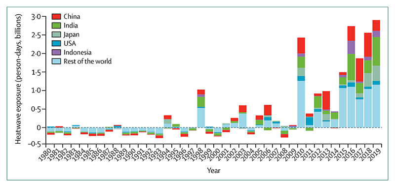
The dotted line at 0 represents baseline.
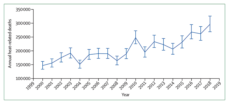
The error bars were calculated on the basis of the uncertainty range of the exposure-response function, as described by Honda and colleagues.
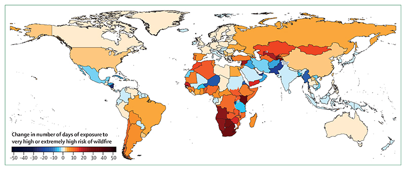
Large urban areas with a population density of 400 people per km2 or more are excluded. Wildfire risk is based on the Fire Danger Index, which rates risk on a scale from 1 to 6 (1 is very low; 2 is low; 3 is medium; 4 is high; 5 is very high; and 6 is extremely high). The higher the number, the more favourable the meteorological conditions are to trigger a wildfire.
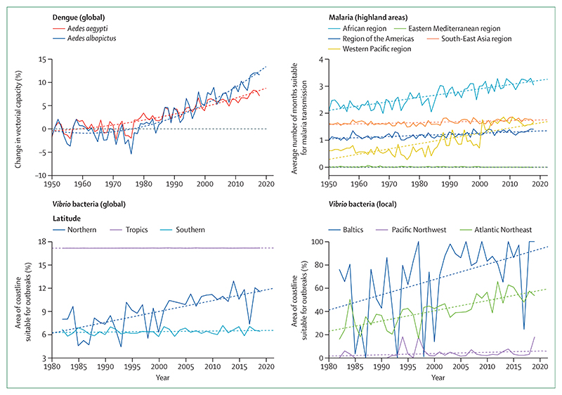
Solid lines represent the annual change. Dashed lines represent the trend since 1950 (for dengue and malaria) and 1982 (for Vibrio bacteria).
The grey line represents the annual global area-weighted change. The blue line represents the running mean over 11 years (5 years forward and 5 years backward). The dashed line represents the 1981–2010 baseline.
(A) 1 m. (B) 5 m.
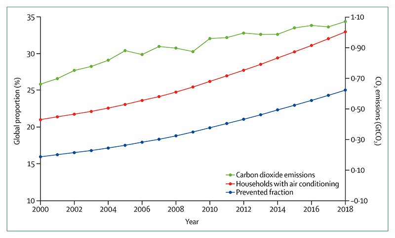
Global proportion of households with air conditioning (red line), prevented fraction of heatwave-related mortality because of air conditioning (blue line), and CO2 emissions from air conditioning (green line), from 2000 to 2018. CO2=carbon dioxide. GtCO2=gigatonnes of carbon dioxide.
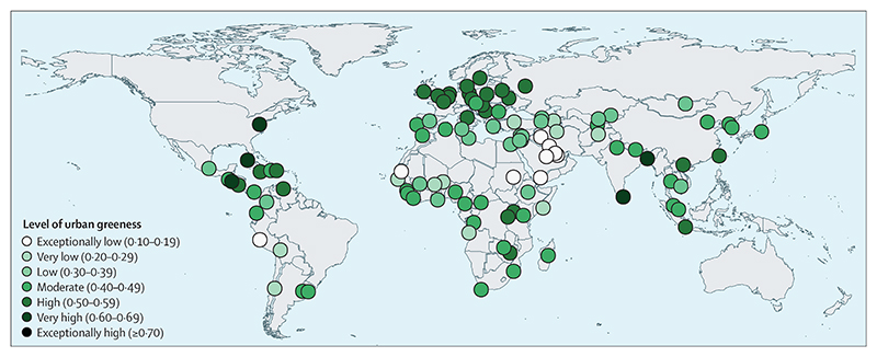
Levels of urban greenness were quantified on the basis of the mean, population-weighted normalised difference vegetation index, which is a standard, satellite-based measurment to estimate vegetation and is on a scale of –1·0 to 1·0.
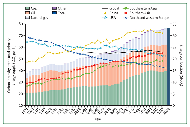
Carbon intensity trends are shown by a trend line (primary axis) and global CO2 emissions by stacked bars (secondary axis). This carbon intensity metric estimates the tCO2 for each unit of total primary energy supplied (tCO2 per TJ). For reference, the carbon intensity of fuels are as follows: coal, 95–100 tCO2 per TJ; oil, 70–75 tCO2 per TJ; and natural gas, 56 tCO2 per TJ. CO2=carbon dioxide. tCO2=tonnes of carbon dioxide.
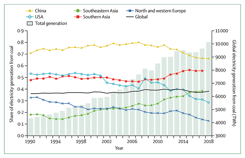
Regional shares of electricity generation from coal are shown by the trend lines (primary axis) and total electricity generation from coal by the bars (secondary axis). The global share of electricity generation from coal is shown with the thick black line. Data series are shown to at least 2017 and are extended to 2018 when data allow.
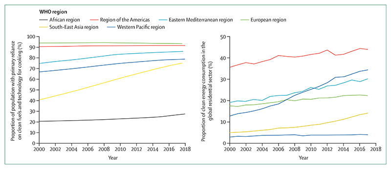
(A) Proportion of population with a primary reliance on clean fuels and technology for cooking by WHO region, 2000–18. (B) Proportion of clean energy at the point of consumption in the global residential sector, 2000–16. Proportion is measured as the zero-emission energy consumed (fuels with no emissions at the point of use) over the total energy consumed in the residential sector. Electricity comprised 75% of total clean energy use in 2016.
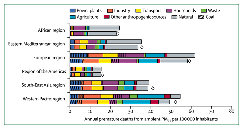
PM2·5=fine particulate matter.
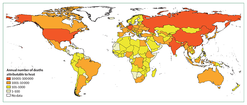
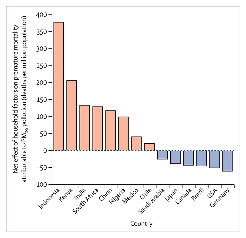
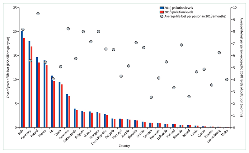
The coloured bars represent the attributable deaths if there were a constant 2015 population structure. The diamonds represent the total attributable deaths for 2018 when considering demographic changes. PM2·5=fine particulate matter.
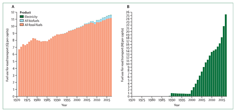
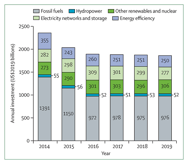
(A) All fossil fuels, biofuels, and electricity. (B) Electricity only. Please note the varying scales in the y-axes.
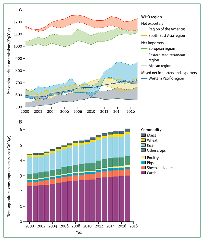
(A) Emissions by WHO region. (B) Global agricultural consumption emissions by commodity. Trade data from the Food and Agriculture Organization of the United Nations were used to calculate these numbers. Per-capita production is shown by the solid lines and per-capita consumption by the dotted lines. GtCO2e=gigatonnes of carbon dioxide equivalent. kgCO2e=kilograms of carbon dioxide equivalent.
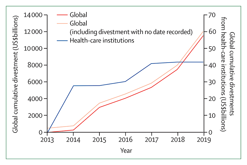
kgCO2e=kilograms of carbon dioxide equivalent.
PM2·5=fine particulate matter.
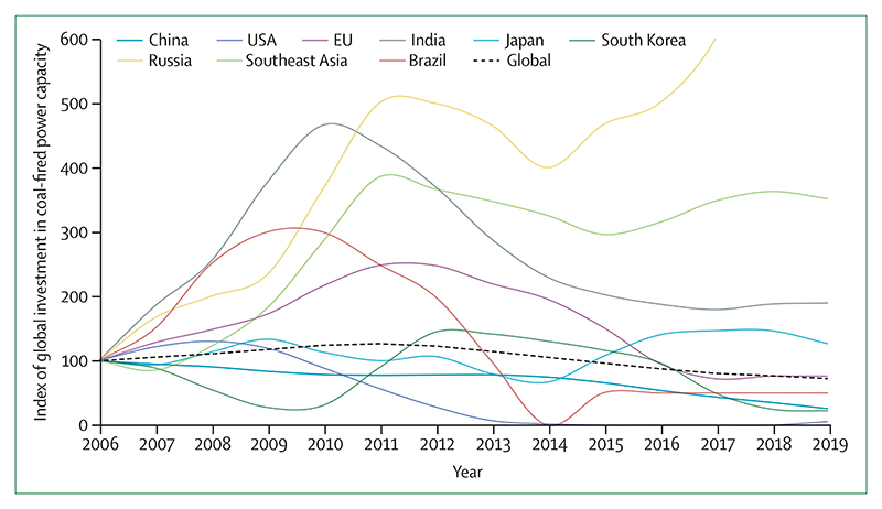
An index score of 100 corresponds to 2006 levels of capacity.
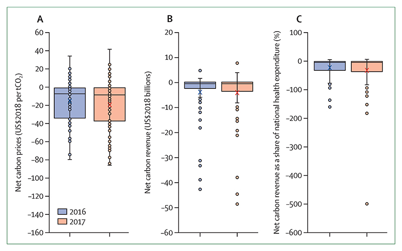
(A) Net carbon prices. (B) Net carbon revenues. (C) Net carbon revenue as a share of current national health expenditure. The boxes represent the IQRs, the horizontal lines inside the boxes represent the medians, and the crosses represent the means. The brackets represent the range from minimum to maximum; however, points are represented as outliers beyond this range if their values are 1·5 times the IQR less than the first quartile or more than the third quartile. tC02=tonnes of carbon dioxide.
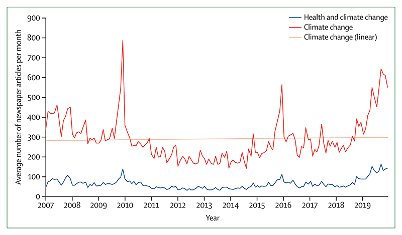
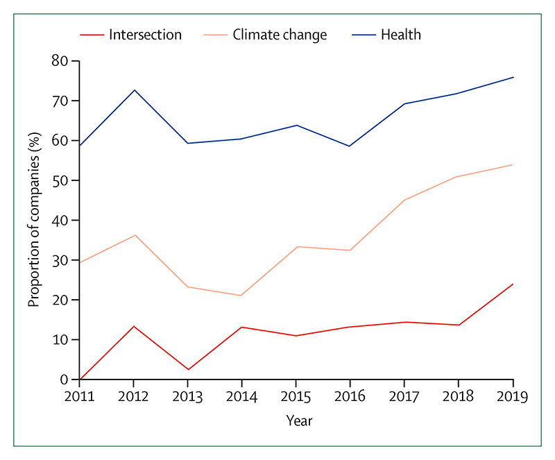
The non-linear lines represent the average monthly coverage of climate change and health and climate change only across the 61 newspapers. The linear line represents the linear trend of the average number of climate change articles per month between 2007 and 2019.
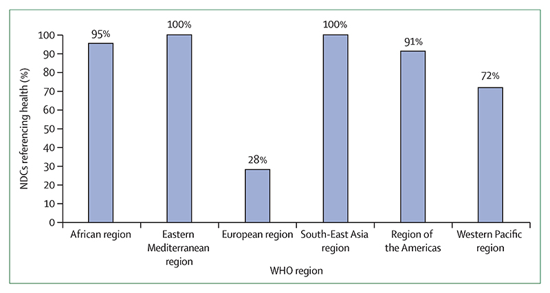
The European region, which consists of 53 countries, is adjusted for the single NDC representing 28 EU countries; treating the EU as one country would increase the regional proportion of NCDs referencing health to 60%. NDCs=Nationally Determined Contributions.
Comment in
-
Health and climate change MJA-Lancet Countdown report: Australia gets another failing grade in 2020 but shows signs of progress.Lancet. 2021 May 15;397(10287):e12-e14. doi: 10.1016/S0140-6736(20)32632-5. Epub 2020 Dec 23. Lancet. 2021. PMID: 33357509 No abstract available.
-
Countdown on health and climate change: too important for methodological errors.Lancet. 2021 Jul 3;398(10294):26. doi: 10.1016/S0140-6736(21)00884-9. Lancet. 2021. PMID: 34217397 No abstract available.
References
-
- McMichael AJ, Haines JA, Slooff R, et al. Climate change and human health: an assessment /prepared by a Task Group on behalf of the World Health Organization, the World Meteorological Association and the United Nations Environment Programme. Geneva, Switzerland: World Health Organization; 1996.
-
- National Aeronautics and Space Administration. GISS surface temperature analysis (GISTEMP v4) 2020. [accessed April 28, 2020]. https://data.giss.nasa.gov/gistemp/
-
- Field CB, Barros VR, Dokken DJ, et al., editors. Intergovernmental Panel on Climate Change. IPCC 2014: climate change 2014: impacts, adaptation, and vulnerability. Part A: global and sectorial aspects. Contribution of working group II to the fifth assessment report of the Intergovernmental Panel on Climate Change. Cambridge, UK and New York, NY: Cambridge University Press; 2014.
-
- UN. United Nations Framework Convention on Climate Change; Report of the Conference of the Parties on its twenty-first session, held in Paris from 30 November to 13 December 2015; 2016. Jan 29, [accessed April 6, 2020]. http://unfccc.int/resource/docs/2015/cop21/eng/10a01.pdf .
-
- Herring SC, Christidis N, Hoell A, Hoerling MP, Stott PA. Explaining extreme events of 2017 from a climate perspective. Bull Am Meteorol Soc. 2019;100:S1–117.
Publication types
MeSH terms
Grants and funding
LinkOut - more resources
Full Text Sources
Other Literature Sources
Medical