. 2020 Nov 20;23(12):101718.
doi: 10.1016/j.isci.2020.101718. eCollection 2020 Dec 18.

Into Thick(er) Air? Oxygen Availability at Humans' Physiological Frontier on Mount Everest

Affiliations

Into Thick(er) Air? Oxygen Availability at Humans' Physiological Frontier on Mount Everest

Tom Matthews et al. iScience. .

Abstract

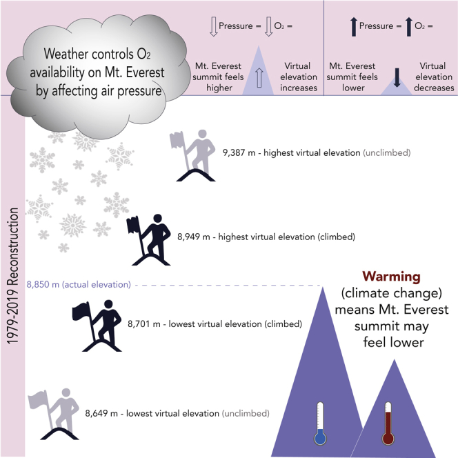
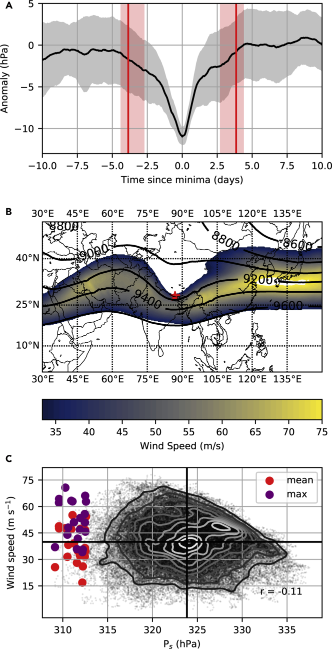
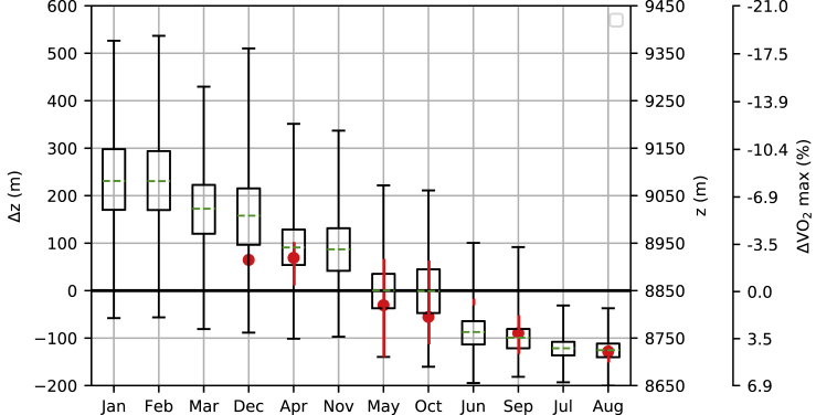
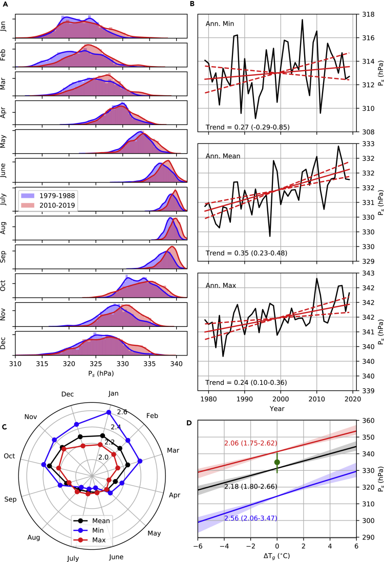
Global audiences are captivated by climbers pushing themselves to the limits in the hypoxic environment of Mount Everest. However, air pressure sets oxygen abundance, meaning it varies with the weather and climate warming. This presents safety issues for mountaineers but also an opportunity for public engagement around climate change. Here we blend new observations from Everest with ERA5 reanalysis (1979-2019) and climate model results to address both perspectives. We find that plausible warming could generate subtle but physiologically relevant changes in summit oxygen availability, including an almost 5% increase in annual minimum VO2 max for 2°C warming since pre-industrial. In the current climate we find evidence of swings in pressure sufficient to change Everest's apparent elevation by almost 750 m. Winter pressures can also plunge lower than previously reported, highlighting the importance of air pressure forecasts for the safety of those trying to push the physiological frontier on Mt. Everest.

Keywords: Atmospheric Observation; Climatology; Glacial Landscapes; Physical Activity; Physiological State.


Conflict of interest statement

The authors declare no competing interests.

Figures

None
Graphical abstract
Figure 1
Figure 1
Air Pressure on Mt. Everest (A) Hourly observed air pressure at the South Col (7,945 m) from May 22, 2019 to July 1, 2020. (B) Comparison between observed air pressure and ERA5 air pressure for the South Col. (C) Estimated air pressure at the Balcony (8,430 m) compared with observed air pressure at the Balcony AWS for the time period of May 23, 2019 to January 20, 2020. MAE indicates the mean absolute error for this comparison.
Figure 2
Figure 2
Reconstructed Air Pressure for the Summit of Mt. Everest (1979–2019) Blue shading spans the reconstructed minimum and maximum for the respective day of year, whereas the solid blue line indicates the mean value for the day. The solid black line (LTM) is the long-term mean for our reconstruction (331 hPa). The other lines appearing in the legend highlight estimates of summit pressure used in the literature (ICAO: ICAO Standard Atmosphere; West ’83: West et al. (1983b); West ’96: West (1996)). The red circles indicate summit air pressure at the time of successful ascents made without the help of supplemental oxygen (with intensity of shading proportional to the number of climbers). Note that labels are located at the middle of the respective month and that all day-or-year statistics are smoothed with a Gaussian kernel before plotting (see Methods).
Figure 3
Figure 3
Episodes of Lowest Air Pressure on Mt. Everest (1979–2019) (A) Composite mean anomaly (black line) ± standard deviation (gray shading) for the 20 reconstructed events with lowest summit pressure. Red vertical lines mark the mean calculated time since minima for pressure to begin falling away from (negative days), or recover to (positive days), higher values. Calculations are based on wave phase speed, and the shading spans the 25th to 75th percentiles of these estimates (see Methods). (B) Mean geopotential height of the 300 hPa surface (lines) and mean 250 hPa wind (shading) across the 20 events, with Mt. Everest shown as a red star. Note winds <33 m/s (equivalent to a Category 1 hurricane) are not shown. (C) Scatter cloud shows the relationship between hourly winter (Dec-Feb) summit air pressures and concurrent winds interpolated to Mt. Everest's summit. Contours indicate relative density (white higher density, black lower density), whereas heavy black lines indicate the respective means, and r is the Pearson correlation. The larger colored circles show the mean (red) and maximum (purple) summit wind speed and pressure in a 72-h window centered on each of the 20 events.
Figure 4
Figure 4
Monthly Variations in the Aerobic Impacts of Oxygen Variability at Mt. Everest's Summit For each month, Δz is the change in elevation required to reach the respective air pressure, assuming a gradient in log pressure equal to the May mean (0.00014 m−1) and a mean May summit pressure of 333 hPa. Bars extend to the highest and lowest Δz (corresponding to the lowest and highest summit pressures, respectively), whereas boxes span the 25th–75th percentiles, and green lines mark the monthly mean. Note that z (m) is the total perceived summit elevation (Δz + 8,850 m), and ΔVO2 max converts the respective air pressures to differences in VO2 max, relative to the mean May conditions (333 hPa = 16.2 mL min−1 kg−1). Months are sorted in descending order of mean Δz. Red circles indicate conditions during oxygenless summits, with vertical lines extending to maximum and minimum values [For two summits only the range is plotted; and for one summit the value is denoted by the red circle]. See Supplemental Information for apparent elevation data during previous oxygen-assisted summits.
Figure 5
Figure 5
Analysis of Seasonal Air Pressure Changes at Mt. Everest's Summit (A) Observed distribution of hourly air pressure in the first and last decades of the reconstruction. (B) Observed trends in annual statistics. The solid red line indicates the median Theil-Sen slope estimate, and the dotted red lines show the 5th–95th percentiles. Decadal trends (and uncertainty range) are annotated at the bottom of each panel. (C) CMIP5 ensemble median sensitivities of monthly statistics to global mean temperature change (hPa °C−1). (D) CMIP5 projections for annual mean, maximum, and minimum summit pressures for ΔTgof warming above 1981–2010 global mean temperature Solid lines indicate the CMIP5 ensemble median, whereas shading spans the 5th–95th percentiles. Note that the colors share the same meaning as panel (C), and annotations summarize the gradients (hPa °C−1) of the lines plotted (5th–95th percentiles). The green circle marks the mean summit pressure across all successful oxygenless ascents, with green lines extending to the minimum and maximum pressures.

References

    1. Bailey D.M. The last “oxygenless” ascent of Mt Everest. Br. J. Sports Med. 2001;35:294–296. - PMC - PubMed
    1. Benavides A. Everest : push begins, Kobusch Passes 7,000m. 2020. https://explorersweb.com/2020/02/24/everest-push-begins-kobusch-passes-7...
    1. Benavides A. Jost Kobusch to solo Everest in winter. 2019. https://explorersweb.com/2019/12/09/jost-kobusch-to-solo-everest-in-winter/
    1. Brutsaert T.D. Do high-altitude natives have enhanced exercise performance at altitude? Appl. Physiol. Nutr. Metab. 2008;33:582–592. - PubMed
    1. Clark P.U., Dyke A.S., Shakun J.D., Carlson A.E., Clark J., Wohlfarth B., Mitrovica J.X., Hostetler S.W., McCabe A.M. The last glacial maximum. Science. 2009;325:710–714. - PubMed

LinkOut - more resources