. 2021 May;39(5):586-598.
doi: 10.1038/s41587-020-00775-6. Epub 2021 Jan 11.

ChIP-seq of plasma cell-free nucleosomes identifies gene expression programs of the cells of origin

Affiliations

ChIP-seq of plasma cell-free nucleosomes identifies gene expression programs of the cells of origin

Ronen Sadeh et al. Nat Biotechnol. 2021 May.

Erratum in

Abstract

Cell-free DNA (cfDNA) in human plasma provides access to molecular information about the pathological processes in the organs or tumors from which it originates. These DNA fragments are derived from fragmented chromatin in dying cells and retain some of the cell-of-origin histone modifications. In this study, we applied chromatin immunoprecipitation of cell-free nucleosomes carrying active chromatin modifications followed by sequencing (cfChIP-seq) to 268 human samples. In healthy donors, we identified bone marrow megakaryocytes, but not erythroblasts, as major contributors to the cfDNA pool. In patients with a range of liver diseases, we showed that we can identify pathology-related changes in hepatocyte transcriptional programs. In patients with metastatic colorectal carcinoma, we detected clinically relevant and patient-specific information, including transcriptionally active human epidermal growth factor receptor 2 (HER2) amplifications. Altogether, cfChIP-seq, using low sequencing depth, provides systemic and genome-wide information and can inform diagnosis and facilitate interrogation of physiological and pathological processes using blood samples.


Conflict of interest statement

Competing interests statement

A patent application for cfChIP-seq has been submitted by the Hebrew University of Jerusalem. R.S., I.S., J.G., and N.F. are founders of Senseera LTD.

Figures

Extended Data Fig. 1
A. Distribution of reads for cfChIP-seq with different antibodies on four samples (H012.1, H012.2, H013.1, and H013.2). We divided the genome into regions that contain (putative) TSS based on our catalogue (see below) and (putative) Enhancers. Since there are regions that are marked as both (in different tissues), we consider the intersection separately. For each subset we show the fraction of reads mapped to the region. Within each bar, the fraction estimated as background (based on our background model, Methods) is marked in dark gray. B. Genome browser view (as in Figure 1C). C. Metaplots (as in Figure 1D) of ChIP-seq samples from the Roadmap Epigenomics compendium. D. Scatter plots showing signal levels from cfChIP-seq versus Leukocyte ChIP-seq of H3K4me3, H3K4me2, and H3K36me3 (similar to Figure 1E). E. Estimation of the amount of specific reads in cfChIP-seq. Top panel: box plot of the estimate of % reads that are above background levels for all the cfChIP-seq samples analyzed in the manuscript (Supplementary Table 1) compared to selected ChIP-seq samples from Roadmap Epigenomics compendium. Bottom panel: percent of the signal above background that is in the expected genomic locations (i.e H3K4me1 and H3K4me2 - promoters and enhancers, H3K4me3 - promoters, H3K36me3 - gene bodies). For comparison, the same analysis pipeline was applied to selected Roadmap Epigenomic ChIP- seq samples against the same marks. Box limits: 25% -75% quantiles, middle: median, upper (lower) whisker to the largest (smallest) value no further than 1.5 * inter-quartile range from the hinge.
Extended Data Fig. 2
A. Fragment length distribution for all samples in this manuscript. Each row represents a histogram of fragment length of a specific sample. Color represents the number of fragments/million with that length (RPM). B. Reproducibility of the cfChIP-seq assay. Shown are technical repeats, biological repeats (two samples from the same donor) and comparison of two different donors for three histone marks. Each dot is a gene, and values are normalized counts at the gene promoter (H3K4me2/3) or body (H3K36me3).
Extended Data Fig. 3
A. Testing gene sets defined by highly expressed in different cancer types (TCGA, Methods) against genes with higher signal in a CRC tumor sample (Figure 2A). Hypergeometric test with FDR corrected q-values. B. Levels of H3K4me2 coverage over colon-specific enhancers (y-axis) in healthy donors and in CRC cancer samples. Box limits: 25% -75% quantiles, middle: median, upper (lower) whisker to the largest (smallest) value no further than 1.5 * inter-quartile range from the hinge, n = 144. C. Average coverage of H3K36me3 across gene bodies (meta gene) D. Coverage of H3K36me3 cfChIP-seq over gene bodies in a healthy donor (H012.1) for genes at different leukocyte expression quantiles. Box limits: 25% -75% quantiles, middle: median, upper (lower) whisker to the largest (smallest) value no further than 1.5 * inter-quartile range from the hinge.
Extended Data Fig. 4
A. Comparison of H3K4me3 cfChIP-seq signal from a healthy donor (H012.1) with expected gene expression levels, based on the expression in cells contributing to cfDNA in healthy subjects (Methods). Each dot is a gene. x-axis: normalized number of H3K4me3 reads in gene promoter. y-axis: expected expression in number of transcripts/million (TPM). B. Comparison (as in A) of Leukocytes H3K4me3 ChIP-seq signal vs. Leukocytes gene expression levels (both for Roadmap Epigenomic sample E062). C. Comparison (as in A) of H3K4me3 cfChIP-seq signal from a healthy donor (H012.1) vs. Liver gene expression levels (Roadmap Epigenomics sample E066). D. Summary of correlations of healthy cfChIP-seq levels against different expression patterns from Roadmap Epigenomics and BLUEPRINT. For each category of expression profiles we plot the boxplot of r2 values. Red line denotes the correlation against the predicted expression mixture of cells contributing to cfDNA pool (panel A). Box limits: 25% -75% quantiles, middle: median, upper (lower) whisker to the largest (smallest) value no further than 1.5 * inter-quartile range from the hinge. E. Comparison of the expression levels of genes in two clusters of Figure 3C (see inset). Cluster A contains 4,690 genes that change between samples, and Cluster B contains 10,177 genes that do not change between samples. Violin plots show the distribution of expression levels in three tissues - PBMC, Heart, and Liver, from the Roadmap Epigenomics expression data. F. Overlap of both clusters with the set of genes with CpG island promoters (blue) and housekeeping genes (green; based on analysis of GTEX compendium, see Methods). For clarity we show each cluster in a separate Venn diagram.
Extended Data Fig. 5
A. Schematics of the parameters involved in determining cfChIP-seq sensitivity. 1. Number of informative nucleosomes is the total number of signature-specific nucleosomes in the plasma that carry a mark of interest; 2. The percent contribution of the signature-positive cells to the circulation; 3. Total number of genomes in circulation; 4. The specific capture probability of marked nucleosomes by the cfChIP-seq assay; and 5. The non-specific capture probability of nucleosomes (background). The signal to noise ratio (SNR) is the ratio of the specific to non-specific capture probabilities. B. Simulation analysis of event detection power as a function of percent positive (x-axis) and number of informative locations (y-axis). Detection is defined as 95% probability of assay results (capture & sequencing) that reject the null hypothesis of background signal with p < 0.05 (Poisson test, Methods). Simulation assumes number of genomes = 10,000 (10 ml plasma of healthy donor), capture probability of 1%, and SNR of 500 (Methods, Supplemental Note). The size of several example signatures are shown.
Extended Data Fig. 6
A. Total sizes (in nucleosomes) of TSS (Left) and Enhancer (Right) signatures of various cell types. B. Estimates of specific capture rate and of SNR (specific capture / non-specific capture) over 88 healthy samples, assuming 1000 genomes/ml and 2ml input. Box limits: 25% - 75% quantiles, middle: median, upper (lower) whisker to the largest (smallest) value no further than 1.5 * inter-quartile range from the hinge. C. Signal level is linear with input. Plasma of a healthy donor was spiked in with different amounts of yeast nucleosomes (x- axis). The number of counts observed (y-axis) for signatures of different sizes. Error bars show 20-80% range over 100 different sampled signatures of the given size. D. Genome browser of chrY male-specific promoters (left) and a representative autosomal region (right) in the male/female titration experiment. E. Test of sensitivity using male spike-in. Plasma of healthy female and male donors were titrated at different ratios. Detection of male-specific promoters as a function of percent of chrY genomes in the sample (x-axis). Shown are the number of counts (y-axis) and significance (circle radius) of signal above background distribution (Methods). F. Simulation study of the effect of capture probability on detection. The blue marks denote the concentrations used in the male-female titration experiment which had capture probabilities ~0.1% and SNRs of ~500-800. G. Simulation study of the effect of SNR levels on detection probability.
Extended Data Fig. 7
A. % Liver as estimated using DNA CpG methylation markers vs. signature strength. B. % Liver as estimated using DNA CpG methylation markers vs. estimate of % liver in Figure 5A.
Extended Data Fig. 8
A. Evaluation of classification of CRC samples vs. healthy samples using Digestive (Top) and COAD (Bottom) signature scores (as Figure 6C). B. Intra-patient comparisons (as Figure 6E). Inset: time samples drawn on the patient timeline (Figure 6D).
Extended Data Fig. 9
A. Levels of CRC associated genes in different samples. Each point is a sample plotted with % CRC (x-axis) vs. normalized number of reads of the gene (y-axis). Solid points - the signal of the gene is significantly above the expectation given % CRC (Methods). B. Example of immune-related genes in CRC samples. Same as (A). C. Clustering of gene set enrichment in CRC samples (see Supplementary Table 11). D. Venn diagram of overlaps between cancer gene signatures that were identified in our analysis. E. Evaluation of cancer signatures in CRC samples from TCGA, grouped by their CMS subtype. Box limits: 25% -75% quantiles, middle: median, upper (lower) whisker to the largest (smallest) value no further than 1.5 * inter-quartile range from the hinge.
Figure 1
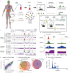
Figure 1. Chromatin Immunoprecipitation from plasma
A. cfChIP-seq method outline. Chromatin fragments from different cells are released to the bloodstream. These fragments are immunoprecipitated, and sequenced. B. cfChIP-seq protocol. Antibodies are covalently bound to paramagnetic beads. Target fragments are immunoprecipitated directly from plasma. After washing, on-bead-ligation is performed to add indexed sequencing adapters to the fragments. The indexed fragments are released and amplified by PCR to generate sequencing-ready libraries. C. Genome browser view of cfChIP-seq signal on a segment of chromosome 12. Top tracks are cfChIP-seq signals from two healthy donors. The lower tracks are published ChIP-seq results from human white blood cells (leukocytes). In each group we show four tracks corresponding to four histone marks -- H3K4me3 (red), H3K4me2 (green), H3K4me1 (blue), and H3K36me3 (purple). D. Meta analysis of cfChIP-seq signal over active promoters and enhancers. The orange line denotes the average of corresponding negative control regions (inactive genes and enhancers), providing an estimate of the background. Scale of all graphs is in coverage of fragments per million. E. Comparison of normalized H3K4me3 coverage of cfChIP-seq from a healthy donor against ChIP-seq from leukocytes. Each dot corresponds to a single gene. x-axis: healthy cfChIP-seq sample, y-axis leukocytes ChIP-seq. F. Analysis of promoters of RefSeq genes with a significant cfChIP-seq signal (Methods) in healthy donors. cfChIP-seq captures most housekeeping promoters (ones that are marked in most samples in the reference compendium). The remaining 2000 non-housekeeping genes in cfChIP-seq show large overlaps with non-housekeeping promoters marked in neutrophils and monocytes, the two cell types that contribute most to cfDNA in healthy donors. G. Size distribution of sequenced cfChIP-seq fragments shows a clear pattern of mono- and di-nucleosome fragment sizes: x-axis: fragment length in base pairs (bp), y-axis: number of fragments per million in 1-bp bins.
Figure 2
Figure 2. cfChIP-seq of multiple marks is informative on gene expression
A. Detection of genes with significant high coverage in a sample from a colorectal cancer (CRC) patient (C001, Supplementary Table 4). For each gene we compare mean normalized coverage in a reference healthy cohort (x-axis) against the normalized coverage in the cancer sample (y-axis). For H3K36me3, the signal is normalized by gene length. Significance test whether the observed number of reads is significantly higher than expected based on the distribution of values in healthy samples (Methods). The levels of three genes in these comparisons are shown on the bar chart (right panel). B. Browser views of genes that demonstrate different H3K4me3 and H3K36me3 classes. Class I: genes marked by both marks in healthy and cancer patient samples. Class II: genes marked by H3K4me3 in healthy and cancer samples, but with H3K36me3 only in the cancer patient sample (gain of H3K36me3). Class III: genes marked by both marks only in the cancer patient sample (gain of both marks). C. Venn diagram (zoom in view) showing the relations of genes from the three classes in B with the set of genes that show increased H3K4me3 and the set of genes previously identified to be highly expressed in colorectal adenocarcinoma (COAD, Methods).
Figure 3
Figure 3. H3K4me3 cfChIP-seq signal is correlated with expression levels
A. Gene level analysis of the correlation in expression level and H3K4me3 signal across 56 Roadmap Epigenomic samples with matching profiles of both expression and H3K4me3 ChIP-seq. For each gene we computed the Pearson correlation of its normalized expression levels and normalized H3K4me3 levels across the samples. Shown on the right is a histogram of the correlations on all RefSeq genes (significance w.r.t. to random correlation, shown in gray). Left: examples of genes with different correlation values. B. Heatmap showing patterns of the relative H3K4me3 cfChIP-seq coverage on promoters of 14,875 RefSeq genes. The normalized coverage on the gene promoter (Methods) was log-transformed (log2(1+coverage)) and then adjusted to zero mean for each gene across the samples. The samples include cfChIP-seq samples from a compendium that includes healthy donors, acute myocardial infarction (AMI) patients, liver disease patients and CRC patients. C. Zoom in on the bottom cluster of (C). The right panel shows the H3K4me3 ChIP-seq from tissues and cell types from Roadmap epigenomics and BLUEPRINT. Specific clusters of genes are marked by arrows. D. Genome browser view for megakaryocyte- and erythroblast specific genes. Shown is cfChIP-seq from two healthy samples (H012.1 and H013.1) and an AMI subject who exhibited enhanced erythropoiesis (M002.1). Also shown are two ChIP-seq profiles from the Roadmap Epigenetic reference atlas, and two samples from the BLUEPRINT project of cord-blood derived megakaryocytes and erythroblasts.
Figure 4
Figure 4. cfChIP-seq identifies cell-type and program specific expression patterns
A. Using the compendium of ChIP-seq profiles, we define for each cell-type a signature consisting of the locations that are high only in the target cell-type. Given a cfChIP-seq profile, we sum the signal at signature locations and test against the null hypothesis of non-specific background signal (Methods). B. Evaluation of average signal for cell-type signatures in 88 healthy samples from 61 donors. Top: Distribution of signature values (normalized reads/Kb). Each dot is a sample. Box limits: 25% -75% quantiles, middle: median, upper (lower) whisker to the largest (smallest) value no further than 1.5 * inter-quartile range from the hinge. Dots marked in red indicate values significantly higher than background levels (Methods). Bottom: percent of samples with significant signal for each signature. C. H3K4me3 cfChIP-seq signal in heart-specific locations in samples from representative healthy donors and acute myocardial infarction (AMI) patients (Supplementary Table 4) tested with respect to background levels (Methods). Inset: measured troponin levels and percent cfDNA from cardiomyocytes as estimated using DNA CpG methylation markers from the same blood draws. D. Changes in signature strength in an AMI (M001) patient before/after PCI. Signatures levels are normalized to the mean in healthy donors. E. Changes in cfChIP-seq liver signature (brown line) and ALT levels (liver damage biomarker, black line) in samples of a patient that underwent partial hepatectomy (PH01). F. Heatmap showing significance of selected cell-type signatures in selected healthy donors and patients (Supplementary Table 6). Circle radius represents statistical significance (FDR corrected q-value) and the color represents read-density (normalized reads per kb, Methods). G. Heatmap showing significance of selected gene sets from curated database of transcriptional programs and transcription factor targets– (Methods; Supplementary Table 7) tested against the null hypothesis of healthy baseline (Methods). Circle radius represents statistical significance (FDR corrected q-value) and the color represents the average read number (normalized reads per genes) compared to healthy baseline (Methods).
Figure 5
Figure 5. cfChIP-seq detects changes in liver-specific transcriptional programs
A. Estimate of %liver contribution to healthy reference cohort and a cohort of subjects with various liver-pathologies (Supplementary Table 4). Box limits: 25% -75% quantiles, middle: median, upper (lower) whisker to the largest (smallest) value no further than 1.5 * inter-quartile range from the hinge. B. Evaluation of differentially marked genes in a sample of an acute AIH subject (L001) as in Figure 2A. C. Differentially marked genes between two samples with similarly high liver contribution L001.1 (acute AIH) and M001.1 (AMI induced liver damage). For each gene we compare the observed levels (L001.1, x-axis; M001.1 y-axis) and test against the null hypothesis that the two values were sampled from the same distribution (Methods). Dark circles - genes that are significantly different in liver ChIP-Seq (Roadmap Epigenomics) compared to healthy reference. D. Clustering of 1,320 genes that are significantly higher in one of the samples in the liver cohort compared to healthy baseline. Left: values compared to healthy baseline. Middle: expected level assuming healthy liver signal with sample-specific %liver contribution. Right: Z-score of observed value from expected value. Listed 3-4 representative genes per cluster (right). Sample order in each heatmap is identical and matches the order in (G). E. Percent of genes in each cluster of (D) that are annotated as hepatocyte genes. Clusters above the 50% threshold (red dashed line) are considered of hepatocyte origins. F. Enrichment analysis of hepatocyte clusters (Clusters I-VI, XI, and XII). Hypergeometric test for significant overlap with gene programs from curated databases and marker genes of hepatocyte zones. Circle radius: FDR corrected q-values of hypergeometric enrichment test, circle color - fraction of overlap. G. Top: Percent of liver contribution in each sample. Bottom: Deviations from expected values for each sample in each of the hepatocyte clusters (average Z-score for each sample on cluster genes).
Figure 6
Figure 6. cfChIP-seq identifies molecular heterogeneity in colorectal carcinoma patients
A. Pairwise comparisons (pearson correlation, y-axis) of between samples: healthy donors; different CRC patients; the same CRC patient more than a week apart; the same CRC patient less than a week apart. Box limits: 25% -75% quantiles, middle: median, upper (lower) whisker to the largest (smallest) value no further than 1.5 * inter-quartile range from the hinge. B. Signature differences between healthy and CRC samples. Top: signature of digestive tissue. Bottom: COAD gene signature. Box plots show distribution of signal (Reads/KB, y-axis) in each group. Each sample is a dot, red = significantly above background (Digestive) or healthy baseline (COAD). Box limits: 25% -75% quantiles, middle: median, upper (lower) whisker to the largest (smallest) value no further than 1.5 * inter-quartile range from the hinge. C. Classification accuracy of CRC patients vs healthy donors with CRC signature. Fraction false positive (x-axis) vs fraction true positives (y-axis). Diagonal line: expected curve for random classification. D. CRC signature progression during a single patient treatment. Top: treatment history as a function of time (x-axis) Bottom: CRC signature strength (y-axis) for different time-points. E. Differences between samples with high CRC signature strength. For each gene we compare coverage in the two samples (x-axis and y-axis). Significance test whether the two values are sampled from the same distribution (Methods). F. Signature and representative gene levels are shown for five signatures identified by our analysis and the CRC signature. Circle color: increase in counts/gene above healthy baseline, circle radius: significance of this increase (Methods). Rightmost panel displays major clinical parameters: RAS, BRAF mutations, HER2 amplification, MMR deficiency, and survival after 6 months and 1 year after the sample was taken. G. Functional enrichment of signatures. Representative enrichment from an unbiased testing of signature genes against large annotations database using FDR corrected hypergeometric test (Supplementary Table 11). H. Genome regions containing SigD and SigE genes. Marked in red are genes from each signature in the specific genomic loci.

References

    1. Mandel P. Les acides nucleiques du plasma sanguin chez l’homme. CR Acad Sci Paris. 1948;142:241–243. - PubMed
    1. Lo YM, et al. Rapid clearance of fetal DNA from maternal plasma. Am J Hum Genet. 1999;64:218–224. - PMC - PubMed
    1. De Vlaminck I, et al. Circulating cell-free DNA enables noninvasive diagnosis of heart transplant rejection. Sci Transl Med. 2014;6:241–77. - PMC - PubMed
    1. Schwarzenbach H, Hoon DS, Pantel K. Cell-free nucleic acids as biomarkers in cancer patients. Nat Rev Cancer. 2011;11:426–437. - PubMed
    1. Sun K, et al. Plasma DNA tissue mapping by genome-wide methylation sequencing for noninvasive prenatal, cancer, and transplantation assessments. Proc Natl Acad Sci U S A. 2015;112:E5503–12. - PMC - PubMed

Publication types

MeSH terms