. 2021 Feb 1;40(3):e105889.
doi: 10.15252/embj.2020105889. Epub 2021 Jan 22.

Reproducible image handling and analysis

Affiliations

Reproducible image handling and analysis

Kota Miura et al. EMBO J. .

Abstract

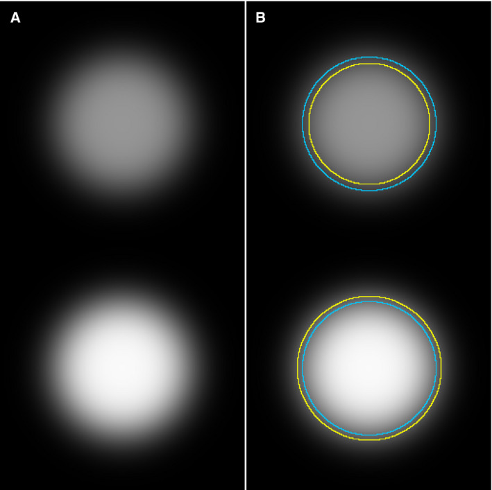
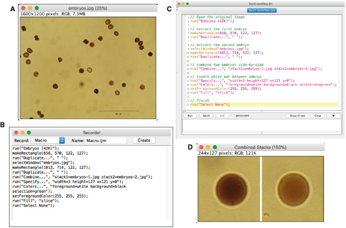
Image data are universal in life sciences research. Their proper handling is not. A significant proportion of image data in research papers show signs of mishandling that undermine their interpretation. We propose that a precise description of the image processing and analysis applied is required to address this problem. A new norm for reporting reproducible image analyses will diminish mishandling, as it will alert co-authors, referees, and journals to aberrant image data processing or, if published nonetheless, it will document it to the reader. To promote this norm, we discuss the effectiveness of this approach and give some step-by-step instructions for publishing reproducible image data processing and analysis workflows.


Conflict of interest statement

The authors declare that they have no conflict of interest.

Figures

Figure 1
Figure 1. Enhancing contrasts in a wrong way
Two Hoechst‐stained nuclei were cropped from the original sample image (A). The full image was contrast‐enhanced using the ImageJ “Enhance Contrast” function (B). The default saturation value was used (0.35%). Both nuclei are now with a better contrast against the background, while preserving the difference in the signal intensity observed in the original image. For comparison, each cell was individually selected and contrast‐enhanced separately indicated by yellow region‐of‐interests (C). The applied function and parameters were exactly the same as B, but the two nuclei now appear to have similar signal intensity. Since the degree of enhancement varies depending on the image, such difference in the processing results happens, depending on the area to which one applies the function. An example of such a case can be found in Fig S12 of Tanno et al (2019), available from the Broad Bioimage Benchmark Collection (Ljosa et al, 2012; “BBBC039: Nuclei of U2OS Cells in a Chemical Screen” n.d.). No scale bar information was available. The reproducible workflow for the figure shown above is available at: https://github.com/miura/reproducible_bioimage_analysis.
Figure 2
Figure 2. Overuse of single channel image
(A) Two circular spots were plotted in an 8‐bit image. The spots are with the same radius, but with different gray values: One is 150 (top, darker) and the other is 250 (bottom, brighter), and then Gaussian blurring was applied to mimic realistic image data. (B) The image, with both objects in it, was segmented by automatic global thresholding (Otsu, 1979) to detect the boundary of each and shown as yellow ROIs. The threshold value determined by Otsu’s algorithm was 86 (same threshold applied to both the darker and the brighter circle disk). The mean intensities measured inside the yellow circles were 125.0 and 180.6 for dark and bright circles, respectively. The original boundaries, before applying the Gaussian blur filter, are shown as blue circular ROIs. The workflow for this image analysis, including the creation of the figure above, is available at: https://github.com/miura/reproducible_bioimage_analysis.
Figure 3
Figure 3. Bit depth conversion and normalization
Panel A shows an 8‐bit version of a 16‐bit image, created by conversion in ImageJ/Fiji (Schindelin et al, 2012) with the default settings of the software. The display range is automatically set, when opened, based on the pixel intensity distribution of that image, and used when performing the linearly scaled conversion from 16 to 8 bit, of all values inside the display range. Panels B and C are likewise 8‐bit versions, created by cropping the original 16‐bit image, using its display range when converting. Panels D and E are again 8‐bit images, created by letting ImageJ/Fiji automatically determine their individual display ranges, and then making the conversion; thus mimicking the procedure used if two original images are opened and converted independent of each other. This result is similar, but not generally identical, to what we would find if we had applied auto‐contrast or histogram normalization on the two cropped images independent of each other (Fig 1). The “royal” lookup table (LUT) was used, to better visualize the difference. The image is from the publicly available image set BBBC021v1 (Caie et al, 2010), available from the Broad Bioimage Benchmark Collection (Ljosa et al, 2012). No scale bar information was available. Macro for cropping and generating panels for this figure is available in the GitHub repository at: https://github.com/miura/reproducible_bioimage_analysis. Composite figure was created using the ImageJ/Fiji plugin ScientiFig (Aigouy & Mirouse, 2013).
Figure 4
Figure 4. “PSF volume”
A 3D image of PSF was made using a PSF generator plugin for ImageJ (Sage et al, 2017), showing the Rochard & Wolf model with default parameters provided in the plugin. A point source fluorescence signal with its size below the pixel resolution (100 nm) can be measured with its apparent “volume”. XY (top‐left) and XZ plane (top‐right) at the position of the point source showing the PSF. Image thresholding segments a region that can be measured as “volume” (bottom panels). Details about the generation of this PSF and the reproducible workflow for the composite image shown are available at: https://github.com/miura/reproducible_bioimage_analysis.
Figure 5
Figure 5. Manipulation of images is like replacing table values
(A) Original values of measurement. (B) Manipulated values of values of (A) showing two‐fold increase in treated samples compared to control samples. This is equivalent to enhancing the contrast of images (C) to (D). Note that we are not arguing against the use of contrast enhancements of image data, e.g., histogram stretching, in research papers, merely warning against its inappropriate application. See Fig 1 for more details.
Figure 6
Figure 6. Recording figure creation
Proper reporting of image data handling/analysis is facilitated by recording the process of image handling. As an example, we explain a case of creating a figure using the “Command Recorder” function in ImageJ (version 1.51o). (A) The original image. We select two embryos, extract them and create a figure with two panels. (B) The result of macro recording. All these lines were automatically generated during the manual handling of the image. (C) Comments (shown in green) were added manually after recording to clarify what is achieved by each step. Others can easily understand the aim of different parts of the macro by these comments. (D) The figure. The macro shown in (B) can be used to reproduce exactly the same figure from the original image. Macro programming in ImageJ is explained in the chapter “ImageJ Macro Programming” in “Bioimage Data Analysis”, 2016, Wiley‐VCH. The macro code shown here is available at: https://github.com/miura/reproducible_bioimage_analysis.
Figure 7
Figure 7. Recording bioimage analysis workflow
We show here the recording of a simple analysis workflow as an ImageJ macro. The workflow counts blobs in the sample image “blobs.gif” loaded from the ImageJ menu. We segment blobs with the auto‐threshold function, and then apply particle analysis in order to count the number of blobs and measure their area. Auto‐thresholding of blobs (A, top‐left), segmented blobs (A, top‐right), and the results of particle analysis (a, bottom, the results table). These steps were taken using the GUI of ImageJ, while the command recorder is turned on. (B) The result of command recording of the analysis workflow. The code is slightly cleaned‐up, removing unnecessary steps, and then verified for the reproducibility of results. The code is available in the GitHub repository https://github.com/miura/reproducible_bioimage_analysis.

References

    1. Abbott A (2019) The science institutions hiring integrity inspectors to vet their papers. Nature 575: 430–433 - PubMed
    1. Acuna DE, Brookes PS, Kording KP (2018) Bioscience‐scale automated detection of figure element reuse. bioRxiv 10.1101/269415 [PREPRINT] - DOI
    1. Aigouy B, Mirouse V (2013) ScientiFig: a tool to build publication‐ready scientific figures. Nat Methods 10: 1048 - PubMed
    1. Baker M (2016) 1,500 scientists lift the lid on reproducibility. Nature 533: 452–454 - PubMed
    1. Bankhead P, Loughrey MB, Fernández JA, Dombrowski Y, McArt DG, Dunne PD, McQuaid S, Gray RT, Murray LJ, Coleman HG et al (2017) QuPath: open source software for digital pathology image analysis. Sci Rep 7: 16878 - PMC - PubMed

Publication types