

Leveraging data visualization and a statewide health information exchange to support COVID-19 surveillance and response: Application of public health informatics
- PMID: 33480419
- PMCID: PMC7928924
- DOI: 10.1093/jamia/ocab004
Leveraging data visualization and a statewide health information exchange to support COVID-19 surveillance and response: Application of public health informatics
Abstract
Objective: We sought to support public health surveillance and response to coronavirus disease 2019 (COVID-19) through rapid development and implementation of novel visualization applications for data amalgamated across sectors.
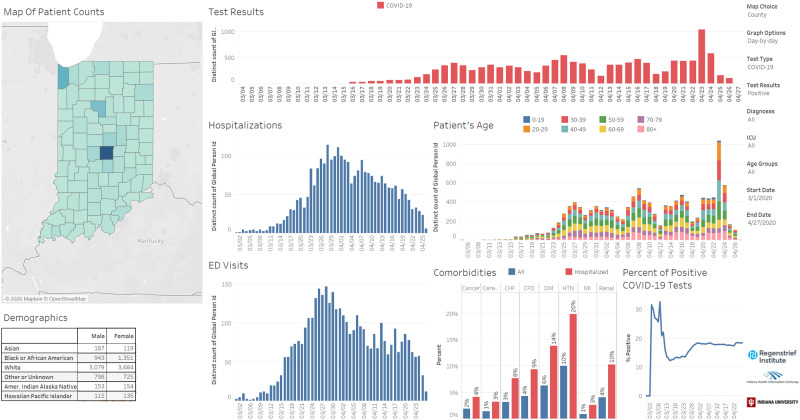
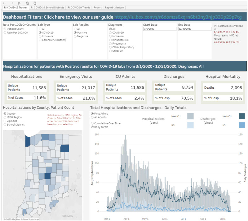
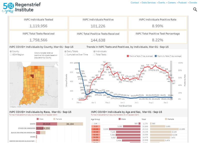
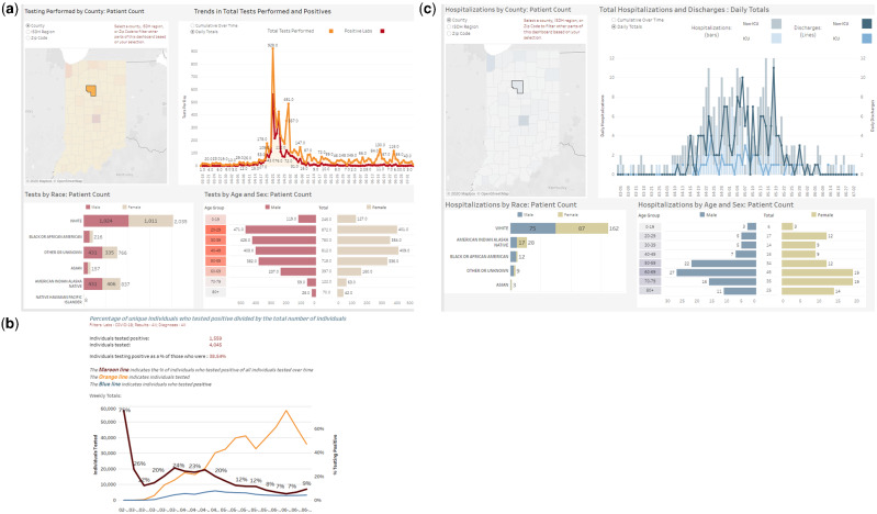
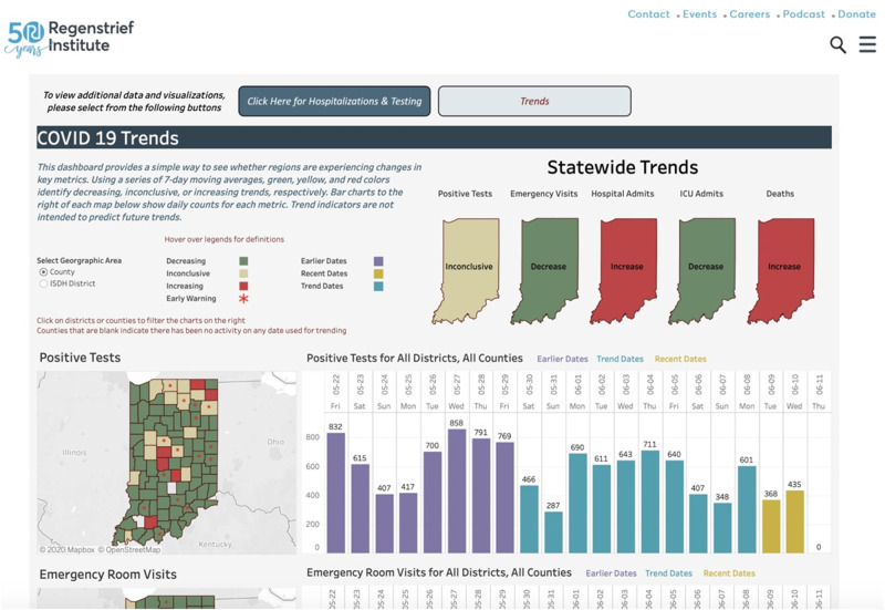
Materials and methods: We developed and implemented population-level dashboards that collate information on individuals tested for and infected with COVID-19, in partnership with state and local public health agencies as well as health systems. The dashboards are deployed on top of a statewide health information exchange. One dashboard enables authorized users working in public health agencies to surveil populations in detail, and a public version provides higher-level situational awareness to inform ongoing pandemic response efforts in communities.
Results: Both dashboards have proved useful informatics resources. For example, the private dashboard enabled detection of a local community outbreak associated with a meat packing plant. The public dashboard provides recent trend analysis to track disease spread and community-level hospitalizations. Combined, the tools were utilized 133 637 times by 74 317 distinct users between June 21 and August 22, 2020. The tools are frequently cited by journalists and featured on social media.
Discussion: Capitalizing on a statewide health information exchange, in partnership with health system and public health leaders, Regenstrief biomedical informatics experts rapidly developed and deployed informatics tools to support surveillance and response to COVID-19.
Conclusions: The application of public health informatics methods and tools in Indiana holds promise for other states and nations. Yet, development of infrastructure and partnerships will require effort and investment after the current pandemic in preparation for the next public health emergency.
Keywords: coronavirus; health information exchange; health information interoperability; pandemics; public health informatics.
© The Author(s) 2021. Published by Oxford University Press on behalf of the American Medical Informatics Association. All rights reserved. For permissions, please email: journals.permissions@oup.com.
Figures
References
-
- World Health Organization. Coronavirus disease (COVID-19) pandemic. 2020. https://www.who.int/emergencies/diseases/novel-coronavirus-2019 Accessed September 15, 2020.
-
- Rudavsky S. Indiana has passed 100,000 cases of the coronavirus. Here's what that means. Indianapolis Star. September 7, 2020. https://www.indystar.com/story/news/health/2020/09/07/indiana-coronaviru... Accessed September 15, 2020.
-
- Yoon P, Pollock D, Foldy S. National public health informatics, United States. In: Magnuson JA, Dixon BE, eds. Public Health Informatics and Information Systems. Cham, Switzerland: Springer International; 2020: 439–58.
-
- Meigs M, Merrick R, Hinrichs S. Public health laboratories. In: Magnuson JA, Dixon BE, eds. Public Health Informatics and Information Systems. 3rd ed. Cham, Switzerland: Springer Nature; 2020: 259–68.
Publication types
MeSH terms
Grants and funding
LinkOut - more resources
Full Text Sources
Other Literature Sources
Medical
