Unresolvable Pixels Contribute to Character Legibility: Another Reason Why High-Resolution Images Appear Clearer
- PMID: 33489075
- PMCID: PMC7768324
- DOI: 10.1177/2041669520981102
Unresolvable Pixels Contribute to Character Legibility: Another Reason Why High-Resolution Images Appear Clearer
Abstract
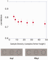
This study examined the effect of character sample density on legibility. As the spatial frequency component important for character recognition is said to be 1 to 3 cycles/letter (cpl), six dots in each direction should be sufficient to represent a character; however, some studies have reported that high-density characters are more legible. Considering that these seemingly contradictory findings could be compatible, we analyzed the frequency component of the character stimulus with adjusted sample density and found that the component content of 1 to 3 cpl increased in the high-density character. In the following three psychophysical experiments, high sample density characters tended to have lower contrast thresholds, both for normal and low vision. Furthermore, the contrast threshold with characters of each sample density was predicted from the amplitude of the 1 to 3 cpl component. Thus, while increasing the sample density improves legibility, adding a high frequency is not important in itself. The findings suggest that enhancing the frequency components important for recognizing characters by adding the high-frequency component contributes to making characters more legible.
Keywords: character; critical band; high resolution; legibility; letter; low vision; sample density; spatial frequency.
© The Author(s) 2020.
Conflict of interest statement
Declaration of Conflicting Interests: The author(s) declared no potential conflicts of interest with respect to the research, authorship, and/or publication of this article.
Figures


References
-
- Arditi A., Liu L., Lynn W. (1997). Legibility of outline and solid fonts with wide and narrow spacing In Yager D.(Ed.), Trends in optics and photonics (Vol. 11, pp. 52–56). Optical Society of America.
LinkOut - more resources
Full Text Sources
Research Materials

