. 2020 Dec 26;2(1):100166.
doi: 10.1016/j.xcrm.2020.100166. eCollection 2021 Jan 19.

A distinct innate immune signature marks progression from mild to severe COVID-19

Affiliations

A distinct innate immune signature marks progression from mild to severe COVID-19

Stéphane Chevrier et al. Cell Rep Med. .

Abstract

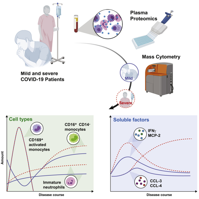
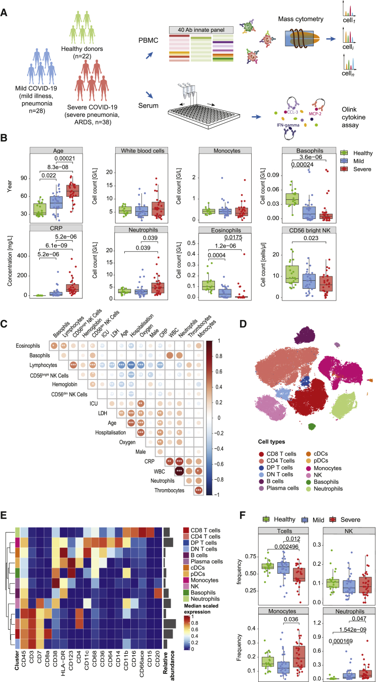
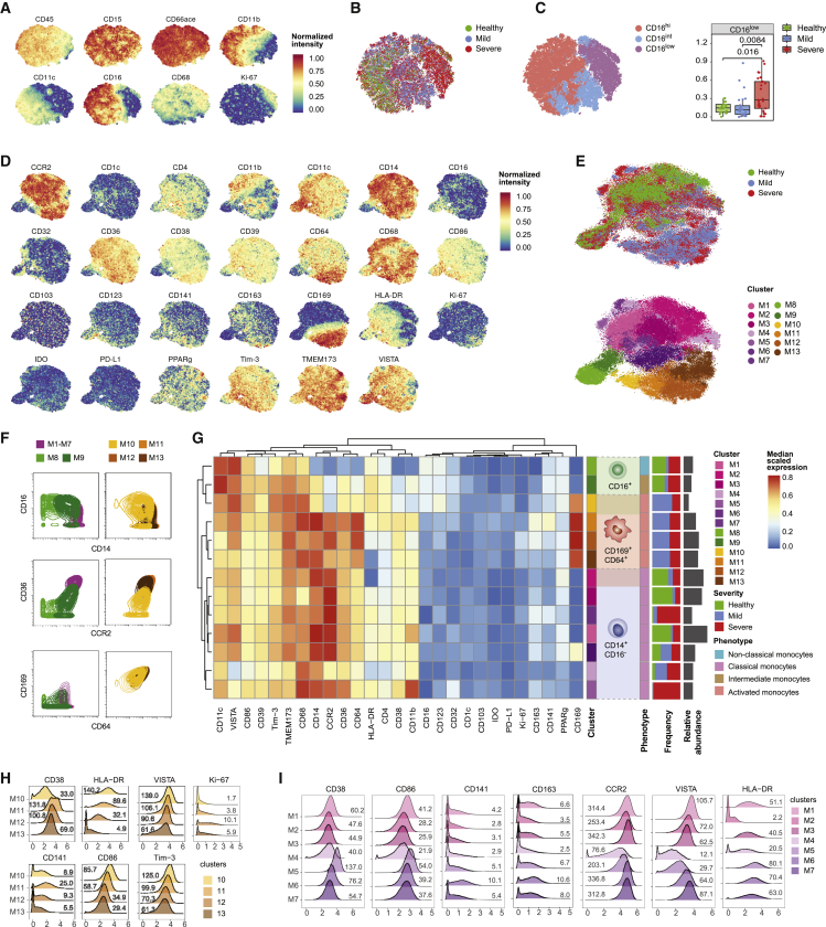
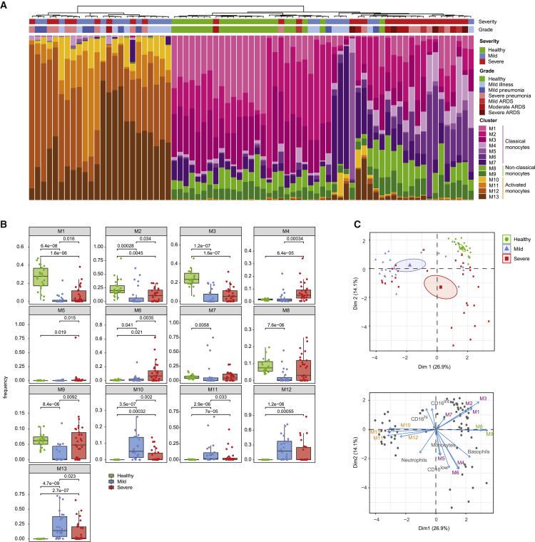
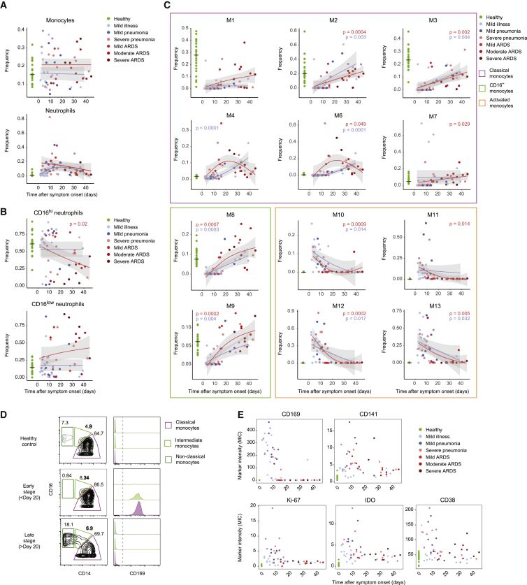
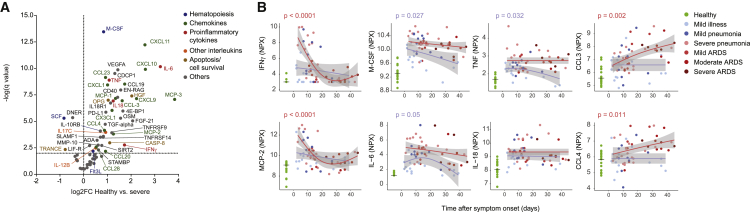
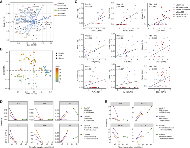
Coronavirus disease 2019 (COVID-19) manifests with a range of severities, but immune signatures of mild and severe disease are still not fully understood. Here, we use mass cytometry and targeted proteomics to profile the innate immune response of patients with mild or severe COVID-19 and of healthy individuals. Sampling at different stages allows us to reconstruct a pseudo-temporal trajectory of the innate response. A surge of CD169+ monocytes associated with an IFN-γ+MCP-2+ signature rapidly follows symptom onset. At later stages, we observe a persistent inflammatory phenotype in patients with severe disease, dominated by high CCL3 and CCL4 abundance correlating with the re-appearance of CD16+ monocytes, whereas the response of mild COVID-19 patients normalizes. Our data provide insights into the dynamic nature of inflammatory responses in COVID-19 patients and identify sustained innate immune responses as a likely mechanism in severe patients, thus supporting the investigation of targeted interventions in severe COVID-19.

Keywords: CCL3; CD169; COVID-19; MIP1α; SARS-CoV-2; emergency granulopoiesis; inflammation; innate immune response; mass cytometry; monocytes; proteomics; sialoadhesin.


Conflict of interest statement

The authors declare no competing interests.

Figures

None
Graphical abstract
Figure 1
Figure 1
Experimental approach, clinical characteristics, and identification of the main immune cell types in COVID-19 patients based on mass cytometry (A) Schematic of the study design of the cohort. (B) Boxplots showing the age distribution, selected clinical parameters at admission, and the NK cell counts in the patient cohort split by disease severity (n = 22 healthy controls, 28 mild COVID-19 patients, and 38 severe COVID-19 patients). (C) Correlation map of the indicated parameters and clinical features grouped by a hierarchical clustering on the COVID-19 patients. The circle color reflects the magnitude of the Pearson’s correlation coefficient (red indicates positive correlation, blue indicates negative correlation). Asterisks represent the statistically significant correlations (∗p < 0.05, ∗∗p < 0.01, ∗∗∗p < 0.001). (D) t-SNE plot of a random subset of 1,000 immune cells of the mass cytometry analysis from each sample (n = 78 individuals) colored by main cell types as identified based on a random forest cell classification. (E) Heatmap of the normalized marker expression in the main cell types. Relative abundances of each cell type are plotted to the right of the heatmap. (F) Boxplots comparing the frequencies of the indicated cell types in healthy controls and patients with mild and severe disease. Statistical analyses were performed with a Mann-Whitney-Wilcoxon test corrected for multiple testing using the Holm method, and p values are shown if the results were significant (p < 0.05).
Figure 2
Figure 2
In-depth characterization of the myeloid cells in the peripheral blood of COVID-19 patients (A) t-SNE plots of normalized expression of the indicated markers across a maximum of 1,000 neutrophils per patient (n = 22 healthy controls, 27 mild COVID-19 patients, and 29 severe COVID-19 patients). (B) t-SNE plot generated as indicated in (A) and colored by disease severity. (C) Left: t-SNE plot generated as indicated in (A) and colored by CD16 expression level based on manual assignment of PhenoGraph clusters. Right: boxplot showing the frequency of CD16low neutrophils in COVID-19 patients and healthy controls. Statistical analyses were performed with a Mann-Whitney-Wilcoxon test corrected for multiple testing using the Holm method, and p values are shown if the results were significant (p < 0.05). (D) t-SNE plots of normalized expression of the indicated markers across a maximum of 1,000 monocytes per patient. (E) t-SNE plots generated as indicated in (D) colored by disease severity (top) and by clusters identified with the PhenoGraph algorithm (bottom). (F) Contour plots showing the distribution of a subset of 10,000 cells from the indicated clusters for a selected set of markers. For this analysis, classical monocytes M1–M7 were merged in a single cluster. (G) Heatmap of the normalized marker expression in PhenoGraph monocyte clusters. The frequency of each cluster in patients with mild and severe disease and in healthy controls is indicated as a stacked histogram to the right of the heatmap. Cell numbers for each cluster are plotted to the right of the stacked histogram. (H) Overlaid histograms showing arcsinh transformed counts on a linear axis for selected markers for the CD169+-activated monocyte clusters. (I) Overlaid histograms showing arcsinh transformed counts on a linear axis for the indicated markers for the classical monocyte clusters. Values in the plot indicate median untransformed count intensities. In (H) and (I), values on the plot indicate the median raw ion count intensity for each cluster and marker indicated.
Figure 3
Figure 3
Patient stratification based on myeloid signature (A) Stacked histogram of the PhenoGraph monocyte clusters per patient (n = 75 individuals), ordered by cluster composition similarities. Disease severity and grade for each patient are shown on top of the stacked histogram. (B) Boxplots of frequencies of the indicated monocyte clusters in the different disease severities. Statistical analyses were performed with a Mann-Whitney-Wilcoxon test corrected for multiple testing based on the Holm method, and p values are shown if the results were significant (p < 0.05). (C) Top: principal-component analysis (PCA) of monocyte and neutrophil cluster frequencies and myeloid immune cell subset frequencies across the cohort. The PCA plot (top) shows the first 2 principal components separating the samples. The percentage of explained variance for each component is shown in brackets. Each dot represents a patient, colored by disease status. A concentration ellipse and the mean point are shown for each group. Bottom: biplot displaying simultaneously the observations (patients) as gray dots and the variables (cell subsets) as vectors. Vectors indicate the direction and strength of each cell component to the overall distribution. Variables grouping together are positively correlated.
Figure 4
Figure 4
Myeloid cell frequencies over the course of the SARS-CoV-2 infection (A–C) Scatterplot of indicated subset frequencies of (A) total PBMCs, (B) total neutrophils, and (C) total monocytes, relative to time after symptom onset. The dots are colored by disease grade at sampling time (n = 75 individuals). The frequencies in healthy controls are shown as a reference on the left, with a horizontal line indicating the median. The pseudo-time course was modeled using a generalized additive model for the disease severities separately (mild, blue lines; severe, red lines). p values of generalized additive models using time as a covariate were calculated for both the mild (blue) and severe (red) patient group and are shown when significant (p < 0.05). (D) Contour plots showing expression of CD14 and CD16 on monocytes from a representative sample of a healthy donor as well as an early- and late-stage patient (left column). Gates and percentage of cells in each gate for classical, intermediate, and non-classical monocytes are indicated for each sample. Expression of CD169 in each gate for each sample is displayed as overlaid histograms on the left. (E) Scatterplots of indicated marker median ion count (MIC) in the classical monocyte gate relative to the time after symptom onset. Dots are colored by disease grade at sampling time and healthy controls are displayed in green on the left as reference.
Figure 5
Figure 5
Cytokine signature shift between early and late stages of disease (A) Volcano plot of the Olink proteomics data comparing the healthy control data (n = 17) to that from patients with severe COVID-19 (n = 35). An FDR of 1% was taken as significance cutoff. The identity is given for factors reaching significance, with the color code indicated on the right. (B) Scatterplot of serum protein expression levels relative to the time after symptom onset. Plotted is normalized protein expression (NPX) on a log2 scale. The dots are colored by disease grade at sampling time (n = 77 individuals). The expression levels of the healthy controls are shown as a reference on the left, with a horizontal line indicating the median. The pseudo-time course was modeled as described in Figure 4A, and p values are shown when significant (p < 0.05).
Figure 6
Figure 6
Temporal correlation of cytokine signature and innate cell subsets (A) Biplot of the first two principal components of a PCA based on monocyte and neutrophil cluster frequencies, myeloid immune cell subset frequencies, and expression values of selected serum proteins. Dots represent the COVID-19 patients and healthy controls (n = 70 individuals), and the arrows indicate the direction and strength of each cell and soluble components to the overall distribution. Variables that group together are positively correlated. The percentage of explained variance for each component is shown in brackets. (B) Scatterplot of the first two principal components of a PCA generated as indicated in (A), colored by the time since symptom onset. The shape of each dot corresponds to the patient groups. (C) Scatterplots of frequencies of the indicated clusters versus NPX of selected serum proteins in individual patients. The dots indicate data for individual patients colored by disease grade. Relationship between the 2 variables is visualized with a linear regression line and quantified using a Spearman’s correlation coefficient (Rho) with the corresponding p value. Fq, frequency. (D and E) Scatterplots of frequencies of the indicated monocyte clusters (D) or the NPX of the indicated soluble factors (E) as a function of time after symptom onset in individual patients who were sampled twice during the course of the study. Dots are colored by patient number, and lines connect paired samples. Sample indicated with an asterisk was excluded from the cohort analysis due to low cell number.

References

    1. Zhu N., Zhang D., Wang W., Li X., Yang B., Song J., Zhao X., Huang B., Shi W., Lu R., China Novel Coronavirus Investigating and Research Team A novel coronavirus from patients with pneumonia in China, 2019. N. Engl. J. Med. 2020;382:727–733. - PMC - PubMed
    1. Dong E., Du H., Gardner L. An interactive web-based dashboard to track COVID-19 in real time. Lancet Infect. Dis. 2020;20:533–534. - PMC - PubMed
    1. Wu Z., McGoogan J.M. Characteristics of and Important Lessons from the Coronavirus Disease 2019 (COVID-19) Outbreak in China: Summary of a Report of 72314 Cases from the Chinese Center for Disease Control and Prevention. JAMA. 2020;323:1239–1242. - PubMed
    1. Wiersinga W.J., Rhodes A., Cheng A.C., Peacock S.J., Prescott H.C. Pathophysiology, Transmission, Diagnosis, and Treatment of Coronavirus Disease 2019 (COVID-19): A Review. JAMA. 2020;324:782–793. - PubMed
    1. Puelles V.G., Lütgehetmann M., Lindenmeyer M.T., Sperhake J.P., Wong M.N., Allweiss L., Chilla S., Heinemann A., Wanner N., Liu S. Multiorgan and Renal Tropism of SARS-CoV-2. N. Engl. J. Med. 2020;383:590–592. - PMC - PubMed

Publication types

MeSH terms