Clinical Trial
. 2021 Feb 1;131(3):e143648.
doi: 10.1172/JCI143648.

The COVID-19 immune landscape is dynamically and reversibly correlated with disease severity

Affiliations
Clinical Trial

The COVID-19 immune landscape is dynamically and reversibly correlated with disease severity

Hamid Bolouri et al. J Clin Invest. .

Abstract

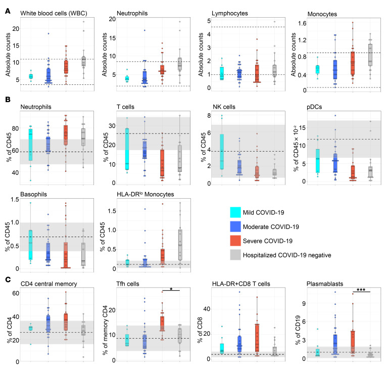
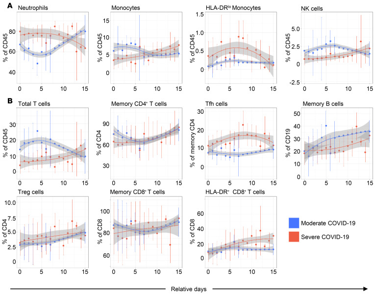
BACKGROUNDDespite a rapidly growing body of literature on coronavirus disease 2019 (COVID-19), our understanding of the immune correlates of disease severity, course, and outcome remains poor.METHODSUsing mass cytometry, we assessed the immune landscape in longitudinal whole-blood specimens from 59 patients presenting with acute COVID-19 and classified based on maximal disease severity. Hospitalized patients negative for SARS-CoV-2 were used as controls.RESULTSWe found that the immune landscape in COVID-19 formed 3 dominant clusters, which correlated with disease severity. Longitudinal analysis identified a pattern of productive innate and adaptive immune responses in individuals who had a moderate disease course, whereas those with severe disease had features suggestive of a protracted and dysregulated immune response. Further, we identified coordinate immune alterations accompanying clinical improvement and decline that were also seen in patients who received IL-6 pathway blockade.CONCLUSIONThe hospitalized COVID-19 negative cohort allowed us to identify immune alterations that were shared between severe COVID-19 and other critically ill patients. Collectively, our findings indicate that selection of immune interventions should be based in part on disease presentation and early disease trajectory due to the profound differences in the immune response in those with mild to moderate disease and those with the most severe disease.FUNDINGBenaroya Family Foundation, the Leonard and Norma Klorfine Foundation, Glenn and Mary Lynn Mounger, and the National Institutes of Health.

Keywords: Adaptive immunity; COVID-19; Innate immunity.


Conflict of interest statement

Conflict of interest: JHB is president of the Benaroya Research Institute at Virginia Mason, scientific cofounder and scientific advisory board member of GentiBio, consultant for Bristol-Myers Squibb, and has past and current research projects sponsored by Amgen, Bristol-Myers Squibb, Janssen, Novo Nordisk, and Pfizer. JHB also has a patent, no: US8053235B2, “Methods of generating antigen-specific CD4+CD25+ regulatory T cells, compositions and methods of use.”

Figures

Figure 1
Figure 1. Clinical course and mechanistic data for subjects with COVID-19.
Each subject is represented in one row. Subjects are first grouped by severity: severe (red), moderate (blue), and mild (cyan) disease. Subjects are next ranked by highest-ever ordinal score (most severe at top) and finally by minimum ordinal score (representing the largest change over time). The x axis shows days from first clinical assessment, typically the date of hospital admission. Colored points represent the ordinal score captured daily. No subjects had a score of 1 (recovered) at any point. Dates with CyTOF data available are denoted by circles; dates without CyTOF data are denoted by triangles.
Figure 2
Figure 2. Overview of correlations among cell frequencies and COVID-19 patient characteristics.
(A) Heatmap visualization of pairwise Pearson correlations with P < 0.05 among ordinal score, age, BMI, CyTOF population frequencies, and CBC parameters. Key indicates r value scale for positive (red) and negative (blue) correlations. (B) Network map visualization of correlations between CyTOF major immune cell subsets in our mild, moderate, and severe COVID-19 cohort. Shown are positive (red lines) and negative (blue lines) Pearson correlations with absolute (r) > 0.35 and P < 0.05. Line thickness corresponds to the strength of association (thicker is stronger). Correlations within major cell populations (same-color nodes) are not shown.
Figure 3
Figure 3. Correlations among immune cell populations in patients with COVID-19 demonstrate a relationship between disease severity and an increase in neutrophils and a depletion of pDCs and basophils.
(AF) Plots display FDR-adjusted Pearson correlations and linear regression lines with 95% confidence interval shading. Data points are colored according to the ordinal score observed for each patient at admission.
Figure 4
Figure 4. Cross-sectional immune correlates of COVID-19 disease severity.
In 274 samples from 59 patients with COVID-19, the abundances of (A) neutrophils, (B) T cells, (C) NK cells, (D) pDCs, and (E) basophils are highly correlated with disease severity (all P values FDR adjusted). Red plot points mark values for samples further analyzed in improving versus declining patients (Figure 9).
Figure 5
Figure 5. Immune cell frequencies vary by COVID-19 disease severity.
(A) Clinically measured CBC absolute count values from day of admission. Dashed black lines mark the clinical laboratories normal ranges. Subjects grouped based on disease severity, mild (cyan), moderate (blue), and severe (red), and SARS-CoV-2–negative hospitalized controls (gray). (B and C) The relative proportions of immune cell sub-types vary by disease severity. CyTOF cell frequencies based on disease severity expressed as either percentage of all leukocytes (B) or percentage of parent population (C). Gray bands mark the mean (dashed black line) ± 1 SD in 20 healthy control subjects. * P < 0.05, *** P < 0.001.
Figure 6
Figure 6. Admission day sample CyTOF cell frequencies.
The admission day sample CyTOF cell frequencies fall into 3 distinct clusters. The heatmap shows row-normalized z scores thresholded at ± 2 (see color key). Disease severity scores are shown on the right side of the heatmap for the day of admission, day of sampling, maximum score, and score at discharge (disease score key shown at top of heatmap). Clusters are marked (AC) at right, and indicated by green, orange, and red highlighting on the dendrogram at left.
Figure 7
Figure 7. The COVID-19 immune landscape changes over recovery time.
UMAP projections of batch-corrected CyTOF probe intensities for 4 samples from a single patient with COVID-19 recovering from a disease severity ordinal score of 6 to a score of 3 over a period of 6 weeks (see Methods for details).
Figure 8
Figure 8. Immune profiles of moderate and severe patients diverge over time, reflecting different disease trajectories.
Longitudinal plots of gated populations for (A) innate and (B) adaptive cell types. Days (relative) from first hospitalization are shown. Loess trajectory smoothing was performed on the median values (colored disks) for each group at each time point. Vertical bars indicate ± 1 SD around the median at each time point. Plot points without vertical error bars are from single data points, or interpolated values used for smoothing.
Figure 9
Figure 9. Immune signatures of clinical decline and improvement.
(A) Schematic outlining approach for identifying immune signatures of clinical decline and improvement focusing on changes in monitored parameters in longitudinal samples taken before and after changes in clinical score. (B) Log2-fold change in the indicated cell populations as measured by CyTOF or CBC analysis in longitudinal samples taken before and after improving (green) or declining (red) clinical scores. Asterisks indicate a significant difference in the fold changes (2-tailed, unpaired Wilcoxon rank sum FDR-adjusted P < 0.05) between improving (n = 7) and declining (n = 10) patient groups for the indicated cell populations. (C) Longitudinal analyses of the frequency of neutrophils, T cells, NK cells, and pDCs vs. clinical score in 3 individual patients. Black line shows disease score (left y axis) and red line shows immune cell frequency (right y axis).
Figure 10
Figure 10. Early immune responses to tocilizumab but not convalescent plasma in severe COVID-19.
(A) Serum CRP in patients receiving tocilizumab (top; n = 7) or convalescent plasma (bottom; n = 7) measured in clinical labs relative to day of treatment. Each line represents an individual patient. (B and C) Change in blood immune populations measured by CyTOF after treatment with tocilizumab (B) or convalescent plasma (C). The fold change in each population for each subject was determined by dividing the percentage of each population in the first posttreatment sample at day +2 or more after treatment with the closest pretreatment sample available as detailed in Supplemental Table 3. All are shown as percentage of CD45+ cells unless otherwise indicated. (D) Plots showing the percent of the indicated populations in tocilizumab-treated patients before and after treatment, using the time points used for analysis in B and Supplemental Table 3. (E) Plots showing all the data points available for tocilizumab-treated patients for the indicated populations shown in D and Supplemental Table 3. Each line represents an individual patient and the color of the line reflects the clinical ordinal score at the time of sampling. *P < 0.05 Wilcoxon matched pairs test, adjusted for multiple comparisons.

References

    1. Williamson EJ, et al. Factors associated with COVID-19-related death using OpenSAFELY. Nature. 2020;584(7821):430–436. doi: 10.1038/s41586-020-2521-4. - DOI - PMC - PubMed
    1. Barron E, et al. Associations of type 1 and type 2 diabetes with COVID-19-related mortality in England: a whole-population study. Lancet Diabetes Endocrinol. 2020;8(10):813–822. doi: 10.1016/S2213-8587(20)30272-2. - DOI - PMC - PubMed
    1. Holman N, et al. Risk factors for COVID-19-related mortality in people with type 1 and type 2 diabetes in England: a population-based cohort study. Lancet Diabetes Endocrinol. 2020;8(10):823–833. doi: 10.1016/S2213-8587(20)30271-0. - DOI - PMC - PubMed
    1. Shi Q, et al. Clinical characteristics and risk factors for mortality of COVID-19 patients with diabetes in Wuhan, China: a two-center, retrospective study. Diabetes Care. 2020;43(7):1382–1391. doi: 10.2337/dc20-0598. - DOI - PubMed
    1. Cai Q, et al. Obesity and COVID-19 severity in a designated hospital in Shenzhen, China. Diabetes Care. 2020;43(7):1392–1398. doi: 10.2337/dc20-0576. - DOI - PubMed