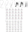
. 2021 Mar;27(3):447-453.
doi: 10.1038/s41591-021-01234-8. Epub 2021 Feb 2.

Variation in SARS-CoV-2 outbreaks across sub-Saharan Africa

Affiliations

Variation in SARS-CoV-2 outbreaks across sub-Saharan Africa

Benjamin L Rice et al. Nat Med. 2021 Mar.

Abstract

A surprising feature of the SARS-CoV-2 pandemic to date is the low burdens reported in sub-Saharan Africa (SSA) countries relative to other global regions. Potential explanations (for example, warmer environments1, younger populations2-4) have yet to be framed within a comprehensive analysis. We synthesized factors hypothesized to drive the pace and burden of this pandemic in SSA during the period from 25 February to 20 December 2020, encompassing demographic, comorbidity, climatic, healthcare capacity, intervention efforts and human mobility dimensions. Large diversity in the probable drivers indicates a need for caution in interpreting analyses that aggregate data across low- and middle-income settings. Our simulation shows that climatic variation between SSA population centers has little effect on early outbreak trajectories; however, heterogeneity in connectivity, although rarely considered, is likely an important contributor to variance in the pace of viral spread across SSA. Our synthesis points to the potential benefits of context-specific adaptation of surveillance systems during the ongoing pandemic. In particular, characterizing patterns of severity over age will be a priority in settings with high comorbidity burdens and poor access to care. Understanding the spatial extent of outbreaks warrants emphasis in settings where low connectivity could drive prolonged, asynchronous outbreaks resulting in extended stress to health systems.


Conflict of interest statement

Competing interests

The authors declare no competing interests.

Figures
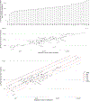
Extended Data Fig. 1 |
Extended Data Fig. 1 |. Variation between SSA countries in testing and reporting rates.
a, Reported number of tests completed per country as of December 20, 2020. b, Number of infections (I) per reported number of tests (T); line shows linear least squares regression: I = 1.422×10⁻¹×T − 1.912×10⁴ (df = 46, adjusted R2 = 0.9496, Pearson’s correlation coefficient, r = 0.9750, p < 0.001). c, Reported infections and deaths for sub-Saharan African countries with case fatality ratios (CFRs) shown as diagonal lines.
Extended Data Fig. 2 |
Extended Data Fig. 2 |. Year of most recent data available for variables compared between global regions.
Dotted vertical line shows regional median; solid vertical line shows regional mean. Note that most data comes from 2015–2019 (median = 2016, mean = 2014.62–2014.93).
Extended Data Fig. 3 |
Extended Data Fig. 3 |. Variation among sub-Saharan African countries in determinants of SARS-CoV-2 risk by variable.
A subset of variables is shown in Fig. 3a–d in the main text. Non-communicable disease (NCD) overall mortality per 100,000 population (age standardized) is shown here as an exemplar. The remaining variables are shown online: SSA-SARS-CoV-2-tool (https://labmetcalf.shinyapps.io/covid19-burden-africa/).
Extended Data Fig. 4 |
Extended Data Fig. 4 |. Variation among sub-Saharan African countries in determinants of SARS-CoV-2 mortality risk by category.
A subset of variables is shown in Fig. 4d,e in the main text. The remaining variables are shown online: SSA-SARS-CoV-2-tool (https://labmetcalf.shinyapps.io/covid19-burden-africa/). a, Select national level indicators; estimates of increased comorbidity burden (for example, higher prevalence of raised blood pressure) shown with darker red for higher risk quartiles. b, Select national level indicators; estimates of reduced access to care (for example, fewer hospitals) shown with darker red for higher risk quartiles. Countries missing data for an indicator (NA) are shown in gray. For comparison between countries, estimates are age-standardized where applicable (see Supplementary Table 3 for details).
Extended Data Fig. 5 |
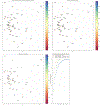
Extended Data Fig. 5 |. Principal Component Analysis of all variables and category specific subsets of variables.
a, Principal Component 1 and 2, countries colored by Log10 scaled tests per 100,000 population (as of June 30, 2020). b, Principal Component 1 and 2, countries colored by Log10 scaled GDP per capita. c, Principal Component 1 and 2, countries colored by the GINI index (a measure of wealth disparity). d, Scree plot showing the cumulative proportion of variance explained by principal component for analysis done using all variables (blue, 29 variables), comorbidity indicators (green, 14 variables, Section B in Supplementary Table 3)), and access to care indicators (orange, 8 variables, Section E in Supplementary Table 3).
Extended Data Fig. 6 |
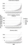
Extended Data Fig. 6 |. Comorbidity burden by age in sub-Saharan Africa.
Estimated mortality per age group for sub-Saharan African countries (gray lines) compared to China, France, and Italy (the countries from which estimates of SARS-CoV-2 infection fatality ratios (IFRs) by age are available) for three NCD categories (cardiovascular diseases, chronic respiratory diseases excluding asthma, and diabetes).
Extended Data Fig. 7 |
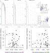
Extended Data Fig. 7 |. Pace of the outbreak and cases and testing vs. the pace of the outbreak.
Top: Each grey line on the left-hand panels indicates the total infected across all administrative units in a metapopulation simulation with parameters reflecting the country indicated by the plot title, assuming interventions are constant, and that immunity does not wane. Simulations with parameters reflecting three representative countries are shown, ranked from higher connectivity (Malawi-like) to lower connectivity (Madagascar-like). The top right-hand plot shows where more rapid disappearances of the outbreak locally are expected (y axis shows time to first extinction) and where a higher proportion of the countries’ population is reached during simulation (x axis shows proportion of population infected by 1 year); grey horizontal bars indicate quartiles across 100 simulations. We note that a shorter duration of immunity will reduce the probability of extinction within an admin-2 (simulations shown do not include waning). The lower right-hand panel shows the fraction of administrative units unreached against the travel time in hours to the nearest city of 50,000 or more people; grey horizontal bars again reflect quartiles across 100 simulations. Bottom: The total number of confirmed cases reported by country (x axis, left, as reported for June 28th by Africa CDC) and the test positivity (x axis, right, defined as the total number of confirmed cases divided by the number of tests run, as reported by Africa CDC) compared with the proportion of the population estimated to be infected after one year using the metapopulation simulation described in the methods, assuming no waning of immunity (Pearson’s correlation coefficients, respectively, r = −0.04, p > 0.5, df=41; r = 0.02, p > 0.5, df = 41).
Extended Data Fig. 8 |
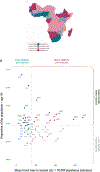
Extended Data Fig. 8 |. Bivariate example of expected pace versus expected burden at the national level in SARS-CoV-2 outbreaks in sub-Saharan Africa.
Countries are colored by with respect to indicators of their expected epidemic pace (using as an example subnational connectivity in terms of travel time to nearest city) and potential burden (using as an example the proportion of the population over age 50). a, In pink, countries with less connectivity (that is, less synchronous outbreaks) relative to the median among SSA countries; in blue, countries with more connectivity; darker colors show countries with older populations (that is, a greater proportion in higher risk age groups). b, Dotted lines show the median; in the upper right, in dark pink, countries are highlighted due to their increased potential risk for an outbreak to be prolonged (see metapopulation model methods) and high burden (see burden estimation methods).
Extended Data Fig. 9 |
Extended Data Fig. 9 |. Impact of waning of immunity and the introduction of control efforts on spatial spread.
a, Impact of waning of immunity and the introduction of control efforts on spatial spread. The left panel indicates the proportion of the population infected after one year in the absence (x-axis) or presence (y-axis) of waning of immunity (duration of immunity taken to be ~40 weeks, that is, w=1/40, reflecting estimates for other coronaviruses HCoV-OC43 and HCoV-HKU1) across countries in SSA; grey horizontal lines indicate quartiles across 100 simulations. All points above the 0,1 line indicate that waning of immunity accelerates spatial spread. The central panel indicates the proportion of the population infected after one year in the absence (x axis) or presence (y axis) of control efforts with 12 weeks of a 20% reduction in transmission as an exemplar. All points below the 0,1 line indicate a lower proportion infected as a result of control efforts. All points above the 0,1 line in the right panel indicate more weeks until the first extinction in the presence of NPIs. Note that a duration of immunity of less than 40 weeks yields no local extinction. b, Time course of the range of policies deployed across different countries. A composite score of government response (left), interventions for containment (middle) and economic support provided (right) each scored from 0–100, provided by the University of Oxford Blavatnik School of Government; showing SSA countries (black lines) relative to other countries (grey lines). c, Comparison of policies implemented in SSA and google derived measures of mobility. The black line indicates a score of the magnitude of policies directed towards health containment for each country (plot title) on a scale from 0–100 with other SSA countries for which data on mobility was available (n = 24 of 48) shown for comparison in grey; the red line indicates the percent reductions in mobility to work relative to baseline for that country (similar patterns seen for other mobility measures). The vertical blue line shows the day on which 10 cases were exceeded based on the Johns Hopkins dashboard data. d, Comparison of reductions in transmission with another directly transmitted infection. Monthly measles incidence (y-axis) between 2011 and 2019 is shown in gray, and the first 6 months of 2020 (months on the x-axis) shown in red for countries for which data is available in SSA (n = 34 of 48). China and Germany (which have been relatively successful in controlling the virus) shown for comparison at the bottom right. Although multi-annual features might drive measles incidence (for example, dynamics in Madagascar are largely dominated by a honeymoon outbreak that occurred in 2018–2019) for countries that slowed the SARS-CoV-2 pandemic, signatures of reduction in measles can be identified (for example, Germany and China; similar patterns are seen in Viet Nam).
Extended Data Fig. 10 |
Extended Data Fig. 10 |. Transmission climate-dependency and sensitivity to R0max and R0min value selection.
Transmission (R0) declines with increasing specific humidity from R0max to R0min. Three exemplar cities with low, intermediate, and high average specific humidity are shown across rows (Windhoek, Antananarivo, and Lome, respectively). a-c, Proportion of the population infected (I/N) over time for the specified R0min and R0max values. d, Variation in peak size and timing when 1.0 < R0min < 1.5.
Fig. 1 |
Fig. 1 |. Variation in the cumulative percentage of the population infected in SSA countries as expected from reported mortality totals.
a,b, The expected percentage of a country’s population infected given the number of reported deaths to date, country-specific age structure and a range of death reporting completeness scenarios (a), or a range of IFR scenarios (b). The global IFR age curves were fitted to existing age-stratified IFR estimates (Methods and Supplementary Table 4) and shifted toward younger or older ages by the specified number of years to simulate higher or lower IFRs, respectively (b). Conservatively, we assumed no variation in infection rates by age. (Infections skewed toward older age groups would result in a higher average IFR and thus a lower expected percentage of the population infected for a given number of deaths.) Reported case and death counts are current as of December 2020 (sourced from the Africa CDC; Supplementary Table 1). Data from Eritrea and the Seychelles are not shown as they have zero reported deaths as of December 2020. Comparisons to serological surveys (unfilled triangles) available from blood banks in Kenya, health care workers in urban Malawi and a subnational cluster-stratified random sample from Niger State in Nigeria are shown.
Fig. 2 |
Fig. 2 |. Hypothesized modulators of relative SARS-CoV-2 epidemic risk in SSA.
The factors (A–F) hypothesized to increase (red) or decrease (blue) mortality burden or epidemic pace within SSA, relative to global averages, are grouped into six categories or dimensions of risk. In this framework, epidemic pace is determined by person-to-person transmissibility, which can be defined as the time-varying effective reproductive number, Rt, and introduction and geographical spread of the virus via human mobility. SARS-CoV-2 mortality (determined by the IFR) is modulated by demography, comorbidities (for example, noncommunicable diseases) and access to care. Overall burden is a function of direct burden and indirect effects due to, for example, socioeconomic disruptions and disruptions in health services, such as vaccination and infectious disease control. Supplementary Table 2 contains the details and references used as a basis to draw the hypothesized modulating pathways.
Fig. 3 |
Fig. 3 |. Variation among SSA countries in select determinants of SARS-CoV-2 risk.
ad, Right, SSA countries were ranked from least to greatest for each indicator; the bar color shows the population age structure (percentage of the population above the age of 50). The solid horizontal lines show the global mean value and the dotted lines show the mean among SSA countries. Left, The boxplots show the median, the inner bounds correspond to the interquartile range (IQR, 25th to 75th percentiles) and the outer bounds correspond to the 1.5 × IQR, grouped by WHO-defined geographic regions. SSA, Sub-Saharan Africa; AMR, Americas Region; EMR, Eastern Mediterranean Region; EUR, Europe Region; SEA, Southeast Asia Region; WPR, Western Pacific Region (n = 206, 172, 106 and 92 countries with available data for ad, respectively). e,f, Bivariate comparisons of the variables shown in a,b and c,d, respectively. The dot size shows the mean household size for households with individuals aged over 50, the dashed lines show the median value among SSA countries and the quadrants with the greatest risk are outlined in red (for example, fewer physicians and greater age-standardized chronic obstructive pulmonary disease mortality). See Supplementary Table 3 and Extended Data Fig. 3 for a full description and link to visualization of all variables.
Fig. 4 |
Fig. 4 |. Variation in expected burden for SARS-CoV-2 outbreaks in SSA.
a, Expected mortality in a scenario where cumulative infection reaches 20% across age groups and the IFR curve is fitted to existing age-stratified IFR estimates (Methods and Supplementary Table 4). b, National-level variation in comorbidity and access to care variables, for example, diabetes prevalence among adults and the number of hospital beds per 100,000 population for SSA countries. c, Range in mortality per 100,000 population expected in scenarios where the cumulative infection rate is 20% and IFR per age is the baseline (black) or shifted ±2, 5 or 10 years (gray). Inset, The IFR by age curves for each scenario are shown. d,e, Selected national-level indicators; estimates of reduced access to care (for example, fewer hospitals) (d) or increased comorbidity burden (for example, higher prevalence of raised blood pressure) (e) shown with darker red for higher-risk quartiles (see Extended Data Fig. 4 for all indicators). Countries missing data for an indicator are shown in gray. For comparison between countries, estimates are age-standardized where applicable (Supplementary Table 3). High-resolution maps for each variable and scenario are available at the SSA-SARS-CoV-2-tool for estimating the burden of SARS-CoV-2 in SSA (https://labmetcalf.shinyapps.io/covid19-burden-africa/).
Fig. 5 |
Fig. 5 |. Variation in connectivity and climate in SSA and expected effects on SARS-CoV-2.
a, International travelers to SSA from January to April 2020, as inferred from the number of passenger seats on arriving aircrafts. b, For the 4 countries with the most arrivals, the proportion of arrivals by month coming from countries with 0, 1–100, 101–1,000 and 1000+ reported SARS-CoV-2 infections at the time of travel (see Supplementary Table 5 for all others) is shown. c, Connectivity within SSA countries as inferred from average population-weighted mean travel time to the nearest urban area with a population >50,000. d, Mean travel time at the national level and variation in the fraction of the population expected to be infected (I/N) in the first year from stochastic simulations (Methods). e, Climate variation across SSA as shown by seasonal range in specific humidity, q (g kg−1) (max average q − min average q). f, The effect of local seasonality and control efforts (R0 decreases by 0%, that is, unmitigated, 10 or 20%) on the timing of epidemic peaks (max I/N) in SSA cities (with three exemplar cities highlighted in pink; Methods).

Update of

References

    1. Mecenas P, Bastos RTDM, Vallinoto ACR & Normando D Effects of temperature and humidity on the spread of COVID-19: a systematic review. PLoS ONE 15, e0238339 (2020). - PMC - PubMed
    1. Salje H Estimating the burden of SARS-CoV-2 in France. Science 369, 208–211 (2020). - PMC - PubMed
    1. Rinaldi G & Paradisi M An empirical estimate of the infection fatality rate of COVID-19 from the first Italian outbreak. Preprint at medRxiv 10.1101/2020.04.18.20070912 (2020). - DOI
    1. Verity R et al. Estimates of the severity of coronavirus disease 2019: a model-based analysis. Lancet Infect. Dis 20, 669–677 (2020). - PMC - PubMed
    1. Uyoga S et al. Seroprevalence of anti-SARS-CoV-2 IgG antibodies in Kenyan blood donors. Science 371, 79–82 (2021). - PMC - PubMed

Publication types

MeSH terms