. 2021 Mar 2;118(9):e2019716118.
doi: 10.1073/pnas.2019716118.

Quantifying asymptomatic infection and transmission of COVID-19 in New York City using observed cases, serology, and testing capacity

Affiliations

Quantifying asymptomatic infection and transmission of COVID-19 in New York City using observed cases, serology, and testing capacity

Rahul Subramanian et al. Proc Natl Acad Sci U S A. .

Abstract

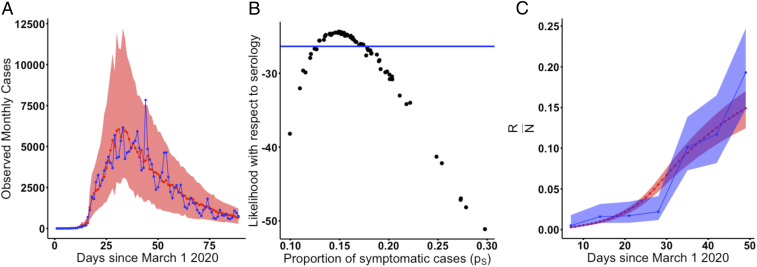
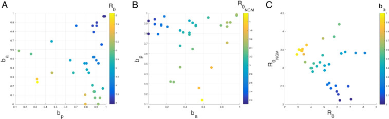
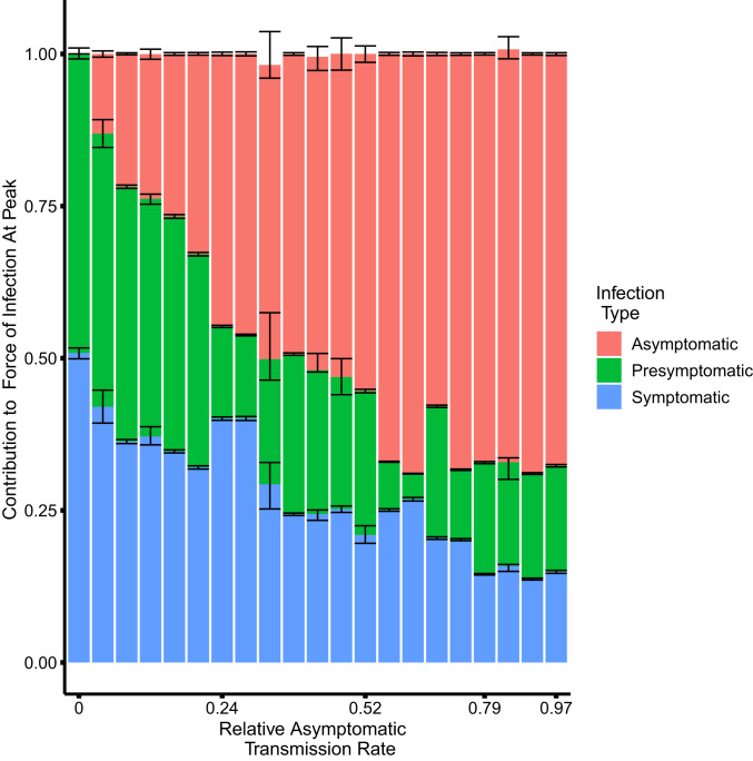
The contributions of asymptomatic infections to herd immunity and community transmission are key to the resurgence and control of COVID-19, but are difficult to estimate using current models that ignore changes in testing capacity. Using a model that incorporates daily testing information fit to the case and serology data from New York City, we show that the proportion of symptomatic cases is low, ranging from 13 to 18%, and that the reproductive number may be larger than often assumed. Asymptomatic infections contribute substantially to herd immunity, and to community transmission together with presymptomatic ones. If asymptomatic infections transmit at similar rates as symptomatic ones, the overall reproductive number across all classes is larger than often assumed, with estimates ranging from 3.2 to 4.4. If they transmit poorly, then symptomatic cases have a larger reproductive number ranging from 3.9 to 8.1. Even in this regime, presymptomatic and asymptomatic cases together comprise at least 50% of the force of infection at the outbreak peak. We find no regimes in which all infection subpopulations have reproductive numbers lower than three. These findings elucidate the uncertainty that current case and serology data cannot resolve, despite consideration of different model structures. They also emphasize how temporal data on testing can reduce and better define this uncertainty, as we move forward through longer surveillance and second epidemic waves. Complementary information is required to determine the transmissibility of asymptomatic cases, which we discuss. Regardless, current assumptions about the basic reproductive number of severe acute respiratory syndrome coronavirus 2 (SARS-Cov-2) should be reconsidered.

Keywords: COVID-19; asymptomatic transmission; epidemiological model; epidemiological parameter estimates; testing submodel.


Conflict of interest statement

The authors declare no competing interest.

Figures

Fig. 1.
Fig. 1.
Model diagrams. (A) The full SEPIAR model used for inference. The model is an extension of an SEIR formulation that considers both presymptomatic transmission (from compartment P) and asymptomatic transmission (from compartment A). (B) When the strength of presymptomatic transmission bp is set to zero, the SEPIAR model reduces to the SEIAR model. Since we assume that ϕU=ϕE, when bp=0, the infectious presymptomatic compartment behaves like an additional exposed compartment. (C) When the strength of asymptomatic transmission ba is set to zero, the SEPIAR model reduces to the SEPIR model. Individuals in the asymptomatic infectious compartment (A) make no contribution to the force of infection, so asymptomatic individuals essentially recover after leaving the presymptomatic period (P). In all three panels, circular/elliptical compartments contribute to the force of infection, while rectangular compartments do not. The green ellipse denotes the point at which severe/hospitalized COVID patients are sampled and enter the testing queue for severe cases, while the red ellipse denotes the corresponding entry point for the queue for nonsevere symptomatic cases.
Fig. 2.
Fig. 2.
The probability of symptomatic infection. (A) Simulated vs. observed cases from the profile of the asymptomatic transmission strength (ba) using the SEPIAR model. The red line is the median from 100 simulations using the MLE, while the red shaded region denotes the 2.5 to 97.5% quantiles across 100 simulations from all parameter combinations within two log-likelihood units of the profile MLE. Likelihoods here are with respect to case data. The observed daily case counts are denoted by the blue line. (B) Model likelihood as a function of the proportion of cases that are symptomatic (pS) for each parameter combination from A. The y axis shows the likelihood for that parameter combination with respect to serology data. All parameter combinations above the blue line have likelihoods within two log-likelihood units of the MLE (defined with respect to serology). This corresponds to a range of values for pS of approximately 13 to 18%. (C) Comparison of observed vs. simulated estimates of herd immunity in the population from parameter combinations supported by both case and antibody data (all points above the blue line in B). The red line denotes the median value of herd immunity (the proportion of the population that has recovered [R/N]) at that point in time in 100 simulations from the MLE parameter combination. The red shaded region denotes the 2.5 to 97.5% quantiles for these simulations from all parameter combinations within two log-likelihood units of the MLE with respect to serology (all parameter combinations above the blue line in B). The blue line denotes estimates of herd immunity from a recent serological survey in New York City (24). The blue shading denotes 95% CIs for those serology estimates using the methods of ref. .
Fig. 3.
Fig. 3.
Plots of (A) the reproductive number of symptomatic individuals (R0) and (B) the overall reproductive number (R0NGM), as a function of the relative strength of presymptomatic transmission (bp) and the relative strength of asymptomatic transmission (ba). Each point represents one parameter combination within two log-likelihood units of the MLE (with respect to serology) from the ba profile. (C) Plot of the overall reproductive number vs. the reproductive number in symptomatic individuals for the same points colored by ba. The black arrows show the direction of increasing strength of asymptomatic transmission (ba) and presymptomatic transmission (bp). For this same plot, except colored by the strength of presymptomatic transmission (bp), see SI Appendix, Fig. S6. For ease of plotting, we exclude two parameter combinations which had very low relative rates of presymptomatic transmission (i.e., bp was lower than 0.020). The two outlier combinations had high reproductive numbers (R0=17.77,R0NGM=3.95 and R0=4.97,R0NGM=4.37). These outliers are included in SI Appendix, Fig. S7.
Fig. 4.
Fig. 4.
The contribution to the force of infection at the peak of the outbreak on April 14, 2020 from symptomatic, asymptomatic, and presymptomatic infections under different relative asymptomatic transmission rates ba. For each parameter combination from the fitted SEPIAR model supported by case and serology data (corresponding to the points in Fig. 3), we simulate 100 trajectories and calculate the proportion of the overall force of infection on April 14, 2020 that is due to asymptomatic, symptomatic, and presymptomatic infections. We pool trajectories from all parameter combinations that have the same value of ba, and calculate the median, 2.5%, and 97.5% quantiles for each infection class and value of ba. The colored bars represent, for each infection class, the median proportion of its contribution to the force of infection (and hence may not sum exactly to one). The error bars represent the corresponding 2.5% and 97.5% quantiles. Versions of this plot calculated 4 wk before and 4 wk after the peak can be found in SI Appendix, Fig. S9. We excluded two outlier parameter combinations that had extremely low relative rates of presymptomatic transmission (i.e., where bp was less than 0.02).
Fig. 5.
Fig. 5.
Comparison of daily COVID hospitalizations under the model with observed COVID hospitalizations in New York City and emergency department respiratory syndrome surveillance reports. The red line represents the median daily case hospitalizations from 100 simulations from the parameter combination with the highest likelihood with respect to serology from the ba profile. The red shading represents the bounds of the 2.5% and 97.5% quantiles across all parameter combinations from the ba profile that are supported by case and serology data. The blue line shows observed COVID daily hospitalizations in New York City. The yellow line denotes daily reports of respiratory illness from syndrome surveillance in New York City emergency departments, while the pink line denotes anomalous respiratory surveillance reports compared to previous years.

References

    1. Paules C. I., Marston H. D., Fauci A. S., Coronavirus infections—More than just the common cold. JAMA 323, 707–708 (2020). - PubMed
    1. Dong E., Du H., Gardner L., An interactive web-based dashboard to track COVID-19 in real time. Lancet Infect. Dis. 20, 533–534 (2020). - PMC - PubMed
    1. Centers for Disease Control and Prevention , Overview of testing for SARS-CoV-2 (COVID-19). https://www.cdc.gov/coronavirus/2019-ncov/hcp/testing-overview.html. Accessed 7 August 2020.
    1. Majumder M., Mandl K. D., Early transmissibility assessment of a novel coronavirus in Wuhan, China. SSRN [Preprint] (2020). 10.2139/ssrn.3524675 (Accessed January 26, 2020). - DOI
    1. Sanche S., et al. , High contagiousness and rapid spread of severe acute respiratory syndrome coronavirus 2. Emerg. Infect. Dis. J. 26, 1470 (2020). - PMC - PubMed

Publication types

LinkOut - more resources