. 2021 Feb;1(2):e37.
doi: 10.1002/cpz1.37.

Assembly and Exploration of a Single Cell Atlas of the Drosophila Larval Ventral Cord. Identification of Rare Cell Types

Affiliations

Assembly and Exploration of a Single Cell Atlas of the Drosophila Larval Ventral Cord. Identification of Rare Cell Types

Rosario Vicidomini et al. Curr Protoc. 2021 Feb.

Erratum in

Abstract

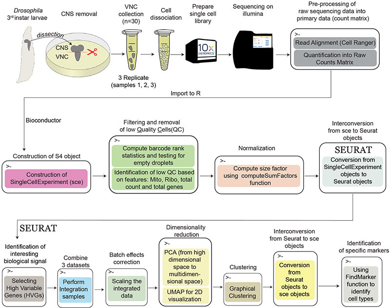
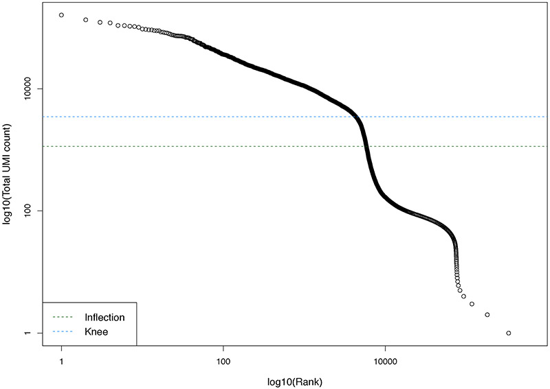
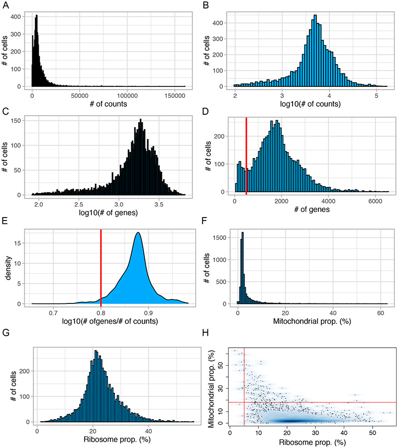
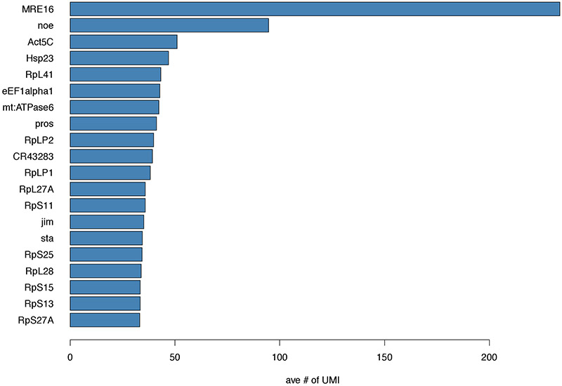
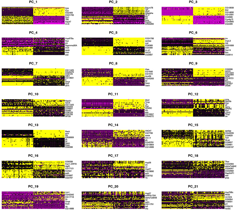
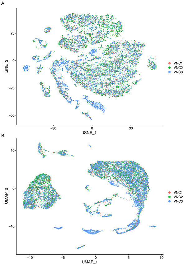
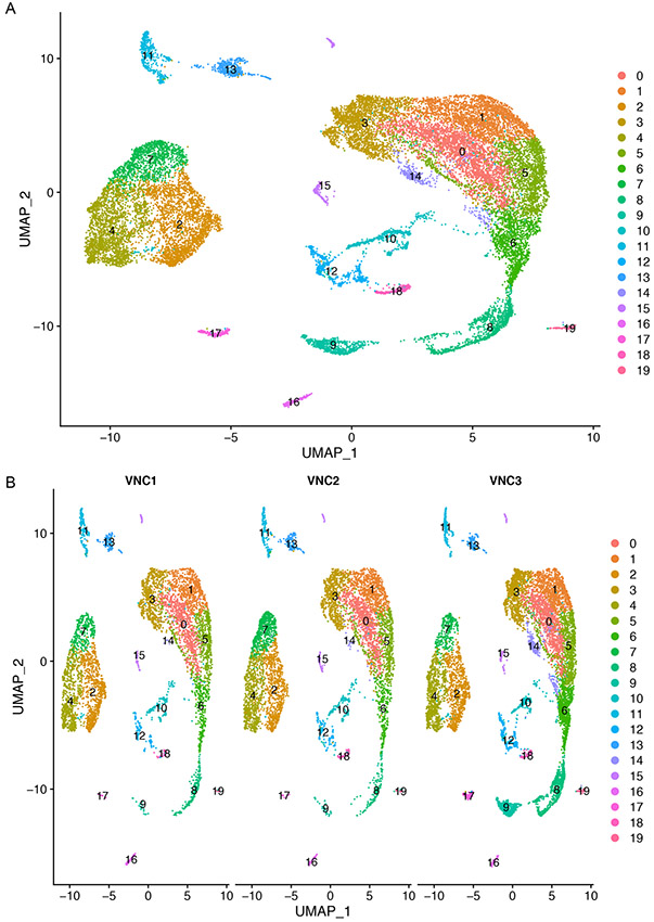
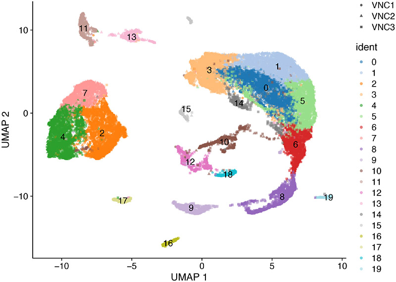
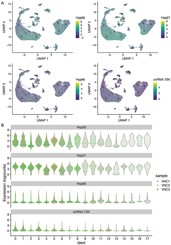
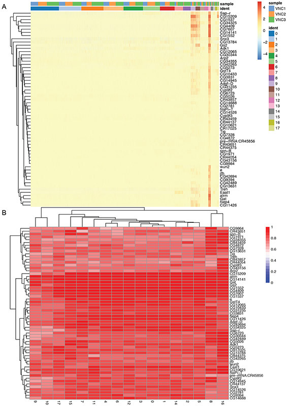
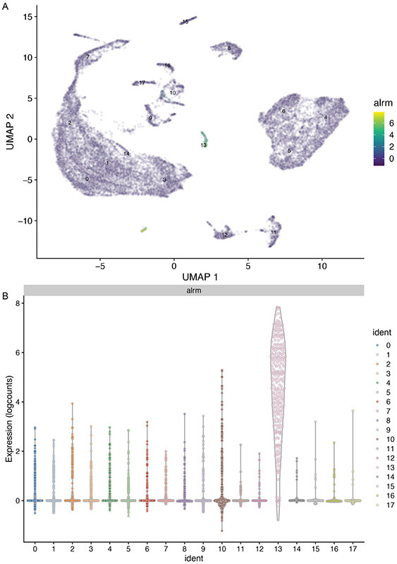
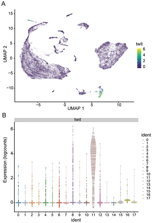
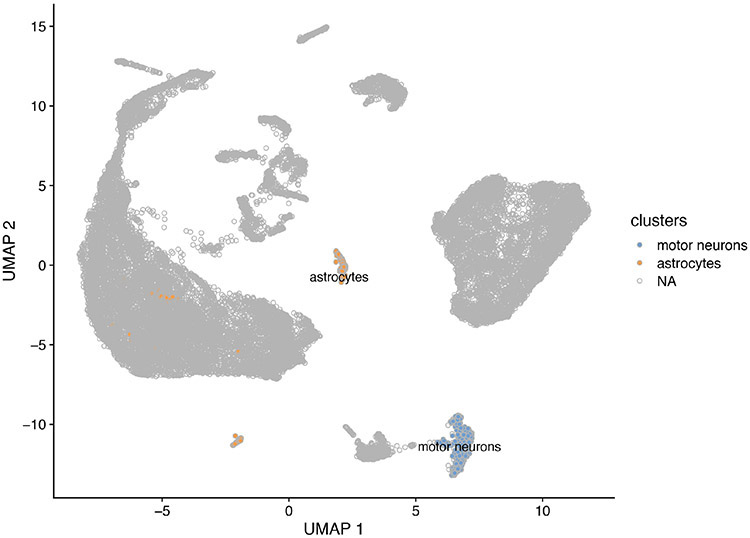
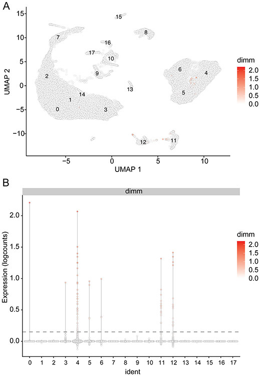
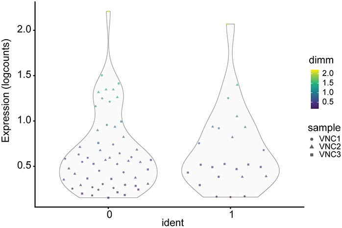
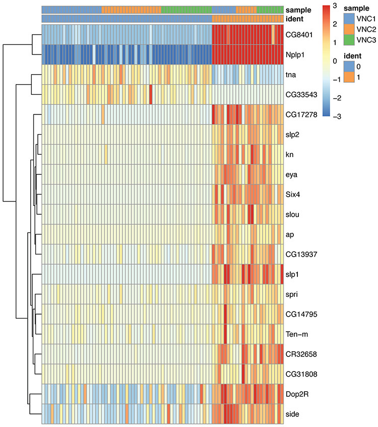
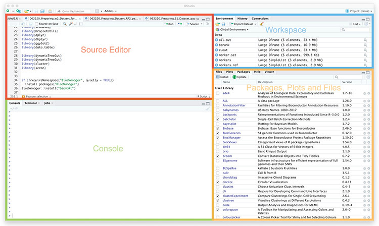
Single-cell RNA sequencing provides a new approach to an old problem: how to study cellular diversity in complex biological systems. This powerful tool has been instrumental in profiling different cell types and investigating, at the single-cell level, cell states, functions, and responses. However, mining these data requires new analytical and statistical methods for high-dimensional analyses that must be customized and adapted to specific goals. Here we present a custom multistage analysis pipeline which integrates modules contained in different R packages to ensure flexible, high-quality RNA-seq data analysis. We describe this workflow step by step, providing the codes, explaining the rationale for each function, and discussing the results and the limitations. We apply this pipeline to analyze different datasets of Drosophila larval ventral cords, identifying and describing rare cell types, such as astrocytes and neuroendocrine cells. This multistage analysis pipeline can be easily implemented by both novice and experienced scientists interested in neuronal and/or cellular diversity beyond the Drosophila model system. © 2021 US Government.

Keywords: R pipeline; cell type identification; clustering; dimensionality reduction; multisample integration; scRNA-seq.


Figures

Figure 1.
Figure 1.
Workflow diagram showing the experimental steps (first row) followed by the different computation steps (second and third row).
Figure 2.
Figure 2.. Barcode rank plot showing the fitted data used for detection of the knee point and the inflection point in emptyDrops.
The Y axis displays the number of distinct UMIs for each barcode of the VNC1 dataset. High quality barcodes are located above the knee point (blue line). Low quality barcodes are located below the inflection point (green line). The low-quality barcodes have relatively low numbers of reads probably derived from ambient RNA. Barcodes between the knee and the inflection points may have a small False Discovery Rate, suggesting that their UMI count is different from the ambient RNA.
Figure 3.
Figure 3.. Histogram of quality control metrics for the VNC1 dataset.
(A-D) Distribution of number of cells relative to total number of counts (A), log10(total number of counts) (B), log10(total detected genes) (C), and total number of genes detected (D) in each cell. Cells with less than 500 genes (left of the red vertical line, panel D) should be filtered out. (E) Distribution of log10(total number of detected genes)/log10(total number of counts). Cells with a ratio lower than 0.8 (left of the red vertical line) should be removed. (F) Distribution of number of cells relative to mitochondrial (F) and ribosomal (G) fraction in each cell. (H) Cells with a mitochondrial fraction higher than 18% (above the red horizontal line) and a ribosomal fraction lower than 5% (left of the red vertical line) should be removed from subsequent analyses.
Figure 4.
Figure 4.
Histogram of the top 20 highly expressed genes ordered by average number of counts.
Figure 5.
Figure 5.
Scatter plot of size factor values versus log10(total counts) for each cell within the VNC1 dataset.
Figure 6.
Figure 6.
Structure of the sce_VNC1 and Seurat_VNC1 (converted from sce) objects.
Figure 7.
Figure 7.. Standardized variance plotted against average expression in the VNC1 dataset.
Each point represents the relationship between standardized variance and average expression of each gene.
Figure 8.
Figure 8.
Elbow plot showing the standard deviation of each of the 40 PCs arbitrarily defined in the merged Seurat_VNCs dataset.
Figure 9.
Figure 9.
Heatmaps showing the top eight driving genes of the first 21 PCs in the merged Seurat_VNCs dataset. Genes (rows) and cells (columns) are ordered based on their PCA scores. Warm colors (gold/yellow) represent high PCA scores while cold colors (magenta/black) represent low PCA scores. To plot multiple PCs in one figure (in our case 21), we used the Dimheatmap function and set the cells argument to 100 (100 cells) and the nfeatures argument to 8 (8 genes). The cells shown are selected from both ends of the spectrum (50 + 50). This selection speeds up the plotting of a very large dataset and captures discrete differences within each PC.
Figure 10.
Figure 10.
t-SNE (A) and UMAP (B) plots color-coded for individual VNC samples. Each point represents a cell.
Figure 11.
Figure 11.
UMAP plot of merged VNCs dataset colored by cluster (A) and split by individual VNC sample (B). Each point represents a cell.
Figure 12.
Figure 12.
UMAP plot of the three sce_VNC objects colored by clusters. Each datapoint represents a cell. Different VNC samples are indicated by different shapes.
Figure 13.
Figure 13.
Heatmap (A) and UMAP (B) plots illustrating genes highly expressed in cluster #14. Each column is an individual cell (A). Enrichment of expression for the top four genes indicated in the heatmap (A) is examined individually in the UMAP plots (B).
Figure 14.
Figure 14.
Violin plots illustrating the expression levels for specific genes (Hsp26, Hsp27, Hsp68 and snRNA:7sk) in each of the 20 clusters (A) and in cluster #14 (B). The VNC samples are color-coded and are superimposed in panel A but separated in panel B, to emphasize the overwhelming contribution of VNC3 sample to cluster #14.
Figure 15.
Figure 15.. Distribution of Heat shock transcripts in various clusters and datasets.
(A) Violin plots showing the distribution of Heat shock transcripts in each of the 20 clusters. Each point represents a cell (color-coded by samples) that is superimposed on the area of distribution of Heat shock transcripts in each cluster. The dotted line marks a threshold of 6.5% for the fraction of Heat shock transcripts (see below). Note that cells in cluster #14 are mostly blue (that is, derived from sample VNC3) and show a much higher percentage of Heat shock transcripts than cells in other clusters. (B) Most cells within a sample show a relatively small percentage of Heat shock transcripts (VNC1 dataset is shown here). (C) Relative distribution of the percentages of Heat shock and mitochondrial transcripts in each cell of the VNC1 sample. The cells with a fraction of Heat shock transcripts higher than 6.5% (above the red horizontal line) and a mitochondrial fraction higher than 18% (right red vertical line) are probably technical artefacts and were removed.
Figure 16.
Figure 16.
UMAP plot of merged VNCs (A) and individual datasets (B) after removal of stressed cells. Each datapoint represents a cell color-coded by cluster (A and B) and separated by sample (B).
Figure 17.
Figure 17.. Redistribution of specific transcripts (Hsp26, Hsp27, Hsp68 and snRNA:7sk) after the removal of stressed cells.
(A) UMAP plots illustrating the levels of expression for each of the indicated genes in the merged_VNCs dataset. (B) Violin plots of the same transcripts of interest in various cluster and VNC sample. Each datapoint represents a cell color-coded by sample.
Figure 18.
Figure 18.. Heatmaps illustrating expression levels for genes specific for cluster #13.
(A) Heatmap illustrating the level of expression in each cluster and in each sample for genes highly expressed in cluster #13. Each column is an individual cell. (B) Heatmap of AUCs for the top marker genes in cluster #13 in comparison to all the other clusters.
Figure 19.
Figure 19.. Enrichment of alrm expression in cluster #13.
(A) UMAP and (B) violin plots showing that alrm transcript is indeed highly enriched in cluster #13 and is sparsely expressed in other clusters.
Figure 20.
Figure 20.. Enrichment of twit expression in cluster #11.
(A) UMAP and (B) violin plots illustrating that twit transcript is indeed highly enriched in cluster #11 and is sparsely expressed in other clusters.
Figure 21.
Figure 21.
UMAP plot highlighting and labeling clusters #11 as motor neurons and #13 as astrocytes. The remaining clusters are not assigned (NA) and colored in gray.
Figure 22.
Figure 22.. Distribution of dimm expression in the merged_VNCs dataset.
(A) UMAP and (B) violin plots illustrating the levels and distribution of dimm transcripts. Each datapoint represent a cell colored by the dimm expression levels. The dotted line in panel B marks a threshold of 0.15 for dimm expression [log10(#count)dimm].
Figure 23.
Figure 23.. Segregation of dimm cells into two distinct groups.
Violin plots illustrating the distribution of dimm expression levels in the two distinctly separated groups of cells. Each datapoint represents a barcode/cell color-coded by the dimm expression levels. Different VNC samples are indicated by different shapes.
Figure 24.
Figure 24.. Genes differentially expressed in the two clusters of dimm cells.
Each column represents a cell. The cells are separated by cluster and by VNC sample. Note the strong enrichment of Neuropeptide-like precursor 1 (Nplp1) in cluster #1.
Figure 25.
Figure 25.
Screenshot of R studio interface showing the Source Editor, Console, Workspace and Packages-Plots-Files windows.

Similar articles

Cited by

References

    1. Amezquita RA, Lun ATL, Becht E, Carey VJ, Carpp LN, Geistlinger L, Marini F, Rue-Albrecht K, Risso D, Soneson C, et al. (2020). Publisher Correction: Orchestrating single-cell analysis with Bioconductor. Nat Methods 17, 242. - PubMed
    1. Angerer P, Haghverdi L, Buttner M, Theis FJ, Marr C, and Buettner F (2016). destiny: diffusion maps for large-scale single-cell data in R. Bioinformatics 32, 1241–1243. - PubMed
    1. Barkas N, Petukhov V, Nikolaeva D, Lozinsky Y, Demharter S, Khodosevich K, and Kharchenko PV (2019). Joint analysis of heterogeneous single-cell RNA-seq dataset collections. Nat Methods 16, 695–698. - PMC - PubMed
    1. Becht E, McInnes L, Healy J, Dutertre CA, Kwok IWH, Ng LG, Ginhoux F, and Newell EW (2018). Dimensionality reduction for visualizing single-cell data using UMAP. Nat Biotechnol. - PubMed
    1. Brennecke P, Anders S, Kim JK, Kolodziejczyk AA, Zhang X, Proserpio V, Baying B, Benes V, Teichmann SA, Marioni JC, et al. (2013). Accounting for technical noise in single-cell RNA-seq experiments. Nat Methods 10, 1093–1095. - PubMed

LinkOut - more resources