. 2021 Feb 22:12:592303.
doi: 10.3389/fimmu.2021.592303. eCollection 2021.

Machine Learning Identifies Complicated Sepsis Course and Subsequent Mortality Based on 20 Genes in Peripheral Blood Immune Cells at 24 H Post-ICU Admission

Affiliations

Machine Learning Identifies Complicated Sepsis Course and Subsequent Mortality Based on 20 Genes in Peripheral Blood Immune Cells at 24 H Post-ICU Admission

Shayantan Banerjee et al. Front Immunol. .

Abstract

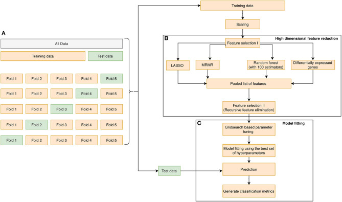
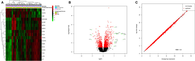
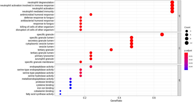
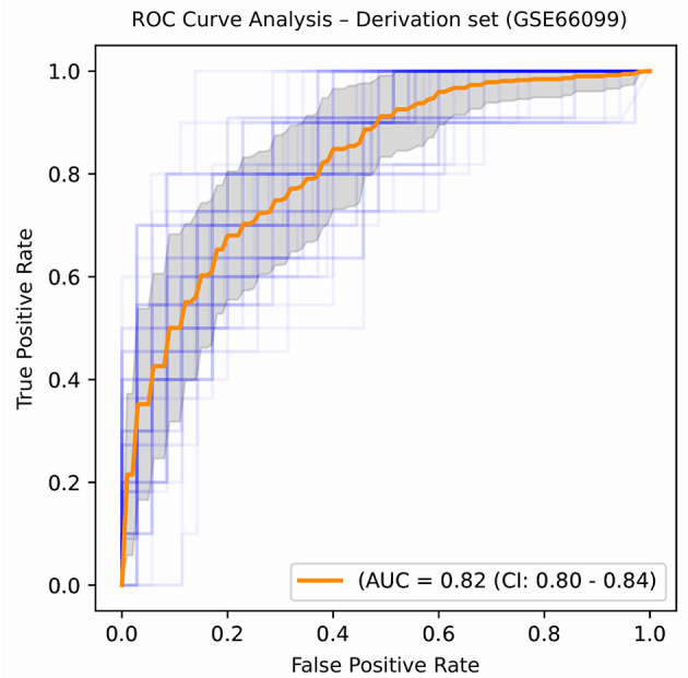
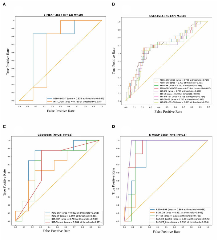
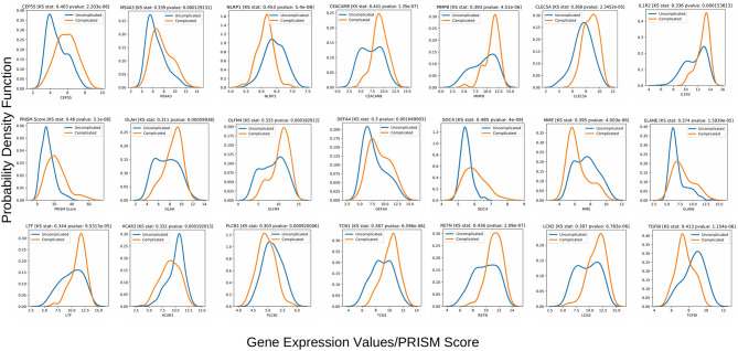
A complicated clinical course for critically ill patients admitted to the intensive care unit (ICU) usually includes multiorgan dysfunction and subsequent death. Owing to the heterogeneity, complexity, and unpredictability of the disease progression, ICU patient care is challenging. Identifying the predictors of complicated courses and subsequent mortality at the early stages of the disease and recognizing the trajectory of the disease from the vast array of longitudinal quantitative clinical data is difficult. Therefore, we attempted to perform a meta-analysis of previously published gene expression datasets to identify novel early biomarkers and train the artificial intelligence systems to recognize the disease trajectories and subsequent clinical outcomes. Using the gene expression profile of peripheral blood cells obtained within 24 h of pediatric ICU (PICU) admission and numerous clinical data from 228 septic patients from pediatric ICU, we identified 20 differentially expressed genes predictive of complicated course outcomes and developed a new machine learning model. After 5-fold cross-validation with 10 iterations, the overall mean area under the curve reached 0.82. Using a subset of the same set of genes, we further achieved an overall area under the curve of 0.72, 0.96, 0.83, and 0.82, respectively, on four independent external validation sets. This model was highly effective in identifying the clinical trajectories of the patients and mortality. Artificial intelligence systems identified eight out of twenty novel genetic markers (SDC4, CLEC5A, TCN1, MS4A3, HCAR3, OLAH, PLCB1, and NLRP1) that help predict sepsis severity or mortality. While these genes have been previously associated with sepsis mortality, in this work, we show that these genes are also implicated in complex disease courses, even among survivors. The discovery of eight novel genetic biomarkers related to the overactive innate immune system, including neutrophil function, and a new predictive machine learning method provides options to effectively recognize sepsis trajectories, modify real-time treatment options, improve prognosis, and patient survival.

Keywords: biomarkers; complicated course; critical care; machine learning; sepsis; transcriptomics.


Conflict of interest statement

HW and Cincinnati Children's Hospital Medical Center hold United States patents for the PERSEVERE biomarkers and the endotyping strategy described in this manuscript. The remaining authors declare that the research was conducted in the absence of any commercial or financial relationships that could be construed as a potential conflict of interest.

Figures

Figure 1
Figure 1
The overall methodology design for biomarker discovery from the derivation dataset GSE66099 containing 228 samples is illustrated in this figure. (A) The initial data is aggregated, normalized, corrected for batch normalization, and separated into even chunks using k-fold cross-validation (CV). In our pipeline, we used k = 5. (B) The training chunks of the CV are used for model development; the data analysis pipeline follows the Complete Cross-Validation (CCC) approach defined by Alder et al. (42). In addition to DEG, we apply three other variable selection methods to generate a pool of candidate genes. We then apply a wrapper method, namely the RFE to arrive on the most predictive genes. (C) The genes selected by the RFE method are then used to develop a predictive model. The model is then evaluated on the test fold of the CV. This process is repeated for the remaining training and test folds. Finally, the entire 5-fold CV is repeated 10 times to generate a total of 50 iterations, and the top predictors from (B) are saved and analyzed to generate a normalization score, which is a measure of how often a gene appears as a top predictor across each of the 50 iterations.
Figure 2
Figure 2
Preprocessing of derivation dataset GSE66099 containing 228 samples. (A,B) Average gene expression values before normalization and after normalization. The x-axis represents the samples, and the y-axis represents the gene expression values. According to the figures, the average expression values of the samples were more stable and consistent after normalization and suitable for analysis. (C) One of the most well-known sources of variation in gene expression studies is batch effects when samples are processed during different time points or by different groups of people. We removed the batch effects from the data due to the microarray experiments being conducted over multiple years using the Combat() in the “sva” package. In the given figure, the first SVA component ordered by date before batch effect correction shows that one of the inferred batch effects (or the surrogate variable) is associated with the actual batch variable.
Figure 3
Figure 3
Differential gene expression analysis results of the patients included in the derivation dataset GSE66099 containing 228 samples. (A) Heatmap representing differentially expressed genes between complicated and uncomplicated course groups with annotations. The color and intensity of the boxes represent changes in gene expression. Red represents upregulated genes and green represents downregulated genes. The horizontal bars show annotations for complicated course outcomes and mortality and are useful for interpreting the sample-wise clusters formed using the expression measurements. (B) Volcano plot of differentially expressed genes in complicated and uncomplicated course outcomes. A volcano plot helps us to assess the adjusted p-values (significance), and the log fold changes (biological difference) of differential expression for the given list of genes at the same time. (C) An MA plot is a 2D scatter plot (each dot representing a gene) that represents log fold change vs. mean expression across two different conditions. All the significantly differentially expressed genes (FDR cutoff = 0.1) are colored in red and the genes without significant gene expression differences are colored in black.
Figure 4
Figure 4
Functional analysis of the 17 DEGs using the expression levels of the patients included in the derivation dataset GSE66099 containing 228 samples. The Gene Ontology terms representing our knowledge for the biological domain are grouped on the basis of three major aspects: Biological Processes (BP), Cellular Components (CC), and Molecular Function (MF). A biological process is a specific objective that an organism is genetically designed to accomplish. It is often described by the ending state or the outcome. For instance, a biological process defined as “cell division” results in the creation of a divided cell (two daughter cells) from a single parent cell. A Cellular Component (CC) defines a location occupied by a macromolecular machine during the execution of a specific molecular function. For instance, “cytoplasmic side of plasma membrane” is a cellular component defining the location of a gene product relative to cellular structures. A Molecular Function (MF) represents the primary activity of a gene product at the molecular level. Biochemical activities such as “binding” or “catalysis” are examples of GO terms representing molecular functions. In this figure, the y-axis represents the gene ontology terms and the x-axis represents the “Gene Ratio” or the percentage of total DEGs in the given GO term. The size of the dot or the “Gene Count” represents the number of genes associated with the enriched term and the color of the dot represents the significance of the terms (more significant terms being redder). “P.adjust” is the p-value adjusted using the Benjamini-Hochberg procedure.
Figure 5
Figure 5
ROC plot displaying the classification performances of the best model (in terms of mean AUROC) trained using the top 21 consistently chosen gene and clinical variables (Table 2) from patients included in the derivation dataset GSE66099 containing 228 samples. An ROC plot illustrates the performance of a binary classifier at different classification thresholds usually featuring a false positive rate (1-Specificity) on the x-axis and true positive rate (Sensitivity) on the y-axis. The top left corner is an ideal point with a false positive rate of zero and a true positive rate of one. The area under the curve (or AUC) denotes the probability that a randomly chosen positive instance is ranked higher than a randomly chosen negative one by our classifier. An AUC of zero means that the classifier is predicting the positive class as negative and vice versa, while an AUC of one denotes perfect separability. In the above figure, we denote the ROC plots generated from the different cross-validation experiments along with the mean area under the curve (in orange). The variance of the curve (shaded part) roughly shows how the output from our best performing model is affected by changes in the training data.
Figure 6
Figure 6
Combined ROC plots illustrating the performances of various binary classifiers on four independent validation sets. “N” represents the total number of samples in each dataset and “M” represents the total number of genes used to derive the best classification models (in terms of AUROC). (A) E-MEXP-3567: The best model (AUROC=0.833) was obtained using a total of 10 out of the 20 gene biomarkers (MMP8, CEACAM8, LCN2, RETN, CLEC5A, TGFBI, CEP55, MME, OLAH, and SDC4). (B) GSE54514: The best model (AUROC = 0.723) was obtained using a total of 10 out of the 20 gene biomarkers (MMP8, CEACAM8, LCN2, RETN, CLEC5A, TGFBI, CEP55, MME, OLAH, and SDC4). (C) GSE40586: The best model (AUROC = 0.822) was obtained using a total of 15 out of the 20 gene biomarkers. (D) E-MEXP-3850: The best model (AUROC = 0.956) was obtained using a total of 11 out of the 20 gene biomarkers (MMP8, TCN1, OLAH, CEP55, PLCB1, OLFM4, HCAR3, TGFBI, MS4A3, CEACAM8, and SDC4). Due to the inherent imbalance in the training data (GSE66099) we tried different classification thresholds for the tuned classifiers and reported the ones that gave the best classification performances. The list of top performing classifiers included both individual and stacked classifiers. The legend displays the names of the sampling-classifier combinations, the AUROC and the classification thresholds that gave the top results in brackets.
Figure 7
Figure 7
Class-wise gaussian kernel density plots for the top performing variables along with the KS test scores built using the gene expression values from the 228 patients included in the derivation dataset GSE66099. The x-axis represents the gene expression values and the y-axis represents the probability density function. A Kolmogorov-Smirnov test is a non-parametric test used to compare the equality of probability distributions. There are two scores associated with a KS test: a KS statistic that is used to quantify the distance between two distributions and the p-value which tells us the significance of the result. The differences in the distribution between the complicated and uncomplicated course groups in terms of the top 20 gene predictors and a severity score (PRISM) is shown in this plot.

References

    1. Smith SW, Pheley A, Collier R, Rahmatullah A, Johnson L, Peterson PK. Severe sepsis in the emergency department and its association with a complicated clinical course. Acad Emerg Med. (1998) 5:1169–76. 10.1111/j.1553-2712.1998.tb02691.x - DOI - PubMed
    1. Singer M, Deutschman CS, Seymour CW, Shankar-Hari M, Annane D, Bauer M, et al. The third international consensus definitions for sepsis and septic shock (sepsis-3). JAMA. (2016) 315:801–10. 10.1001/jama.2016.0287 - DOI - PMC - PubMed
    1. Rudd KE, Johnson SC, Agesa KM, Shackelford KA, Tsoi D, Kievlan DR, et al. Global, regional, and national sepsis incidence and mortality, 1990–2017: analysis for the Global Burden of Disease Study. Lancet. (2020) 395:200–11. 10.1016/S0140-6736(19)32989-7 - DOI - PMC - PubMed
    1. Seymour CW, Kennedy JN, Wang S, Chang C-CH, Elliott CF, Xu Z, et al. Derivation, validation, and potential treatment implications of novel clinical phenotypes for sepsis. JAMA. (2019) 321:2003–17. 10.1001/jama.2019.5791 - DOI - PMC - PubMed
    1. Leligdowicz A, Matthay MA. Heterogeneity in sepsis: new biological evidence with clinical applications. Critical Care. (2019) 23:80. 10.1186/s13054-019-2372-2 - DOI - PMC - PubMed

Publication types