. 2021 Mar 12;4(1):49.
doi: 10.1038/s41746-021-00422-7.

Modeling the effect of exposure notification and non-pharmaceutical interventions on COVID-19 transmission in Washington state

Affiliations

Modeling the effect of exposure notification and non-pharmaceutical interventions on COVID-19 transmission in Washington state

Matthew Abueg et al. NPJ Digit Med. .

Abstract

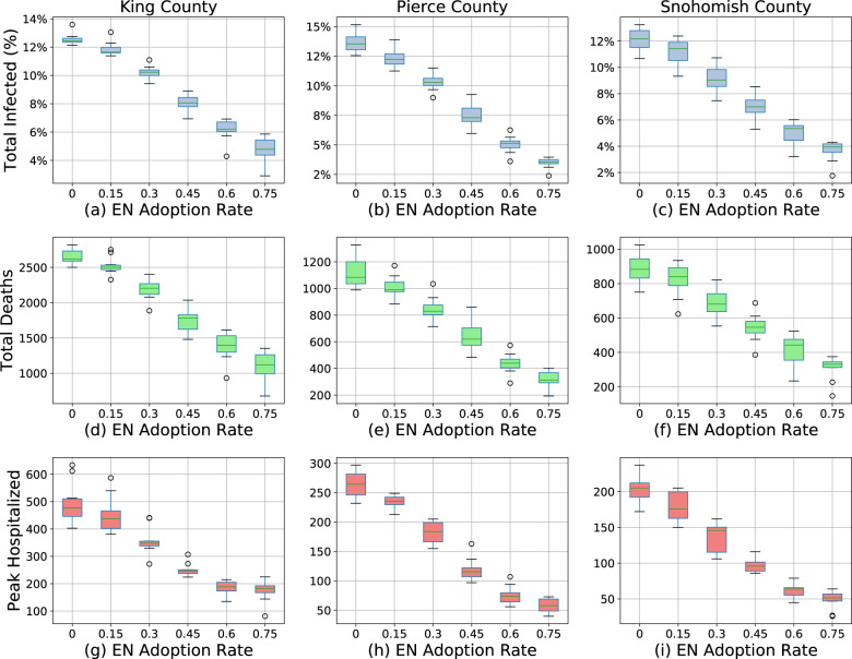
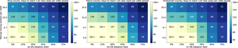
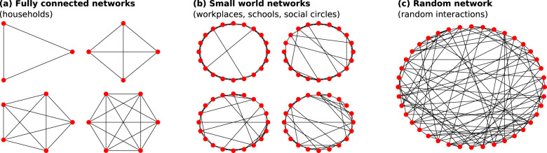
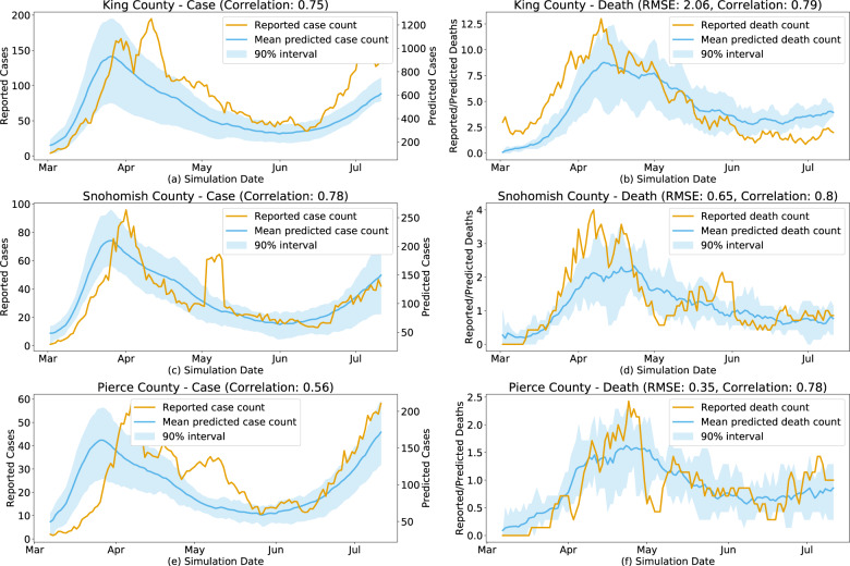
Contact tracing is increasingly used to combat COVID-19, and digital implementations are now being deployed, many based on Apple and Google's Exposure Notification System. These systems utilize non-traditional smartphone-based technology, presenting challenges in understanding possible outcomes. In this work, we create individual-based models of three Washington state counties to explore how digital exposure notifications combined with other non-pharmaceutical interventions influence COVID-19 disease spread under various adoption, compliance, and mobility scenarios. In a model with 15% participation, we found that exposure notification could reduce infections and deaths by approximately 8% and 6% and could effectively complement traditional contact tracing. We believe this can provide health authorities in Washington state and beyond with guidance on how exposure notification can complement traditional interventions to suppress the spread of COVID-19.


Conflict of interest statement

M.A., N.W., L.L., A.W., P.E., Y.S., M.R., M.D., Z.C., M.M., and S.O. are employees of Alphabet, Inc., a provider of the Exposure Notification System; no other relationships or activities that could appear to have influenced the submitted work. The remaining authors declare no competing interests.

Figures

Fig. 1
Fig. 1. Simulation time series.
Simulation results for various levels of exposure notification app uptake (among the total population) during 2020, with the app being implemented on July 11, 2020 in King County (af), Pierce County (gl), and Snohomish County (mr). The shaded areas represent one standard deviation. Plots (a, g, m) are the new infections on the given day, which consistently decrease with EN adoption, although the largest variances occur in the mid-range of adoption changes. Plots (b, h, n) are the total infected percentage, Plots (c, i, o) are the total deaths, Plots (d, j, p) are the total in hospital, all of which naturally vary by new infections given the natural progression through the compartmental model. Plots (e, k, q) are the total number of tests performed per day, which also varies by new infections as tests are only performed on symptoms, not on trace, so they correlate with the proportion of newly infected individuals who eventually show symptoms. Plots (f, l, r) are the percent of people in quarantine at that time step, which varies non-linearly with the infection rates due to increased quarantines from increased contact tracing but decreased quarantines with decreasing infection rates.
Fig. 2
Fig. 2. Peak metrics vs exposure notification adoption rates.
Estimated total infected percentage (a–c), total deaths (df), and peak in hospital (gi) (y-axes) of King (a, d, g), Pierce (b, e, h), and Snohomish (c, f, i) counties for various levels of exposure notification (EN) app uptake among the population (x-axis) between July 11, 2020 and December 25, 2020. The boxes represent the Q1 to Q3 quartile values with a line at the median. The whiskers show the range of the data (1.5 * (Q3–Q1)) and any outlier points are past the end of the whiskers.
Fig. 3
Fig. 3. Quarantine events vs exposure notification adoption.
Estimated total quarantine events of King (a), Pierce (b), and Snohomish (c) counties for various levels of exposure notification app uptake among the population from July 11, 2020 to December 25, 2020. Note that even for the “default” (0% exposure notification app uptake) scenario there is a non-zero number of quarantine events because this assumes that symptomatic and confirmed COVID-19 positive individuals will self-quarantine at a rate of 80%, even in the absence of an app.
Fig. 4
Fig. 4. Infections under manual contact tracing.
Estimated effect of manual contact tracing on new infections (ac) and total infected percentage (df) at various staffing levels per 100k people in King (a, d), Pierce (b, e), and Snohomish (c, f) counties between July 11, 2020 and December 25, 2020.
Fig. 5
Fig. 5. Combined effects of manual contact tracing and exposure notification system.
Comparison between manual contact tracing (CT) at the recommended staffing level and exposure notification (EN) at 30% adoption in King (a), Pierce (b), and Snohomish (c) counties. In all three counties, the combined effect is greater than individual contributions by either system.
Fig. 6
Fig. 6. Simulated reopenings under varied exposure notification adoption rates.
Estimated total infected percentage as of December 25, 2020 as a function of simultaneous network reopening and exposure notification app adoption rates, assuming fully staffed manual contact tracing (15 workers per 100,000 people), in King (a), Pierce (b), and Snohomish (c) counties. The infectious rate increases due to a 10–20% reopening are balanced by decreases due to a 22–37% exposure notification app adoption, although the effect varies by county.
Fig. 7
Fig. 7. Days to key metric under varied intervention levels.
Estimated number of days from July 11, 2020 for King, Pierce, and Snohomish counties to reach the Washington state goal of fewer than 25 new cases per 100,000 people over the trailing 14 days, as a function of manual tracing workforce capacity and exposure notification app adoption, given a renewed lockdown to the average level over the month before June 5th. Simulated results shown for King (a), Pierce (b), and Snohomish (c) counties show the ability of the interventions to suppress the epidemic by the primary reopening metric.
Fig. 8
Fig. 8. Example interaction networks.
Examples of fully connected (a), Watts–Strogatz small-world (b), and random (c) networks that define interactions among synthetic agents in households (a), workplaces, schools, social circles (b), and random (c) settings.
Fig. 9
Fig. 9. Calibrated simulation vs observed epidemic dynamics.
Daily reported and predicted COVID-19 deaths in King County, WA (Correlation: 0.75) (a), Pierce County, WA (Correlation: 0.78) (c), and Snohomish County, WA (Correlation: 0.56) (e) and daily reported and predicted COVID-19 cases for King County, WA (RMSE: 2.06, Correlation: 0.79) (b), Pierce County, WA (RMSE: 0.65, Correlation: 0.80) (d), and Snohomish County, WA (RMSE: 0.35, Correlation: 0.78) (f).

References

    1. Whitelaw S, Mamas MA, Topol E, Van Spall HGC. Applications of digital technology in COVID-19 pandemic planning and response. Lancet Digital Health. 2020;2:e435–e440. doi: 10.1016/S2589-7500(20)30142-4. - DOI - PMC - PubMed
    1. Boylston A. John Haygarth’s 18th-century ‘rules of prevention’ for eradicating smallpox. J. R. Soc. Med. 2014;107:494–499. doi: 10.1177/0141076814557198. - DOI - PMC - PubMed
    1. Gudbjartsson DF, et al. Spread of SARS-CoV-2 in the Icelandic Population. N. Engl. J. Med. 2020;382:2302–2315. doi: 10.1056/NEJMoa2006100. - DOI - PMC - PubMed
    1. Israel’s contact tracing system said to be vastly overwhelmed by virus spread. https://www.timesofisrael.com/contact-tracing-system-vastly-overwhelmed-... (2020).
    1. California’s Plan to Trace Travelers for Virus Faltered When Overwhelmed, Study Finds. https://www.nytimes.com/2020/05/11/health/contact-tracing-coronavirus.html (2020).

LinkOut - more resources