. 2021 Mar 4;2(3):100213.
doi: 10.1016/j.patter.2021.100213. eCollection 2021 Mar 12.

Appyters: Turning Jupyter Notebooks into data-driven web apps

Affiliations

Appyters: Turning Jupyter Notebooks into data-driven web apps

Daniel J B Clarke et al. Patterns (N Y). .

Abstract

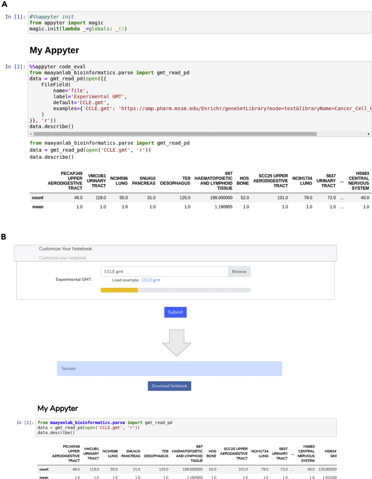
Jupyter Notebooks have transformed the communication of data analysis pipelines by facilitating a modular structure that brings together code, markdown text, and interactive visualizations. Here, we extended Jupyter Notebooks to broaden their accessibility with Appyters. Appyters turn Jupyter Notebooks into fully functional standalone web-based bioinformatics applications. Appyters present to users an entry form enabling them to upload their data and set various parameters for a multitude of data analysis workflows. Once the form is filled, the Appyter executes the corresponding notebook in the cloud, producing the output without requiring the user to interact directly with the code. Appyters were used to create many bioinformatics web-based reusable workflows, including applications to build customized machine learning pipelines, analyze omics data, and produce publishable figures. These Appyters are served in the Appyters Catalog at https://appyters.maayanlab.cloud. In summary, Appyters enable the rapid development of interactive web-based bioinformatics applications.

Keywords: RNA-seq; TCGA; big data; data analysis; data visualization; gene set enrichment analysis; machine learning; notebooks; scRNA-seq; workflow.


Conflict of interest statement

The authors declare no competing interests.

Figures

Figure 1
Figure 1
Appyters are created from a meta-Jupyter Notebook report that contains magics Once compiled, these meta-reports are converted into web-based applications that can accept user input. Once the users upload their data, and enter their parameters in a form, the notebook is automatically executed in the cloud and produces a permanent report.
Figure 2
Figure 2
Example components when developing Appyters (A) The Appyter library provides functions to initialize Appyter-related jinja2-style template functionality using a standard Jupyter Notebook session, allowing creation and testing with default field inputs. (B) The Appyter can be served, tested, and updated in real time using the Appyter command line interface.
Figure 3
Figure 3
Screenshot from the Appyters Catalog with the Enrichr filter applied Each Appyter is presented as a box with tags and links. A search engine and pre-defined buttons can be used to find and filter Appyters.
Figure 4
Figure 4
The various components constituting the Appyters Catalog system Once a user selects an Appyter to execute from the catalog, the job is counted and then enters a queue. The Appyter orchestrator then executes Appyters with Appyter data from S3. L7 LB, layer 7 load balancing.
Figure 5
Figure 5
Overlap among the top-ranked 500 differentially expressed genes computed for data downloaded from the GEO study GSE70466 The differentially expressed genes are determined using the Bulk RNA-Seq Analysis Appyter, and the visualization is achieved with a SuperVenn diagram implemented within the Set Comparison Appyter.
Figure 6
Figure 6
Three methods of visualization of gene set enrichment analysis results (A) Hexagonal grid visualization places all the terms from a gene set library near one another based on gene set content similarity. Top enriched terms are highlighted in blue. (B) Manhattan plot visualization of enrichment results for four gene set libraries from Enrichr. (C) Scatterplot visualization of enrichment results. Each point represents a gene set. The points are scattered based on their gene set similarity. Points highlighted in blue are enriched terms. For all analyses default settings and example files were used.

References

    1. Perkel J.M. Why Jupyter is data scientists' computational notebook of choice. Nature. 2018;563:145–147. - PubMed
    1. Torre D., Lachmann A., Ma'ayan A. BioJupies: automated generation of interactive notebooks for RNA-seq data analysis in the cloud. Cell Syst. 2018;7:556–561. - PMC - PubMed
    1. Feng D., Whitehurst C.E., Shan D., Hill J.D., Yue Y.G. Single Cell Explorer, collaboration-driven tools to leverage large-scale single cell RNA-seq data. BMC Genomics. 2019;20:676. - PMC - PubMed
    1. Nguyen H., Case D.A., Rose A.S. NGLview interactive molecular graphics for Jupyter notebooks. Bioinformatics. 2018;34:1241–1242. - PMC - PubMed
    1. Lau S., Hug J. nbinteract: generate interactive web pages from Jupyter notebooks. Master’s thesis (EECS Department, University of California, Berkeley) 2018

LinkOut - more resources