

This is a preprint.
Examining SARS-CoV-2 Interventions in Residential Colleges Using an Empirical Network
- PMID: 33758870
- PMCID: PMC7987029
- DOI: 10.1101/2021.03.09.21253198
Examining SARS-CoV-2 Interventions in Residential Colleges Using an Empirical Network
Update in
-
Examining SARS-CoV-2 Interventions in Residential Colleges Using an Empirical Network.Int J Infect Dis. 2021 Dec;113:325-330. doi: 10.1016/j.ijid.2021.10.008. Epub 2021 Oct 6. Int J Infect Dis. 2021. PMID: 34624516 Free PMC article.
Abstract
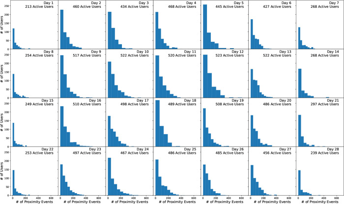
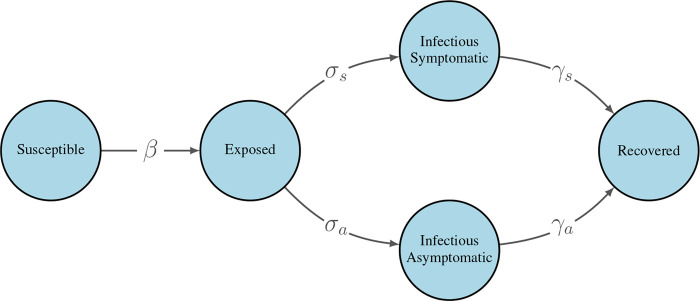
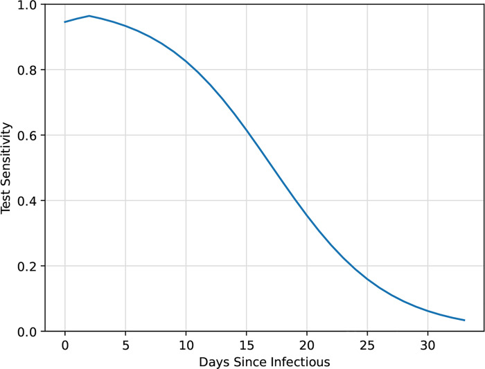
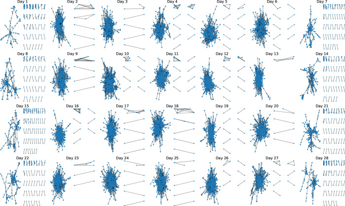
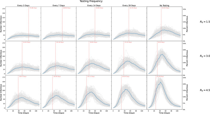
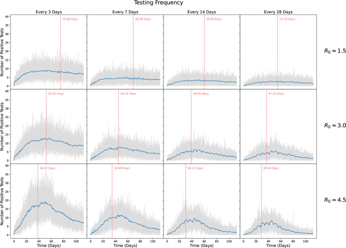
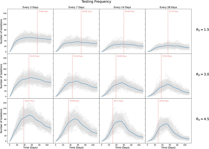
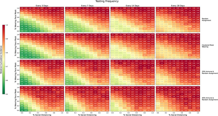
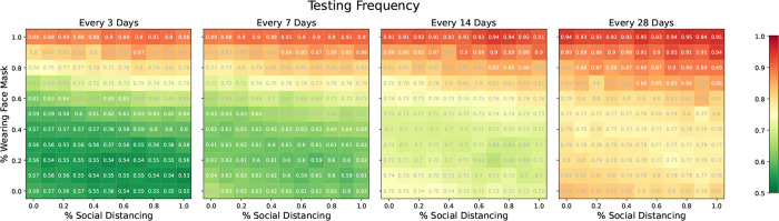
Universities have turned to SARS-CoV-2 models to examine campus reopening strategies1-9. While these studies have explored a variety of modeling techniques, all have relied on simulated data. Here, we use an empirical proximity network of college freshmen10, ascertained using smartphone Bluetooth, to simulate the spread of the virus. We investigate the role of testing, isolation, mask wearing, and social distancing in the presence of implementation challenges and imperfect compliance. Here we show that while frequent testing can drastically reduce spread if mask wearing and social distancing are not widely adopted, testing has limited impact if they are ubiquitous. Furthermore, even moderate levels of immunity can significantly reduce new infections, especially when combined with other interventions. Our findings suggest that while testing and isolation are powerful tools, they have limited benefit if other interventions are widely adopted. If universities can attain high levels of masking and social distancing, they may be able to relax testing frequency to once every two to four weeks.
Keywords: Bluetooth; COVID-19; Copenhagen Network Study; Proximity network; Repeat testing; SARS-CoV-2.
Conflict of interest statement
Competing interests: Authors declare that they have no competing interests.
Figures
Similar articles
-
Examining SARS-CoV-2 Interventions in Residential Colleges Using an Empirical Network.Int J Infect Dis. 2021 Dec;113:325-330. doi: 10.1016/j.ijid.2021.10.008. Epub 2021 Oct 6. Int J Infect Dis. 2021. PMID: 34624516 Free PMC article.
-
COVID-19 Testing and Case Rates and Social Contact Among Residential College Students in Connecticut During the 2020-2021 Academic Year.JAMA Netw Open. 2021 Dec 1;4(12):e2140602. doi: 10.1001/jamanetworkopen.2021.40602. JAMA Netw Open. 2021. PMID: 34940864 Free PMC article.
-
Implementation of a Pooled Surveillance Testing Program for Asymptomatic SARS-CoV-2 Infections on a College Campus - Duke University, Durham, North Carolina, August 2-October 11, 2020.MMWR Morb Mortal Wkly Rep. 2020 Nov 20;69(46):1743-1747. doi: 10.15585/mmwr.mm6946e1. MMWR Morb Mortal Wkly Rep. 2020. PMID: 33211678 Free PMC article.
-
Physical interventions to interrupt or reduce the spread of respiratory viruses.Cochrane Database Syst Rev. 2020 Nov 20;11(11):CD006207. doi: 10.1002/14651858.CD006207.pub5. Cochrane Database Syst Rev. 2020. Update in: Cochrane Database Syst Rev. 2023 Jan 30;1:CD006207. doi: 10.1002/14651858.CD006207.pub6. PMID: 33215698 Free PMC article. Updated.
-
[What is the effect of social distancing on the course of COVID-19 epidemic?].Pol Merkur Lekarski. 2021 Feb 24;49(289):71-79. Pol Merkur Lekarski. 2021. PMID: 33713099 Review. Polish.
References
-
- Ghaffarzadegan N., Childs L. M. & TÄuber U. C. Diverse computer simulation models provide unified lessons on university operation during a pandemic. BioScience (2020).
-
- Christensen H. et al. Covid-19 transmission in a university setting: a rapid review of modelling studies. medRxiv (2020).
-
- Lopman B. et al. A model of covid-19 transmission and control on university campuses. medRxiv (2020).
Publication types
Grants and funding
LinkOut - more resources
Full Text Sources
Other Literature Sources
Miscellaneous