[Preprint]. 2021 May 25:2021.03.11.21253348.
doi: 10.1101/2021.03.11.21253348.

The role of connectivity on COVID-19 preventive approaches

Affiliations

The role of connectivity on COVID-19 preventive approaches

V Miró Pina et al. medRxiv. .

Update in

  • The role of connectivity on COVID-19 preventive approaches.
    Miró Pina V, Nava-Trejo J, Tóbiás A, Nzabarushimana E, González-Casanova A, González-Casanova I. Miró Pina V, et al. PLoS One. 2022 Sep 1;17(9):e0273906. doi: 10.1371/journal.pone.0273906. eCollection 2022. PLoS One. 2022. PMID: 36048855 Free PMC article.

Abstract

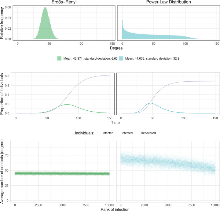
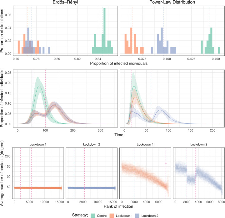
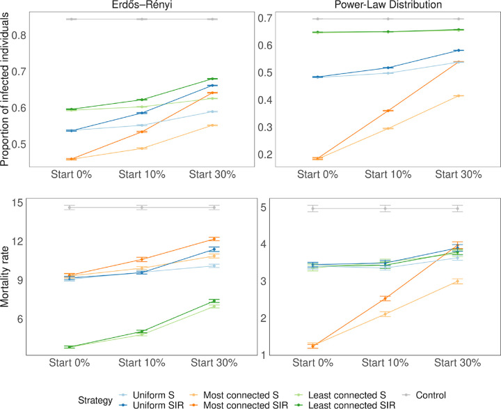
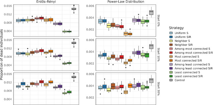
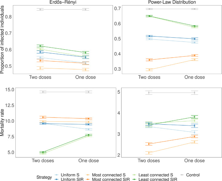
Preventive and modelling approaches to address the COVID-19 pandemic have been primarily based on the age or occupation, and often disregard the importance of heterogeneity in population contact structure and individual connectivity. To address this gap, we developed models based on Erdős-Rényi and a power law degree distribution that first incorporate the role of heterogeneity and connectivity and then can be expanded to make assumptions about demographic characteristics. Results demonstrate that variations in the number of connections of individuals within a population modify the impact of public health interventions such as lockdown or vaccination approaches. We conclude that the most effective strategy will vary depending on the underlying contact structure of individuals within a population and on timing of the interventions.


Conflict of interest statement

Conflict of interest statement Authors declare no competing interests.

Figures

Fig 1.
Fig 1.
Two different ways of modelling social interactions. Top panels represent the distribution of the number of risky interactions in the ER and the PL graphs with 20000 individuals. Panels in the middle show a realization of the SIR process for each of the models. Bottom panels show the number of risky interactions individuals have, as a function of the order in which they are infected (dots show the average over 30 simulations).
Fig 2.
Fig 2.
Effect of the different lockdown strategies. The lockdown starts when 10% of the population is infected and lasts for 45 days. Top panels represent the proportion of infected individuals at the end of the infection in 30 different simulations. The panels in the middle represent the number of infected people as a function of time. Error bars indicate standard deviation (computed from 30 repeats). Vertical bars indicate the start and the end of the lockdown. In the bottom panels, we show the average degree of the infected individuals as a function of their rank of infection for the two lockdown strategies. The controls are shown in Fig 1.
Fig 3.
Fig 3.
Proportion of infected and dead individuals for three vaccination strategies. The plot shows the proportion of infected at the end of the infection for 30 repetitions. The number of doses of the vaccine represents 25% of the population size (N = 20000). Error bars represent standard deviation. Different starting times are shown in the different panels (when 0, 10 and 30% of the individuals have been infected). On the top right panel, when vaccinating the most connected, the epidemic always died out quickly, before infecting at least 50 individuals, which is the minimum required to be considered a successful simulation (see Methods).
Fig 4.
Fig 4.
Effect of the vaccination strategy on the rank of infection. The dots represent averages over 30 simulations. The number of doses of the vaccine represents 25% of the population size (N= 20000). In these simulations we vaccinate individuals regardless of their status (S, I, R). Vertical bars indicate the time when the intervention is made.
Fig 5.
Fig 5.
Proportion of deaths, for an effectiveness of 90% and for different values of tV (top panels vaccination starts at 10% and bottom panels at 30%) The horizontal lines in the middle of the boxes show the mean values among all simulations, the upper and lower edges of the boxes are the quantiles q0.25and q0.75 corresponding to 75% respectively 25%. The vertical lines reach until q0.25–1.5*(q0.75-q0.25) downwards and until q0.75+1.5*(q0.75-q0.25). The points represent outliers (i.e., simulations whose results are atypical).
Fig 6.
Fig 6.
Dose sparing. Two doses: 25% of the population receives two doses of the vaccine (effectiveness 90%). One dose: 50% of the population receives a single dose of the vaccine (effectiveness 50%). Error bars represent standard deviation. The time of the vaccination tV is when the cumulative number of infected individuals reaches 10%.

Similar articles

References

    1. Dong E, Du H, and Gardner L. An interactive web-based dashboard to track COVID-19 in real time. Lancet Infect Dis. 2020; 20(5): 533–534. - PMC - PubMed
    1. COVID-19 Data Repository by the Center for Systems Science and Engineering (CSSE) at Johns Hopkins University. 2021. Feb 2 [Cited 2021 Apr 12].
    1. Alwan NA, et al. Scientific consensus on the COVID-19 pandemic: we need to act now. The Lancet. 2020; 396(10260): p. e71–e72. - PMC - PubMed
    1. Britton T, Ball F, and Trapman P. A mathematical model reveals the influence of population heterogeneity on herd immunity to SARS-CoV-2. Science. 2020; 369(6505): 846–849. - PMC - PubMed
    1. Persad G. Peek ME, and Emanuel EJ. Fairly Prioritizing Groups for Access to COVID-19 Vaccines. JAMA, 2020; 324(16): 1601–1602. - PubMed

Publication types

LinkOut - more resources