Geographic Variation in Cardiovascular Health Among American Adults
- PMID: 33775420
- PMCID: PMC8260439
- DOI: 10.1016/j.mayocp.2020.12.034
Geographic Variation in Cardiovascular Health Among American Adults
Abstract
Objective: To evaluate the contemporary geographic trends in cardiovascular health in the United States and its relationship with geographic distribution of cardiovascular mortality.
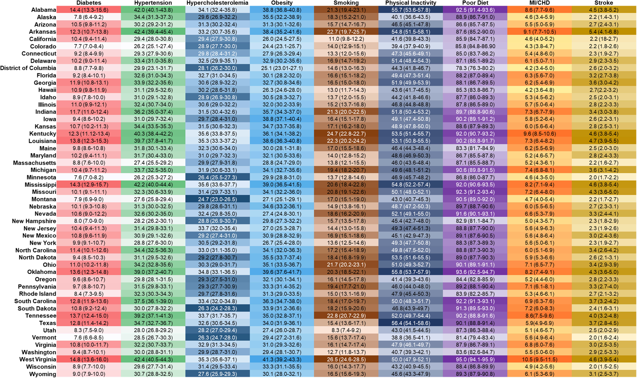
Methods: By use of a retrospective cross-sectional design, the 2011-2017 Behavioral Risk Factor Surveillance System (BRFSS) was queried to determine the age-adjusted prevalence of cardiovascular health index (CVHI) metrics (sum of ideal blood pressure, blood glucose concentration, lipid levels, body mass index, smoking, physical activity, and diet). Cardiovascular health was estimated as both continuous (0 to 7 points) and categorical (ideal, intermediate, poor) variables from the BRFSS. Age-adjusted cardiovascular mortality for 2017 was obtained from the Centers for Disease Control and Prevention WONDER database.
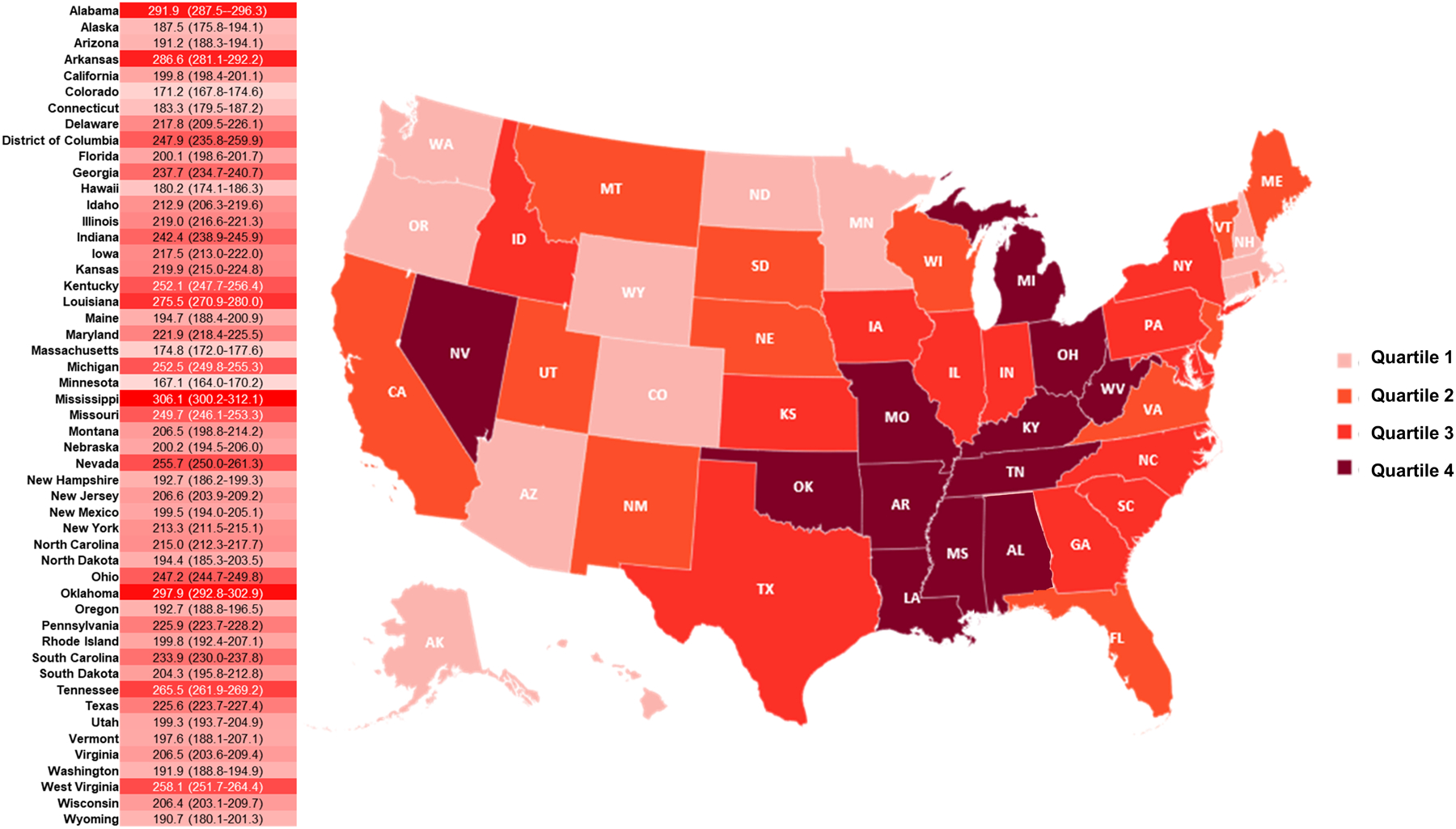
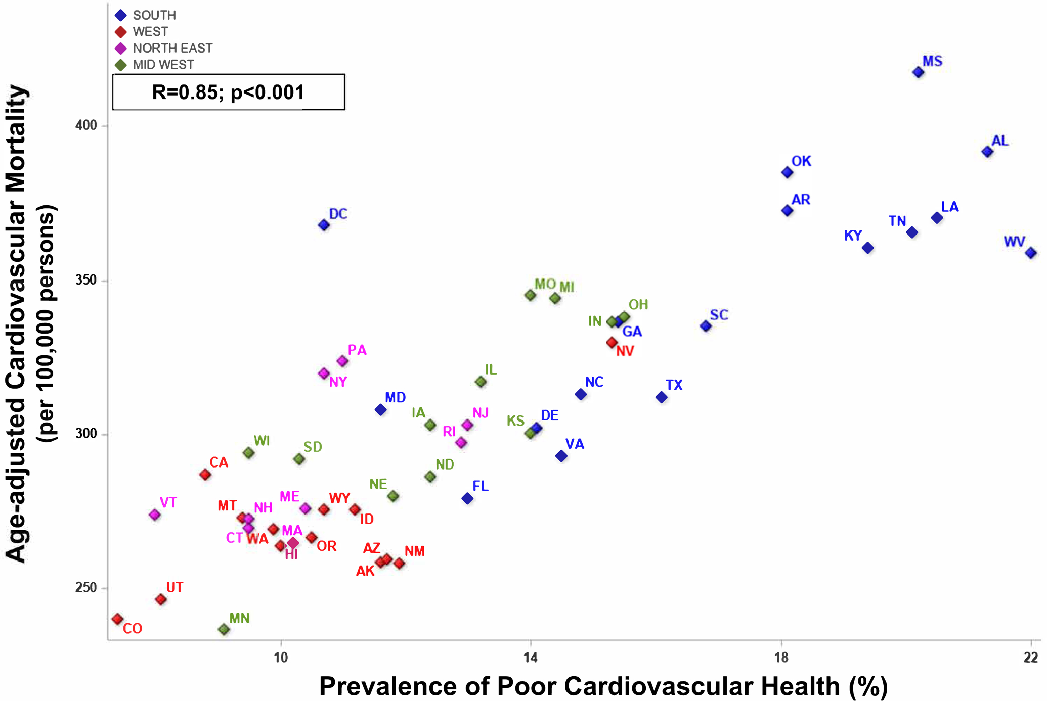
Results: Among 1,362,529 American adult participants of the BRFSS 2011-2017 and all American residents in 2017, the CVHI score increased from 3.89±0.004 in 2011 to 3.96±0.005 in 2017 (Ptrend<.001) nationally, with modest improvement across all regions (Ptrend<.05 for all). Ideal cardiovascular health prevalence improved in the northeastern (Ptrend=.03) and southern regions (Ptrend=.002). In 2017, the prevalence of coronary heart disease (6.8%; 95% CI, 6.5% to 7.1%) and stroke (3.7%; 95% CI, 3.4% to 3.9%) was highest in the southern region. The CVHI score (3.81±0.01) and the prevalence of ideal cardiovascular health (12.2%; 95% CI, 11.7% to 12.7%) were lowest in the southern United States. This corresponded to the higher cardiovascular mortality in the southern region (233.0 [95% CI, 232.2- to 33.8] per 100,000 persons).
Conclusion: Despite a modest improvement in CVHI, only 1 in 6 Americans has ideal cardiovascular health with significant geographic differences. These differences correlate with the geographic distribution of cardiovascular mortality. An urgent unmet need exists to mitigate the geographic disparities in cardiovascular morbidity and mortality.
Copyright © 2021 Mayo Foundation for Medical Education and Research. Published by Elsevier Inc. All rights reserved.
Conflict of interest statement
Figures
Similar articles
-
Changes in Cardiovascular Health in the United States, 2003-2011.J Am Heart Assoc. 2015 Sep 22;4(9):e001650. doi: 10.1161/JAHA.114.001650. J Am Heart Assoc. 2015. PMID: 26396200 Free PMC article.
-
Racial, Ethnic, and Geographic Disparities in Cardiovascular Health Among Women of Childbearing Age in the United States.J Am Heart Assoc. 2021 Sep 7;10(17):e020138. doi: 10.1161/JAHA.120.020138. Epub 2021 Aug 25. J Am Heart Assoc. 2021. PMID: 34431309 Free PMC article.
-
Trends in Racial/Ethnic Disparities in Cardiovascular Health Among US Adults From 1999-2012.J Am Heart Assoc. 2017 Sep 22;6(9):e006027. doi: 10.1161/JAHA.117.006027. J Am Heart Assoc. 2017. PMID: 28939713 Free PMC article.
-
Prevalence of the cardiovascular health status in adults: A systematic review and meta-analysis.Nutr Metab Cardiovasc Dis. 2018 Dec;28(12):1197-1207. doi: 10.1016/j.numecd.2018.08.002. Epub 2018 Aug 20. Nutr Metab Cardiovasc Dis. 2018. PMID: 30360955
-
Further understanding of ideal cardiovascular health score metrics and cardiovascular disease.Expert Rev Cardiovasc Ther. 2021 Jul;19(7):607-617. doi: 10.1080/14779072.2021.1937127. Epub 2021 Jun 15. Expert Rev Cardiovasc Ther. 2021. PMID: 34053373 Free PMC article. Review.
Cited by
-
Medical financial hardship in the Southern United States: the struggle continues across generations pre- and post- the Affordable Care Act.Res Health Serv Reg. 2024 Sep 4;3(1):13. doi: 10.1007/s43999-024-00049-7. Res Health Serv Reg. 2024. PMID: 39227529 Free PMC article.
-
Individual and regional differences in the effects of school racial segregation on Black students' health.SSM Popul Health. 2024 May 20;26:101681. doi: 10.1016/j.ssmph.2024.101681. eCollection 2024 Jun. SSM Popul Health. 2024. PMID: 38840850 Free PMC article.
-
Unveiling Disparities in Heart Failure and Cirrhosis Related Mortality: CDC WONDER 1999 to 2020.Dig Dis Sci. 2025 Jun;70(6):2128-2137. doi: 10.1007/s10620-025-08970-8. Epub 2025 Apr 10. Dig Dis Sci. 2025. PMID: 40208496 Free PMC article.
-
Racial and ethnic disparities in longitudinal trajectories of cardiovascular risk factors in U.S. middle-aged and older adults.PLoS One. 2025 Feb 7;20(2):e0318419. doi: 10.1371/journal.pone.0318419. eCollection 2025. PLoS One. 2025. PMID: 39919034 Free PMC article.
-
Association of Neighborhood Social Determinants of Health with Acute Kidney Injury during Hospitalization.Clin J Am Soc Nephrol. 2024 Nov 1;19(11):1371-1381. doi: 10.2215/CJN.0000000000000528. Epub 2024 Sep 11. Clin J Am Soc Nephrol. 2024. PMID: 39259609
References
-
- Lanska DJ, Kuller LH. The geography of stroke mortality in the United States and the concept of a stroke belt. Stroke. 1995;26:1145–1149. - PubMed
-
- Casper ML, Wing S, Anda RF, Knowles M, Pollard RA. The shifting stroke belt. Changes in the geographic pattern of stroke mortality in the United States, 1962 to 1988. Stroke. 1995;26:755–760. - PubMed
Publication types
MeSH terms
Substances
Grants and funding
LinkOut - more resources
Full Text Sources
Other Literature Sources
Medical