. 2021;36(2):150-201.
doi: 10.1080/07370024.2019.1578652. Epub 2019 Mar 13.

Screenomics: A Framework to Capture and Analyze Personal Life Experiences and the Ways that Technology Shapes Them

Affiliations

Screenomics: A Framework to Capture and Analyze Personal Life Experiences and the Ways that Technology Shapes Them

Byron Reeves et al. Hum Comput Interact. 2021.

Abstract

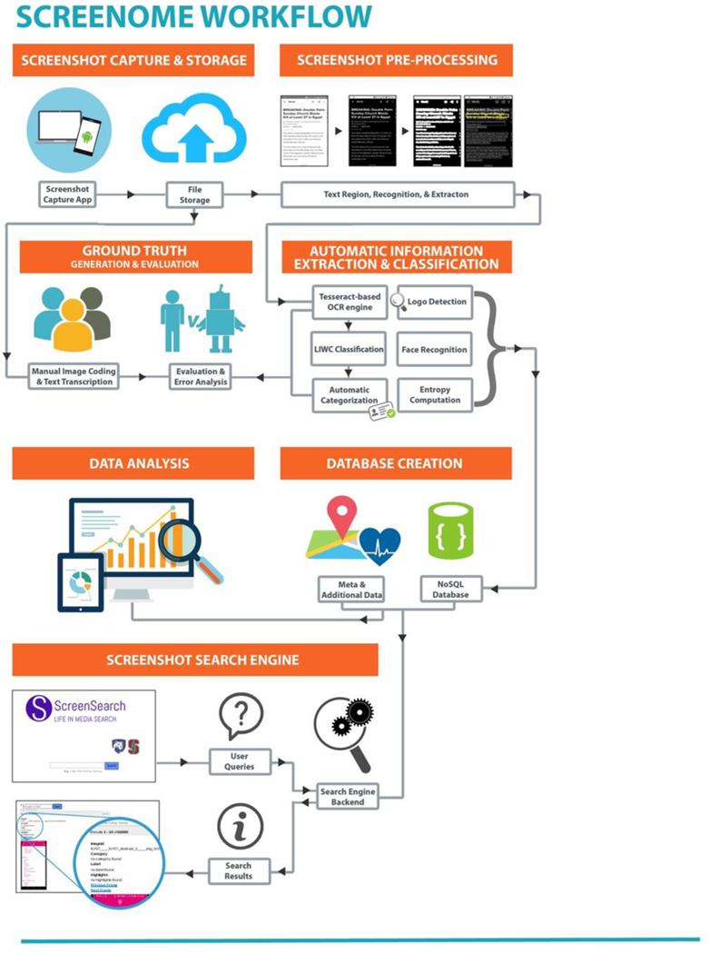
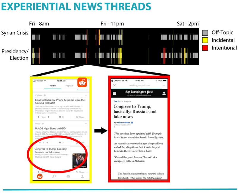
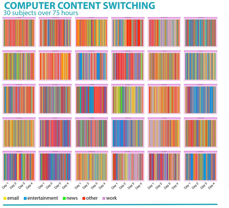
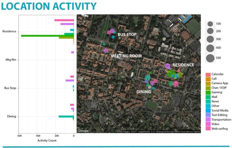
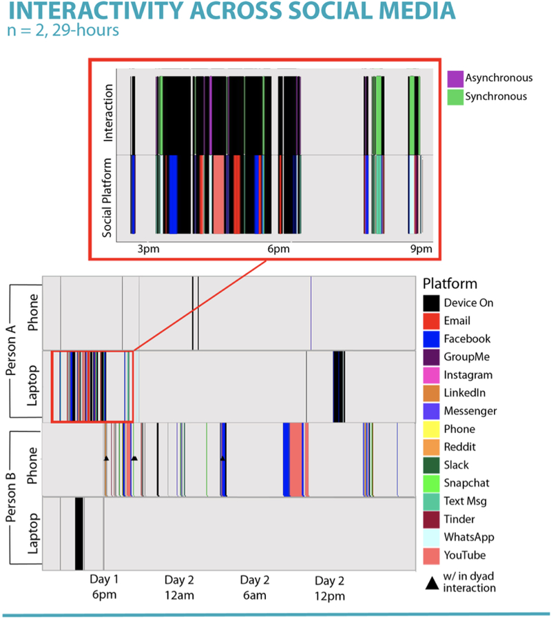
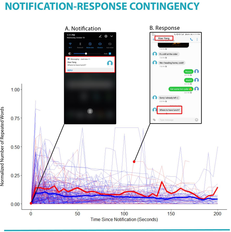
Digital experiences capture an increasingly large part of life, making them a preferred, if not required, method to describe and theorize about human behavior. Digital media also shape behavior by enabling people to switch between different content easily, and create unique threads of experiences that pass quickly through numerous information categories. Current methods of recording digital experiences provide only partial reconstructions of digital lives that weave - often within seconds - among multiple applications, locations, functions and media. We describe an end-to-end system for capturing and analyzing the "screenome" of life in media, i.e., the record of individual experiences represented as a sequence of screens that people view and interact with over time. The system includes software that collects screenshots, extracts text and images, and allows searching of a screenshot database. We discuss how the system can be used to elaborate current theories about psychological processing of technology, and suggest new theoretical questions that are enabled by multiple time scale analyses. Capabilities of the system are highlighted with eight research examples that analyze screens from adults who have generated data within the system. We end with a discussion of future uses, limitations, theory and privacy.

Keywords: Mobile; cognitive science; communication; internet use; personal tools; software development; visualization.


Figures

Figure 1.
Figure 1.
Diagram illustrating screenome workflow.
Figure 2.
Figure 2.
Top left panel. Survival analysis for each participant in the study. Each curve represents an individual’s likelihood of switching screens at a given point in time. Individual differences in survival rates (i.e., rate of switching behaviors) were found. Top right panel. Survival analysis for each of 17 screen segment categories in the study, aggregated across the sample. Each curve represents the sample’s likelihood of switching screens given a particular screen category at each time point. Differences in survival rates (i.e., rate of switching behaviors) were found. Bottom panels. Survival analysis for each of 17 screen segment categories in the study for two individuals. Individual differences between switching behaviors given a certain screen category can be seen.
Figure 3.
Figure 3.
Visualization of within- and between- device switches by category for one person for one day.
Figure 4.
Figure 4.
Transitions between and within devices for one person over the course for one day.
Figure 5.
Figure 5.
This 36-hour screenome shows how incidental exposure to political information can lead to intentional information-seeking. For instance, the magnified screenshots show that a headline on Reddit inspires click-through to a traditional news source.
Figure 6.
Figure 6.
Intraindividual variation in laptop screenshot content categories over the course of four days for 30 people. Each panel of vertical colored lines represents a unique person and each vertical line represents time spent in five different categories of content. Both within-person and between-person differences are evident across panels.
Figure 7.
Figure 7.
Barplot and map of a person’s screen activity for one day within one city. Locations visited include (from top to bottom of barplot): residence, meeting room, bus stop, and dining establishment.
Figure 8.
Figure 8.
Panels depicts two individuals’ social media use during a 29-hour period on both laptops and smartphones. Each color represents a different interpersonal media platform, with black indicating device use that was not on a social media platform, and gray indicating that the device was off. Zoomed panel shows detail of asynchronous and synchronous communication during a specific 3-hour period.
Figure 9.
Figure 9.
The graph shows how the content of specific notification stimuli manifested in the screenshots following that notification. Red lines indicate notifications characterized as social cues, and blue lines indicate notifications with non-social cues. Bold lines provide the response profile for each type of cue, as averaged across all notifications in the two cue types. Inserts highlight a specific notification cue, and the moment, 115 s later, that the content of the cue returned (i.e., the response).

Similar articles

Cited by

References

    1. Acquisti A, Brandimarte L, & Loewenstein G (2015). Privacy and human behavior in the age of information. Science, 347(6221), 509–514. - PubMed
    1. Agichtein E, Castillo C, Donato D, Gionis A, & Mishne G (2008, February). Finding high-quality content in social media. In Proceedings of the 2008 international conference on web search and data mining (183–194). ACM.
    1. Aharony N, Pan W, Ip C, Khayal I, & Pentland A (2011). Social fMRI: Investigating and shaping social mechanisms in the real world. Pervasive and Mobile Computing, 7(6), 643–659.
    1. Allcott H, & Gentzkow M (2017). Social media and fake news in the 2016 election. Journal of Economic Perspectives, 31(2), 211–36.
    1. Anderson C (2008). The end of theory: The data deluge makes the scientific method obsolete. Wired Magazine, 16(7), 16–07.

LinkOut - more resources