. 2021 Apr;1(4):400-412.
doi: 10.1038/s43587-021-00051-5. Epub 2021 Apr 8.

Common genetic associations between age-related diseases

Affiliations

Common genetic associations between age-related diseases

Handan Melike Dönertaş et al. Nat Aging. 2021 Apr.

Abstract

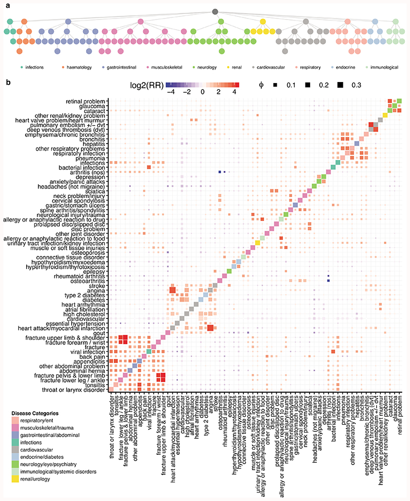
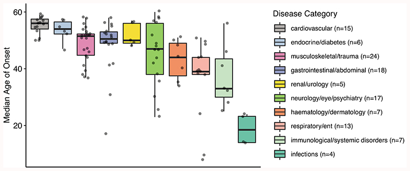
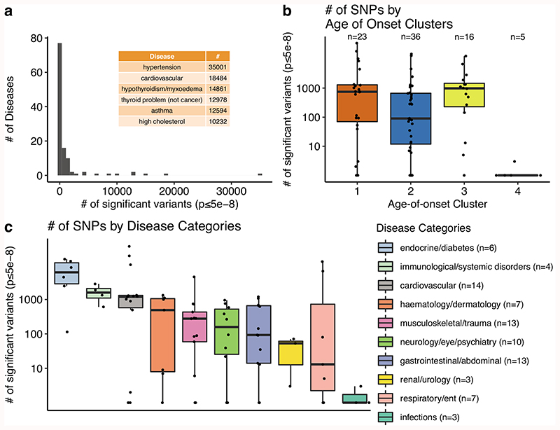
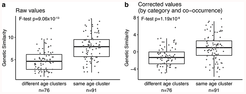
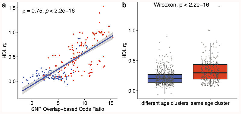
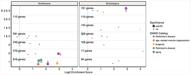
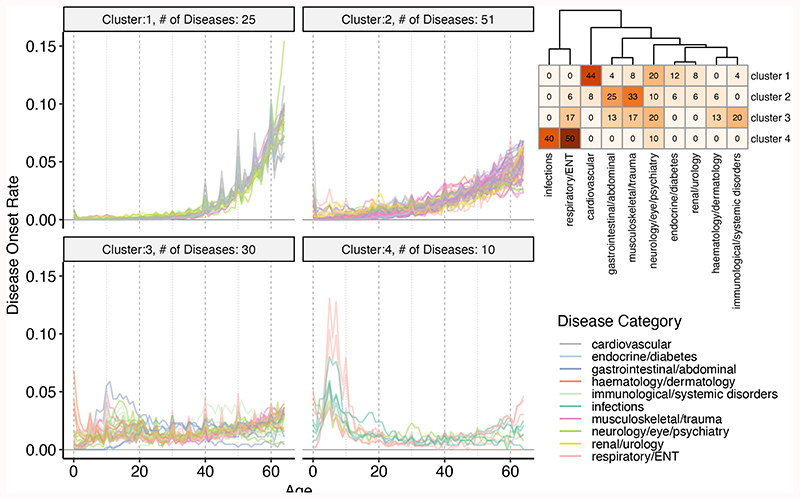
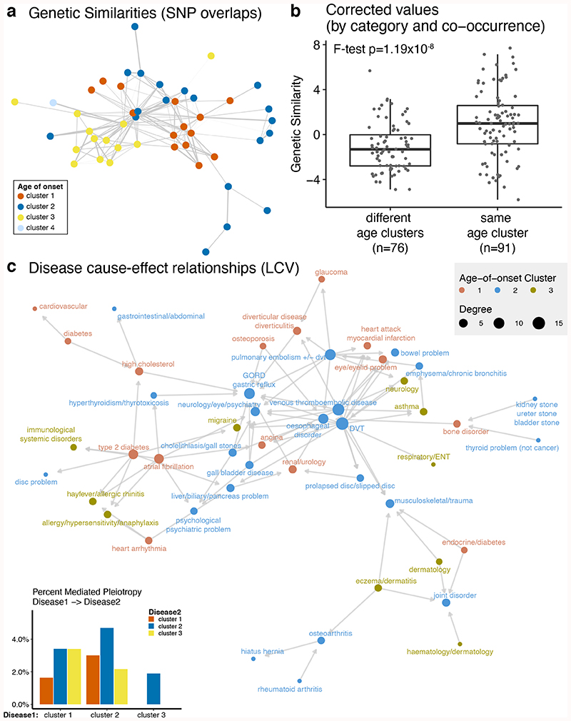
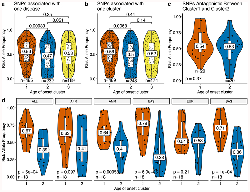
Age is a common risk factor in many diseases, but the molecular basis for this relationship is elusive. In this study we identified 4 disease clusters from 116 diseases in the UK Biobank data, defined by their age-of-onset profiles, and found that diseases with the same onset profile are genetically more similar, suggesting a common etiology. This similarity was not explained by disease categories, co-occurrences or disease cause-effect relationships. Two of the four disease clusters had an increased risk of occurrence from age 20 and 40 years respectively. They both showed an association with known aging-related genes, yet differed in functional enrichment and evolutionary profiles. Moreover, they both had age-related expression and methylation changes. We also tested mutation accumulation and antagonistic pleiotropy theories of aging and found support for both.

Keywords: Aging; GWAS; UK Biobank; age-related disease; antagonistic pleiotropy; mutation accumulation.


Conflict of interest statement

Competing interests The authors declare that they have no competing interests.

Figures

Extended Data Fig. 1
Extended Data Fig. 1. Disease categories and co-occurrences.
a) Disease hierarchy for the 116 diseases included in the analysis. The nodes are colored by the disease categories as indicated in the legend. b) Disease co-occurrence matrix summarizing relative risk scores and correlations. Each row and column denote diseases, ordered by hierarchical clustering of risk scores. The color is defined by relative risk scores while the size is determined by ϕ value, indicating the robustness of the association (see Methods). The diagonal tiles are colored by the UK Biobank’s disease hierarchy to visualize if diseases from the same category cluster together. Associations for the 62 diseases that have at least one relative risk ratio higher than four (log2RR ≥ 2) or lower than minus four (log2RR ≤ -2) are plotted.
Extended Data Fig. 2
Extended Data Fig. 2. Distribution of median age-of-onset across disease categories.
Points show diseases grouped by categories (individual boxplots). Categories are ordered by the median value of the median age-of-onset. The boxplots show the first and third quartiles, the median (dark line), and the whiskers extend from the quartiles to the last point in 1.5xIQR distance to the quartiles.
Extended Data Fig. 3
Extended Data Fig. 3. The number of significant variants across diseases, age-of-onset clusters, and disease categories.
a) Number of diseases for different number of significant variants (pBOLT-LMM≤5e-8). Diseases with the highest number of associations (N≥10,000) are given as an inset table. b) Comparison of the number of significant associations (y-axis, on a log scale) across age-of-onset clusters (x-axis) (ANOVA after excluding cluster 4, p = 0.06). Since the y-axis is on a log scale, diseases with zero significant associations are not shown on the graph. c) The same as b) but for disease categories. Categories are ordered by the median number of significant SNPs. The boxplots (b-c) show the first and third quartiles, the median (dark line), and the whiskers extend from the quartiles to the last point in 1.5xIQR distance to the quartiles.
Extended Data Fig. 4
Extended Data Fig. 4. The raw and corrected values of genetic similarities within and across age-of-onset clusters.
a) The difference between genetic similarity within and across age-of-onset clusters, calculated between 47 diseases. Y-axis shows the genetic similarity (see Methods). b) The same as a) but the y-axis is corrected for disease category and co-occurrence using a linear model. This panel is the same as Figure 2b and given here only for easier comparison. The boxplots show the first and third quartiles, the median (dark line), and the whiskers extend from the quartiles to the last point in 1.5xIQR distance to the quartiles. P-values are calculated using F-test on a linear model between genetic similarity scores and different/same age of onset clusters for panel a and including different/same disease category and disease co-occurrence (risk ratio) as covariates in panel b.
Extended Data Fig. 5
Extended Data Fig. 5. Genetic similarities calculated using the high-definition likelihood (HDL) inference method.
a) The correlation between the genetic similarity scores calculated using the SNP overlap-based odds ratio (x-axis) and HDL (y-axis). Blue points show the similarities calculated between diseases in different age of onset clusters and red points show the similarities calculated between diseases in the same age of onset cluster. The correlation coefficient and p-value are calculated using a twosided Spearman correlation test. The linear regression line (blue) and 95% confidence interval (gray shaded area) are shown. b) The difference between genetic similarity within and across age-of-onset clusters, calculated between 59 diseases. Y-axis shows the genetic similarity calculated using HDL. The difference between different and same age clusters is tested using a two-sided Wilcoxon test. The boxplots show the first and third quartiles, the median (dark line), and the whiskers extend from the quartiles to the last point in 1.5xIQR distance to the quartiles.
Extended Data Fig. 6
Extended Data Fig. 6. The overlap between genes associated with selected aging-related traits and genes associated with diseases in different clusters.
The x-axis shows the log2 enrichment score, and the y-axis shows the age-of-onset clusters. The numbers of genes in each cluster (for both multidisease and multicategory genes) are given. The size of the points shows the statistical significance based on a onesided permutation test (large points show nominal p-value≤0.05, small ‘x’ indicates non-significant overlaps – none of the associations are significant after multiple testing correction), and the color shows different aging-related GWAS Catalog traits. The colored numbers near the points show the numbers of overlapping genes.
Extended Data Fig. 7
Extended Data Fig. 7. Drug-target gene interaction network for the drugs specifically targeting multicategory genes in agedependent clusters.
‘Drug-target gene’ interaction network for the drugs that specifically target multicategory cluster 1, cluster 2, or cluster ‘1 & 2’ genes as determined by Fisher’s exact test. Blue diamonds show the drugs with a significant association or targeting only one gene in these gene groups. Diamonds without written names are only represented with the ChEMBL IDs in the datasets and did not have names. Drug labels written in bold are drugs approved for different conditions. Circles represent the genes targeted by the significant hits, colored by their age-of-onset cluster. Gray circles show the genes targeted by these drugs but are not among the gene set of interest.
Figure 1
Figure 1
Age-of-onset profiles clustered by the PAM algorithm, using dissimilarities calculated with temporal correlation measure (CORT). The y-axis shows the number of individuals who were diagnosed with the disease at a certain age, divided by the total number of people having that disease. Values were calculated by taking the median value of 100 permutations of 10,000 people in the UKBB (see Methods). The x-axis shows the age-of-onset in years. Each line denotes one disease and is colored by disease categories. The heatmap in the right upper corner shows the percent overlap between categories and clusters. Numbers give the percentage of an age-of-onset cluster belonging to each category. Supplementary Fig. 8-17 shows the distributions for each disease separately.
Figure 2
Figure 2. Genetic similarities and mediated pleiotropy across diseases.
(a) Network representation of the genetic similarities calculated by the overlaps between significantly associated SNPs between diseases. Nodes (n=47) show diseases with a significant genetic similarity to at least one disease and are colored by the age-of-onset cluster. Edges (n=167) show the genetic similarity corrected by disease categories and co-occurrences. (b) The difference between genetic similarity within and across the age-of-onset clusters. The y-axis shows genetic similarity corrected by category and co-occurrence (raw values are available in Extended Data Fig. 4). The x-axis groups similarities into different or same age-of-onset clusters. The boxplots show the first and third quartiles, the median (dark line) and the whiskers extend from the quartiles to the last point in 1.5xIQR distance to the quartiles. The p-value is calculated using F-test on a linear model between genetic similarity scores and different/same age of onset clusters, including different/same disease category and disease co-occurrence (risk ratio) as covariates. (c) Network representation of the causal relationships between diseases calculated using LCV. Each node (n=48) shows a disease, colored by the age-of-onset cluster. Size of the nodes represent the number of significant causal relationships between diseases, including both in and out degrees. Arrows show the causal relationship between pairs with FDR corrected pLCV≤0.01 and GCP>0.6. The inset bar plot shows the percent significant causal relationships among all possible pairs (y-axis) between disease 1 (x-axis) and disease 2 (bars colored by the age-of-onset).
Figure 3
Figure 3. Enrichment of disease-associated genes in known longevity modulators and gene ontology categories.
a) Overlap between known aging-related genes in databases and genes associated with diseases in different clusters. The x-axis shows log2 enrichment score, and the y-axis shows the age-of-onset clusters. The numbers of genes in each cluster (for both Multidisease and Multicategory genes) are given. The size of the points shows the statistical significance based on a one-sided permutation test (large points show nominal p- value≤0.05, and those annotated with a black ‘*’ have FDR corrected p-value≤0.1. Overlaps shown with small ‘x’ indicate non-significant associations) and the color shows different databases. The colored numbers near the points show the numbers of overlapping genes. b- f) Gene Ontology (GO) Enrichment results for genes associated with diseases in b) Cluster 1, c) Cluster 2, d) Cluster 3, e) Cluster 2 & 3, f) Cluster ‘1 & 2’, g) Cluster ‘1 & 2 & 3’. Representative GO categories for significantly enriched categories (BY-adjusted p-value ≤ 0.05 of hypergeometric tests using Wallenius non-central hypergeometric distribution) are listed on the y-axis (see Methods). Log2 enrichment scores are given on the x-axis. The color of the bar shows the result for multidisease and multicategory genes. There was no significant enrichment for cluster 1 & 3.
Figure 4
Figure 4
Risk allele frequencies for diseases associated with different age-of-onset clusters. Risk allele frequency distributions (y-axis) for different age-of-onset clusters (x-axis) in the UKBB for a) SNPs associated with one disease (excluding antagonistic associations), b) SNPs specific to one cluster (excluding antagonistic associations) and c) SNPs that have antagonistic association with cluster 1 and 2 (excluding agonists between cluster 1 and 2). d) The same as panel c but for different 1000 Genomes super-populations (ALL: complete 1000 Genomes cohort, AFR: African, AMR: Ad Mixed American, EAS: East Asian, EUR: European, SAS: South Asian). The nominal p-values are shown for each comparison and are calculated using two-sided t-test. The boxplots show the first and third quartiles and the whiskers extend from the quartiles to the last point in 1.5xIQR distance to the quartiles. Median risk allele frequencies are also noted on the plots.

References

    1. López-Otín C, Blasco MA, Partridge L, Serrano M, Kroemer G. The hallmarks of aging. Cell. 2013;153:1194–1217. - PMC - PubMed
    1. Crimmins EM. Lifespan and Healthspan: Past, Present, and Promise. Gerontologist. 2015;55:901–911. - PMC - PubMed
    1. Partridge L, Deelen J, Slagboom PE. Facing up to the global challenges of ageing. Nature. 2018;561:45–56. - PubMed
    1. Niccoli T, Partridge L. Ageing as a risk factor for disease. Curr Biol. 2012;22:R741–52. - PubMed
    1. Flatt T, Partridge L. Horizons in the evolution of aging. BMC Biol. 2018;16:93. - PMC - PubMed

Publication types

LinkOut - more resources