. 2021 Mar;2(3):156-165.
doi: 10.1038/s43016-021-00241-9. Epub 2021 Mar 19.

Global dietary convergence from 1970 to 2010, despite inequality in agriculture, leaves undernutrition concentrated in a few countries

Affiliations

Global dietary convergence from 1970 to 2010, despite inequality in agriculture, leaves undernutrition concentrated in a few countries

Winnie Bell et al. Nat Food. 2021 Mar.

Abstract

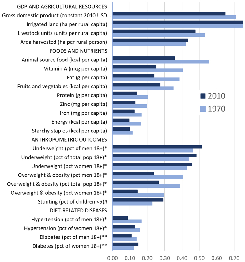
Humans globally have similar nutritional needs but face large differences in natural resource endowments and local food production. This study quantifies food system inequality across countries based on natural resource inputs, food/nutrient outputs, and nutrition/health outcomes, from 1970 to 2010. Animal source foods and overweight/obesity show rapid convergence while availability of selected micronutrients demonstrate slower convergence. However, all variables are more equally distributed than national income per capita, whose Gini coefficient declined from 0·71 to 0·65. Inequalities in total and animal-source dietary energy declined from 0·16 to 0·10 and 0·55 to 0·36, respectively. There was convergence in overweight/obesity prevalence from 0·39 to 0·27, while undernutrition and stunting became increasingly concentrated in a few high-burden countries. Characterizing cross-country inequalities in agricultural resources, foods, nutrients, and health can help identify critical opportunities for agriculture and food policies, as well as prioritize research objectives and funding allocation for the coming decade.


Conflict of interest statement

Ethics declaration: The authors declare no competing interests.

Figures

Figure 1
Figure 1. Gross domestic product per capita
Data shown are from the World Bank. Countries are sorted by GDP per capita, and color-coded by region. Lorenz curves (top panels) show cumulative percent of global totals, relative to diagonal line of equality. Parade plots (lower panel) show country averages, relative to the global mean. BR = Brazil, CH = China, ET = Ethiopia, ID = Indonesia, IN = India, MX = Mexico, NG = Nigeria, PK = Pakistan, RU = Russia, US = United States.
Figure 2
Figure 2. Area harvested per rural capita and livestock units per rural capita
Data shown are from the Food and Agriculture Organization. Countries are sorted by the natural log of the area harvested per rural capita and livestock units per rural capita and color-coded by region. Lorenz curves (top panels) show cumulative percent of global totals, relative to diagonal line of equality. Parade plots (lower panels) show country averages, relative to the global mean. BR = Brazil, CH = China, ET = Ethiopia, ID = Indonesia, IN = India, MX = Mexico, NG = Nigeria, PK = Pakistan, RU = Russia, US = United States.
Figure 3
Figure 3. Energy from animal source foods and from fruits and vegetables
Data shown are derived from NBS estimates, based on FAO data on food use by country and USDA data on nutrient composition of each food. Countries are sorted by nutrient availability per capita and color-coded by region. Lorenz curves (top panels) show cumulative percent of global totals, relative to diagonal line of equality. Parade plots (lower panel) show country averages, relative to the global mean. BR = Brazil, CH = China, ET = Ethiopia, ID = Indonesia, IN = India, MS = Mexico, NG = Nigeria, PK = Pakistan, RU = Russia, US = United States, RW = Rwanda.
Figure 4
Figure 4. Micronutrient availability per capita
Data shown are derived from NBS estimates, based on FAO data on food use by country and USDA data on nutrient composition of each food. Countries are sorted by nutrient availability per capita and color-coded by region. Lorenz curves (top panels) show cumulative percent of global totals, relative to diagonal line of equality. Parade plots (lower panel) show country averages, relative to the global mean. BR = Brazil, CH = China, ET = Ethiopia, ID = Indonesia, IN = India, MS = Mexico, NG = Nigeria, PK = Pakistan, RU = Russia, US = United States, SL = Sierra Leone.
Figure 5
Figure 5. Stunting per children <5, underweight, and overweight per adult population
Data shown are from the UNICEF/World Bank/WHO Joint Monitoring Program for stunting and NCD RisC Group for underweight and overweight/obesity. Stunting data come from a range of years and were grouped based on earliest data point and most recent data point. Countries are sorted by prevalence of stunting, underweight, or overweight and obesity, and color-coded by region. Lorenz curves (top panels) show cumulative percent of global totals, relative to diagonal line of equality. Parade plots (lower panels) show country averages, relative to the global mean. BR = Brazil, CH = China, ET = Ethiopia, ID = Indonesia, IN = India, MX = Mexico, NG = Nigeria, PK = Pakistan, RU = Russia, US = United States.
Figure 6
Figure 6. Hypertension, female and male
Data shown are from the NCD RisC Group. Countries are sorted by the prevalence of hypertension and color-coded by region. Lorenz curves (top panels) show cumulative percent of global totals, relative to diagonal line of equality. Parade plots (lower panels) show country averages, relative to the global mean. BR = Brazil, CH = China, ET = Ethiopia, ID = Indonesia, IN = India, MX = Mexico, NG = Nigeria, PK = Pakistan, RU = Russia, US = United States.
Figure 7
Figure 7. Levels and changes in Gini coefficients (1970 and 2010)
Data shown are Gini coefficients, ranging from unity (complete inequality) to zero (perfect equality), constructed as detailed in the text from national totals in 2010 compared to 1970 or the earliest available year, denoted *= 1975, ** =1980, #Years for stunting data vary by country.

Similar articles

Cited by

References

    1. Rockström J, Stordalen GA, Horton R. Acting in the anthropocene: the EAT–Lancet commission. The Lancet. 2016;387(10036):2364–2365. doi: 10.1016/S0140-6736(16)30681-X. - DOI - PubMed
    1. Bentham J, Singh GM, Danaei G, et al. Multidimensional characterization of global food supply from 1961 to 2013. Nature Food. 2020;1:70–75. doi: 10.1038/s43016-019-0012-2. - DOI - PMC - PubMed
    1. Popkin BM. Relationship between shifts in food system dynamics and acceleration of the global nutrition transition. Nutrition Reviews. 2017;75(2):73–82. - PMC - PubMed
    1. Khoury CK, Bjorkman AD, Dempewolf H, Ramirez-Villegas J, Guarino L, Jarvis A, Rieseberg LH, Struik PC. Increasing homogeneity in global food supplies. Proceedings of the National Academy of Sciences; 2014. pp. 4001–4006. - PMC - PubMed
    1. Hawkes C, Chopra M, Friel S. Globalization, Trade, and the Nutrition Transition. Ch. 10. In: Labonté R, Schrecker T, Packer C, Runnel V, editors. Globalization and Health: Pathways, evidence and policy. 1st. Routledge; New York: 2009.

LinkOut - more resources