

Visualisation and network analysis of physical activity and its determinants: Demonstrating opportunities in analysing baseline associations in the Let's Move It trial
- PMID: 34040851
- PMCID: PMC8114395
- DOI: 10.1080/21642850.2019.1646136
Visualisation and network analysis of physical activity and its determinants: Demonstrating opportunities in analysing baseline associations in the Let's Move It trial
Abstract
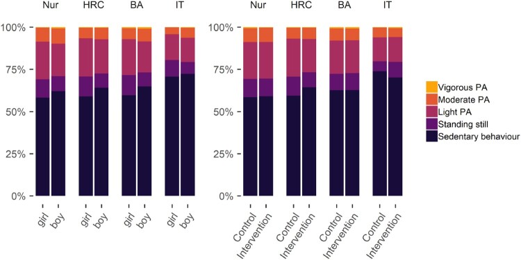
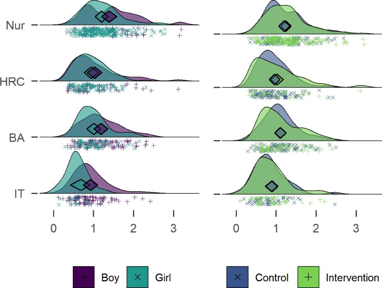
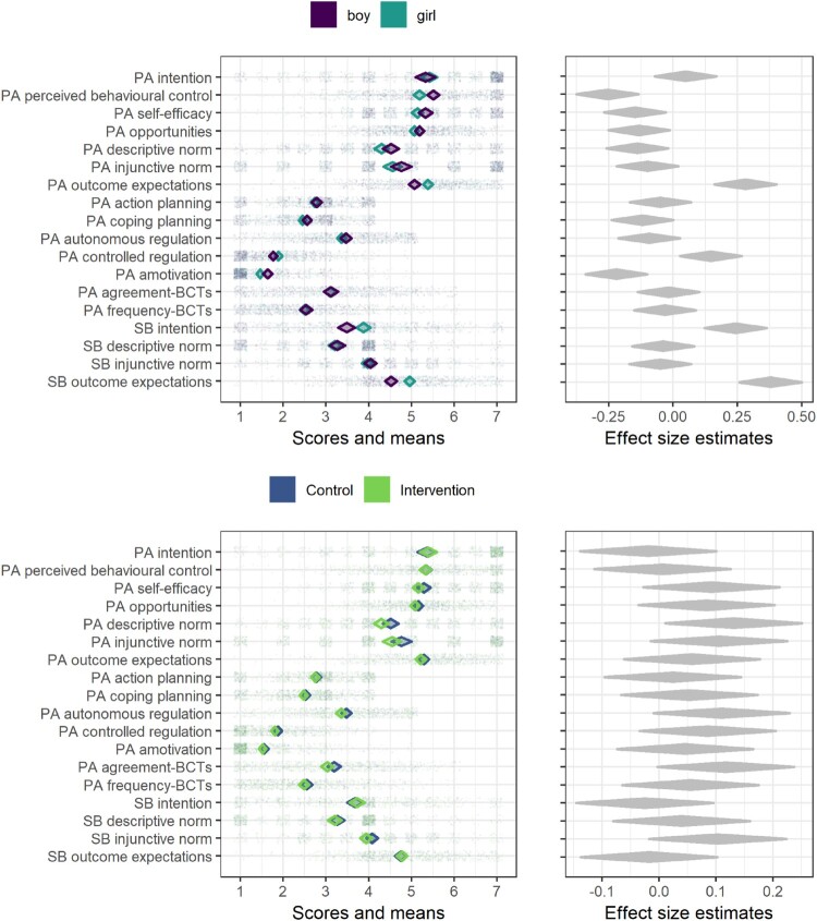
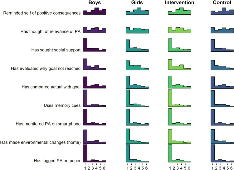
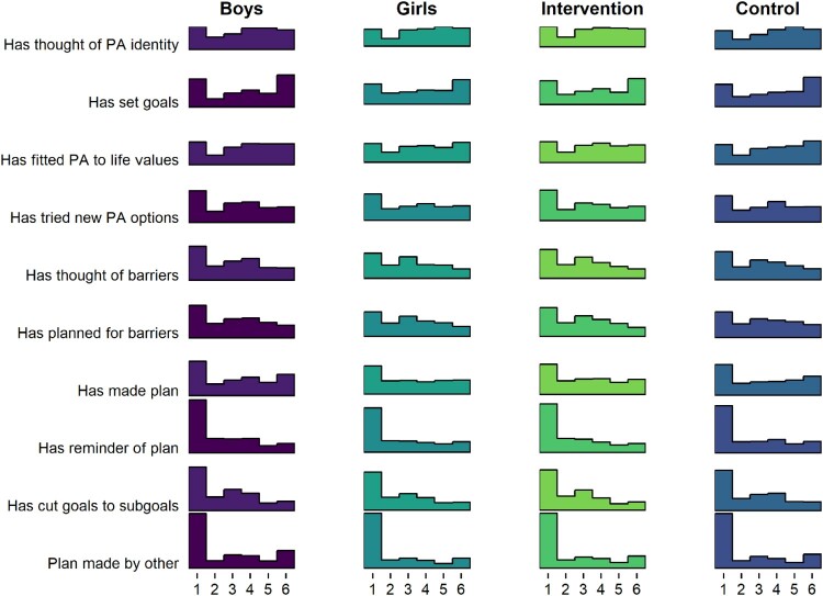
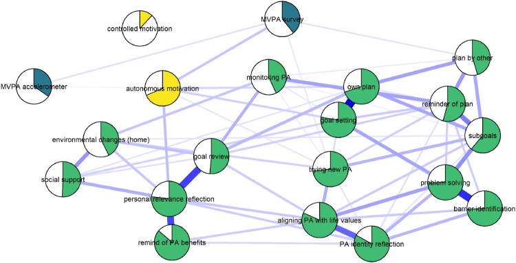
Background: Visualisations and readily-accessible web-based supplementary files can improve data reporting and transparency. In this paper, we make use of recent developments in software and psychological network analysis to describe the baseline cohort of a trial testing the Let's Move It intervention, which aimed to increase physical activity (PA) and reduce sedentary behaviours (SB) among vocational school students. Methods: At baseline, 1166 adolescents, distributed across 6 school clusters and four educational tracks, completed measures of PA and SB, theoretical predictors of these behaviours, and body composition. Within a comprehensive website supplement, which includes all code and analyses, data were tabulated and visualised, and network analyses explored relations between predictor variables and outcomes. Results: Average daily moderate-to-vigorous PA was 65 min (CI95: 57min-73 min), and SB 8h44 min (CI95: 8h04min-9h24 min), with 25.8 (CI95: 23.5-28.0) interruptions to sitting. Cluster randomisation appeared to result in balanced distributions for baseline characteristics between intervention and control groups, but differences emerged across the four educational tracks. Self-reported behaviour change technique (BCT) use was low for many but not all techniques. A network analysis revealed direct relationships between PA and behavioural experiments, planning and autonomous motivation, and several BCTs were connected to PA via autonomous motivation. Visualisation uncovered a case of Simpson's paradox. Conclusions: Data-visualisation and data exploration techniques (e.g. network analysis) can help reveal the dynamics involved in complex multi-causal systems - a challenging task with traditional data presentations. The benefits of presenting complex data visually should encourage researchers to publish extensive analyses and descriptions as website supplements, which would increase the speed and quality of scientific communication, as well as help to address the crisis of reduced confidence in research findings. We hope that this example will serve as a template for other investigators to improve upon in the future.
Keywords: Exercise; behaviour change; physical activity; school-based intervention; sedentary behaviour.
© 2019 The Author(s). Published by Informa UK Limited, trading as Taylor & Francis Group.
Conflict of interest statement
No potential conflict of interest was reported by the authors.
Figures
References
-
- Arslan, R. C. (in press). How to automatically document data with the codebook package to facilitate data re-use. Advances in Methods and Practices in Psychological Science. doi: 10.31234/osf.io/5qc6h - DOI
-
- Aust, F., & Barth, M. (2019). papaja: Create APA manuscripts with R Markdown. Retrieved from https://github.com/crsh/papaja
-
- Bers, M. U. (2017). Coding as a playground: Programming and computational thinking in the early childhood classroom. New York: Routledge. doi: 10.4324/9781315398945 - DOI
Grants and funding
LinkOut - more resources
Full Text Sources