. 2021 Jun 24;184(13):3573-3587.e29.
doi: 10.1016/j.cell.2021.04.048. Epub 2021 May 31.

Integrated analysis of multimodal single-cell data

Affiliations

Integrated analysis of multimodal single-cell data

Yuhan Hao et al. Cell. .

Abstract

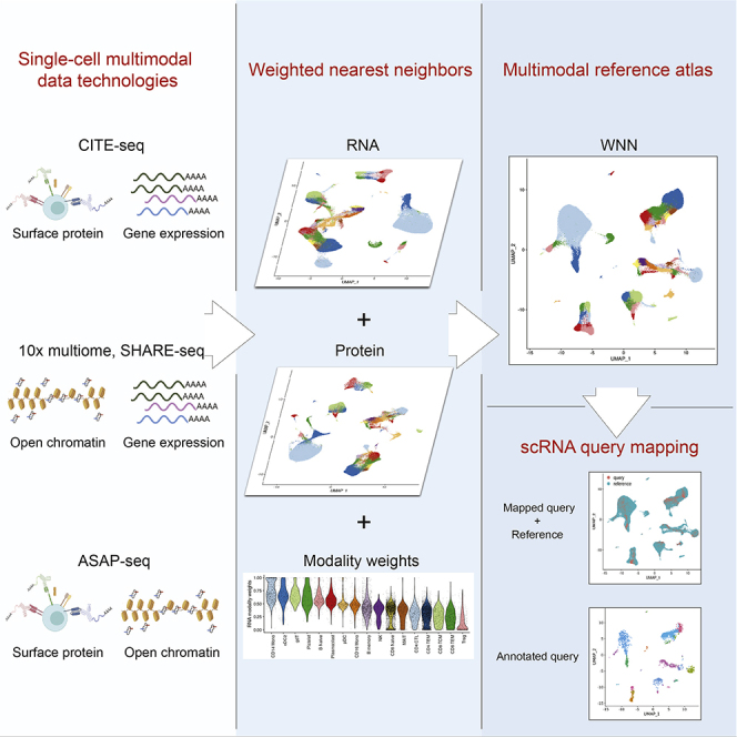
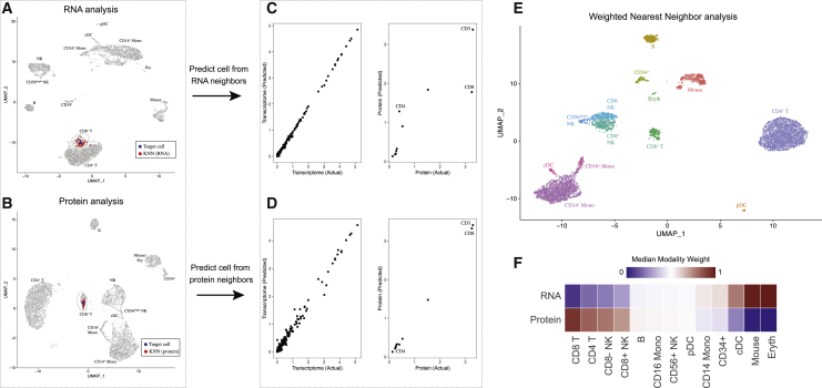
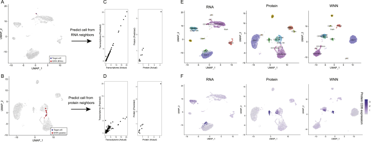
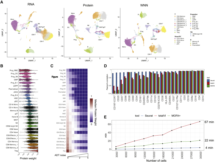
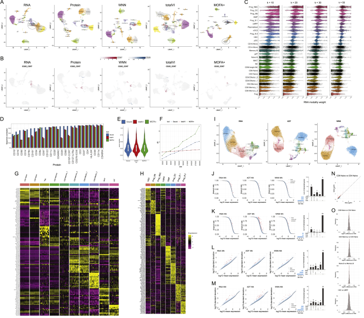
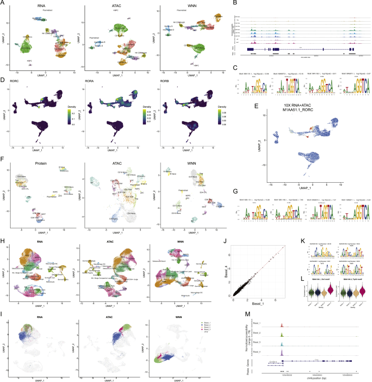
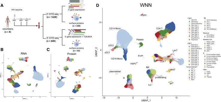
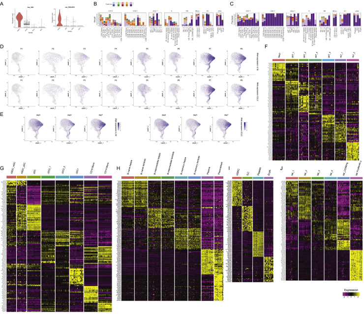
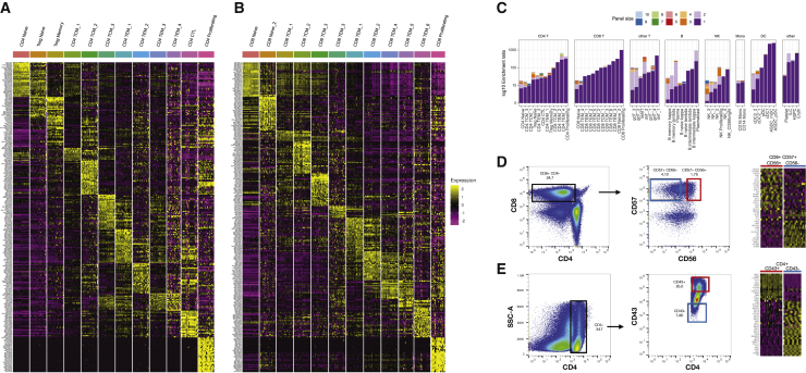
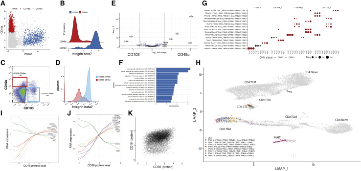
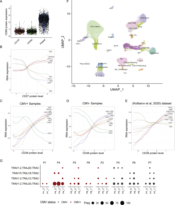
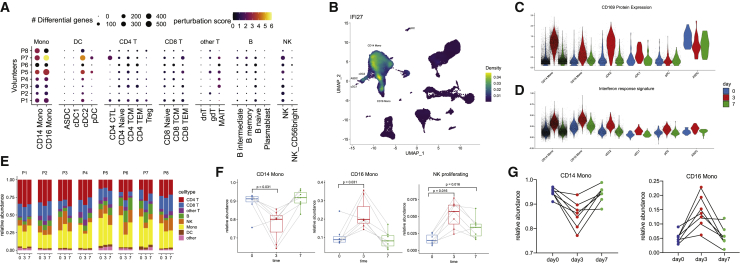
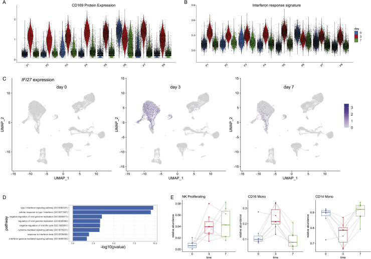
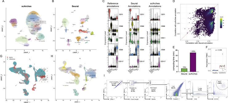
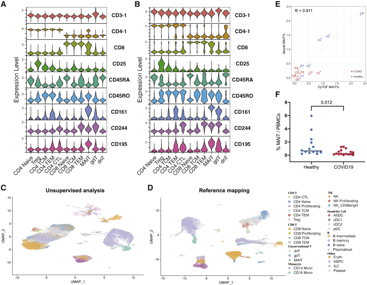
The simultaneous measurement of multiple modalities represents an exciting frontier for single-cell genomics and necessitates computational methods that can define cellular states based on multimodal data. Here, we introduce "weighted-nearest neighbor" analysis, an unsupervised framework to learn the relative utility of each data type in each cell, enabling an integrative analysis of multiple modalities. We apply our procedure to a CITE-seq dataset of 211,000 human peripheral blood mononuclear cells (PBMCs) with panels extending to 228 antibodies to construct a multimodal reference atlas of the circulating immune system. Multimodal analysis substantially improves our ability to resolve cell states, allowing us to identify and validate previously unreported lymphoid subpopulations. Moreover, we demonstrate how to leverage this reference to rapidly map new datasets and to interpret immune responses to vaccination and coronavirus disease 2019 (COVID-19). Our approach represents a broadly applicable strategy to analyze single-cell multimodal datasets and to look beyond the transcriptome toward a unified and multimodal definition of cellular identity.

Keywords: CITE-seq; COVID-19; T cell; immune system; multimodal analysis; reference mapping; single cell genomics.


Conflict of interest statement

Declaration of interests In the past three years, R.S. has worked as a consultant for Bristol-Myers Squibb, Regeneron, and Kallyope and served as an SAB member for ImmunAI, Apollo Life Sciences GmbH, Nanostring, and the NYC Pandemic Response Lab. R.G. has received consulting income from Juno Therapeutics, Takeda, Infotech Soft, Celgene, and Merck, he has received research support from Janssen Pharmaceuticals and Juno Therapeutics, and he declares ownership in CellSpace Biosciences. P.S. is a co-inventor of a patent related to this work. B.Z.Y. is an employee at BioLegend Inc., which is the exclusive licensee of the New York Genome Center patent application related to this work.

Figures

None
Graphical abstract
Figure 1
Figure 1
Schematic overview of multimodal integration using weighted nearest neighbor analysis (A and B) Independent analysis of transcriptome (A) and protein (B) modalities from a CITE-seq dataset of cord blood mononuclear cells. Blue dot marks the same target cell in (A) and (B). Red dots denote the k = 20 nearest neighbors to the target cell based on the transcriptome (A) or protein (B) modalities. (C) The RNA neighbors are averaged together to predict the molecular contents of the target cell, which can be compared to the actual measurements. Each dot denotes an individual gene, and the axis scale of expression is based on default log-normalization in Seurat. Because the RNA neighbors represent a mixture of different T cell subsets, there is substantial error between predicted and measured protein expression levels for CD4 and CD8. (D) Same as in (C), but averaging protein neighbors. Because protein neighbors are all CD8 T cells, the predicted values are close to the actual measurements. We can therefore infer that for this target cell, the protein data are most useful for defining cell state and assign it a higher protein modality weight. As described in STAR Methods, we perform the prediction and comparison steps in low-dimensional space. (E) We can integrate the modalities by constructing a weighted nearest neighbor (WNN) graph, based on a weighted average of protein and RNA similarities. UMAP visualization and clustering of this graph. (F) Median RNA and protein modality weights for all cell types in the dataset. Modality weights were calculated for each cell without knowledge of cell type labels. See also Figure S1.
Figure S1
Figure S1
Weighted nearest neighbor analysis on a CITE-seq dataset of cord blood mononuclear cells, related to Figure 1 (A, B) Independent analysis of transcriptome (A) and protein (B) modalities from a CITE-seq analysis of cord blood mononuclear cells. Panels A-D correspond to Figures 1A–1D, but the target cell is a dendritic cell instead of a CD8 T cell. Blue dot marks the same target dendritic cell in (A) and (B). Red dots denote the k = 20 nearest neighbors to the target dendritic cell based on the transcriptome (A) or protein (B) modalities. (C) The RNA neighbors are averaged together to predict the molecular contents of the target dendritic cells. Since the RNA neighbors are all dendritic cells, the predicted values are close to the actual measurements. (D) Same as in (C), but averaging protein neighbors. Since protein neighbors are a mixture of cell types, there is substantial error between predicted and measured RNA expression. Thus, the RNA data is more informative for characterizing the state of the target cell, and the cell is assigned an increased RNA modality weight. (E) RNA, Protein and WNN UMAP visualization for this dataset. Cells are annotated by their WNN-assigned labels. Visualizations are the same as in Figure 1, but all cell types are labeled on the UMAP plots for greater clarity. (F) Feature plot of CD8 protein expression on all three UMAP visualizations, showing that WNN and ADT analyses help to separate CD4 and CD8 T cells, and also identify additional heterogeneity within NK cells.
Figure 2
Figure 2
Benchmarking and robustness analysis for WNN integration (A) Analysis of a CITE-seq dataset of human bone marrow mononuclear cells and 25 surface proteins. UMAP visualizations are computed using RNA, protein, or WNN analysis. Cell annotations are derived from WNN analysis and reveal heterogeneity within T cells and progenitors that cannot be discovered by either modality independently. Granular annotations, which more clearly indicate subpar performance when analyzing only one modality, are shown in Figure S2. (B) Single-cell protein modality weights. Progenitor populations all receive low protein weights, whereas T cell populations receive high protein modality weights, consistent with the composition of the antibody panel that was tailored for differentiated cell types. (C) To test the robustness of WNN, we added increasing amounts of Gaussian noise to the protein data. Protein weights decrease to 0 in all cell types as noise levels increase. (D and E) Benchmarking WNN against totalVI and MOFA+. (D) The integrated latent space defined by WNN most accurately reconstructs expression levels for 25 proteins. (E) WNN analysis exhibits improved runtimes compared to competing methods. Additional benchmarking analyses in Figure S2. See also Figure S3.
Figure S2
Figure S2
Benchmarking and robustness analysis for WNN integration on a CITE-seq dataset of human bone marrow mononuclear cells (BMNC), related to Figure 2 (A) UMAP visualizations of the BMNC dataset based on five analytical strategies: independent RNA analysis, independent Protein analysis, WNN, totalVI and MOFA+. Cell annotations are derived from WNN analysis, which reflect distinct molecular states (see heatmaps in (G-H)). Dashed ovals indicate regions in each analysis where cell states are intermixed. (B) Expression of protein CD25 and CD57 in these five UMAP visualizations. In WNN analysis, cells that are positive for these proteins are correctly determined to be neighbors of each other, and therefore separate in UMAP visualization. (C) Robustness analysis for k in the WNN procedure (k = 20 by default). We varied the number of single-cell RNA modality weights across different number of k-nearest neighbors used (k = 10, 20, 30, 50) on the BMNC dataset, and show single-cell violin plots of the resulting RNA modality weight. We observe only minor fluctuations when varying k within this range. (D) Benchmarking WNN against totalVI and MOFA+. The integrated latent space defined by WNN most accurately reconstructs expression levels for all 25 proteins. Same as Figure 2D but showing Spearman correlation instead of Pearson correlation. (E) When using the integrated latent space to reconstruct 2000 variable features in the transcriptome, all three methods exhibit equivalent performance. Figure shows boxplot of Pearson correlation between predicted and measured values for 2,000 features. Benchmarking metrics are described further in STAR Methods. (F) Memory usage for all three methods as a function of the size of the input dataset. (G) Heatmap of WNN-annotated T cell states. Features include the best RNA and protein features identified by differential expression. Heatmap displays pseudobulk averages where cells are grouped by cell type, human donor, and technical replicate, and demonstrates that markers are repeatedly detected across samples and replicates. (H) Same as in (G) but for progenitor cell states. (I) Sub-clustering BMNC T cells based on RNA profiles, ADT profiles, and WNN analysis. (J) Gene dropout curve for neighbors of regulatory T cells defined by RNA, ADT, and WNN analysis. Each point represents a gene, with the average trendline in black. Genes that deviate from the trendline (STAR Methods) are denoted as ‘variable’ and plotted as red dots. Rightmost panel represents an upsetR plot examining the set of variable genes identified for each neighborhood set, and shows that WNN-derived neighborhoods exhibit a lower number of variable genes than RNA-derived neighborhoods. (K) Same as in (J) but for HSC cells. (L) Same as (J) but examining the standard deviation of gene expression as an alternative metric to dropout rate. (M) Same as in (L) but for HSC cells. (N) Absolute log2FC of differentially expressed genes between CD4 Naive and CD8 Naive clusters, where clusters were defined by either RNA or WNN analysis (STAR Methods). (O) Distribution of changes in the magnitude of log2FC for differentially expressed genes between cell populations based on WNN-based and RNA-based clustering. Distributions are centered at 0, indicating that for all comparisons, WNN-derived clusters were equally effective at identifying cluster-enriched genes as RNA-derived clusters.
Figure S3
Figure S3
Applying WNN to additional multimodal technologies, related to Figure 2 (A) Analysis of a publicly available dataset of 11,351 PBMC processed with the 10x Genomics Multiome ATAC+RNA kit. UMAP visualizations of RNA and ATAC-seq data, as well as integrated WNN analysis. Cells are labeled by their WNN-annotated clusters. (B) Visualization of pseudobulk chromatin accessibility tracks of the CD8A locus for eight T cell subsets. Multiple peaks clearly separate CD8+ and CD8- T cells, exemplifying the information in ATAC-seq that can enhance parallel RNA measurements for defining cell states. (C) Enriched motifs within MAIT-specific open chromatin regions. Since multiple transcription factors (i.e., RORA, RORB, RORC) have very similar binding motifs, each exhibits strong evidence of enrichment. (D) Density plots, produced by the Nebulosa package, showing the RNA expression of RORC, RORA and RORB. (E) Visualization of RORC motif activity, as calculated by chromVAR, which mirrors the expression of the RORC as shown in (D). (F) Analysis of a published ASAP-seq dataset of 4,725 human PBMC where chromatin accessibility and surface expression of 227 surface proteins are simultaneously measured. UMAP visualizations of ATAC and protein data, as well as integrated WNN analysis. Cells are labeled by their WNN-annotated clusters. (G) Enriched motifs within MAIT-specific open chromatin regions in the ASAP-seq dataset are concordant with those identified in ATAC+RNA analysis. (H) Analysis of a publicly available dataset of 34,774 mouse skin cells from SHARE-seq, which generates paired single-cell profiles of gene expression and chromatin accessibility. UMAP visualizations of RNA and ATAC-seq profiles, as well as integrated WNN analysis. Cells are labeled by their annotations from (Ma et al., 2020b). (I) Four basal subpopulations were identified from WNN clustering, and cells from each subpopulation are highlighted in the UMAP visualizations from (H). Basal_4 and Basal_1 do not separate in transcriptomic analysis, but form distinct clusters in ATAC and WNN analysis. (J) Pseudobulk expression profiles of the Basal_4 and Basal_1 subpopulations demonstrate that the two groups exhibit similar transcriptomic profiles. (K) Top motifs exhibiting differential accessibility between Basal_4 and Basal_1, as identified by chromVar analysis. (L) chromVar motif activity scores for the p53 and CTCF motifs for all basal subpopulations. In each case, Basal_4 exhibits elevated accessibility at these motif sites. ∗∗∗p value < 1e-5 based on Wilcoxon test. (M) Visualization of pseudobulk chromatin accessibility tracks of the Ctcf. locus for four basal subpopulations. In addition to exhibiting greater accessibility globally at CTCF motif sites, Basal_4 exhibits increased accessibility at the Ctcf. promoter.
Figure 3
Figure 3
A multimodal atlas of human PBMC (A) Experimental design schematic of the CITE-seq experiment. PBMC samples originate from eight volunteers pre (day 0) and post-vaccination (day 3 and day 7). We processed each sample with CITE-seq using the 10x 3′ (228 antibodies) and 10x 5′ (54 antibodies + BCR + TCR) technologies, yielding a total of 210,911 cells. (B–D) UMAP visualization of 161,764 cells 10x 3′ cells analyzed based on RNA data (B), protein data (C), or WNN analysis (D). Cell types were identified using unsupervised clustering of the WNN graph and grouped into three annotation tiers, ranging from eight broad categories, to 57 high-resolution clusters. UMAP visualization of 49,147 10x 5′ cells, mapped onto the 3′ reference data, is shown in Figure S5. See also Table S1.
Figure S4
Figure S4
Identifying targeted gene expression markers and immunophenotype panels, related to Figure 4 (A) RNA expression of two canonical markers of AXL+ SIGLEC6+ dendritic cells (ASDC). Both markers were specifically enriched in the ASDC cells compared to other DC subsets. (B-C) For each of the 57 clusters, we computed targeted immunophenotype panels using forward selection coupled with logistic regression. In Figure 4C we visualize the level of enrichment for each cluster based on panels of one to ten markers. Here, we show precision and recall metrics based on logistic regression, using a decision boundary of 0.5. These data demonstrate that while we can achieve substantial enrichment with small panels, isolating pure and homogeneous populations based on small marker panels remains challenging for some clusters. (D-E) Additional heterogeneity in the expression of inflammatory genes in monocyte populations. Only CD14+ and CD16+ monocytes are shown. Heterogeneous expression of these genes is exhibited in multiple, but not all, volunteers. This heterogeneity was not related to the vaccination time course, as shown in (E). (F) Heatmap of unconventional T cells states. Features include the best RNA and protein features identified by differential expression. Heatmap displays pseudobulk averages where cells are grouped by cell type, human volunteer, and vaccination time point and demonstrates that markers are repeatedly identified across samples. Heatmaps for CD4+ T cell and CD8+ T cell states are shown in Figures 4A and 4B. (G) Same as in (F) but for myeloid cell states. (H) Same as in (F) but for B cell states. B cell states are subdivided by their mutually exclusive expression of kappa or lambda light chain, with distinguishing markers including IGKC, IGLC3, IGLC3. (I) Same as in (F) but for other cells states. (J) Same as in (F) but for NK cells states.
Figure 4
Figure 4
Multimodal biomarkers of immune cell states (A) Heatmap of CD4+ T cell states. Markers include the best RNA and protein features identified by differential expression (DE). Heatmap displays pseudobulk averages where cells are grouped by cell type, donor, and vaccination time point and demonstrates that markers do not vary across different PBMC samples. (B) Same as in (A) but for CD8+ T cell states. Additional heatmaps are shown in Figure S4. (C) For each of our 57 clusters, we calculated the optimal surface marker enrichment panels based on our CITE-seq data. Bar plots show the ability of the panels to enrich for each cell type in silico. The composition of each panel is shown in Table S2. (D) Validation of predicted marker panels for the CD8_TEM_5 cluster. We sorted cells based on the marker panels identified in (C), and performed bulk RNA-seq. Each column represents a replicate bulk RNA-seq profile. Heatmap is ordered by genes expected to be DE based on our CITE-seq dataset and are validated by bulk RNA-seq. (E) Same as in (D) but for CD4 CTL cells.
Figure 5
Figure 5
Characterizing heterogeneity within lymphoid populations (A) Mutually exclusive expression of the integrin proteins CD103 and CD49a within CD8+ T memory cells, as measured by CITE-seq. (B) Differential expression of integrin-7 between CD103+ CD49a and CD103+ CD49+ populations as measured by CITE-seq. (C and D) Flow cytometry validates the presence of these populations. Plots are the same as in (A) and (B) but generated via flow cytometry. (E and F) Differentially expressed genes, and enriched gene ontology terms, between CD103+ CD49a and CD103 CD49+ populations. (G) Dot plot showing the representation of the fifteen most abundant T cell clonotypes in the dataset. For space, only the VDJ regions are shown on the y axis, but all cells in a clone share identical CDR3 sequences. Clones reside in a restricted set of cytotoxic and effector cell states and are shared across vaccination time points. Size of each dot represents the number of cells in the clonotype. Clones present in donors who were classified as CMV-positive are colored in red. (H) Cells within a clone exhibit similar molecular profiles. Grey dots represent T cells where TCR sequence was measured using the 10x 5′ assay. Cells from the eight most highly represented clonotypes are highlighted as colored dots. (I–K) Heterogeneity in NK cells is defined by two gradients correlating with CD16 and CD38 protein expression. (I) NK cells are ordered by their quantitative expression of CD16 protein expression. Rolling averages for the expression of genes that correlate positively or negatively with CD16 are shown as smoothed lines. (J) same as (I) but for CD38. (K) CD38 and CD16 protein expression define two separate gradients and are uncorrelated in NK cells. See also Figure S5 and Table S3.
Figure S5
Figure S5
Additional heterogeneity within lymphoid populations, related to Figure 5 (A) Protein expression of canonical resident lymphocyte marker CD69 in CD8+ CD103+, CD8+ CD49a+ T cell populations. Neither population is positive. Platelets are included as a positive control, as CD69 is constitutively expressed on these cells. (B) Naive, intermediate and memory B cells are ordered by their quantitative level of CD27 protein expression. Rolling averages for the expression of genes that correlate positively or negatively with CD27 are shown as smoothed lines. (C-E) Same as Figure 5J, but after splitting the eight volunteers into five CMV+ (C) and three CMV- (D) samples (Table S3). We observe concordant trends in both subsets, as well as an independent CITE-seq dataset (Kotliarov et al., 2020). (F) UMAP visualization of CITE-seq dataset of 49,147 PBMC analyzed with the 10X 5′ Immune Profiling kit, which also measures immune repertoires. The dataset has been mapped onto the 3′-defined multimodal reference, allowing cells to be visualized in the same UMAP space as the reference, and cells are labeled based on transferred Level 2 annotations. (G) Dot plot showing the overrepresentation of TCRα sequences within cells annotated as MAIT. As expected, we detect the canonical MAIT TRAV1-2-TRAJ33 as the most abundant sequence along with reduced usage of TRAJ12 and TRAJ20. We also detect rare populations of invariant NKT cells (defined by the use of TRAV10.TRAJ18). As expected, and in contrast to the clonotypes reported in Figure 5G, these findings are consistent across volunteers, vaccination time points, and CMV status.
Figure 6
Figure 6
Identifying cell-type-specific responses to vaccination (A) For each of our level 2 annotated cell clusters, we calculated the number of differentially expressed genes between unvaccinated (day 0) and day 3 samples (size of each dot). As each per-gene test is highly sensitive to the number of cells, we also calculated a “perturbation score,” which reflects the strength of the molecular response based on the whole transcriptome (color of each dot). (B) Density plot, produced by the Nebulosa package, showing the expression of canonical interferon response gene IFI27. (C and D) Violin plot showing the protein upregulation of Siglec-1 (CD169) in single cells from day 3 samples (C), along with a signature of interferon response (D), in select cell types. In (A)–(D) we consistently observe robust responses only in CD14+ monocytes, CD16+ monocytes, and cDC2 DC. (E) Bar plot showing that the frequency of broad groups (level 1 annotations) is stable across the vaccination time course. (F) Within these broad categories, the relative abundance of classical monocytes, nonclassical monocytes, and proliferating NK cells across the vaccination time course. p values are computed using a paired Wilcoxon test. (G) Relative abundance of monocyte populations as measured by flow cytometry. See also Figure S6.
Figure S6
Figure S6
Cell-type-specific responses to vaccination, related to Figure 6 (A, B) Violin plot showing the upregulation of CD169 protein levels and a module of interferon response genes at day 3. Plot is similar to Figures 6C and 6D, but restricted to CD14 Monocytes, and shows the individual response of each volunteer. The response is consistent across all volunteers with one exception (P6), which exhibited signs of a highly activated immune system even prior to vaccination. (C) RNA expression of canonical interferon response gene IFI27 across the vaccination time course. The expression of IFI27 increases within particular myeloid populations at day 3, but dampens at day 7. (D) Pathway enrichment (enrichR) of the top DE genes between day 0 and day 3 myeloid cells exhibits a clear enrichment for components of the interferon response. (E) Same as in Figure 6F, but computed for cells profiled with the 10X 5′ kit.
Figure S7
Figure S7
Reference-based mapping of query datasets, related to Figure 7 (A-E) Benchmarking of Seurat v4 reference-based mapping with scArches. Both methods utilize reference datasets to assist in the interpretation of query data. (A-B) UMAP visualizations of reference-based mapping of a human PBMC CITE-seq dataset from Kotliarov et al. (2020). Cells are label by the annotation that was transferred using each method. The protein data was withheld from mapping and can be used to assess accuracy. (C) For five cell types where we observed a high rate of discordant predictions between Seurat and scArches, we visualize the protein expression of key markers in the reference dataset (left), Seurat-transferred annotations (middle), and scArches-transferred annotations (right). In each case, the Seurat annotations provide the most concordant results. For example, cells annotated by Seurat as Treg express CD25 protein, while cells annotated by scArches as Treg do not. (D) For all 17,480 (32.9%) of query cells where Seurat and scArches returned different annotations based on the transcriptome, we calculated protein-based classification metrics to determine the support for each result (STAR Methods). In 73.8% of cases, we observe stronger support for the Seurat annotation. (E) Computing time for reference-mapping of Kotliarov et al. (2020) onto the multimodal reference. (F) The abundance of plamablasts increases during COVID-19 response. p value is computed using an unpaired Wilcoxon test. Annotations were derived from reference-based mapping, and confirm the result reported in Wilk et al. (2020). (G) ‘de novo’ UMAP (STAR Methods) visualization of the dataset from Wilk et al. (2020) after reference-mapping. Concordant cell types are identified between query and reference data with three exceptions, denoted with dashed rectangles. (H) Same as in (G), but cells are colored by their unsupervised label as described in Wilk et al. (2020). These results demonstrate that developing and differentiated neutrophils, which are not present in the reference, remain distinct after reference-based mapping. Additionally, a population of CD14+ Monocytes that has severe transcriptional responses to COVID-19 is also highlighted in this analysis. (I) Gating strategy used to identify MAIT cells in mass cytometry experiments.
Figure 7
Figure 7
Supervised mapping of immune perturbations (A) Violin plots showing the expression patterns for nine proteins in our CITE-seq dataset. Cells are grouped by their WNN-defined T cell level 2 annotations. (B) Violin plots for the same proteins in an independent CITE-seq dataset of human PBMC (Kotliarov et al., 2020). Cells are grouped based on their predicted annotations from transcriptome-based reference mapping. The protein data were withheld from the mapping but displays the same patterns as in (A). (C) UMAP visualization of Wilk et al. (2020) scRNA-seq dataset, which includes 44,721 PBMC from patients hospitalized with COVID-19 and healthy controls. UMAP was computed using unsupervised analysis. (D) Same as in (C), but after the dataset has been mapped onto our multimodal reference. Cells are colored by their predicted level-2 annotations. (E) Quantification of MAIT cell abundance based on scRNA-seq reference mapping (y axis) and CyTOF (x axis) for the samples in Wilk et al. (2020). The Pearson correlation between these two methods is 0.911. (F) CyTOF quantification of MAIT cell abundance in PBMC samples from COVID-19 patients and healthy controls. p values are computed using an unpaired Wilcoxon test. See also Figure S7.

References

    1. Abel A.M., Yang C., Thakar M.S., Malarkannan S. Natural Killer Cells: Development, Maturation, and Clinical Utilization. Front. Immunol. 2018;9:1869. - PMC - PubMed
    1. Alquicira-Hernandez J., Powell J.E. Nebulosa recovers single cell gene expression signals by kernel density estimation. bioRxiv. 2020 doi: 10.1101/2020.09.29.315879. - DOI - PubMed
    1. Andreeff M., Beck J.D., Darzynkiewicz Z., Traganos F., Gupta S., Melamed M.R., Good R.A. RNA content in human lymphocyte subpopulations. Proc. Natl. Acad. Sci. USA. 1978;75:1938–1942. - PMC - PubMed
    1. Andrews T.S., Hemberg M. M3Drop: dropout-based feature selection for scRNASeq. Bioinformatics. 2019;35:2865–2867. - PMC - PubMed
    1. Argelaguet R., Arnol D., Bredikhin D., Deloro Y., Velten B., Marioni J.C., Stegle O. MOFA+: a statistical framework for comprehensive integration of multi-modal single-cell data. Genome Biol. 2020;21:111. - PMC - PubMed

Publication types