. 2021 Jun;53(6):861-868.
doi: 10.1038/s41588-021-00875-2. Epub 2021 Jun 3.

A map of transcriptional heterogeneity and regulatory variation in human microglia

Affiliations

A map of transcriptional heterogeneity and regulatory variation in human microglia

Adam M H Young et al. Nat Genet. 2021 Jun.

Abstract

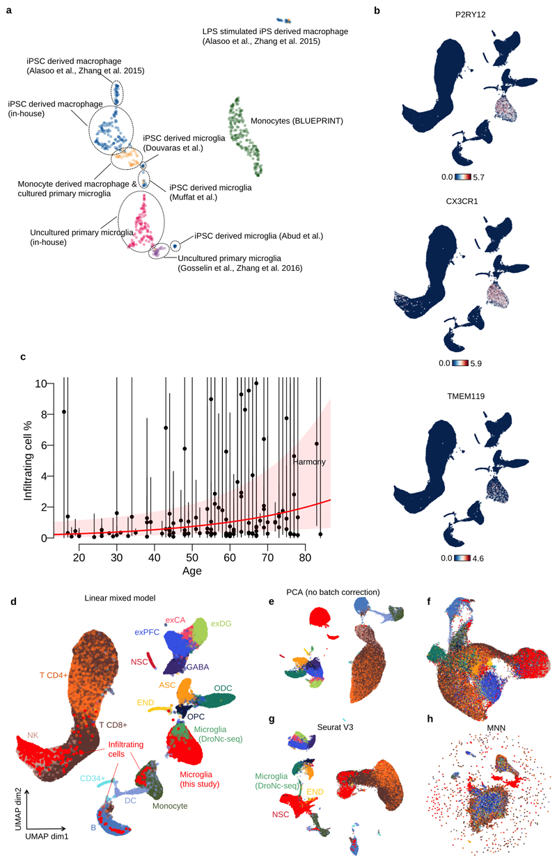
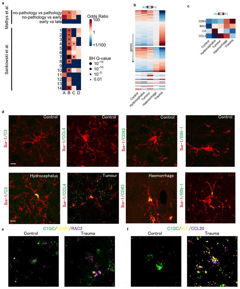
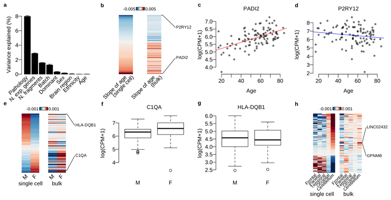
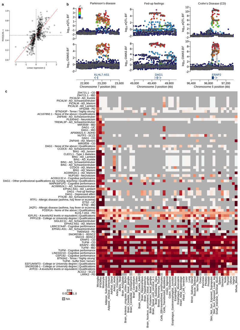
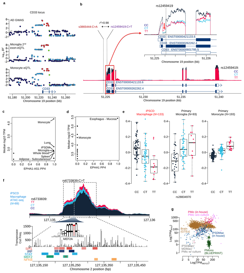
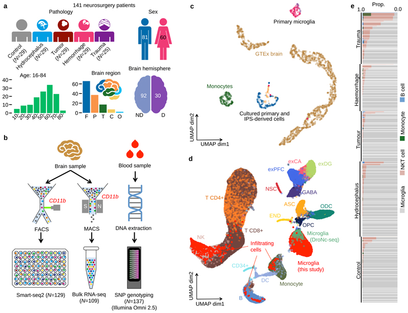
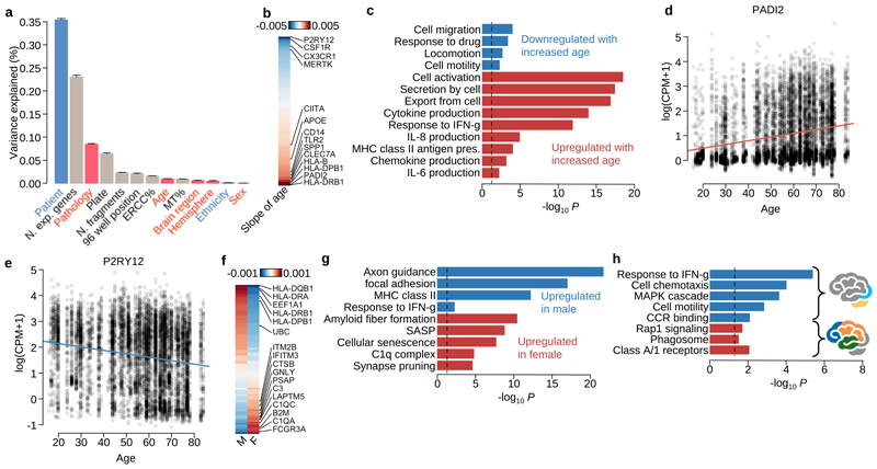
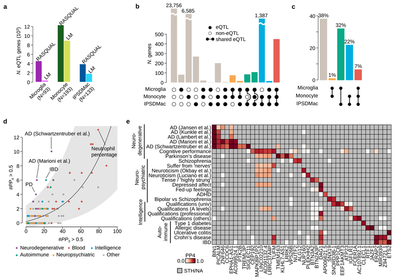
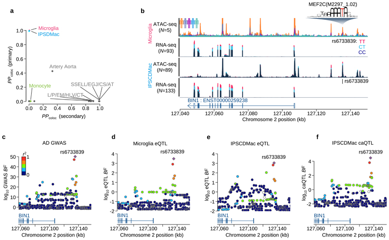
Microglia, the tissue-resident macrophages of the central nervous system (CNS), play critical roles in immune defense, development and homeostasis. However, isolating microglia from humans in large numbers is challenging. Here, we profiled gene expression variation in primary human microglia isolated from 141 patients undergoing neurosurgery. Using single-cell and bulk RNA sequencing, we identify how age, sex and clinical pathology influence microglia gene expression and which genetic variants have microglia-specific functions using expression quantitative trait loci (eQTL) mapping. We follow up one of our findings using a human induced pluripotent stem cell-based macrophage model to fine-map a candidate causal variant for Alzheimer's disease at the BIN1 locus. Our study provides a population-scale transcriptional map of a critically important cell for human CNS development and disease.


Conflict of interest statement

Competing Interests Statement

D.J.G. and E.M. were employees of Genomics PLC at the time the manuscript was submitted.

Figures

Extended Data Fig. 1
Extended Data Fig. 1. Overview of bulk and single cell RNA-seq data.
UMAP of bulk RNA-seq for myeloid cells. The “Primary microglia” cluster contains samples collected in this study (pink dots) and previous studies (purple dots) (information on the source of previous study data can be found in Supplementary Table 7). “Cultured primary and IPS-derived cells”, includes IPS-derived macrophages and microglia (blue dots), cultured primary microglia and monocyte derived macrophages (orange dots). “Monocytes” (green dots) denotes primary monocytes obtained from the BLUEPRINT project. b. Feature plots of three microglia marker genes (P2RY12, CX3CR1 and TMEM119) using the same UMAP coordinates as Figure. 1d. c. Age versus percentage of infiltrating cells. Red line shows the logistic regression line, the red transparent band shows the 95% confidence interval estimated using a generalised linear mixed model for the binary outcome (Materials and Methods). d. UMAP plot identical to Figure 1d. e. UMAP plot from the first 12 principal components computed from the same input data for the linear mixed model without any batch correction. f. UMAP of the same 12 PCs where the batch effect was corrected by using Harmony. g. UMAP of batch corrected data using the canonical correlation analysis method implemented in Seurat V3 with a default setting. We computed the 12 PCs from the integrated data for UMAP plot. h. UMAP of batch corrected data using MNN correct. Note that points were coloured according to the cell types (same as Figure 1d): glutamatergic neurons from the PFC (exPFC); pyramidal neurons from the hip CA region (exCA); GABAergic interneurons (GABA); granule neurons from the hip dentate gyrus region (exDG); astrocytes (ASC); oligodendrocytes (ODC); oligodendrocyte precursor cells (OPC); neuronal stem cells (NSC); endothelial cells (END); dendritic cell (DC); B cell (B); hematopoietic progenitor cell (CD34+); NK T cell (NK).
Extended Data Fig. 2
Extended Data Fig. 2. Microglia marker gene comparisons and validations.
a. Marker gene enrichment analysis with Alzheimer’s disease associated microglia and glioma associated microglia. There are three different comparisons for Alzheimer’s disease associated microglia and 14 different populations for glioma associated microglia. Heatmap shows odds ratios and Benjamini-Hochberg (BH) Q-values of the Fisher exact tests between our marker genes and differentially expressed genes in other studies. b. Differentially expressed genes between microglia from different patient pathologies using single cell RNA-seq data. Heatmap shows averaged, normalised expression level (defined as the posterior mean of pathology random effect term, see Materials and Methods) of differentially expressed genes at local true sign rate (ltsr) greater than 0.9 ((Urbut et al. 2019); see Materials and Methods for details). Heatmap is divided into groups based on all possible pairwise groupings of the four cell populations, ordered by most transcriptionally distinct, such that the most different grouping, trauma versus all non-trauma, appears at the top. c. Differential expression of candidate marker genes for immunohistochemistry in fresh frozen patient tissue samples. d. Immunohistochemistry panel of each pathology to validate expression of a differentially expressed gene at the protein level; hydrocephalus (C3), tumour (CCL4), haemorrhage (CD63) and trauma (BIN-1) compared to control. Iba-1 (red) and protein of interest (green). e. RNAScope image of differentially expressed gene panel for cluster C; HAMP (yellow) and RAC2 (purple) with C1QC (green) used to identify microglia. f. RNAScope image of differentially expressed gene panel for cluster D; KLF (yellow) and CCL20 (purple). Scale bar 10μM.
Extended Data Fig. 3
Extended Data Fig. 3. Differential expression analysis with bulk RNA-seq data.
a. Variance components analysis of log CPM values for the bulk RNA-seq data (N=102) with biological and technical factors using the linear mixed model (Online methods). b. Heatmap shows the effect size of age for each gene (each row) estimated by the linear mixed model (Online methods). The genes with LTSR>0.9 in single-cell data are shown. c. PADI2 normalised expression in bulk RNA-seq data against patients’ age. d. P2RY12 expression in bulk RNA-seq data against patients’ age. e. Heatmap shows the average expression of males and females for each gene (each row) estimated by the linear mixed model (Online methods). The genes with LTSR>0.9 in single-cell data are shown. f. C1QA normalised expression in bulk RNA-seq data for males (M) and females (F). g. HLA-DQB1 normalised expression in bulk RNA-seq data for males (M) and females (F). h. Heatmap shows the average expression for 5 different brain regions estimated by the linear mixed model (Online methods). The genes differentially expressed between a combination of Occipital and Cerebellum and the 3 other regions (LTSR>0.9) in single-cell data are shown.
Extended Data Fig. 4
Extended Data Fig. 4. Colocalisation of eQTLs with various GWAS traits.
a. eQTL effect size comparison for 502 eQTL genes at FDR 5% (linear regression) whose gene body contains at least one feature SNP with sufficient coverage (greater than 5% of average coverage across coding regions). The x-axis shows the eQTL effect size (beta) estimated from linear regression and the y-axis shows the eQTL effect size (pi value) from RASQUAL using only allele-specific count data. The red line shows the least square line crossing (0, 0.5). Note that, x=0 is the null hypothesis for linear regression and y=0.5 is the null hypothesis for RASQUAL. b. Examples of colocalised eQTLs in microglia. Colocalisation with Parkinson’s disease at KLHL7-AS1 eQTL (left column), colocalisation with Fed-up feelings at DAG1 eQTL (middle column) and colocalisation with Crohn’s disease at ERAP2 eQTL (right column). The y-axis of each panel shows log10 association Bayes factor for the eQTL or the GWAS trait. The colour of each point indicates LD index (r2 value) to the lead eQTL variant shown by the purple diamond. c. Heatmap of the posterior probability for colocalisation (PP4) between various GWAS traits and cell types/tissues. Each row corresponds to a specific combination of gene and a GWAS trait. Each column corresponds to eQTLs discovered in different cell types and tissues. The first column of the heatmap corresponds to microglia eQTLs, the second column corresponds to eQTLs in IPS cell derived macrophage (IPSDMac) from this study (Materials and Methods), the third column shows eQTLs in primary monocytes from the BLUEPRINT project (Materials and Methods) and the remaining 48 tissues are eQTLs from GTEx V7 (Materials and Methods). The colour of each grid shows the strength of PP4 (white: PP4=0.0 and red: PP4=1.0). Gray indicates that the gene was very weakly or not expressed, and therefore no eQTL summary statistics were available.
Extended Data Fig. 5
Extended Data Fig. 5. Finemapping of microglia eQTLs.
a. Regional association plots at the CD33 locus. b. Coverage plot shows the normalised expression level around the CD33 gene stratified by genotype at the putative splice variant (rs12459419C>T). The zoom-in panel shows a coverage plot of expression level around the second exon (ENST0000262262.4). The coverage shows the first intron expression is negatively correlated with the second exon expression, suggesting the expression of non-coding isoform (ENST00000601785.5) is increased by the alternative allele (T) of the splicing QTL. c. Colocalisation between an association with risk for Alzheimer’s disease on chromosome 2 and an eQTL for the noncoding RNA gene EPHA1-AS1 in microglia, GTEx tissues and myeloid cell types. The x-axis shows the posterior probability of colocalisation (PP4) and y-axis shows the average expression level (log10 TPM) for each tissue or cell type. d. Colocalisation between AD risk and expression of the protein-coding EPHA1 gene. The x-axis shows the posterior probability of colocalisation (PP4) and y-axis shows the average expression level (log10 TPM) for each tissue or cell type. e. Boxplots show the relationship between expression at the PTK2B gene and genotype at the lead eQTL variant (rs28834970C>T) three myeloid cell types. The y-axis shows normalised expression levels (log TPM value). Each dot on the box shows the expression level of a single sample. f. Coverage plot shows chromatin accessibility in iPS cell derived macrophages stratified by three genotype groups of the lead AD GWAS/BIN1 eQTL variant g. Scatter plot of MEF2C (x-axis) and BIN1 (y-axis) expression in GTEx brain tissues and myeloid cell type.
Figure 1
Figure 1. Study design and overview of the data.
a. Metadata from 141 neurosurgery patients enrolled in this study. Brain region annotation: Cerebellum (C); Frontal (F); Occipital (O); Parietal (P); Temporal (T); non-dominant (ND); dominant (D). b. Experimental design using Smart-seq2 and bulk RNA-seq with SNP genotyping. c. UMAP of bulk RNA-seq from myeloid cells and brain tissue. The “Primary microglia” cluster contains samples collected in this study (pink dots) and previous studies (purple dots) (information on the source of previous study data can be found in Supplementary Table 7). “Cultured primary and IPS-derived cells”, includes IPS-derived macrophages and microglia (blue dots), cultured primary microglia and monocyte derived macrophages (orange dots). “Monocytes” (green dots) denotes primary monocytes obtained from the BLUEPRINT project, and “GTEx brain” denotes all brain tissues from GTEx v7. The left cluster of GTEx brain corresponds to cerebellum or cerebellar hemisphere samples and the right cluster contains samples from all other brain regions. d. UMAP of single-cell RNA-seq data combined with 68K PBMC scRNA-seq and whole brain DroNc-seq. Bright red dots represent cells collected in this study. Cell type annotations were obtained from: glutamatergic neurons from the PFC (exPFC); pyramidal neurons from the hip CA region (exCA); GABAergic interneurons (GABA); granule neurons from the hip dentate gyrus region (exDG); astrocytes (ASC); oligodendrocytes (ODC); oligodendrocyte precursor cells (OPC); neuronal stem cells (NSC); endothelial cells (END); dendritic cell (DC); B cell (B); hematopoietic progenitor cell (CD34+); NK T cell (NK). e. Proportions of non microglia for each patient in our data. Each horizontal bar corresponds to one patient. The thickness of each bar is proportional to the number of cells observed for the patient. Patients are stratified by pathology.
Figure 2
Figure 2. Transcriptional heterogeneity in human microglia.
a. UMAP of 8,662 microglia cells after removing putative infiltrating cells. Colors show 4 clusters defined using Louvain clustering (Materials and Methods). b. Microglial population variation between patient pathologies. The four different colours in Figure 2a illustrate population compositions for each pathology. Points coloured gray are all other cells. c. Heatmap shows the enrichment (log odds ratio) of microglial populations between pathologies d. Heatmap of averaged, normalised expression level (defined as the posterior mean of pathology random effect term, see Materials and Methods) of differentially expressed genes at local true sign rate (ltsr) greater than 0.9 (see Materials and Methods for details). Heatmap is divided into groups based on all possible pairwise groupings of the four cell populations, with the most transcriptionally distinct population at the top. e. Pathway enrichment analysis of differentially expressed genes between different microglial populations. The x-axis shows the P-value obtained by gProfiler2 with multiple testing corrections (Materials and Methods). Bars are coloured according to the combinations of clusters in which genes are upregulated. The upregulated cluster IDs are also shown besides the bars.
Figure 3
Figure 3. Single-cell RNA-seq reveals how microglial transcriptional heterogeneity is driven by clinical factors.
a. Barplot shows the variance explained by each factor. Bars coloured gray are technical factors (N.exp.genes: the number of expressed genes in each cell, which is expected to reflect cell health or quality; Plate: cells undergoing library preparation and sequencing together on the same 384 well plate; ERCC%: ERCC spike-in percentage among all mapped fragments for each cell; N.fragments: the number of fragments for each cell mapped on autosomes; 96 well position: the position of a cell on the 96 well plate processed in the SmartSeq2 protocol; MT%: percentage of mitochondrial RNA fragments among all mapped fragments for each cell) and coloured pink are clinical factors (Pathology; Age of patient; Brain region; Brain hemisphere; Sex of patient). Blue bars are partly related to patients’ genetic background (Patient and Ethnicity). b. Heatmap showing the strength and direction of the age effect for differentially expressed (DE) genes at local true sign rate (ltsr) greater than 0.9 (Materials and Methods). The effect size is the posterior mean estimate weighted by the empirical prior distribution, where hyperparameters were estimated from the data using a linear mixed model (Materials and Methods). c. Pathway enrichment for differentially expressed (DE) genes by age. Pathways coloured red are enriched only for DE genes upregulated by age, and the pathways coloured blue are enriched for DE genes downregulated by age. d-e. Example genes upregulated or downregulated by age. f. Heatmap showing the average normalised expression levels for DE genes by sex at ltsr greater than 0.9 (Materials and Methods). The effect size is the posterior mean estimate weighted by the prior distribution calibrated in the linear mixed model (Materials and Methods). g. Pathway enrichment by sex. h. Pathway enrichment for combinations of brain regions. The blue bars show pathways upregulated in cerebellum and occipital lobe. The red bars show pathways upregulated in frontal, parietal and temporal lobes.
Figure 4
Figure 4. Mapping and colocalisation of microglia eQTLs with various GWAS traits.
a. The numbers of eQTL genes discovered by two different methods, RASQUAL (left bar) or simple linear regression (right bar, LM) in three myeloid cell types at FDR 5% (see Online Methods). b. The number of shared eQTLs across three myeloid cell types obtained by the three-way Bayesian hierarchical model (Online Methods). The combination of genes that are eQTLs (closed dots) or non-eQTLs (open dots) across three different myeloid cell types are shown below each bar. A line connecting two dots indicates a shared eQTL between different cell types. c. Empirical prior probability of eQTL sharing among three different myeloid cell types obtained by the three-way Bayesian hierarchical model (Online Methods). The Y-axis shows the proportion of genes genome-wide and the dots connected by segment illustrate the shared genetic association. d. Colocalisation of microglia eQTLs with 146 GWAS traits. The x-axis shows the number of genes where PP3, the posterior probability of the microglia eQTL and GWAS association being driven by two independent causal variants, was greater than 0.5. The y-axis is the number of colocalised genes where the posterior probability of a single shared causal variant between a microglia eQTL and a GWAS locus (PP4) was greater than 0.5. We subdivided and colored GWAS traits as follows: purple: neurodegenerative diseases; red: blood cell trait; blue: traits related with intelligence; green: autoimmune diseases; yellow: neuropsychiatric diseases; gray: others. The line shows a log-normal linear regression fit with gray shaded area indicating the 95% prediction interval of the fit. e. Heatmap of PP4 for neuro-degenerative/psychiatric diseases, intelligence related traits and autoimmune diseases showing all genes and GWAS trait with a combined PP4 greater than 0.5. Gray cells indicate that the gene-trait combination was not tested because the GWAS locus was not significant (lead SNP P>10-6), or there were no GWAS summary statistics available for secondary hits (PTK2B and TREML3P).
Figure 5
Figure 5. Fine-mapping of the BIN1 eQTL / Alzheimer’s disease association.
a. Posterior probability of colocalisation between Alzheimer’s disease and the three myeloid cells and GTEx eQTLs for the BIN1 gene. The y-axis is based on the AD GWAS primary signal of the BIN1 locus and the x-axis is based on the secondary signal at BIN1 found by the conditional analysis. b. Sequencing coverage depth of ATAC-seq and RNA-seq stratified by individuals (top ATAC-seq panel) or the three genotype groups at BIN1 lead eQTL SNP (rs6733839C>T) (bottom three panels). The top two panels show data from the primary microglia (Materials and Methods) and the bottom two panels were obtained from iPS cell derived macrophage (Materials and Methods). The MEF2CA motif overlaps with the lead SNP and the alternative allele (T) increases predicted binding affinity. c. Regional Manhattan plot around the BIN1 gene. The y-axis shows the statistical significance of AD GWAS in log10 Bayes factor. d. Regional plot shows the statistical significance of microglia eQTL for BIN1 gene in log10 Bayes factor. e. Regional plot shows the statistical significance of IPSDMac eQTL for BIN1 gene in log10 Bayes factor. f. Regional plot shows the statistical significance of IPSDMac chromatin accessibility QTL (log10 Bayes factor) at the chromatin accessibility peak involving the putative causal variant rs6733839C>T. Tissue type annotation: Artery Tibial (AT), Esophagus Gastroesophageal Junction (EGJ), Colon Sigmoid (CS), Skin Sun Exposed Lower leg (SSELL), Heart Left Ventricle (HLV), Colon Transverse (CT), Esophagus Mucosa (EM), Pituitary (PI).

Comment in

References

    1. Schafer DP, Stevens B. Microglia Function in Central Nervous System Development and Plasticity. Cold Spring Harb Perspect Biol. 2015;7:a020545. - PMC - PubMed
    1. Li Q, Barres BA. Microglia and macrophages in brain homeostasis and disease. Nat Rev Immunol. 2018;18:225–242. - PubMed
    1. Salter MW, Stevens B. Microglia emerge as central players in brain disease. Nat Med. 2017;23:1018–1027. - PubMed
    1. Guerreiro R, et al. TREM2 variants in Alzheimer’s disease. N Engl J Med. 2013;368:117–127. - PMC - PubMed
    1. Jonsson T, et al. Variant of TREM2 associated with the risk of Alzheimer’s disease. N Engl J Med. 2013;368:107–116. - PMC - PubMed

Publication types